DEPRECATION WARNING
This documentation is not using the current rendering mechanism and is probably outdated. The extension maintainer should switch to the new system. Details on how to use the rendering mechanism can be found here.
EXT: SAV Library Extension Generator
| Created: | 2008-12-05T07:38:36 |
|---|---|
| Changed: | 2009-02-28T17:41:48 |
| Classification: | sav_library |
| Keywords: | Extension generator, SAV Library |
| Author: | Laurent Foulloy |
| Email: | yolf.typo3@orange.fr |
| Info 4: | |
| Language: | en |

 EXT: SAV Library Extension Generator - sav_library
EXT: SAV Library Extension Generator
Extension Key: sav_library
Language: en
Keywords: Extension generator, SAV Library
Copyright 2000-2011, Laurent Foulloy, <yolf.typo3@orange.fr>
This document is published under the Open Content License
available from http://www.opencontent.org/opl.shtml
The content of this document is related to TYPO3
- a GNU/GPL CMS/Framework available from www.typo3.org
Table of Contents
EXT: SAV Library Extension Generator 1
`Introduction 4 <#__RefHeading__9458_2085275629>`_
Important development remarks 11
`Users manual 13 <#__RefHeading__9464_2085275629>`_
`Administration 14 <#__RefHeading__9468_2085275629>`_
Updating previously generated extensions 14
`Configuration 16 <#__RefHeading__9474_2085275629>`_
Flexform associated with the Plugin 16
Changing the template for the views 18
Configuration of the Queriers, Viewers, Item Viewers 18
Modification of the SAV Library configuration 19
Reference for the field configuration 19
Field configuration by means of the page TS Config 30
Configuration of the code generation 31
`Tutorial 1 : Contact List 33 <#__RefHeading__9496_2085275629>`_
`Tutorial 2: CD Album 49 <#__RefHeading__33613803>`_
`Tutorial 3: CD Album (Advanced) 55 <#__RefHeading__9514_2085275629>`_
`Tutorial 4: CD Album (Improved) 62 <#__RefHeading__9522_2085275629>`_
`Tutorial 5: Extends test 67 <#__RefHeading__9530_2085275629>`_
`Tutorial 6: Email and RTF 68 <#__RefHeading__9534_2085275629>`_
The configuration explained 69
`Tutorial 7: Guest book 72 <#__RefHeading__9542_2085275629>`_
The guest input form (FORM) 73
The guest input list (LIST) 76
Installation and configuration 78
`Tutorial 8: Fe Users Admin and Export 81 <#__RefHeading__9558_2085275629>`_
The administration form (ADMIN) 83
Installation and configuration 83
Exporting data to CSV format 85
Exporting data to other formats 86
`Tutorial 9: Using XML JpGraph 90 <#__RefHeading__9574_2085275629>`_
Gantt graphs display (Display) 91
Using the graph with a year selector 94
`Tutorial 10: Using TypoScript (Gallery with google map) 97 <#__RefHeading__9584_2085275629>`_
Configuration of the plugin 99
`Other examples 101 <#__RefHeading__39576314>`_
Downloading documents (sav_download) 101
Minutes of meetings (sav_meetings) 101
`Known problems 103 <#__RefHeading__9596_2085275629>`_
`To-Do list 104 <#__RefHeading__9598_2085275629>`_
`Sponsors and credits 105 <#__RefHeading__9600_2085275629>`_
`Changelog 106 <#__RefHeading__9606_2085275629>`_
Introduction
What does it do?
The SAV Library extension contains:
- an “Extension Generator” based on the conventional kickstarter,
- a library which is required to run the generated extensions.
Thanks to simple configuration parameters it generates extensions without any PHP coding . The SAV Library Extension Generator includes:
- Creation of multiple views of the data,
- Front end input of the data,
- Views with folders,
- Simple interface in the Kickstarter with Context Sensitive Help,
- Generation of emails,
- Generation of RTF files using database tags,
- Data export in CSV format,
- Many other features.
Important: this extension is now obsolete. It is replaced by the SAV Library Plus extension which works with the SAV Library Kickstarter.
Screenshots
The Extension Manager in BE
New wizard items, tab selector for the views, links for fast access to the fields
Configuration window for each field with tab selector for the views
Update tool
Configuration of the generated extension by flexform
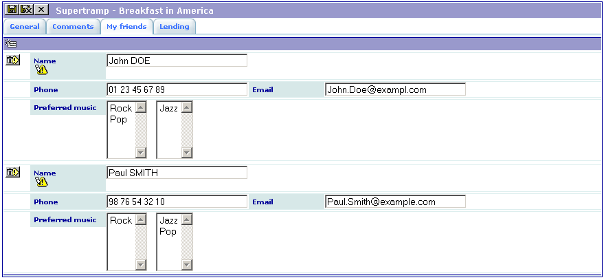
Example 4 – Double-window selector, table in a sub-form which is not in relation with items
Single view
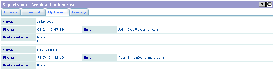
Input view
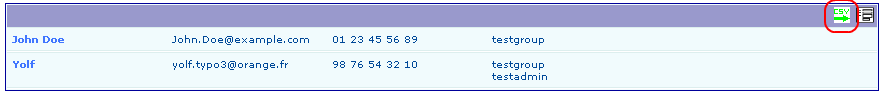
Example 8 – Fe Users Admin and Export
Show All view of the ADMIN form with export icon
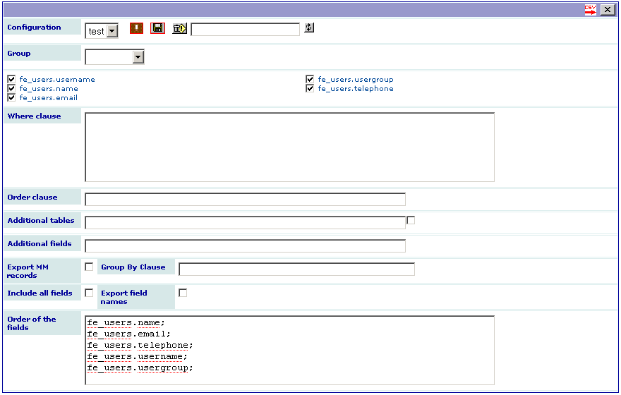
Export form using a previously saved configuration
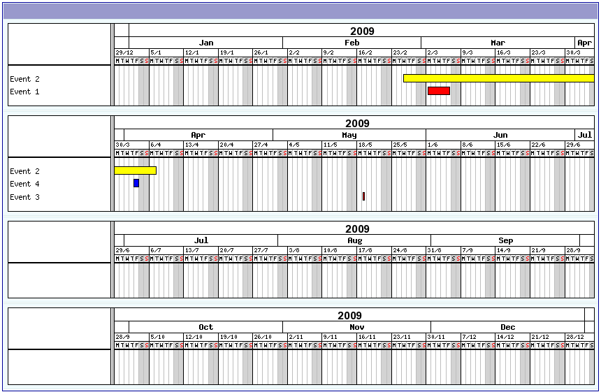
Example 9 – XML JpGraph (year events display as Gantt graphs)
Important development remarks
When the development of this extension started, it was chosen to modify the Kickstarter using the XCLASS method. All the functionnalities of the Kickstarter are preserved and it can be used normally. The current version of the SAV Library Extension Generator works the Kickstarter 0.4.0, 0.5.0, 0.5.1 .
If you have developed extensions with the previous version of the SAV Library Generator, that is version 2.x.y, you will need to update all your extensions. A tool in the Extension Manager was specially designed to easily update extensions.
However the Kickstarter is an old code which is quite difficult to change because it does not clearly separate the code generation and the BE interface. Furthermore, having the generator and the library in the same extension is not the best solution. Therefore, I have decided to develop a specific kickstarter for the SAV Library extension. This new kickstarter, called sav_library_kickstarter, is based on fluid and extbase and is available in the TER ( https://typo3 .org/extensions/repository/view/sav_library_kickstarter/current/ ). Please use this new SAV Library Kickstarter for your developements .
The SAV Library extension still contains the kickstarter XCLASS files only for compatibility reasons with TYPO3 versions which doe not have “fluid” and “extbase”. For now, the dependency between the extension “sav_library” and “kickstarter” has been removed.
The latest developments of the SAV Library extension are available on TYPO3 Forge ( Extension Generator ).
Remember that “It's not abug, it's amissingfeature”. If you find some, please use the bug tracker on the TYPO3 Forge.
Users manual
Installation
If not installed, download the extension “kickstarter” and install it.
Download the extension “sav_library” and install it.
Read the tutorial sections
Administration
Updating previously generated extensions
In case of a major release of the SAV Library Extension Generator you will need to update all the previously generated extensions.
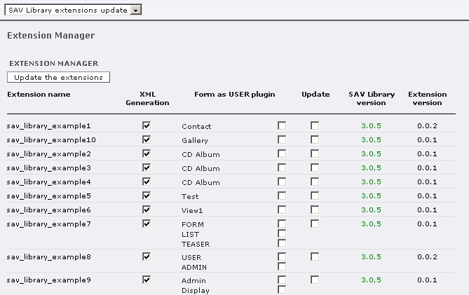
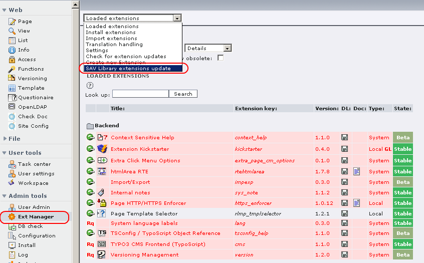
A special tool is available in the Extension Manager to perform this task easily. Click on the Extension Manager and select “SAV Library extensions update” in the selector box.
All the loaded extensions which have been generated the SAV Library Extension Generator are displayed.
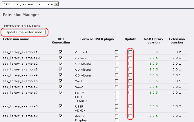
For each extension, several information are displayed:
The name of the extension, that is the extension key. By clicking on the name, the tool provides a quick access to an extension. It will be opened in the kickstarter.
By default, the SAV Library Extension Generator will generate a XML configuration file in the “pi1” directory of the extension. You may prefer to use the “php-array” generation. In that case, please uncheck the checkbox in the column “XML Generation”.
The list of the form used in the extension since one extension may contain several forms. For each form you can select if the plugin will behave as a USER for this form, that is caching will be possible. By default, the plugin will behave as a USER_INT for all forms, that is no caching is available. If you want to make a form behaving as a USER, just check it.
Check the update flag if you want to rebuild the extension. When clicking on the button “Update the extensions”, only the extensions with a “update” checkbox selected will be updated.
The version of the SAV Library Extension Generator which has been used to generate the extension is displayed. If the version of the generator is older than 3.0.0, “Unknown” is displayed.
The current version of the extension is displayed.
Kickstarter 0.4.0 has introduced changes in the type of the field in the SQL generation. The “SAV Library extensions update” tool will inform you about the required changes. Click once again on the button “Update the extensions” to execute the SQL field updates.
Running the tests
A bench of unit tests has been developed for the SAV Library Extension Generator. To run the tests :
Download the extension “phpunit” from the TER and install it.
Download the extension “sav_library_example1” from the TER and install it.
Click on PHPunit in the “Admin tools”.
Select the test to run.
New tests will be added in the next versions of the SAV Library Extension Generator.
Configuration
Introduction
This section describes the different available configurations of the plugin generated by the SAV Library Extension Generator. Read the tutorial section first .
Flexform associated with the Plugin
The configuration of each generated extension is done by means of a flexform. The flexform has three folders:
- General
- Input controls
- Advanced
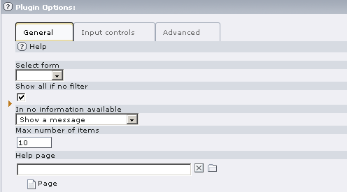
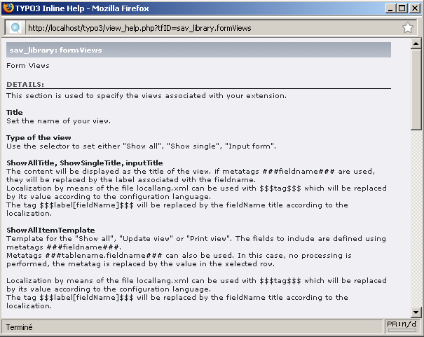
Help : click on the icon to get the context sensitive help.
Select form : use this selector to select the form name. Let use recall that the “sav_library” makes it possible to build several forms associated with the same extension, thus providing different views of your tables.
Show all if no filter : if set, all items are displayed if no filter is applied, for example by means of the “sav_filter_abc” extension.
If no information available : use the selector to choose what to display when no information are available.
Max number of items : maximum number of items that will be displayed in a page. If set to 0, all items are displayed.
Help page : use this selector to choose a page of your site which will be use as an help page for your extension. In this case, an icon is displayed in the title bar of your extension.
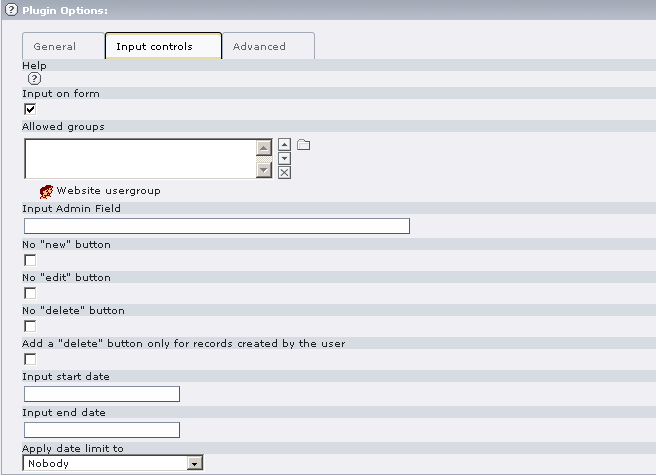
Help : click on the icon to get the context sensitive help.
Input on form : if set, Front End inputs are allowed (set by default).
Allowed groups : if you select user groups, user must belong to one of these groups to be allowed to input data in the Front End.
Input Admin field : put here a field under the form “tableName.fieldName” (if you use only “fieldName”, the main table is taken as “tableName”). This will restrict the input to users that have “Admin” right for this field in their TS Config. For example, if one user has “extKey_Admin=value1,value2” in his TS Config , he will be allowed to edit or delete items for which “fieldName” is equal to “value1” or “value2” for the extension “extKey”. The fields or the folders which have the attribute “editAdminPlus= 1;” can be modified if the user has the “Admin+” rights. For example, if the TS Config is “extKey_Admin=value1+,value2” , the user is an “Admin+” for the records where “fieldName” is equal to “value1” and just “Admin” for the records where “fieldName” is equal to “value2”. Users become “Super Admin” if their TS Config is “extKey_Admin=*”.
No “new” button : no new button is added to the form. It means that you can modify existing records but you cannot create new record.
No “edit” button : an edit button will not be added in front of the records in “show All” views.
No “delete” button : a delete button will not be added in front of the records in “show All” views.
Add a “delete” button only for records created by the user : add a "delete" button only for records created by the user.
Input start date : if set, inputs in the Front End will not be possible before this date.
Input end date : if set, inputs in the Front End will not be possible after this date.
Apply date limit : use the selector to set either “Nobody”, “All”, “Admin plus users”, “All excluding Super Admin”. The date limit is applied according to this selector.
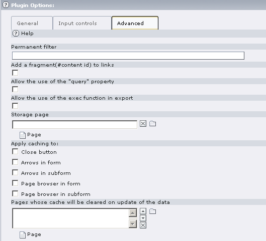
Help : click on the icon to get the context sensitive help.
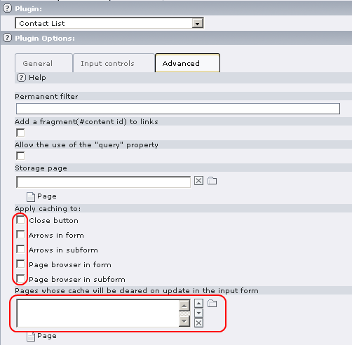
Permanent filter : you can use this field to add a where clause that will be “anded” to the where clause of the form query.
Add a fragment (# content id) to links : the content id is added as a fragment to the links.
Allow the use of the “query” property: the “query” property makes it possible to execute queries in “input” or “update” forms. Because any query may be executed, for security reason, only admin users can check this field when this property is needed.
Allow the use of the exec function in export: The use of the php exec function is allowed in export which makes the execution of text processors possible, for example.
Storage page : this option makes it possible to store your record in a storage page, for example a “sysfolder”, otherwise records are stored in the current page. When this option is used, records are fetched in the storage page and in the pages defined in the “starting point” if any.
Apply caching to : When the plugin is running as a USER for the form, that is when caching is required, these option control the caching for various buttons or links. If an option is set, a cHash will be added to the link.
Pages whose cache will be cleared on update in the input form : When the plugin is running as a USER for the form, that is when caching is required, updating items in the input form will clear the cache for the current page by default. If you need to clear the cache for other pages, select them here. Use also this option when the plugin is running as a USER_INT for the form and you need to clear the cache of another page used by a form for which caching is used.
Changing the icons
The extension “sav_library” comes with default icon files associated with its various functionalities. There are two ways of changing the icons:
Create a “res/icons” directory in the generated extension in which you put your icon files with the same names as in the default directory “res/icons” in the extension “sav_library”.
Create a directory where you want in the fileadmin directory, in which you put your icon files with the same names as in the default directory. Then, in the “Setup” of your template, write:plugin.tx_yourExtensionNameWithoutUnderscores_pi1.iconsDir = yourIconsDirwhere “yourExtensionNameWithoutUnderscores” is the key of the extension you have created with the generator, but without underscores if any, and “yourIconsDir” is the relative path of the directory where you have put your icon files.
Changing the template for the views
The extension “sav_library” comes with a default template file for the views. It is the file “sav_library.tmpl” in the “res” directory of the “sav_library” extension. There are two ways of changing the template:
Put your template file in the “res” directory of your extension under the name “yourExtensionName.tmpl”, where “yourExtensionName” is the key of the extension you have created with the generator.
Put your template file where you want in the fileadmin directory. Then, in the “Setup” of your template, write:plugin.tx_yourExtensionNameWithoutUnderscores_pi1.template = yourFileNamewhere “yourExtensionNameWithoutUnderscores” is the key of the extension you have created with the generator, but without underscores if any, and “yourFileName” is the filename with its relative path (i.e. fileadmin/....).
Changing the default CSS
The extension “sav_library” comes with a default CSS which is in the file “ext_typoscript_setup.txt” of the SAV Library directory. You may overload the styles in your CSS file to change them globally. You also may want to modify the default styles only for one specific extension. In that case, you just have to put a CSS file in the “res” directory of your extension under the name under the name “yourExtensionName.css”, where “yourExtensionName” is the key of the extension you have created with the generator. This CSS will be automatically added in the HTML <head> section (see “sav_library_example7” for such a case).
Configuration of the Queriers, Viewers, Item Viewers
The extension “sav_library” comes with a default configuration for queries, viewers, item viewers. It can be easily changed.
The configuration is defined by the file “sav_library.xml” which is in the “res” directory of the “sav_library” extension.
The xml file contains three parts:
- Definition of the queriers
- Definition of the viewers
- Definition of the item viewers
Definition of the queriers
The queriers are organized in three classes: the select queriers (one for each type of view), the delete querier and the update querier. Between the tags, there is the method name that should be called to execute the querier.
For example, UPDATE_defaultQuerier is the method that will be called by default for UPDATE.
<update>
  UPDATE_defaultQuerier
</update>
Definition of viewers
The principle is the same as for the queriers.
Definition of the item viewers.
The principle is more complex. Let us explain it from the example of the Date viewer:
<viewDate>
  <type>input</type>
  <conditions>
    <condition index="0">
      <field>eval</field>
      <ope>isEqual</ope>
      <value>date</value>
    </condition>
  </conditions>
</viewDateTime>
All item viewers are associated with two methods. One is for the “normal” mode and one for the “edit” mode. By convention, for the previous example, the method names will respectively be “viewDate” and “viewDateEditMode”.
The definition of the item viewer contains a type tag and conditions. The type and the conditions are built from the TCA. In the example, for a date-type field, the type is “input” and the “eval” is set to “date”. Therefore, to detect this case, one condition is built to check if the field “eval” is equal to “date”. The equality verification is done using the “ope” tag “isEqual”.
Several operators (ope) are provided: isEqual, isArray, isNotArray, arrayKeyExists, isNull, isNotNull. They are defined as methods in the file sav_library.php.
Modification of the SAV Library configuration
You may want to change the configuration and adapt it to your specific needs. For this purpose, a special extension called “sav_library_extends” was developed to extend the SAV Library. Download this extension from the TER and install it.
In the extension directory, you will find several classes which extends the SAV Library classes by means of XCLASS. Looking to the file “sav_library_extends.xml” in the directory “res”, you will see that a new item viewer “Example” is added. It is associated with a new type “example”.
Then, check the class “ux_tx_savlibrary_defaultItemviewers” in the file “class.ux_tx_savlibrary_defaultItemviewers.php” to understand how to add the new item viewer.
Check also the class “ux_tx_savlibrary_defaultVerifiers” in the file “class.ux_tx_savlibrary_defaultVerifiers.php” to see how to add a new verifier.
Now download the extension “sav_library_example5” and install it. It is a very simple example. Edit it in the kickstarter to see how the new type was associated with the field. Finally, use the extension in FE. Type “Hello” in the field to see the effect of the new verifier.
Reference for the field configuration
The SAV Library Extension Generator is based on the kickstarter. Therefore, the TCA configuration generated by the kickstarter is available and can be changed for each view by means of the field configuration interface. In the example below, the default width (size attribute in the TCA) is replaced by the value 40.
The SAV Library Extension Generator makes it possible to enter data in the Front End. However, since extensions are generated by means of the kickstarter, in most cases data can also be input in the Back End using the regular interface.
The following configurations have been added for the SAV Library Extension Generator. They are organized in the alphabetic order and the TCA type is recalled in parentheses. Of course, no type is provided for the general configuration which can be applied to any field and to the function options.
Checkbox, single (field type: check)
displayAsImage
Property
displayAsImage
Data type
boolean
Description
If set, the check box is displayed as an image instead of a label.
Default
0
doNotDisplayIfNotChecked
Property
doNotDisplayIfNotChecked
Data type
boolean
Description
If set, do not display the check box value (default is "No") if it is not checked (obviously it does not apply when in edit mode).
Default
0
Checkbox, 4 boxes or 10 boxes (field type: check_4 or check_10)
cols
Property
cols
Data type
integer
Description
Number of columns to display.
Default
1
displayAsImage
Property
displayAsImage
Data type
boolean
Description
If set, the check boxes are displayed as images instead of labels.
Default
0
doNotDisplayIfNotChecked
Property
doNotDisplayIfNotChecked
Data type
boolean
Description
If set, do not display the check box value (default is "No") if it is not checked (obviously it does not apply when in edit mode).
Default
0
nbItems
Property
nbItems
Data type
integer
Description
Number of items to display.
Default
Database relation - selectorbox, select global (field type: rel)
aliasSelect
Property
aliasSelect
Data type
Field name
Description
Defines an alias used in the SELECT query. Markers ###fieldname### can be used, fieldname must be in the relation table.
Default
labelSelect
Property
labelSelect
Data type
Field name
Description
Defines the label from the field name for the selector.
Default
additionalTableSelect
Property
additionalTableSelect
Data type
Comma-separated table names
Description
Add the table names in the select query. It can be used when tables need to be joined.
Default
orderSelect
Property
orderSelect
Data type
String
Description
Define the order clause for the selector. In general : fieldname [desc].
Default
whereSelect
Property
whereSelect
Data type
String
Description
Defines the WHERE clause for the selector. It can be:
. a conventional MySQL clause.
- The marker ###user### can be used. It will be replaced by the user uid.
- The marker ###uid### can be used. it will be replaced by the main current record.
- The marker ###CURRENT_PID### can be used. It will be replaced by the current page uid.
- The marker ###STORAGE_PID### can be used. It will be replaced by the storage page uid.
. ###group_list = list_of_comma_separed_fe_groups###. To be used with a selector on fe_users. It checks if the user belongs to the group list.
. ###group_list != list_of_comma_separed_fe_groups###. To be used with a selector on fe_users. It checks if the user does not belong to the group list.
Default
groupBySelect
Property
groupBySelect
Data type
String
Description
Defines the GROUP BY clause for the selector.
Default
content
Property
content
Data type
SQL SELECT statement
Description
SQL SELECT statement must have an alias "uid" and an alias "label" which will be used as the value to display. Special markers can be used in the statement :
. ###uid### will be replaced by the current record uid.
. ###uidSelected### will be replaced by the selected item.
. ###user### will be replaced by the user id.
. ###cruser### will be replaced by the user id.
The following example returns a selectorbox with the usernames that are linked with the user by a MM relation :
content =
 SELECT fe_users.uid as uid, fe_users.name as label
 FROM tx_mytable_rel_myfield_mm,fe_users
 WHERE
  tx_mytable_rel_myfields_mm.uid_local=###user###
 AND
  tx_mytable_rel_myfields_mm.uid_foreign=fe_users.ui
 ORDER by label;
Default
separator
Property
separator
Data type
string
Description
It should be used when the max number of relations is greater than 1 (not true MM-relation) to replace the default <br /> separator between items in showAll or showSingle views.
Default
specialFields
Property
specialFields
Data type
comma-separated list of fields
Description
The value of the fields will be propagated in the ###special[fieldname]### marker when available.
Default
singleWindow
Property
singleWindow
Data type
boolean
Description
In case of a MM relation, a double window is used to select items. When this option is used, a single selectorbox in multiple mode is used.
Default
0
overrideEnableFields
Property
overrideEnableFields
Data type
boolean
Description
If set, the method enableFields of the class tslib_cObj which filters out records with start/end times or hidden/fe_groups fields is not applied to the query associated with the selectorbox.
It may be used in specific cases when you needed to retreive all the records.
Default
0
overrideStartingPoint
Property
overrideStartingPoint
Data type
boolean
Description
By default, when starting points are provided, information associated with the selector is searched in these page. This property overrides the default behavior.
Default
0
Database relation - field with element browser (field type: rel)
addDelete
Property
addDelete
Data type
boolean
Description
A delete icon will be added in front of each item.
Default
0
addUpDown
Property
addUpDown
Data type
boolean
Description
Two buttons (up and down) will be added. They can be used to reorganize the order of the subform items.
Default
0
addSave
Property
addSave
Data type
boolean
Description
A save button and an anchor will be added. It simplifies the saving when several items are in the subform and the height of an item is important.
Default
0
cutNewButtonIfNotSaved
Property
cutNewButtonIfNotSaved
Data type
boolean
Description
The new button of the subform will be cut if the form in which the subform takes place is not saved.
Default
0
keepFieldsInSubForm
Property
keepFieldsInSubForm
Data type
comma-separated list of fields
Description
The values of the fields (use tableName.fieldName) from the parent form will be kept in the subform. It can be used to deal with these values in the subform.
If * is used instead of the comma-separated list of fields, all fields are kept.
Default
labelOnTitle
Property
labelOnTitle
Data type
boolean
Description
The label will be displayed in the title of the subform in input mode.
Default
0
maxSubItems
Property
maxSubItems
Data type
integer
Description
Number of items that will be displayed in the subform. All items are displayed if set to 0. If not set, the "maxitems" value in the TCA, that is the "Max number of relations" in the Kickstarter, is used.
Default
noFirstLast
Property
noFirstLast
Data type
boolean
Description
First and last buttons in the browser associated with the "subFormAlt" template will not be shown.
Default
0
subFormTemplate
Property
subFormTemplate
Data type
string
Description
Name of the template (e.g. subFormAlt). By default the template "subForm" is used.
Default
Date (field type: date)
format
Property
format
Data type
Date format
Description
Sets a format to display the date. The format is the same as in strftime php function.
Example: full weekday and month names plus year
format = %A %B %Y;
Default
%d/%m/%Y
noDefault
Property
noDefault
Data type
boolean
Description
Do not display the default date.
Default
0
resetToDefault
Property
resetToDefault
Data type
boolean
Description
If set, the field value is reset to the current date in the input mode.
Default
0
Date and time (field type: datetime)
format
Property
format
Data type
Date format
Description
Sets a format to display the date. The format is the same as in strftime php function.
Example: full weekday and month names plus year
format = %A %B %Y at %H:%M;
Default
%d/%m/%Y %H:%M
noDefault
Property
noDefault
Data type
boolean
Description
Do not display the default date and time.
Default
0
resetToDefault
Property
resetToDefault
Data type
boolean
Description
If set, the field value is reset to the current date in the input mode.
Default
0
Files and images (field type: files)
addIcon
Property
addIcon
Data type
boolean
Description
Adds an icon in front of the hyperlink associated with the file.
Default
0
uploadFolder
Property
uploadFolder
Data type
string
Description
Sets the folder path where the file is stored. It overwrites the same attribute in the TCA.
Default
addToUploadFolder
Property
addToUploadFolder
Data type
string
Description
Adds a subpath to the UploadFolder path.
Default
addToUploadFolderFromField
Property
addToUploadFolderFromField
Data type
Field name
Description
Adds the content of the field whose name is given by "field_name" to the uploadFolder attribute. This information is separated with an underscore.
Example : if the field_name is "my_field" and its contents is "123", then
AddToUploadFolderFromField = my_field;
will add "_123" to the uploadFolder name.
Default
size
Property
size
Data type
integer
Description
Sets the size attribute. It overwrites the same attribute in the TCA.
Default
iframe
Property
iframe
Data type
boolean
Description
Opens the image in an iframe.
Default
width
Property
width
Data type
integer
Description
Sets the width of an image or of the iframe.
Default
height
Property
height
Data type
integer
Description
Sets the height of an image or of the iframe.
Default
message
Property
message
Data type
string
Description
If the file is not an image, an hyperlink is created with the string.
Default
fieldMessage
Property
fieldMessage
Data type
Field name
Description
Sets the attribute "message" with the content of the field whose name is given by field_name.
Default
alt
Property
alt
Data type
string
Description
Provides the HTML alt attribute for an image.
Default
fieldAlt
Property
fieldAlt
Data type
Field name
Description
Sets the "alt" attribute with the content of the field whose name is given by field_name.
Default
default
Property
default
Data type
string
Description
Defines the default image if the content of the field is null otherwise the default image is “unknown.gif” taken in the directory sav_library/res/images.
Default
tsProperties
Property
tsProperties
Data type
string
Description
It makes it possible to use the graphic possibilities of TYPO3. If set, an IMAGE cObject is generated with the given TS properties.
Do not forget that the configuration field is ended by a semi-column, therefore if you need a semi-column in your TS write it “;”
Default
Functions
Functions are applied to the value of the field. It can be also applied to left and right contents. In this case, "Left" or "Right" should be added to the function name and the optional attributes.
Property:
a
Property:
Data type
Data type:
Description
Description:
Default
Default:
func = makeDateFormat;
a
func = makeDateFormat;
Data type
Description
This function generates a format for a unix time stamp date.
Optional attributes can be added:
. format = string; The string should be a format that makes sense for the php-function strftime().
Default
func = makeImage;
a
func = makeImage;
Data type
Description
This function builds an IMG tag where the field value is the name of the image file.
Additional parameter can be used.
. folder = string; (string will be the folder where the file should be).
. width = integer; (width of the image in pixels).
. height = integer; (height of the image in pixels).
. alt = string; (string will be the "alt" attribute of the image).
. fieldAlt = field_name; (the "alt" attribute will be the value of the fieldname for the current record).
Default
func = makeEmailLink;
a
func = makeEmailLink;
Data type
Description
This function generates an email link associated with the field.
Optional attributes can be added:
. message = string; Message associated with the link.
. fieldMessage = fieldName; Sets the attribute "message" with the content of the field whose name is given by fieldName.
Default
func = makeNewWindowLink;
a
func = makeNewWindowLink;
Data type
Description
This function generates an hyperlink associated with the value of the field which opens a new window. Paramaters are :
. windowUrl = string; string is the url. The marker ###special[fieldname]### from selectors can be used. This parameter is not necessary if the field is an image.
Optional attributes can be added:
. windowText = string; string will be added above the image. The marker ###special[fieldname]### from selectors can be used.
. windowBodyStyle = string; string will be added as the style attribute to the body html tag. Do not forget to use ; for style attributes, since the semi-colon is use to split field attributes, and do not forget to end your definition by a semi-colon. Example:
windowBodyStyle = fontweight:bold\;font-color:blue\;;
. message = string; Message associated with the link.
. fieldMessage = fieldName; Sets the attribute "message" with the content of the field whose name is given by fieldName.
Default
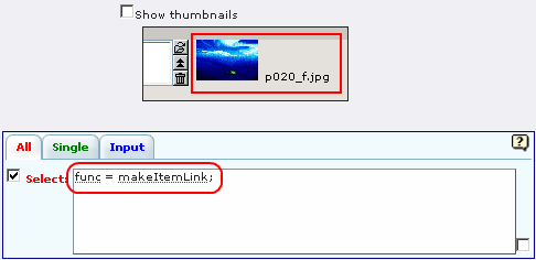
func=makeItemLink;
a
func=makeItemLink;
Data type
Description
This function generates an hyperlink associated with the value of the field. It will open the "showSingle" view associated with the selected item.
Optional attributes can be added:
. folderTab = string; (string is the folder tab name, if the extension uses serveral folders).
. page = string; (same as folderTab but deprecated).
. updateForm = 1; makes it possible to open an "update" view instead of the "Show single" view.
. inputForm = 1; makes it possible to open an "Input form" view instead of the "Show single" view.
Default
func = makeLink;
a
func = makeLink;
Data type
Description
This function generates an internal link (typolink).
Optional attributes can be added:
. folder = string; The string will be the folder where the file should be).
. target = string; The string defines the target parameter.
. class = string; Name of the class associated with the link.
. message = string; Message associated with the link.
. fieldMessage = fieldName; Sets the attribute "message" with the content of the field whose name is given by fieldName.
. setUid = integer; the integer defines the page uid associated with the link.
. valueIsUid = 1; The field value is used as the uid of the page associated with the link.
Default
func = makeExtLink;
a
func = makeExtLink;
Data type
Description
This function generates an hyperlink associated with the value of the field. It will open the "showSingle" view associated with the selected item in another extension. The following attributes must be provided:
. ext = string; (string is the extension name followedby the form name. Example "myext_intranet").
. pageId = integer; (integer is the page id where the extension is the content element).
. contentId = integer; (integer is the content id of the extension).
Optional attributes can be added:
. folderTab = string; (string is the folder tab name, if the extension uses serveral folders).
. page = string; (same as folderTab but deprecated).
. setUid = this; The uid of the record to open, is given by the value of the field.
. restrictLinkTo = ###usergroup=group_name###; the link will be displayed if the user belongs to the group_name.
. restrictLinkTo = ###usergroup!=group_name###; the link will be displayed if the user does not belong to the group_name.
Default
func = makeUrlLink;
a
func = makeUrlLink;
Data type
Description
This function generates a link for an external url.
Optional attributes can be added:
. link = string; The string will be used for the link instead of the field value.
. fieldLink = fieldName; Sets the attribute "link" with the content of the field whose name is given by fieldName.
. message = string; Message associated with the link.
. fieldMessage = fieldName; Sets the attribute "message" with the content of the field whose name is given by fieldName.
Default
func = makeXmlLabel;
a
func = makeXmlLabel;
Data type
Description
This function generates the label from a xml language file. It works with the following parameter:
. xmlLabel = string; the string is the label definition. For example, assume that the value comes from a selectorbox whose label definition is in the file locallang_db.xml in the extension "my_ext". Assume also that the field is "my_field". Then, to obtain the label one has to write
xmlLabel = LLL:EXT:my_ext/locallang_db.xml:tx_myext.my_field.I.;
Default
General attributes
addEdit
Property
addEdit
Data type
boolean
Description
When the field is used in an "Update form" view, it will add an input element for update that can be used with the marker ###field_name_Edit### where "field_name" is the name of the field.
See also the help for Form views (showAllItemTemplate) to see how to use markers ###field[field_name, label]###.
Default
0
addEditIfNull
Property
addEditIfNull
Data type
boolean
Description
Same as addEdit but the element will be added only if the field is null.
Default
0
addEditIfAdmin
Property
addEditIfAdmin
Data type
boolean
Description
Same as addEdit but the element will be added only if the user has the input right for the plugin.
Default
0
addLeftIfNotNull
Property
addLeftIfNotNull
Data type
string
Description
String will be added to the left if the field value is not null.
Default
0
addLeftIfNull
Property
addLeftIfNull
Data type
string
Description
String will be added to the left if the field value is null.
Default
addNewIcon
Property
addNewIcon
Data type
integer
Description
A new icon, will be displayed in front of the field during the number of days given by the int number.
Default
addRighIfNotNull
Property
addRighIfNotNull
Data type
string
Description
String will be added to the right if the field value is not null.
Default
addRighIfNull
Property
addRighIfNull
Data type
string
Description
String will be added to the right if the field value is null.
Default
alias
Property
alias
Data type
Field name
Description
The displayed value will be provided by the fieldname value for the current record.
Default
classLabel
Property
classLabel
Data type
string
Description
The default class "label" associated with the label of the displayed value will be replaced by the string.
Default
classValue
Property
classValue
Data type
string
Description
The default class "value" associated with the displayed value will be replaced by the string.
Default
classHTMLTag
Property
classHTMLTag
Data type
string
Description
The string will be added as a class to the HTML tag associated with the displayed item (not always available).
Default
styleLabel
Property
styleLabel
Data type
string
Description
The string will be added as a style attribute associated with the label of the displayed value.
Default
styleValue
Property
styleValue
Data type
string
Description
The string will be added as a style attribute associated with the displayed value.
Default
styleHTMLTag
Property
styleHTMLTag
Data type
string
Description
The string will be added as a style attribute to the HTML tag associated with the displayed item (not always available).
Default
cutIfNull
Property
cutIfNull
Data type
boolean
Description
Cut the field if null.
Default
0
cutIf
Property
cutIf
Data type
expression
Description
Expression can be:
. fieldName=value
Cuts the field if current value of the field is equal to the given value. The markers ###user### or ###cruser### (same as user but should be used if a new record is created) will be replaced by the user id. Use EMPTY for the value to test an empty field.
. fieldName!=value
Cuts the field if current value of the field is not equal to the given value. Same markers as above can be used.
. ###usergroup=group_name###
The field is cut if the group “group_name” is a valid group for the current user.
. ###usergroup!=group_name###
The field is cut if the group “group_name” is not a valid group for the current user.
. group=group_name
The field is cut if the group “group_name” is a valid group for the current record. It checks the usergroup field in the local table if any.
. group!=group_name
The field is cut if the group “group_name” is not a valid group for the current record. It checks the usergroup field in the local table if any.
Default
cutLabel
Property
cutLabel
Data type
boolean
Description
Cuts the label associated with the field.
Default
0
edit
Property
edit
Data type
boolean
Description
Makes the field not editable in an input form.
Default
1 in input forms
editAdminPlus
Property
editAdminPlus
Data type
boolean
Description
Makes the field editable in an input form, if the user has the "Admin+" right. To be an "Admin" user, his/her TSConfig must contain a line as follows:
. extKey_Admin=value where “extKey” is the extension key and value is one of the possible value of the "Input Admin Field" defined in the flexform associated with the extension.
The user becomes an "Admin+" user, if his/her TSConfig contains a line as follows:
. extKey_Admin=value+
Default
0
func
Property
func
Data type
Function name
Description
See the section devoted to functions.
Default
funcAddLeftIfNotNull
Property
funcAddLeftIfNotNull
Data type
string
Description
String will be added to the left if the result of the applied function, defined by "func=function_name;" property, is not null.
Default
funcAddLeftIfNull
Property
funcAddLeftIfNull
Data type
string
Description
String will be added to the left if the result of the applied function, defined by "func=function_name;" property, is null.
Default
funcAddRightIfNotNull
Property
funcAddRightIfNotNull
Data type
string
Description
String will be added to the right if the result of the applied function, defined by "func=function_name;" property, is not null.
Default
funcAddRightIfNull
Property
funcAddRightIfNull
Data type
string
Description
String will be added to the right if the result of the applied function, defined by "func=function_name;" property, is null.
Default
fusion
Property
fusion
Data type
{begin, end}
Description
. fusion = begin;
Starts the fusion of the fields, that is the following fields will be displayed on the same line.
. fusion = end;
Ends the fusion of the fields, that is the following field will be displayed on the next line.
Default
label
Property
label
Data type
string
Description
The displayed label will be provided by the string.
Default
mail
Property
Data type
boolean
Description
A mail will be associated with the field.
If the field is a checkbox, it is used as a flag to verify is the mail has to be sent. Mail information are the following and can be used as properties:
. fieldForCheckMail=field_name; The mail will be sent if the value of the fieldname for the current row is not null.
. mailIfFieldSetTo=string; The mail will be sent if the value of the fieldname for the current row was previoulsy null or zero and is set to the given string value.
. mailSender=string; mail of the sender. Marker ###user_email### will be replaced by the user email.
. mailReceiver=string; mail of the person who will receive the mail and process the information.
. mailReceiverFromField=field_name; The field_name contains the mail of the person who will receive the mail and process the information.
. mailReceiverFromQuery=MySQL_Query; The receiver is obtained from a select query with an alias "value" that will used to retrieve the receiver. Example:
SELECT email AS value FROM fe_users WHERE ...
. mailSubject=string; subject of the mail. Markers ###fieldname### are allowed and will be replaced by their current value.
. mailMessage=string, mail message. Markers ###fieldname### are allowed and will be replaced by their current value.
. mailcc=string; if set the string is used as Cc: for the mail.
Localization by means of the file locallang.xml can be used with $$$tag$$$ which will be replaced by its value according to the configuration language.
. mailMessageLanguage=string; This parameter will force the language for the message to the value of the string.
. mailMessageLanguageFromField=fieldname; This parameter will force the language for the message to the value of the field (for example a selector box).
Default
0
mailAlways
Property
mailAlways
Data type
boolean
Description
The mail property must be set (mail = 1;) when using this property.
The mail is always sent when saving. Mail information are the following:
. mailSender=string; mail of the sender. Marker ###user_email### will be replaced by the user email.
. mailReceiver=string; mail of the person who will receive the mail and process the information.
. mailReceiverFromField=field_name; The field_name contains the mail of the person who will receive the mail and process the information.
. mailReceiverFromQuery=MySQL_Query; The receiver is obtained from a select query with an alias "value" that will used to retreive the receiver. Example:
SELECT email AS value FROM fe_users WHERE ...
. mailSubject=string; subject of the mail. Markers ###fieldname### are allowed and will be replaced by their current value.
. mailMessage=string, mail message. Markers ###fieldname### are allowed and will be replaced by their current value.
. mailcc=string; if set the string is used as Cc: for the mail.
Localization by means of the file locallang.xml can be used with $$$tag$$$ which will be replaced by its value according to the configuration language.
. mailMessageLanguage=string; This parameter will force the language for the message to the value of the string.
. mailMessageLanguageFromField=fieldname; This parameter will force the language for the message to the value of the field (for example a selector box).
Default
0
mailAuto
Property
mailAuto
Data type
boolean
Description
The mail property must be set (mail = 1;) when using this property.
The mail is sent when saving, if the field is not empty and if one field in the form is changed. Mail information are the following:
. mailSender=string; mail of the sender. The marker ###user_email### will be replaced by the user email.
. mailReceiver=string; mail of the person who will receive the mail and process the information.
. mailReceiverFromField=field_name; The field_name contains the mail of the person who will receive the mail and process the information.
. mailReceiverFromQuery=MySQL_Query; The receiver is obtained from a select query with an alias "value" that will used to retreive the receiver. Example:
SELECT email AS value FROM fe_users WHERE ...
. mailSubject=string; subject of the mail. Markers ###fieldname### are allowed and will be replaced by their current value.
. mailMessage=string, mail message. Markers ###fieldname### are allowed and will be replaced by their current value.
. mailcc=string; if set the string is used as Cc: for the mail.
Localization by means of the file locallang.xml can be used with $$$tag$$$ which will be replaced by its value according to the configuration language.
. mailMessageLanguage=string; This parameter will force the language for the message to the value of the string.
. mailMessageLanguageFromField=fieldname; This parameter will force the language for the message to the value of the field (for example a selector box).
Default
0
onLabel
Property
onLabel
Data type
boolean
Description
The value will be displayed in place of the label. Not so useful since the label can be cut.
Default
0
orderLinkInTitle
Property
orderLinkInTitle
Data type
boolean
Description
If this property is set, it makes it possible to generate an hyperlink in the title bar of the "showAll" view. The hyperlink is associated with the field if the marker ###fieldname### is used in the "showAllTitle" section. Order clauses have to be defined in the "Where Tags" section of the "Query Form" with "+" and "-" sign added after "fieldname".
Use for example:
'fieldname+' => array('order' => 'tablename.fieldname'),
'fieldname-' => array('order' => 'tablename.fieldname desc'),
Default
orderLinkInTitleSetup
Property
orderLinkInTitleSetup
Data type
string
Description
This property controls the display of the link when “orderLinkInTitle” is set. The format is “param1:param2:param3” where “param1” to “param3” can take the following values:
. value: the field value is displayed,
. link: the field value is displayed with a link with toggle the sort,
. asc: an icon is displayed with a link to make an ascending sort,
. desc: an icon is displayed with a link to make a descending sort,
. ascdesc: two icons are displayed with separate links to make an ascending or descending sort.
. if there is no value, nothing is displayed.
(see How to change the order of the item list by clicking on the label in the title bar ? for examples).
Default
| link: |
|---|
query
Property
query
Data type
SQL statements
Description
The query will be executed once the input form data have been saved. Therefore, it can only be used with "input" or "update" views.
Because any query may be executed, for security reason, this property can only be used if an admin user has checked the field “Allow the use of the “query” property” in the advanced folder of the flexform.
It may be useful, for example, to update a specific table when the current data are saved. Several queries can be used in the SQL statements. Each query must be separated using ";".
Special markers can be used in the statement:
. ###uid### will be replaced by the current record uid.
. ###CURRENT_PID### will be replaced by the current page uid.
. ###STORAGE_PID### will be replaced by the storage page uid.
. ###user### will be replaced by the user id.
. ###value### will be replaced by the current value for the field.
Default
queryOnValue
Property
queryOnValue
Data type
string
Description
The query, as defined above, will be executed if the current field value is equal to the right hand side string.
Default
queryForEach
Property
queryForEach
Data type
Field name
Description
If the field is a true MM relation, the query, as defined above, will be executed for all the record in the relation.
The special marker ###field_name###, where "field_name" is the field where the relation is defined, can be used to identify the record. It will be replaced by the uid of the associated record.
Default
reqValue
Property
reqValue
Data type
SQL SELECT statement
Description
SQL SELECT statement must have an alias "value" which will be used as the value to display.
Special markers can be used in the statement :
. ###uid### will be replaced by the current record uid.
. ###uidItem### will be replaced by the uid of the current subform item.
. ###user### will be replaced by the user id.
. ###row[field_name]### where field_name is the name of a field in the current record, will be replaced by its current value.
The following example returns the name of the user who has created the current record, assuming that tx_mytable is the local table:
reqValue= SELECT name AS value
FROM fe_users
WHERE uid=(SELECT cruser_id FROM tx_mytable WHERE uid=###uid###);
Default
setExtendLink
Property
setExtendLink
Data type
Table name
Description
The table name will be left-joined to existing tables.
Default
stdWrapValue
Property
stdWrapValue
Data type
TS syntax
Description
It defines a conventional TypoScript stdWrap property. You can add here full TS syntax.
Do not forget that the configuration field is ended by a semi-column, therefore if you need a semi-column in your TS write it ";"
Default
tsObject
Property
tsObject
Data type
cObject
Description
It defines a TS content object (e.g. TEXT, IMAGE, ...)
Default
tsProperties
Property
tsProperties
Data type
String
Description
It defines the properties of the TS cObject.
Do not forget that the configuration field is ended by a semi-column, therefore if you need a semi-column in your TS write it “;”.
Default
value
Property
value
Data type
String
Description
The value of the field will be directly provided by the string instead of the record value.
Localization by means of the file locallang.xml can be used with $$$tag$$$ which will be replaced by its value according to the configuration language.
Markers ###fieldname### are allowed and will be replaced by their current value.
Default
verifier
Property
verifier
Data type
Verifier name
Description
Verifiers can be used to check if a field satisfy a constraint. Each field can have one verifier. Each verifier is associated with a parameter.
Verifiers can be defined by the user. They must be added in the class tx_savlibrary_verifiers defined in the file: class.tx_savlibrary_verifiers.php.
The verifier name can be :
. isValidPattern
. isValidLength
. isValidInterval
. isValidQuery
Default
verifierMessage
Property
verifierMessage
Data type
string
Description
It replaces the default message.
Localization by means of the file locallang.xml can be used with $$$tag$$$ which will be replaced by its value according to the configuration language.
The marker $$$label[fieldName]$$$ will be replaced by the fieldName title according to the localization.
Default
verifierParam
Property
verifierParam
Data type
expression
Description
The expression can be :
. a regular expression for the verifier "isValidPattern".
For example /^[A-Za-z0-9_]*$/ will allow any input which contains letters, numbers or underline characters.
. an integer value for the verifier "isValidLength".
. an interval [a, b] where a and b are integers for the verifier "isValidInterval".
. a SELECT query for "isValidQuery". The marker ###value### in the query will be replaced by the value of the field. The marker ###uid### will be replaced by the uid of the current record.
Default
verifierSetWarning
Property
verifierSetWarning
Data type
boolean
Description
If set an error detected by the verifier becomes a warning. In that case, the field content is written in the database (which is not the case for errors) and a message is displayed.
Default
0
wrapItem
Property
wrapItem
Data type
string
Description
The string will be used to wrap the item. The syntax in the same as in TypoScript.
Localization by means of the file locallang.xml can be used with $$$tag$$$ which will be replaced by its value according to the configuration language.
The marker $$$label[fieldName]$$$ will be replaced by the fieldName title according to the localization.
Default
Links (field type: link)
generateRTF
Property
generateRTF
Data type
boolean
Description
Sets the RTF generator.
Default
0
templateRTF
Property
templateRTF
Data type
File name
Description
Defines the template to be used by the RTF generator. Field markers ###tableName.fieldName### or ###fieldName### (for aliases) can be used.
Default
saveFileRTF
Property
saveFileRTF
Data type
File name
Description
Name under which the generated file will be saved. Field markers ###tableName.fieldName### or ###fieldName### (for aliases) can be used.
Default
tableName.fieldName
Property
tableName.fieldName
Data type
expression
Description
Expression can be string1->string2 or NL-> string2
In an rtf document, if the field marker ###tableName.fieldName### exists string1 will be replaced by string2. String1 can be NL (for the ASCII character LF).
It may be useful when one wants to input data in a textarea and display them in one line with a given separator in the file.
Default
link
Property
link
Data type
string
Description
The string will be used for the link instead of the field value.
Default
fieldLink
Property
fieldLink
Data type
fieldName
Description
Sets the attribute "link" with the content of the field whose name is given by fieldName.
Default
message
Property
message
Data type
string
Description
Message associated with the link.
Default
fieldMessage
Property
fieldMessage
Data type
fieldName
Description
Sets the attribute "message" with the content of the field whose name is given by fieldName.
Default
Radio buttons (field type: radio)
cols
Property
cols
Data type
integer
Description
Number of columns to display.
Default
1
default
Property
default
Data type
integer
Description
Default value.
Default
displayAsImage
Property
displayAsImage
Data type
boolean
Description
If set to 1, radio buttons are displayed as images instead of labels.
Default
0
horizontalLayout
Property
horizontalLayout
Data type
bollean
Description
If set to 1, radio buttons are displayed horizontally in edit forms.
Default
0
Selectors (field type: select)
func
Property
func
Data type
Function name
Description
It associates a function with the selectorbox items. The parameter function_name can be:
. makeItemLink
. makeExtLink
. makeLink
. makeUrlLink
. makeEmailLink
See functions for the associated parameters.
Default
separator
Property
separator
Data type
character or string
Description
It can be used with selector boxes associated with a MM relation to replace the default <br /> separator between items in showAll or showSingle views.
Default
String Input (field type: input)
size
Property
size
Data type
integer
Description
Size of the field.
Default
30
keepZero
Property
keepZero
Data type
boolean
Description
If set and the field is equal to zero the "0" is displayed otherwise an empty field is displayed.
Default
0
Textarea (field type: textarea)
cols
Property
cols
Data type
integer
Description
Defines the number of cols of the textarea. This attribute overwrites the same attribute in the TCA.
Default
rows
Property
rows
Data type
integer
Description
Defines the number of rows of the textarea. This attribute overwrites the same attribute in the TCA.
Default
Textarea with RTE (field type: textarea_rte)
height
Property
height
Data type
integer
Description
Defines the height of the textarea. The integer value represents the height in pixels (45 pixels are automatically added).
Default
width
Property
width
Data type
integer
Description
Defines the width of the textarea. The integer value represents the width in pixels.
Default
XML JpGraph (field type: graph)
graphTemplate
Property
graphTemplate
Data type
string
Description
File name of the XML template from the site root.
Default
markers
Property
markers
Data type
string
Description
Comma-separated list of definitions. Example: “marker#begin = ###beginPeriod###” means that the “marker” whose id is “begin” in the template will be replaced by the marker “###beginPeriod###”, that is by the alias “beginPeriod”.
Default
Field configuration by means of the page TS Config
The configuration of any field can be changed by means of the page TS Config. The syntax is the following:
tx_extensionKey.formName.viewType.fieldName.fieldProperty = propertyValue.
For example, assume that one wants to change the width and the height of the image in the “All” view in the example 1.
- The “extensionKey” must have no underscore, i.e. “savlibraryexample1”,
- the “formName” is “Contact”,
- the “viewType” is “showAll” (use “showSingle” or “inputForm” for the other types),
- the “fieldName” is “image”,
- the “fieldProperty” is “width” or “height.
It leads to the following configuration:
tx_savlibraryexample1.Contact.showAll.image.width =200
tx_savlibraryexample1.Contact.showAll.image.height = 200
Maintenance configurations
The SAV Library Extension Generator includes flags to deal with maintenance operation.
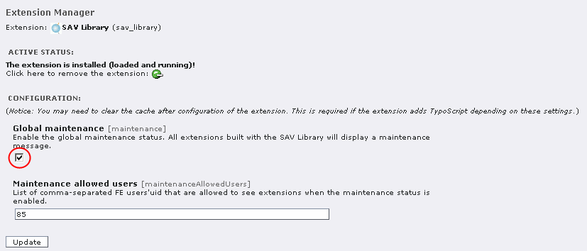
A global maintenance flag is available at the SAV Library level using the Extension Manager. If you check the flag, a maintenance message will be displayed by all extensions built with the SAV Library and filters will not be displayed.
If you provide a list of users'id, separated by a comma, then these users will still see the extensions and the filters.
Global maintenance is useful for developers when global changes are performed on the SAV Library.
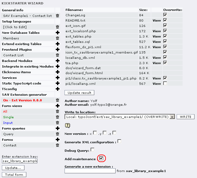
The maintenance can also be performed at the extension level. In order to have a maintenance flag in the Extension Manager, you must select “Add maintenance” when saving you extension in the Kickstarter.
A flag will be added for the extension, in the Extension Manager. If you check it, a maintenance message will be displayed except for allowed users in the configuration of the SAV Library.
Configuration of the code generation
You can either choose to have the configuration generated as a XML file or directly included as a php array in the pi1 class of the generated extension. Let us assume that we are generating the extension “sav_library_example1”.
- If you select the checkbox “Generate XML configuration”, the configuration will be saved in the file “pi1/ tx_savlibraryexample1_ pi1.xml”. The method initExtConfig() is automatically modified to read the configuration from the XML file. This configuration is set by default when the SAV Library Extension Generator is switched on.
- If you do not select this checkbox, the configuration generated by the kickstarter is saved in the file “pi1/class.tx_savlibraryexample1_ pi1.php” under the form of a php-array in the method initExtConfig().
Caching
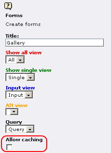
A caching feature was introduced with the version 3.1.0 of the SAV Library Extension Generator. The plugin behaviour may be changed for each form. By default, the plugin runs as USER_INT for each form, that is no caching is performed. By selecting the checkbox “Allow caching” in the “Forms” section of the Kickstarter, the plugin will run as USER for this form. It means that caching will be set. A “cHash” parameter is added to each item links used to access to the “showSingle” view associated with the item.
A “cHash” parameter can also be added to other links such as:
- the close button,
- arrows in form and/or subform,
- page selector in form and/or subform.
This configuration is possible in the “Advanced” folder tab of the flexform associated with the plugin (see below).
When the plugin is running as USER (caching enabled) and an item is updated in the “inputForm” view, the cache of the current page is cleared on saving so that updated information could be displayed. If you need to clear the cache of other pages, select this pages in the flexform.
When the plugin is running as USER_INT (caching disabled) and an item is updated in the “inputForm” view, it may be needed to clear the cache of pages where another form of the same extension is running as USER. For example, it is the case when one uses an administration form and other forms to display the data. Select the pages whose cache must be cleared in the flexform.
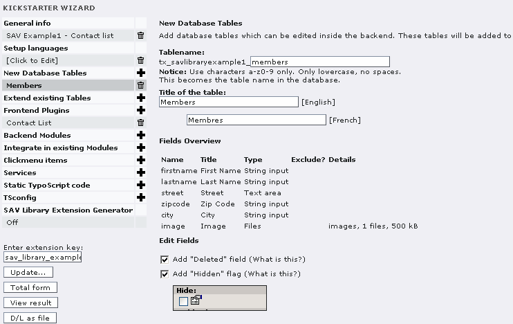
Tutorial 1 : Contact List
Introduction
This example is taken from http://www.typo3journal.info/articles/developpement.html . It creates a contact list with the first name, last name, street, zip code, city and an image of the contact.
You can download this example from the TER (sav_library_example1). Install it and enjoy. The following sections explain how to create the extension and the new features, if you do not download it.
Creation of the extension
Create the extension by filling the language, plugin, table, field sections using the Kickstarter as in the original tutorial.
Starting the SAV Extension Generator
Click on the “cross” icon at the right hand side of “SAV Extension generator”.
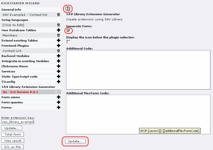
Click on the “Context Sensitive Help” icon and read the description associated with each field .
Validate the check box “Generate Form” and update. Now, the extension generator is active.
Definition of the form views
The extension generator allows to define as many views as you want of the same extension. Four types of view may be used:
- “Show all” views which display all the items associated with a query,
- “Show single” views which display only one item,
- “Input form” views which make it possible to input items in front end,
- “Alt form” views which are used to develop update or print views.
A conventional extension deals with one form with three views : one “Show all” view to present items, one “Show Single” view to display one item and an “Input form” view to input items. However, you may only have one “Show all” view. You may also have several forms.
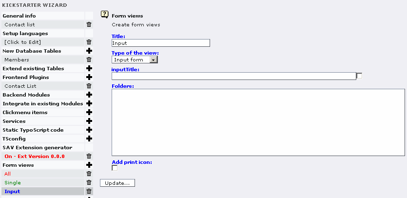
In order to define your views, click on the “cross” icon at the right hand side of “Form views”.
Click on the “Context Sensitive Help” icon and read the description associated with each field .
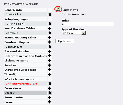
Give a title to your view (for example “All”, “Single”, “Input”), set its type with the selector and update.
The caption below shows a “show all” view named ”All”.
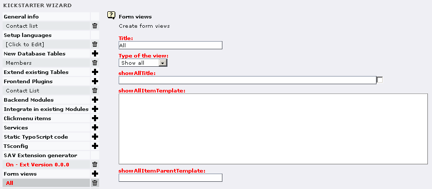
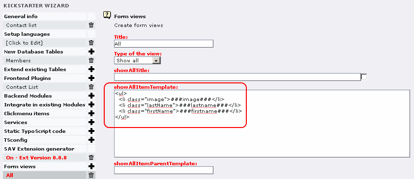
Fill the showAllItemTemplate field. In general, it is an <ul> list with <li> elements which contain the fields to display. Fields must be written as markers ###fieldname###.
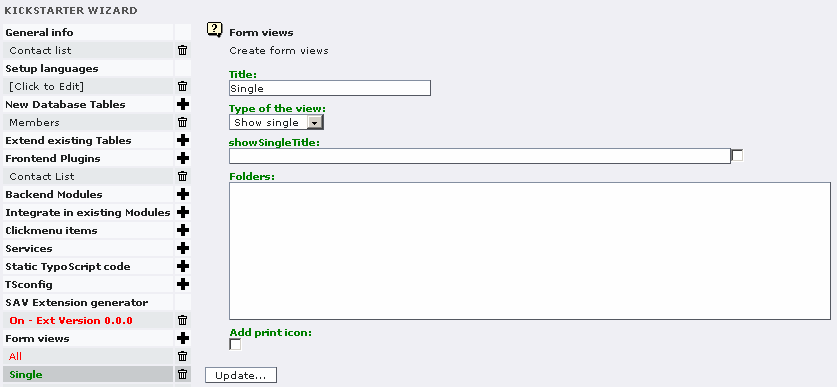
Repeat the process again for the “Show single”. Nothing special has to be filled for the moment.
Repeat the process again for the “Input form”. Nothing special has to be filled for the moment.
Definition of the form queries
Click on the “cross” icon at the right hand side of “Form queries”. The field “Local table” is automatically filled with the name of the first table you have defined.
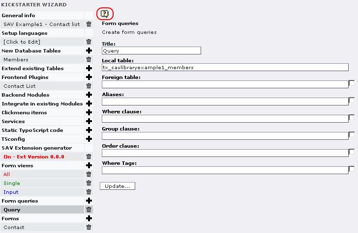
Click on the “Context Sensitive Help” icon and read the description associated with each field .
Give a name to your query and update. For example “Query” is the name used here.
Definition of the forms
Now, we have to define the forms. Click on the “cross” icon at the right hand side of “Forms”.
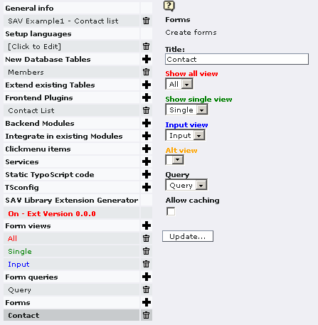
Click on the “Context Sensitive Help” icon and read the description associated with each field .
Give a name to your form, use the selectors to choose the “Show all” view, the “Show single” view, the “Input form” view and the query.
Definition of the fields to display
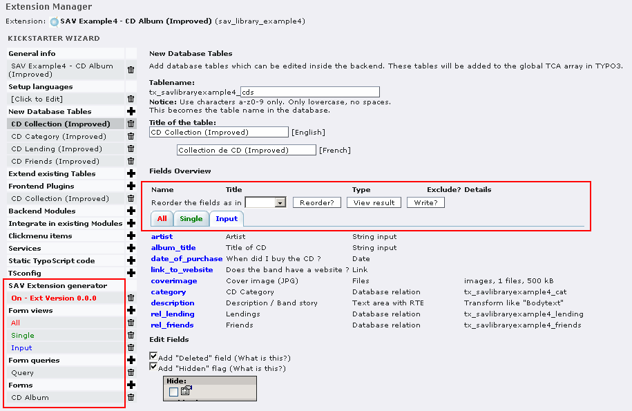
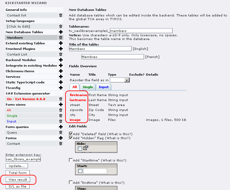
Click on the data base table. The field overview has been modified. Three tabs associated with your three views have been generated. By clicking on a tab, you will see the configuration parameters of all the fields for the selected view (change is global).

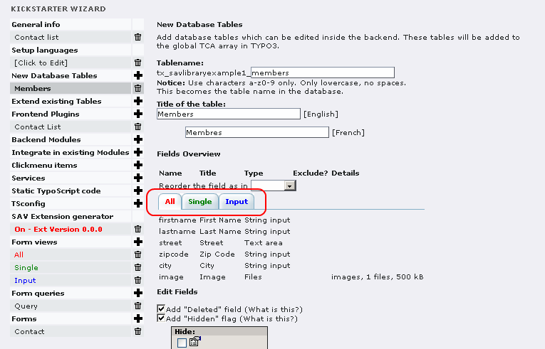
If you click on a field name, you will directly go to the field name definition.
If you click on the red up arrow, you will return to the overview at the top of the page. Using the selector and its left icon, you can reorder the field in the view, which means that you may have different orders of the field in your three views.
Folders are used to see the configuration parameters associated with a view (change is local – use the tab at the top level for a global change).
A Context Sensitive Help is available for each item type. Click on the CSH icon to know the configuration parameters that may be used. Do not forget to click on the “SEE ALSO:” items , if any, in the CSH windows, for example, to see the general allowed configuration parameters.
Let us give an example to explain how it works.
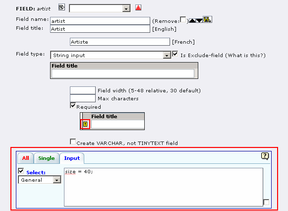
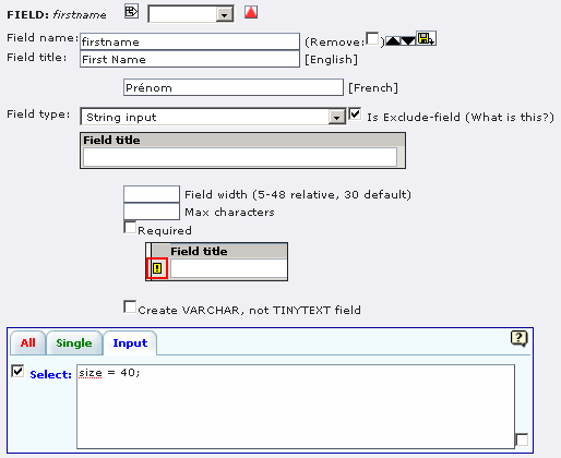
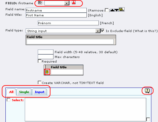
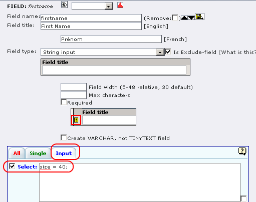
In the “All” and “Single” views, we want to display the first name. In the “Input”, we want to input the first name in a filed whose size is 40. The following captions show the configuration for each view. Do not forget to select the item .
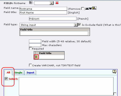
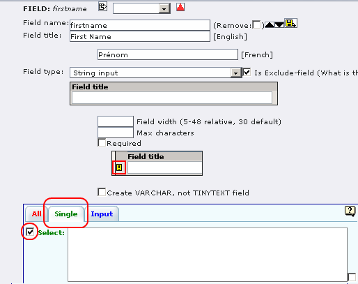
For the moment, select also “lastname” and “image” in the “All” view and all the fields in “Single” and “Input” views.
Creation of the extension
According to the selected tab at the top level, you will see the selected field. Now, click on “View result”.
Click on the “Context Sensitive Help” icon and read the description associated with each field . It explains how to use the version, debug and maintenance functions.
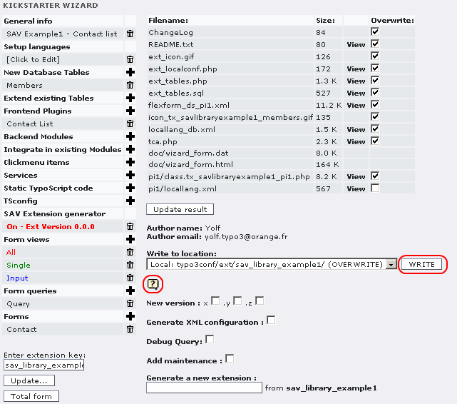
Click on “WRITE” to generate your extension . Depending on your server it may take several seconds. A memory of 48MB is a good configuration.
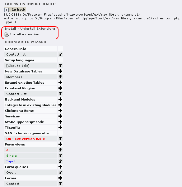
Then, click on “Install extension”. Once again, depending on your server, it may take several seconds.
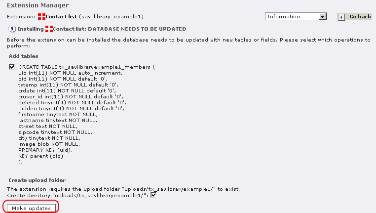
Click on “Make updates”. Now your extension “sav_library_example1” is running and ready to be inserted as a page content.
Using the extension
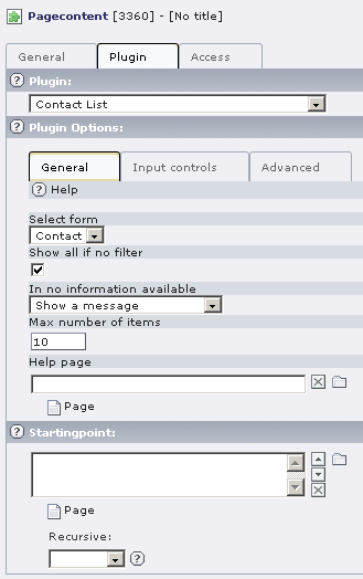
Create a page and insert a plugin content element and select “Contact list” in the plugin selector.
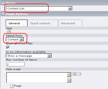
The configuration of the plugin is performed by means of a flexform which comes with default values. Just select your form name, that is “Contact” in the “Select form” selector, save your content element and clear the cache .
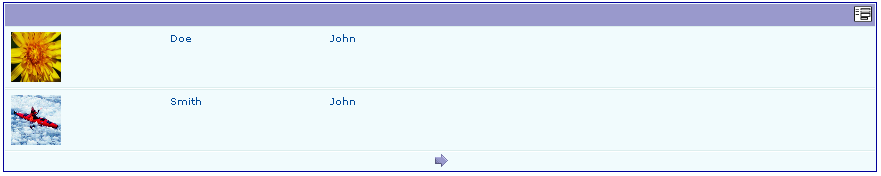
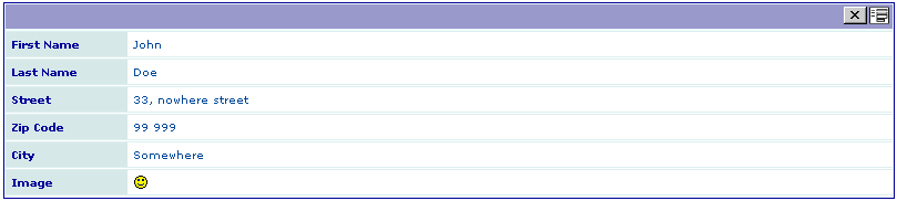
Go to your page in Front End and you should see the following caption (message should be in French if your configuration is in French).

Click on the right icon to be in the input mode. A new icon appears at the left hand side of the form. Click on it to input a new item.

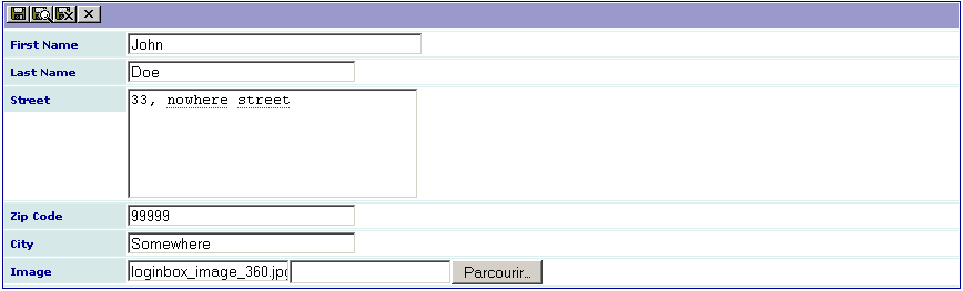
Your generated input form is shown. As it can be seen on the following caption, the size of the field firstname is longer than the other fields of the same type. This is due to the configuration parameter “size = 40;” that we have added. The other fields take the default configuration of the Kickstarter, that is a default size of 30.
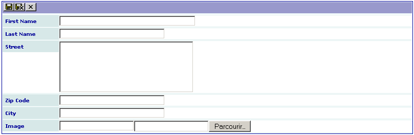
Fill the form with information. Use the browser to select the image and save.
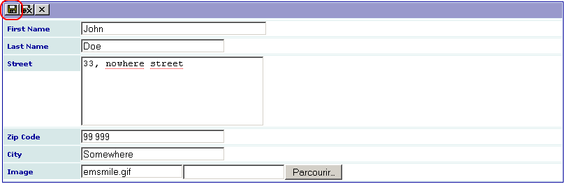
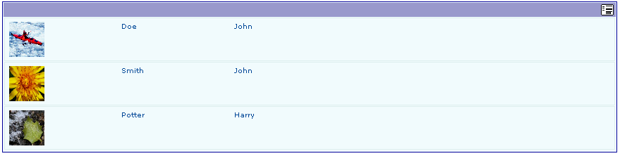
When your have completed your input quit the input form. Note that you can also use the save and close icon. Now, your extension will display one item in your “All” view.

Click on the toggle mode button to add another item, edit the previous one or suppress it.

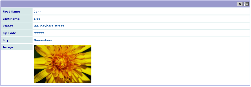
At that level, nothing more can be done and we cannot display information in our “Single” view. Thus, we need to modify slightly our extension. Let us assume that we want to open the “Single” view when clicking on the image.
Click on the extension manager, select the extension and select “Edit in Kickstarter”. In fact, with “sav_library” the kickstarter is used as a configuration tool.
Click on the table “Members” then on the tab “All” and finally go to the image field by clicking on it.
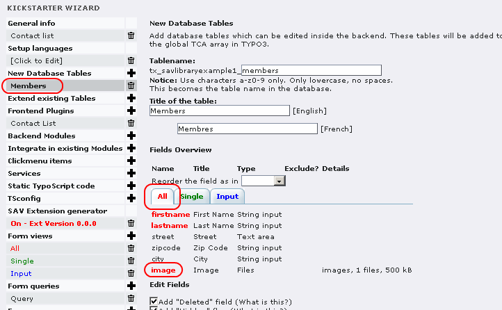
Now, we will add a configuration parameter to the image field. Using “func = makeItemLink;” we create an item link associated with the field.
Save your new extension by clicking on “View result” then on “WRITE” as done previously. Now, go to your extension, reload, click on the image and you will access to the “Single” view.

Let us note that if you click on the icon at the right hand side, you will access to the “Input” view and be able to edit the content.
How to ?
How to specify the size of the image ?
The image is displayed in the “All” and “Single” views. Use the following configuration parameters to define a 50x50 image, for example in the “All” view:
- width = 50;
- height = 50;
How to change the number of items displayed by page in the “showAll” view ?
By default, the “Max number of items” in the flexform is set to 10, just change this number. Setting this number to 0 will display all items.
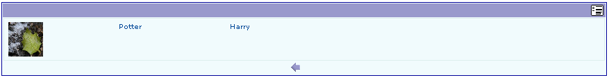
Using the default configuration :
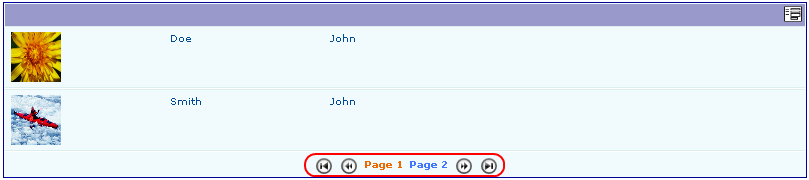
Now, if you set “Max number of items” to 2, you will obtain:
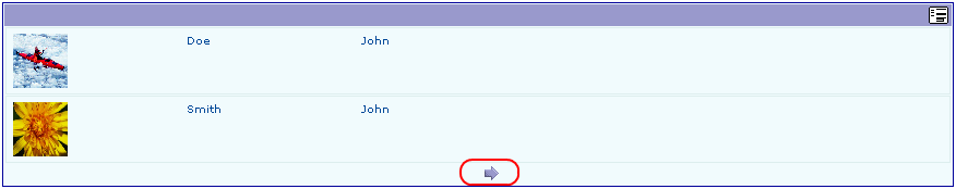
By clicking on the arrow, the next page is displayed. Use the arrows to go backward or forward.
How to have a direct access to pages ?
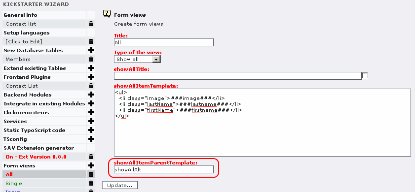
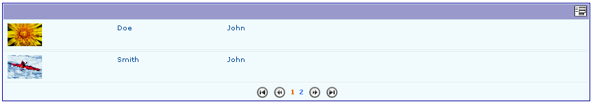
Use the alternative template by using “showAllAlt” in the “showAllItemParentTemplate” section as shown below:
Now, the output is:
Click on to the requested page.
The selection browser display, that is “Page 1 Page 2”, is a default feature. If you want to remove “Page” before each number, you must modify the “pi/locallang.xml” file by inserting the following line inside the <languageKey> tag:
<label index="pi_list_browseresults_page"></label>
It will leads to the following display:
How to introduce an alphabetical selector ?
It is often useful to select records based on, for example, the first letter of the name. The extension “sav_filter_abc” was specially built to deal with this problem.
Download “sav_filter_abc” from the TER, read the documentation and install it.
Add the plugin “sav_filter_abc” as a content element in the same page as the extension “sav_library_example1”.
Configure the flexform by filling the table name and the field name. A Context Sensitive Help is available.
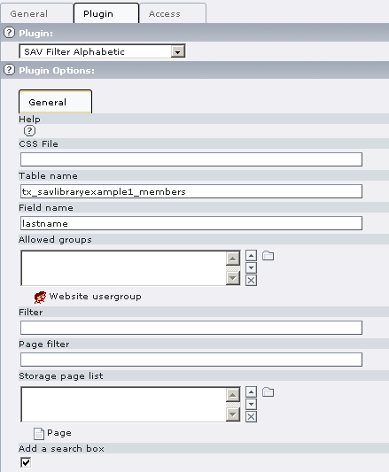
Save your configuration and go in the Front end.
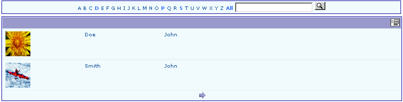
Only the letters corresponding to the first letter of existing records can be selected. Click on a letter to select the records.
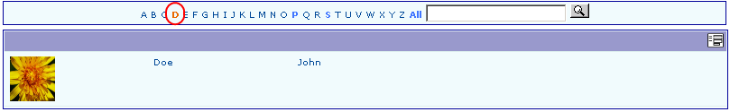
Tutorial 2: CD Album
Introduction
This example is taken from Kasper's video Episode III (http://typo3.org/documentation/videos/wmv-format/). It creates a list of CD albums. It includes artist name, title of the album, date of purchase, cover image, artist web link, category fields.
You can download this example from the TER (sav_library_example2). Install it, add your CD categories in the Back End and enjoy. The following sections explain how to create the extension and the new features, if you do not download it.
Creation of the extension
Proceed exactly as in the video.
Define your views, query and form as in Example 1.
Configuration
Configure your “All” view template.
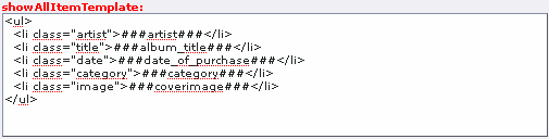
Configure your “All” view fields in the table “tx_savlibraryexample2_cds”.
Select the fields artist, album_title, date_of_purchase, category, coverimage.
Add the following configuration parameter in the “artist” field. It will associate a link with the name of the artist:
func = makeItemLink;
Add the following configurations in the “coverimage” field. It defines the size of the image and allows to open the image in a new window when clicking on it.
- width = 70;
- height = 70;
- func = makeNewWindowLink;
Configure your “Single” and “Input” views by selecting all fields. No configuration parameters are necessary.
Save your extension as in “Example 1”.
Using the extension
Create a page and insert a plugin content element and select “CD Collection” in the plugin selector.
The configuration of the plugin is performed by means of a flexform which comes with default values. Just select your form name, that is “CD Album” in the “Select form” selector, save your content element and clear the cache .
Add your CD categories in the Back End (in list mode, create on or several “CD Category” records: Rock, Jazz, Pop...).
Finally, go to your page in Front End and add items to your collection.
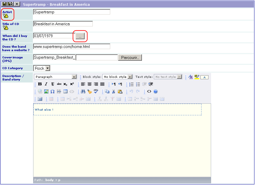
As it can be seen, a new icon is associated with the fields “artist” and “album_title”. It indicates that these fields are required (if you have selected “Required” as shown in the video, of course !). You will not be able to save your record if you do not fill these fields and an error message will be displayed.
Let us note that you can also mark any field as required using the configuration parameter:
required = 1;
You can use a date picker by clicking on the button associated with a date.
The icons displayed for the RTE depend on the Front End configuration of the RTE.
How to ?
How to display a title in the upper icon bar of the view ?
A title can be associated with each view. It is defined in the “showAllTitle”, “showSingleTitle”, “inputTitle” fields. Text, language markers or field markers can be used.
For example, if you use “$$$formTitle$$$” in the “showAllTitle” field, this language marker will be replaced by its definition in the locallang.xml file. In this example, “formTitle” is defined as “CD Collection” for the default language and “Liste de CD” for the French language. Therefore, the output is:
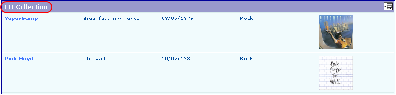
Now, if you use “###artist### - ###album_title###” in the “showSingleTitle” and “inputTitle” fields, the markers “###artist###” and “###album_title###” will be replaced by the respective values of the field “artist” and “album_title” for the current record. If these markers are used in the “showAllTitle” field, they will be replaced by the label associated with the fields. Thus, the output is the following for the “Single” view:

How to display the labels associated with each field in the title bar ?
As explain above, field markers used in “showAll” view are replaced by the label associated with the fields. Therefore, if the “showAllTitle” is the following:
<ul><li class="artist">###artist###</li><li class="title">###album_title###</li><li class="date">###date_of_purchase###</li><li class="category">###category###</li><li class="image">###coverimage###</li></ul>
the title bar becomes:

How to change the order of the item list by clicking on the label in the title bar ?
For example, assume that we want to change the displayed order by clicking on “Artist” (or “Artiste” if you use the french language).
- Add the following configuration parameter in the “artist” field of the “All” view.
- orderLinkInTitle = 1;
- Add the following configuration in the “Where Tags” of your query. Click on the checkbox and update to enlarge the input section.
- 'artist+'=> array('order' => 'tx_savlibraryexample2_cds.artist'),
- 'artist-'=> array('order' => 'tx_savlibraryexample2_cds.artist desc'),
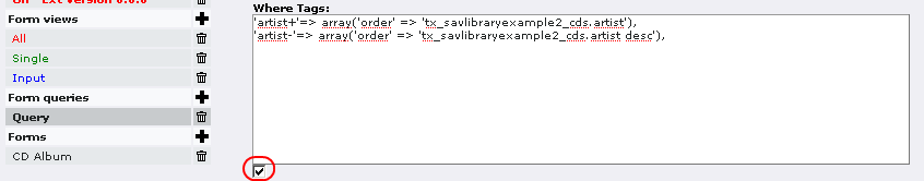
In this configuration, use “filedname+” or “fieldname-” and associate the order clause you want. In general “+” can be used for the ascending order and “-” for the descending order.
With this configuration, the order clause you have defined will be applied.
By default, the displayed link will behave as a toogle between the ascending and the descending sort. However you can control the display using the property “orderLinkInTitleSetup” which introduces links associated with icons (see General attributes in Reference for the field configuration). For example, using “orderLinkInTitleSetup = :value:ascdesc;” or “orderLinkInTitleSetup = asc:value:desc;” will respectively provide the following outputs:


Of course, you may keep the toggle link if wanted which gives respectively “orderLinkInTitleSetup = :link:ascdesc;” or “orderLinkInTitleSetup = asc:link:desc;”.
The icon color will change depending on the sort order as shown below.
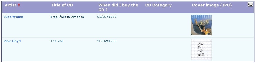
How to reorganize the fields with folders ?
Folders may be introduced in the “showSingle” and “inputForm” views to provide a better organization of the information.
Add the folder definitions in the views.
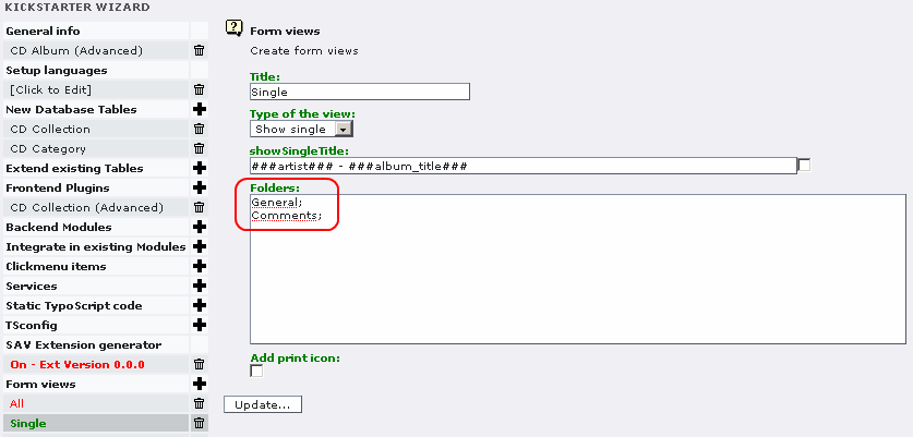
In this example, two folders are defined. If the labels “General” and “Comments” are defined in the locallang.xml file, they will be replaced by their definition in the selected language, otherwise they are used as it.
Then, set a folder to each selected field as below:
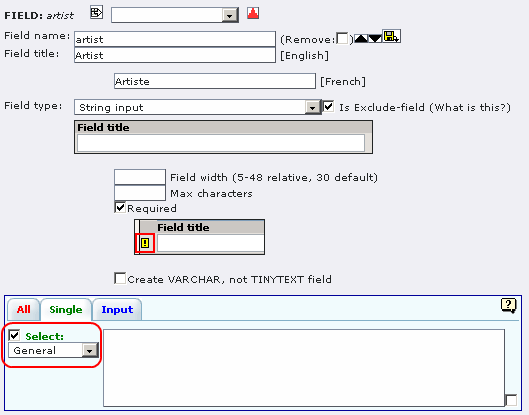
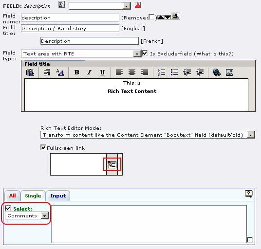
If you set all the fields to the folder “General” except the field “description” which is set to “Comments”, the following views are obtained in Front End:
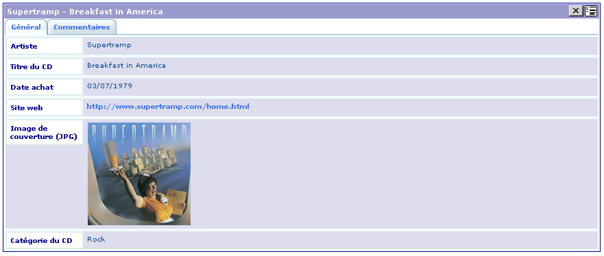
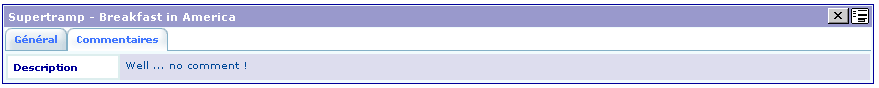
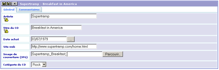
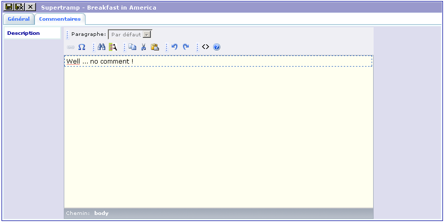
Tutorial 3: CD Album (Advanced)
Introduction
This example illustrates other features of the extension generator (MM table, email link, fields on the same line).
You can download this example from the TER (sav_library_example3). Install it, add your CD categories in the backend and enjoy. The following sections explain how to create the extension and the new features, if you do not download it.
Creation of the extension
Duplicate the extension from sav_library_example2 using the kickstarter as shown below:
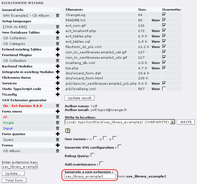
- Type sav_library_example3 in the input window;
- Click on “Update result” ;
- Click on “WRITE”;
- Install the new extension.
MM table
Now, let us assume that you want to lend your CD to your friends. Well, even with friends it is useful to keep trace of your CD! One solution is to build a new table which will be in a MM-relation with your main table. One CD can have been borrowed by several friends.
In this table, we will keep the name of your friend, its phone number, its email, the lending date and the return date. All the lending operation will be displayed in a folder “Lendings” (which is “Prêts” in French).
Create the new table “tx_savlibraryexample3_lending”
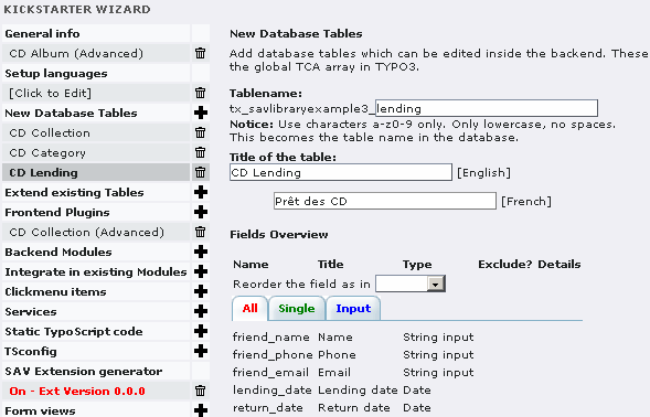
Create a new folder “Lending” in the “Single” and “Input” views (see below for the “Single” view).
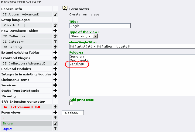
Add your translation of “Lending” in the locallang.xml file in the “sav_library_example3/pi1” directory.
Add the field “rel_lending” in the main table “tx_savlibraryexample3_cds” as a database relation with the table “tx_savlibraryexample3_lending”.
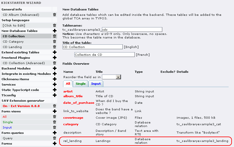
The Kickstarter field configuration should be :
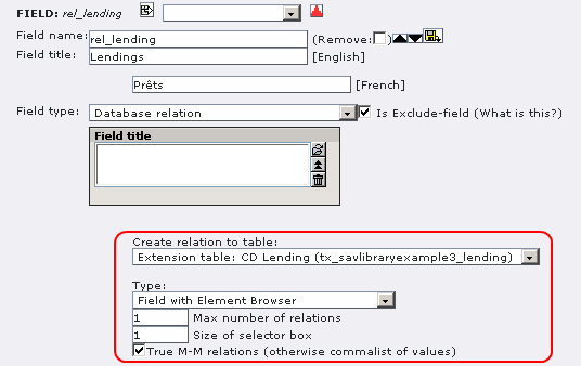
- Select the “CD Lending (Advanced)” table.
- Select Field with Element Browser. This type will generate a subform.
- Select True M-M relations even if it should work in the non true MM mode (that is with no intermediate table for the relation).
- “Max number of relations” will be the max number of items displayed in the sub-form. You can also override this value using the “maxSubItems” attribute in the configuration field for the view.
- Size of selector has no effect.
Define the configuration for the “rel_lending” field for the “Single” and “Input” views.
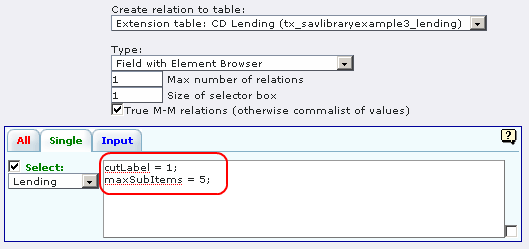
- “cutLabel = 1;” means that the label of this field will not be displayed (it is just a personal choice !)
- “maxSubItems = 5;” overrides the “Max number of relations” value (it is also a personal choice !)
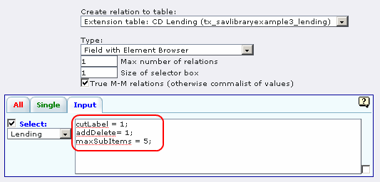
“addDelete” will add a delete icon in front of each item in the sub- form so that you can delete them.
Define the configuration for the fields in the “CD lending (Advanced)” table for the “Single” and “Input” views. It defines how item will be displayed in your sub-form views.
Let us recall that the Context Sensitive Help provides information on the attributes that can be used. In following captions, three different attributes are used:
- “noDefault = 1;” is an attribute for “Date” type fields. It means that no default value, i.e. the current date, will be displayed when a new item is created.
- “fusion = begin;” and “fusion = end;” are “General” attributes which can be used almost with every fields. “fusion = begin;” starts the process of writing fields consequently on the same line, while “fusion = end;” stops the process.
- func = makeEmailLink;” belongs to “Functions” attributes, they can also be used almost with every fields for which it makes sense to apply thy function. It will generate an email link the the current value of the field.
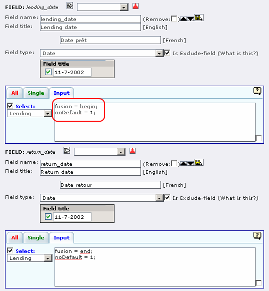
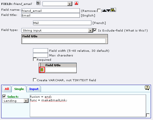
Add a “Group clause” to the “Query” as shown below. If you do not add this clause, you will get, in the “All” view, as many repeated outputs for same item as the number of sub-items you have associated with it (the reason is that “sav_library” extension generates left join relations between the tables).
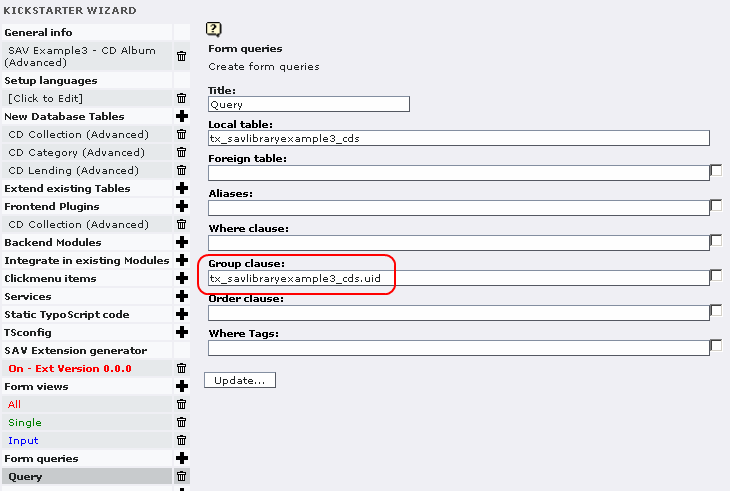
Go in Front and enjoy editing and displaying you “Lendings”.
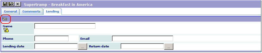
Click on the Icon to edit a new item. Fill it and save.

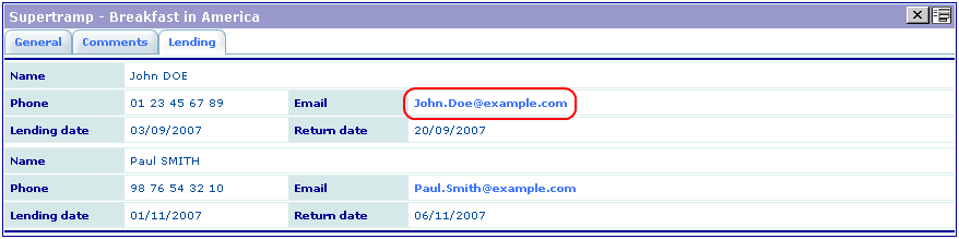 Click on the link to open your mail tool.
Tutorial 4: CD Album (Improved)
Introduction
This example makes it possible to add your friends and to lend them your CDs. It illustrates other features of the extension generator (MM relation in a double window selector, input table which is not in relation with an item).
You can download this example from the TER (sav_library_example4). Install it, add your CD categories in the backend and enjoy. The following sections explain how to create the extension and the new features, if you do not download it.
Creation of the extension
Duplicate “sav_library_example3” as explained in the previous section.
Creation of the “friends” table
Create a new folder “Friends” in the “input” and “single” views.
Let us assume that the new folder should come before the “Lending” folder. Use ###INSERT### in front of the new folder to insert it. If you do not use ###INSERT###, the folder is added but it will also modify the folder name associated with your fields!
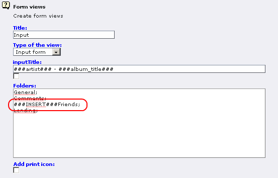
Click on “View result” in order to make the processing. If you go back to the “Input” view, you will see that ###INSERT### has been removed.
Create a new table “tx_savlibraryexample4_friends” with four fields : “friend_name”, “friend_phone”, “friend_email” as string inputs and “friend_preferred_music” as a database relation.
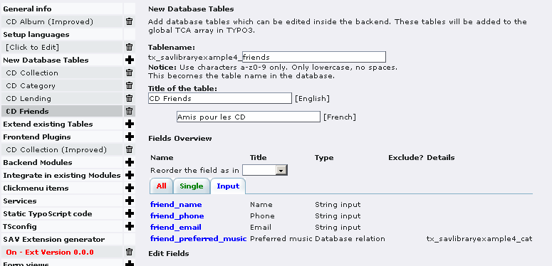
Let us assume that we want to select our friend's preferred music styles from a double-window selector. Since our friends may have several preferred styles, we have to build a MM relation. In this example, we have chosen to use a non-true MM relation, that is no MM table is built and, instead, TYPO3 uses a comma-separated list. If you prefer to use a true MM relation just select the checkbox.
A double-window selector is obtained when a “Selector box” is chosen and the “max number of relations” is greater than 1. It will define the number of elements displayed in the Front End.
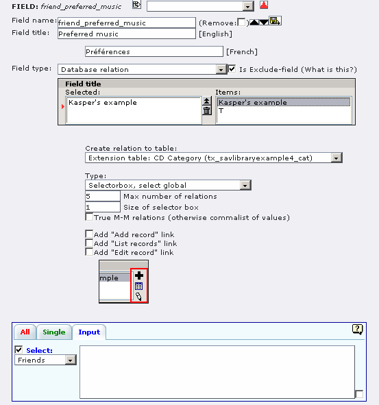
In this example, it is clear that your friends are not associated with one CD. They should be in the table but with no relation with the CD item. We need a new “input” in the table “tx_savlibraryexample4_cds”, such that you will be able to add your friends in an element browser as shown in Example 3, but without creating a relation field in the table .
This is done by selecting “Just create the Element Browser (no relation)” as shown in the caption below.
As we want to select only our friends, a where clause is added to the field which will select the records. They must have the correct “cruser_id” in the “tx_savlibraryexample4_friends” table.
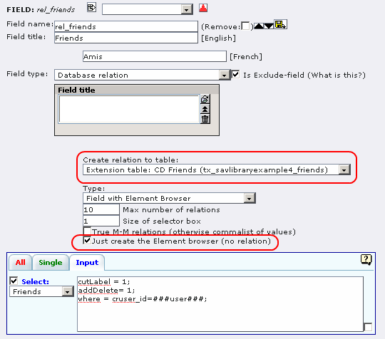
Now, we will modify the table “tx_savlibraryexample4_lending”. Delete the fields “friend_phone”, “friend_email” used in Example 3, because now they are in the “tx_savlibraryexample4_friends” table.
Then, modify the type of the “friend_name” field so that it becomes a relation to the “tx_savlibraryexample4_friends” table.
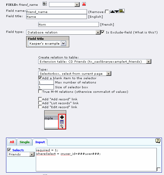
Using the extension
Add your friends. In the double-window selector, double-click on the items to make them go from one window to the other. The left hand side defines what is saved in the table.
Finally, input the lendings of your CDs.
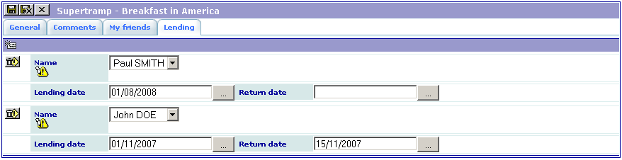
Tutorial 5: Extends test
Introduction
This example shows how to extend the SAV Library with your own methods. It is described in section 4.7.
Tutorial 6: Email and RTF
Introduction
This example shows how emails and RTF file generation can be used. You can download this example from the TER (sav_library_example6).
Install the extension,
Copy the file “invoice.rtf”, which is in the extension directory, in the “fileadmin” directory,
Add the following line in the field TSconfig of the page where you have installed the extension: tx_savlibraryexample6.View1.inputForm.email_flag.mailSender = `your_email@your <mailto:your_email@your>`_ _provider It will overload the email sender defined in the extension as it will be described in the configuration section.
The objective of this example is a very simple conference registration tool. It contains different fields:
- the participant name,
- the participant address,
- the registration items,
- the participant email,
- the email flag which is used to send emails,
- the email language,
- the link for the RTF file.
Use the input form to enter a conference participant as in the following caption.
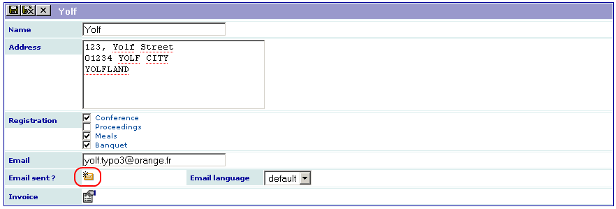
Then select the email language (default or French) and click on the email icon. If the email is correct, the form will slightly change as shown below. You cannot click on the email icon anymore (if you need to re-send the email, cancel the checkbox at the right hand side of the email icon and save the form).
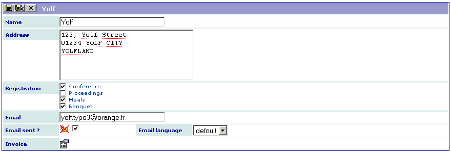
You should have received an email as the one below:
Dear Yolf,

Thank you for your registration to the conference.

Your registration includes:

X Conference
- Proceedings
X Meals
X Banquet


Your invoice will be available at the registration desk.

Looking forwards to seeing you.

Best regards,

The conference organization committee.
To generate the RTF file, click on the icon associated with the invoice, then open the generated file by clicking on the link and print it (the fields are automatically updated).
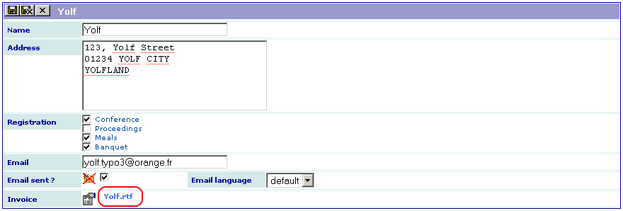
The configuration explained
Open the extension in the Kickstarter and select “SAV Example6 – Email and RTF” in the “New Database Tables”, then select the “Input” folder. As it can be seen, only the fields “email_flag”, “email_language” and “invoice” have special configurations.
Field “email_flag”
The field “email_flag” is associated with the email generation. Let us analyze its configuration shown below. Do not forget to use the Context Sensitive Help to get information about the field type attributes and to click on the “sav_library / general” attributes.
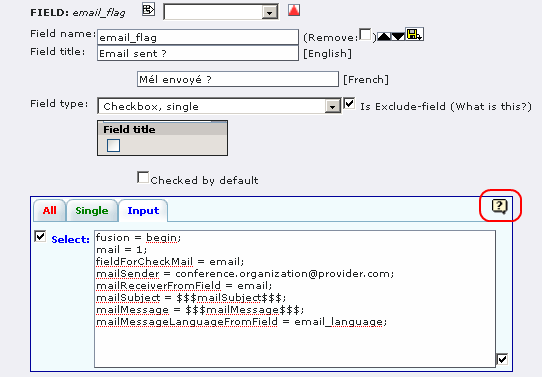
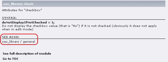
- “fusion = begin;”. This attribute is used with “fusion = end;” in the field “email_language” to have both fields aligned.
- “mail = 1;”. It tells that an email is associated with the field.
- “fieldForCheckMail = email;”. The email will be sent only if the field “email” is not null.
- “mailSender = conference.organization@provider.com ;”. This attribute defines the email sender. You can change it with your email and remove the line you have added in the TSconfig of the page.
- “mailSubject = $$$mailSubject$$$;”. It defines the mail subject. Since $$$tag$$$ is used, it means that localization is used. Therefore, the mail subject is defined in the file “locallang.xml” in the extension directory “pi1”. Open this file in your favorite editor and check the xml tag “<label index="mailSubject">”.
- “mailMessage = $$$mailMessage$$$;”. This attribute is the same as the previous one for the message to be sent. As you can check in the file “locallang.xml”, the xml tag “<label index="mailMessage">” contains ###fieldName### markers that were replaced by their values in the received message.
- “mailMessageLanguageFromField = email_language;”. This attribute indicates that the language for the mail is provided by the value of the field “email_language”.
This is one of the possibilities for sending emails. See the Context Sensitive Help to see how to send emails each time you save the form (mailAlways) or when data have changed (mailAuto).
Field “email_language”
Nothing special about this field. It contains only:
“fusion = end;”. It closes the fusion, thus the next field will be on the next line.
Field “invoice”
This field is used to generate the RTF file. It configuration is:
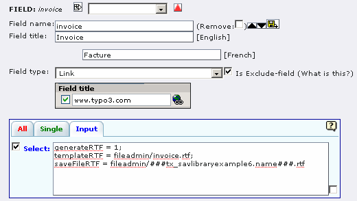
- “generateRTF = 1;”. It tells that RTF should be generated.
- “templateRTF = fileadmin/invoice.rtf;”. It defines the template file for the generation. This file contains markers ###tableName.fieldName### that will be replaced by their value for the current row.
- “saveFileRTF = fileadmin/###tx_savlibraryexample6.name###.rtf;”. This attribute defines the name under which the RTF file will be saved. Since a marker is used in this attribute, it will be replaced by its value for the current row. In this example, the value of the field “name” is “Yolf”, therefore, the file name will be “Yolf.rtf”.
How to ?
How to replace check box labels by images in the “showSingle” view ?
By default, check boxes and radio buttons as displayed as labels in “showSingle” views as shown below.
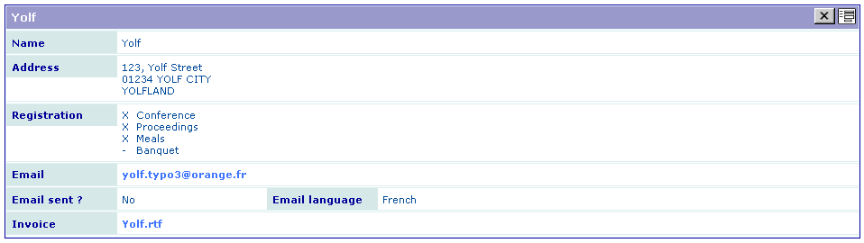 Using the property “displayAsImage = 1;” in the
configuration of the fields “Registration” and “email_flag”, the
following output is obtained.
Using the property “displayAsImage = 1;” in the
configuration of the fields “Registration” and “email_flag”, the
following output is obtained.
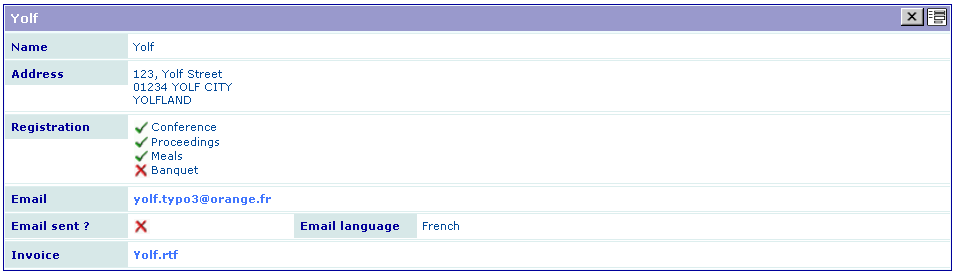
Tutorial 7: Guest book
Introduction
The aim of this extension is to deal with multiple forms of the same table and to explain how update views can be used. It creates a guest book which is inspired from the extension “ve_guestbook ” (Modern guest book) available in the TER. You can download this example from the TER (sav_library_example7). This extension uses a table with the following fields:
- the guest firstname,
- the guest lastname,
- the guest email,
- the guest website,
- the guest message,
- a comment field.
We want to have three forms associated with this table:
- one form for the guest input (FORM),
- one form for the list of guest inputs (LIST),
- one form for a teaser of the most recent entries (TEASER).
For the guest input, we want to avoid spams and to control the content. Therefore, we want the following behavior:
The guest will answer to a captcha, then his/her email will be required.
If he/she has given a valid email, he/she will receive a personal link by email.
Using this link, the guest will be able to input data. His/her firstname, lastname and message should be required fields.
The guest input will only appear on your website if you validate the data.
To perform this task, we will use new concepts: the “update view” and the filter “sav_filter_pageaccess” (you already know the filter “sav_filter_abc” used in example 1 - cf. 5.1.10.4).
Extension overview
Edit the extension “sav_library_example7” in the Kickstarter to get an overview. It contains:
- Three forms (FORM, LIST, TEASER),
- Four views (FORM_update, FORM_All, LIST_All, TEASER_All),
- Three queries (FORM_Query, LIST_Query, TEASER_Query).
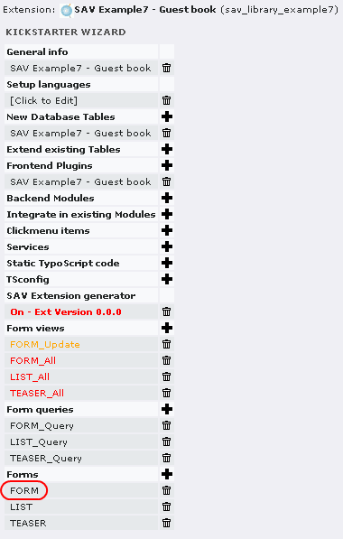
The guest input form (FORM)
Click on “FORM” in the “Forms” section. As you can see, the form has a “Show all” view, an “alt” view and a query.
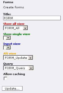
The “Alt” view, named “FORM_Update” is used to generate the guest input form. The “Show all” view is used to validate the data in the administration mode. Now, let us analyze each view.
The view FORM_Update
Click on “FORM_Update” in the “Form views” section.
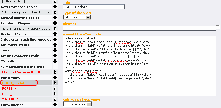
The view is of type “Alt form”, for alternative form, and of sub-type “Update view”. The “showAllItemTemplate” field defines the template. In our case, two <div> are used for having two columns in the form. The SAV Library provides some help to easily implement the view. $$$label[fiedname]$$$ will be replaced by the field title, depending on the localization, while ###field[fieldname]### will be replaced by the input item associated with the type of the field. The css classes “field” and “label” are defined in the default css of the SAV Library. You may overload their properties in your css file. Finally, ###button[submit]### creates the submit button.
Now, we will analyse the configuration. Click on “SAV Example7 – Guest book” in the section “New database tables”, select the “FORM_Update” folder tab and click on “message”, for example.
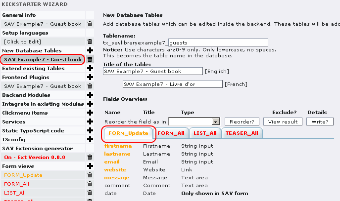
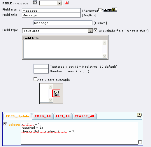
As it can be seen, the configuration is simple since only three attributes are used:
- “addEdit = 1;” means that the field can be edited by the guest, that is it will be displayed in the edit mode for the defined type. For the above example, a textarea is displayed.
- “required = 1;” means that the guest will have to fill the field.
- “checkedInUpdateformAdmin = 1;” means that the field will be pre- checked for the validation in the Admin form as explained in the next section.
For example, with the above configuration and the provided css file, once installed, you should have the following result. Required fields appear with the “*” character.
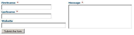
And, thanks to the localization markers $$$label[fieldname]$$$, if you change to the French language, you will get:
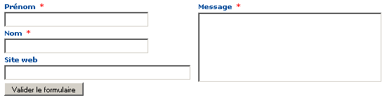
The view FORM_All
When an “Update view” is used, information provided by the guest are not directly saved in the table fields. A temporary field, named “_submitted_data_” is automatically added to the table. It used to keep the guest inputs until you have validated them. For that, the “Update view” includes an “Admin” mode in which you have to enter by means of an associated “Show all” view which will display the new inputs. Since we will use a filter which requests the email of the guest input, it will be used in the view to switch to the “Admin” mode.
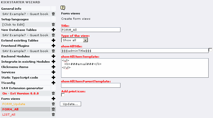
Localization marker $$$adminTitle$$$ is used to the view title bar. Let us recall that the marker is defined in the file locallang.xml in the “pi1” directory of the extension. The template is very simple and contains only the email field which is selected in the configuration.
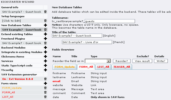
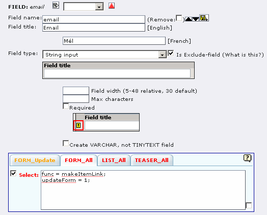
Two attributes are associated with the field “email”:
- “func = makeItemlink;”, already seen in the previous examples, which creates the link associated to the field value.
- “updateForm = 1;” specifies that the updateform should be opened.
Once correctly installed, if a guest, e.g. “ paul.durand@example.com ” has left a new message, you should have the following output:

Now, by clicking on the link, you will enter in the “Admin” mode. As can be seen, the fields have a checkbox already checked. It is due to the property “checkedInUpdateformAdmin = 1;” set in the “Update view”. Only fields that are checked will be transfered to their respective place in the table when submitting the form.
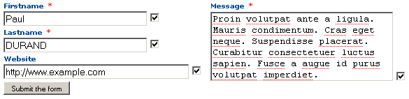
The query FORM_Query
In order to get only the guest inputs that have not been checked and processed, a special WHERE clause has to be used.
As explained before, the guest entry is not directly saved in the table fields. Information are serialized and temporary saved in the field “_submitted_data_”. This field is cleared once data are processed in the “Admin” mode. Therefore, to check that new entries are present, the WHERE clause checks a substring in the “_submitted_data_” field. The substring is: extensionName_formName in lower case .
In our example, the extensionName is “sav_library_example7” and the formName is “FORM”, thus the substring to fetch is: “sav_library_example7_form”.
The guest input list (LIST)
Nothing very special here. The form LIST includes a conventional “show All” view. Analyze the view, the query and the field configurations (use the Context Sensitive Help if necessary). Below are two useful comments.
Field “comment”
- “addLeftIfNotNull = <strong>$$$label[comment]$$$</strong><br />;”
- cutIfNull = 1;
These two properties make is possible to display the label for the field only if the field is not null (addLeftIfNotNull will add the right hand side string to the left of the content if it is not null). The field content is cut if it is null (cutIfNull).
Field “date”
This field has a special type “Not created, only shown in savform”. It means that it will not be present in the table but you may use it as marker ###date### in forms. It has three properties:
- “alias = crdate;” means that this field is an alias for the field “crdate” that already exists in the table (it is created by the Kickstarter).
- “func = makeDateFormat;” calls the internal function “makeDateFormat” which will process the field. Let us recall that crdate is a unix time stamp.
- “format = %d/%m/%Y %H:%M;” defines the the format that will be used to process the date.
Below is the screen shot obtained for the LIST form when the extension is correctly installed.
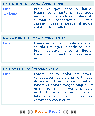
Installation and configuration
Downloads
Download the extension “sav_library_example7” from the TER and install it.
Download the extension “sav_filter_pageaccess” from the TER and install it.
Download the extension “sr_freecap” from the TER and install it.
Guest input
Create a page for the guest input.
In this page, insert a plugin content. Select “SAV Example7 – Guest book”, select “FORM” in the “General” folder, then in the “Input Controls” folder, uncheck “input on form”.
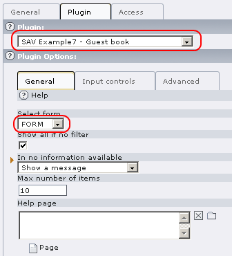
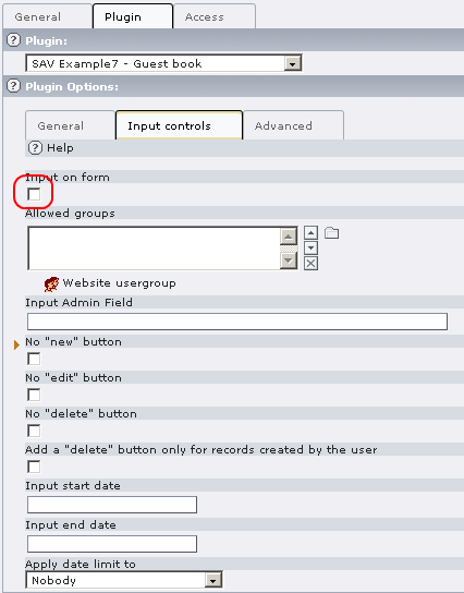

In the same page, before the previous plugin (see below) , add a new plugin content. Select “SAV Filter Page Access”. Read the Context Sensitive Help by clicking on the icon. You may also read the documentation associated with this extension. Fill the fields as shown below. Replace your_email@example.com by a valid email . The value in “Uid for the field cruser_id” will be the default value for the “cruser_id” field of each record in the table “tx_savlibrary_example7_guests”. For example, put your FE user uid. Provide a key which will be used to crypt the link. Finally provide a redirection page for errors ( this field is required ). When using captcha, you can set this field with the current page.
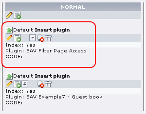
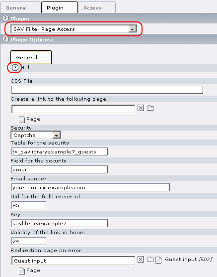
Save and go to the page in the Front End. Answer to the captcha and submit.
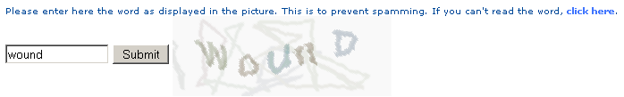 Fill the field with your email and submit.
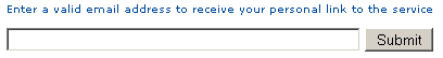 An information message is displayed and you should received
an email with a personal link.
An information message is displayed and you should received
an email with a personal link.
Click on the following link to access to the service
Guest input
This link is valid only for one request.
The link is “Your_page_title” (“Guest input” is the page title used for the tutorial). Click on the link to access to the input form, fill the form and submit it.
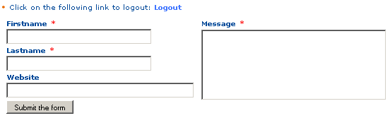 Guest input validation
Create a FE group, for example “savlibrary_test”. It will be use to protect the page and define the “Admin” group. Apply this group to you, that is to your FE user record.
Create a page for the guest input validation. Protect the page with the FE group.
Insert a plugin content. Select “SAV Example7 – Guest book”, select “FORM” in the “General” folder. In the “Input Controls” folder, uncheck “input on form” and add the FE Group to the “Allowed groups” field.
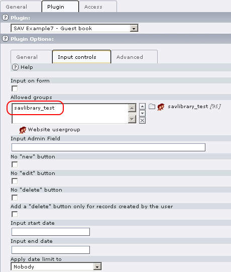
Save and go to the page in the Front End and click on the email associated with your last input.
List view
Insert a plugin content. Select “SAV Example7 – Guest book”, select “LIST” in the “General” folder. Set the field “Max number of items” to the number of items you want in the list (10 is the default). Uncheck “input on form” in the “Input Controls” folder. Save and go to the page in the Front End.
Template and CSS files
You have certainly remarked that the forms and the styles used in the guest book were not the same as in the other SAV Library examples. The reason is very simple. The extension “sav_library_example7” comes with its own template and CSS files. By convention:
- if a file “extensionKey.tmpl” is in the “res” directory of an extension, this file is used for the template instead of the default one,
- if a file “extensionKey.css” is in the “res” directory of an extension, this file is loaded in the <head> section of the HTML. It is used to overload several default styles.
Tutorial 8: Fe Users Admin and Export
Introduction
The aim of this tutorial is to show how an extension can be easily built from an existing table. It will also be explained how to export data in CSV from the extension.
The example deals with the fe_users table from which we want to build two forms :
- The first one (USER) is for the authenticated user who wants to manage his/her personal data.
- The second one (ADMIN) is for a FE Admin user who may manage all users and export them.
You can download this example from the TER (sav_library_example8).
Extension overview
Edit the extension “sav_library_example8” in the Kickstarter to get an overview. It contains:
- Two forms (USER, ADMIN),
- Five views (USER_All, User_Input, ADMIN_All, ADMIN_Single, ADMIN_Input),
- Two queries (USER_Query, ADMIN_Query).
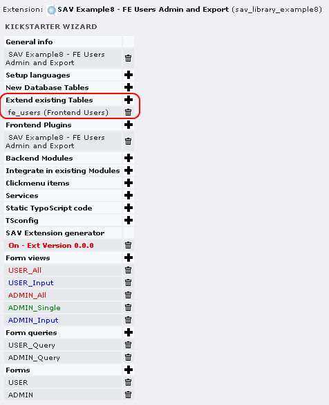
The organization of the forms is quite similar to the previous examples. Just click on them to analyze it. Let us focus on the configurations associated with the existing table “fe_users” by clicking on the link “fe_users”. As it can be seen, all fields have type “Only shown in SAV Form”.
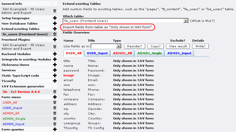
By clicking on the link Import fields from table as “Only shown in SAV form” , all fields from the table “fe_users” were imported, then unwanted fields were removed.
The user form (USER)
In this example, it was chosen to design a very simple form consisting in the display of the user image field. The image is associated with a link, that is a <a> tag, to open the user form input.
The query USER_Query
The query is used to filter the “fe_users” table with the authenticated user. This is easily done by using the marker ###user### in the WHERE clause of the query.
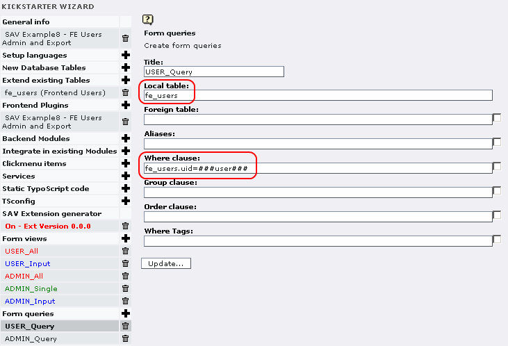
The views USER_All and USER_INPUT
The template associated with these views is quite simple since the only field to display is “image”.
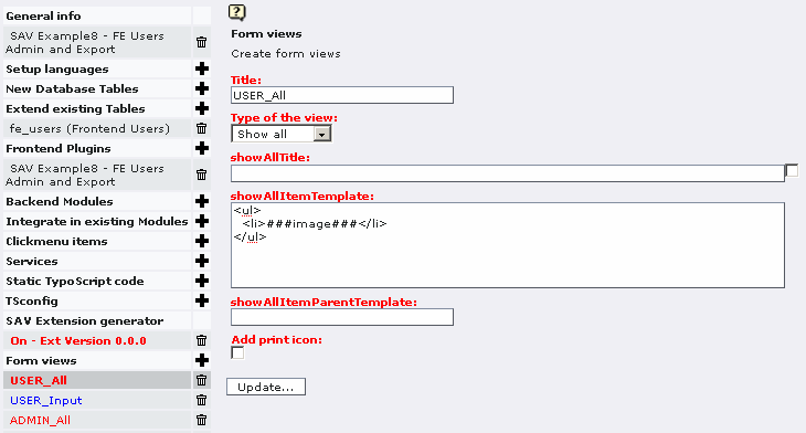
And to make it possible to generate the link to open the input view, only a few configuration attributes are required.
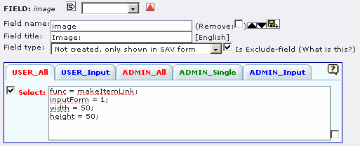
- “func = makeItemLink;” generates the link for the current item.
- “inputForm = 1;” opens the input view instead of default view (“showSingle” view).
- “width = 50;” and “height = 50;” define the size of the image.
Finally, to override the default css, the example comes with a css file (sav_library_example8.css) in the “res” directory which contains the following instructions :
.tx-savlibraryexample8-pi1-USER .sav-library .showAll {width:62px;background-color:#ffffff;}
.tx-savlibraryexample8-pi1-USER .sav-library .showAll .title {display:none;}
.tx-savlibraryexample8-pi1-USER .sav-library .showAll .items .item {border:none;background-color:#ffffff;}
Concerning the view USER_Input, there is no specific configuration that needs to be described here. Fields are selected and attributes “fusion = begin;” and “fusion = end;” are used to group fields.
The administration form (ADMIN)
The administration form is used in the Front End to manage, give rights, export FE users. It is based on a conventional query, “Show all”, “Show single” and “Input form” views for which no specific configuration is needed. Just click on the different views and tabs to see how fields are grouped.
Installation and configuration
Installation
The following installation is just an example for testing the extension.
Download the extension “sav_library_example8” from the TER and install it.
Create a folder for the FE users.
In the folder, create a FE group for regular users and a FE group for admin users.
In the folder, create a regular user and an admin user for the test.
Create a test page for the USER form and another for the ADMIN form.
In the USER page, insert the plugin and select the USER form.
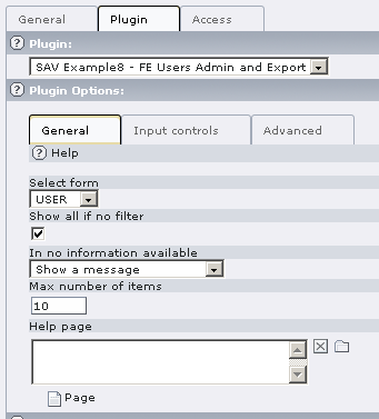
Authenticate the user and go to the USER page. You should see either the user's image (here user_defined.gif icon was used) or a question mark image if no input was provided.


Click on the image link to open the input form.
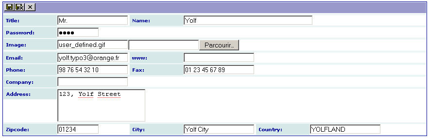
In the ADMIN page, insert the plugin, select the ADMIN form and include the user folder in the “Startingpoint” field.
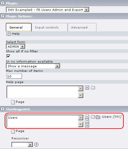
Click on the folder “Input controls” . Select “Input on form” to allow the input. Add your administration group (here “testadmin”) in “Allowed group”. Select “No new button” if you do not want to allow the creation of new users.
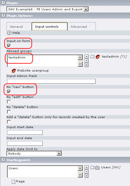
Authenticate the administration user and go to the ADMIN page. The view displays the users'name, their email, their phone number and their groups. The behavior of the form is the same as in the previous examples. Click on the name to see the user's configuration. Use the edit icon to modify the fields.
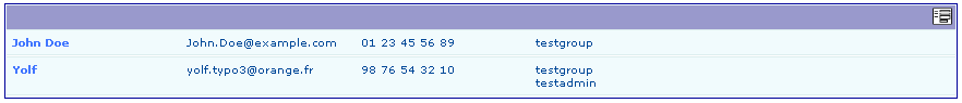
Exporting data to CSV format
Exporting data is possible for any form built with the SAV Library Generator. To allow this feature you simply have to add the following line either in the user TS Config field or in a group TS Config :
sav_library_example8_Export = *
In general, it is done in the Back End. However, our extension makes it possible to do it in the Front End for the user as shown below.
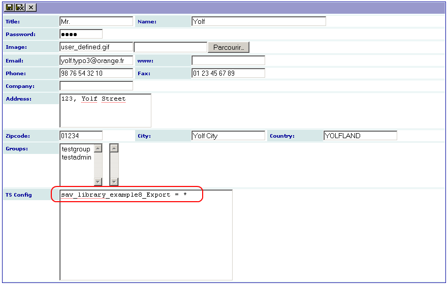
Now, close the view and verify that you obtain a new “CSV” icon in the ADMIN “Show All” and click on it to obtain the export view.
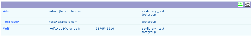
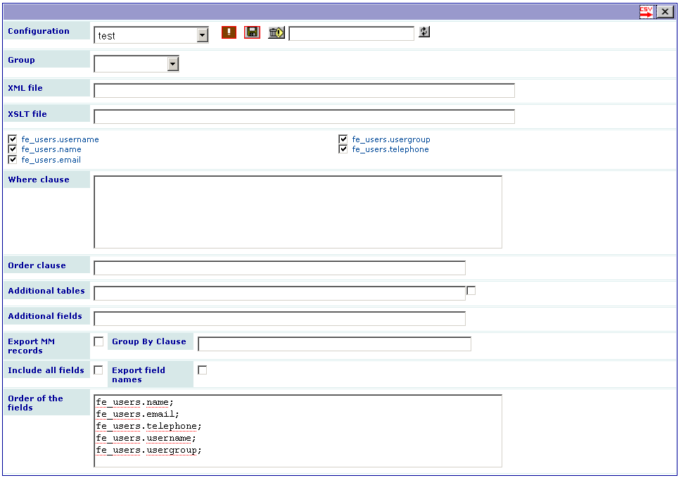
The configuration can be used to save, load, delete an export configuration. Use the toogle button to display only selected fields or to display all fields. In the above caption, the export configuration “test”, previously saved, was reloaded.
XML and XSLT files can be used to export data to other formats (see next section).
Checkboxes are used to select the fields to be exported.
The “Where clause” field is used to filter the data to be exported. Let us note that if you double-click on a field name, it will be added in the “Where clause” field. It is useful to avoid mistakes.
The “Order clause” field is used to order the data to export.
“Additional tables” can be used for more complex export where you need to link data used by the extension to data in other tables. In that case do not forget to add a condition in the “Where clause” to join correctly the tables.
“Export MM records” can be set when your extension use MM tables and you want to export all data. In that case you may also need to add a “Group by clause”.
“Include all fields” can be used when you want to export fields like uid, pid, crdate, ... which are hidden by default. Click on the red CSV icon to include all the fields. Use the toogle button if you have previously restricted the display to selected fields.
“Export field names” can be selected when you want to have the field names as the first line in the CSV file.
“Order of the fields” can be used to change the order in which the fields are extracted. By default, it is the order in which the appear in the checkbox list from left to right. In the above example, without information in this field, “fe_users.username” comes first, then “fe_users.usergroup” is extracted, then “fe_users.name” and so on. Provide a list of fields separated by a semi-column (one field per line makes it simple to read) in the text area to change this order. Let us also note that you can put the same field several time, which is sometimes useful when you process directly the CSV file.
Click on the red CSV icon to export your data. Below is the result obtained when the CSV file is imported in OpenOffice Calc.
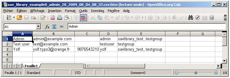
Exporting data to other formats
The exporting form contains two fields “XML file” and “XSLT file” which enable the export to other formats.
The “XML file” field must be a XML file which will be used as a template. It may contain:
- field markers under the conventional format in the SAV Library Extension Generator, that is ###field_name###,
- localization markers under the conventional format in the SAV Library Extension Generator, that is $$$tag$$$ for a marker in the locallang.xml file, $$$label[field_name]$$$ to obtain the label associated with a field,
- constant markers under the form $$$constant[tag]$$$ (e.g. $$$constant[PATH_site]$$$).
The XML tag may contain special attributes:
- “sav_type” can be set to:
- “replaceAlways”: the XML tag and its children will be processed for all exported rows,
- “replaceDistinct”: the XML tag and its children will be processed each time the associated “sav_id” attribute changes in the rows,
- “cutIfEmpty”: the XML tag and its children will be cut if the associated “sav_id” attribute is empty in the row,
- “cutIfNotEmpty”: the XML tag and its children will be cut if the associated “sav_id” attribute is not empty in the row,
- “cutIfEqual”, “cutIfNotEqual”, “cutIfgreater”, “cutIfLower”, “cutIfgreaterEqual”, “cutIfLessEqual”: the XML tag and its children will be cut if the associated “sav_id” attribute in the row is respectively equal to, not equal to, greater than, less than, greater than or equal to, lower than or equal to, a given value provided by the “sav_value” attribute.
- “sav_id” must be a field name,
- “sav_value” must be a value.
Let us illustrate this principle to generate a docbook article. If your are not familiar with docbook, please read http://www.oasis- open.org/docbook/documentation/reference/html/docbook.html and http://www.sagehill.net/docbookxsl/ . The former is the docbook definitive guide and the later the docbook xsl complete guide.
Assume that we want to produce the FE user list under the form of a table with four columns: the user image, his/her name, email and groups. It can be solved used the XML file “to_docbook.xml”, available in the “res” directory of this extension. As it can be seen, this file uses several markers and attributes which are in bold in the following listing.
<?xml version="1.0" encoding="UTF-8"?>
<!DOCTYPE article
  PUBLIC "-//OASIS//DTD DocBook XML V4.5//EN" "http://www.oasis-open.org/docbook/xml/4.5/docbookx.dtd">

<article lang="en">
  <title>List of FE users</title>
  <informaltable>
    <tgroup cols="4" align="left" colsep="1" rowsep="1">
      <thead>
        <row>
          <entry align="center"></entry>
          <entry align="center">$$$label[fe_users.name]$$$</entry>
          <entry align="center">$$$label[fe_users.email]$$$</entry>
          <entry align="center">$$$label[fe_users.usergroup]$$$</entry>
        </row>
      </thead>
      <tbody>
        <row sav_type="replaceAlways">
          <entry align="center">
            <mediaobject sav_type="cutIfEmpty" sav_id="fe_users.image">
              <imageobject>
                <imagedata fileref="$$$constant[PATH_site]$$$###fe_users.image###" width="2cm" scalefit="1" />
              </imageobject>
            </mediaobject>
          </entry>
          <entry>###fe_users.name###</entry>
          <entry>###fe_users.email###</entry>
          <entry>###fe_users.usergroup###</entry>
        </row>
      </tbody>
    </tgroup>
  </informaltable>
</article>
In order to produce the XML file, the process is the same as for the CSV export. Each field marker have to be selected to be replaced and the template file has to be provided in the “XML file” field as shown in the following caption (the configuration was saved in “FE users (docbook)”).
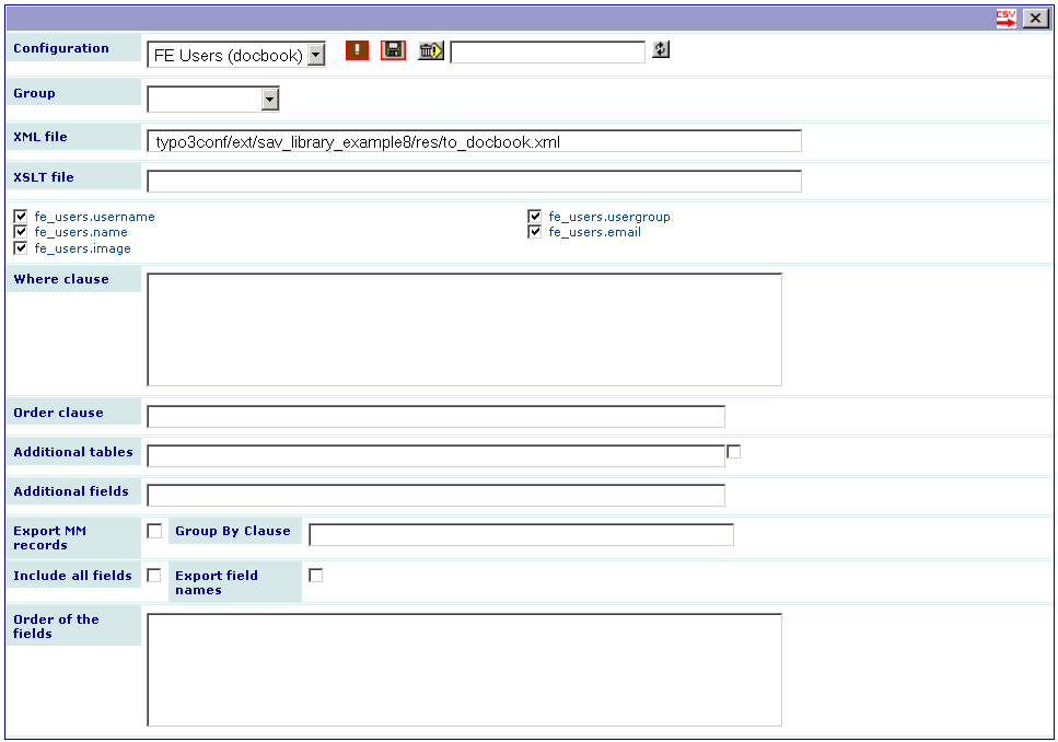
The resulting file name is the same as with the CSV format, e.g. “sav_library_example8_admin_28_2009_08_04_08_37.csv”. It is built as follows: “extensionName_formName_contentId_year_month_da y_hour_minute.csv”.Save the generated file and rename it if you want. Then, use your favorite docbook processor. For example, the following caption was obtained using FOP ( http://xmlgraphics.apache.org/fop/ ) to produce a pdf output.
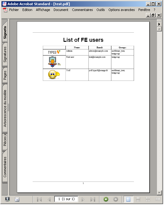
As you may also add a XSLT file ( http://xmlfr.org/w3c/TR/xslt/ ), the resulting XML output can be transformed to virtually any file format. For example, this process was used to produce limesurvey import files ( http://www.limesurvey.org/ ). It was also used to transform docbook XML file before the FOP processing, especially when RTE field content are used. RTE content is HTML based, therefore , <p>, <ul>, <ol> ... tags have to be transformed to docbook tags.
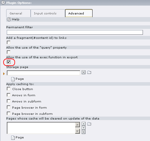 Finally, you may want to automatically process the document,
by calling for example the docbook processor, in the extension. In
order to do so, an admin user must allow the use of the php exec
function in the “Advanced” folder of the configuration of the
extension as shown in the following caption.
Finally, you may want to automatically process the document,
by calling for example the docbook processor, in the extension. In
order to do so, an admin user must allow the use of the php exec
function in the “Advanced” folder of the configuration of the
extension as shown in the following caption.
It will lead to a new field in the FE export form as shown below:
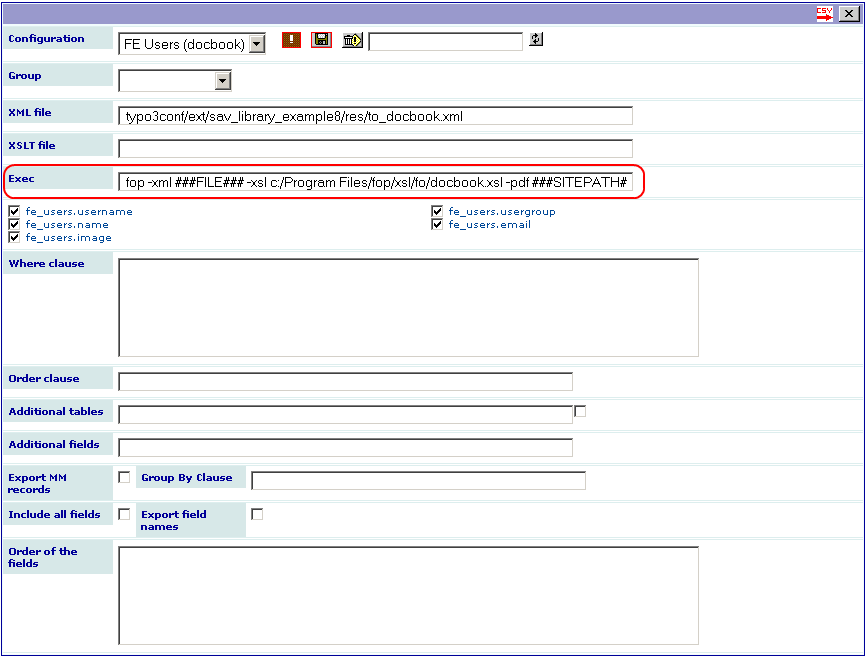
Fill this field with your command (it will be saved if you use the save icon). In the above caption, the following input is used for calling the FOP command.
fop -xml ###FILE### -xsl c:/Program Files/fop/xsl/fo/docbook.xsl -pdf ###SITEPATH###/fileadmin/test.pdf
The tag ###FILE### will be replaced by the resulting file name. In our example it will be replaced by “sav_library_example8_admin_28_2009_08_04_08_37.csv”. The xsl path for the file name docbook.xsl depends on your installation of the FOP processor.
The tag ###SITEPATH### will be replaced by your site path. Here, the generated file will be “test.pdf” in the “fileadmin” directory of the site.
Tutorial 9: Using XML JpGraph
Introduction
The aim of this tutorial is to show how to include XML JpGraphs into an extension (see the extension “sav_jpgraph” for detailed information and a tutorial).
In this example, we want to display list of events as Gantt graphs. Each graph is a period of time as, for example months or quarters. Two forms are requested:
- The first one (Admin) will be used to input events in FE. An event includes a title, a begin and a end date, a category. Categories will be input in BE. They have a name and a color which will be used in the Gantt graph.
- The second one (Display) is the Gantt graph display.
You can download this example from the TER (sav_library_example9).
FE input events (Admin)
If you have followed the previous tutorials, you are now familiar with the SAV Library Extension Generator. The “Admin” form has three views: “Admin_All”, “Admin_Single” and “Admin_Input”.
Download the extension “sav_library_example9” from the TER and open it in the Kickstarter.
Look at each folder tab and analyze the configuration of each field.
Create a page and a sysfolder as shown below.
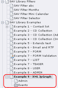
Insert the extension in the page “Admin” and configure the “Storage page” in the “Advanced tab” so that it points to the sysfolder (“Events” in the example).
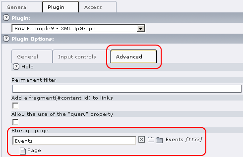
In the List mode (Web->List), create the categories and the periods in the sysfolder. Use color names recognized by JpGraph library. In this example, the year events are organized by quarters.
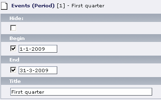
Go to the Front End and insert events. Events are displayed in the “All” view by decreasing order of the begin date (see the “Order clause” in the “Admin_Query”).
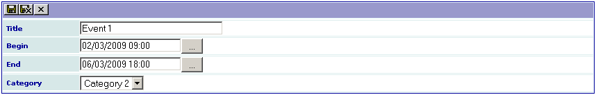
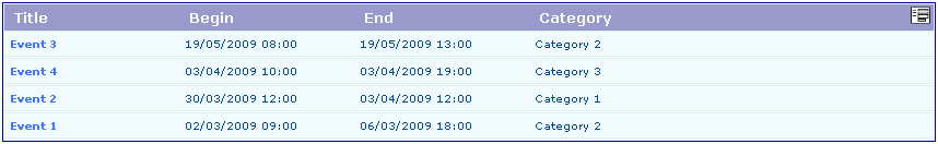
Gantt graphs display (Display)
The “Display” form has only one view : “Admin_All”. This view displays only one field named “graph”. Its configuration is the following:
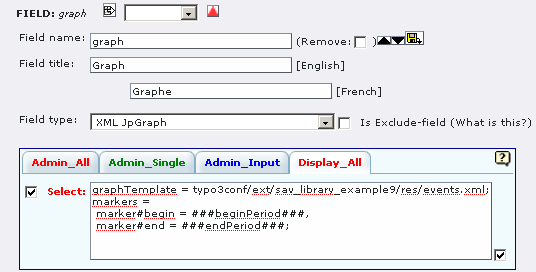
The fields with a type XML JpGraph are not created in the database. They are displayed in the view if selected.
The configuration includes several lines:
- graphTemplate = typo3/ext/sav_library_example9/res/events.xml; defines the file to be used as a template for the graph display.
- markers = marker#begin = ###beginPeriod###, marker#end = ###endPeriod###; This attribute is used to define XML SAV JpGraph markers. The syntax is a comma-separated list of definitions. Let us analyze the first one: “marker#begin = ###beginPeriod###”. It says that the “marker” whose id is “begin” in the template will be replace by the SAV Library marker “###beginPeriod###”, that is by the alias “beginPeriod”. Thus it is necessary for this alias to be defined as shown in the query section of the form.
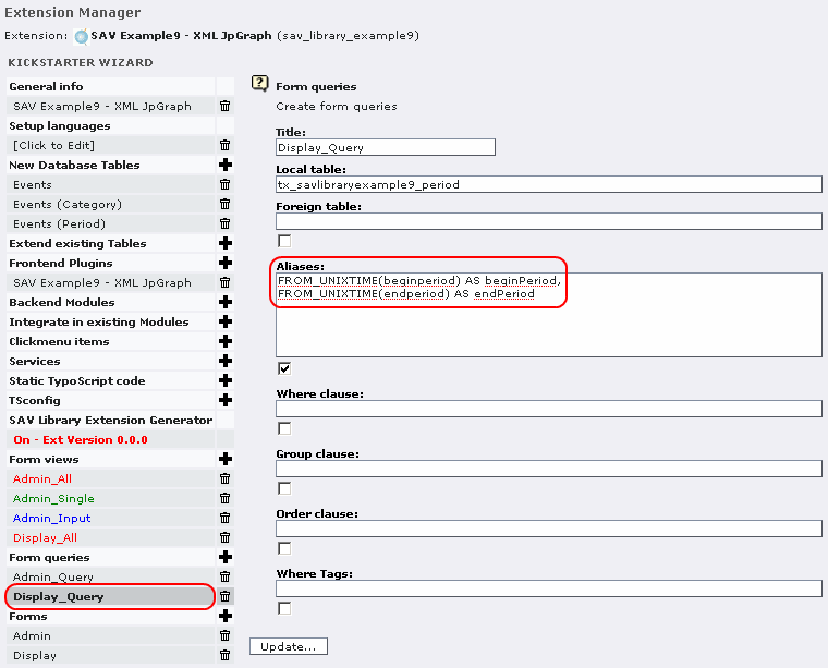
Now, download the extension “sav_jpgraph” from the TER and install it.
Then, install the extension in the page where you want to display the graph.
In the folder tab “Options” of the page, set the “General Record Storage page” to the folder where the data are stored.
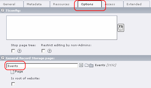
In the folder tab “General” of the extension, select the form “Display” and set the starting point to the sysfolder containing your events.
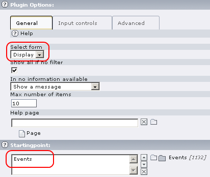
In the folder tab “Input controls”, uncheck “Input on form”.
Save and go to your Front End page. You should obtain something similar to the following view, depending on your events.
Finally, open the files “events.xml” and “eventsTemplate.xml” in the directory “res” of the extension and analyze them. The file “eventsTemplate.xml” is the general template for the graph display (see the extension “sav_jpgraph” for more details). The file “events.xml” contains the user definitions for the references used in the general template. The only tricky part is the use of the SQL variable @row to number the position of the bar plots.
Using the graph with a year selector
To introduce a year selector, we are going to use a new filter called “SAV Filter Selectors”.
Download the extension “sav_filter_selectors” from the TER and install it. Let us note that this extension is very useful to develop quickly selectors, checkboxes, radio buttons, search boxes which can be used to filter extensions produced by means of the SAV Library Generator ... even if the syntax is sometimes surprising !
Using a selector in the “Admin” form
In the “Admin” page, add a plugin content element and select “sav_filter_selectors”.
In the flexform, add the configuration as shown below. The template part is an HTML template which may contain special markers that will be replaced by the extension (see the CSH or the manual for details). It may also contain localization markers which must, in that case, be defined in the language section. In the example localization is used for markers $$$year$$$, $$$category$$$ and $$$search$$$ which are defined in English and in French. You can add your own language or replace the French part. If you do so, do not forget to modify the index attribute according to your language.
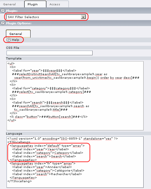
Save and go to your “Admin” page. The extension “sav_filter_selectors” displays selectors for the year and categories and a search box. By default, events are displayed for the current year, thanks to the “Where clause” in the “Admin_Query”.
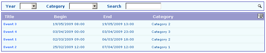
You can use the selector to select events for a given year and/or a category.
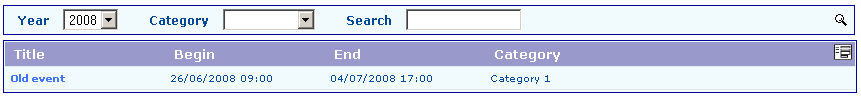
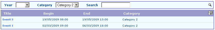
Using a selector with the “Display” form
Let us now analyze how to introduce a selector with the “Display” form which is a little bit more tricky.
In the display page, add a plugin content element and select “sav_filter_selectors”. In the flexform, add the configuration shown below.
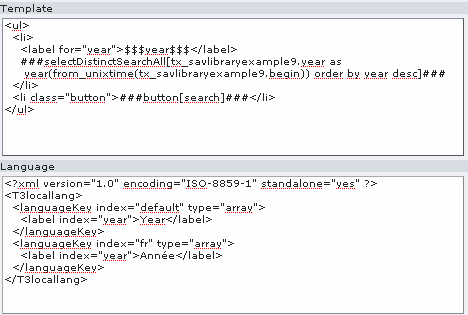
Now, let us explain the tricky part. The “Display” form refers to the table “tx_savlibraryexample9_period” but the aliases “beginPeriod” and “endPeriod” depend now on the selected year. Therefore, they must be built using the year of the selected events, that is information in the “tx_savlibraryexample9”. For that we need to build a query which will take into account this new table which is not joined with the period table. The “foreign table” field can be used for that. Be careful, the coma is required before the table name in this field. Modify the query as shown below:
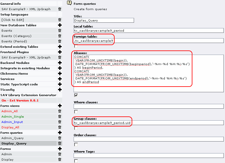
Finally go to the front end, select a year and validate.
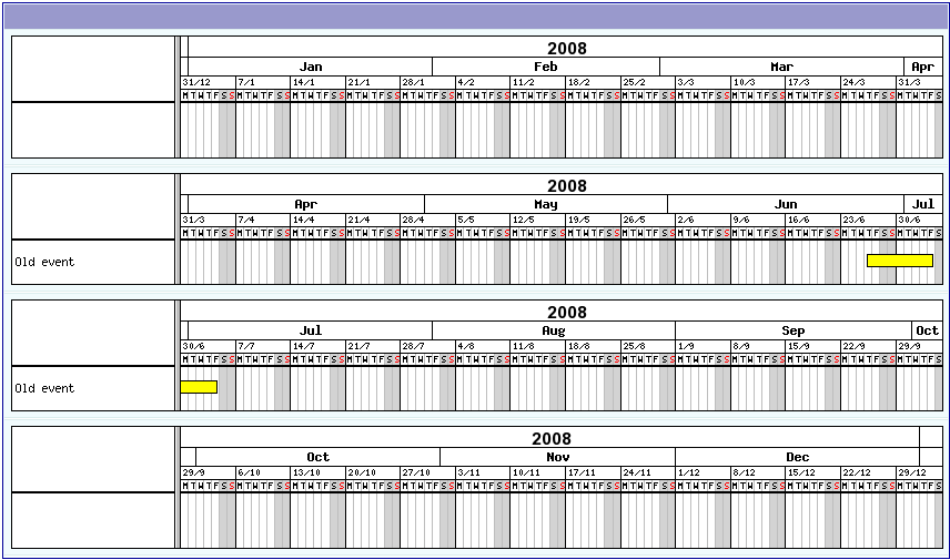
Tutorial 10: Using TypoScript (Gallery with google map)
Introduction
The aim of this tutorial is to show how to use TypoScript into an extension.
In this example, we want to display a gallery of pictures. We will use three views in only one form for the sake of the simplicity (see previous examples to create an admin form):
The “showAll” view to display small images.
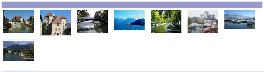
The “inputForm” to enter the picture, its title, a description and the address corresponding to the picture.
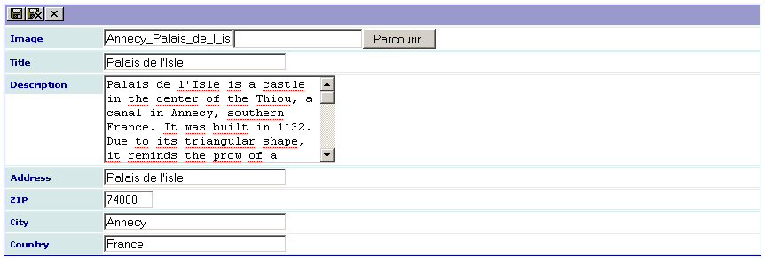
The “showSingle” view with a special organization. The picture is on the left, then the title and the description is displayed at the right of the picture and, finally, the google map, where the marker is defined by the address, goes to the right of the description. By clicking on the image, it should be displayed in its original size.
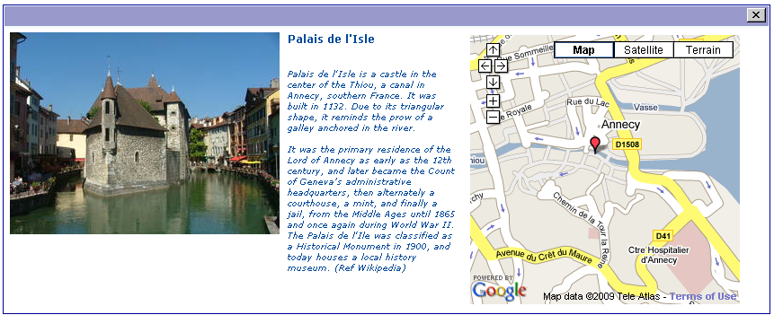
Several authenticated users may use the plugin. Each user can modify or delete the records he/she has created.
- Download this example from the TER (sav_library_example10) and install it.
- Download also the extension “wec_map” from the TER, read the documentation, get your google map API key and install it.
The “showAll” view
The template of this view is very simple since the only field to display is the image. However, we want to take advantage of the TYPO3 image processing instead of using the conventional modification of the size of the image through the properties “width” and “height”.
When the field is an image and you use the property “tsProperties”, an IMAGE cObject is generated with the provided TS properties. You can use markers to refer to the fields. In the example, the configuration is the following:
func = makeItemLink;
tsProperties =
file = uploads/tx_savlibraryexample10/###image###
file.width= 100
;
The first property is already known. It makes it possible to open the “showSingle” view by clicking on the image.
The second one is just TypoScript syntax for an IMAGE cObject. It defines the file using the ###image### marker, that is the file name and it sets the width to 100px. You may insert any other TS property as, for example, GIFBUILDER.
The syntax is exactly the same as in TypoScript. Do not forget to end the property by a semicolon. If you need a semicolon in a TypoScript property, please use “;”.
The last problem to solve in the “showAll” view is to have several images on the same line instead of having them one per line. It can be simply done by changing the default style (See the file “sav_library_example10.css” in the “res” directory) as follows:
.tx-savlibraryexample10-pi1-Gallery .sav-library .showAll .items .item {
        width:120px;height:100px;background-color:#ffffff;
}
The “inputForm” view
This view has nothing special. No configuration is needed. Of course you can change the size of the input fields if needed.
The “showSingle” view
In this view, we have to deal with two problems:
- positioning correctly the fields,
- executing the plugin “wec_map”.
Positioning the fields
The positioning of the fields is very simple in “showAll” view because you can define the template. For the “showSingle” and “inputForm” views, the positioning can be obtained using the “wrapItem” property. This property has the same syntax and the same behaviour as the “wrap” property in TypoScript.
To perform the requested positioning, we will use <div> tags organized as follows:
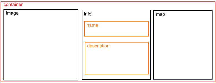
The wrapping is done field by field. For example, the first field is “image”. It defines the beginning of the container <div> and the image <div> when the following property is used:
wrapItem = <div class="container"><div class="image"> | </div>;
Analyze the “wrapItem” for all the fields, then open the file “sav_library_example10.css” in the “res” directory to analyze the configuration. As it can be seen, the labels associated with the field are not displayed thanks to the {display:none;} CSS configuration. Let us note that the same result could have been obtained using the “cutLabel” property in the Kickstarter (see for example the “image” and “map” fields).
Executing the plugin “wec_map”
Executing a plugin in the extension can simply be done by means of the “tsObject” and “tsProperties” properties. The “tsObject” is a content object in TypoScript, that is TEXT, FILE, CONTENT, ...
To include the pi1 of a plugin, the syntax is:
tsObject = <plugin.tx_thePluginName_pi1;
Then simply add the plugin configuration attributes by means of the “tsProperties” property as already explained in the case of the “image” field.
Inserting the “wec_map” plugin is a little bit more complex because it was designed as a USER type with a javascript executed by means of the “onload” attribute in the <body> tag (<body onload="T3_onloadWrapper();">). Therefore, a small piece of javascript must be added through the TypoScript. For example a COA can be used as follows:
tsObject = COA;
tsProperties =
10 = TEXT
10.dataWrap = <script type="text/javascript">setTimeout("drawMap_map{field:uid}()",500)\;</script>
20 = < plugin.tx_wecmap_pi1
20 {
 height = 300
 width = 300
 showDirections = 0
 prefillAddress = 0
 initialMapType = G_NORMAL_MAP
 showInfoOnLoad = 0
 controls {
 showOverviewMap = 0
 showMapType = 1
 showScale = 0
 mapControlSize = small
 }
 markers.1 {
 title = ###title###
 street = ###address###
 city = ###city###
 zip = ###zip###
 country = ###country###
 }
}
;
cutIf = address = EMPTY;
Let us note the use of “;” in the 10.dataWrap property because the semicolon is the separator for configuration properties.
The “cutIf” property checks if the “address” field is empty to cut the plugin if no address is provided (otherwise the google map API would return an error message). An example of an image with no address is shown below.
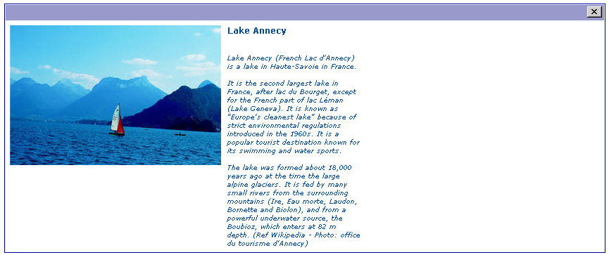
Configuration of the plugin
The last step is the configuration of the plugin so that the authenticated users can only modified their images.
This can be simply done by using the “cruser_id” field in the “Input Admin Field” of the flexform as shown below.
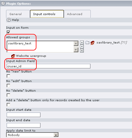
Other examples
If you have reached this part of this manual, you are familiar with form and field configurations.
This section describes simple or more complex examples that I have designed to answer to my specific problems. Most often, they are used as tools for an intranet. I share them with the TYPO3 community to illustrate the simplicity and the power of the SAV Library Extension Generator. They are provided as it and will probably have no updated version. Download extensions from the TER, open them in the kickstarter, analyze the configurations and adapt them to your problem.
In the following, each extension will be shortly described and illustrated by several screenshots. Useful information are provided when needed.
Downloading documents (sav_download)
What does it do ?
This very simple extension makes it possible to download documents. A new icon indicates the new documents during 15 days and icons are associated with the file type (see the field configurations). Sorting is available by clicking on “Date” or “Category” in the title bar.
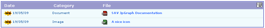
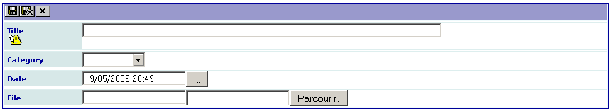
Minutes of meetings (sav_meetings)
What does it do ?
This extension was designed to enter and display the minutes of a meeting for a group of FE users, for example a management team or a development team. Each member of the group may enter items that will be discussed during the meeting. A meeting has a date and belongs to a category (for example a project for a development team). An item is proposed by a member of the group. It has a name and an expected duration. A report is associated with it. Up and down icons are displayed to reorganize the items. A delete icon makes it possible to delete one item. A save button with an anchor is displayed to make the saving more comfortable when the minutes are taken during the meeting.
Useful information
By default the group of FE users is “sav_meetings”. The selectors for the “participants” and the “proposed_by” fields filter the fe_users table with this group. See the configuration of these fields for the “Input” view. It includes the following property :
whereSelect=###group_list=sav_meetings###;
If you do not want to use this group name nor modify the extension, you can overload this property using the facility provided by the SAV Library Extension Generator (see: Field configuration by means of the page TS Config). Edit the page properties and add the following lines in the TSConfig field (see the folder tab “Options” in the flexform of the page properties). The group that will be used is now “testgroup”.
tx_savmeetings.Meetings.inputForm.participants.whereSelect = ###group_list=testgroup###
tx_savmeetings.Meetings.inputForm.proposed_by.whereSelect = ###group_list=testgroup###
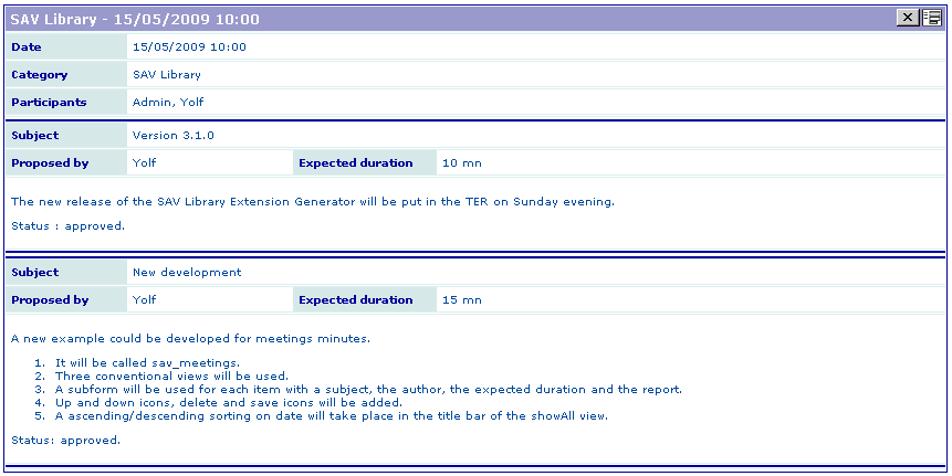

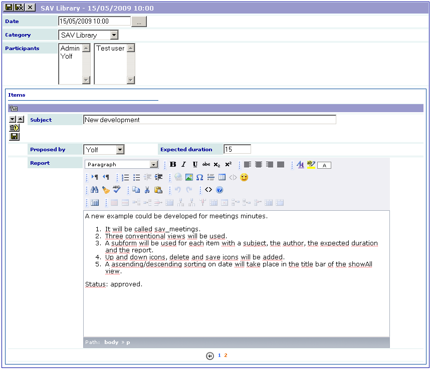
Known problems
Delete query do not delete items in MM relations.
To-Do list
New ideas are welcome !
Sponsors and credits
Sponsors
Thanks to:
Dipool ( http://www.dipool.net/ ) for supporting the development of the “tsObject” and “tsProperties” properties and the extension “sav_library_example10”. It has also supported the development of a special processing for workspaces.
Credits
Thanks to:
Paul Boomkamp and Thomas Hirt for having detected several bugs in the version 3.0.0.
Changelog
Stable 3.3.0
Version
Stable 3.3.0
Date
07/08/2013
Stable 3.2.3
Version
Stable 3.2.3
Date
24/06/2012
Comment
Localization tags and markers substitution introduced for the “value” attribute.
Comptability with SAV Library Plus.
Stable 3.2.2
Version
Stable 3.2.2
Date
27/06/2011
Comment
“Default” and “horizontalLayout” attributes added to radio buttons.
New feature added to deal with edit or single views that may change depending on a cutif condition.
“resetToDefault” attribute added to “date” and “date and time” types.
Small bug corrected in the xml processing for exports.
Compatibility with the kickstarter 0.5.1 added.
Stable 3.2.1
Version
Stable 3.2.1
Date
17/02/2011
Comment
Path to the calendar image corrected and calendar image added.
Compatibility with the kickstarter 0.5.0 added.
Small bugs corrected.
Stable 3.2.0
Version
Stable 3.2.0
Date
09/12/2010
Comment
After several years and many generated extensions used in production, the time has come to change the status from beta to stable.
Bug #11049 and several other minor bugs corrected.
New icon “Save and show” added.
Special processing has been developed for workspaces.
Latest version of the DHTML calendar Widget distributed under the GNU Lesser General Public License replaced the previous Date Picker.
Change mode button modified.
The File item viewer modified to allow multiple files upload.
Dependency with the “kickstarter” was removed. Please see the section Important development remarks.
Beta 3.1.3
Version
Beta 3.1.3
Date
Comment
Bug when using TYPO3 4.3 fixed (Bug #4191).
Bug when using JpGraph in an extension fixed (Bug #4192).
Exec command can be added when exporting data. See the section “Exporting to other formats” in example 8.
Beta 3.1.2
Version
Beta 3.1.2
Date
Comment
Bug #3798 fixed.
New verifier, verifier message and warning added (Features #3796, #3797)
viewFile itemViewer modified to display all images for an image field when several images are input in the BE (Feature #3829).
New property “displayAsImage” added to display check boxes or radio buttons as images instead of text in showSingle views (Feature #4113). See the section “how to ?” in example 6.
XML and XSLT processing added when exporting data (Feature #4115). See the section “Exporting to other formats” in example 8.
Sorting icons when orderLinkInTitle is used ave been added. They can be configured by means of a new property orderLinkInTitleSetup (Feature #4153). See the How to change the order of the item list by clicking on the label in the title bar ? in Tutorial 2: CD Album.
Beta 3.1.1
Version
Beta 3.1.1
Date
Comment
Minor changes in the code.
New section “Other examples” added in the documentation and two new examples added in the TER (sav_download and sav_meetings).
Beta 3.1.0
Version
Beta 3.1.0
Date
Comment
Bug #3228 fixed.
Each form of the plugin can either be a USER or a USER_INT (Feature #3251). The status of each form can be viewed and changed in the update tool.
Only one parameter is now used for links in all extensions generated by the SAV Library Extension Generator.
Configuration by a XML file is now the default.
A save button can be added, with an anchor, in subform items using the configuration property addSave (Feature #3279).
Beta 3.0.5
Version
Beta 3.0.5
Date
Comment
Bug #3146 fixed.
Use of localization tags in the “wrapItem” property added (Feature #3145).
Localization improved for translations (Feature #3202).
One variable changed in the class tx_savlibrary_filter. Update the extension sav_filter_pageaccess if you use it.
Beta 3.0.4
Version
Beta 3.0.4
Date
Comment
Bugs #3085 and #3086 fixed.
New property added to use TypoScript in generated extensions (Feature #3087).
New example added in the tutorial to illustrate how to use TypoScript (gallery with google map position).
Beta 3.0.3
Version
Beta 3.0.3
Date
Comment
Smalls bugs fixed and documentation updated for example 9.
Translations available through the translation server.
Beta 3.0.2
Version
Beta 3.0.2
Date
Comment
New item viewer added for displaying XML JpGraph (see the extension “sav_jpgraph”).
New example added in the tutorial explaining how to use XML JpGraph.
Beta 3.0.1
Version
Beta 3.0.1
Date
Comment
Several bugs fixed.
Default image configuration added.
Display of the extension version in the SAV Library Extension update tool.
Beta 3.0.0
Version
Beta 3.0.0
Date
Comment
The extension was made compatible with the Kickstarter 0.4.0 and 0.3.8.
All generated extensions are USER_INT by default. Changing the checkbox in the “Frontend Plugins” section of the Kickstarter will have no effect.
Choice added in the Kickstarter to save the configuration either as a xml file or as a php array.
A global update tool has been introduced in the extension manager.
Field name in the forms are crypted.
A checkbox was added in the SAV Library Extension Generator item in the kickstarter to choose whether to add the icon under the plugin selector or not.
The manual change of the version was removed in the SAV Library Extension Generator item in the kickstarter.
A storage page option was introduced in the “Advanced” folder of the flexform
A new class “utils” was added and a part of the code was rewritten with the HTML utils
A bench of phpUnit tests have been introduced and a part of the code has been rewritten.
groupBySelect property added to selector boxes associated with database relations.
Beta 2.0.8
Version
Beta 2.0.8
Date
Comment
onclick attribute replaced by ondblclick to retrieve default values.
Up and down selectors in subforms modified so that when clicking on the up (resp. down) selector associated with the first (resp. last) item, it becomes the last (resp. first) item.
Small improvements in the CSV exportation of data.
SubFormAlt Template added. It makes it possible to display a page browser in subform instead of arrows.
Beta 2.0.7
Version
Beta 2.0.7
Date
Comment
Reference section for field configurations added to the documentation.
Group added to the export configuration so that configurations can be shared by the group members.
Additional field input added to the export configuration so that aliases can be used.
Beta 2.0.6
Version
Beta 2.0.6
Date
Comment
Link field removed in “form Queries” in the Kickstarter.
Minor changes in the code.
Error message added on errors in queries.
Property “reqValue” restricted to SELECT query.
Property “query” has now to be authorized by an admin user in the extension flexform.
Beta 2.0.5
Version
Beta 2.0.5
Date
Comment
Major bug fixed in the kickstarter. It was occurring when creating a new extension.
Minor bugs fixed.
Item viewer for password field added.
New tutorial section added (Tutorial 8) to explain how to export data.
Beta 2.0.4
Version
Beta 2.0.4
Date
Comment
Small bugs fixed.
Tutorials section reorganized.
Session is now dealt with the TYPO3 session API.
Beta 2.0.3
Version
Beta 2.0.3
Date
Comment
Small bugs fixed.
Documentation updated.
Beta 2.0.2
Version
Beta 2.0.2
Date
Comment
The manual was updated to the new documentation template (doc_template 1.2.5).
Comment
Status changed to Obsolete. This extension is replaced by “sav_library_plus”.