Cards
Target group: Editors
The card element is a flexbile element. You can display images, images with text or just text.
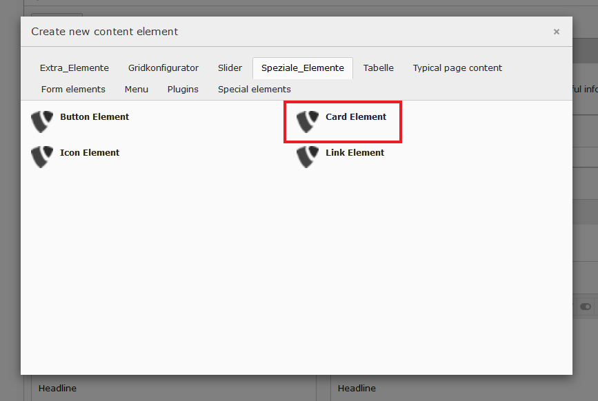
Within a page click on the “+ content” button. Next choose the “card element” from the tab: “Speziale_Elemente”.
After that your entering the settings screen for the card element. Within that you have two tabs where you can manage the content and the behavior of the element.
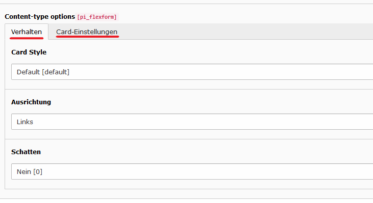
The first tab (“Verhalten”) is about the behavior of the element. Here you have three dropdowns to use.
- Card Style: Here you can choose whether the card has an image or not.
- Ausrichtung (Alignment) Whether the text inside the card is left, center or right.
- Schatten (shadow) Whether the Card should have a box shadow or not.
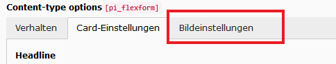
Within the second tab (Card-Einstellungen) you can manage the content of the element.
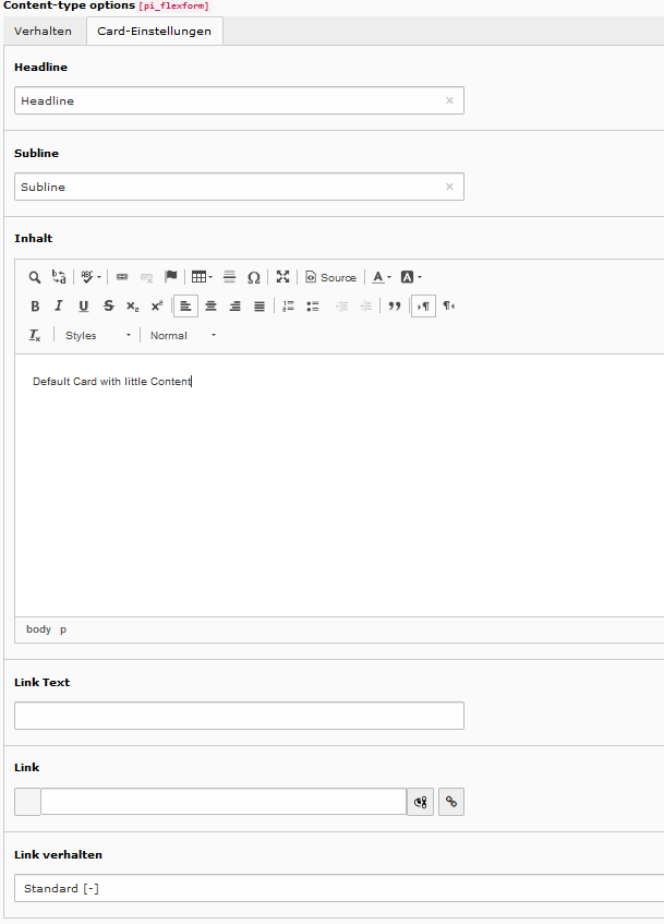
Here you can set an headline, subline, content and an link as well as an linktext.
If you choosed that the card should have an image in the first tab, there is a third tab, called “Bildeinstellungen”.
Within the image setting tab you have to settings.
- Bildverhalten (image behavior)
- Bild (image itself)
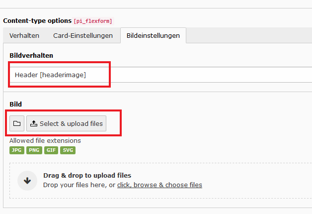
At the “Bildverhalten” dropdown, you can choose whether the image will be displayed as:
- Header image of the card
- Background Image of the card
- Footer image of the card
At the “Bild” section you choose the actual image.
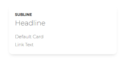
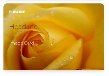
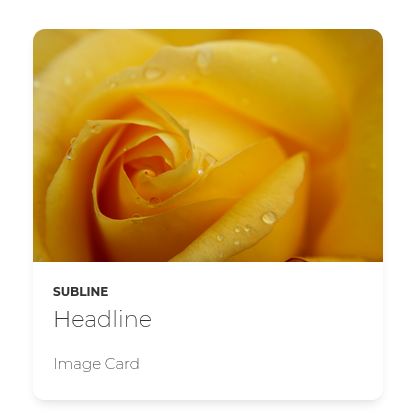
Examples of the card element at the frontend:
Card with background image:
Card with header image:
Card without image: