DEPRECATION WARNING
This documentation is not using the current rendering mechanism and is probably outdated. The extension maintainer should switch to the new system. Details on how to use the rendering mechanism can be found here.
EXT: Multiple Content
| Created: | 2010-02-18T17:33:18 |
|---|---|
| Changed by: | Jürgen Furrer |
| Changed: | 2014-03-17T23:03:28 |
| Classification: | jfmulticontent |
| Keywords: | multiple content tabulator accordion slider jquery ui |
| Author: | Juergen Furrer |
| Email: | juergen.furrer@gmail.com |
| Info 4: | |
| Language: | en |

 EXT: Multiple Content - jfmulticontent
EXT: Multiple Content
Extension Key: jfmulticontent
Language: en
Keywords: multiple content tabulator accordion slider jquery ui
Copyright 2000-2010, Juergen Furrer, <juergen.furrer@gmail.com>
jQuery UI © 2009 Paul Bakaus, http://jqueryui.com/
jQuery © 2009 John Resig http://ejohn.org/ and the jQuery Team http://docs.jquery.com/Contributors
anythingSlider By Chris Coyier http://css-tricks.com
SlideDeck © 2010 digital-telepathy http://www.dtelepathy.com
easyAccordion © 2010 Andrea Cima Serniotti http://www.madeincima.eu
booklet © 2010 W. Grauvogel http://builtbywill.com/
easyAccordion and booklet sponsored by http://www.made-in- nature.de/typo3-agentur.html
This document is published under the Open Content License
available from http://www.opencontent.org/opl.shtml
The content of this document is related to TYPO3
- a GNU/GPL CMS/Framework available from www.typo3.org
Table of Contents
`Introduction 3 <#__RefHeading__1783_1528161777>`_
`Users manual 5 <#__RefHeading__1789_1528161777>`_
`Administration 17 <#__RefHeading__1805_1528161777>`_
`Configuration 20 <#__RefHeading__1809_1528161777>`_
`Known problems 30 <#__RefHeading__1817_1528161777>`_
`To-Do list 31 <#__RefHeading__1819_1528161777>`_
`ChangeLog 32 <#__RefHeading__1821_1528161777>`_
Introduction
What does it do?
With this extension you're able to show multiple content elements in one content.
There are seven possibility's:
Multiple contents, like the sub columns in yaml
Tabulator
Accordion
Sider
SlideDeck
easyAccordion
Booklet
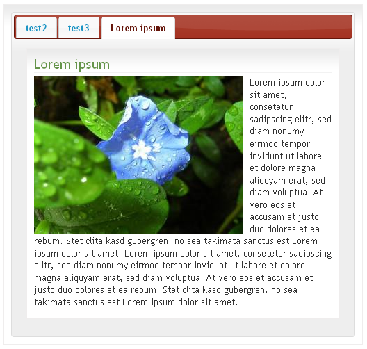
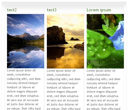
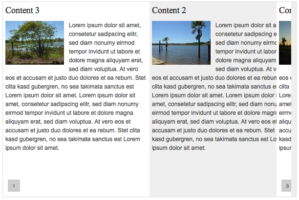
Screenshots
Users manual
Here you can find a video-tutorial in german:
http://jweiland.net/typo3-hosting/service/video- anleitungen/typo3-extensions/jfmulticontent.html
There are two different methods to choose multiple content:
Choose content from one “General Record Storage page”
Choose contents from any site
Your administrator can define this in the configuration of the extension. If this feature is activated, the select box of the content will change. More of this later.
To add a multiple content to a site, you have to define a “General Record Storage page” for your current page. You can define only one “General Record Storage page” per page.
To do this, you have to:
Go to Web → Page
Choose the page you want to add the “General Record Storage page”
“Edit page property”
Go to tab “Option”
Choose the storage page in “General Record Storage page”
You should use a hidden page or a SysFolder for the “General Record Storage page”.
Your Page could look like this:
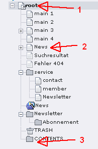
Define the “General Record Storage page” on root (1) and set it to the SysFolder (3)
Go to the page (2) and create a new content:
Go to Web → Page
Choose the page where the new content should be displayed (2)
Create new content
Choose the plugin “Multiple Content”
Go to tab “Plugin”
First you should define the contents to display.
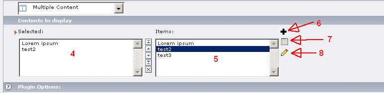
The “Selected” (4) are the contents witch will be displayed in the “Multi Content”
“Items” (5) show all available contents in “General Record Storage page”
You can add (6) new contents directly to the “General Record Storage page”
You can show (7) the list of all contents in “General Record Storage page”
You can edit (8) existing contents (choose them first in “Selected”)
In case of “Use General Record Storage page only”-configuration is turned off, the “Content to display” looks like this:
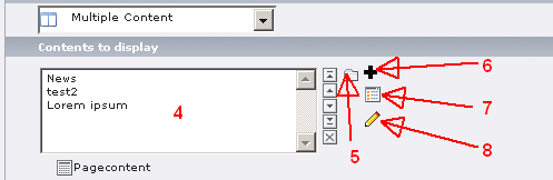
The only difference here is the file browser (5). You are able to choose content from every site and every SysFolder.
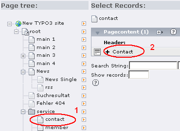
After click the icon (5) you get a popup, where you can choose a page on the left (1) and choose on the right the content to include in your multiple content element.
Be warned by changing content (8) you selected from another page, if you change it in multiple content, you will change it everywhere else too, because it is the same content!
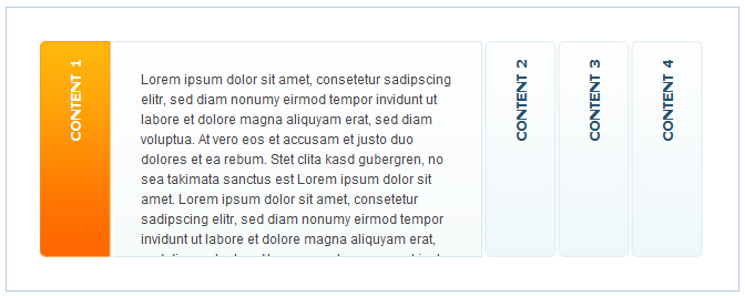
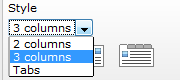
Multiple Columns
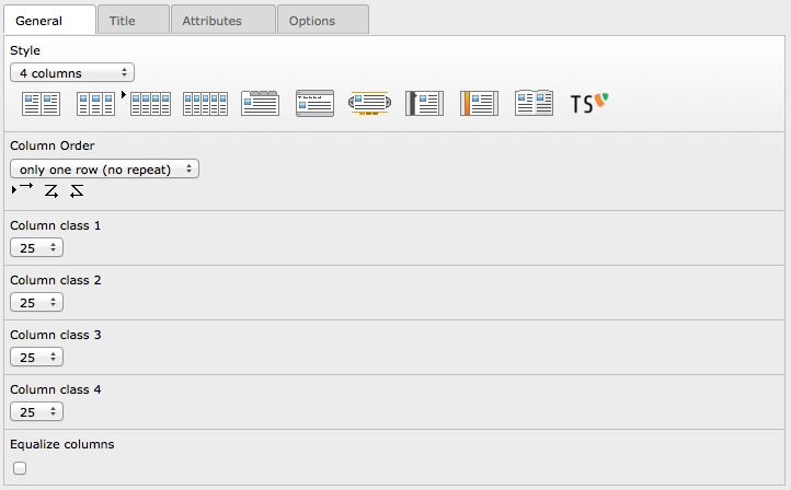
If you choose “2 columns” you have to select the “Column class 1” and the “Column class 2”. The sum of these values should be 100%. This applies to 3 and 4 columns also.
For 3 columns the following combinations are possible:
33 | 33 | 33
25 | 25 | 50
25 | 50 | 25
20 | 20 | 60
and so on...
This will generate, in normal configuration, classes to the content like in YAML:
class=”c33l” | class=”c33l” | class=”c33r”
The class name can be defined in constant editor by the integrator and will be wrapped with the number you choose.
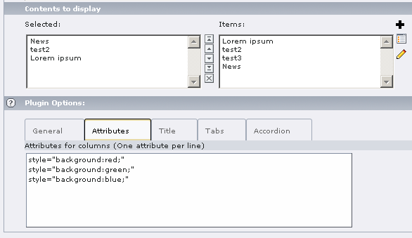
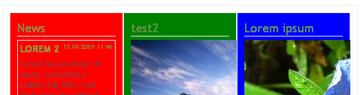
Attributes
You can define additional attributes to the contents. Go to the “Attributes”-tab and write one attribute per line.
It's possible to define multiple attributes per line:
style=”width: 20em;” class=”myclass”
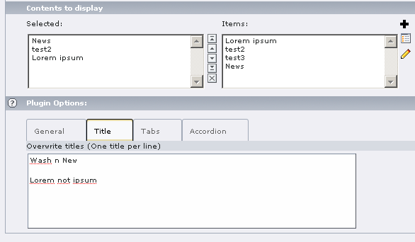
Overwrite Title
For “Tabs”, “Accordion”, “Slider”, “SlideDeck“, “easyAccordion”, “booklet”-style you can overwrite the titles by defining theme in “Overwrite titles”.
 This example would produce an output like this:
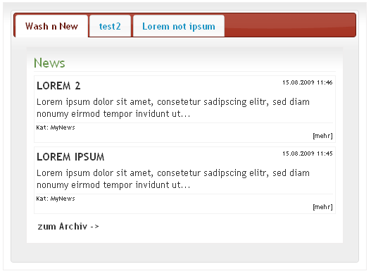 The second tab shows the title of the content, because only
filled lines will be taken to overwrite the title of the content.
The second tab shows the title of the content, because only
filled lines will be taken to overwrite the title of the content.
Options
Here you can define your own Javascript options.
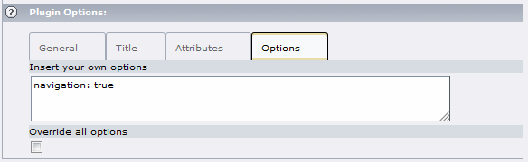
Be aware, that you have to know what you are doing!
See the following pages for possible options:
For “Tab”-style: http://jqueryui.com/demos/tabs/
For “Accordion”-style: http://jqueryui.com/demos/accordion/
For “Slider”-style: http://css-tricks.com/anythingslider-jquery- plugin/
For “SlideDeck”-style: http://www.slidedeck.com/usage- documentation/usage_available_options/
For “easyAccordion”: http://www.madeincima.eu/blog/jquery-plugin- easy-accordion/
For “booklet”: http://builtbywill.com/code/booklet/options
If you select the “override all options”, all defines options in the “General”-tab will be overridden by your options, elsewhere it will be appended to the other options defined in “General”-tab.
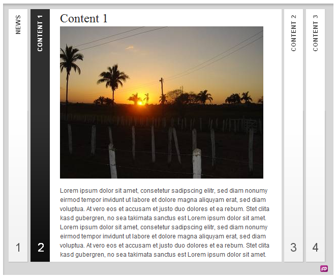
Tab
After you select “Tab”-style, the system ask you to reload the content.
After reload you can change the following options:
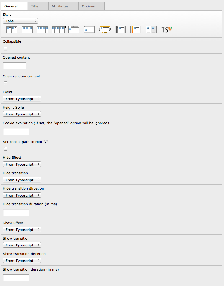
- “Collapsible”: You can “close” all tabs, if you click the active tab again
- “Opened content”: Defines the content witch is opened at startup. If define “0” no tab is active (closed at startup)
- “Open random content”: Check if you like to show the content randomly
- “Event”: Defines the event on witch the accordion will be opened (click or mouseover)
- “Height Style”: Defines how the contents height will be rendered (auto, fill or content)
- “Cookie expiration”: Defines the days to Keep the cookie
- “Set cookie path to root”: Set the domain for the cookie to “/”
- “Hide Effect”: Defines the effect to use for hide (none, fade, slide)
- “Hide Transition”: Configure your own animation (3 options: type, direction, duration)
- “Show Effect”: Defines the effect to use for show (none, fade, slide)
- “Show Transition”: Configure your own animation (3 options: type, direction, duration)
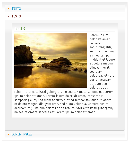
Accordion
After you select “Accordion”-style, the system ask you to reload the content.
After reload you can change the following options:
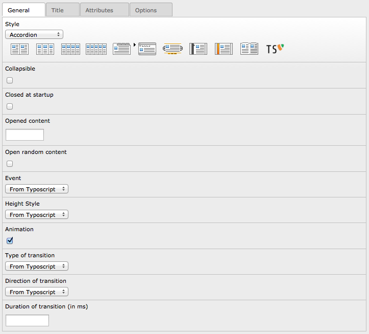
- “Collapsible”: If set, accordion will be collapsible
- “Closed at startup”: The accordion will be closed by default
- “Opened content”: Defines the content witch is opened at startup (will not work, if “Closed at startup” is active)
- “Open random content”: Check if you like to show the content randomly
- “Event”: Defines the event on witch the accordion will be opened (click or mouseover)
- “Height Style”: Defines how the contents height will be rendered (auto, fill or content)
- “Animation”: Activate the animation, settings can be done in “Transition”
- “Transition”: Configure your own animation (3 options: type, direction, duration)
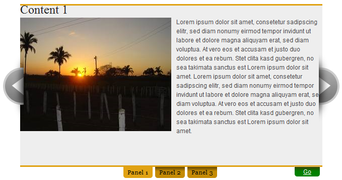
Slider
After you select “Slider”-style, the system ask you to reload the content.
After reload you can change the following options:
- “Width”: Defines the width of the slider
- “Height”: Defines the height of the slider
- “Resize contents”: If true, solitary images/objects in the panel will expand to fit the viewport
- “Theme”: Used theme for slider
- “Opened content”: Defines the content witch is opened at startup
- “Open random content”: Check if you like to show the content randomly
- “Change URL (hash tag)”: If set, the URL will change if you choose a panel
- “Build Arrows”: If true, builds the forwards and backwards buttons
- “Toggle Arrows”: If true, side navigation arrows will slide out on hovering & hide at other times
- “Show navigation”: If set, the panels will be displayed
- “Paneltext from title”: Override the paneltext with the title from content
- “Toggle Controls”: If true, slide in controls (navigation + play/stop button) on hover and slide change, hide at other times
- “Start autoplay”: If set, the autoplay button will be on
- “Pause on mouseover”: If set, the autoplay will pause when mouse over
- “Resume on video end”: If true & the slideshow is active & a youtube video is playing, it will pause the autoplay until the video is complete
- “Stop at end”: If true & the slideshow is active, the slideshow will stop on the last page
- “Play rtl”: If true, the slideshow will move right-to-left
- “Transition”: Configure your own animation (3 options: type, direction, duration)
- “Delay for autoplay (in ms)”: Delay in milliseconds before the the next content is shown
SlideDeck
After you select “SlideDeck”-style, the system ask you to reload the content.
After reload you can change the following options:
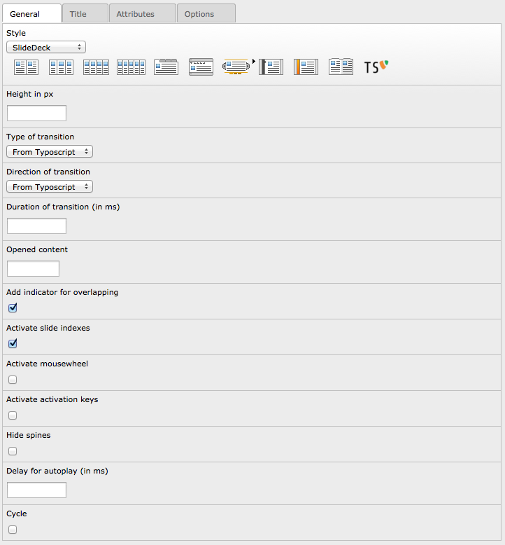
- “Height in px”: Sets the height of the SlideDeck
- “Transition”: Configure your own animation (3 options: type, direction, duration)
- “Opened content“: Defines the content witch is opened at startup
- “Add indicator for overlapping“: If set, there will be a overlaped indicator for active slide
- “Active slide indexes“: If set, every slide gets a number
- “Activate mousewheel“: If set, the slides can be moved with the mousewheel
- “Activate activation keys“: If set, every slide can be activated by a shortcut
- “Hide spine“: If set, the spines will not be displayed
- “Delay for autoplay (in ms)”: Delay in milliseconds before the the next content is shown
- “Cycle”: If set, the autoplay will start over after last slide
easyAccordion
After you select “easyAccordion”-style, the system ask you to reload the content.
After reload you can change the following options:
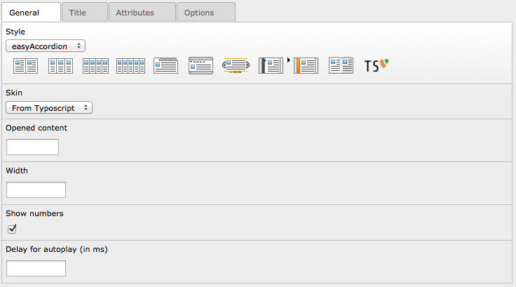
- “Skin”: Defines the used skin for this accordion
- “Opened content”: Defines the content witch is opened at startup
- “Width”: Sets the width of the accordion (the height is defined in css!)
- “Show numbers”: If set, the slide numbers will be displayed
- “Delay for autoplay (in ms)”: Delay in milliseconds before the the next content is shown
Booklet
After you select “booklet”-style, the system ask you to reload the content.
After reload you can change the following options:
- “Width”: Container width
- “Height”: Container height
- “Speed (in ms)”: Speed of the transition between pages
- “Starting page”: Index of the first page to be displayed
- “Direction right to left”: If set, the direction of the overall content organization will be right to left
- “Type of transition”: Type of transition ('swing', 'linear', 'Quad', 'Cubic', 'Quart', 'Quint', 'Sine', 'Expo', 'Circ', 'Back', 'Bounce' or 'Elastic')
- “Direction of transition”: Direction of transition ('In', 'Out' or 'InOut')
- “Page padding”: Padding for each page wrapper
- “Show page numbers”: Display page numbers on each page
- “Manual page turning”: Enables manual page turning, requires jQuery UI to function
- “Show shadows”: Display shadows on page animations
- “Booklet closed”: Start with the book "closed", will add empty pages to beginning and end of book
- “Show covers”: Used with "closed", makes first and last pages into covers, without page numbers (if enabled)
- “Center closed booklet”: Used with “closed”, makes book position in centre of container when closed
- “Use hash”: Enables navigation using a hash string, ex: #/page/1 for page 1, will affect all booklets with 'hash' enabled
- “Use keyboard”: Enables navigation with arrow keys (left: previous, right: next)
- “Autoplay”: Enables automatic navigation, requires “Delay for autoplay”
- “Delay for autoplay”: Amount of time between automatic page flipping
- “Activate overlay”: Enables navigation using a page sized overlay, when enabled links inside the content will not be clickable
- “Show arrows”: Adds arrows overlayed over the book edges
- “Hide arrows if mouseout”: Auto hides arrows when controls are not hovered
- “Hover effect”: Enables preview pageturn hover animation, shows a small preview of previous or next page on hover
Typoscript
After you select “typoscript”-style, the system ask you to reload the content.
All settings in the general-tab will be taken from typoscript, you cant change any settings in FlexForm
Administration
For administration, you can allow / disallow the following exclude fields for user:
Pagecontent: Contents to display
You are able to change the following options in configuration:
useStoragePidOnly
Property
useStoragePidOnly
Data type
boolean
Description
If set, only content can be choosen from the defined General Record Storage page
Default
1
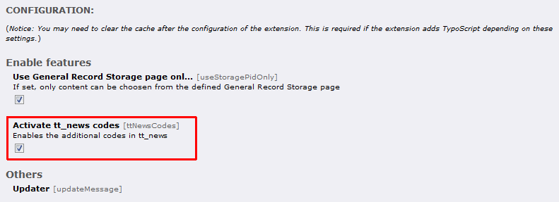
ttNewsCodes
Property
ttNewsCodes
Data type
boolean
Description
Enables the additional codes in tt_news
Default
0
frontendErrorMsg
Property
frontendErrorMsg
Data type
boolean
Description
If set, messages in case of missing templates are displayed in FE (Turn of in production)
Default
1
useSelectInsteadCheckbox
Property
useSelectInsteadCheckbox
Data type
boolean
Description
If set, most of checkboxes will turn into selectboxes, so you can choose "from TS"
Default
0
useOwnUserFuncForPages
Property
useOwnUserFuncForPages
Data type
boolean
Description
If set, you have to do the page rendering with a own userFunc
Default
0
openExternalLink
Property
openExternalLink
Data type
boolean
Description
If set, the external link in page-view will be opened
Default
0
showEmptyContent
Property
showEmptyContent
Data type
boolean
Description
If set, an empty content will be shown as well
Default
0
addBrowseLinks
Property
addBrowseLinks
Data type
boolean
Description
If set, there will be an additional tab in the link-browser
Default
0
tabSelectByHash
Property
tabSelectByHash
Data type
boolean
Description
If set, the tabs can be selected by hash-value in URL
Default
0
colPosOfIrreContent
Property
colPosOfIrreContent
Data type
integer
Description
Select the colPos where the tt_content will be saved in IRRE-view
Default
93
style.2column
Property
style.2column
Data type
boolean
Description
Enables the 2column-Style for the backend
Default
1
style.3column
Property
style.3column
Data type
boolean
Description
Enables the 3column-Style for the backend
Default
1
style.4column
Property
style.4column
Data type
boolean
Description
Enables the 4column-Style for the backend
Default
1
style.5column
Property
style.5column
Data type
boolean
Description
Enables the 5column-Style for the backend
Default
1
style.tab
Property
style.tab
Data type
boolean
Description
Enables the tab-Style for the backend
Default
1
style.accordion
Property
style.accordion
Data type
boolean
Description
Enables the accordion-Style for the backend
Default
1
style.slider
Property
style.slider
Data type
boolean
Description
Enables the slider-Style for the backend
Default
1
style.slidedeck
Property
style.slidedeck
Data type
boolean
Description
Enables the slidedeck-Style for the backend
Default
1
style.easyaccordion
Property
style.easyaccordion
Data type
boolean
Description
Enables the easyaccordion-Style for the backend
Default
1
style.booklet
Property
style.booklet
Data type
boolean
Description
Enables the booklet-Style for the backend
Default
1
style.typoscript
Property
style.typoscript
Data type
boolean
Description
Enable the typoscrip-Style for the backend
Default
0
classInner
Property
classInner
Data type
string
Description
Possible values to wrap in column classes
Default
,16,20,25,33,38,40, 50,60,62,66,75,80
anythingSliderThemeFolder
Property
anythingSliderThemeFolder
Data type
string
Description
Location of the themes folder of anythingSlider
Default
EXT:jfmulticontent/res/anythingslider/themes/
easyAccordionSkinFolder
Property
easyAccordionSkinFolder
Data type
string
Description
Location of the skin folder for easyAccordion
Default
EXT:jfmulticontent/res/easyaccordion/skins/
anythingSliderModes
Property
anythingSliderModes
Data type
string
Description
Possible values to use for AnythingSlider "mode"
Default
horizontal,vertical,fade
Page configuration
Your able to configure the available styles by pageTS.
mod.jfmulticontent {
  availableStyles = 2column,3column,tab
  classInner = 16,33,50
  anythingSliderModes = horizontal,vertical
}
In this case in the backend are only these three styles available:
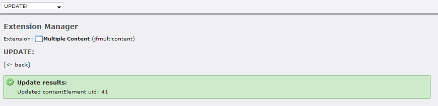
Updater
If you update from prior versions, you should go to the updater of this plugin to prevent problems.
After installing the extension, choose “UPDATE!” from the dropdown or use the link in the updater message box.
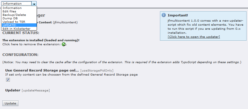
You will get a list of jobs to be done.
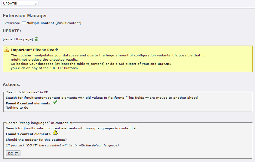
Please read the warning carefully!
To do the update of a job, you have to click the “DO IT” button.
Configuration
After installing the extension, you have to add the static “Multi content (jfmulticontent)” to your template.
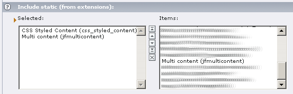
You can define the used JS-Library and the used template and CSS-file in the constant editor.
Reference
plugin.tx_jfmulticontent_pi1
jQueryNoConflict
Property
jQueryNoConflict
Data type
boolean
Description
Use jQuery in noConflict mode
Default
1
jsMinify
Property
jsMinify
Data type
boolean
Description
If set, the Javascript will be minified
Default
0
jsInline
Property
jsInline
Data type
boolean
Description
If set, the Javascript will be inserted into the inlineJS, after this, its possible to put it into externel files (config.removeDefaultJS = external)
Default
0
cssMinify
Property
cssMinify
Data type
boolean
Description
If set, the CSS will be minified
Default
0
templateFile
Property
templateFile
Data type
file
Description
Location of the used template
Default
EXT:jfmulticontent/res/tx_jfmulticontent_pi1.tmpl
templateFileJS
Property
templateFileJS
Data type
file
Description
Location of the used template for JS
Default
EXT:jfmulticontent/res/tx_jfmulticontent_pi1.js
cssFile
Property
cssFile
Data type
file
Description
CSS-File to include, if empty or file does not exist, the script will not be included
Default
EXT:jfmulticontent/res/tx_jfmulticontent_pi1.css
jQueryLibrary
Property
jQueryLibrary
Data type
file
Description
Location of the jQuery Lib, if empty or file does not exist, the script will not be included
Default
EXT:jfmulticontent/res/jquery/js/jquery-1.8.2.min.js
jQueryCookies
Property
jQueryCookies
Data type
file
Description
Location of jQuery Cookies, if empty or file does not exist, the script will not be included
Default
EXT:jfmulticontent/res/jquery/js/jquery.cookies.js
jQueryEasing
Property
jQueryEasing
Data type
file
Description
Location of the jQuery Easing, if empty or file does not exist, the script will not be included
Default
EXT:jfmulticontent/res/jquery/js/jquery.easing-1.3.js
jQueryMouseWheel
Property
jQueryMouseWheel
Data type
file
Description
Location of the Mousewheel
Default
EXT:jfmulticontent/res/jquery/js/jquery.mousewheel-3.0.6.min.js
jQueryUI
Property
jQueryUI
Data type
file
Description
Location of the jQuery UI, if empty or file does not exist, the script will not be included
Default
EXT:jfmulticontent/res/jquery/js/jquery-ui-1.9.1.custom.min.js
jQueryUIstyle
Property
jQueryUIstyle
Data type
file
Description
Location of the jQuery UI CSS, if empty or file does not exist, the script will not be included
Default
EXT:jfmulticontent/res/jquery/css/theme-1.9.1/jquery- ui-1.9.1.custom.css
sliderJS
Property
sliderJS
Data type
file
Description
Location of the anythingSlider JS-file, if empty or file does not exist, the script will not be included
Default
EXT:jfmulticontent/res/anythingslider/jquery.anythingslider-1.8.6.min. js
sliderJSvideo
Property
sliderJSvideo
Data type
file
Description
Location of the anythingSlider Video JS-file
Default
EXT:jfmulticontent/res/anythingslider/jquery.anythingslider-1.8.6.vide o.min.js
sliderJSfx
Property
sliderJSfx
Data type
file
Description
Location of the anythingSlider FX JS-file
Default
EXT:jfmulticontent/res/anythingslider/jquery.anythingslider-1.8.6.fx.m in.js
sliderCSS
Property
sliderCSS
Data type
file
Description
Location of the default anythingSlider CSS-File, if empty or file does not exist, the script will not be included
Default
EXT:jfmulticontent/res/anythingslider/style.css
sliderCSSie7
Property
sliderCSSie7
Data type
file
Description
Location of the anythingSlider CSS-File for IE7 and lower, if empty or file does not exist, the script will not be included
Default
EXT:jfmulticontent/res/anythingslider/style-ie.css
sliderCSSanimate
Property
sliderCSSanimate
Data type
file
Description
Location of the anythingSlider CSS-File for CSS3-Animation
Default
EXT:jfmulticontent/res/anythingslider/animate.css
slidedeckJS
Property
slidedeckJS
Data type
file
Description
Location of the SlideDeck JS-file
Default
EXT:jfmulticontent/res/slidedeck/jquery.slidedeck-1.3.2.min.js
slidedeckCSS
Property
slidedeckCSS
Data type
file
Description
Location of the SlideDeck CSS-File.
There are some skins available in “res/slidedeck/skins”, try theme to see the possibility’s of the SlideDeck
Default
EXT:jfmulticontent/res/slidedeck/skins/default/skin.css
easyaccordionJS
Property
easyaccordionJS
Data type
file
Description
Location of the Easy-Accordion JS-file
Default
EXT:jfmulticontent/res/easyaccordion/jquery.easyAccordion-0.1.js
easyaccordionCSS
Property
easyaccordionCSS
Data type
file
Description
Location of the Easy-Accordion CSS-File
Default
EXT:jfmulticontent/res/easyaccordion/skins/orange/style.css
bookletJS
Property
bookletJS
Data type
file
Description
Location of the Booklet JS-file
Default
EXT:jfmulticontent/res/booklet/jquery.booklet.1.4.0.min.js
bookletCSS
Property
bookletCSS
Data type
file
Description
Location of the Booklet CSS-file
Default
EXT:jfmulticontent/res/booklet/jquery.booklet.1.4.0.css
2columnClasses
Property
2columnClasses
Data type
string
Description
Wrap of the classname for 2 Column
This string will be used to wrap the selected classInner.
It is separated by the |*| and define in every part the wrap that is used in the column ([first column] |*| [second column] etc.)
Default
c|l |*| c|r
3columnClasses
Property
3columnClasses
Data type
string
Description
Wrap of the classname for 3 Column
This string will be used to wrap the selected classInner.
It is separated by the |*| and define in every part the wrap that is used in the column ([first column] |*| [second column] etc.)
Default
c|l |*| c|l |*| c|r
4columnClasses
Property
4columnClasses
Data type
string
Description
Wrap of the classname for 4 Column
This string will be used to wrap the selected classInner.
It is separated by the |*| and define in every part the wrap that is used in the column ([first column] |*| [second column] etc.)
Default
c|l |*| c|l |*| c|l |*| c|r
5columnClasses
Property
5columnClasses
Data type
string
Description
Wrap of the classname for 5 Column
This string will be used to wrap the selected classInner.
It is separated by the |*| and define in every part the wrap that is used in the column ([first column] |*| [second column] etc.)
Default
c|l |*| c|l |*| c|l |*| c|l |*| c|r
equalizeClass
Property
equalizeClass
Data type
-> stdWrap
Description
Defines the class to use when config.equalize is set, if you use the famous YAML framework, the subcolumns will have the same height, elsewhere you have to define the style by your own:
.equalize{
  overflow: visible;
  display: table;
  table-layout: fixed;
}
Default
equalize
columnWrap
Property
columnWrap
Data type
-> stdWrap
Description
Wrap for column based display.
You can define it like in TMENU with three states:
firstWrap |*| middleWrap |*| lastWrap
If you define just one stat, this state will be used for all contents.
If you define two states, it will use the first state for middle too.
Example:
plugin.tx_jfmulticontent_pi1.columnWrap {
  wrap = <div class="subcl">|</div> |*| <div class="subcl">|</div> |*| <div class="subcr">|</div>
}
Default
tabWrap
Property
tabWrap
Data type
-> stdWrap
Description
Wrap for tab based display (see above)
Default
tabKey
Property
tabKey
Data type
cObject
Description
Defines the key to use for tabs-style. The result will be stored in the marker ###TAB_KEY###
You're able to use some registered variables:
register:key – The key of the multicontent
register:content_id – The uid of the tt_content
register:id – The id of the actual tab (0,1,2,3 etc.)
register:title – The title of the tab
Example:
plugin.tx_jfmulticontent_pi1 {
  tabKey = TEXT
  tabKey {
    value = {register:key}-{register:id}
    insertData = 1
  }
}
Default
accordionWrap
Property
accordionWrap
Data type
-> stdWrap
Description
Wrap for accordion based display (see above)
Default
sliderWrap
Property
sliderWrap
Data type
-> stdWrap
Description
Wrap for slider based display (see above)
Default
slidedeckWrap
Property
slidedeckWrap
Data type
-> stdWrap
Description
Wrap for slidedeck based display (see above)
Default
easyaccordionWrap
Property
easyaccordionWrap
Data type
-> stdWrap
Description
Wrap for easyAccordion based display (see above)
Default
bookletWrap
Property
bookletWrap
Data type
-> stdWrap
Description
Wrap for booklet based display (see above)
Default
disableJs
Property
disableJs
Data type
boolean
Description
Disable the Javascript (for print)
Default
0
additionalMarkers / additionalContentMarkers
Property
additionalMarkers / additionalContentMarkers
Data type
Description
Here you can define your marks comma seperated, every mark will be replaced with the definition in additionalMarkerConf.
The used string have to be in upper case in your template.
####CONTENTTITLE##
Example:
plugin.tx_jfmulticontent_pi1 {
  additionalMarkers = contentmarker
  additionalContentMarkers = itemmarker
}
Default
additionalMarkerConf
Property
additionalMarkerConf
Data type
Description
The configuration of the used Marks, here you can define the TS to use for every mark defined in additionalMarkers or additionalContentMarkers
Example:
plugin.tx_jfmulticontent_pi1 {
  additionalMarkerConf {
    contentmarker = TEXT
    contentmarker {
      field = header
      fieldRequired = header
      if.equals.field = header_layout
      if.value = 100
      if.negate = 1
      wrap = <span> | </span>
    }
    itemmarker = RECORDS
    itemmarker {
      source.data = register:content_id
      tables = tt_content
      dontCheckPid = 1
      conf.tt_content = TEXT
      conf.tt_content {
        field = header
        wrap = <p>Header: |</p>
      }
    }
  }
}
Default
config.*
Property
config.*
Data type
Description
Here you can optionally define the multicontent in TS to add it to the template
Default
config.contentKey
Property
config.contentKey
Data type
string
Description
Define the id of the element
Default
jfmulticontent_ts1
config.style
Property
config.style
Data type
string
Description
Define the used style when you define the plugin threw TS
'2column', '3column', '4column', '5column', 'tab', 'accordion', 'slider', 'typoscript'
Default
2column
config.columnOrder
Property
config.columnOrder
Data type
string
Description
Define the order of the column:
0 = no repeat
1 = left to right, top to down
2 = right to left, top to down
Default
config.column1
Property
config.column1
Data type
string
Description
Class value to use for column 1 will result in class=”c33l”
Default
50
config.column2
Property
config.column2
Data type
string
Description
Class value to use for column 2 will result in class=”c33l”
Default
50
config.column3
Property
config.column3
Data type
string
Description
Class value to use for column 3 will result in class=”c33l”
Default
config.column4
Property
config.column4
Data type
string
Description
Class value to use for column 4 will result in class=”c33l”
Default
config.equalize
Property
config.equalize
Data type
string
Description
If set, the equalizeClass will be inserted
Default
0
config.tabCollapsible
Property
config.tabCollapsible
Data type
boolean
Description
If set, tab will be collapsible
Default
0
config.tabOpen
Property
config.tabOpen
Data type
integer
Description
Defines the content witch is opened at startup. If 0 the tabs will be closed at startup (only if tabCookieExpires not set)
Default
1
config.tabRandomContent
Property
config.tabRandomContent
Data type
string
Description
Check if you like to show the content randomly
Default
0
config.tabEvent
Property
config.tabEvent
Data type
string
Description
Defines the event on witch the accordion will be opened ('click' or 'mouseover')
Default
config.tabHeightStyle
Property
config.tabHeightStyle
Data type
string
Description
Defines how the contents height will be rendered (auto, fill or content)
Default
auto
config.tabCookieExpires
Property
config.tabCookieExpires
Data type
integer
Description
Count of days, the cookie will be stored for selected tab.
If set, the tabOpen and tabRandomContent will be disabled
Default
config.tabCookieRoot
Property
config.tabCookieRoot
Data type
boolean
Description
If set, the cookie path will be set to “/” otherwise it will be set from URI
Default
0
config.tabHideEffect
Property
config.tabHideEffect
Data type
string
Description
Defines the effect to use for hide (none, fadeOut, slideUp)
Default
fadeOut
config.tabHideTransition
Property
config.tabHideTransition
Data type
string
Description
Type of transition ('swing', 'linear', 'Quad', 'Cubic', 'Quart', 'Quint', 'Sine', 'Expo', 'Circ', 'Back', 'Bounce' or 'Elastic')
Default
config.tabHideTransitiondir
Property
config.tabHideTransitiondir
Data type
string
Description
Direction of transition ('In', 'Out' or 'InOut')
Default
In
config.tabHideTransitionduration
Property
config.tabHideTransitionduration
Data type
integer
Description
Duration of transition in ms
Default
config.tabShowEffect
Property
config.tabShowEffect
Data type
string
Description
Defines the effect to use for show (none, fadeIn, slideDown)
Default
fadeIn
config.tabShowTransition
Property
config.tabShowTransition
Data type
string
Description
Type of transition ('swing', 'linear', 'Quad', 'Cubic', 'Quart', 'Quint', 'Sine', 'Expo', 'Circ', 'Back', 'Bounce' or 'Elastic')
Default
config.tabShowTransitiondir
Property
config.tabShowTransitiondir
Data type
string
Description
Direction of transition ('In', 'Out' or 'InOut')
Default
In
config.tabShowTransitionduration
Property
config.tabShowTransitionduration
Data type
integer
Description
Duration of transition in ms
Default
config.tabOptions
Property
config.tabOptions
Data type
string
Description
Define own options for tabs
Default
config.tabOptionsOverride
Property
config.tabOptionsOverride
Data type
boolean
Description
Define if the options defined above will override all other options or append to theme
Default
0
config.accordionCollapsible
Property
config.accordionCollapsible
Data type
boolean
Description
If set, accordion will be collapsible
Default
0
config.accordionClosed
Property
config.accordionClosed
Data type
boolean
Description
The accordion will be closed by default
Default
0
config.accordionOpen
Property
config.accordionOpen
Data type
integer
Description
Defines the content witch is opened at startup (will not work, if “Closed at startup” is active)
Default
1
config.accordionRandomContent
Property
config.accordionRandomContent
Data type
boolean
Description
Check if you like to show the content randomly
Default
0
config.accordionEvent
Property
config.accordionEvent
Data type
string
Description
Defines the event on witch the accordion will be opened ('click' or 'mouseover')
Default
config.accordionHeightStyle
Property
config.accordionHeightStyle
Data type
string
Description
Defines how the contents height will be rendered (auto, fill or content)
Default
auto
config.accordionAnimate
Property
config.accordionAnimate
Data type
boolean
Description
If set, the accordion will be animated
Default
1
config.accordionTransition
Property
config.accordionTransition
Data type
string
Description
Type of transition ('swing', 'linear', 'Quad', 'Cubic', 'Quart', 'Quint', 'Sine', 'Expo', 'Circ', 'Back', 'Bounce' or 'Elastic')
Default
config.accordionTransitiondir
Property
config.accordionTransitiondir
Data type
string
Description
Direction of transition ('In', 'Out' or 'InOut')
Default
In
config.accordionTransitionduration
Property
config.accordionTransitionduration
Data type
integer
Description
Duration of transition in ms
Default
1000
config.accordionOptions
Property
config.accordionOptions
Data type
string
Description
Define own options for accordion
Default
config.accordionOptionsOverride
Property
config.accordionOptionsOverride
Data type
boolean
Description
Define if the options defined above will override all other options or append to theme
Default
0
config.sliderWidth
Property
config.sliderWidth
Data type
string
Description
Defines the width of the slider
Default
config.sliderHeight
Property
config.sliderHeight
Data type
string
Description
Defines the height of the slider
Default
config.sliderResizeContents
Property
config.sliderResizeContents
Data type
boolean
Description
If true, solitary images/objects in the panel will expand to fit the viewport
Default
0
config.sliderTheme
Property
config.sliderTheme
Data type
string
Description
Used theme for slider
Default
config.sliderOpen
Property
config.sliderOpen
Data type
integer
Description
Defines the content witch is opened at startup
Default
1
config.sliderRandomContent
Property
config.sliderRandomContent
Data type
boolean
Description
Check if you like to show the content randomly
Default
0
config.sliderHashTags
Property
config.sliderHashTags
Data type
boolean
Description
If set, the URL will change if you choose a panel
Default
0
config.sliderBuildArrows
Property
config.sliderBuildArrows
Data type
boolean
Description
If true, builds the forwards and backwards buttons
Default
1
config.sliderToggleArrows
Property
config.sliderToggleArrows
Data type
boolean
Description
If true, side navigation arrows will slide out on hovering & hide at other times
Default
0
config.sliderStartStop
Property
config.sliderStartStop
Data type
boolean
Description
If set, the start/stop panel will be displayed
Default
1
config.sliderPanelFromHeader
Property
config.sliderPanelFromHeader
Data type
boolean
Description
Override the paneltext with the title from content
Default
0
config.sliderToggleControls
Property
config.sliderToggleControls
Data type
boolean
Description
If true, slide in controls (navigation + play/stop button) on hover and slide change, hide at other times
Default
0
config.sliderAutoStart
Property
config.sliderAutoStart
Data type
boolean
Description
If set, the autoplay button will be on
Default
0
config.sliderPauseOnHover
Property
config.sliderPauseOnHover
Data type
boolean
Description
If set, the autoplay will pause when mouse over
Default
0
config.sliderResumeOnVideoEnd
Property
config.sliderResumeOnVideoEnd
Data type
boolean
Description
If true & the slideshow is active & a youtube video is playing, it will pause the autoplay until the video is complete
Default
0
config.sliderAllowRapidChange
Property
config.sliderAllowRapidChange
Data type
boolean
Description
If true, allow rapid changing of the active pane, instead of ignoring activity during animation
Default
0
config.sliderStopAtEnd
Property
config.sliderStopAtEnd
Data type
boolean
Description
If true & the slideshow is active, the slideshow will stop on the last page
Default
0
config.sliderPlayRtl
Property
config.sliderPlayRtl
Data type
boolean
Description
If true, the slideshow will move right-to-left
Default
0
config.sliderTransition
Property
config.sliderTransition
Data type
string
Description
Type of transition ('swing', 'linear', 'Quad', 'Cubic', 'Quart', 'Quint', 'Sine', 'Expo', 'Circ', 'Back', 'Bounce' or 'Elastic')
Default
swing
config.sliderTransitiondir
Property
config.sliderTransitiondir
Data type
string
Description
Direction of transition ('In', 'Out' or 'InOut')
Default
In
config.sliderTransitionduration
Property
config.sliderTransitionduration
Data type
integer
Description
Duration of transition in ms
Default
1000
config.sliderAutoplay
Property
config.sliderAutoplay
Data type
boolean
Description
Autoplay at start
Default
0
config.sliderOptions
Property
config.sliderOptions
Data type
string
Description
Define own options for slider
Default
config.sliderOptionsOverride
Property
config.sliderOptionsOverride
Data type
boolean
Description
Define if the options defined above will override all other options or append to theme
Default
0
config.slidedeckHeight
Property
config.slidedeckHeight
Data type
integer
Description
Sets the height of the SlideDeck
Default
300
config.slidedeckTransition
Property
config.slidedeckTransition
Data type
string
Description
Type of transition ('swing', 'linear', 'Quad', 'Cubic', 'Quart', 'Quint', 'Sine', 'Expo', 'Circ', 'Back', 'Bounce' or 'Elastic')
Default
swing
config.slidedeckTransitiondir
Property
config.slidedeckTransitiondir
Data type
string
Description
Direction of transition ('In', 'Out' or 'InOut')
Default
config.slidedeckTransitionduration
Property
config.slidedeckTransitionduration
Data type
integer
Description
Duration of transition in ms
Default
500
config.slidedeckStart
Property
config.slidedeckStart
Data type
integer
Description
Defines the content witch is opened at startup
Default
1
config.slidedeckActivecorner
Property
config.slidedeckActivecorner
Data type
boolean
Description
If set, there will be a overlaped indicator for active slide
Default
1
config.slidedeckIndex
Property
config.slidedeckIndex
Data type
boolean
Description
If set, every slide gets a number
Default
1
config.slidedeckScroll
Property
config.slidedeckScroll
Data type
boolean
Description
If set, the slides can be moved with the mousewheel
Default
0
config.slidedeckKeys
Property
config.slidedeckKeys
Data type
boolean
Description
If set, every slide can be activated by a shortcut
Default
0
config.slidedeckHidespines
Property
config.slidedeckHidespines
Data type
boolean
Description
If set, the spines will not be displayed
Default
0
config.slidedeckOptions
Property
config.slidedeckOptions
Data type
string
Description
Define own options for slidedeck
Default
config.slidedeckOptionsOverride
Property
config.slidedeckOptionsOverride
Data type
boolean
Description
Define if the options defined above will override all other options or append to theme
Default
0
config.easyaccordionSkin
Property
config.easyaccordionSkin
Data type
string
Description
Define the used skin
Default
orange
config.easyaccordionOpen
Property
config.easyaccordionOpen
Data type
integer
Description
Defines the content witch is opened at startup
Default
1
config.easyaccordionWidth
Property
config.easyaccordionWidth
Data type
integer
Description
The width of the accordion in pixel
Default
600
config.easyaccordionSlideNum
Property
config.easyaccordionSlideNum
Data type
boolean
Description
If set, the slide numbers will be displayed
Default
1
config.easyaccordionOptions
Property
config.easyaccordionOptions
Data type
string
Description
Define own options for easyaccordion
Default
config.easyaccordionOptionsOverride
Property
config.easyaccordionOptionsOverride
Data type
boolean
Description
Define if the options defined above will override all other options or append to theme
Default
0
config.bookletWidth
Property
config.bookletWidth
Data type
integer
Description
Container width
Default
600
config.bookletHeight
Property
config.bookletHeight
Data type
integer
Description
Container height
Default
400
config.bookletSpeed
Property
config.bookletSpeed
Data type
integer
Description
Speed of the transition between pages
Default
1000
config.bookletStartingPage
Property
config.bookletStartingPage
Data type
integer
Description
Index of the first page to be displayed
Default
0
config.bookletRTL
Property
config.bookletRTL
Data type
boolean
Description
If set, the direction of the overall content organization will be right to left
Default
0
config.bookletTransition
Property
config.bookletTransition
Data type
string
Description
Type of transition ('swing', 'linear', 'Quad', 'Cubic', 'Quart', 'Quint', 'Sine', 'Expo', 'Circ', 'Back', 'Bounce' or 'Elastic')
Default
config.bookletTransitiondir
Property
config.bookletTransitiondir
Data type
string
Description
Direction of transition ('In', 'Out' or 'InOut')
Default
config.bookletPagePadding
Property
config.bookletPagePadding
Data type
integer
Description
Padding for each page wrapper
Default
10
config.bookletPageNumbers
Property
config.bookletPageNumbers
Data type
boolean
Description
Display page numbers on each page
Default
1
config.bookletManual
Property
config.bookletManual
Data type
boolean
Description
Enables manual page turning, requires jQuery UI to function
Default
0
config.bookletShadows
Property
config.bookletShadows
Data type
boolean
Description
Display shadows on page animations
Default
1
config.bookletClosed
Property
config.bookletClosed
Data type
boolean
Description
Start with the book "closed", will add empty pages to beginning and end of book
Default
0
config.bookletCovers
Property
config.bookletCovers
Data type
boolean
Description
Used with "closed", makes first and last pages into covers, without page numbers (if enabled)
Default
0
config.bookletAutoCenter
Property
config.bookletAutoCenter
Data type
boolean
Description
Used with “closed”, makes book position in centre of container when closed
Default
config.bookletHash
Property
config.bookletHash
Data type
boolean
Description
Enables navigation using a hash string, ex: #/page/1 for page 1, will affect all booklets with 'hash' enabled
Default
0
config.bookletKeyboard
Property
config.bookletKeyboard
Data type
boolean
Description
enables navigation with arrow keys
(left: previous, right: next)
Default
0
config.bookletAuto
Property
config.bookletAuto
Data type
boolean
Description
Enables automatic navigation, requires “Delay for autoplay”
Default
0
config.bookletDelay
Property
config.bookletDelay
Data type
integer
Description
Amount of time between automatic page flipping
Default
5000
config.bookletOverlays
Property
config.bookletOverlays
Data type
boolean
Description
Enables navigation using a page sized overlay, when enabled links inside the content will not be clickable
Default
1
config.bookletArrows
Property
config.bookletArrows
Data type
boolean
Description
Adds arrows overlayed over the book edges
Default
0
config.bookletArrowsHide
Property
config.bookletArrowsHide
Data type
boolean
Description
Auto hides arrows when controls are not hovered
Default
0
config.bookletHovers
Property
config.bookletHovers
Data type
boolean
Description
Enables preview pageturn hover animation, shows a small preview of previous or next page on hover
Default
1
config.bookletOptions
Property
config.bookletOptions
Data type
string
Description
Define own options for booklet
Default
config.bookletOptionsOverride
Property
config.bookletOptionsOverride
Data type
boolean
Description
Define if the options defined above will override all other options or append to theme
Default
0
config.delayDuration
Property
config.delayDuration
Data type
integer
Description
Delay in milliseconds before the the next content is shown
Default
0
config.autoplayContinuing
Property
config.autoplayContinuing
Data type
boolean
Description
If this option is enabled, the autoplay will continue after interaction from the user
Default
0
config.autoplayCycle
Property
config.autoplayCycle
Data type
boolean
Description
If set, the autoplay will start over after last slide
Default
0
views.[view].title
Property
views.[view].title
Data type
cObj
Description
cObj to render title for specified view
Default
TEXT
views.[view].content
Property
views.[view].content
Data type
cObj
Description
cObj to render content for specified view
Default
RECORDS
views.[view].rel
Property
views.[view].rel
Data type
cObj
Description
cObj to render rel for specified view
Default
COA
contents.*.title
Property
contents.*.title
Data type
cObj
Description
cObj for the title
Default
COA
contents.*.content
Property
contents.*.content
Data type
cObj
Description
cObj for the content
Default
COA
contents.*.id
Property
contents.*.id
Data type
stdWrap
Description
ID to use in the mark CONTENT_ID
Default
[tsref:(cObject).plugin.tx_jfmulticontent_pi1]
FAQ
((generated))
I like to add some scripts / css -files globally, is this possible?
If you like to add the library globally you can set an empty string to the values. Only existing files will be included!
This will work for cssFile, jQueryLibrary, jQueryCookies, jQueryEasing, jQueryUI, jQueryUIstyle, sliderJS and sliderCSS.
I have additional slides in SlideDeck-Style / easyAccordion, why?
Slidedeck and easyAccordion uses dt/dd elements as markup. If there are dt/dd elements in you content, Slidedeck will interpret it as an additional slider. It appears, if you are using one image with caption in image/text. To solve this, you have to use this configuration:
tt_content.image.20.renderMethod = ul
How can I add my own views for my records?
There is a demo extension in TER where you can see, how to use the HOOK to add your own views:
http://typo3.org/extensions/repository/view/jfmulticontent_viewdemo/ current/
How can I change the quoted title to my needs?
You can override the language variable by using this TS:
plugin.tx_jfmulticontent_pi1._LOCAL_LANG.en {
  default_quote_title_template = Welcome to “###TITLE###” on ###ID###
  tab_quote_title_template = Welcome to “###TITLE###” on tab ###ID###
  accordion_quote_title_template = Welcome to “###TITLE###” on accordion ###ID###
}
How can I use the view “page” with TemplaVoila?
Because TemplaVoila stores the used contents in XML, its not possible to use normal TS. You have to know the Filed-Name of your column you want to display in jfmulticontent, heres an example for “field_feature” and “field_content_block_1”:
includeLibs.jfmulticontent = EXT:jfmulticontent/class.tx_jfmulticontent.php
plugin.tx_jfmulticontent_pi1 {
  views.page >
  views {
    page {
      content = COA
      content {
      10 = USER
        10 {
          userFunc = tx_jfmulticontent->getContentFromTemplavoilaField
          field = field_feature
          pageID.data = register:pid
          contentRender = RECORDS
          contentRender {
            tables = tt_content
            source.data = register:uid
            dontCheckPid = 1
          }
        }
        20 < .10
        20 {
          field = field_content_block_1
        }
      }
      title = TEXT
      title.data = register:page_title
    }
  }
}
This will render the featured field on top, followed by the content_block_1
register:pid is the page selected in the plugin, the register:uid is the content.uid on the selected page (the contentRender will be passed multiple).
There are all values from the page available in the registry, they are stored with the prefix “page_” (page_title, page_hidden)
To use this feature, you have to activate the option “useOwnUserFuncForPages” in configuration.
How can I use the title as a alternative to the generic key?
Normally the id of the tabs looks something like “jfmulticontent_c115-1”. If you like to use the title you have to add the following typoscript:
plugin.tx_jfmulticontent_pi1 {
  tabKey = TEXT
  tabKey {
    data = register:title
    stdWrap {
      case = lower
      split {
        token.char = 32
        cObjNum = 1
        1.current = 1
        1.wrap = |_
      }
      substring = 0,-1
      wrap = |
    }
  }
}
How can I remove all headers of the contents?
The headers are generated equally CSC, if you like to remove them, you can use the follow TS:
plugin.tx_jfmulticontent_pi1.views.content.content.conf.tt_content < tt_content
plugin.tx_jfmulticontent_pi1.views.content.content.conf.tt_content {
  header.10 >
  text.10 >
  image.10 >
  textpic.10 >
  bullets.10 >
  table.10 >
  uploads.10 >
  multimedia.10 >
  swfobject.10 >
  qtobject.10 >
  media.10 >
  mailform.10 >
  search.10 >
  menu.10 >
  list.10 >
}
Additional tt_news codes
To add the tt_news codes, its very important, that you copy the templatecode from EXT:jfmulticontent/pi1/tt_news.tmpl into your tt_news template. You can change the three new template sections as you do normally in tt_news (Marker and subsets).
 Enable the feature „Activate tt_news codes“ in the
configuration of this extension.
Enable the feature „Activate tt_news codes“ in the
configuration of this extension.
After the configuration is done, you are able to choose three new codes in the backend.
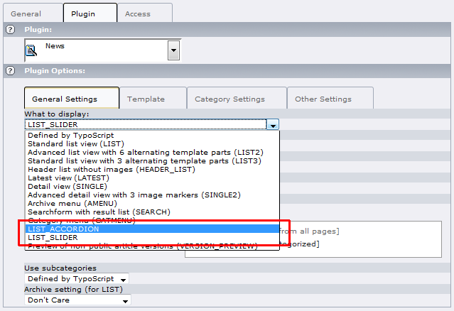
I'd like to translate these items, but there is a small bug in tt_news ( http://bugs.typo3.org/view.php?id=14417 ) so it is called „LIST_ACCORDION”, „LIST_SLIDER”, „LIST_SLIDEDECK” and “LIST_EASYACCORDION”, perhaps in a later version of tt_news it will be possible to translate...
Known problems
- Report bugs at http://forge.typo3.org/projects/show/extension- jfmulticontent
- In “Tab” and “Accordion”-style, the title will be displayed twice (once in tab and once in content). You can turn off this by using the type “hidden” in the “secondary options”
To-Do list
- Report features at http://forge.typo3.org/projects/show/extension- jfmulticontent
- Add continuing to accordion autoplay
ChangeLog
0.0.1
Version
0.0.1
Changes
Initial development
0.1.0
Version
0.1.0
Changes
Add “Overwrite title” to the flexform
0.2.0
Version
0.2.0
Changes
Add “Attributes” to the flexform, to define the attributes per content
0.3.0
Version
0.3.0
Changes
Add new feature to add own classes to the drop down “Colomn class x”
0.3.1
Version
0.3.1
Changes
Add configuration “Use General Record Storage page only”, to turn on / off the General Record Storage
0.3.2
Version
0.3.2
Changes
jquery-ui with minimal configuration / Use of the t3jquery extension
0.4.0
Version
0.4.0
Changes
Add easing to accordion style
0.4.1
Version
0.4.1
Changes
Update the documentation
0.4.2
Version
0.4.2
Changes
Add new feature “Closed at startup” to accordion style
0.4.3
Version
0.4.3
Changes
Add new feature “Opened content” to accordion style
0.4.4
Version
0.4.4
Changes
Add new feature “Selected content” to tabs style
0.4.5
Version
0.4.5
Changes
Bugfix, if id's are defined in attributes (id=”xy”), the tabs style does not work
0.4.6
Version
0.4.6
Changes
Use the wrapJS from t3lib_div to add javascript script
0.5.0
Version
0.5.0
Changes
Add content wrap to static for better YAML compatibility / Fix the problem of displaying whole page in tab-style
0.5.1
Version
0.5.1
Changes
Add project to forge.typo3.org
0.5.2
Version
0.5.2
Changes
Bugfix #6159 and #6160
0.5.3
Version
0.5.3
Changes
Add pi1/locallang.xml (#6159)
0.6.0
Version
0.6.0
Changes
Add autoplay to tabs (#6187) / Add random content to tab and accordion (#6191)
0.6.1
Version
0.6.1
Changes
Bugfix for old typo versions (No such file or directory in t3lib/class.t3lib_div.php on line 4694)
0.6.2
Version
0.6.2
Changes
Add jQuery 1.4.1 / Add autoplay to accordion
0.6.3
Version
0.6.3
Changes
Fix problem when deleting or hiding used content (#6294)
0.6.4
Version
0.6.4
Changes
Changed maximum image number from 32 to 1000
0.6.5
Version
0.6.5
Changes
Fix #6466, go back to jQuery 1.3.2 until jQuery UI 1.8 is final
0.6.6
Version
0.6.6
Changes
Remove unused constant / Change the default for noConflict
0.6.7
Version
0.6.7
Changes
Fix Documentation
0.6.8
Version
0.6.8
Changes
Add the jsInFooter constant to move the javascript to the footer of the HTML
0.7.0
Version
0.7.0
Changes
Add the possibility to add own marker to the template (Thanks to Michael Hübe)
0.7.1
Version
0.7.1
Changes
Update jQuery UI to 1.8
0.7.2
Version
0.7.2
Changes
Remove the constant jQueryFixTabHref. Now autodetecs config.prefixLocalAnchors and fix the “whole page in tab”
0.8.0
Version
0.8.0
Changes
Add “Slider”-style
0.8.1
Version
0.8.1
Changes
Javascript optimizing / Add new documentation
1.0.0
Version
1.0.0
Changes
Refacture the backend (flexform). IMPORTANT! You have to run the Updater!
1.0.1
Version
1.0.1
Changes
Fix the markup of the slider template (Thanks to Raphael Zschorsch)
1.1.0
Version
1.1.0
Changes
Add opened content and random content to “Slider”-style
1.2.0
Version
1.2.0
Changes
Add multilingual support
1.3.0
Version
1.3.0
Changes
Panel text set from title (#7540)
1.4.0
Version
1.4.0
Changes
Add options, JS-template and jsMinify (#7625 and #7626)
1.4.1
Version
1.4.1
Changes
Add fallback for templates
1.4.2
Version
1.4.2
Changes
Write the JS-script in t3jquery if installed
1.4.3
Version
1.4.3
Changes
Bugfix for t3lib_extMgm::getExtensionVersion, only in Typo3 4.4.x
1.5.0
Version
1.5.0
Changes
Add some nice list codes to tt_news (see documentation!)
1.5.1
Version
1.5.1
Changes
Add new icons for mode / Add FAQ to the documentation
1.6.0
Version
1.6.0
Changes
Change style name, you have to run the UPDATER! / Add the TS configuration to the setup, its possible to add elements via typoscript now
1.6.1
Version
1.6.1
Changes
Fix the double insert of the scripts (#7913)
1.6.2
Version
1.6.2
Changes
In new contents, no additional fields where displayed
1.6.3
Version
1.6.3
Changes
Add cms_layout to backend / Fix some naming annoyances
1.7.0
Version
1.7.0
Changes
Add 5 Column style
1.8.0
Version
1.8.0
Changes
Add columnOrder to display multiple contents to a column / Fix problems with config.moveJsFromHeaderToFooter
1.8.1
Version
1.8.1
Changes
Add anythingSlider 1.3 / Fix the display problems in TV-Backend (cms_layout) / Remove PHP Warnings in tt_news_extend
1.8.2
Version
1.8.2
Changes
Fix the CSS of anythingSlider 1.3
1.8.3
Version
1.8.3
Changes
Fix problem with tt_news template (#9553)
1.8.4
Version
1.8.4
Changes
Prevent multiple JS-script output
1.8.5
Version
1.8.5
Changes
Move the template to the res folder
1.9.0
Version
1.9.0
Changes
Add „SlideDeck“-style (#9711)
1.9.1
Version
1.9.1
Changes
Add „SlideDeck“ for tt_news
1.9.2
Version
1.9.2
Changes
Moved the classInner to ext_conf_template.txt
1.9.3
Version
1.9.3
Changes
Add jQuery 1.8.5 / Fix focus problem in accordion (#9873)
1.9.4
Version
1.9.4
Changes
Disable alert in case of missing template (#9899)
1.9.5
Version
1.9.5
Changes
Use pageRenderer for script include
1.10.0
Version
1.10.0
Changes
Add easyAccordion sponsored by http://www.made-in- nature.de/typo3-agentur.html
1.10.1
Version
1.10.1
Changes
Small bug fix
1.10.2
Version
1.10.2
Changes
Add easyAccordion to tt_news / Fix leading zero's (#10186)
1.11.0
Version
1.11.0
Changes
Update anythingSlider to 1.4.5. Markup has changed! Change templates if you use own!
1.12.0
Version
1.12.0
Changes
Changed the max characters for imagewith and imageheight to 16 caracters (#10114) / Restrict selection by pageconfig (#10302)
1.12.1
Version
1.12.1
Changes
Add jQuery 1.4.3 / Fix problem with classInner
1.12.2
Version
1.12.2
Changes
Fix documentation classInner / Add availableStyles to plugin configuration / Add equalize to sub columns
1.12.3
Version
1.12.3
Changes
Update anythingSlider to version 1.4.7 / Add new marker CONTENT_ID
2.0.0
Version
2.0.0
Changes
Add “booklet” sponsored by http://www.made-in- nature.de/typo3-agentur.html / Changed the configuration, if you have changed the availableStyles, you have do it again!
2.1.0
Version
2.1.0
Changes
Add useSelectInsteadCheckbox to select „from TS“
2.1.1
Version
2.1.1
Changes
Add “opened content” to easyAccordion (#11031) / Fix easyAccordion for Opera (#11784)
2.1.2
Version
2.1.2
Changes
Update jQuery UI to 1.8.9 / Update anythingSlider to 1.5.6.3 / Update slideDeck to 1.2.1
2.1.3
Version
2.1.3
Changes
Add support for TYPO3 4.5 / Add jQuery 1.4.4
2.2.0
Version
2.2.0
Changes
Add jQuery 1.5.0 / Add cookie to tabs (#13031)
2.2.1
Version
2.2.1
Changes
Fix the HTML in easyAccordion / Fix XHTML error in booklet / Add jQuery 1.5.1 / Add jQuery UI 1.8.10 / Add anythingslider 1.5.7.3
2.2.2
Version
2.2.2
Changes
Add exclude to all flexform-fields / Add jQuery 1.5.2 / Add Slidedeck 1.2.2 for IE9 compatibility / Fix easyAccordion for IE9
2.3.0
Version
2.3.0
Changes
Fix updater link for Typo3 4.5 / Add page view (#25957) / Add HOOK for additional views (#25861)
2.3.1
Version
2.3.1
Changes
Fix the flexform data extraction (#26163) / Add isActive to view-HOOK
2.4.0
Version
2.4.0
Changes
Remove unused scripts / Fix YAML subc classes (#26782) / Add jQuery 1.6.1 / Add jQuery UI 1.8.13 / Add anythingSlider 1.5.12 / Add booklet 1.2.0
2.4.1
Version
2.4.1
Changes
Fix the Booklet-Style documentation / Add jQuery 1.6.2 / Add jQuery UI 1.8.14 / Add anythingSlider 1.5.21 / Add SlideDeck 1.2.5 / Fix jsInFooter / Convert linefeed to Unix
2.5.0
Version
2.5.0
Changes
Add IRRE for content elements (#28976) / Add anythingSlider 1.7.10 (#29010) / Add jQuery Mousewheel 3.0.4 / Add jQuery UI 1.8.16 / The cssFile will be included last (THX to Jean-Francois De Locht)
2.5.1
Version
2.5.1
Changes
Fix style problem when entering numeric values in Slider width and height (#29424) / Add anythingSlider 1.7.12 / Add class to render page data / Add IE Hacks for Slider-Style
2.5.2
Version
2.5.2
Changes
CEO optimizing for tab and accordion (title attribute) / Add page-view for templavoila (#30172) / Add path to cookie in Tab-Style (#30410)
2.5.3
Version
2.5.3
Changes
Fix documentation / Add jQuery 1.6.4
2.5.4
Version
2.5.4
Changes
Update Mousewheel to 3.0.5 / Update AnythingSlider to 1.7.13 / Update SlideDeck to 1.3.0 / Add Autoplay and StartStop option (#31453)
2.5.5
Version
2.5.5
Changes
Update jQuery to 1.7.1 / Update jQuery MouseWheel to 3.0.6 / Update AnythingSlider to 1.7.18 / Fix content selection for multilingual sites (tt_content.sys_language_uid IN (0, -1))
2.5.6
Version
2.5.6
Changes
Fix problem with cookies-path (#32140)
2.5.7
Version
2.5.7
Changes
Add openExternalLink to open external links in tab and accordion (#32432)
2.5.8
Version
2.5.8
Changes
Add showEmptyContent to define if empty contents will be shown (#32443)
2.5.9
Version
2.5.9
Changes
Change the opened content to provide closed at startup / Fix collapsible in tabs and accordion
2.6.0
Version
2.6.0
Changes
Hide the deleted and hidden content in IRRE / Add special options for styles
2.6.1
Version
2.6.1
Changes
Add jQuery UI 1.8.17
2.6.2
Version
2.6.2
Changes
Add new TS-Option to define the tabKey (#33484)
2.6.3
Version
2.6.3
Changes
Fix translation in IRRE (#33744) / Add AnythingSlider 1.7.24 / Add AnythingSlider Video / Add SlideDeck 1.3.2
2.6.4
Version
2.6.4
Changes
Fix cookie path for IE and Safari
2.6.5
Version
2.6.5
Changes
Fix “getContentFromTemplavoilaField”
2.7.0
Version
2.7.0
Changes
Fix the column display name for IRRE / Remove deprecated methods (#36599) / Add jQuery 1.7.2 / Add anythingSlider 1.8 / Add jQuery.Booklet 1.3.0
2.7.1
Version
2.7.1
Changes
Add jQuery UI 1.8.20 / Add anythingSlider 1.8.2 / Fix line breaks (UNIX)
2.7.2
Version
2.7.2
Changes
Fix t3lib_utility_VersionNumber::convertVersionNumberToInteger for older typo3 versions / Add new marker and register COLUMN_CLASSES (#36711) / Add new FAQ to the documentation (#35346)
2.7.3
Version
2.7.3
Changes
Fix some translation issues (#37275 and #35285)
2.7.4
Version
2.7.4
Changes
Fix order in IRRE (#37613) / Fix JS-Template (#37679)
2.8.0
Version
2.8.0
Changes
Fix the type for bookletJS and bookletCSS in constants / Add option sliderAllowRapidChange / Add jQuery UI 1.8.21
2.8.1
Version
2.8.1
Changes
Add jQuery 1.8.23 / Add Booklet 1.4.0 / Add new style typoscript to set the style by TS
2.8.2
Version
2.8.2
Changes
Turn off Javascript by Condition (#40943)
2.8.3
Version
2.8.3
Changes
Fix compatibility for Typo3 V6 (#41010)
2.8.4
Version
2.8.4
Changes
Fix multilingual issue (#39704) / Fix “Add new” in backend
2.8.5
Version
2.8.5
Changes
Add addBrowseLinks and tabSelectByHash to select link to a specific content in RTE (#26720)
2.8.6
Version
2.8.6
Changes
Fix the browser link select / Add tabSelectByHash for accordion-style
2.8.7
Version
2.8.7
Changes
Fix the sorting in IRRE (#37947)
2.9.0
Version
2.9.0
Changes
Change Lib to jQuery UI 1.9.1 Add jQuery 1.8.2 / If you use t3jquery, you have to change the jQuery UI Version to 1.9.x and generate the Lib again
2.9.1
Version
2.9.1
Changes
Fix the override of the tabs (#42449) / If you use t3jquery, you have to change the jQuery UI Version to 1.9.x and generate the Lib again
2.9.2
Version
2.9.2
Changes
Fix EasyAccordion in IE10 (#39719) / Add additionalContentMarkers to have them in content / Add jQuery 1.8.3 / Add jQuery UI 1.9.2
2.9.3
Version
2.9.3
Changes
Fix the anchor in tab when using baseUrl (#42905)
2.9.4
Version
2.9.4
Changes
Fix SlideDeck for Firefox 20
2.9.5
Version
2.9.5
Changes
Fix the Hash in URL (#42905)
2.9.6
Version
2.9.6
Changes
Add SlideDeck 1.4.3 / Add jQuery Booklet 1.4.2 / Add anythingSlider 1.9.0 / Add jQuery MouseWheel 3.1.3 / Add jQuery Cookie 1.3.1
2.9.7
Version
2.9.7
Changes
Fix compatibility for TYPO3 6.2 (#54154)
2.9.8
Version
2.9.8
Changes
Add Workspace compatibility (#54153)