DEPRECATION WARNING
This documentation is not using the current rendering mechanism and is probably outdated. The extension maintainer should switch to the new system. Details on how to use the rendering mechanism can be found here.
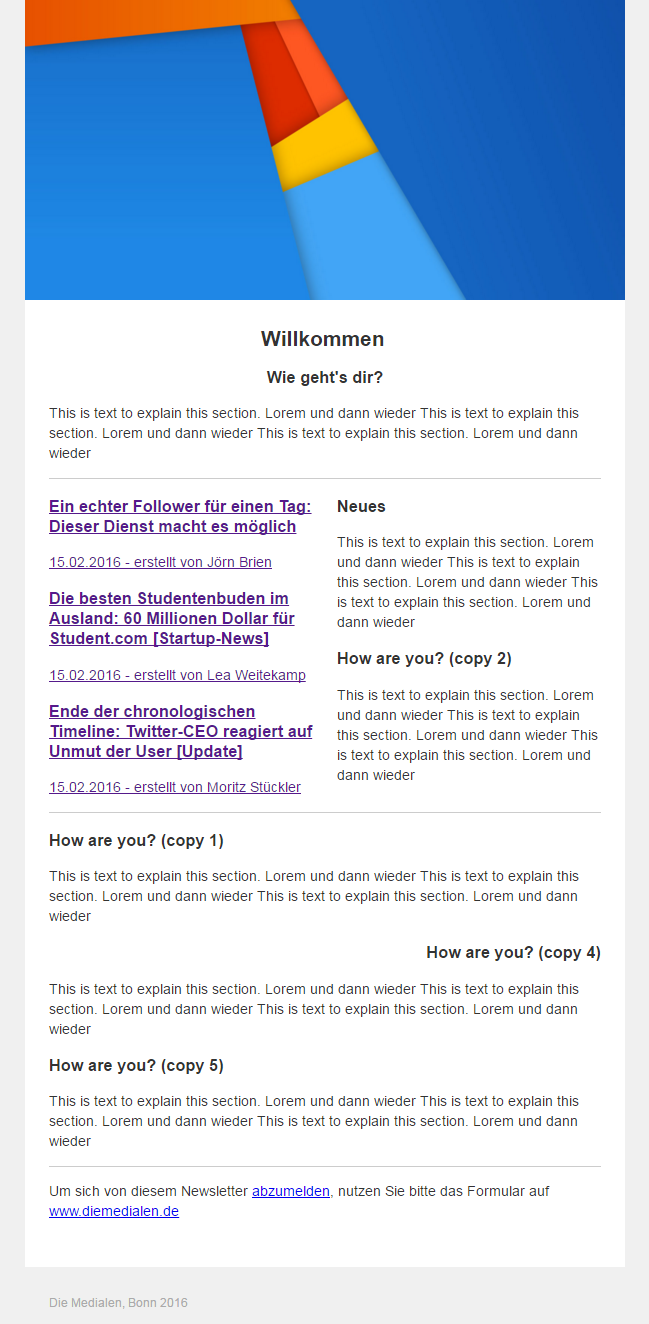
Set up Newsletter
Setup for multiple newsletters in 2 easy steps!
1. Include static template for newsletter pages
Newsletter Page (simplegrids) will create a standalone newsletter pagetype for a page and its children. It also adds the grid element Newsletter grid.
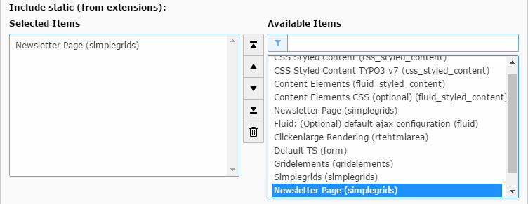
We recommend to include the direct_mail statics too, to simplify your newsletter process.
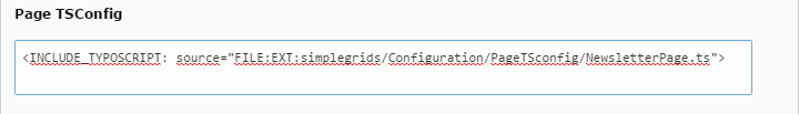
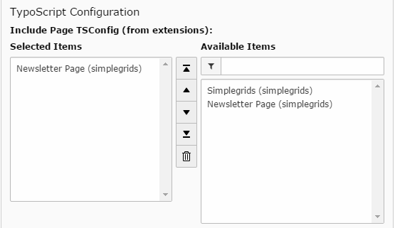
2. Include the Newsletter PageTS for TYPO3 Content elements
Important
In TYPO3 CMS Version 6.x, you have to include the PageTS Config in the page settings by the old way
Tip
In TYPO3 CMS Version 7.x, you can include the PageTS Config in the page settings by the new way
If you include our PageTS on newsletter pages, the html output of the used content elements is optimizes for Newsletter. It will also hide content elements with no relevanve for Newsletter and it adds extra Gridelements for Newsletter.
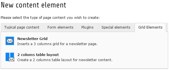
The following grid elements will be added
The following part will show you how to customize the newsletter templates
Customizing
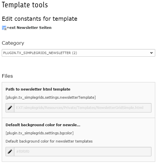
Easily change the newsletter template file in constant editor
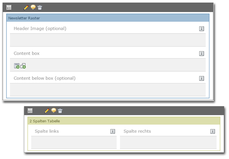
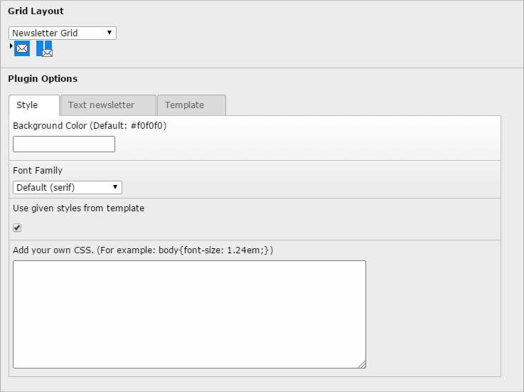
Configuration of the newsletter grid
Template Variables
| Variable | Title | Container-Variable | Type |
|---|---|---|---|
| tx_gridelements_view_column_101 | Header Image (optional) | data. | string |
| tx_gridelements_view_column_201 | Content box | data. | string |
| tx_gridelements_view_column_301 | Content below box (optional) | data. | string |
| flexform_backgroundColor | Background Color (Default: #f0f0f0) | data. | string |
| flexform_includeTemplateStyle | Use given styles from template | data. | boolean |
| flexform_ownStyle | Add your own CSS. | data. | string |
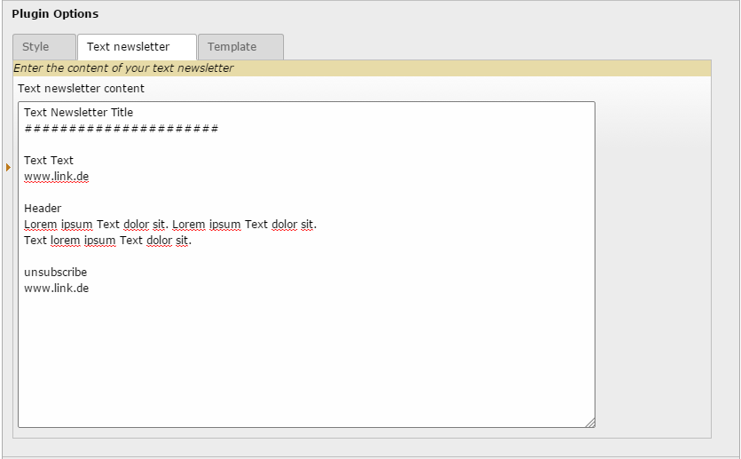
| flexform_textcontent | Text newsletter content | data. | string |
tx_gridelements_view_column_101
Property
tx_gridelements_view_column_101
Data type
string
Description
Contains the content of the header-image-column. Example usage is: {data.tx_gridelements_view_column_101 -> f:format.raw()}
tx_gridelements_view_column_201
Property
tx_gridelements_view_column_201
Data type
string
Description
Contains the main content of the content-box-column. Example usage is: {data.tx_gridelements_view_column_201 -> f:format.raw()}
tx_gridelements_view_column_301
Property
tx_gridelements_view_column_301
Data type
string
Description
Contains the main content of the content-below-box-column. Example usage is: {data.tx_gridelements_view_column_301 -> f:format.raw()}
flexform_backgroundColor
Property
flexform_backgroundColor
Data type
string
Description
This variable contains the color code from each newsletter-grid flexform. Example usage is: {data.flexform_backgroundColor}. You can use the variable {bgcolor} as fallback color code: {f:if(condition:'{data.flexform_backgroundColor}',then:data.flexform_backgroundColor,else:bgcolor)}
bgcolor
Property
bgcolor
Data type
string
Description
This variable contains the color code, what is defined in the contant editor. Example usage: {bgcolor}
flexform_includeTemplateStyle
Property
flexform_includeTemplateStyle
Data type
boolean
Description
This variable can include/exclude the template defined CSS styles. Example usage is: {f:if(condition:'{data.flexform_includeTemplateStyle}',then:'body {margin: 0;padding: 0;}')}
flexform_ownStyle
Property
flexform_ownStyle
Data type
string
Description
Contains the CSS styles you have entered in newsletter-grid flexform. Example usage is: {f:if(condition:'{data.flexform_ownStyle}',then:data.flexform_ownStyle)}
flexform_textcontent
Property
flexform_textcontent
Data type
string
Description
Contains the text-content for text-newsletter. Example usage is: <f:if condition="{textcontent}"><f:then>{data.flexform_textcontent}</f:then><f:else><!DOCTYPE html newsletter goes here>...