This documentation will be extended on a constant basis. If you have
problems understanding a certain aspect or if you notice something
missing, please contribute to improve it. This will help you as well as everyone else!
The
typo3/cms-form
extension is a system extension that provides a
flexible, extendable, and easy-to-use form framework. It incorporates interfaces
and functionality that allow editors, integrators and developers to build forms.
Non-technical editors can use the Content > Forms backend module.
They can create and manage forms using a simple drag and drop interface.
Forms can be previewed instantly.
Experienced integrators can build ambitious forms which are
stored in a site package. These forms can use powerful finishers and ship
localization files.
Developers can use the PHP API to create interfaces with conditional
form elements, register new validators and finishers, as well as create
custom form elements. Plenty of hooks allow form creation
and processing to be manipulated.
Form editor displaying a new form in the abstract view
Features list
Here are some of the features of the form framework:
form editor
fully customizable editor for building complex forms
replaceable and extendable form editor components
JS API to extend form editor
PHP API
entire forms via API
own renderers for form and/ or form elements
conditional steps, form elements and validators based on other form
elements
configuration
YAML as configuration and definition language including inheritance
and overrides
file based
behaviour and design of the frontend, plugin, and form editor can be
adapted for individual forms
'prototypes' can be used as boilerplate
form elements
own form elements possible
uploads handled as FAL objects
finishers
ships built-in finishers, like email, redirect, and save-to-database
own finishers possible
finisher configuration can be overridden in the form plugin
validators
own validators possible
miscellaneous
multiple languages support
multiple steps support
multiple forms on one page
built-in spam protection (honeypot)
Installation
This extension is part of the TYPO3 Core, but not installed by default.
Check whether you are already using the extension with:
composer show | grep form
Copied!
This should either give you no result or something similar to:
typo3/cms-form v12.4.11
Copied!
If it is not installed yet, use the composer require command to install
the extension:
composer require typo3/cms-form
Copied!
The given version depends on the version of the TYPO3 Core you are using.
Installation without Composer
In an installation without Composer, the extension is already shipped but might
not be activated yet. Activate it as follows:
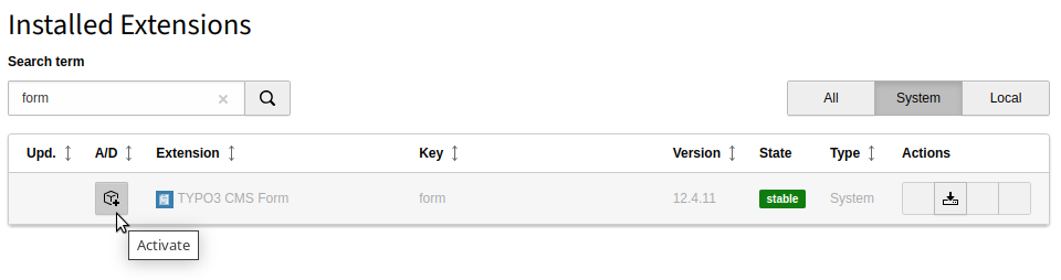
In the backend, navigate to the System > Extensions
module.
Click the Activate icon for the Form extension.
Extension manager showing Form extension
Quick Start for Editors
Are you an editor, the form extension has already been installed by your admin and you want
to get started quickly? Follow these steps:
Create a new form
Go to the Forms module and build a form using the form editor. With the
form editor you can quickly build appealing forms.
Insert the form on a page
The next step is inserting the form on the desired page(s).
Open the page module in the backend.
Go to your desired page.
Create a new content element of type "Form". You can find this
under the "Form Elements" tab.
Select your form on the "Plugin" tab.
Save the form content element.
Repeat steps 2 to 5 to insert the form on further pages.
View your form on your web site. Enjoy!
Quick Start for Integrators
Are you an integrator, you or your admin have already installed the form extension
and you want to get started quickly? Just follow these steps:
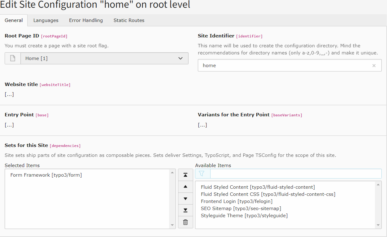
Include a site set
New in version 13.3
EXT:form contains a site set that can be included as described here.
Legacy TypoScript includes are still possible
for compability reasons but not recommended anymore.
Create a
translation
of your form if required by registering the .xlf file in your YAML configuration.
Insert your form on a page
The final step is inserting the form on the desired page(s).
Open the page module in the backend.
Go to the desired page.
Create a new content element of type "Form". You can find this
on the "Form Elements" tab.
Select your new form on the "Plugin" tab.
Select "Override finisher settings" on the
"Plugin" tab if necessary. Save the form content element.
Repeat steps 2 to 5 to insert the form on further pages.
View your form in the frontend. Enjoy!
Legacy TypoScript includes
Changed in version 13.3
It is recommended to include the TypoScript via site set. The legacy way
of using TypoScript includes, in the past also called "TypoScript sets"
is still possible for compatibility reasons but not recommended anymore.
Open the TypoScript module in the backend and edit your root
TypoScript record. Under the tab "Includes", ensure that "Fluid Content
Elements" (fluid_styled_content) and "Form" (form) are among the selected
items. Save the record.
Then continue with the steps above.
For Developers / API Reference
This chapter is a complete reference of the API of the form framework. It
mainly addresses your concerns as a developer.
All built-in finishers including their options and programmatic usage
is now described in: Ready-to-use finishers.
PSR-14 Events
EXT:form dispatches PSR-14 events at key points in the lifecycle of a form –
both in the backend form editor and during frontend rendering. These events
are the recommended extension point for developers; the legacy
$GLOBALS['TYPO3_CONF_VARS']['SC_OPTIONS']
hooks have been removed.
See also
The canonical, always-up-to-date reference for all EXT:form events lives
in the TYPO3 Core API documentation:
Dispatched before a renderable is removed from the form tree. Set
$event->preventRemoval = true
to abort the removal (the
event implements
StoppableEventInterface
).
Modify
$event->data
(e.g.
processedValue
) just before the
value of a single form element is handed over to Fluid, e.g. on a
summary page or in a mail template.
Enrich components with runtime data after the
FormState
has
been restored from the request (form state and form session are
both available at this point).
Dispatched by
FormPersistenceManager
after a YAML form
definition has been loaded from disk. Modify the definition globally
before it reaches the form factory.
Dispatched after the form definition validation configuration has
been built from the form editor setup. Add additional writable
property paths for custom inspector editor implementations.
Registering an event listener
Register a listener via the
#[AsEventListener]
PHP attribute:
<?phpdeclare(strict_types=1);
namespaceMyVendor\MyExtension\EventListener;
useTYPO3\CMS\Core\Attribute\AsEventListener;
useTYPO3\CMS\Form\Event\BeforeFormIsSavedEvent;
#[AsEventListener(
identifier: 'my-extension/before-form-is-saved',
)]
final readonly classMyFormEventListener{
publicfunction__invoke(BeforeFormIsSavedEvent $event): void{
// Enrich the form definition before it is persisted
$event->form['renderingOptions']['myCustomOption'] = 'value';
}
}
This chapter is the developer reference for the TYPO3 backend form editor.
It covers the JavaScript extension points and the data model used by the
editor's TypeScript modules.
Wraps the TYPO3 backend tree web component and bridges its
events to the publish/subscribe bus.
@typo3/form/backend/form-editor/mediator
—
Wires all publish/subscribe events to view-model actions.
Loaded automatically; replace via
dynamicJavaScriptModules.mediator
only when you need to
completely swap the event-wiring logic.
All modules communicate exclusively via a publish/subscribe bus
(
PublisherSubscriber
). Direct module-to-module calls are avoided
so that extension code can hook into any point without modifying core
files.
Registering a custom JavaScript module
Custom modules must export a
bootstrap
function. The form editor
calls this function once all built-in modules have loaded, passing the
central
FormEditor
application object as the sole argument.
The form editor uses a publish/subscribe bus for all cross-component
communication. Any custom JavaScript module can subscribe to these events
to extend or react to editor behaviour without patching core files.
Note
The module system is ES modules (ESM). The legacy AMD
define([…], function() {})
pattern from TYPO3 v11 and earlier is
no longer supported. Custom modules must use
export function bootstrap(formEditorApp)
.
See Registering a custom JavaScript module.
The order in which subscribers receive an event is not guaranteed.
Subscribers cannot pass data to each other. All event handlers must
be designed without assumptions about execution order.
A form element was clicked in the validation-error dialog.
Event reference
view/ready
Published once all additional view-model modules registered via
dynamicJavaScriptModules.additionalViewModelModules
have
bootstrapped. EXT:form uses this event to remove the loading indicator
and finish editor initialisation. This is the earliest safe point to
interact with the fully wired editor.
Arguments
none
exportfunctionbootstrap(formEditorApp) {
formEditorApp.getPublisherSubscriber().subscribe('view/ready', () => {
// Safe to call any formEditorApp API here.
});
}
Copied!
core/ajax/saveFormDefinition/success
Published after the form definition was saved successfully. EXT:form
shows a success flash message, updates the in-memory form definition
and re-renders all components.
Arguments
Index
Type
Description
args[0]
{ status: string, formDefinition: object }
Response payload;
formDefinition
is the saved definition.
core/ajax/saveFormDefinition/error
Published when the save Ajax request returns a server-side error.
Arguments
Index
Type
Description
args[0]
{ status: string, message: string, code: number }
Error details from the server.
core/ajax/renderFormDefinitionPage/success
Published after the preview Ajax request returns successfully. EXT:form
uses this to display the rendered form HTML in the preview stage.
Arguments
Index
Type
Description
args[0]
string
Rendered HTML of the current form page.
args[1]
number
Zero-based index of the rendered page.
core/ajax/error
Published when any Ajax request (save or preview render) fails at the
HTTP level. EXT:form shows an error flash message and displays the raw
error in the preview area.
Arguments
Index
Type
Description
args[0]
string
HTTP status text (e.g. 'Internal Server Error').
args[1]
string
Raw response body.
core/applicationState/add
Published every time an action (add / remove / move element or
collection element) is pushed onto the undo/redo stack. EXT:form uses
this to enable or disable the undo/redo buttons.
Arguments
Index
Type
Description
args[0]
ApplicationState
Snapshot of the application state that was just pushed.
args[1]
number
Current stack pointer position (0-based).
args[2]
number
Total number of entries in the undo/redo stack.
core/currentlySelectedFormElementChanged
Published at the end of
formEditorApp.setCurrentlySelectedFormElement()
.
All components that need to react to a selection change (inspector, stage,
tree highlight) subscribe to this event.
Arguments
Index
Type
Description
args[0]
FormElement
The newly selected FormElement model.
core/formElement/somePropertyChanged
Published by the FormElement model whenever a property is written via
set()
. EXT:form uses this to keep the tree labels, stage and
inspector in sync. It is also the mechanism behind
FormElement.on().
Arguments
Index
Type
Description
args[0]
string
Dot-separated property path that was written.
args[1]
unknown
New value.
args[2]
unknown
Previous value.
args[3]
string | undefined
__identifierPath
of the element whose property changed.
Published after a new form element has been added to the form definition
tree. EXT:form selects the new element and re-renders tree, stage and
inspector.
Arguments
Index
Type
Description
args[0]
FormElement
The newly inserted FormElement model.
view/formElement/moved
Published after a form element has been moved within the tree. EXT:form
does not add additional behaviour here by default.
Arguments
Index
Type
Description
args[0]
FormElement
The moved FormElement model.
view/formElement/removed
Published after a form element has been removed. EXT:form selects the
parent element and re-renders tree, stage and inspector.
Arguments
Index
Type
Description
args[0]
FormElement
The parent FormElement model of the deleted element.
view/collectionElement/new/added
Published after a new validator or finisher has been created and added to
the form definition. EXT:form re-renders the inspector.
Arguments
Index
Type
Description
args[0]
string
Identifier of the new collection element (e.g. 'NotEmpty').
args[1]
string
Collection name: 'validators' or 'finishers'.
args[2]
FormElement
The owning form element.
args[3]
object
Full configuration object of the added collection element.
args[4]
string
Identifier of the reference element (inserted before/after).
view/collectionElement/moved
Published after a validator or finisher has been reordered. EXT:form
re-renders the inspector.
Arguments
Index
Type
Description
args[0]
string
Identifier of the moved element.
args[1]
string
Relative position: 'before' or 'after'.
args[2]
string
Identifier of the reference element.
args[3]
string
Collection name.
args[4]
FormElement
The owning form element.
view/collectionElement/removed
Published after a validator or finisher has been removed from the form
definition. EXT:form re-renders the inspector.
Arguments
Index
Type
Description
args[0]
string
Identifier of the removed element.
args[1]
string
Collection name.
args[2]
FormElement
The owning form element.
view/insertElements/perform/before
Published when the user selects an element type in the "New element"
dialog after clicking the "Before" toolbar option. EXT:form creates the
new element and moves it before the currently selected element.
Arguments
Index
Type
Description
args[0]
string
Form element type identifier (e.g. 'Text').
view/insertElements/perform/after
Published when the user selects an element type after clicking the
"After" toolbar option or the standard toolbar button for non-composite
elements. EXT:form creates the element and moves it after the selected
element (as a sibling).
Arguments
Index
Type
Description
args[0]
string
Form element type identifier.
view/insertElements/perform/inside
Published when the user selects an element type after clicking the
"Inside" toolbar option on a composite element (e.g. Fieldset). EXT:form
creates the element as a child of the currently selected composite.
Arguments
Index
Type
Description
args[0]
string
Form element type identifier.
view/insertElements/perform/bottom
Published when the user selects an element type after clicking the
"Create new element" button at the very bottom of the stage in abstract
view. EXT:form appends the element as the last child of the current page.
Arguments
Index
Type
Description
args[0]
string
Form element type identifier.
view/insertPages/perform
Published when the user selects a page type in the "New page" dialog.
EXT:form creates the page after the currently selected page.
Arguments
Index
Type
Description
args[0]
string
Form element type identifier (typically 'Page').
view/header/button/save/clicked
Published when the "Save" button is clicked. EXT:form either opens a
validation-error dialog (if there are errors) or saves the form definition.
Arguments
none
view/header/button/close/clicked
Published when the "Close" button is clicked and the form has unsaved
changes. EXT:form opens a confirmation dialog.
Arguments
none
view/header/button/newPage/clicked
Published when the "New page" icon in the header is clicked. EXT:form
opens the "New page" dialog.
Arguments
Index
Type
Description
args[0]
'view/insertPages/perform'
The event to publish once the user picks a page type.
view/header/formSettings/clicked
Published when the "Form settings" button is clicked. EXT:form selects
the root form element and renders its settings in the inspector.
Arguments
none
view/undoButton/clicked
Published when the undo button is clicked. EXT:form steps back one state
in the undo/redo stack and re-renders all components.
Arguments
none
view/redoButton/clicked
Published when the redo button is clicked. EXT:form steps forward one
state in the undo/redo stack and re-renders all components.
Arguments
none
view/viewModeButton/abstract/clicked
Published when the "Abstract view" toggle in the stage header is clicked.
EXT:form switches to abstract view if not already active.
Arguments
none
view/viewModeButton/preview/clicked
Published when the "Preview" toggle in the stage header is clicked.
EXT:form switches to preview view if not already active.
Arguments
none
view/paginationNext/clicked
Published when the "next page" arrow in the stage header is clicked.
EXT:form advances to the next form page.
Arguments
none
view/paginationPrevious/clicked
Published when the "previous page" arrow in the stage header is clicked.
EXT:form goes back to the previous form page.
Arguments
none
view/stage/abstract/render/template/perform
The primary extension point for custom stage rendering.
Published by the Stage component for each form element that has a
formEditorPartials
entry in the prototype configuration. Form
elements without a
formEditorPartials
entry are rendered
automatically by the
<typo3-form-form-element-stage-item>
web component — no
subscriber is needed for those.
Note
For most custom form elements the web-component approach (no
formEditorPartials
, no subscriber) is sufficient.
Use this event only when you need fully custom DOM inside the stage
that the built-in web component cannot provide.
Arguments
Index
Type
Description
args[0]
FormElement
The FormElement model being rendered.
args[1]
HTMLElement
Cloned DOM node from the Fluid partial. Populate this via DOM
manipulation.
Full example — custom element with a dedicated stage partial:
Published immediately before the abstract stage area is re-rendered.
Arguments
none
view/stage/abstract/render/postProcess
Published immediately after the abstract stage area has been rendered.
EXT:form uses this to re-render the undo/redo buttons and apply validation
error highlights.
Arguments
none
view/stage/preview/render/postProcess
Published after the preview stage area has been rendered. EXT:form uses
this to re-render the undo/redo buttons.
Arguments
none
view/stage/element/clicked
Published when a form element in the abstract stage is clicked. EXT:form
selects the element, shows its toolbar and re-renders the inspector.
Arguments
Index
Type
Description
args[0]
string
__identifierPath
of the clicked element.
view/stage/panel/clicked
Published when the stage panel header or background area is clicked
(not on a specific form element).
Arguments
none
view/stage/abstract/button/newElement/clicked
Published when the "Create new element" button at the bottom of the
stage (in abstract view) is clicked. EXT:form opens the "New element"
dialog configured to insert at the bottom of the current page.
Published when the "Add element" button or split-button ("Before",
"After", "Inside") in the per-element toolbar is clicked. EXT:form opens
the "New element" dialog with the appropriate target event.
Arguments
Index
Type
Description
args[0]
string
Target event: 'view/insertElements/perform/before',
'…/after' or '…/inside'.
Published when a drag operation begins in the abstract stage. EXT:form
adds CSS classes to highlight the dragged element.
Arguments
Index
Type
Description
args[0]
HTMLElement
The dragged element's DOM node.
args[1]
HTMLElement
The drag placeholder DOM node.
view/stage/abstract/dnd/change
Published on each positional change during a drag operation in the stage
(SortableJS
onChange
). EXT:form applies hover CSS classes.
Arguments
Index
Type
Description
args[0]
HTMLElement
The drag placeholder DOM node.
args[1]
string
__identifierPath
of the potential parent element.
args[2]
FormElement
Innermost enclosing composite element (if any).
view/stage/abstract/dnd/update
Published at the end of a drag operation when the element was dropped in a
new position (SortableJS
onEnd
). EXT:form calls
moveFormElement()
to persist the new order.
Arguments
Index
Type
Description
args[0]
HTMLElement
The dropped DOM node.
args[1]
string
__identifierPath
of the moved element.
args[2]
string
__identifierPath
of the preceding sibling (empty string if first).
args[3]
string
__identifierPath
of the following sibling (empty string if last).
view/stage/abstract/dnd/stop
Published after the drag operation completes and all model updates are
done. EXT:form re-renders tree, stage and inspector and selects the moved
element.
Arguments
Index
Type
Description
args[0]
string
__identifierPath
of the element that was dragged.
view/inspector/editor/insert/perform
Extension point for custom inspector editors.
Published after each inspector editor has been rendered (both for form
elements and for collection elements). Use
args[0].templateName
to
identify which editor is being rendered and apply custom logic.
Arguments
Index
Type
Description
args[0]
EditorConfiguration
Full YAML configuration of the editor (includes
templateName
).
args[1]
HTMLElement
The rendered DOM node of the inspector editor.
args[2]
string
Identifier of the active collection element (validator/finisher),
or empty string when rendering a plain element editor.
args[3]
string
Collection name ('validators' or 'finishers'), or empty.
Published when the user selects a new validator or finisher from the
select box in the inspector. EXT:form adds the collection element to the
form definition and re-renders the inspector.
Published when the user expands an existing validator or finisher row
in the inspector. EXT:form renders that element's sub-editors.
Arguments
Index
Type
Description
args[0]
string
Identifier of the already-selected collection element.
args[1]
string
Collection name.
view/inspector/collectionElements/dnd/update
Published when a validator or finisher is reordered via drag-and-drop
inside the inspector (SortableJS
onEnd
). EXT:form moves the element
in the form definition.
Arguments
Index
Type
Description
args[0]
string
Identifier of the moved element.
args[1]
string
Identifier of the preceding element after the move.
args[2]
string
Identifier of the following element after the move.
args[3]
string
Collection name.
view/inspector/removeCollectionElement/perform
Published by the RequiredValidatorEditor when its checkbox is
unchecked. EXT:form removes the NotEmpty validator from the form
definition.
Arguments
Index
Type
Description
args[0]
string
Validator identifier (e.g. 'NotEmpty').
args[1]
'validators'
Collection name (always 'validators' for this event).
args[2]
FormElement | undefined
The owning form element, or undefined for the currently
selected one.
view/modal/close/perform
Published when the user confirms closing the editor in the "unsaved
changes" dialog. EXT:form clears the unsaved-content flag and navigates
back to the form manager.
Arguments
none
view/modal/removeFormElement/perform
Published when the user confirms deleting a form element in the
confirmation dialog. EXT:form removes the element from the form
definition.
Arguments
Index
Type
Description
args[0]
FormElement
The form element to be deleted.
view/modal/removeCollectionElement/perform
Published when the user confirms removing a validator or finisher via its
delete icon. EXT:form removes the collection element from the form
definition.
Arguments
Index
Type
Description
args[0]
string
Identifier of the collection element to remove.
args[1]
string
Collection name.
args[2]
FormElement
The owning form element.
view/modal/validationErrors/element/clicked
Published when the user clicks a form element link inside the validation
error dialog. EXT:form selects the element and navigates to it.
Arguments
Index
Type
Description
args[0]
string
__identifierPath
of the element with the validation error.
view/structure/root/selected
Published when the root element in the structure tree is clicked. EXT:form
selects the root form element and re-renders stage, tree and inspector.
Arguments
none
view/structure/button/newPage/clicked
Published when the "Create new page" button inside the structure tree panel
is clicked. EXT:form opens the "New page" dialog.
Arguments
Index
Type
Description
args[0]
'view/insertPages/perform'
Target publish event for the dialog result.
view/structure/renew/postProcess
Published after the structure tree has been fully re-rendered. EXT:form
uses this to apply validation error markers to tree nodes.
Arguments
none
view/tree/node/clicked
Published when a node in the structure tree is clicked. EXT:form selects
the element and re-renders stage and inspector.
Arguments
Index
Type
Description
args[0]
string
__identifierPath
of the clicked element.
view/tree/node/changed
New in version 13.4
This event was previously missing from the documentation. It has been
dispatched since inline label editing in the structure tree was introduced.
Published when a tree node label is edited inline (inline-rename). EXT:form
writes the new label to the FormElement model and updates the inspector if
the element is currently selected.
Arguments
Index
Type
Description
args[0]
string
__identifierPath
of the renamed element.
args[1]
string
The new label string.
view/tree/render/listItemAdded
Note
This event is defined in the TypeScript event-map interface but is
not yet published by the core tree component. It is reserved for
future use. Subscribing to it will currently have no effect.
Published by the tree component for each form element as it is added to
the rendered tree. Use this to augment individual tree nodes.
Arguments
Index
Type
Description
args[0]
HTMLElement | null
The list item DOM node that was added.
args[1]
FormElement
The FormElement model for this tree node.
view/tree/dnd/change
Published on each positional change during a drag in the structure tree
(SortableJS
onChange
). EXT:form applies hover CSS classes.
Arguments
Index
Type
Description
args[0]
HTMLElement | null
The drag placeholder node.
args[1]
string
__identifierPath
of the potential parent element.
args[2]
FormElement
Innermost enclosing composite element (if any).
view/tree/dnd/update
Published when a drag in the structure tree ends and the element was
dropped in a new position. EXT:form calls
moveFormElement()
.
Arguments
Index
Type
Description
args[0]
HTMLElement | null
The dropped DOM node.
args[1]
string
__identifierPath
of the moved element.
args[2]
string
__identifierPath
of the preceding sibling.
args[3]
string
__identifierPath
of the following sibling.
view/tree/dnd/stop
Published after the tree drag operation completes. EXT:form re-renders
tree, stage and inspector and selects the moved element.
Arguments
Index
Type
Description
args[0]
string
__identifierPath
of the element that was dragged.
Stage templates
The Stage component renders each form element as an HTML item in the
abstract view. This section explains the two rendering strategies: the
modern web-component approach (recommended) and the legacy Fluid-partial
approach (deprecated).
When no
formEditorPartials
entry exists for a form element type,
the Stage component automatically renders it using the built-in
<typo3-form-form-element-stage-item>
web component. The component
displays the element's label, type icon, validators, select options and
allowed MIME types without requiring any custom JavaScript.
Tip
For most custom form elements this is the recommended approach. Simply
omit
formEditorPartials
from the prototype configuration and the
editor handles the rest.
Properties set on the web component from the
FormElement
model:
Property
Source in FormElement model
elementType
Form element definition
label
elementLabel
label
(falls back to
identifier
)
elementIconIdentifier
Form element definition
iconIdentifier
validators
validators
array (excludes NotEmpty, shown via
isRequired
)
isRequired
true when a NotEmpty validator is present
options
properties.options
(for select-like elements)
allowedMimeTypes
properties.allowedMimeTypes
content
properties.text
or
properties.contentElementUid
isHidden
true when
renderingOptions.enabled
is false
Custom Fluid partial (advanced)
If you need fully custom stage rendering – for example to display a
proprietary summary of complex properties – you can still provide a Fluid
partial and subscribe to the
view/stage/abstract/render/template/perform
event to populate it with DOM manipulation.
The core Fluid partials are located in
EXT:form/Resources/Private/Backend/Partials/FormEditor/Stage/.
Warning
The legacy stage rendering helpers
renderSimpleTemplateWithValidators()
and
renderSelectTemplates()
from
@typo3/form/backend/form-editor/stage-component
are deprecated
since TYPO3 v14.2 and will be removed in TYPO3 v15. Migrate to the
web component approach (omit
formEditorPartials
) or implement
custom DOM manipulation in the event subscriber.
Stage/SimpleTemplate (deprecated)
Displays the element
label
. When the element has validators, a
validator icon and their labels appear on hover/selection. Rendered via
the deprecated
renderSimpleTemplateWithValidators()
.
Deprecated since version 14.2
Use the
<typo3-form-form-element-stage-item>
web component
by omitting
formEditorPartials
, or implement custom DOM
manipulation in the
view/stage/abstract/render/template/perform
subscriber. See Deprecation forge#109306.
Stage/SelectTemplate (deprecated)
Extends Stage/SimpleTemplate by additionally listing the chosen option
labels from
properties.options.*
. Rendered via the deprecated
renderSelectTemplates()
.
For elements using a different array property (e.g. FileUpload with
properties.allowedMimeTypes
), adjust the
data-template-property
attribute accordingly:
Every form element in the editor is represented by a FormElement model
object. This model is the single source of truth for all element properties
during an editing session; it is separate from the YAML form definition on
disk (which is only written on save).
A FormElement model carries all YAML properties of the element plus two
internal bookkeeping properties:
Property
Description
__identifierPath
Slash-separated path from the root element to this element
(e.g.
'example-form/page-1/name'
). Used as a unique key
for API lookups.
__parentRenderable
Reference to the parent FormElement model (filtered for display).
Example model in memory:
// Illustrative snapshot of a FormElement model as it exists in memory at runtime.// The actual object is managed by the FormElement class – access it via// formEditorApp.getFormElementByIdentifierPath() and the get()/set() API.exportconst formElementSnapshot = {
identifier: 'name',
defaultValue: '',
label: 'Name',
type: 'Text',
properties: {
fluidAdditionalAttributes: {
placeholder: 'Name',
},
},
__parentRenderable: 'example-form/page-1 (filtered)',
__identifierPath: 'example-form/page-1/name',
validators: [
{ identifier: 'NotEmpty' },
],
};
Copied!
get()
Reads a property by its dot-separated path. All intermediate levels must
be objects.
For renderables (child elements),
get('renderables')
returns a
plain array of FormElement models. To access a specific child, use
formEditorApp.getFormElementByIdentifierPath()
with the full path.
set()
Writes a property by its dot-separated path. Every
set()
call
automatically publishes all events registered for that path via
on(), including
the built-in
core/formElement/somePropertyChanged.
To modify property collection properties or add child renderables, use
the dedicated API methods on
formEditorApp
/
getViewModel()
instead of setting array positions directly:
createAndAddFormElement()
addFormElement()
moveFormElement()
removeFormElement()
unset()
Removes a property at the given dot-separated path.
For property collection properties, use
buildPropertyPath()
in the
same way as for get().
To remove a child renderable, call
formEditorApp.removeFormElement()
.
on()
Registers an additional publish/subscribe event name that is fired
whenever
set()
is called for a given property path.
exportfunctionbootstrap(formEditorApp) {
const element = formEditorApp
.getFormElementByIdentifierPath('example-form/page-1/name');
element.on('properties.fluidAdditionalAttributes.placeholder', 'my/custom/event');
// The next set() on that path will also publish 'my/custom/event'.
element.set('properties.fluidAdditionalAttributes.placeholder', 'New Placeholder');
}
Returns a deep-cloned plain object of all properties. Used internally for
Ajax serialisation. Provides read access to data set via
set()
from
outside the model without breaking encapsulation.
clone()
Returns a fully dereferenced clone of the FormElement model.
This chapter explains how EXT:form renders forms in the frontend and how
developers can build forms programmatically or customize the rendering
pipeline.
The
FluidFormRenderer
resolves
Fluid templates, layouts and partials through rendering options defined in the
prototype configuration. All options are read from
\TYPO3\CMS\Form\Domain\Model\FormDefinition::getRenderingOptions()
.
templateRootPaths
Defines one or more paths to Fluid templates.
Paths are searched in reverse order (bottom to top); the first match wins.
Only the root form element (type
Form
) must be a template file.
All child elements are resolved as partials.
Defines one or more paths to Fluid partials, searched in reverse order.
Within these paths the renderer looks for a file named after the
form element type (e.g. Text.html for a
Text
element).
Use templateName
to override this convention.
A configuration array that is merged on top of the loaded form
definition (or passed directly to the factory when no
persistenceIdentifier
is given).
This allows adjusting a form per usage without duplicating the YAML file.
factoryClass
A fully qualified class name implementing
FormFactoryInterface
.
Defaults to
ArrayFormFactory
.
Set a custom factory to build forms programmatically.
Name of the prototype the factory should use (e.g.
standard
).
If omitted the framework looks for the prototype name inside the form
definition; if none is found,
standard
is used.
Building forms programmatically
Instead of writing YAML, you can create a form entirely in PHP by
implementing a custom
FormFactory
.
Create a FormFactory
Extend
AbstractFormFactory
and implement
build()
.
Use
FormDefinition::createPage()
to add pages,
Page::createElement()
to add elements, and
FormDefinition::createFinisher()
to attach finishers.
The following table lists the most important classes you work with when
building or manipulating forms programmatically. Use your IDE's
autocompletion or the
API documentation
for the full method reference.
Class
Purpose
FormDefinition
The complete form model. Create pages (
createPage()
),
attach finishers (
createFinisher()
), look up elements
(
getElementByIdentifier()
), and bind to a request
(
bind()
).
FormRuntime
A bound form instance (created by
FormDefinition::bind()
).
Provides access to the current page, submitted values
(
getElementValue()
), and the request/response objects.
This is the object available inside finishers and event listeners.
Page
One page of a multi-step form. Add elements with
createElement()
, reorder them with
moveElementBefore()
/
moveElementAfter()
.
Section
A grouping element inside a page. Same API as
Page
for
managing child elements.
AbstractFormElement
Base class of all concrete elements. Most element types use
GenericFormElement
;
specialized subclasses include, e.g.
FileUpload
.
Set properties (
setProperty()
), add validators
(
createValidator()
), define default values
(
setDefaultValue()
).
ConfigurationService
Reads the merged prototype configuration.
Call
getPrototypeConfiguration('standard')
to obtain the
full array for a prototype.
Initializing elements at runtime
Override
initializeFormElement()
in a custom form element class to
populate data (e.g. from a database) when the element is added to the form.
At that point the prototype defaults have already been applied; properties
from the YAML definition are applied afterwards.
Tip
If you only need to initialize an element without writing a full custom
class, listen to the
BeforeRenderableIsAddedToFormEvent
PSR-14
event instead. See PSR-14 Events.
Working with finishers
Custom finishers extend
AbstractFinisher
and place their logic in
executeInternal()
. The base class provides:
parseOption(string $optionName)
Resolves a finisher option, applying form-element variable replacements
and TypoScript-style option overrides. Always prefer this over direct
array access.
The
FinisherContext
passed to
execute()
gives access to:
getFormRuntime()
The
FormRuntime
for the current
submission.
getFormValues()
All submitted values (after validation and property mapping).
getFinisherVariableProvider()
A key/value store to share data between finishers within the same
request. The returned
FinisherVariableProvider
offers:
EXT:form dispatches PSR-14 events at every important step of the rendering
lifecycle. Use them to modify the form, redirect page flow, or adjust
submitted values – without subclassing framework internals.
Within this chapter, you will learn the basic concepts of the form framework.
It addresses your concerns as backend editor and integrator. Some of the
chapters also cover topics for developers.
As we saw in the introduction, the form extension is a
framework where editors, integrators, and developers can
create and manage forms with different interfaces and functionality.
The most important part of EXT:form is the backend form editor. Different types of users
can use the form editor for different things. Integrators can manage HTML
class attributes, developers can create
complex form definitions and editors can edit properties.
The form extension tries to find a compromise between these things. The
form editor is mainly designed for editors, so simple, easy-to-edit properties are
displayed. However, the form editor can be easily extended by YAML configuration.
And should this is not enough for your specific project, you can
integrate your own JavaScript code using the JavaScript API.
You can create and define forms globally in the Web->Forms module or you can load forms
from inside extensions, for example, the Mail form content element.
Some parts of a form can be overridden in the form plugin. This means you can
reuse the same form on different pages with a different configuration.
The information in this chapter will show you that there are many ways to
customize the form framework, depending on your use case. Be creative and share
your solution with the TYPO3 community!
This chapter describes the basics of the form framework. Check
out the reference and the examples to get a deeper understanding of
the framework.
Configuration
A lot of configuration. Why?
Building forms in a declarative and programmatic way is complex. Dynamic forms need
program code that is as generic as possible. But generic
program code means a lot of configurative overhead.
Having so much configuration may seem overwhelming, but it has a lot of
advantages. Many aspects of EXT:form can be manipulated purely
by configuration and without having to involve a developer.
The configuration in EXT:form is mainly located in places which make sense to a
user. However, this means that certain settings have to be
defined in multiple places in order to avoid unpredictable behaviour. There is
no magic in the form framework - it is all about configuration.
Why YAML?
Previous versions of EXT:form used a subset of TypoScript to describe form definitions and
form element behavior. This led to a lot of confusion among integrators because the
definition language looked like TypoScript but did not behave
like TypoScript.
Form and form element definitions had to be declarative, so YAML was chosen as it is
a declarative language.
YAML registration
YAML configuration files are discovered automatically — no PHP or TypoScript
registration is required.
Place your YAML files in EXT:my_extension/Configuration/Form/<SetName>/ and
add a config.yaml with a unique set name. TYPO3 scans all active
extensions and loads the files automatically for both frontend and backend.
Tip
For debugging purposes or to get an overview of the configuration
use the System > Configuration module. Select
the Form: YAML Configuration item in the menu to display
parsed YAML form setup. Make sure you have the lowlevel
system extension installed.
Tip
We recommend using a site package.
This will make your life easier if you need to do a lot of customization of EXT:form.
name:my-vendor/my-form-setlabel:'My Custom Form Set'# Load order: lower = loaded first. Core base set uses priority 10.# Extension sets should use > 10 (default: 100) to overlay the base.priority:200# Form configuration goes directly below the metadata:persistenceManager:allowedExtensionPaths:10:'EXT:my_extension/Resources/Private/Forms/'
Copied!
YAML loading
TYPO3 uses a 'YAML loader' for handling
YAML, based on the Symfony YAML package. This YAML loader is able to resolve
environment variables. In addition, EXT:form comes with its own YAML loader, but it
has some restrictions, especially when resolving environment
variables. This is for security reasons.
EXT:form differentiates between form configuration and form definition.
A form definition can be stored
in the file system (FAL) or can be shipped with an extension. The type of YAML loader
used depends on the setup.
YAML file
YAML loader
YAML configuration
TYPO3 core
YAML definition stored in file system (default when using the form editor)
TYPO3 Form Framework
YAML definition stored in an extension
TYPO3 core
Configuration aspects
Four things can be configured in EXT:form:
frontend rendering,
the form editor,
the form manager, and
the form plugin.
All configuration is placed in a single config.yaml per form set and
is loaded for both frontend and backend. It is up to you whether you want to
keep all configuration in one set or spread it across multiple form sets with
different priorities.
Inheritance
The final YAML configuration does not produce one huge file. Instead, it is
a sequential compilation process:
Registered configuration files are parsed as YAML and
are combined according to their order.
Finally, all configuration entries with a value of null are deleted.
Instead of inheritance, you can also extend/override the frontend configuration
using TypoScript:
TypoScript overrides like this are ignored by the backend form editor.
Note
This process makes life easier. If you are working
with your own configuration files,
you only have to define things that are different to what was in the previously
loaded configuration files.
An example of overriding the EXT:form Fluid templates. Place the configuration
in EXT:my_site_package/Configuration/Form/SitePackage/config.yaml
(auto-discovered, no PHP or TypoScript registration required):
In addition to anchors and aliases, the TYPO3 YAML loader supports %...%
placeholders. Unlike anchors, they work across imported files, because they
are resolved after all files have been parsed and merged.
A placeholder is a dot-separated path into the merged configuration. The
referenced value is looked up and substituted:
%path.to.value%
How the result is inserted depends on where the placeholder is used:
Whole value – if the placeholder is the only content of a value, it is
replaced by the referenced value as-is. This may be a scalar or a complete
array/subtree.
Inside a string – if the placeholder is embedded in a larger string, the
referenced value must be scalar (string or numeric) and is interpolated.
Placeholders can be nested and are resolved recursively. If a referenced path
does not exist, the placeholder is left unchanged.
Reusing a single value from an existing form element works the same way – here
the new CustomText element takes over the label of the core Text
element:
Because a whole-value placeholder substitutes a complete subtree, it can be used
to base a new form element on the complete configuration of an existing (core) element and
override only a few properties.
A placeholder is resolved after parsing and replaces a whole value. The
inheritance and the overrides therefore live in two files: the imported file
copies the complete element subtree, the importing file merges its overrides on
top.
Imported file, copies the whole Text element to CustomText:
CustomText now inherits the complete configuration of the core Text
element, while only the listed properties are overridden.
Prototypes
Most of the form framework configuration is defined
in prototypes. standard is the default prototype in EXT:form. Prototypes
contain form element definitions - including frontend rendering, form editor
and form plugin. When you create a new form, your form definition references
a prototype configuration.
This allows you to do a lot of clever stuff. For example:
depending on which prototype is referenced, the same form can load different
...templates
...form editor configurations
...form plugin finisher overrides
in the form manager, depending on the selected prototype
...different form editor configurations can be loaded
...different pre-configured form templates (boilerplates) can be chosen
prototypes can define different/ extended form elements and
display them in the frontend/ form editor
The following use case illustrates the prototype concept. Imagine that two
prototypes are defined: "noob" and
"poweruser".
Prototype "noob"
Prototype "poweruser"
Form elements in the ``form editor``
Just Text, Textarea
No changes. Default behaviour.
Finisher in the ``form editor``
Only the email finisher is available. It has a field for setting
the subject of the email. The rest of the fields are hidden and filled
with default values.
No changes. Default behaviour.
Finisher overrides in the ``form plugin``
It is not possible to override the finisher configuration.
No changes. Default behaviour.
Form configuration vs. form definition
Up to this point, we have mainly looked at form framework configuration.
In short, form configuration is based on prototypes and allows you to define:
which form elements, finishers, and validators are available to the system,
how they are pre-configured,
how they are displayed in the frontend and backend.
However, a second important part of the form framework is form definition,
which is configuration but for specific forms, for example the ones users define. Form
definition includes:
form elements and their validators,
the order of the form elements on the form
the finishers that are fired when the form is submitted
values of form element properties.
In other words, a Text form element would be defined in form configuration
but a Text form element located on page 1 at position 1 of a specific form
would be defined in a form definition. A form definition might also define
a placeholder (HTML attribute) with a value of "Your name
here" in a form element. Form definitions are created by the backend form editor.
Example form definition (for a specific form)
identifier:ext-form-simple-contact-form-examplelabel:'Simple Contact Form'prototype:standardtype:Formfinishers:-identifier:EmailToReceiveroptions:subject:'Your message'recipients:your.company@example.com:'Your Company name'ceo@example.com:'CEO'senderAddress:'{email}'senderName:'{name}'renderables:-identifier:page-1label:'Contact Form'type:Pagerenderables:-identifier:namelabel:'Name'type:Textproperties:fluidAdditionalAttributes:placeholder:'Name'defaultValue:''validators:-identifier:NotEmpty-identifier:subjectlabel:'Subject'type:Textproperties:fluidAdditionalAttributes:placeholder:'Subject'defaultValue:''validators:-identifier:NotEmpty-identifier:emaillabel:'Email'type:Textproperties:fluidAdditionalAttributes:placeholder:'Email address'defaultValue:''validators:-identifier:NotEmpty-identifier:EmailAddress-identifier:messagelabel:'Message'type:Textareaproperties:fluidAdditionalAttributes:placeholder:''defaultValue:''validators:-identifier:NotEmpty-identifier:hiddenlabel:'Hidden Field'type:Hidden-identifier:summarypagelabel:'Summary page'type:SummaryPage
Copied!
Form/ File storage
Form definitions can also be stored in and shipped with your own
extensions and backend users can then
embed your forms. Furthermore, you can configure that your form
definitions:
can be edited in the form editor,
can be deleted with the form manager.
By default, all these options are turned off because dynamic content inside an
extension - possibly version-controlled - is not a good idea. There is also no
ACL system available.
File uploads are saved in file mounts. They are handled
as FAL objects. The file mounts for file uploads can be configured.
When adding/ editing a file upload element, backend users can select the
storage for the uploads.
Add your extension path as an additional file mount for form definitions as follows:
Fluid templates in the form framework are based on Bootstrap.
Custom templates
In order to use your own Fluid templates for frontend forms,
register your own template paths via YAML in the form configuration
(here under the default standard prototype).
If your form definition then references the standard prototype, the form
framework will look for Fluid templates in
EXT:my_site_package/Resources/Private/Frontend/[*].
The Form element is the 'main' element. The framework will look for
Form.html in templateRootPaths. For all other elements,
it will look in partialRootPaths. A partial has the same name
as the formElementTypeIdentifier property, for example,
a Text template will be in a partial named Text.html in
partialRootPaths.
Form element values in finisher templates
Use the
RenderFormValueViewHelper
to access form element values in your
finisher templates. This ViewHelper accepts a single form
element and renders it. The following example shows the
RenderFormValueViewHelper
being called with two parameters (renderable and as) to output the value of a
message field. The value
{formValue.processedValue}
can then
be manipulated with Fluid, styled, etc.
Names of your form elements can be found in your form definition (in your
individual YAML files or in the System > Configuration module if you
have the lowlevel extension installed). Or use the debug ViewHelper in Fluid to
list all the form elements.
<f:debug>{page.rootForm.elements}</f:debug>
Copied!
Translation
Translate form definition
Translation of form definitions works differently to the usual translation
of the backend. Currently, there is no graphical user interface
for this translation process.
If form definition properties were translated in the same way as the rest of the backend,
a backend editor using the form editor to edit a form they would see long
unwieldy translation keys. In order to avoid this, form element properties are translated
instead of their values. The form framework does not look for translation keys
in a translation file. Instead, the system searches for translations
of the form element properties independent of their property values. The
property values are ignored if an entry is found in a
translation file. The form element property values are overridden by the
translated values.
This approach is a compromise between two scenarios: creating forms using the form editor
or creating form definitions (which could later be edited in the
form editor). An editor can create forms just using the form editor where
form element property values are displayed in the default language. An integrator
can provide additional language files which translate the form depending on the
prototype.
Add additional translation files to the form configuration as follows:
The translationFiles array is processed from the highest key to the lowest, i.e. your
translation file with key 20 is processed before translation files with key
'10' in EXT:form. If no key is found in the translation files, a
property value will be displayed unmodified.
The following properties can be translated:
label
defaultValue (scalar values only; array values, e.g. for
MultiCheckbox
, are not translated)
properties.[*]
properties.options.[*]
properties.fluidAdditionalAttributes.[*]
renderingOptions.[*]
The translation keys are put together based on a specific pattern and there is a
order (fallback chain) for the translations that depends on translation scenarios.
These are the translation scenarios:
translation of a form element property for a specific form (formDefinitionIdentifier) and form
element (ElementIdentifier`)
translation of a form element property for a specific form element (formElementIdentifier) and
various forms
translation of a form element property for an element type (elementType) and various
forms, e.g. the Page element
The look-up process searches for translation keys in all given translation
files based on the following order (the same order as the translation scenarios above):
identifier:ApplicationFormtype:FormprototypeName:standardlabel:'Application form'renderables:-identifier:GeneralInformationtype:Pagelabel:'General information'renderables:-identifier:LastNametype:Textlabel:'Last name'properties:placeholder:'Please enter your last name.'defaultValue:''-identifier:Softwaretype:MultiSelectlabel:'Known software'properties:options:value1:TYPO3value2:Neos
Copied!
In order to translate the form element LastName, the process will look for the following
translation keys in the translation files:
If none of the these keys exist, 'TYPO3' will be displayed as
label for the first option and 'Neos' for the second option.
Translation of validation messages
The translation of validation messages is similar to the translation of
form definitions abpve. The same translation files can be used. If the look-up
process does not find a key within the files, an Extbase message will be displayed.
EXT:form translates validators by default.
The same as for form definitions, the translation keys are put together based on a
specific pattern. There is also a fallback chain.
The following translation scenarios are possible:
translation of validation messages for a specific validator of a specific
form element (elementIdentifier) and specific form (formDefinitionIdentifier)
translation of validation messages for a specific validator of various
form elements within a specific form (formDefinitionIdentifier)
translation of validation messages for a specific validator of a specific
form element (elementIdentifier) in various forms
translation of validation messages for a specific validator in various
forms
In Extbase, validation messages are identified by numerical codes (UNIX
timestamps). Different codes can be used for the same validator. Read more about
concrete validator configurations.
The look-up process searches for translation keys in the translation
files in the following order (the same order as the translation scenarios above):
If a user submits this form without providing a last name, the NotEmpty
validator (at the bottom of the example above) fails and
sends 1221560910 as a <validationErrorCode>. The system looks through the
translation keys in the following order searching for the NotEmpty validator for form element LastName:
As mentioned above, if no translation key is available,
a default Extbase framework message is displayed.
Translation of finisher options
The translation of finisher options is similar to the translation of
form definitions above. The same translation files can be used. If the look-up
process does not find a key in the provided translation files, the property value
will be displayed unmodified.
The same as for form definitions, the translation keys are put together based on a
specific pattern. There is also a fallback chain.
The following translation scenarios are possible:
translation of finisher options for a specific finisher (finisherIdentifier) of a specific form (formDefinitionIdentifier below)
translation of finisher options for a specific finisher (finisherIdentifier) of various forms
The look-up process searches for translation keys in all the translation
files based on the following order (the same order as the translation scenarios above):
Localized value provided by translation files (if any)
The
translation.propertiesExcludedFromTranslation
option skips the
third step so that the translation resolves to a FlexForm value if one exists.
For an example see
Skip translation of overridden form finisher options.
Example Form Definition with Finisher
identifier:ContactFormtype:FormprototypeName:standardlabel:'Contact us'finishers:-identifier:Confirmationoptions:message:'Thank you for your inquiry.'renderables:...
Copied!
The look-up process searches for the following translation keys for the
'Confirmation' finisher message option:
If no translation key exists, the message 'Thank you for your inquiry.' will
be displayed.
Form element translation arguments
Form element property translations and finisher option translations can have
placeholders to output translation arguments. Translations can be enriched with
variable values by passing arguments to form element properties. This
feature was introduced in forge#81363.
Form element properties
In the YAML form configuration you can add simple literal values:
This will produce the label: This is a useful feature.
Alternatively, you can use
formDefinitionOverrides
in TypoScript to set
translation arguments. One use case is a checkbox for
user confirmation which links to further information. Here it makes sense to use
YAML hashes (key value pairs) instead of YAML lists so that sections have keys. This simplifies
references in TypoScript since named keys are easy to read and can easily be reordered. With lists and numeric
keys the TypoScript setup would also need to be updated in this case.
In the following form configuration example the list of
renderables
has been replaced with
a hash of
renderables
, and the field
field-with-translation-arguments
now has a named key
fieldWithTranslationArguments
. This key can be anything
as long as it is unique at its level in the YAML - here just the
identifier
in another form:
If the label contains HTML markup - like in the above example - it must
be wrapped in CDATA tags in the path/to/locallang.xlf translation file,
to prevent analysis of character data by the parser. Also, the
label should be rendered using the
<f:format.raw>
ViewHelper in fluid templates, to prevent escaping of HTML tags:
<trans-unitid="<form-id>.element.field-with-translation-arguments.properties.label"><source><![CDATA[I agree to the <a href="%s">terms and conditions</a>]]></source></trans-unit>
Copied!
The TypoScript below can use the
fieldWithTranslationArguments
key to refer
to the field and adds a page URL as a translation argument for the link in the label:
The
Page
element of the form definition is not registered with a named key so a numeric
key
0
is used which, as mentioned above, is prone to errors when more pages are added
or reordered.
Important
There must be at least one translation file with a translation for the
form element property. Arguments are not inserted into default
values in a form definition.
Finishers
The same mechanism (YAML, YAML + TypoScript) works for finisher options:
finishers:finisherWithTranslationArguments:identifier:EmailToReceiveroptions:subject:My%ssubjectrecipients:your.company@example.com:'Your Company name'ceo@example.com:'CEO'senderAddress:bar@example.orgtranslation:translationFiles:10:path/to/locallang.xlfarguments:subject:-awesome
Copied!
This will produce My awesome subject.
Basic code components
Basic code components
TYPO3\CMS\Form\Domain\Model\FormDefinition
The class
\TYPO3\CMS\Form\Domain\Model\FormDefinition
encapsulates
a complete form definition, with all of its
pages,
form elements,
validation rules, and
finishers which are executed when the form is submitted.
The FormDefinition domain model is not modified when the form is executed.
The anatomy of a form
A FormDefinition domain model consists of multiple Page objects.
When a form is displayed, only one Page is visible at a time.
However, you can navigate back and forth between the pages. A
Page consists of multiple FormElements which represent input
fields, textareas, checkboxes, etc, on a page. The FormDefinition
domain model, Page and FormElement objects have identifiers
which must be unique for each <formElementTypeIdentifier>,
i.e. the FormDefinition domain model and a FormElement object may
have the same identifier but two FormElement objects cannot have the same
identifier.
Example
You can create a
FormDefinition
domain model by calling the API methods
on it, or you can use a
FormFactory
to build the form from a different
representation format such as YAML. The example below calls API methods to
add a page to a
FormDefinition
and then to add an element to the page:
$formDefinition = GeneralUtility::makeInstance(FormDefinition::class, 'myForm');
$page1 = GeneralUtility::makeInstance(Page::class, 'page1');
$formDefinition->addPage($page);
// second argument is the <formElementTypeIdentifier> of the form element
$element1 = GeneralUtility::makeInstance(GenericFormElement::class, 'title', 'Text');
$page1->addElement($element1);
Copied!
Creating a form using abstract form element types
You can use the
TYPO3\CMS\Form\Domain\Model\FormDefinition::addPage()
and
TYPO3\CMS\Form\Domain\Model\FormElements\Page::addElement()
methods as above
and create the Page and FormElement objects manually, but it is often
better to use the corresponding create methods (
TYPO3\CMS\Form\Domain\Model\FormDefinition::createPage()
and
TYPO3\CMS\Form\Domain\Model\FormElements\Page::createElement()
).
You only need to pass them an abstract <formElementTypeIdentifier> such as Text
or Page and EXT:form will resolve the classname and set default values.
The simple example
shown above can then be rewritten as follows:
// we will come back to this later on
$prototypeConfiguration = [];
$formDefinition = GeneralUtility::makeInstance(FormDefinition::class, 'myForm', $prototypeConfiguration);
$page1 = $formDefinition->createPage('page1');
$element1 = $page1->addElement('title', 'Text');
Copied!
You might wonder how the system knows that the element Text is
implemented with a GenericFormElement. This is configured in the
$prototypeConfiguration
. To make the example from above actually work,
we need to add some meaningful values to
$prototypeConfiguration
:
For each abstract <formElementTypeIdentifier>, we have to add some
configuration. In the snippet above, we only define the implementation
class name. Apart from that, it is always possible to set default values
for all configuration options of such elements, as the following example
shows:
$prototypeConfiguration = [
'formElementsDefinition' => [
'Page' => [
'implementationClassName' => 'TYPO3\CMS\Form\Domain\Model\FormElements\Page',
'label' => 'This is the label of the page if nothing else is specified'
],
'Text' => [
'implementationClassName' => 'TYPO3\CMS\Form\Domain\Model\FormElements\GenericFormElement',
'label' = >'Default Label',
'defaultValue' => 'Default form element value',
'properties' => [
'placeholder' => 'Text that is shown if element is empty'
],
],
],
];
Copied!
Using pre-configured $prototypeConfiguration
Often, it does not make sense to manually create the $prototypeConfiguration
array. Bigger parts of this array are pre-configured in the extensions's
YAML settings. The
\TYPO3\CMS\Form\Domain\Configuration\ConfigurationService
contains helper methods which return the ready-to-use :php$prototypeConfiguration.
Rendering a FormDefinition
To trigger the rendering of a
FormDefinition
domain model, the current
\TYPO3\CMS\Extbase\Mvc\Web\Request
needs to be bound to the
FormDefinition. This binding results in a
\TYPO3\CMS\Form\Domain\Runtime\FormRuntime
object which contains the Runtime State of the form. Among other things,
this object includes the currently inserted values:
// $currentRequest needs to be available.// Inside a controller, you would use $this->request
$form = $formDefinition->bind($currentRequest);
// now, you can use the $form object to get information about the currently entered values, etc.
Copied!
TYPO3\CMS\Form\Domain\Runtime\FormRuntime
This class implements the runtime logic of a form, i.e. the class
decides which page is currently shown,
determines the current values of the form
triggers validation and property mappings.
You generally receive an instance of this class by
calling
TYPO3\CMS\Form\Domain\Model\FormDefinition::bind()
.
Rendering a form
Rendering a form is easy. Just call
render()
on the
FormRuntime
:
In order to get the values the user has entered into the form, you can
access the
FormRuntime
object like an array. If a form element with the
identifier firstName exists, you can use
$form['firstName']
to
retrieve its current value. You can set values the same way.
Rendering internals
The
FormRuntime
inquires the
FormDefinition
domain model regarding
the configured renderer (
TYPO3\CMS\Form\Domain\Model\FormDefinition::getRendererClassName()
)
and then triggers
render()
on this Renderer.
This allows you to declaratively define how a form should be rendered.
This class is a
\TYPO3\CMS\Form\Domain\Renderer\RendererInterface
implementation which used to render a
FormDefinition
domain model. It
is the default EXT:form renderer.
PSR-14 events are available at crucial points in the life cycle of a
FormElement. Most of the time, own class implementations are therefore
unnecessary. A custom form element can be defined by:
writing some configuration, and
utilizing the standard implementation of
\TYPO3\CMS\Form\Domain\Model\FormElements\GenericFormElement
.
If you insist on your own implementation, the abstract class
\TYPO3\CMS\Form\Domain\Model\FormElements\AbstractFormElement
offers a perfect entry point. In addition, we recommend checking-out
\TYPO3\CMS\Form\Domain\Model\Renderable\AbstractRenderable
.
All of your own form element implementations must be programmed to the
interface
\TYPO3\CMS\Form\Domain\Model\Renderable\RenderableInterface
.
It is a good idea to derive your implementation from
\TYPO3\CMS\Form\Domain\Model\FormElements\AbstractFormElement
.
"render" viewHelper
The RenderViewHelper is the actual starting point for form rendering and
not the typical Extbase Controller as you may know it.
For more technical insights read more about the viewHelper's arguments.
Point the property controllerAction to the desired action name and
provide values for the other parameters displayed below (you might need
those).
type:Formidentifier:'example-form'label:'TYPO3 is cool'prototypeName:standardrenderingOptions:controllerAction:performaddQueryString:falseargumentsToBeExcludedFromQueryString:[]additionalParams:[]renderables:...
Copied!
Note
In general, you can override each and every form definition with the help
of TypoScript (see 'TypoScript overrides').
When using the RenderViewHelper, there is a second way:
The 'overrideConfiguration' parameter.
This way, you can override the form definition within your template.
Provide an according array as shown in the example below.
<formvh:renderpersistenceIdentifier="EXT:my_site_package/Resources/Private/Forms/MyForm.yaml"overrideConfiguration="{renderables: {0: {renderables: {0: {label: 'My shiny new label'}}}}}"/>
Copied!
Build forms programmatically
To learn more about this topic, head to the chapter 'Build forms programmatically'
which is part of the API reference section.
Runtime manipulation
EXT:form implements a decent amount of events that allow the manipulation of
your forms during runtime. In this way, it is possible to, for example,
... prefill form elements with values from your database,
... skip a whole page based on the value of a certain form element,
... mark a form element as mandatory depending of the chosen value of another
form element.
Each and every form definition can be overridden via TypoScript if the
FormFrontendController
of EXT:form is used to render the form. Normally,
this is the case if the form has been added to the page using the form
plugin or when rendering the form via FLUIDTEMPLATE.
The overriding of settings with TypoScript's help takes place after the custom finisher settings
of the form plugin have been loaded. In this way, you are able to manipulate
the form definition for a single page. In doing so, the altered
form definition is passed to the
RenderViewHelper
which then
generates the form programmatically. At this point, you can still change the
form elements using the above-mentioned concept of hooks.
A variant is an "alternative" form definition section that allows you to change
properties of form elements, validators, and finishers. Variants are activated
by conditions. This allows you to:
translate form element values depending on the frontend language
set and remove validators from one form element depending on the
value of another form element
hide entire steps (form pages) depending on the value of a form
element
set finisher options depending on the value of a form element
hide a form element in particular finishers and on the summary step
Form element variants can be defined statically in
form definitions or created programmatically through an API. The
variants defined in a form definition are applied to
a form based on their conditions at runtime. Programmatically defined variants
can be applied at any time.
Variant conditions can be evaluated programmatically
at any time. However, some conditions are only available at runtime,
for example, checking a form element value.
Custom conditions and operators can be easily added.
Only the form element properties listed in a variant are applied to the
form element, all other properties are retained. An exception to this
rule are finishers and validators. If finishers or validators are
not defined in a variant, the original finishers and validators
will be used. If at least one finisher or validator is defined in a
variant, the original finishers and validators are overwritten
by the finishers and validators in the variant.
Variants defined in a form definition are all processed and
applied in the order of their matching conditions. This means if
variant 1 sets the label of a form element to "X" and variant 2 sets
the label to "Y", then variant 2 is applied, i.e. the label will be "Y".
Note
Currently it is not possible to define variants in
the backend form editor.
Rendering option enabled
The rendering option
enabled
is available for all finishers and
form elements except the root form element and the first form
page. The option accepts a boolean value (
true
or
false
).
Setting a form element to
enabled: true
renders it in the
frontend and enables processing of its values, including property mapping
and validation. Setting
enabled: false
disables it in the frontend. All
form elements and finishers except the root form element and the first form page can be enabled
or disabled.
Setting a finisher to
enabled: true
executes it when
the form is submitted. Setting
enabled: false
skips the finisher.
Variants are defined at the form element level in YAML. Here is an example of a text
form element variant:
type:Textidentifier:text-1label:Foovariants:-identifier:variant-1condition:'traverse(formValues, "checkbox-1") == 1'# If the condition matches, the label property of the form# element is set to the value 'Bar'label:Bar
Copied!
The
identifier
must be unique at the form element level.
Each variant has a single
condition
which applies the variant if the
condition is satisfied. The
properties in the variant are applied to the form element. In the
example above the label of
text-1
is
changed to Bar if the checkbox
checkbox-1
is checked.
The following properties can be overwritten by
Form
(the topmost element)
variants:
label
renderingOptions
finishers
rendererClassName
The following properties can be overwritten by all other form element variants:
enabled
label
defaultValue
properties
renderingOptions
validators
Note
Unset individual list items in select option variants by marking the values with
__UNSET. See example below.
Conditions
The form framework uses the Symfony component expression language
for conditions. An expression is a one-liner that returns a boolean value, for example,
applicationContext matches "#Production/Local#"
. For further information see
the Symfony docs.
The form framework extends the expression language with variables to access
form values and environment settings.
formRuntime (object)
You can access every public method of
\TYPO3\CMS\Form\Domain\Runtime\FormRuntime
.
Learn more here.
For example:
formRuntime.getIdentifier() == "test"
.
renderable (VariableRenderableInterface)
renderable
contains the instance of renderable that the condition
is applied to. This can be used e.g. to access the identifier of the
current renderable without having to duplicate it.
Apply a variant to a form element regardless of its conditions:
$formElement->applyVariant($variant);
Copied!
Examples
Here are some more complex examples to show you what is possible with the
form framework.
Translation of form elements
In this example, form, page and text elements have variants so that they are translated differently depending on
the frontend language (whether it is German or English).
In this example, the form element
email-address
has
been enabled explicitly but this can be left out as this is
the default state. The form element
text-3
has been disabled
to (temporarily) remove it from the form. The
field
text-1
has a variant that hides it in all finishers and on the summary step.
The
EmailToSender
finisher contains form values (
email-address
and
name
). The
EmailToSender
finisher is only enabled if
checkbox-1
has been checked by the user, otherwise it is skipped.
type:FormprototypeName:standardidentifier:hidden-field-formlabel:Hiddenfieldformfinishers:-identifier:EmailToReceiveroptions:subject:Yes,Iamreadyrecipients:your.company@example.com:'Your Company name'senderAddress:tritum@example.orgsenderName:tritum@example.org-identifier:EmailToSenderoptions:subject:Thisisacopyoftheformdatarecipients:{email-address}:'{name}'senderAddress:tritum@example.orgsenderName:tritum@example.orgrenderingOptions:enabled:'{checkbox-1}'renderables:-type:Pageidentifier:page-1label:Generaldatarenderables:-type:Textidentifier:text-1label:Afieldhiddenonconfirmationstepandinallmails(finishers)variants:-identifier:hide-1renderingOptions:enabled:falsecondition:'stepType == "SummaryPage" || finisherIdentifier in ["EmailToSender", "EmailToReceiver"]'-type:Textidentifier:email-addresslabel:Emailaddressproperties:fluidAdditionalAttributes:required:requiredrenderingOptions:enabled:true-type:Textidentifier:text-3label:AtemporarilydisabledfieldrenderingOptions:enabled:false-type:Checkboxidentifier:checkbox-1label:Checkthisandthesendergetsanemail-type:SummaryPageidentifier:summarypage-1label:Confirmation
Copied!
Hide steps
In this example, the second step (
page-2
) has a variant that disables it
if
checkbox-1
is checked.
checkbox-1
has a variant which
disables it on the summary step.
You can extend the expression language with your own custom functions. For more
information see the official docs
and the appropriate TYPO3 implementation details.
Register your own expression language provider class in
Configuration/ExpressionLanguage.php and create it, making sure it
implements
\Symfony\Component\ExpressionLanguage\ExpressionFunctionProviderInterface
.
The form framework ships a set of server-side validators (derived from Extbase
validators) which you can use in form elements. Some validators can only
be used for certain elements, e.g. the "Date range validator" can only be used for
"Date" elements. Some form elements
(like "Email") come with validators.
You can define your own validation error messages using the validationErrorMessages
property. These error messages can also be set in the form editor.
Client-side validation
In the form framework, HTML 5-based frontend validation can be added to form
elements, but JavaScript validation is not included. The TYPO3 core have no plans to
add this functionality at the current time. However, you can
add it yourself if required. Examples of reliable and well-maintained projects are
Parsley
and jQuery Validation.
Localization of client side validation
Display of validation messages is browser-specific and not generated by TYPO3 so
these messages cannot easily be changed. However, you can use JavaScript to change
validation messages. See Stack Overflow
for more information.
Server-side validation
Alphanumeric validator (
Alphanumeric
)
The "Alphanumeric validator"
checks for alphanumeric strings. Alphanumeric is defined as a combination of
alphabetic and numeric characters [A-Z + 0-9].
Minimum [
options.minimum
]: The minimum count to accept.
Maximum [
options.maximum
]: The maximum count to accept.
Date range validator (
DateRange
)
The "Date range validator"
checks if a value is a valid DateTime object and within a specified
date range. The range can be defined by providing a minimum and/or maximum date.
The validator has two options:
Format [
options.format
]: The format of the minimum and maximum option.
Default: [
Y-m-d
].
Minimum date [
options.minimum
]: The minimum date formatted as Y-m-d.
Maximum date [
options.maximum
]: The maximum date formatted as Y-m-d.
The options
minimum
and
maximum
must have the format 'Y-m-d' which
represents the RFC 3339
'full-date' format.
The input must be a DateTime object. This input can be tested against a minimum
date and a maximum date. The minimum date and the maximum date are strings. The minimum
and maximum date can be configured through the validator options.
Date/time validator (
DateTime
)
The "Date/time validator"
checks if a value is a valid DateTime object. The date string is
expected to be formatted according to the W3C standard
which is YYYY-MM-DDT##:##:##+##:##, for example 2005-08-15T15:52:01+00:00.
Email validator (
EmailAddress
)
The "Email validator"
checks if a value is a valid email address. The format of a valid email
address is defined in RFC 3696.
This standard allows international characters and multiple
@ signs.
File size validator (
FileSize
)
The "File size validator"
validates the size of a file resource. The validator has two options:
Minimum [
options.minimum
]: The minimum file size. Use the
format <size>B|K|M|G. For example: 10M is 10 Megabytes.
Maximum [
options.maximum
]: The maximum file size. Use the
format <size>B|K|M|G. For example: 10M is 10 Megabytes.
Use the format <size>B|K|M|G for file size, for example, 10M
is 10 megabytes. Note: the maximum file size also depends on the php.ini
settings of your environment.
The "Regular expression validator"
checks if a value matches a specified regular expression. Delimiters
or modifiers are not supported. The validator has one option:
Regular expression [
options.regularExpression
]: The regular expression
to use for validation, used as given.
As an example, a user submits a domain name and the submitted value should only
contain the second and the top level domain, i.e. "typo3.org" instead of
"https://typo3.org". The regular expression for this would be /^[-a-z0-9]+.[a-z]{2,6}$/.
String length validator (
StringLength
)
The "String length validator"
checks if a value is a valid string and its length is within a specified
range. The validator has two options:
Minimum [
options.minimum
]: The minimum length of a valid string.
Maximum [
options.maximum
]: The maximum length of a valid string.
Non-XML text validator (
Text
)
The "Non-XML text validator"
checks if a value is a valid piece of text (containing no XML tags). This basically
means that tags are stripped out. In this special case quotes are not encoded
(see filter_var() for more information.
Be aware that the value of this check entirely depends on the output
context. The validated text is not expected to be secure.
If you want to be sure of that, use a customized regular expression or filter on
output.
Validators belong to configuration prototypes in a validatorsDefinition.
Set the implementationClassName property of the prototype to your
own validator classes.
As mentioned above, EXT:form uses Extbase validators. That said,
your own validators should extend
\TYPO3\CMS\Extbase\Validation\Validator\AbstractValidator
.
Read more in "TYPO3 Explained":
Writing a custom Extbase validator.
Finishers: post-submission actions for forms
When a form has been submitted in TYPO3, finishers decide what happens
next - sending an email, redirecting to another page, or showing a
confirmation message. This page gives you a quick tour of built-in finishers.
For more details, see Finisher Options.
Finishers are executed in the order that is defined in your form definition. The
Redirect finisher
terminates all finishers.
If you are using the redirect finisher, make sure it is the last finisher
that is executed. The redirect finisher stops the
execution of all subsequent finishers in order to perform a redirect. Finishers
that are defined after a redirect finisher will be ignored.
identifier:contacttype:FormprototypeName:standardfinishers:-identifier:EmailToSenderoptions:subject:'Your Message: {message}'## ...-identifier:DeleteUploads-# Attention! The Redirect finisher stops the execution of all finishersidentifier:Redirectoptions:pageUid:1additionalParameters:'param1=value1¶m2=value2'
Copied!
Ready-to-use finishers
The TYPO3 Form Framework provides several built-in finishers that can be
used out of the box. These handle common post submission tasks such as
sending emails, showing confirmation messages, and saving data.
Persists submitted form values to a database table according to
your mapping/configuration.
Closure finisher
The "Closure finisher" can only be used in programmatically-created forms. It allows
you to execute your own finisher code without implementing/ declaring a finisher.
This finisher can only be used in programmatically-created forms. It allows
you to execute your own finisher code without implementing/ declaring a finisher.
This finisher outputs a text or a content element after the form has been submitted.
The settings of the finisher are:
message
message
Type
string
Default
The form has been submitted.
Displays this text if the contentElementUid is not set.
contentElementUid
contentElementUid
Type
int
Default
0
Renders the content element with the supplied ID.
translation.propertiesExcludedFromTranslation
translation.propertiesExcludedFromTranslation
Type
array
Default
[]
Defines a list of finisher option properties that should be excluded from
translation.
When specified, the listed properties are not processed by the
TranslationService
during translation
of finisher options. This prevents their values from being replaced by
translated equivalents, even if translations exist for those options.
This option is usually generated automatically as soon as FlexForm overrides
are in place and normally does not need to be set manually in the form
definition.
Using this translation option, the properties can only be overridden by a FlexForm, not by the
TranslationService
.
This option is automatically generated as soon as FlexForm overrides are in place.
The following syntax is only documented for completeness. Nonetheless, it can
also be added to a form definition YAML file.
public/fileadmin/forms/my_form.yaml
identifier:example-formlabel:'example'type:Formfinishers:-options:identifier:EmailToSendersubject:'Email to sender'recipients:recipient@example.org:'Some Name'translation:propertiesExcludedFromTranslation:-subject-recipients-format# ...
Copied!
Using the confirmation finisher in PHP code
Developers can use the finisher key Confirmation to create
confirmation finishers in their own classes:
Th confirmation finisher is implemented in
\TYPO3\CMS\Form\Domain\Finishers\ConfirmationFinisher
.
DeleteUploads finishers
The "DeleteUploads finisher" removes files that have been submitted. You can use this
finisher after the email finisher if you do not want to keep the files
in your TYPO3 installation.
Note
Finishers are only executed when a form is successfully submitted. If a user uploads
a file but does not finish filling out the form, the uploaded files will not
be deleted.
DeleteUploads finisher in the YAML form definition
Use this finisher after the email finisher if you do not want to keep the files
in your TYPO3 installation.
Finishers are executed in the order they are listed in the form definition
YAML file:
public/fileadmin/forms/my_form.yaml
identifier:example-formlabel:'example'type:Formfinishers:-identifier:EmailToSenderoptions:subject:'Your Message: {message}'-identifier:DeleteUploads# Define the delete uploads finisher AFTER the email finisher# ...
Copied!
Using the DeleteUploads finisher in PHP code
Developers can use the finisher key DeleteUploads to create
deleteuploads finishers in their own classes:
Editors can use two email finishers in the backend form editor:
Email to sender (form submitter)
This finisher sends an email with the contents of the form to the user
submitting the form .
Email to receiver (you)
This finisher sends an email with the contents of the form to the owner of the
website. The settings of this finisher are the
same as the "Email to sender" finisher
If smtp
is used, this email address needs to be allowed by the
SMTP server. Use replyToRecipients if you want to enable the receiver to
reply to the message.
Sender name [senderName]
Sender name [senderName]
Type
string
Default
''
Name of the sender, for example "Your Company".
Reply-to Recipients [replyToRecipients]
Reply-to Recipients [replyToRecipients]
Type
array
Default
[]
Email address which will be used when someone replies to the email.
Email Address:
Email address for reply-to.
Name
Name for reply-to.
CC Recipient [carbonCopyRecipients]
CC Recipient [carbonCopyRecipients]
Type
array
Default
[]
Email address to which a copy of the email is sent. The information is
visible to all other recipients.
Email Address:
Email address for CC.
Name
Name for CC.
BCC Recipients [blindCarbonCopyRecipients]
BCC Recipients [blindCarbonCopyRecipients]
Type
array
Default
[]
Email address to which a copy of the email is sent. The information is not
visible to any of the recipients.
Email Address:
Email address for BCC.
Name
Name for BCC.
Add HTML part [addHtmlPart]
Add HTML part [addHtmlPart]
Type
bool
Default
true
If set, emails will contain plaintext and HTML, otherwise only plaintext.
In this way, HTML can be disabled and plaintext-only emails enforced.
Attach uploads [attachUploads]
Attach uploads [attachUploads]
Type
bool
Default
true
If set, all uploaded items are attached to the email.
Title [title]
Title [title]
Type
string
Default
undefined
The title shown in the email.
Translation language [translation.language]
Translation language [translation.language]
Type
string
Default
undefined
If not set, the finisher options are translated depending on the current
frontend language (if translations exist). This option allows you to force
translations for a given language isocode, e.g. da or de.
See Translate finisher options.
Additional email finisher options
Additional options can be set in the form definition YAML and
programmatically in the options array but not in the backend editor:
Properties excluded from translation [translation.propertiesExcludedFromTranslation]
Properties excluded from translation [translation.propertiesExcludedFromTranslation]
Type
array
Default
undefined
If not set, the finisher options are translated depending on the current frontend language (if translations exists).
This option allows you to force translations for a given language isocode, e.g 'da' or 'de'.
See Translate finisher options.
It will be skipped for all specified finisher options.
translation.translationFiles
translation.translationFiles
Type
array
Default
undefined
If set, this translation file(s) will be used for finisher option
translations. If not set, the translation file(s) from the Form element
will be used.
Read Translate finisher options.
layoutRootPaths
layoutRootPaths
Type
array
Default
undefined
Fluid layout paths.
partialRootPaths
partialRootPaths
Type
array
Default
undefined
Fluid partial paths.
templateRootPaths
templateRootPaths
Type
array
Default
undefined
Fluid template paths; all templates get the current
FormRuntime
assigned as form and the
FinisherVariableProvider
assigned
as finisherVariableProvider.
variables
variables
Type
array
Default
undefined
Associative array of variables which are available inside the Fluid template.
Email finishers in the YAML form definition
This finisher sends an email to one recipient.
EXT:form has two email finishers with identifiers
EmailToReceiver and EmailToSender.
public/fileadmin/forms/my_form.yaml
identifier:example-formlabel:'example'type:Formfinishers:-identifier:EmailToReceiveroptions:subject:'Your message'recipients:your.company@example.com:'Your Company name'ceo@example.com:'CEO'senderAddress:'form@example.com'senderName:'form submitter'
Copied!
Using Email finishers in PHP code
Developers can create a confirmation finisher by using the key EmailToReceiver
or EmailToSender.
This finisher is implemented in
\TYPO3\CMS\Form\Domain\Finishers\EmailFinisher
.
Working with BCC recipients
Email finishers can work with different recipient types, including Carbon Copy
(CC) and Blind Carbon Copy (BCC). Depending on the configuration of your server
and TYPO3 instance, it may not be possible to send emails to BCC recipients.
The
$GLOBALS['TYPO3_CONF_VARS']['MAIL']['transport_sendmail_command']
configuration value is important here. As documented in CORE API,
TYPO3 recommends using the parameter
-bs
(instead of
-t -i
) with
sendmail
. The parameter
-bs
tells TYPO3 to use the SMTP standard
so that BCC recipients are properly set. Symfony
also mentions the
-t
parameter problem. Since TYPO3 7.5
(#65791)
the
transport_sendmail_command
is automatically set from the PHP runtime
configuration and saved. If you have problems sending emails to BCC
recipients, this could be the solution.
About FluidEmail
Changed in version 12.0
The
EmailFinisher
always sends email via
FluidEmail
.
The FluidEmail finisher allows emails to be sent in a standardized way.
The finisher has an
option
property
title
that adds an email title to the default
FluidEmail template. Variables can be used in options using the bracket syntax.
These variables can be overwritten by FlexForm configuration in the form plugin
Use these options to customize the fluid templates:
templateName
: The template name (for both HTML and plaintext, without the
extension)
templateRootPaths
: The paths to the templates
partialRootPaths
: The paths to the partials
layoutRootPaths
: The paths to the layouts
Note
The field
templatePathAndFilename
is no longer evaluated.
The following options can be set (in the form definition YAML or
programmatically):
messageBody
messageBody
Type
string
Required
true
The flash message. May contain placeholders like %s that
are replaced with messageArguments.
messageTitle
messageTitle
Type
string
Default
''
If set, is the flash message title.
messageArguments
messageArguments
Type
array
Default
[]
If messageBody contains placeholders (like %s), they will be replaced
by these.
messageCode
messageCode
Type
?int
Default
null
A unique code to identify the message. By convention, the
unix time stamp at the time when the message is created is used,
for example 1758455932.
severity
severity
Type
\TYPO3\CMS\Core\Type\ContextualFeedbackSeverity
Default
ContextualFeedbackSeverity::OK
The severity influences the display (color and icon) of the flash message.
translation.propertiesExcludedFromTranslation
translation.propertiesExcludedFromTranslation
Type
array
Default
[]
Defines a list of finisher option properties to be excluded from
translation.
If set, these properties will not be processed by the
TranslationService
during translation
of finisher options. This prevents their values from being replaced by
translated equivalents, even if translations exist for those options.
This option is usually generated automatically as soon as FlexForm overrides
are in place and normally does not need to be set manually in the form
definition.
identifier:example-formlabel:'example'type:Formfinishers:-identifier:FlashMessageoptions:messageTitle:'Merci'messageCode:201905041245messageBody:'Thx for using %s'messageArguments:-'TYPO3'severity:0
Copied!
Using FlashMessage finishers in PHP code
Developers can use the finisher key FlashMessage to create
flash message finishers in their own classes:
Finishers are executed in the order defined in your form definition.
This finisher stops the execution of all subsequent finishers in order to perform
the redirect. Therefore, this finisher should always be the last finisher to be
executed. Finishers placed after this one in the form definition will be ignored.
Redirect finisher options
Page: [pageUid]
Page: [pageUid]
Type
int
Required
true
Default
1
ID of the page to redirect to. Button Page can be used to select
a page from the page tree.
Additional parameters: [additionalParameters]
Additional parameters: [additionalParameters]
Type
string
Default
''
URL parameters which will be appended to the URL.
URL fragment: [fragment]
URL fragment: [fragment]
Type
string
Default
''
ID of a content element identifier or a custom fragment
identifier. This will be appended to the URL and used as section anchor.
Adds a fragment (e.g.
#c9
or
#foo
) to the redirect link.
The
#
character can be omitted.
Additional redirect finisher options
These options can be set in the form definition YAML or
programmatically in the options array. They cannot be set in the backend form editor:
delay
delay
Type
int
Default
0
The redirect delay in seconds.
statusCode
statusCode
Type
int
Default
303
The HTTP status code for the redirect. Default is "303 See Other".
translation.propertiesExcludedFromTranslation
translation.propertiesExcludedFromTranslation
Type
array
Default
[]
Defines a list of finisher option properties to be excluded from
translation.
If set, these properties are not processed by the
TranslationService
during translation.
This prevents their values from being replaced by
translated equivalents, even if translations exist for those options.
This option is usually generated automatically shen FlexForm overrides
are in place and normally does not need to be set manually in the form
definition.
identifier:contacttype:FormprototypeName:standardfinishers:-identifier:EmailToSenderoptions:subject:'Your Message: {message}'## ...-identifier:DeleteUploads-# Attention! The Redirect finisher stops the execution of all finishersidentifier:Redirectoptions:pageUid:1additionalParameters:'param1=value1¶m2=value2'
Copied!
Using a Redirect finisher in PHP code
Developers can use the finisher key Redirect to create redirect finishers in their own classes:
The finisher options can be set in the form definition YAML file or
programmatically:
table
table
Type
string
Required
true
Insert or update values in this table.
mode
mode
Type
string
Default
'insert'
insert
will create a new database row with the values from the submitted form
and/or some predefined values. See also elements and
databaseColumnMappings.
update
will update a database row with the values from the submitted form
and/or some predefined values. In this case whereClause is required.
whereClause
whereClause
Type
array
Required
true
Default
[]
The where clause for a database update action.
elements
elements
Type
array
Required
true
Use options.elements to map form element values to database columns (they must exist).
Each key in options.elements has to match a form element identifier.
The value of each key in options.elements is an array containing additional information.
Set this to true if the database column should not be written if the value from the
submitted form element with the identifier <formElementIdentifier> is empty
(e.g. for password fields). Empty means strings without content, whitespace is valid content.
elements.<formElementIdentifier>.hashed
elements.<formElementIdentifier>.hashed
Type
bool
Default
false
Set this to true if the value from the submitted form element should be hashed before
writing into the database.
By default, the uid of the FAL object will be written into the database column.
Set this to true if you want to store the FAL identifier
(e.g. 1:/user_uploads/some_uploaded_pic.jpg) instead.
This only applies for form elements which create a FAL object like
FileUpload or ImageUpload.
elements.<formElementIdentifier>.dateFormat
elements.<formElementIdentifier>.dateFormat
Type
string
Default
'U'
If the internal datatype is
\DateTime
(true for the form element type
Date
), the object needs to be converted into a string.
This option defines the format of the date. You can use any format accepted by
the PHP
date()
function.
Default is 'U' (Unix timestamp).
databaseColumnMappings
databaseColumnMappings
Type
array
Default
[]
Use this to map database columns to values.
Each key within options.databaseColumnMappings has to match an existing database column.
Each value in options.databaseColumnMappings is an array with
additional information.
The value which will be written to the database column.
You can also use the FormRuntime accessor feature
to access properties from the FormRuntime, e.g. {<formElementIdentifier>}.
Defines a list of finisher option properties to be excluded from
translation.
If set, these properties are not processed by the
TranslationService
during translation.
This prevents the values from being replaced by
translated equivalents, even if translations exist for those options.
This option is usually generated when FlexForm overrides
exist and normally does not need to be set manually in the form
definition.
You can access inserted UIDs with '{SaveToDatabase.insertedUids.<theArrayKeyNumberInsideOptions>}'.
If you perform an insert operation, the inserted values will be stored in the FinisherVariableProvider.
<theArrayKeyNumberInOptions> references the numeric options.* key.
Custom finisher
Important
Finishers are executed in the order defined in your form definition.
To make your finisher configurable by users in the backend form editor, see
here.
Add a new finisher to the form configuration prototype by defining a
finishersDefinition. Set the implementationClassName property to your new implementation class.
A finisher must implement
FinisherInterface
and should extend
AbstractFinisher
.
In doing so, in the logic of the
finisher the method executeInternal() will be called first.
Accessing finisher options
If your finisher class extends
AbstractFinisher
,
you can access the option values in the finisher using method parseOption():
You can populate finisher options with
submitted form values using the parseOption() method.
You can access values of the FormRuntime and therefore values in every
form element by encapsulating option values with {}. Below, if there is a
form element with the identifier 'subject', you can access the value
in the finisher configuration:
// $yourCustomOption contains the value of the form element with the// identifier 'subject'
$yourCustomOption = $this->parseOption('yourCustomOption');
Copied!
You can use {__currentTimestamp} as an option value to return the
current UNIX timestamp.
Finisher Context
The
FinisherContext
class takes care of
transferring a finisher context to each finisher. If your finisher class extends
AbstractFinisher
the
finisher context will be available via:
$this->finisherContext
Copied!
The cancel method prevents the execution of successive finishers:
$this->finisherContext->cancel();
Copied!
The method getFormValues returns the submitted form values.
$this->finisherContext->getFormValues();
Copied!
The method getFormRuntime returns the FormRuntime:
$this->finisherContext->getFormRuntime();
Copied!
Share data between finishers
The method getFinisherVariableProvider returns an
object (
FinisherVariableProvider
) which allows you
to store data and transfer it to other finishers. The data
can be easily accessed programmatically or inside your configuration:
The data is stored in
FinisherVariableProvider
and is accessed
by a user-defined 'finisher identifier' and a custom option value path. The
name of the 'finisher identifier' should consist of the name of the finisher
without the 'Finisher' appendix. If your finisher class extends
AbstractFinisher
, the finisher
identifier name is stored in the following variable:
$this->shortFinisherIdentifier
Copied!
For example, if the name of your finisher class is 'CustomFinisher', this
variable will contain 'Custom'.
There are 4 methods to access and manage data in the FinisherVariableProvider:
In this way, finishers can access FinisherVariableProvider data programmatically.
However, it is also possible to access FinisherVariableProvider data using form configuration.
Assuming that a finisher called 'Custom' adds data to a FinisherVariableProvider:
After registering a new finisher in the yaml form definition file, you can also
add it to the backend form editor for your backend users ( formEditor:
section below) to work with in the GUI:
prototypes:standard:formElementsDefinition:Form:formEditor:editors:900:# Extend finisher drop downselectOptions:35:value:'CustomFinisher'label:'Custom Finisher'propertyCollections:finishers:# add finisher fields25:identifier:'CustomFinisher'editors:100:identifier:headertemplateName:Inspector-CollectionElementHeaderEditorlabel:"Custom Finisher"# custom field (input, required)110:identifier:'customField'templateName:'Inspector-TextEditor'label:'Custom Field'propertyPath:'options.customField'propertyValidators:10:'NotEmpty'# email field120:identifier:'email'templateName:'Inspector-TextEditor'label:'Subscribers email'propertyPath:'options.email'enableFormelementSelectionButton:truepropertyValidators:10:'NotEmpty'20:'FormElementIdentifierWithinCurlyBracesInclusive'9999:identifier:removeButtontemplateName:Inspector-RemoveElementEditorfinishersDefinition:CustomFinisher:formEditor:iconIdentifier:'form-finisher'label:'Custom Finisher'predefinedDefaults:options:customField:''email:''# displayed when overriding finisher settingsFormEngine:label:'Custom Finisher'elements:customField:label:'Custom Field'config:type:'text'email:label:'Subscribers email'config:type:'text'
Copied!
Important
Make sure to define an iconIdentifier in the finishersDefinition of your
finisher, otherwise the button to remove the finisher from the
form will not be visible.
Configuration registration
Place your YAML files in a form set directory — no PHP registration needed:
You will find the form manager in the backend Web > Forms backend
module. Editors can use the form manager to administer forms stored on file
mounts that they have access to. The form manager:
lists all forms
allows users to create, edit, duplicate, and delete forms
identifies the storage folder
gives an overview of which pages the forms are on.
Creation and duplication of forms is made easier by a form wizard.
The wizard guides the editor through form creation and offers a
variety of settings, such as the file
mount, the prototype, and start templates.
TYPO3 Backend with opened module 'Forms' displaying the form manager.
Start templates
Editors can select a Start template when they are creating a new form. A
Start template is a form definition which hasn't been assigned a
prototypeName (the prototypeName property is normally used as the
foundation of a new form).
An integrator can create as many Start templates as they wish for a particular
prototype. After the Start templates have been defined the integrator can then:
open Web > Forms
create a new form by clicking on the appropriate button
enter the 'Form name' and click the 'Advanced settings' checkbox
select a Start template during the next steps
Integrators have to define Start templates so that they can be selected
by editors. Also, the same Start template
can be used for several prototypes. To do this, make sure the
start template form elements are defined in the corresponding prototypes.
For example, imagine an integrator has configured
a prototype called 'routing' which contains a form element of type
<formElementTypeIdentifier> 'locationPicker'. The element is only
defined in this prototype. The integrator has created a Start template
which contains the 'locationPicker' form element. A backend editor could now
select and use this Start template with the 'locationPicker' form element,
as long as the prototype is 'routing'. If the integrator
adds this form element to another prototype, the process would
crash. The 'locationPicker' form element is only known to the 'routing'
prototype.
The following example shows a Start template. A
Start template requires at least the root form element
('Form') and a 'Page'.
The form manager form wizard displays
a list of all pre-configuredStart templates.When a backend editor creates a form using a
Start template, a new form definition is generated based on that
Start template. The form definitionpropertyName will be that of the
chosen prototype.The identifier of the root form element ('Form') is set
to the entered "Form name". This name is also used for the
property label of the 'Form' element. Finally, the form editor is
loaded and displays the newly created form.
Translation of the form manager
All option values below the form editor key in the form configuration can be
translated:
formManager:
Copied!
The form manager translation files are loaded as follows:
The process searches for each option value within all of the defined
translation files. If a translation is found, the translated option value
will be used in preference.
the process searches for the translation key formManager.selectablePrototypesConfiguration.standard.label
in the file under key 20 20: 'EXT:my_site_package/Resources/Private/Language/Form/Database.xlf'
and then the file in EXT:form 10: 'EXT:form/Resources/Private/Language/Database.xlf'
(loaded by default). If nothing is found, the option value will be
displayed unmodified.
Form editor
What does it do?
The form editor is a powerful graphical user interface in the TYPO3 backend
which allows editors to create form definitions without writing a single line
of code. These form definitions are used by the frontend process to
render beautiful forms.
The form editor is a modular interface which consists of the following
components:
Stage: main visual component of the backend form editor where displaying
form elements in an abstract view or a frontend preview (in the middle of the form editor)
Tree: displays the structure of the form as a tree (on the left)
Inspector: context specific toolbar which displays
form element options and where options can be edited (on the right)
Core: core functionality of the form editor
ViewModel: defines and controls the visual display
Mediator: delegates component events
Modals: processes modals
FormEditor: provides API functions
Helper: helper functions for the manipulation of DOM elements
The Modals, Inspector, and Stage components
can be modified by configuration. The Inspector component
is modular and extremely flexible. Integrators can add
inspector editors (input fields of different types)
to allow backend editors to alter form element
options.
The diagram below shows Javascript module interaction between the form editor and the
core, viewmodel and mediator.
JavaScript module interaction
The form editor configuration is under the following configuration path:
prototypes:standard:formEditor:
Copied!
Here you can configure different aspects of the form editor under the following
configuration paths:
The Stage is the central visual component of the form editor and it
can display form elements in two different modes:
abstract view: all the form elements on a Page (a step) presented in an
abstract way,
frontend preview: renders the form as it will be displayed in
the frontend (to render the form exactly the same as in the frontend, make sure
your frontend CSS is loaded in the backend)
By default, the frontend templates of EXT:form are based on Bootstrap.
Since the backend of TYPO3 CMS also depends on Bootstrap,
the corresponding CSS files will already loaded in the backend.
Nevertheless, some CSS is overridden and extended in order
to meet the specific needs of the TYPO3 backend, meaning frontend preview
(in the backend) could differ compared to the "real" frontend.
If your frontend preview requires additional CSS or a CSS framework
then go ahead and configure a specific prototype accordingly.
Beside the frontend templates, there are also templates for the abstract
view, i.e. you can customize the rendering of the abstract view for each
form element. If you have created your own form elements, in most cases you
will fall back to the already existing Fluid templates. But remember, you
are always able to create your own Fluid templates and adapt the abstract view
to suit your needs.
The Inspector is on the right side of the form editor. It is a modular,
flexible, and context-specific toolbar
and depends on which form element is currently selected. The Inspector
is where you can edit form element options using inspector editors.
The interface is easily customized by YAML configuration. You can define form element
properties and how they can be edited.
You can edit form element properties (like properties.placeholder)
as well as property collections. They are defined at the form element level
in the YAML configuration file. There are two types of property collections:
validators
finishers
Property collections are also configured by inspector editors and this
allows you to do some cool stuff. Imagine that you have a "Number range" validator with
two validator options "Minimum" and "Maximum" and two form elements, "Age
spouse" and "Age infant". You could set the validator for both form elements,
but make "Minimum" non-editable and pre-fill "Maximum" with a value for the "Age
infant" form element only and not the "Age spouse" form element.
Translation of the form editor
All option values below the following configuration keys can be translated:
The translation key formEditor.elements.Form.editor.finishers.label
is first searched for in the file
20: 'EXT:my_site_package/Resources/Private/Language/Database.xlf'
and then in the file 10: 'EXT:form/Resources/Private/Language/Database.xlf'
(loaded by default by EXT:form). If nothing is found, the option value will be
displayed unmodified.
Customization of the form editor
The form editor can be customized by YAML
configuration in the configuration. The configuration is not stored in one central configuration
file. Instead, configuration is defined for each form element (see
EXT:form/form/Configuration/Yaml/FormElements/). In addition,
the
Form
element itself (see EXT:form/Configuration/Yaml/FormElements/Form.yaml)
has some basic configuration.
A common customization is to remove form elements from the form
editor. Unlike other TYPO3 modules, the form editor cannot be configured
using backend user groups and Access Lists - it can only be done by YAML configuration.
Quite often, integrators tend to unset form elements as shown below.
In this example, the
AdvancedPassword
form element is completely removed from
the form framework. Integrators and developers will no longer be able to use
the
AdvancedPassword
element in their YAML form definitions or via API.
The correct way is to unset the group property.
This property defines which group in the form editor "new Element"
modal the form element should belong in. Unsetting this property will remove the
form element safely from the form editor:
Learn here
how to make finishers configurable in the backend form editor.
Basic JavaScript concepts
The form framework was designed to be as extendable as possible. Sooner or
later, you will want to customize form editor components using
JavaScript. This is especially true if you want to create your own
inspector editors. In order to achieve this, you can implement your own
JavaScript modules. Those modules will include the required algorithms for
the inspector editors and the abstract view as well as your own
events.
Register custom JavaScript modules
You can use the following configuration YAML to register your JavaScript module.
In the configuration above, the JavaScript files have to be in the folder
my_site_package/Resources/Public/JavaScript/backend/form-editor/view-model.js.
The following example module is a template you can use containing the recommended setup.
Event handling in EXT:form is based on the Publish/Subscribe Pattern.
To learn more about this terrific pattern, see: https://addyosmani.com/resources/essentialjsdesignpatterns/book/.
Please note that the processing sequence of the subscribers cannot be
influenced. Furthermore, there is no information flow between the
subscribers. All events are asynchronous.
For more information, head to the API reference and read the section about
'Events'.
FormElement model
In the JavaScript code, each form element is represented by a
FormElement model. This model can be seen as a copy of the form definition
enriched with some additional data. The following example shows
you a form definition and, below it, the debug output of FormElement model.
identifier:javascript-form-element-modellabel:'JavaScript FormElement model'type:Formfinishers:-identifier:EmailToReceiveroptions:subject:'Your message: {subject}'recipients:your.company@example.com:'Your Company name'ceo@example.com:'CEO'senderAddress:'{email}'senderName:'{name}'replyToRecipients:replyTo.company@example.com:'Your Company name'carbonCopyRecipients:cc.company@example.com:'Your Company name'blindCarbonCopyRecipients:bcc.company@example.com:'Your Company name'addHtmlPart:trueattachUploads:'true'translation:language:''title:''renderables:-identifier:page-1label:'Contact Form'type:Pagerenderables:-identifier:namelabel:Nametype:Textproperties:fluidAdditionalAttributes:placeholder:NamedefaultValue:''validators:-identifier:NotEmpty
For each form element which has child elements, there is a property
called renderables. renderables are arrays of FormElement models
of child elements.
The FormElement model is therefore a combination of the
of form definition data and some additional information:
__parentRenderable
__identifierPath
The following methods can be used to access FormElement model data:
The form plugin allows you to assign a form to a page and view it in the
frontend. The form can have been created via the form editor or shipped with
your extension. Forms can be re-used throughout the TYPO3 installation and backend editors
can override form definitions. At the moment, only finisher options can be overridden but the
possibilities depend on the configuration of the underlying prototype.
Imagine that your form contains a redirect finisher. The redirect target is set
globally and valid for the whole form definition. When they are adding the form
to a page, a backend editor can define a redirect target that is different to the
'global' form definition. This setting is only valid on the page containing the plugin.
Sometimes it is useful to prevent options from being overridden by the
form plugin. You can do this by unsetting the options in your
general forms configuration YAML. To unset options use the YAML NULL (
~
) value.
In this example, four EmailToReceiver finisher fields are unset. The
options will be removed from the form plugin but not the form editor.
The translation key
tt_content.finishersDefinition.EmailToReceiver.label is first searched for in the file
20: 'EXT:my_site_package/Resources/Private/Language/Database.xlf' and
then in the file 10: 'EXT:form/Resources/Private/Language/Database.xlf'
(loaded by EXT:form by default). If nothing is found, the option value will be
displayed unmodified.
Autocomplete
The Autocomplete select in the form editor can be used to
define
autocomplete
properties for input fields. This extension
predefines the most common of the input purposes that are widely
recognized by assistive technologies and
recommended by the W3C. The
HTML standard allows arbitrary values.
If you need to provide additional fields, you can reconfigure the autocomplete
field with additional select options:
Add Autocomplete options to the backend editor
Create a form set in your extension and add a config.yaml with the
additional autocomplete options. The file is auto-discovered — no PHP or
TypoScript registration is required.
name:my-sitepackage/formlabel:'My Sitepackage — Form Configuration'priority:200prototypes:standard:formElementsDefinition:Text:formEditor:editors:600:selectOptions:# Choose an index that is not in use yet12345:value:'cc-name'label:'cc-name - Full name as given on the payment instrument'
Copied!
Configuration Reference
This chapter is a complete reference of the possible configuration settings.
It addresses your concerns as and integrator and developer.
This array key identifies the prototype``. Every ``form definition`` references to such a ``<prototypeIdentifier>`` through the property ``prototypeName`.
If set this string/ array will be used as default value of the form
element. Array is in place for multi value elements (e.g. the
MultiSelect form element).
If the form element lies within a GridRow you can define the number of columns which the form element should occupy.
Each viewPorts configuration key has to match with on ofe the defined viewports within prototypes.<prototypeIdentifier>.formElementsDefinition.GridRow.properties.gridColumnClassAutoConfiguration.viewPorts
Define within which group within the form editor "new Element" modal the form element should be shown.
The group value must be equal to an array key within formElementGroups.
Identifies the current inspector editor within the current form element.
The identifier is a text of your choice but must be unique within the optionpath prototypes.prototypeIdentifier.formElementsDefinition.formelementtypeidentifier.formEditor.editors.
The inline HTML template which is used for this inspector editor.
Must be equal to an existing array key within prototypes.<prototypeIdentifier>.formEditor.formEditorPartials and must be started with 'Inspector-' by convention.
The inline HTML template which is used for this inspector editor.
Must be equal to an existing array key within prototypes.<prototypeIdentifier>.formEditor.formEditorPartials and must be started with 'Inspector-' by convention.
Identifies the current inspector editor within the current form element.
The identifier is a text of your choice but must be unique within the optionpath prototypes.prototypeIdentifier.formElementsDefinition.formelementtypeidentifier.formEditor.editors.
The path to the property of the form element which should be written by this inspector editor.
[CollectionElementHeaderEditor]
Introduction
This is not really an editor because this editor don't write values into the form definition.
This editor show the header area for collection elements (finishers/ validators) with it's icon and label.
The inline HTML template which is used for this inspector editor.
Must be equal to an existing array key within prototypes.<prototypeIdentifier>.formEditor.formEditorPartials and must be started with 'Inspector-' by convention.
Identifies the current inspector editor within the current form element.
The identifier is a text of your choice but must be unique within the optionpath prototypes.prototypeIdentifier.formElementsDefinition.formelementtypeidentifier.formEditor.editors.
The inline HTML template which is used for this inspector editor.
Must be equal to an existing array key within prototypes.<prototypeIdentifier>.formEditor.formEditorPartials and must be started with 'Inspector-' by convention.
Identifies the current inspector editor within the current form element.
The identifier is a text of your choice but must be unique within the optionpath prototypes.prototypeIdentifier.formElementsDefinition.formelementtypeidentifier.formEditor.editors.
Has to match with a prototypes.<prototypeIdentifier>.finishersdefinition configuration key.
selectOptions.[*].label
Data type
string
Needed by
Backend (form editor)
Mandatory
Yes
Description
The label which is shown within the select field.
[FormElementHeaderEditor]
Introduction
This is not really an editor because this editor don't write values into the form definition.
This editor show the header area for the form element with it's icon and label.
The inline HTML template which is used for this inspector editor.
Must be equal to an existing array key within prototypes.<prototypeIdentifier>.formEditor.formEditorPartials and must be started with 'Inspector-' by convention.
Identifies the current inspector editor within the current form element.
The identifier is a text of your choice but must be unique within the optionpath prototypes.prototypeIdentifier.formElementsDefinition.formelementtypeidentifier.formEditor.editors.
[GridColumnViewPortConfigurationEditor]
Introduction
Shows a viewport selector as buttons and an input field. With this editor, you can define how many columns per viewPort an form element should occupy.
The inline HTML template which is used for this inspector editor.
Must be equal to an existing array key within prototypes.<prototypeIdentifier>.formEditor.formEditorPartials and must be started with 'Inspector-' by convention.
Identifies the current inspector editor within the current form element.
The identifier is a text of your choice but must be unique within the optionpath prototypes.prototypeIdentifier.formElementsDefinition.formelementtypeidentifier.formEditor.editors.
Has to match with a prototypes.<prototypeIdentifier>.formElementsDefinition.<formElementTypeIdentifier>.properties.gridColumnClassAutoConfiguration.viewPorts configuration key.
configurationOptions.viewPorts.[*].label
Data type
string
Needed by
Backend (form editor)
Mandatory
Yes
Description
The label for the viewport button.
configurationOptions.numbersOfColumnsToUse.label
Data type
string
Needed by
Backend (form editor)
Mandatory
Yes
Description
The label for the "Numbers of columns" input field.
A text which is shown at the bottom of the "Numbers of columns" input field.
[MultiSelectEditor]
Introduction
Shows a multiselect list with values. If one or more selectoptions are selected, then the option value will be written within a form element property which is defined by the "propertyPath" option.
The inline HTML template which is used for this inspector editor.
Must be equal to an existing array key within prototypes.<prototypeIdentifier>.formEditor.formEditorPartials and must be started with 'Inspector-' by convention.
Identifies the current inspector editor within the current form element.
The identifier is a text of your choice but must be unique within the optionpath prototypes.prototypeIdentifier.formElementsDefinition.formelementtypeidentifier.formEditor.editors.
The path to the property of the form element which should be written by this inspector editor.
selectOptions.[*].value
Data type
string
Needed by
Backend (form editor)
Mandatory
Yes
Description
The value which should be written into the corresponding form elements property.
The corresponding form elements property is identified by the propertyPath option.
selectOptions.[*].label
Data type
string
Needed by
Backend (form editor)
Mandatory
Yes
Description
The label which is shown within the select field.
[PropertyGridEditor]
Introduction
Shows a grid which allows you to add (and remove) multiple rows and fill values for each row.
The inline HTML template which is used for this inspector editor.
Must be equal to an existing array key within prototypes.<prototypeIdentifier>.formEditor.formEditorPartials and must be started with 'Inspector-' by convention.
Identifies the current inspector editor within the current form element.
The identifier is a text of your choice but must be unique within the optionpath prototypes.prototypeIdentifier.formElementsDefinition.formelementtypeidentifier.formEditor.editors.
There must be at least one existing row within this inspector editor. If the last existing row is tried to be removed a flash message is shown.
This property defines the title for the flash message.
There must be at least one existing row within this inspector editor. If the last existing row is tried to be removed a flash message is shown.
This property defines the text for the flash message.
[RemoveElementEditor]
Introduction
This editor show a button which allows you to remove the form element or the collection element (finishers/ validators).
The inline HTML template which is used for this inspector editor.
Must be equal to an existing array key within prototypes.<prototypeIdentifier>.formEditor.formEditorPartials and must be started with 'Inspector-' by convention.
Identifies the current inspector editor within the current form element.
The identifier is a text of your choice but must be unique within the optionpath prototypes.prototypeIdentifier.formElementsDefinition.formelementtypeidentifier.formEditor.editors.
[RequiredValidatorEditor]
Introduction
Shows a checkbox. If set, a validator ('NotEmpty' by default) will be written into the form definition. In addition another property could be written into the form definition.
The inline HTML template which is used for this inspector editor.
Must be equal to an existing array key within prototypes.<prototypeIdentifier>.formEditor.formEditorPartials and must be started with 'Inspector-' by convention.
Identifies the current inspector editor within the current form element.
The identifier is a text of your choice but must be unique within the optionpath prototypes.prototypeIdentifier.formElementsDefinition.formelementtypeidentifier.formEditor.editors.
The value for the property path which should be written into the form definition` if the checkbox is set.
[SingleSelectEditor]
Introduction
Shows a single select list with values. If a selectoption is selected, then the option value will be written within a form element property which is defined by the "propertyPath" option.
The inline HTML template which is used for this inspector editor.
Must be equal to an existing array key within prototypes.<prototypeIdentifier>.formEditor.formEditorPartials and must be started with 'Inspector-' by convention.
Identifies the current inspector editor within the current form element.
The identifier is a text of your choice but must be unique within the optionpath prototypes.prototypeIdentifier.formElementsDefinition.formelementtypeidentifier.formEditor.editors.
The path to the property of the form element which should be written by this inspector editor.
selectOptions.[*].value
Data type
string
Needed by
Backend (form editor)
Mandatory
Yes
Description
The value which should be written into the corresponding form elements property.
The corresponding form elements property is identified by the propertyPath option.
The inline HTML template which is used for this inspector editor.
Must be equal to an existing array key within prototypes.<prototypeIdentifier>.formEditor.formEditorPartials and must be started with 'Inspector-' by convention.
Identifies the current inspector editor within the current form element.
The identifier is a text of your choice but must be unique within the optionpath prototypes.prototypeIdentifier.formElementsDefinition.formelementtypeidentifier.formEditor.editors.
The path to the property of the form element which should be written by this inspector editor.
enableRichtext
Data type
boolean
Needed by
Backend (form editor)
Mandatory
No
Default value
false
Description
If set to true, the textarea will be rendered as a rich text editor using CKEditor 5.
This allows for formatted text input with features like bold, italic, links, and lists.
The RTE configuration is loaded from the global TYPO3 RTE presets defined in the
system configuration. Use the richtextConfiguration option to specify which
preset should be used.
Defines which RTE preset configuration should be used when enableRichtext is true.
The preset name must correspond to a preset defined in the global TYPO3 RTE configuration.
Common preset names include:
form-label - Simple formatting for labels and short texts (bold, italic, link) - default
form-content - Extended formatting for content fields (includes lists)
default - The default TYPO3 RTE configuration
minimal - A minimal configuration with basic formatting
full - A full-featured configuration with all available features
If the specified preset does not exist, the system will fall back to the 'form-label' preset.
The inline HTML template which is used for this inspector editor.
Must be equal to an existing array key within prototypes.<prototypeIdentifier>.formEditor.formEditorPartials and must be started with 'Inspector-' by convention.
Identifies the current inspector editor within the current form element.
The identifier is a text of your choice but must be unique within the optionpath prototypes.prototypeIdentifier.formElementsDefinition.formelementtypeidentifier.formEditor.editors.
If set to true then the property which should be written through this inspector editor will be removed within the form definition if the
value from the inspector editor is empty instead of writing an empty value ('') for this property.
This inspector editors is able to validate it's value through JavaScript methods.
This JavaScript validators can be registered through getFormEditorApp().addPropertyValidationValidator().
The first method argument is the identifier for such a validator.
Every array value within propertyValidators must be equal to such an identifier.
The inline HTML template which is used for this inspector editor.
Must be equal to an existing array key within prototypes.<prototypeIdentifier>.formEditor.formEditorPartials and must be started with 'Inspector-' by convention.
Identifies the current inspector editor within the current form element.
The identifier is a text of your choice but must be unique within the optionpath prototypes.prototypeIdentifier.formElementsDefinition.formelementtypeidentifier.formEditor.editors.
This inspector editors is able to validate it's value through JavaScript methods.
This JavaScript validators can be registered through getFormEditorApp().addPropertyValidationValidator().
The first method argument is the identifier for such a validator.
Every array value within propertyValidators must be equal to such an identifier.
The inline HTML template which is used for this inspector editor.
Must be equal to an existing array key within prototypes.<prototypeIdentifier>.formEditor.formEditorPartials and must be started with 'Inspector-' by convention.
Identifies the current inspector editor within the current form element.
The identifier is a text of your choice but must be unique within the optionpath prototypes.prototypeIdentifier.formElementsDefinition.formelementtypeidentifier.formEditor.editors.
Has to match with a prototypes.<prototypeIdentifier>.validatorsDefinition configuration key.
selectOptions.[*].label
Data type
string
Needed by
Backend (form editor)
Mandatory
Yes
Description
The label which is shown within the select field.
[ValidationErrorMessageEditor]
Introduction
Shows a textarea. It allows the definition of custom validation error messages. Within the form editor, one can set
those error messages for all existing validators.
The inline HTML template which is used for this inspector editor.
Must be equal to an existing array key within prototypes.<prototypeIdentifier>.formEditor.formEditorPartials and must be started with 'Inspector-' by convention.
Identifies the current inspector editor within the current form element.
The identifier is a text of your choice but must be unique within the optionpath prototypes.prototypeIdentifier.formElementsDefinition.formelementtypeidentifier.formEditor.editors.
Define within which group within the form editor "new Element" modal the form element should be shown.
The group value must be equal to an array key within formElementGroups.
Define within which group within the form editor "new Element" modal the form element should be shown.
The group value must be equal to an array key within formElementGroups.
Define within which group within the form editor "new Element" modal the form element should be shown.
The group value must be equal to an array key within formElementGroups.
The form framework contains a form element called 'Date' which is technically an HTML5 'date' form element.
The DateRange validator is the server side validation equivalent to the client side validation through the min
and max HTML attribute and should always be used in combination. If the DateRange validator is added to the
form element within the form editor, the min and max HTML attributes are added automatically.
Browsers which do not support the HTML5 date element gracefully degrade to a text input. The HTML5 date element always
normalizes the value to the format Y-m-d (RFC 3339 'full-date'). With a text input, by default the browser has no
recognition of which format the date should be in. A workaround could be to put a pattern attribute on the date input.
Even though the date input does not use it, the text input fallback will.
By default, the HTML attribute pattern="([0-9]{4})-(0[1-9]|1[012])-(0[1-9]|1[0-9]|2[0-9]|3[01])" is rendered on the
date form element. Note that this basic regular expression does not support leap years and does not check for the
correct number of days in a month. But as a start, this should be sufficient. The same pattern is used by the form
editor to validate the properties defaultValue and the DateRange validator options minimum and maximum.
The display format defines the display format of the submitted value within the
summary step, email finishers etc. but not for the form element value itself.
The display format of the form element value depends on the browser settings and
can not be defined!
The properties defaultValue, properties.fluidAdditionalAttributes.min,
properties.fluidAdditionalAttributes.max must have the format 'Y-m-d' which represents the RFC 3339
'full-date' format.
Define within which group within the form editor "new Element" modal the form element should be shown.
The group value must be equal to an array key within formElementGroups.
Define within which group within the form editor "new Element" modal the form element should be shown.
The group value must be equal to an array key within formElementGroups.
Define within which group within the form editor "new Element" modal the form element should be shown.
The group value must be equal to an array key within formElementGroups.
The location (file mount) for the uploaded files.
If this file mount or the property "saveToFileMount" does not exist
the folder in which the form definition lies (persistence identifier) will be used.
If the form is generated programmatically and therefore no persistence identifier exist
the default storage "1:/user_upload/" will be used.
Define within which group within the form editor "new Element" modal the form element should be shown.
The group value must be equal to an array key within formElementGroups.
Each configuration key within properties.gridColumnClassAutoConfiguration.viewPorts represents an viewport of the CSS grid system (bootstrap by default).
Defines the CSS class pattern for the CSS grid system.
Each viewport classPattern will be wrapped around a form element within a grid row.
The {@numbersOfColumnsToUse} placeholder will be replaced by the number of columns which the respective form element should occupy.
The number of columns which the respective form element should occupy has to defined within the respective form elements within a GridRow.
If a form element has no number of columns defined, the {@numbersOfColumnsToUse} are calculated automatically.
Define within which group within the form editor "new Element" modal the form element should be shown.
The group value must be equal to an array key within formElementGroups.
Define within which group within the form editor "new Element" modal the form element should be shown.
The group value must be equal to an array key within formElementGroups.
By default the honeypot will be rendered as a regular text form element (input type "text"). renderAsHiddenField renders the honeypot as a hidden form element (input type "hidden").
By default the honeypot will be rendered as a regular text form element (input type "text"). The styleAttribute is written to the honeypot form element to make it "invisible" for humans.
The location (file mount) for the uploaded images.
If this file mount or the property "saveToFileMount" does not exist
the folder in which the form definition lies (persistence identifier) will be used.
If the form is generated programmatically and therefore no persistence identifier exist
the default storage "1:/user_upload/" will be used.
Define within which group within the form editor "new Element" modal the form element should be shown.
The group value must be equal to an array key within formElementGroups.
Define within which group within the form editor "new Element" modal the form element should be shown.
The group value must be equal to an array key within formElementGroups.
Define within which group within the form editor "new Element" modal the form element should be shown.
The group value must be equal to an array key within formElementGroups.
Define within which group within the form editor "new Element" modal the form element should be shown.
The group value must be equal to an array key within formElementGroups.
Define within which group within the form editor "new Element" modal the form element should be shown.
The group value must be equal to an array key within formElementGroups.
Define within which group within the form editor "new Element" modal the form element should be shown.
The group value must be equal to an array key within formElementGroups.
Define within which group within the form editor "new Element" modal the form element should be shown.
The group value must be equal to an array key within formElementGroups.
Define within which group within the form editor "new Element" modal the form element should be shown.
The group value must be equal to an array key within formElementGroups.
Define within which group within the form editor "new Element" modal the form element should be shown.
The group value must be equal to an array key within formElementGroups.
Define within which group within the form editor "new Element" modal the form element should be shown.
The group value must be equal to an array key within formElementGroups.
Define within which group within the form editor "new Element" modal the form element should be shown.
The group value must be equal to an array key within formElementGroups.
Define within which group within the form editor "new Element" modal the form element should be shown.
The group value must be equal to an array key within formElementGroups.
Define within which group within the form editor "new Element" modal the form element should be shown.
The group value must be equal to an array key within formElementGroups.
Define within which group within the form editor "new Element" modal the form element should be shown.
The group value must be equal to an array key within formElementGroups.
An icon identifier which must be registered through the
\TYPO3\CMS\Core\Imaging\IconRegistry
.
This icon will be shown within the - "Inspector [CollectionElementHeaderEditor]" if the finisher is selected.
Finisher options are overwritable within the form plugin.
If the "Override finisher settings" checkbox is selected within the form plugin, every finisher who has a - "FormEngine" configuration, is shown in a separate tab.
label is the label for such a tab.
Every array key must match to the related finisher option name.
For example, the - "[Redirect] finisher" has the option - "pageUid".
If you want to make the pageUid overwritable within the form plugin, then an array key pageUid has to exists within prototypes.prototypeIdentifier.finishersDefinition.finisheridentifier.FormEngine.elements.
The configuration within prototypes.prototypeIdentifier.finishersDefinition.Redirect.FormEngine.elements.pageUid must follow the TCA syntax.
An icon identifier which must be registered through the
\TYPO3\CMS\Core\Imaging\IconRegistry
.
This icon will be shown within the - "Inspector [CollectionElementHeaderEditor]" if the finisher is selected.
If set, this translation file(s) will be used for finisher option translations.
If not set, the translation file(s) from the 'Form' element will be used.
Read Translate finisher options for more informations.
An icon identifier which must be registered through the
\TYPO3\CMS\Core\Imaging\IconRegistry
.
This icon will be shown within the - "Inspector [CollectionElementHeaderEditor]" if the finisher is selected.
If set, mails will contain a plaintext and HTML part, otherwise only a
plaintext part. That way, it can be used to disable HTML and enforce
plaintext-only mails.
The title, being shown in the email. The templates are based onFluidEmail.
The template renders the title field in the header section right above the
email body. Do not confuse this field with the subject of the email.
If not set, the finisher options are translated depending on the current frontend language (if translations exists).
This option allows you to force translations for a given language isocode, e.g 'da' or 'de'.
Read Translate finisher options for more informations.
If set, this translation file(s) will be used for finisher option translations.
If not set, the translation file(s) from the 'Form' element will be used.
Read Translate finisher options for more informations.
An icon identifier which must be registered through the
\TYPO3\CMS\Core\Imaging\IconRegistry
.
This icon will be shown within the - "Inspector [CollectionElementHeaderEditor]" if the finisher is selected.
Finisher options are overwritable within the form plugin.
If the "Override finisher settings" checkbox is selected within the form plugin, every finisher who has a - "FormEngine" configuration, is shown in a separate tab.
label is the label for such a tab.
Every array key must match to the related finisher option name.
For example, the - "[Redirect] finisher" has the option - "pageUid".
If you want to make the pageUid overwritable within the form plugin, then an array key pageUid has to exists within prototypes.prototypeIdentifier.finishersDefinition.finisheridentifier.FormEngine.elements.
The configuration within prototypes.prototypeIdentifier.finishersDefinition.Redirect.FormEngine.elements.pageUid must follow the TCA syntax.
If set, mails will contain a plaintext and HTML part, otherwise only a
plaintext part. That way, it can be used to disable HTML and enforce
plaintext-only mails.
The title, being shown in the email. The templates are based onFluidEmail.
The template renders the title field in the header section right above the
email body. Do not confuse this field with the subject of the email.
If not set, the finisher options are translated depending on the current frontend language (if translations exists).
This option allows you to force translations for a given language isocode, e.g 'da' or 'de'.
Read Translate finisher options for more informations.
If set, this translation file(s) will be used for finisher option translations.
If not set, the translation file(s) from the 'Form' element will be used.
Read Translate finisher options for more informations.
An icon identifier which must be registered through the
\TYPO3\CMS\Core\Imaging\IconRegistry
.
This icon will be shown within the - "Inspector [CollectionElementHeaderEditor]" if the finisher is selected.
Finisher options are overwritable within the form plugin.
If the "Override finisher settings" checkbox is selected within the form plugin, every finisher who has a - "FormEngine" configuration, is shown in a separate tab.
label is the label for such a tab.
Every array key must match to the related finisher option name.
For example, the - "[Redirect] finisher" has the option - "pageUid".
If you want to make the pageUid overwritable within the form plugin, then an array key pageUid has to exists within prototypes.prototypeIdentifier.finishersDefinition.finisheridentifier.FormEngine.elements.
The configuration within prototypes.prototypeIdentifier.finishersDefinition.Redirect.FormEngine.elements.pageUid must follow the TCA syntax.
An icon identifier which must be registered through the
\TYPO3\CMS\Core\Imaging\IconRegistry
.
This icon will be shown within the - "Inspector [CollectionElementHeaderEditor]" if the finisher is selected.
If set, this translation file(s) will be used for finisher option translations.
If not set, the translation file(s) from the 'Form' element will be used.
Read Translate finisher options for more informations.
An icon identifier which must be registered through the
\TYPO3\CMS\Core\Imaging\IconRegistry
.
This icon will be shown within the - "Inspector [CollectionElementHeaderEditor]" if the finisher is selected.
If set, this translation file(s) will be used for finisher option translations.
If not set, the translation file(s) from the 'Form' element will be used.
Read Translate finisher options for more informations.
An icon identifier which must be registered through the
\TYPO3\CMS\Core\Imaging\IconRegistry
.
This icon will be shown within the - "Inspector [CollectionElementHeaderEditor]" if the finisher is selected.
Finisher options are overwritable within the form plugin.
If the "Override finisher settings" checkbox is selected within the form plugin, every finisher who has a - "FormEngine" configuration, is shown in a separate tab.
label is the label for such a tab.
Every array key must match to the related finisher option name.
For example, the - "[Redirect] finisher" has the option - "pageUid".
If you want to make the pageUid overwritable within the form plugin, then an array key pageUid has to exists within prototypes.prototypeIdentifier.finishersDefinition.finisheridentifier.FormEngine.elements.
The configuration within prototypes.prototypeIdentifier.finishersDefinition.Redirect.FormEngine.elements.pageUid must follow the TCA syntax.
insert will create a new database row with the values from the submitted form and/or some predefined values. @see options.elements and options.databaseFieldMappings
update will update a given database row with the values from the submitted form and/or some predefined values. 'options.whereClause' is then required.
Use options.elements to map form element values to existing database columns.
Each key within options.elements has to match with a form element identifier.
The value for each key within options.elements is an array with additional informations.
Set this to true if the database column should not be written if the value from the submitted form element with the identifier
<formElementIdentifier> is empty (think about password fields etc.).
This setting only rules for form elements which creates a FAL object like FileUpload or ImageUpload.
By default, the uid of the FAL object will be written into the database column. Set this to true if you want to store the
FAL identifier (1:/user_uploads/some_uploaded_pic.jpg) instead.
Set this to true if the database column should not be written if the value from the submitted form element with the identifier
<formElementIdentifier> is empty (think about password fields etc.). Empty means strings without content, whitespace
is valid content.
If the internal Datatype is DateTime which is true for the form element type "Date",
the object needs to be converted into a string value.
This option allows you to define the format of the date.
You can use every format accepted by PHP's date() function (https://php.net/manual/en/function.date.php#refsect1-function.date-parameters).
The default value is "U" which means a Unix timestamp.
Use this to map database columns to static values.
Each key within options.databaseColumnMappings has to match with an existing database column.
The value for each key within options.databaseColumnMappings is an array with additional informations.
This mapping is done before the options.element mapping.
This means if you map a database column to a value through options.databaseColumnMappings and map a submitted
form element value to the same database column through options.element, the submitted form element value
will override the value you set within options.databaseColumnMappings.
The value which will be written to the database column.
You can also use the FormRuntime accessor feature to access every getable property from the FormRuntime
In short: use something like {<formElementIdentifier>} to get the value from the submitted form element with the identifier <formElementIdentifier>.
If you use the FormRuntime accessor feature within options.databaseColumnMappings the functionality is nearly equal
to the options.elements configuration variant.
Set this to true if the database column should not be written if the value from options.databaseColumnMappings.
<databaseColumnName>.value is empty. Empty means strings without content, whitespace is valid content.
If set, this translation file(s) will be used for finisher option translations.
If not set, the translation file(s) from the 'Form' element will be used.
Read Translate finisher options for more informations.
An icon identifier which must be registered through the
\TYPO3\CMS\Core\Imaging\IconRegistry
.
This icon will be shown within the - "Inspector [CollectionElementHeaderEditor]" if the finisher is selected.
An icon identifier which must be registered through the
\TYPO3\CMS\Core\Imaging\IconRegistry
.
This icon will be shown within the - "Inspector [CollectionElementHeaderEditor]" if the validator is selected.
An icon identifier which must be registered through the
\TYPO3\CMS\Core\Imaging\IconRegistry
.
This icon will be shown within the - "Inspector [CollectionElementHeaderEditor]" if the validator is selected.
An icon identifier which must be registered through the
\TYPO3\CMS\Core\Imaging\IconRegistry
.
This icon will be shown within the - "Inspector [CollectionElementHeaderEditor]" if the validator is selected.
An icon identifier which must be registered through the
\TYPO3\CMS\Core\Imaging\IconRegistry
.
This icon will be shown within the - "Inspector [CollectionElementHeaderEditor]" if the validator is selected.
An icon identifier which must be registered through the
\TYPO3\CMS\Core\Imaging\IconRegistry
.
This icon will be shown within the - "Inspector [CollectionElementHeaderEditor]" if the validator is selected.
An icon identifier which must be registered through the
\TYPO3\CMS\Core\Imaging\IconRegistry
.
This icon will be shown within the - "Inspector [CollectionElementHeaderEditor]" if the validator is selected.
An icon identifier which must be registered through the
\TYPO3\CMS\Core\Imaging\IconRegistry
.
This icon will be shown within the - "Inspector [CollectionElementHeaderEditor]" if the validator is selected.
An icon identifier which must be registered through the
\TYPO3\CMS\Core\Imaging\IconRegistry
.
This icon will be shown within the - "Inspector [CollectionElementHeaderEditor]" if the validator is selected.
An icon identifier which must be registered through the
\TYPO3\CMS\Core\Imaging\IconRegistry
.
This icon will be shown within the - "Inspector [CollectionElementHeaderEditor]" if the validator is selected.
An icon identifier which must be registered through the
\TYPO3\CMS\Core\Imaging\IconRegistry
.
This icon will be shown within the - "Inspector [CollectionElementHeaderEditor]" if the validator is selected.
An icon identifier which must be registered through the
\TYPO3\CMS\Core\Imaging\IconRegistry
.
This icon will be shown within the - "Inspector [CollectionElementHeaderEditor]" if the validator is selected.
An icon identifier which must be registered through the
\TYPO3\CMS\Core\Imaging\IconRegistry
.
This icon will be shown within the - "Inspector [CollectionElementHeaderEditor]" if the validator is selected.
An icon identifier which must be registered through the
\TYPO3\CMS\Core\Imaging\IconRegistry
.
This icon will be shown within the - "Inspector [CollectionElementHeaderEditor]" if the validator is selected.
An icon identifier which must be registered through the
\TYPO3\CMS\Core\Imaging\IconRegistry
.
This icon will be shown within the - "Inspector [CollectionElementHeaderEditor]" if the validator is selected.
An icon identifier which must be registered through the
\TYPO3\CMS\Core\Imaging\IconRegistry
.
This icon will be shown within the - "Inspector [CollectionElementHeaderEditor]" if the validator is selected.
Array with mappings for the inline HTML templates. The keys are identifiers which could be used within the JavaScript code. The values are partial paths, relative to "prototypes.prototypeIdentifier.formeditor.formEditorFluidConfiguration.partialRootPaths".
The partials content will be rendered as inline HTML. This inline HTML templates can be identified and used by such a key (e.g. "Inspector-TextEditor") within the JavaScript code.
Some inspector editors are able to validate it's values through a JavaScript methods.
formElementPropertyValidatorsDefinition define basic configurations for such JavaScript validators.
This JavaScript validators can be registered through getFormEditorApp().addPropertyValidationValidator(). The first method argument is the identifier
for this validator. Every array key within formElementPropertyValidatorsDefinition must be equal to such an identifier.
Every form element can be placed within a group within the form editor "new Element" modal.
Every form element which should be shown within such a group, must have a group property. The form element group property value
must be equal to an array key within formElementGroups.
Array with numerical Keys. Configure the Start templates selectlist for this prototype within the form manager "Advanced settings" step.
The "Create new form" wizard offers this list in its Predefined mode. Its Blank mode picks no entry at all: it sends no start template and the blank form shipped by EXT:form is used, so the order of this list does not decide what a blank form contains. Use the BeforeFormIsCreatedEvent to change what a newly created form starts from.
prototypes:standard:formElementsDefinition:GenderSelect:implementationClassName:TYPO3\CMS\Form\Domain\Model\FormElements\GenericFormElementrenderingOptions:templateName:'RadioButton'properties:options:f:'Female'm:'Male'd:'Diverse'formEditor:label:'Gender Select'group:selectgroupSorting:9000iconIdentifier:form-single-selecteditors:100:identifier:headertemplateName:Inspector-FormElementHeaderEditor200:identifier:labeltemplateName:Inspector-TextEditor# Labels are retrieved from the default language file "EXT:form/Resources/Private/Language/Database.xlf"# The most keys follow the pattern: formEditor.elements.FormElement.editor.[identifier].[key]# In this example: "formEditor.elements.FormElement.editor.label.label"label:formEditor.elements.FormElement.editor.label.labelpropertyPath:label230:identifier:elementDescriptiontemplateName:Inspector-TextEditorlabel:formEditor.elements.FormElement.editor.elementDescription.labelpropertyPath:properties.elementDescription700:identifier:gridColumnViewPortConfigurationtemplateName:Inspector-GridColumnViewPortConfigurationEditorlabel:formEditor.elements.FormElement.editor.gridColumnViewPortConfiguration.labelconfigurationOptions:viewPorts:10:viewPortIdentifier:xslabel:formEditor.elements.FormElement.editor.gridColumnViewPortConfiguration.xs.label20:viewPortIdentifier:smlabel:formEditor.elements.FormElement.editor.gridColumnViewPortConfiguration.sm.label30:viewPortIdentifier:mdlabel:formEditor.elements.FormElement.editor.gridColumnViewPortConfiguration.md.label40:viewPortIdentifier:lglabel:formEditor.elements.FormElement.editor.gridColumnViewPortConfiguration.lg.label50:viewPortIdentifier:xllabel:formEditor.elements.FormElement.editor.gridColumnViewPortConfiguration.xl.label60:viewPortIdentifier:xxllabel:formEditor.elements.FormElement.editor.gridColumnViewPortConfiguration.xxl.labelnumbersOfColumnsToUse:label:formEditor.elements.FormElement.editor.gridColumnViewPortConfiguration.numbersOfColumnsToUse.labelpropertyPath:'properties.gridColumnClassAutoConfiguration.viewPorts.{@viewPortIdentifier}.numbersOfColumnsToUse'description:formEditor.elements.FormElement.editor.gridColumnViewPortConfiguration.numbersOfColumnsToUse.description800:identifier:requiredValidatortemplateName:Inspector-RequiredValidatorEditorlabel:formEditor.elements.FormElement.editor.requiredValidator.labelvalidatorIdentifier:NotEmptypropertyPath:properties.fluidAdditionalAttributes.requiredpropertyValue:requiredconfigurationOptions:validationErrorMessage:label:formEditor.elements.FormElement.editor.requiredValidator.validationErrorMessage.labelpropertyPath:properties.validationErrorMessagesdescription:formEditor.elements.FormElement.editor.requiredValidator.validationErrorMessage.descriptionerrorCodes:10:122156091020:122156071830:134799240040:13479924539999:identifier:removeButtontemplateName:Inspector-RemoveElementEditor
Copied!
Common inspector editors
Here are some commonly used inspector editors (Inspector) you can add to your form elements:
Inspector-FormElementHeaderEditor (100)
Shows the element header in the inspector panel
Inspector-TextEditor (200-300)
A simple text input field for properties like label and description
Inspector-PropertyGridEditor (400)
A grid editor for managing key-value pairs (like options)
<htmlxmlns:f="http://typo3.org/ns/TYPO3/CMS/Fluid/ViewHelpers"xmlns:formvh="http://typo3.org/ns/TYPO3/CMS/Form/ViewHelpers"data-namespace-typo3-fluid="true"><f:comment>
Custom form element template for a gender selection field.
</f:comment><formvh:renderRenderablerenderable="{element}"><f:comment>Render the field wrapper with optional fieldset and legend</f:comment><f:renderpartial="Field/Field"arguments="{
element: element,
renderFieldset: '{true}',
doNotShowLabel: '{true}'
}"contentAs="elementContent"><f:form.validationResultsfor="{element.rootForm.identifier}.{element.identifier}"><f:comment>Apply error class if validation errors exist</f:comment><f:variablename="errorClass">
{f:if(
condition: '{validationResults.errors}',
then: 'is-invalid'
)}
</f:variable><f:comment>Radio button group container</f:comment><divid="{element.uniqueIdentifier}"class="gender-select {errorClass}"role="radiogroup"aria-label="{element.label}"><f:comment>Loop through all available options (e.g., male, female, diverse)</f:comment><f:foreach="{element.properties.options}"as="label"key="value"iteration="idIterator"><f:comment>Set ARIA attributes for accessibility</f:comment><f:ifcondition="{element.properties.elementDescription}"><f:variablename="aria"value="{describedby: '{element.uniqueIdentifier}-desc'}" /></f:if><f:comment>Add error indication to the first radio button if validation fails</f:comment><f:ifcondition="{validationResults.errors} && {idIterator.isFirst}"><f:variablename="aria"value="{
invalid: 'true',
describedby: '{element.uniqueIdentifier}-errors'
}" /></f:if><f:comment>Individual radio button container</f:comment><divclass="form-check mb-2"><labelclass="form-check-wrapping-label"for="{element.uniqueIdentifier}-{idIterator.index}"><f:form.radioproperty="{element.identifier}"id="{element.uniqueIdentifier}-{idIterator.index}"class="form-check-input"value="{value}"errorClass="is-invalid"additionalAttributes="{formvh:translateElementProperty(
element: element,
property: 'fluidAdditionalAttributes'
)}"aria="{aria}"
/><spanclass="{element.properties.labelTextClassAttribute}">
{formvh:translateElementProperty(
element: element,
property: '{0: \'options\', 1: value}'
)}
</span></label></div></f:for></div><f:comment>Display validation errors</f:comment><f:ifcondition="{validationResults.flattenedErrors}"><spanid="{element.uniqueIdentifier}-errors"role="alert"><f:foreach="{validationResults.errors}"as="error"><f:format.htmlspecialchars>
{formvh:translateElementError(element: element, error: error)}
</f:format.htmlspecialchars><br/></f:for></span></f:if></f:form.validationResults></f:render></formvh:renderRenderable></html>
Copied!
Update configuration
Update your YAML configuration to use the custom partial template:
There are three ways to override the frontend templates.
Override template paths via site set settings (recommended)
The simplest approach: configure the template paths in the site settings of
your site package. The settings are applied to the Extbase plugin view and
the form element rendering.
Alternatively, edit the settings in the Site Settings backend
module under Form Framework > Templates.
Note
Site set settings are resolved in the frontend only. The backend form
editor preview uses the YAML prototype defaults. If you need the backend
preview to use custom templates, use a form set (see below).
Add fluid search paths via a form set
Create a form set in your site package. The YAML files are picked up
automatically for both frontend and backend — no PHP or TypoScript
registration is required.
Create the directory and a config.yaml with the template paths:
name:my-site-package/formlabel:'My Site Package — Form Configuration'priority:200prototypes:standard:formElementsDefinition:Form:renderingOptions:templateRootPaths:20:'EXT:my_site_package/Resources/Private/Templates/Form/Frontend/'partialRootPaths:20:'EXT:my_site_package/Resources/Private/Partials/Form/Frontend/'layoutRootPaths:20:'EXT:my_site_package/Resources/Private/Layouts/Form/Frontend/'
Copied!
Note
Forms can be previewed in the backend form editor. The preview uses the
same frontend templates. Your customized templates are automatically used
in the preview as well.
TypoScript yamlSettingsOverrides are evaluated in the frontend only
and are ignored by the backend form editor.
How do I prevent multiple form submissions?
A user can submit a form twice by double-clicking the submit button. This means
finishers could be processed multiple times.
At the current time, there are no plans to integrate a function to prevent this behaviour,
especially not server side. An easy solution would be the integration of a
JavaScript function to stop the behaviour. TYPO3 itself does not take care of
any frontend integration and does not want to ship JavaScript solutions for
the frontend. Therefore, integrators have to implement a solution themselves.
One possible solution is the following JavaScript snippet. It can be added to your
site package. Please note, the selector (here
myform-123
) has to be updated
to the id of your form.
You could also style the submit button to provide visual feedback to the user.
This will help make it clear that the form has already been submitted and thus
prevent further interaction by the user.
Is it possible to build frontend user registration with EXT:form?
Possible, yes. But we are not aware of an implementation.
Is there an export module for saved forms?
Currently there are no plans to implement such a feature in the core. There
are concerns regarding data privacy when it comes to storing user data in
your TYPO3 database permanently. The great folks of Pagemachine created an
extension for this.
The honeypot does not work with static site caching. What can I do?
If you want to use static site caching - for example using the
staticfilecache extension - you should disable the automatic inclusion of the
honeypot. Read more here.
How do I set a default value for my form element?
You can set default values for most form elements (not to be confused with
the placeholder attribute). This is easy for text fields and textareas.
Select and multi-select form elements are a bit more complex. These form elements
can have
defaultValue
and
prependOptionValue
settings. The
defaultValue
allows you to select a specific option as a default. This
option will be pre-selected when the
form is loaded. The
prependOptionValue
defines a
string which will be the first select option. If both settings exist,
the
defaultValue
is prioritized.
Keep in mind that a form comes with templates for both the frontend
(this is your website) and the TYPO3 backend. Therefore, we recommend
splitting the templates into subfolders called Frontend/ and
Backend/.
Forms are provided by the Form TYPO3 extension. Form is a TYPO3 core
extension which has been available by default since TYPO3 version 8.
What can Form do?
TYPO3 core extension
flexible, extensible and easy to use
easy to use via drag-and-drop
live preview
form reuse
create templates for new forms
set mandatory fields
set finishers (downstream processing)
automatic spam protection
multi-step forms
What can't Form do?
Form has limited:
formatting of form labels
multilingual support
possibilities for textual design of emails
When can I use Form?
for contact forms
for application forms
for simple or complex forms
for different forms on my pages
Notes on data protection
Data submitted in forms is not stored in the TYPO3 backend due to privacy reasons.
There are TYPO3 extensions that retrofit this behavior but we do not recommend using these
extensions. Instead, check if the form data can be transferred directly to your
CRM or similar tools.
Overview of all form elements included in TYPO3. There may be
fewer or different elements in your installation.
Form element settings
Most form elements have these 7 basic settings:
Label: Label of the element.
Description: Description of the element. Can be used to
provide the user with more information about the expected input.
Placeholder: Example of the expected content. Disappears with the user's
input.
Default value: Preset value. Pre-entered by the system and does not
disappear with the user's input.
Mandatory field: Specify whether the field is a mandatory field and thus
must be filled in by the user.
Custom error message: Custom message that will be displayed to the user
if the field is not filled in. If you don't provide a message, a default
message is shown.
Validators: Validators are used to check the data entered in the
field. The system displays error messages if there are errors.
Warning
If a form element is a required field or validators fail, error
messages are displayed by the browser. These error texts and formatting cannot be
changed by editors or integrators as they are controlled
by the browser/operating system.
Basic form elements
Text
A single-line text field, e.g. for entering short information such as name,
address, location. This element has the
basic settings.
Element 'Text' - preview in the frontend.
Settings for the 'Text' element.
Textarea
A multi-line text field, e.g. for the free input of continuous text. This allows
the user to provide a short text such as a message. This element has the
basic settings.
Element 'Textarea' - preview in the frontend.
Settings for the 'Textarea' element.
Password
A single-line text field for entering a password. The browser "hides" the text
input, i.e. the entered characters are not visible. This element has the
basic settings.
Element 'Password' - preview in the frontend.
Settings for the 'Password' element.
Special elements
Sometimes it is better to use special elements instead of simple text
elements. Mobile devices such as smartphones display on-screen keyboards. If you
use the "Email address" element the form field on the device will contain a
"@" character in a central position and a validator will be triggered
that checks for the input format "firstname.lastname@example.org".
Email address
A single-line field for entering an email address. This element has the
basic settings. In addition, the field has an
Email validator (this is the only validator available for this form element).
Element 'E-mail' - preview in the frontend.
Settings for the 'E-mail' element.
Telephone number
A single-line text field for entering a phone number. This element has the
basic settings.
Element 'Telephone' - preview in the frontend.
Settings for the 'Telephone' element.
URL
A single-line text field for entering a URL. A URL is typically an internet
address, such as that of your website. This element has the
basic settings
Element 'URL' - preview in the frontend.
Settings for the 'URL' element.
Number
A single-line text field for entering a number. A user can increase and decrease
the number in preconfigured steps using visual controls in the browser.
This element has the basic settings.
By default, the field has a Number validator. Additional settings:
Step: Here you can enter a number that defines the step size. The step size
is the amount by which a number is increased or decreased in the frontend.
Element 'Number' - preview in the frontend.
Settings for the 'Number' element.
Date
A single-line text field for entering a date.
Most modern browsers will also display a calendar from
which the user can select the date. This element has the
basic settings. Additional settings:
Frequency: default value "1" means that the user can select every day.
Element 'Date' - preview in the frontend.
Settings for the 'Date' element.
Select elements
Select elements (including checkboxes, radio buttons and selectboxes) do not
allow a user to enter text. Instead, they offer a predefined
number of choices, for example, salutation options.
Note
Select elements behave differently to text fields if they are marked as
"required".Checkboxes with multiple choices, for example, cannot be
be required fields. This is not supported by the HTML standard.
An element to create a drop-down list. This element has the
basic settings. Additional settings:
First option: Define the "empty option", i.e. the first element of the
selectbox. You can use this to provide additional guidance for the user.
Choices: A tool to insert and manage options.
Label: Name of the option.
Value: Value of the option. The system automatically sets the
"Value" to the "Label". You can leave it like this if you are
unsure of what you are doing.
Selected: Check this to pre-select an option in the frontend.
[ + ]: Adds a new line for a new option.
Element 'Single select' - preview in the frontend.
Settings for the 'Single select' element.
Radio buttons
An element to display one or more radio buttons. This element has the
basic settings. Additional settings:
Choices: A tool to insert and manage the options.
Label: Name of the option.
Value: Value of the option. The system automatically sets the
"Value" to the "Label". You can leave it like this if you are
unsure of what you are doing.
Selected: Check this to pre-select an option in the frontend.
[ + ]: Adds a new line for a new option.
Element 'Radio button' - preview in the frontend.
Settings for the 'Radio button' element.
Multi checkbox
An element to create one or more checkboxes. This element has the
basic settings. Additional settings:
Choices: A tool to insert and manage the options.
Label: Name of the option.
Value: Value of the option. The system automatically sets the
"Value" to the "Label". You can leave it like this if you are
unsure of what you are doing.
Selected: Check this to pre-select an option in the frontend.
[ + ]: Adds a new line for a new option.
Element 'Multi checkbox' - preview in the frontend.
Settings for the 'Multi checkbox' element.
Warning
HTML does not check that "required" fields are filled out. They
are only checked after a form has been submitted.
Multi select
An element to create a multiple selection. This element has the
basic settings. Additional settings:
First option: Define the "empty option", i.e. the first element of the
select. You can use this to provide additional guidance for the user.
Choices: A tool to insert and manage the options.
Label: Name of the option.
Value: Value of the option. The system automatically sets the
"Value" to the "Label". You can leave it like this if you are
unsure of what you are doing.
Selected: Check this to pre-select an option in the frontend.
[ + ]: Adds a new line for a new option.
Element 'Multi select' - preview in the frontend.
Settings for the 'Multi select' element.
Country select
An element to create a country selectbox. This element has the
basic settings Additional settings:
First option: Define the "empty option", i.e. the first element of the
select. You can use this to provide additional guidance for the user.
Prioritized countries: A multi-selection of country names, which should
be listed as the top options in the form element.
Only countries: Restrict the countries to be rendered in the selection.
Exclude countries: Define which countries should not appear in the
selection.
Advanced elements
File upload
An element to upload a file to the File > Filelist module. This element has the
basic settings. Additional settings:
Allowed Mime Types: Select the allowed file extensions a user is able to
upload.
Storage path for uploads: Select the storage path in your TYPO3 installation.
This is where the uploaded file will be saved.
Element 'File upload' - preview in the frontend.
Settings for the 'File upload' element.
Error
Privacy issues:
Keep in mind that the storage path you choose may not be protected. The path may
be indexed by your search and search engines. If you need to protect sensitive
documents, contact your administrator to create a secure storage path.
Hidden
A field that is not visible in the frontend. The form element is inside the red
rectangle in the image. Such a field might be needed for technical functionality,
e.g. to add hidden values to a form. This element has the
basic settings. Additional settings:
Value: Here you can set a value for the element.
Element 'Hidden' - preview in the frontend.
Settings for the 'Hidden' element.
Image upload
An element to upload an image to File > Filelist. This element has the
basic settings. Other settings:
Allowed Mime Types: Select the file extensions a user is allowed to
upload.
Storage path for uploads: Select the storage path in your TYPO3 installation.
This is where the uploaded file will be saved.
Element 'Image upload' - preview in the frontend.
Settings for the 'Image upload' element.
Error
Privacy issues:
Keep in mind that the storage path you choose may not be protected. The path may
be indexed by your search and search engines. If you need to protect sensitive
documents, contact your administrator to create a secure storage path.
Advanced password
The element is analogous to the Password form element. A single-line text
field is displayed for entering a password. The browser "hides" the text input,
i.e. the entered characters are not visible. Another field is displayed below it
so that the user has to repeat the password to prevent typing errors. This field
is useful for registration forms. This element has the
basic settings. Additional settings:
Confirmation label: Label for the confirmation field.
Element 'Advanced password' - preview in the frontend.
Settings for the 'Advanced password' element.
Static text
A field for static text. This text cannot be formatted, which means you can't
insert links or highlight text. Instead, the text is output in the style of
your website. The settings for this element are:
Heading: Heading for the element.
Text: Content for the element.
Element 'Static text' - preview in the frontend.
Settings for the 'Static text' element.
Content element
You can display any content elements that are on your website. The settings for
this element are:
Content element uid: ID of the content element you want to display. You can
either enter the ID manually or select it via the page tree.
To do this, click on the "Page content" button.
[ Page content ]: Modal which displays the page tree. You can select
a page and the content element.
Element 'Content element' - preview in the frontend.
Settings for the 'Content element' element.
Container elements
Fieldset and grid elements are container elements that structure
your form in terms of content or visual appearance. Container elements can
be combined. For example, a fieldset can contain several grids.
Fieldset
This container groups form elements based on content. This is
important for screen readers and helps you to improve the accessibility of your form.
For example, in an "Address" fieldset you could have
street, house number, postal code and city form elements. The settings for
this element are:
Field group name: Heading for the field group, e.g. "Address".
Element 'Fieldset' - preview in the frontend.
Element 'Fieldset' - preview in the backend.
Settings for the 'Fieldset' element.
Grid
Use this container element to place fields next to each other (create a visual structure).
The additional settings apply to the content elements inside the grid:
Configuration Grid Area:
Areas: xs (Very small), sm (Small), md (Medium), lg (Large),
xl (Extra large), xxl (Extra extra large).
These are the "breakpoints". These are ranges of
resolutions or adaptations to different screen sizes. Smartphones,
for example, have a low resolution range (xs or sm) and desktop monitors
have a high resolution range (lg, xl or xxl). Use this to
abstractly control how many elements are displayed next to each other in
which resolution.
Number of columns for grid area "xx":
Enter a number for the selected area.
The number determines how much space the field takes up on the different
screen sizes and therefore how many elements are displayed next to
each other.
Element 'Grid' - preview in the frontend.
Element 'Grid' - preview in the backend.
Settings for the 'Grid' element - Part 1.
Settings for the 'Grid' element - Part 2.
Validators
Introduction
Validators can be added to all form elements to check user input for "validity" -
i.e. existence, meaningfulness and correctness. For example, you can
determine whether a field has been filled out or if the user has entered a
valid email address. You can also define your own error messages.
These messages can be edited in the form editor.
This chapter describes the individual validators and their
function.
In the Inspector - adding validators.
Overview of validators
Alphanumeric
This validator checks whether the field contains an alphanumeric string.
"Alphanumeric" means a combination of alphabetic and numeric characters. No
special characters can be entered, only characters from [A-Z] and [0-9].
The settings of the validator are as follows:
Custom error message: Custom error message that will be shown if the
validator fails.
The validator is available for the following form elements:
In the Inspector - settings of the validator "String length".
Email
This validator checks whether an entered value is a valid email address.
International characters and multiple occurrences of the @ sign
are allowed by default. The settings of the validator are as follows:
Custom error message: Custom error message that will be shown if the
validation fails.
The validator is available for the following form elements:
In the Inspector - settings of the validator 'Integer number'.
Floating-point number
The validator checks whether an entered value is a valid floating-point
number. Only numbers with commas can be entered. The settings of the
validator are as follows:
Custom error message: Custom error message that will be shown if the
validation fails.
The validator is available for the following form elements:
In the Inspector - Settings of the 'Number range' validator.
Regular expression
The validator checks whether an entered value matches a
specific regular expression. The settings of the validator are as follows:
Regular expression: The regular expression used for validation.
Custom error message: Custom error message that will be shown if the
validation fails.
Imagine that you want users to specify a domain name. The
resulting value of the field should contain only the domain, for example, "docs.typo3.org"
instead of "https://docs.typo3.org". The regular expression for this
would be /^[a-z]+.[a-z]+.[a-z]$/.
The validator is available for the following form elements:
In the Inspector - Settings of the 'Regular Expression' validator.
Date range
This validator checks whether an entered value is within a specific
date range. The range can be defined by specifying a start and/ or
end date. The settings of the validator are as follows:
Start date: The beginning of the date range (input: YYYY-MM-DD).
End date: The end of the date range (input: YYYY-MM-DD).
Custom error message: Custom error message that will be shown if the
validation fails.
The validator is available for the following form elements:
In the Inspector - Settings of the validator'Number of submitted values'.
File size
The validator checks the file size of a file resource. The settings of the
validator are as follows:
Minimum: The minimum acceptable file size (default: 0B).
Maximum: The maximum acceptable file size (default: 10M).
Use the format B | K | M | G (byte | kilobyte | megabyte | gigabyte) when
entering file sizes. For example: 10M means 10 megabytes. Please note
that the maximum file size also depends on the settings of your server
environment.
The validator is available for the following form elements:
In the Inspector - Settings of the 'File size' validator.
Date/ Time
The validator checks if an entered value is a valid date and/ or time.
The settings of the validator are as follows:
Custom error message: Custom error message that will be shown if the
validation fails.
Finishers
Any number of "finishers" can be added to a form. Finishers are actions that will
be executed once the form has been submitted by a user.
In the following chapter, each finisher and its function will be explained. Not all
finishers can be added via the form editor. There are some
finishers that can only be added by integrators/ administrators. The following
finishers are available by default:
Finishers are executed in the order that they appear in your form definition.
This is particularly important for the Redirect finisher. Make sure
this finisher is the very last one to be executed. The Redirect finisher
stops the execution of all subsequent finishers in order to perform the redirect.
Finishers defined after the Redirect finisher will be ignored.
Accessibility
There are numerous accessibility rules when it comes to making a form accessible
to a large number of users. This includes accessibility to groups such as people
with a disability, the elderly, non-native speakers, etc.
The following should be kept in mind by editors creating forms
in the backend form editor:
Labels
Always use clear, descriptive labels in the Label field. Simply
putting the label in field Placeholder is not
considered accessible.
Descriptions
Add an extended description in the field Description.
Placeholder
The Placeholder field should not contain the label.
It should contain example content to make filling out the field easier for
users.
Autocomplete
The autocomplete property should be used whenever a field contains personal
information. This property can then be used by assistive
technology to aid users to fill out forms. Select the desired purpose from the
select Autocomplete. See Input Purposes for User Interface
Components at w3.org for
an explanation of which purposes to use.
In this tutorial, you will learn how to create a basic contact form.
Let's define what we need:
contact information from our visitors: first name, last name, email address
the message from our visitor: a text area where they can enter their message
an email to us with their message
a confirmation message to the visitor after the form has been submitted
All fields will be required fields.
Let's get started:
Create a new form
Go to the Web > Forms module and create a new form by clicking on "Create new form".
The form module without any forms - click the button to create one.
Choose a name
Choose a name for your form - something you will recognize later on - and click "Next"
Click "Next"
As we are creating a basic form, step 2 is done automatically and we go to step 3. Click "Next" again.
Create new element
The form editor view will now display your new form as below. Click on "Create new element" to add a field to your form.
Add "First Name"
Create a simple text field for the first name by clicking on "Text" in "Basic Elements".
Set options for "First Name"
Options for your new text field will be displayed in the inspector panel on the right:
Fields for a simple text field.
Label: Enter a label for your field - in this case "First Name".
Description: Enter a description - something that helps your users to know what they should enter.
Placeholder: Enter an example value for the field - this will be used as placeholder in the frontend.
Required Field: Click the checkbox to make your field required.
Enter an error message for users who forget to fill out the field.
Add a "Non-XML text" validator to only allow simple text input.
Repeat
Repeat the steps in 6 for the "Last Name" field.
Add Email address
Now add an email field. Choose type email. Set an error message for if the validation fails.
Add textarea for message
Add a Textarea field where the user can enter a message.
The "Textarea" type in the overview.
Add options for the message field
Set label, description and error messages.
Configure the message field.
Send an email on form submit
When a user submits a form, we want to be sent an email by TYPO3. In a form,
this is what is called "a finisher" as it happens when the form is "finished".
Adding a finisher
Click on the form name on the top left - here you can edit general form settings.
Choose a finisher on the right. To send an email to yourself, choose "Email to receiver (you)".
Configure the email finisher
Choose a subject, the recipient, name and CC.
You can use fields from the form to pre-fill values using the {+} button.
Here we configure the sender's name from the first and last names in the form.
Save the form
Click on "Save" to save the current state of the form. Even if your form
isn't complete, it's a good idea to save your state frequently to minimize
the risk of losing data.
Add confirmation finisher
Add a "Confirmation message" finisher to display a confirmation/ thank you
message to the user after they have submitted the form.
Add confirmation message
Set a "Thank You" message in the "Confirmation Finisher" options.
Preview the form
Your form is now fully configured and ready to be added to website pages. Save it again and let's preview it.
Click on the preview icon and see a rudimentary preview of your form. Notice the "Step" headline.
Remove the "Step" headline
The "Step" headline above does not make much sense, as there is only a single
step in our form before a user submits it and the headline should be taken
from the page where we will insert the form. To remove it, leave the preview
and click on "Step" in the tree view on the left side. Delete the word "Step".
Save the form
Save the form and check everything is ok - now it looks fine. Let's go and insert it on a page.
Choose a page for your form
Your form can now be added to a web page. Go to the page module and choose a web page.
Go to the page module.
Choose a page in the page tree (for example: "Contact" for the Contact form :)).
Click on + Content to create a new content element for your form.
Insert Plugin
In the content element wizard, choose "Form" (in "Form elements" tab).
Choose your form definition
In the plugin tab, choose the form definition you just created.
Having a separate form definition allows you to insert the form on many web pages.
You can then customize fields, for example, the headline, by using the "normal" TYPO3
header field to render a headline for your form.
Save the content element and enjoy!
Save the content element and view your web page. You can now see your completed form.
Depending on your frontend, your form might look different.
Congratulations! You have created a fully functional contact form.
Create a photo contest form
In this tutorial, you will learn how to create a photo contest with the form framework.
Let's define what we need:
contact information from our visitors: name and email address
a photo upload for our visitors
an email to us with the participation
terms and conditions for our contest
a thank you page after submitting the form
Let's get started:
Create a new form
Go to the Forms module and create a new form by clicking on "Create new form".
The form module with one form - click the button to create a new one.
Choose a name
Choose a name for your form - something you will recognize later on - and click "Next"
Click "Next"
As we are creating a basic form, step 2 will be automatically done and we directly see step 3. Click "Next" again.
Create new element
You will now see the form editor view for your new form. Click on "Create new element" to add a field to your form. The first field we want to create is the "Name". Choose "Text" from "Basic Elements" to create a simple text field for the first name.
Set options for "Name"
After selecting the "Text" type, we get new options in the inspector panel:
Fields for a simple text field.
Label: Enter a label for your field - in this case "Name".
Placeholder: Enter an example value for the field - this will be used as placeholder in the frontend.
Add a validator "Non-XML text" to only allow simple text input.
Create image upload field
Similar to the previous field, add an image upload field. Choose type Image Upload.
Configure image upload field
Set options for the image upload - for example choose specific image formats or enter a max file size.
The options of the image upload.
Create "Terms and Conditions"
To display terms and conditions for our contest, we want to add a simple static text to the form. Choose "Static Text" from the available element types.
Choose "Static Text".
Enter "Terms and Conditions"
Fill the text box with the terms and conditions for your contest.
Set options for static text.
Change the headline and buttons
We want to have a nice headline for the form and the next button should read "Summary". To do that, click on "Step" (1) in the form tree and set the fields (2,3) on the right. You don't need to change the previous label, as we are on the first page and there is no previous in this case.
Create a summary page
We want to create a summary page where the user can confirm his or her data again. Click on "Create new step" on the left to create a new page/step in the form.
Create a new step in a form.
Choose summary as type for your new step
Configure the summary headline and button labels.
Preview the form
Click on the preview button to preview the form.
Preview the form.
Oh no! We forgot to create the email field. Let's do that next.
Add an email field
Go back to editing the form (1) and click on "Create new element" (2).
Switch to editing and create new element
The "email address" type
Configure the email address field.
Move the email address field to a better position via drag and drop.
Save the form
Your form is now fully configured and ready to be inserted on pages.
Save the form.
You can save the form and do another review - now it looks fine. Let's go and insert it on a page.
Choose a page for your form
The form you configured can now be inserted on any page you want. Go to the page module and choose one.
Go to the page module.
Choose a page in the page tree (for example: "Contest").
Click on + Content to create a new content element.
Insert Plugin
From the content element wizard, choose "Form" (in "Form elements" tab).
Choose your form definition
In the plugin tab, choose the form definition you just created. You can also use the "normal" TYPO3 fields like header to render a headline for your form.
Having a separate form definition allows you to insert the form on many pages, customizing for example the headline in each case.
Save the content element
Save the content element and go and view your web page. You can now see your finished form.
Depending on your frontend, your form might look different.
Depending on your frontend, your summary page might look different.
When testing your form, you might notice that it doesn't do anything yet when we fill it. That's bad. Let's change that.
Add email finisher
Everytime someone fills the form we want to receive an email with the contest picture. Let's add an email finisher for that:
Configure the email finisher
Add redirect to "Thank You" page
After submitting the form we want to redirect the user to a thank you page. There's a ready-made finisher for that, too - the "Redirect to a page" finisher:
Redirect finisher with options.
Choose "Redirect to a page" from the finisher menu. Click on the "Page" button to open the page browser.
Page browser.
Choose your thank you page.
Attention
Make sure that the redirect finisher is the last finisher - after the redirect no other finishers will be executed.
Test again - Enjoy!
Save the form and reload the frontend. Now you can test the form again. After submitting you will now be redirected to the thank you page.
Depending on your frontend, your page might look different.
Sitemap
Important
Finishers are executed in the order defined in your form definition.