Elements
Table of content:
The configuration of the element can be set with a table when creating the element
$form->add('my-element', 'text', array('placeholder' => 'My placeholder', 'class' => 'my-css-class'));
Or after instanciation
$form->add('my-element', 'text');
$form->get('my-element')->with('placeholder', 'My placeholder');
Button
Classic html button.
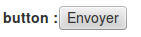
You can add a button like this
$form->add('my-button', 'button', $configuration);
Available configuration
Property |
Description |
Default value |
Example |
|---|---|---|---|
style |
css style for the html tag |
width: 150px; |
|
disabled |
true if the html field is disabled |
false |
true or false |
title |
html tag title |
my field title |
|
custom |
custom html attribute |
customattr="customvalue" |
|
class |
css class for the html tag |
big |
|
errorclass |
css class when there is an error |
error |
|
label |
label of the button |
click me! |
Captcha
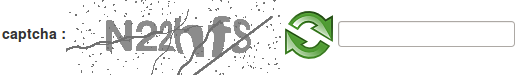
You can add a captcha like this
$form->add('my-captcha', 'captcha', $configuration);
Available configuration
Property |
Description |
Default value |
Example |
|---|---|---|---|
placeholder |
place holder for the html tag |
Enter the code |
|
style |
css style for the html tag |
width: 150px; |
|
disabled |
true if the html field is disabled |
false |
true or false |
title |
html tag title |
my field title |
|
custom |
custom html attribute |
customattr="customvalue" |
|
class |
css class for the html tag |
big |
|
errorclass |
css class when there is an error |
error |
|
errormessage |
Message if the captcha is not valid |
Captcha is not valid |
Captcha is not valid |
Checkbox
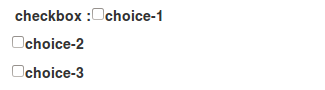
You can add a checkbox like this
$form->add('my-checkbox', 'checkbox', $configuration);
Available configuration
Property |
Description |
Default value |
Example |
|---|---|---|---|
style |
css style for the html tag |
width: 150px; |
|
disabled |
true if the html field is disabled |
false |
true or false |
title |
html tag title |
my field title |
|
custom |
custom html attribute |
customattr="customvalue" |
|
class |
css class for the html tag |
big |
|
errorclass |
css class when there is an error |
error |
|
items |
avalaible choice for checkbox |
array('1' => 'Item 1', '2' => 'Item 2'); |
Checksingle
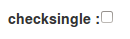
You can add a checksingle (yes/no choice) like this
$form->add('istrue', 'checksingle', $configuration);
Available configuration
Property |
Description |
Default value |
Example |
|---|---|---|---|
style |
css style for the html tag |
width: 150px; |
|
disabled |
true if the html field is disabled |
false |
true or false |
title |
html tag title |
my field title |
|
custom |
custom html attribute |
customattr="customvalue" |
|
class |
css class for the html tag |
big |
|
errorclass |
css class when there is an error |
error |
Color

You can add a input color like this. Work only with html5 browser.
$form->add('my-color-field', 'color', $configuration);
Available configuration
Property |
Description |
Default value |
Example |
|---|---|---|---|
placeholder |
place holder for the html tag |
my firstname |
|
style |
css style for the html tag |
width: 150px; |
|
disabled |
true if the html field is disabled |
false |
true or false |
title |
html tag title |
my field title |
|
custom |
custom html attribute |
customattr="customvalue" |
|
class |
css class for the html tag |
big |
|
errorclass |
css class when there is an error |
error |
Date
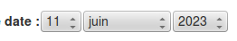
You can add a date like this.
$form->add('birthdate', 'date', $configuration);
Available configuration
Property |
Description |
Default value |
Example |
|---|---|---|---|
class |
css class for the html tag |
big |
|
errorclass |
css class when there is an error |
error |
|
format-display |
sort field.d for day, m for month and y for year |
dmy |
dmy, mdy, ymd |
year-minimum-limit |
minimum availaible year |
1900 |
1970 |
year-maximum-limit |
maximum availaible year |
current year + 20 |
2050 |
format-output |
format of the result |
timestamp |
timestamp or format compatible with strftime |
Datepicker
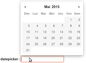
You can add a date picker like this.
$form->add('startdate', 'datepicker', $configuration);
Available configuration
Property |
Description |
Default value |
Example |
|---|---|---|---|
format |
date format (http://momentjs.com/docs/#/displaying/format/) |
D MMM YYYY |
MMM D YYYY |
placeholder |
place holder for the html tag |
my firstname |
|
style |
css style for the html tag |
width: 150px; |
|
disabled |
true if the html field is disabled |
false |
true or false |
title |
html tag title |
my field title |
|
custom |
custom html attribute |
customattr="customvalue" |
|
class |
css class for the html tag |
big |
|
errorclass |
css class when there is an error |
error |
|
firstDay |
define which day of the week must be the first |
0 (sunday) |
1 |
landingDate |
unix timestamp from which will be extracted year and month that will be displayed upon user click |
current day |
1484152522 (for january 2017) |
yearRange |
array of start and end year to display in the year dropdown |
[Year - 10, Year] |
[2015, 2020] |
minDate |
unix timestamp for minimum date available |
1583836842 |
|
maxDate |
unix timestamp for maximum date available |
1589107240 |
|
disableDays |
array of array of specific days, days of week, months, years |
|
Dropdown
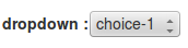
You can add a checkbox like this
$form->add('my-dropdown', 'dropdown', $configuration);
Available configuration
Property |
Description |
Default value |
Example |
|---|---|---|---|
style |
css style for the html tag |
width: 150px; |
|
disabled |
true if the html field is disabled |
false |
true or false |
title |
html tag title |
my field title |
|
custom |
custom html attribute |
customattr="customvalue" |
|
class |
css class for the html tag |
big |
|
errorclass |
css class when there is an error |
error |
|
items |
avalaible choice for checkbox |
array('1' => 'Item 1', '2' => 'Item 2') or a repository result ($this->myrepo->findAll()) |
Email

You can add a input email like this. Work only with html5 browser.
$form->add('my-email', 'email', $configuration);
Available configuration
Property |
Description |
Default value |
Example |
|---|---|---|---|
placeholder |
place holder for the html tag |
my firstname |
|
style |
css style for the html tag |
width: 150px; |
|
disabled |
true if the html field is disabled |
false |
true or false |
title |
html tag title |
my field title |
|
custom |
custom html attribute |
customattr="customvalue" |
|
class |
css class for the html tag |
big |
|
errorclass |
css class when there is an error |
error |
Number
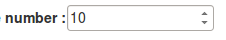
You can add a input hidden like this. Work only with html5 browser.
$form->add('my-number-field', 'number', $configuration);
Available configuration
Property |
Description |
Default value |
Example |
|---|---|---|---|
placeholder |
place holder for the html tag |
my firstname |
|
style |
css style for the html tag |
width: 150px; |
|
disabled |
true if the html field is disabled |
false |
true or false |
title |
html tag title |
my field title |
|
custom |
custom html attribute |
customattr="customvalue" |
|
class |
css class for the html tag |
big |
|
errorclass |
css class when there is an error |
error |
|
min |
minimum number |
10 |
|
max |
maximum number |
100 |
|
step |
increment step between each number |
1 |
10 |
Password
You can add a input password like this.
$form->add('my-password', 'password', $configuration);
Available configuration
Property |
Description |
Default value |
Example |
|---|---|---|---|
placeholder |
place holder for the html tag |
my firstname |
|
style |
css style for the html tag |
width: 150px; |
|
disabled |
true if the html field is disabled |
false |
true or false |
title |
html tag title |
my field title |
|
custom |
custom html attribute |
customattr="customvalue" |
|
class |
css class for the html tag |
big |
|
errorclass |
css class when there is an error |
error |
|
encrypt |
if true, password is encrypt |
false |
true |
fill_value |
if true, add current value in html |
false |
true |
Radio button

You can add a checkbox like this
$form->add('my-radiobutton', 'radio', $configuration);
Available configuration
Property |
Description |
Default value |
Example |
|---|---|---|---|
style |
css style for the html tag |
width: 150px; |
|
disabled |
true if the html field is disabled |
false |
true or false |
title |
html tag title |
my field title |
|
custom |
custom html attribute |
customattr="customvalue" |
|
class |
css class for the html tag |
big |
|
errorclass |
css class when there is an error |
error |
|
items |
avalaible choice for checkbox |
array('1' => 'Item 1', '2' => 'Item 2'); |
Range

You can add a input hidden like this. Work only with html5 browser.
$form->add('my-range-field', 'range', $configuration);
Available configuration
Property |
Description |
Default value |
Example |
|---|---|---|---|
placeholder |
place holder for the html tag |
my firstname |
|
style |
css style for the html tag |
width: 150px; |
|
disabled |
true if the html field is disabled |
false |
true or false |
title |
html tag title |
my field title |
|
custom |
custom html attribute |
customattr="customvalue" |
|
class |
css class for the html tag |
big |
|
errorclass |
css class when there is an error |
error |
|
min |
minimum number |
10 |
|
max |
maximum number |
100 |
|
step |
increment step between each number |
1 |
10 |
Radio button

You can add a rating element like this
$form->add('my-rating', 'rating', $configuration);
Available configuration
Property |
Description |
Default value |
Example |
|---|---|---|---|
style |
css style for the html tag |
width: 150px; |
|
disabled |
true if the html field is disabled |
false |
true or false |
title |
html tag title |
my field title |
|
custom |
custom html attribute |
customattr="customvalue" |
|
class |
css class for the html tag |
big |
|
errorclass |
css class when there is an error |
error |
|
min |
score min |
1 |
10 |
max |
score max |
5 |
50 |
step |
step between score |
1 |
2 |
label |
label of item |
★ |
ReCaptcha
You can add a recaptcha like this
$form->add('my-recaptcha', 'recaptcha', $configuration);
Available configuration
Property |
Description |
Default value |
Example |
|---|---|---|---|
publicKey |
Your api public key (required) |
||
privateKey |
Your api private key (required) |
||
onload |
The name of your callback function to be executed once all the dependencies have loaded. (optional) |
||
render |
Whether to render the widget explicitly. Defaults to onload, which will render the widget in the first g-recaptcha tag it finds. (optional) |
||
language |
Forces the widget to render in a specific language. Auto-detects the user's language if unspecified. (optional) Language codes: https://developers.google.com/recaptcha/docs/language en-GB |
||
theme |
The color theme of the widget (optional) |
light |
dark or light |
type |
The type of CAPTCHA to serve (optional) |
image |
audio or image |
size |
The size of the widget (optional) |
normal |
compact or normal |
tabindex |
The tabindex of the widget and challenge (optional) |
||
callback |
The name of your callback function to be executed when the user submits a successful CAPTCHA response. The user's response, g-recaptcha-response, will be the input for your callback function. (optional) |
||
expired-callback |
The name of your callback function to be executed when the recaptcha response expires and the user needs to solve a new CAPTCHA. (optional) |
||
errormessage |
Message if the captcha is not valid |
Captcha is not valid |
Captcha is not valid |
Submit

You can add a submit button like this
$form->add('my-button', 'submit', $configuration);
Available configuration
Property |
Description |
Default value |
Example |
|---|---|---|---|
style |
css style for the html tag |
width: 150px; |
|
disabled |
true if the html field is disabled |
false |
true or false |
title |
html tag title |
my field title |
|
custom |
custom html attribute |
customattr="customvalue" |
|
class |
css class for the html tag |
big |
|
errorclass |
css class when there is an error |
error |
|
label |
label of the button |
click me! |
Tel
An input telephone field
You can add a input tel like this
$form->add('my-tel', 'tel', $configuration);
Available configuration
Property |
Description |
Default value |
Example |
|---|---|---|---|
placeholder |
place holder for the html tag |
Your telephone |
|
style |
css style for the html tag |
width: 150px; |
|
disabled |
true if the html field is disabled |
false |
true or false |
title |
html tag title |
my field title |
|
datalist |
datalist for autocomplete |
array('key-1' => 'value 1', 'key-2' => 'value 2') |
|
custom |
custom html attribute |
customattr="customvalue" |
|
class |
css class for the html tag |
big |
|
errorclass |
css class when there is an error |
error |
|
pattern |
regex for field control |
^((+d{1,3}(-| )?(?d)?(-| )?d{1,5})|((?d{2,6})?))(-| )?(d{3,4})(-| )?(d{4})(( x| ext)d{1,5}){0,1}$ |
Text
An input text field
You can add a input text like this
$form->add('my-text', 'text', $configuration);
Available configuration
Property |
Description |
Default value |
Example |
|---|---|---|---|
placeholder |
place holder for the html tag |
my firstname |
|
style |
css style for the html tag |
width: 150px; |
|
disabled |
true if the html field is disabled |
false |
true or false |
title |
html tag title |
my field title |
|
datalist |
datalist for autocomplete |
array('key-1' => 'value 1', 'key-2' => 'value 2') |
|
custom |
custom html attribute |
customattr="customvalue" |
|
class |
css class for the html tag |
big |
|
errorclass |
css class when there is an error |
error |
Textarea
You can add a textarea like this
$form->add('my-textarea', 'textarea', $configuration);
Available configuration
Property |
Description |
Default value |
Example |
|---|---|---|---|
placeholder |
place holder for the html tag |
my firstname |
|
style |
css style for the html tag |
width: 150px; |
|
title |
html tag title |
my field title |
|
custom |
custom html attribute |
customattr="customvalue" |
|
class |
css class for the html tag |
big |
|
errorclass |
css class when there is an error |
error |
Upload

You can add a textarea like this
$form->add('my-file', 'update', $configuration);
Available configuration
Property |
Description |
Default value |
Example |
|---|---|---|---|
placeholder |
place holder for the html tag |
my firstname |
|
style |
css style for the html tag |
width: 150px; |
|
title |
html tag title |
my field title |
|
custom |
custom html attribute |
customattr="customvalue" |
|
class |
css class for the html tag |
big |
|
errorclass |
css class when there is an error |
error |
|
directory |
target upload directory |
fileadmin/user_upload/my_ext/ |
|
filename |
target upload file name |
my-file.pdf |
|
canoverwrite |
if true, overwrite existing file |
true or false |
|
show_link |
if true, display an link to the file |
true or false |
Url
An input url field
You can add a input url like this
$form->add('my-url', 'url', $configuration);
Available configuration
Property |
Description |
Default value |
Example |
|---|---|---|---|
placeholder |
place holder for the html tag |
Your website |
|
style |
css style for the html tag |
width: 150px; |
|
disabled |
true if the html field is disabled |
false |
true or false |
title |
html tag title |
my field title |
|
datalist |
datalist for autocomplete |
array('key-1' => 'value 1', 'key-2' => 'value 2') |
|
custom |
custom html attribute |
customattr="customvalue" |
|
class |
css class for the html tag |
big |
|
errorclass |
css class when there is an error |
error |