Adjust container elements
Information regarding special features from some container elements is given below.
Container
A handy element to wrap content with a div-tag. Optionally an additional section wrap can be added.
A container element can be combined with card elements to define the cards layout (see layout from bootstrap's card component). Some layouts can be selected by the container classes value picker.
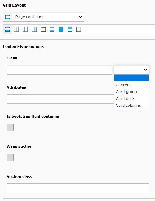
Properties from container element
Tile unit
Tile units are used to create a tile view typically showing images. Tile units aren't yet supported by the bootstrap framework hence might not show up correctly. For the tile units to work correctly content elements might be adapted to render with the desired tile side ratio. These content elements might be provided by an extension (e.g. the extension pizpalue provides various tile layouts for this purpose).
Tile units might be listed or combined together. In this case it can be convenient to collect them in a container. As
well the Frame might need to be set to none in the Appearance tab.

Tile unit showing tiles
Tip
A tile unit is basically a column with specific settings. You might use as well columns container elements (e.g. 3 Columns) and set the related parameters manually.
Card
The card container element can render most card layouts as outlined on the bootstrap framework page.
Defining content
Texts and an image can be defined through the content element's form and/or by adding any kind of content element
to the available grid containers Content and Image content .
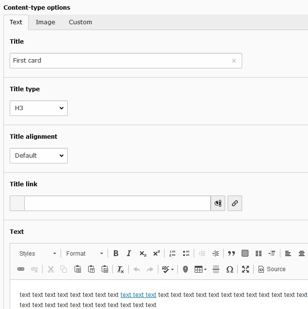
Text and image content defined in the card form
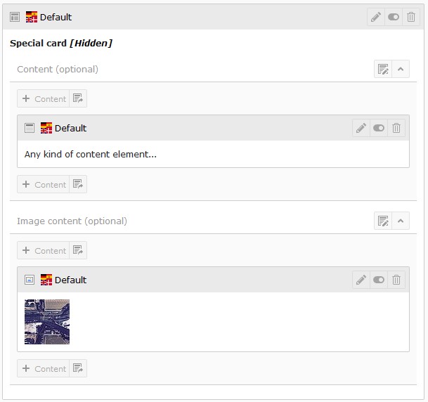
Any kind of content element to be used as image and body content
Using container
Cards might be grouped with container elements.
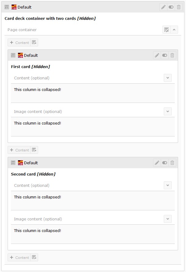
Two cards in a container
