

Introduction
What it does
This extension provides elements to further structure the content area. It is powered by the extension container. Many thanks to the b13.com team!
Currently the following elements are available: container, columns, grid, registers, accordion, tile unit, card and randomizer. The extension is intended to be used together with the bootstrap framework.
Since the elements are provided by container they are following referred to as container elements.
Container elements can hold any kind of content elements hence as well other container elements.
Limitations
When using images in container elements reducing the horizontal space (e.g. column elements) the image dimensions should be adapted to the resulting space. The approach to obtain the final space depends on the context and therefore no general solution can be offered. The template pizpalue offers a flexible way to optimize image dimensions in structure elements and fully supports this extension. An example can be found under pizpalue.buechler.pro.
Example contents
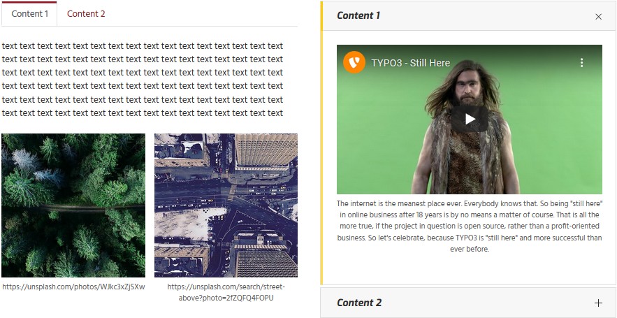
Columns, tabs and accordion
The following image shows the usage from a two columns container element containing a tabs container element in the left column and an accordion container element in the right column. Three and four columns container elements are available too.
Container and cards
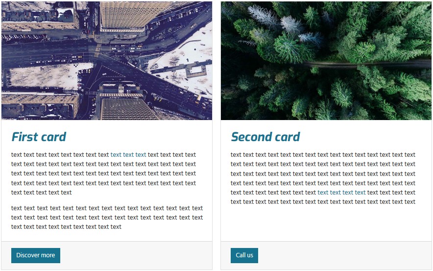
The container container element (it's not a typo since the container element is a dedicated container...) adds freedom
in designing the layout. It might be used to group elements as well as to enhance the functionality. In the below shown
image the Classes field from the container element container has been set to card- and accommodates two card
container elements.
Tile unit
The tile unit container element can be used to create panels showing tiles.
Tiles aren't yet supported by the bootstrap framework hence on bare installations won't show up as expected. To get started using tile units the extension pizpalue might be checked out.
Randomizer
Shows random content elements.
Grid
To create grid components.
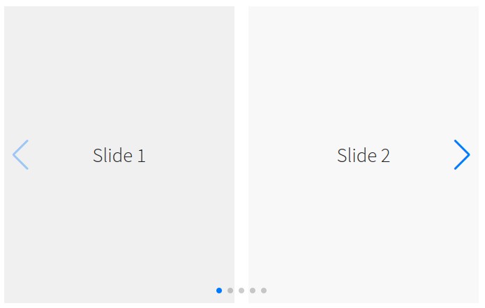
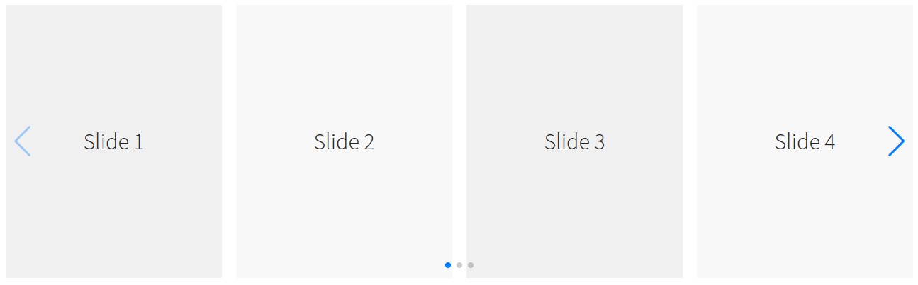
Slider
Responsive slider using Swiper.
Allows to configure the quantity of content elements per breakpoints.