Design
The arrangement and appearance from content elements can be defined on different areas. The coarse structure is defined with the page layout where structure elements like grid elements might further organize the content in columns, registers, and the like. Fine tuning can be done on a content element basis by altering the frame, attributes and background.
Page layout
With a page layout the coarse page structure is defined. They can be selected in the page properties dialog under the appearance tab. See as well demo site.
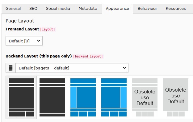
Available page layouts
Note
The page layouts with a navigation menu on the side allow to add content too.
Structure elements
With structure elements the content area might be further organized. Typical elements are containers, columns, accordions and tabs. See as well demo site.
Currently the content elements provided by the extension gridelements are used as structure elements. The available grid elements can be found in the new content element wizard under the “Grid Elements” tab:
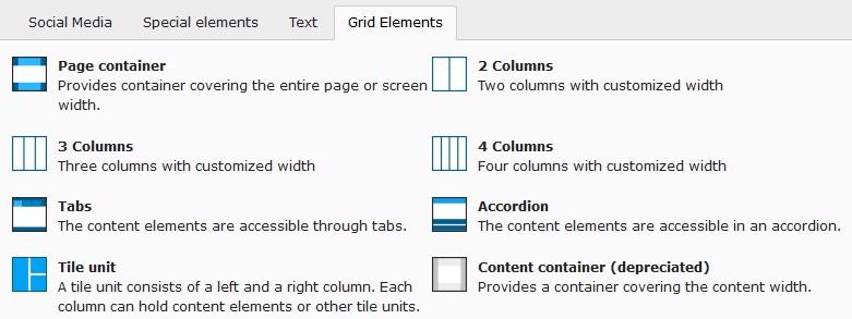
“Grid Elements”-tab in new content element wizard
Tile unit
With tile units a tile view can be composed where tiles can have one of the following side ratios: 2:1, 1:1, 1:2.
Combine any number of tile units to get the desired horizontal column distribution followed by adding content
elements having a tile layout (tab appearance from content element properties dialog) selected. By assigning
a tile layout, the content element becomes a tile.
Additional cropping side ratios (2:1, 1:2) assist in defining the desired image area.
Note
When defining an image crop area with the same side ratio (e.g. 2:1) as used for the content element layout the image might not fill the entire tile area. This is due to the fact that the tile area is having the exact side ratio where the images side ratio deviates from that due to the tile border. After approximating the image area with the exact tile ratio select the free side ratio to fine adjust the area.
Note
The tile border width can be adjusted in the constant editor (PIZPALUE: CLIENT STYLE - Tile gutter).
Note
In case a tile content needs to be vertically scrolled the class pp-tile-scroll-y might be assigned to the tile.
Attention
The tile unit gridelement is available using the recommended gridelements static template
(Gridelements w/DataProcessing (recommended)). Further information can be found on the preliminary
Upgrade 12 documentation.
Content element
Images tab
Image variants
Usually the images are used in a content element using the content width. To optimize page loading time and reducing the data bandwidth the image sizes are adapted to the content width. This works fine for most cases.
In case one likes to use images in a content element spanning a different width (e.g. the full page width) the resolution might result to be too small resulting in not sharp images. For this situation the image variant selector has been introduced allowing to adapt the image rendering to different sizes (e.g. “Full page width”).
Image scaling
The image sizes for the different screen sizes are defined by the selected image variants as well as the image column count.
Some times an editor adds additional elements for structuring the content area resulting in a smaller available space for images. To deliver the optimal image size under such conditions a scaling can be defined.
As an example consider adding a two column grid element with the first column being 33% and the second column 67% from the content width. Let’s assume the two columns to be next to each other for screen sizes bigger than md. Now when adding an image to the first column (33% width) the rendered image would be two times bigger than needed (due to the system not knowing how much space is available in the column). To deliver optimal sized images the following scaling definition could be used:
xl: 0.33,
lg: 0.33,
md: 0.33,
sm: 1.0,
xs: 1.0
Appearance tab
Custom frames
Additional frames can be selected for content elements (see example):
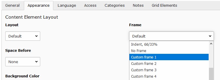
Custom frames for content elements
Note
The custom frame 4 doesn’t have any style definition. You might use it according your needs.
Background
The bootstrap package as well as this distribution provide a way to assign a background to a content element.
The bootstrap package approach uses additional style definitions inside the content element container allowing to define different images for different screen sizes. Additionally it provides easy image manipulations. In case no frame should be used as well no background image can be assigned.
The distribution is embedding a background image by adding an inline style definition. In case no frame is selected the content is wrapped allowing always to have a background image.
Attributes
Sometimes it would be handy to directly alter attributes from a content element. For example to assign additional classes, some inline style or new attributes.
This functionality has been added by introducing additional fields to the content element table and adapting the rendering accordingly. The new fields are available under the appearance tab in the “Attributes” section.
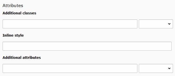
Customizing attributes for a content element
Some predefined classes and attributes can be assigned by help of the adjacent selector box. The selector box for the “Additional attributes” field shows data attributes related to the scroll animation.
Note
For security reasons all attributes are filtered. Currently just data attributes are allowed in the “Additional attributes” field.