Users Manual
Following some hints are given regarding the use from the additions enhancing the user experience.
Please refere as well to the manual user section from the related extensions.
Attribute enhancement for content elements
Sometimes it would be handy to directly alter attributes from a content element container: add an additional class, some inline style or additional attributes.
This functionality has been added by introducing additional fields to the content element table and adapting the rendering accordingly. The new fields are available under the appearance tab in the “Attributes” palette.
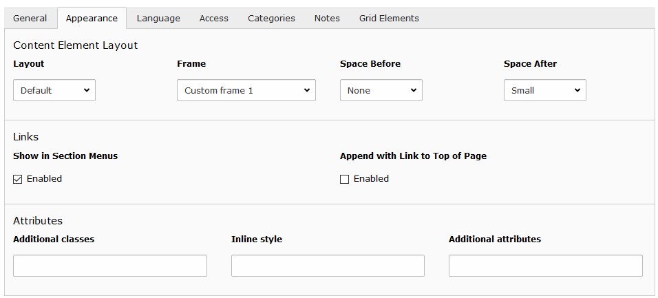
Palette “Attributes” under the appearance tab in the content element form
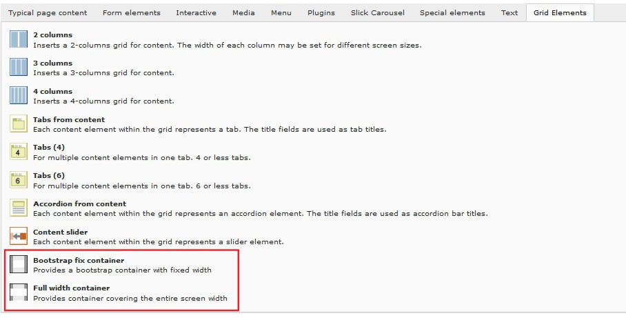
Grid elements
The add new content element wizards shows a tab called “Grid Elements”:
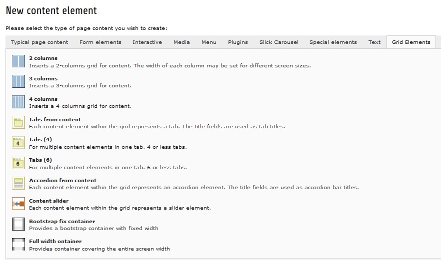
“Grid Elements”-tab in new content element wizard
Hint
Editing the “Appearance”-properties from a grid element doesn’t alter the rendering hence the selections for “Frame” or “Space Before” have no influence to the contents appearance in the page.
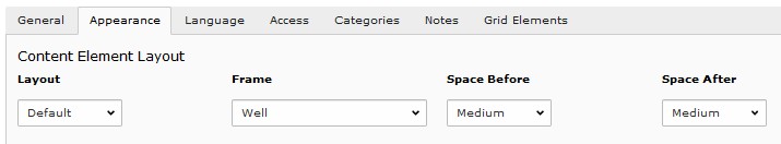
Appearance settings for grid elements don’t change the rendering
Tip
To influence the rendering the grid elements might be wrapped by a container grid element. The container grid elements allow to define additional classes.
News
For the news system a template “Image on top” is provided. It might be used to render the image on top of the text (see example).
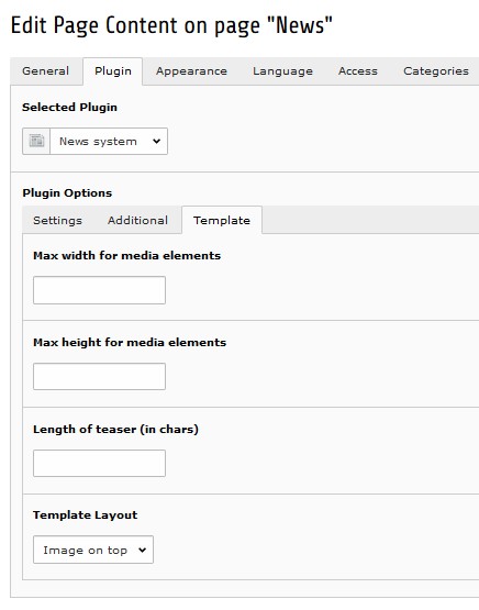
News template to render image on top
Custom frames
Additional frames can be selected for content elements (see example):
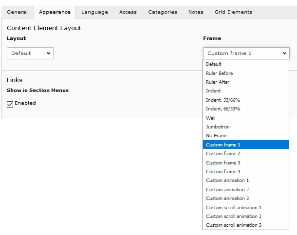
Custom frames for content elements
As for the time beeing the custom animations (Custom animation 1..3) aren’t implemented yet.
Inline localization
Sometimes it might be handy to have a text used at different locations available in several languages. For this users might reference a translated text by using curly brackets within the editor (see example):
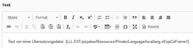
Use of localized text within the editor
Tip
You might reference other content as defined by the “getText” data type.
Flexible content width
To create content spanning the entire page width (see example) one might use the “Full width” page layout in conjunction with the “Bootstrap fix container” and “Full with container” grid elements:
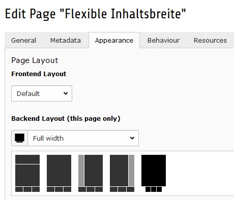
“Full width” page layout
Container grid element
Tip
To further customize the containers css-classes, attributes and a wrapping container might be defined in the “Plugin Options” section from the “General”-tab:
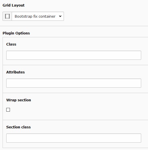
Container grid element plugin options
Scroll animation
The scroll animation feature allows to call further attention to content elements while the user is scrolling on the page. Typically content elements are moved in from the side of the page.
To use this feature follow these steps:
- Make sure the feature is enabled for the page where it is used (see scroll animation configuration)
- Select a “Custom scroll animation” as a frame or specify the data attributes in the appearance tab from the content element
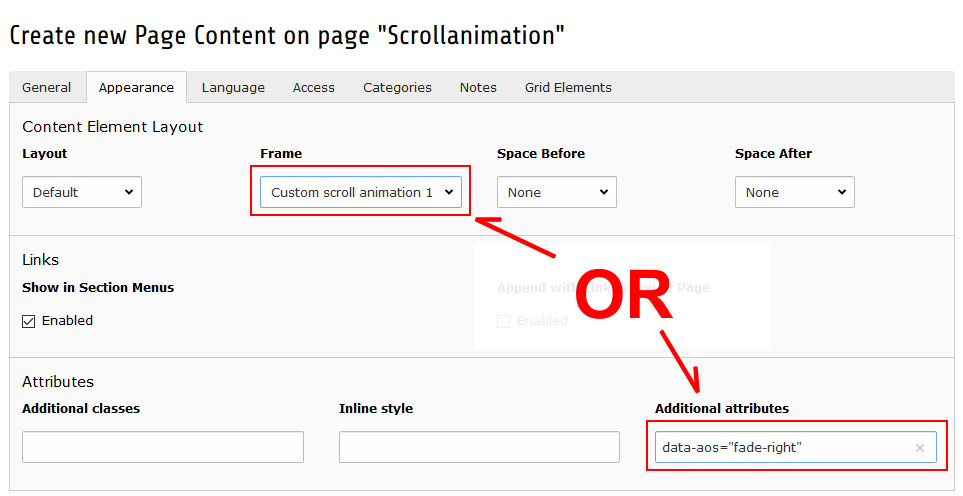
Define the scroll animation either with a frame or withe data attributes
Piz Palue classes
| Class | Usage |
|---|---|
| pp-label-dataprotection | Used in wrapper grid element to define a replacment text for a data protection notice check box (see contact page) |