Introduction
What it does
This extension provides elements to further structure the content area. It is powered by the extension gridelements. Many thanks to the “Grid Elements Team”!
Currently the following elements are available: container, columns, registers, accordion, tile unit and card. The extension is intended to be used together with the bootstrap framework.
Since the elements are provided by gridelements they are following referred to as grid elements.
Grid elements can hold any kind of content elements hence as well other grid elements.
Example contents
Columns, tabs and accordion
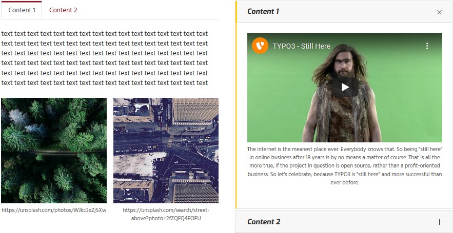
The following image shows the usage from a two columns grid element containing a tabs grid element in the left column and an accordion grid element in the right column. Three and four columns grid elements are available too.
Container and cards
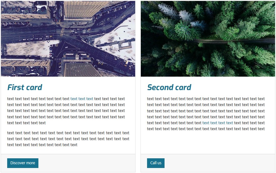
The container grid element adds freedom in designing the layout. It might be used to group elements as well as to
enhance the functionality. In the below shown image the Container classes field from the grid element container has
been set to card-deck and accommodates two card grid elements.
Tile unit
The tile unit grid element can be used to create panels showing tiles.
Tiles aren’t yet supported by the bootstrap framework hence on bare installations won’t show up as expected. To get started using tile units the extension pizpalue might be checked out.