ViewHelper Reference
Tip
The Frontend Editing extension automatically includes its ViewHelpers in the core namespace, so you don't have to declare the namespace.
contentEditable
Defines editable regions within Fluid templates.
Arguments
table
- DataType
string
- Required
true
- Description
The database table name to where the data should be saved.
field
- DataType
string
- Required
false
- Description
The database field to where the data should be saved.
uid
- DataType
string
- Required
true
- Description
The database field to where the data should be saved
tag
- DataType
string
- Required
false
- Description
The HTML tag to use for the editable wrapper.
additionalAttributes
- DataType
mixed
- Required
false
- Description
Additional tag attributes. They will be added directly to the resulting HTML tag.
data
- DataType
mixed
- Required
false
- Description
Additional data-* attributes. They will each be added with a "data-" prefix.
Basic example
This makes the field bodytext of the table tt_content editable:
<core:contentEditable table="tt_content" field="bodytext" uid="{uid}">
        {bodytext}
</core:contentEditable>
When frontend editing is enabled and the user is viewing the page in the Frontend Editing module in the backend, the output HTML will look something like this:
<div contenteditable="true" data-table="tt_content" data-field="bodytext" data-uid="1">
        This is the content text to edit
</div>
When the user is viewing the page anywhere else than in the Frontend Editing module, or if Frontend Editing is disabled, the output HTML will look like this:
This is the content text to edit
Example with custom tag
Using the tag argument, you can make a HTML tag into an editable region. In this case we are using an <ul> tag to make the list items within it editable.
  <core:contentEditable tag="ul" table="tx_example" field="items" uid="{uid}">
          <f:for each="{items}" as="item">
   <li>{item}</li>
</f:for>
  </core:contentEditable>
When frontend editing is enabled and the user is viewing the page in the Frontend Editing module in the backend, the output HTML will look something like this:
  <ul contenteditable="true" data-table="tt_content" data-field="bodytext" data-uid="1">
          <li>Item 1</li>
<li>Item 2</li>
<li>Item 3</li>
  </span>
When the user is viewing the page anywhere else than in the Frontend Editing module, or if Frontend Editing is disabled, the output HTML will look like this:
     <ul>
             <li>Item 1</li>
   <li>Item 2</li>
   <li>Item 3</li>
</ul>
There is also a possibility to make the content element editable through the popup backend editor. It is done by skipping the field option in the view helper:
<core:contentEditable table="tt_content" uid="{data.uid}">
        {item.bodytext}
</core:contentEditable>
customDropZone
Inserts a custom drop zone, for example to drop news directly into the news list.
Default values are defined in TypoScript. See :def:`typoscript-customrecords` for more information.
Arguments
tables
- DataType
array of strings
- Required
true
- Description
Table names allowed to be dropped in this drop zone.
Example
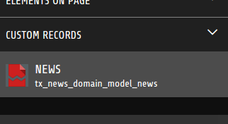
<core:customDropZone tables="{0:'tx_news_domain_model_news'}">
</core:customDropZone>
The result will look like this:
isFrontendEditingActive
Useful to determine whether or not frontend editing is active. Use in conditions to hide or show content for editors.
Example
<f:if condition="{core:isFrontendEditingActive()}">
   <p>You're using Frontend Editing. Congratulations!</p>
</f:if>
No output if Frontend editing is disabled. Output if Frontend Editing is enabled:
<p>You're using Frontend Editing. Congratulations!</p>
isPlaceholderEnabled
Use this view helper in conditions to show empty fields when the placeholder feature is enabled.
Example
<f:if condition="{header} || {core:isPlaceholderEnabled()}">
  {header}
</f:if>

