Installation
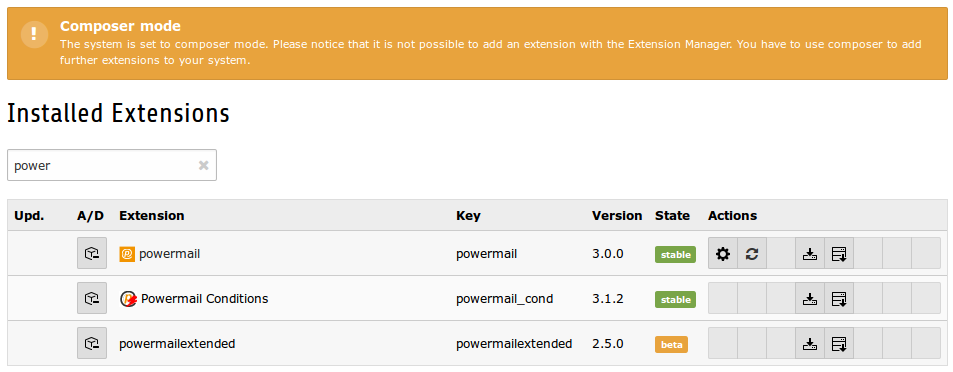
Import for installation
Just require this extension via composer
composer require in2code/powermail
Activate
Install the extension and follow the instructions in TYPO3.
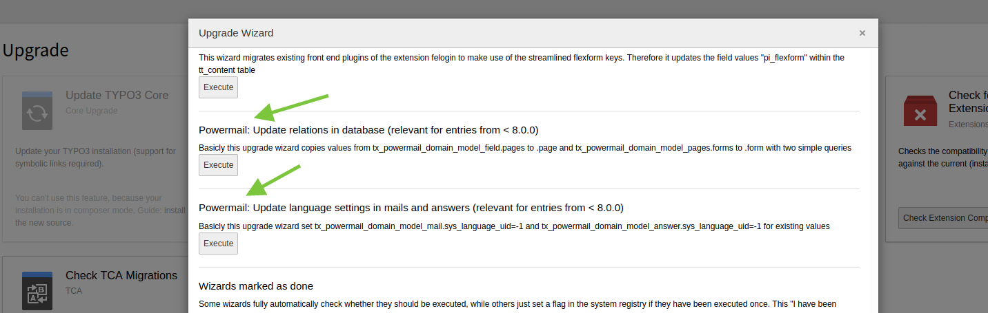
Note: If you update your powermail extension to version 8.0.0 (or higher) from a version under 8, you have to execute the upgrade wizard. Two steps are added from powermail 8.0.0
- Copy values from tx_powermail_domain_model_field.pages to .page and from tx_powermail_domain_model_page.forms to .form
- Set sys_language_uid to -1 for tx_powermail_domain_model_mail and tx_powermail_domain_model_answer
Extension Manager Settings
Main configuration for powermail for CMS wide settings.
| Field | Description | Default value |
|---|---|---|
| Disable IP logging | If you generally don't want to save the sender IP address in the database, you can use this checkbox. | 1 |
| Disable marketing information | If you want to disable all marketing relevant information of powermail, you can enable this checkbox (effected: mail to admin, backend module, mail records, no static typoscript template). | 0 |
| Disable BE module | You can disable the backend module if you don't store mails in your database or if you don't need the module. | 0 |
| Disable plugin information | Below every powermail plugin is a short info table with form settings. You can disable these information. | 0 |
| Disable plugin information mail preview | The plugin information shows 3 latest mails. If you want to disable this preview, you can check the button. | 0 |
| Enable Form caching | With this setting, you can enable the caching of the form generation, what speeds up sites with powermail forms in the frontend. On the other hand, some additional features (like prefilling values from GET paramter, etc...) are not working any more. | 0 |
| Enable Merge for l10n_mode | All fields with l10n_mode exclude should change their translation behaviour to mergeIfNotBlank. This allows you to have different field values in different languages. | 0 |
| ElementBrowser replaces IRRE | Editors can add pages within a form table via IRRE. If this checkbox is enabled, an element browser replaces the IRRE Relation. Note: this is a beta-feature and not completely tested! | 0 |
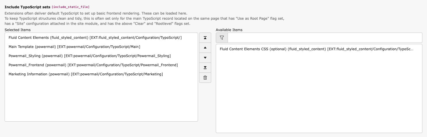
Static Templates
Add powermail static templates for full functions
| Field | Description |
|---|---|
| Main template (powermail) | Main functions and settings for all powermail forms. |
| Powermail_Styling | If you want to add a default styling, color customizable via CSS custom properties. |
| Powermail_Frontend (powermail) | If you want to use show mails in frontend (Pi2), choose this template. |
| Marketing Information (powermail) | If you want to see some marketing information about your visitors, you have to add this Template to your root Template. An AJAX function (needs jQuery) sends basic information to a powermail script (Visitors Country, Page Funnel, etc...). |
Note TypoScript can be modified to configure powermail in the way you want to use powermail. See BestPractice/MainTypoScript for an overview over the complete TypoScript.
Site sets
Since version 13 Powermail provides two sets of site sets for all TypoScript templates:
- one site set as a drop-in, that reflects the current typoscript template behavior
- one site set as a future-proof siteset, that replaces typoscript constants with
settings.definitions.yaml.
Migration
DropIn - SiteSet
For the drop-in site set, you just need remove the inclusion of the TypoScript template and add the SiteSet to your installation. No other steps need to be done.
Future-proof SiteSet
For this site-set there are some more steps to perform.
- remove the inclusion of the typoscript template
- add the necessary site set(s) without the "DropIn" prefix to your site
- migrate TypoScript constants to your site settings. All constant names remain the same.
Default classes
Powermail comes with classes for Bootstrap 5.x by default. You can change the default classes with the constants editor. The full TypoScript constants are:
plugin.tx_powermail {
	settings {
		styles {
			framework {
				# cat=powermail_styles//0020; type=int+; label= Number of columns
				numberOfColumns = 2

				# cat=powermail_styles//0100; type=text; label= Framework classname(s) for containers to build rows
				rowClasses = row

				# cat=powermail_styles//0105; type=text; label= Framework classname(s) for form
				formClasses =

				# cat=powermail_styles//0110; type=text; label= Framework classname(s) for overall wrapping container of a field/label pair e.g. "col-md-6"
				fieldAndLabelWrappingClasses = col-md-6

				# cat=powermail_styles//0120; type=text; label= Framework classname(s) for wrapping container of a field
				fieldWrappingClasses = powermail_field

				# cat=powermail_styles//0130; type=text; label= Framework classname(s) for fieldlabels e.g. "form-label"
				labelClasses = form-label powermail_label

				# cat=powermail_styles//0140; type=text; label= Framework classname(s) for fields e.g. "form-control"
				fieldClasses = form-control

				# cat=powermail_styles//0150; type=text; label= Framework classname(s) for fields with an offset e.g. "col-sm-offset-2"
				offsetClasses =

				# cat=powermail_styles//0160; type=text; label= Framework classname(s) especially for radiobuttons e.g. "form-check"
				radioClasses = form-check powermail_radiowrap

				# cat=powermail_styles//0170; type=text; label= Framework classname(s) especially for checkboxes e.g. "form-check"
				checkClasses = form-check powermail_checkwrap

				# cat=powermail_styles//0180; type=text; label= Framework classname(s) for the submit button e.g. "btn btn-primary"
				submitClasses = btn btn-primary

				# cat=powermail_styles//0190; type=text; label= Framework classname(s) for "create" message after submit
				createClasses = powermail_create
			}
		}
	}
}
Add default styling
You can add the static template "Powermail_Styling" to get a default styling for Powermail. You can change the colors using CSS custom properties:
--pm-primary-color: var(--pm-blue);
--pm-secondary-color: var(--pm-grey-2);

/**
 * Form fields
 *
 */

/* Input */
--pm-input-background-color: var(--pm-white);
--pm-input-border-color: var(--pm-grey-2);
--pm-input-color: var(--pm-black);
--pm-input-placeholder-color: var(--pm-grey-3);
--pm-input-invalid-background-color: var(--pm-input-background-color);
--pm-input-invalid-border-color: var(--pm-red);
--pm-input-invalid-color: var(--pm-input-color);

/* Select */
--pm-select-background-color: var(--pm-white);
--pm-select-border-color: var(--pm-grey-2);
--pm-select-color: var(--pm-black);

/* Checkbox */
--pm-check-background-color: var(--pm-white);
--pm-check-border-color: var(--pm-grey-2);
--pm-check-color: var(--pm-primary-color);

/* Radio */
--pm-radio-background-color: var(--pm-white);
--pm-radio-border-color: var(--pm-grey-2);
--pm-radio-color: var(--pm-primary-color);

/**
 * Buttons
 *
 */
--pm-button-background-color: transparent;
--pm-button-color: currentcolor;
--pm-button-border-color: transparent;
--pm-button-hover-background-color: transparent;
--pm-button-hover-border-color: transparent;
--pm-button-hover-color: currentcolor;

/* Primary */
--pm-button-primary-background-color: var(--pm-primary-color);
--pm-button-primary-border-color: var(--pm-primary-color);
--pm-button-primary-color: var(--pm-white);
--pm-button-primary-hover-background-color: color-mix(in srgb, var(--pm-primary-color), var(--pm-black) 20%);
--pm-button-primary-hover-border-color: color-mix(in srgb, var(--pm-primary-color), var(--pm-black) 20%);
--pm-button-primary-hover-color: var(--pm-white);

/* Secondary */
--pm-button-secondary-background-color: var(--pm-secondary-color);
--pm-button-secondary-border-color: var(--pm-secondary-color);
--pm-button-secondary-color: var(--pm-black);
--pm-button-secondary-hover-background-color: color-mix(in srgb, var(--pm-secondary-color), var(--pm-black) 20%);
--pm-button-secondary-hover-border-color: color-mix(in srgb, var(--pm-secondary-color), var(--pm-black) 20%);
--pm-button-secondary-hover-color: var(--pm-black);

/* Active */
--pm-button-active-background-color: var(--pm-primary-color);
--pm-button-active-border-color: var(--pm-primary-color);
--pm-button-active-color: var(--pm-white);
--pm-button-active-hover-background-color: color-mix(in srgb, var(--pm-primary-color), var(--pm-black) 20%);
--pm-button-active-hover-border-color: color-mix(in srgb, var(--pm-primary-color), var(--pm-black) 20%);
--pm-button-active-hover-color: var(--pm-white);

/* Warning */
--pm-button-warning-background-color: var(--pm-orange);
--pm-button-warning-border-color: var(--pm-orange);
--pm-button-warning-color: var(--pm-black);
--pm-button-warning-hover-background-color: color-mix(in srgb, var(--pm-orange), var(--pm-black) 20%);
--pm-button-warning-hover-border-color: color-mix(in srgb, var(--pm-orange), var(--pm-black) 20%);
--pm-button-warning-hover-color: var(--pm-black);

/* Danger */
--pm-button-danger-background-color: var(--pm-red);
--pm-button-danger-border-color: var(--pm-red);
--pm-button-danger-color: var(--pm-white);
--pm-button-danger-hover-background-color: color-mix(in srgb, var(--pm-red), var(--pm-black) 20%);
--pm-button-danger-hover-border-color: color-mix(in srgb, var(--pm-red), var(--pm-black) 20%);
--pm-button-danger-hover-color: var(--pm-white);

/**
 * Table
 *
 */

/* Head */
--pm-table-thead-tr-background-color: var(--pm-white);
--pm-table-thead-tr-color: var(--pm-black);
--pm-table-thead-th-border-color: var(--pm-grey-2);

/* Body */
--pm-table-tbody-tr-background-color: var(--pm-white);
--pm-table-tbody-tr-color: var(--pm-black);
--pm-table-tbody-tr-odd-background-color: var(--pm-grey-1);
--pm-table-tbody-tr-odd-color: var(--pm-black);
--pm-table-tbody-tr-hover-background-color: color-mix(in srgb, var(--pm-grey-1), var(--pm-black) 8%);
--pm-table-tbody-tr-hover-color: var(--pm-black);
--pm-table-tbody-th-border-color: var(--pm-grey-2);
--pm-table-tbody-td-border-color: var(--pm-grey-2);