JAR Column Row 

Version

2.0

Language

en

Description

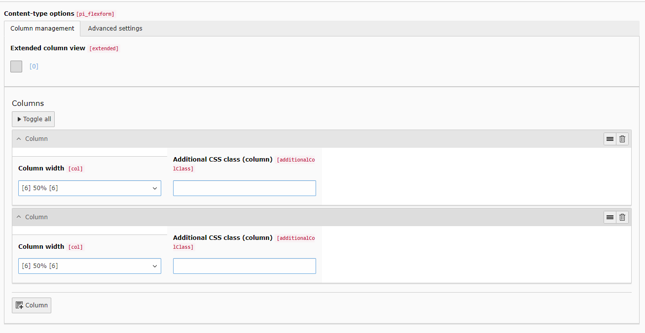
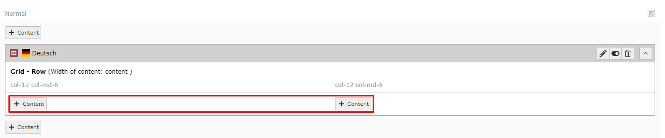
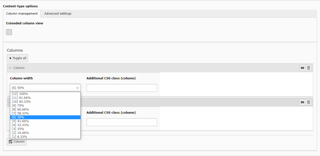
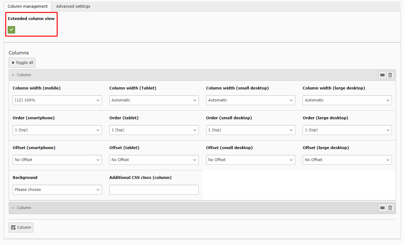
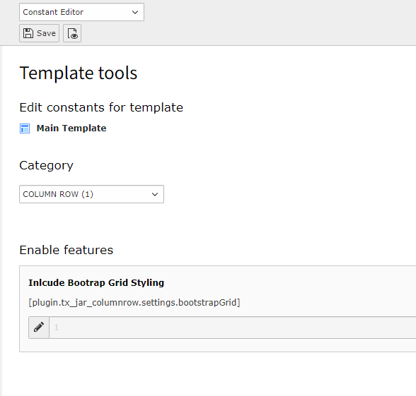
This extension provides a grid layout container where multiple columns with 12 different widths can be added. In the so called 'Column Row'-Element the column width, order and offset can be customized for 4 different breakpoints via the backend.

Authors

Julian Lichte, Maurice Möllmer

Email

info@invokable.gmbh

License

Creative Commons BY 4.0 .

TYPO3

The content of this document is related to TYPO3 CMS, a GNU/GPL CMS/Framework available from typo3.org .

Extension Manual

This documentation is for the TYPO3 extension JAR ColumnRow.
If you find an error or something is missing, please: Report a Problem

Author 

This extension has been created by JAR Media, a brand of invokable.

JAR Media - be creative. and relax invokable GmbH

Quickstart 

Follow the steps below to set up a simple grid element with two rows.

Installation 

Install the extension jar_columnrow via extension manager or via composer (recommended):

composer require jar/jar_columnrow
Copied!

You can find the current version (and older ones) at

TBA

Include static template 

In your main template include the static template "Jar Column Row" of the extension jar_columnrow.

Add Column Row 

Navigate to a page with the page module enabled and add a new content element. |Choose "Column Row" in the new tab "Grids".

Configure Element 

You can add new columns in the repeater at the bottom

In basic view you can now choose the width of each column. For example two columns with 50% each.

After saving and exiting, you can add content elements inside your new column rows either by creating or simply by drag and drop.

General configuration 

Download the extension and include its static template.

Basic 

Add at least one column via the button +Column.
Individual width and an optional css class can be set.
For each clumn the width, order (1-9) and offset can be set for 4 breakpoints (mobile, tablet, small- and large desktop)


Additionally a background color can be set. Either choose a customized hex value or one of the potentially predefined background colors, see Define Background Colors.
.. image:: ../Images/Configuration/configuration_3.png

Advanced 

Under the tab Advanced Settings one can configure the content width and background for the whole row.
There is also the option of giving an additional css class to the row for individual styling.


For choosing a background there can be chosen a color or a image.
Both will unlock new fields to set this up.

Include Bootrap Grid 

bootstrapGrid

bootstrapGrid
type

bool

Default

true

If true, the bootstrap grid css is included for basic grid styling.

Example:

plugin.tx_jar_columnrow.settings {
   bootstrapGrid = true
}
Copied!

Change via the Constant Editor 

Define Background Colors 

In each grid container one can choose a background color.
Adding this to the PageTS config adds the possibility to define custom background colors to use exactly the same colors in any grid container.

jar.bgcolors

jar.bgcolors
type

object

Multiple colors can be added to each grid container Label => Value
Of course either plain labels or XLIFF can be used.

Example:

jar {
   bgcolors {
      LLL:EXT:jar_columnrow/Resources/Private/Language/locallang_be\.xlf:orange = #ED672C
      LLL:EXT:jar_columnrow/Resources/Private/Language/locallang_be\.xlf:light_gray = #A5A5A5
   }
}
Copied!