Das 

Extension key

das

Package name

jaumepresaspuig/das

Version

1.0

Language

en

Author

Jaume Presas Puig

License

This document is published under the Open Publication License.

Rendered

Wed, 29 Apr 2026 16:37:10 +0000


This extension enhances pages and content elements by adding extra fields for Bootstrap 5 classes and introduces a new collection of content elements, page layouts, and view helpers.


Introduction 

An introduction to what Das does.

Installation 

Explains how to install Das.

Quick Start 

Explains how to start without any additional configuration.

Configuration 

Explains how to configure Das.
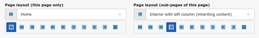
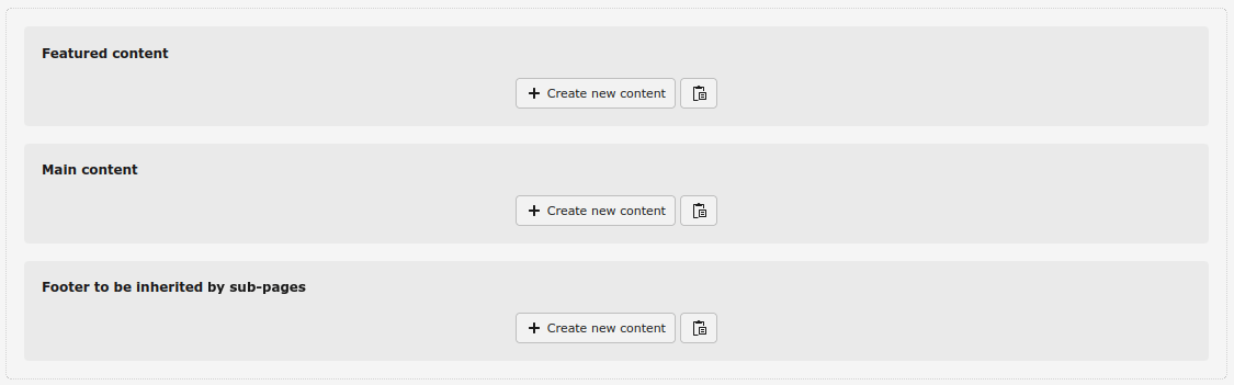
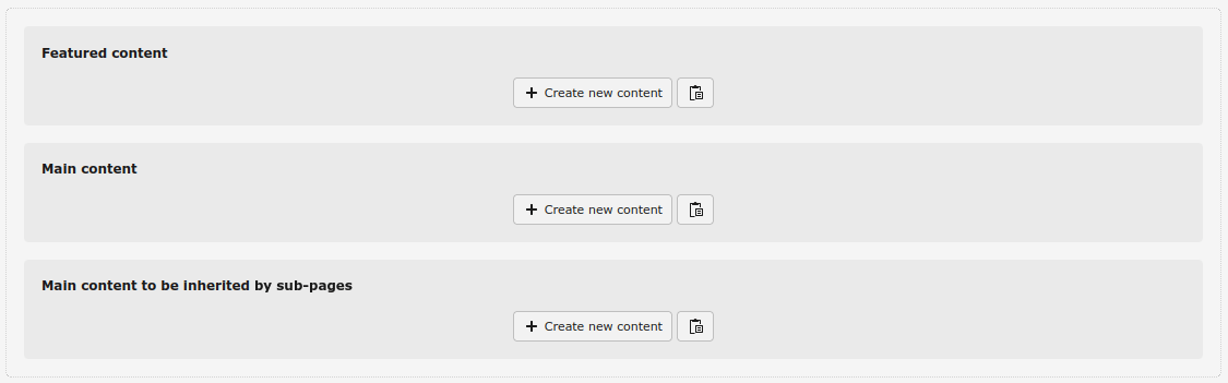
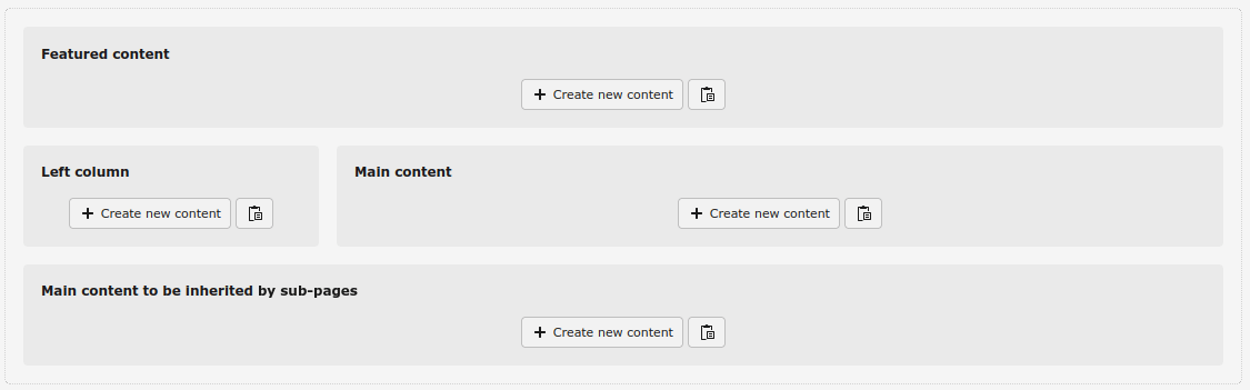
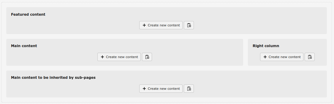
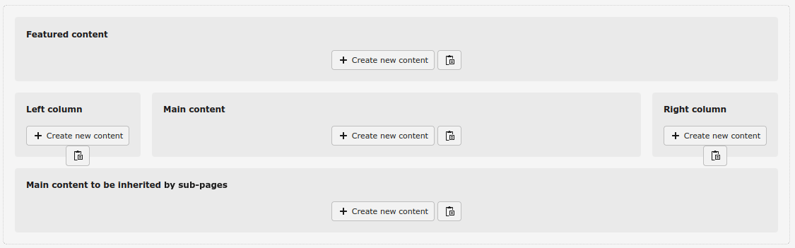
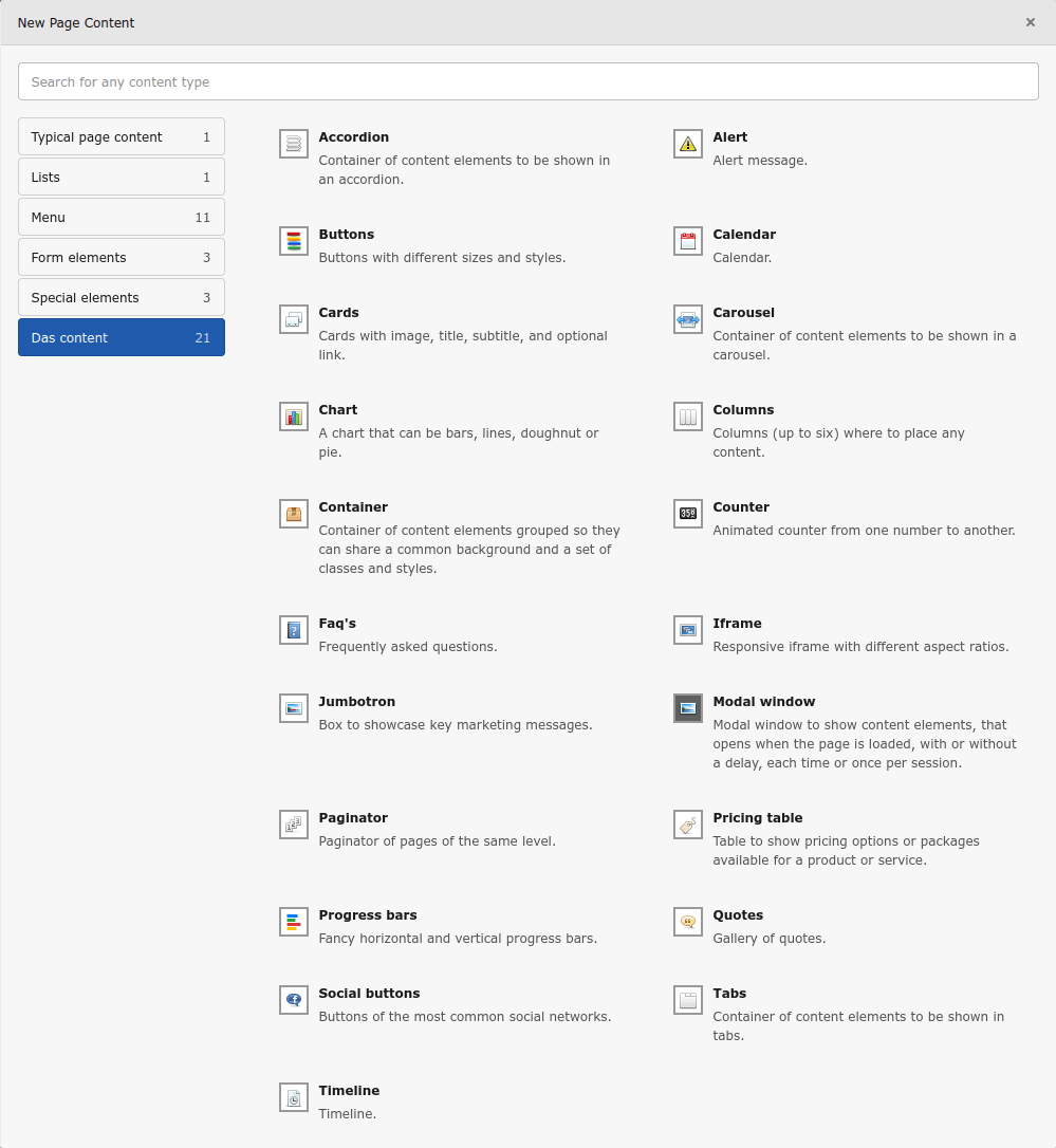
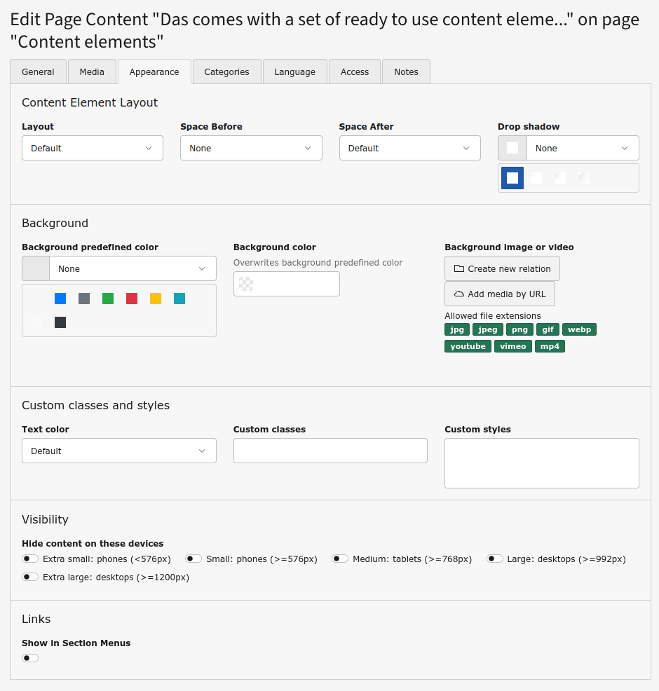
Editors manual 

Explains how to work with the page layouts and the new content elements.

Themes 

Explains how to create your own themes.

How to get help 

Explains how to get help and how to report issues you found.

Introduction 

What does it do? 

Das is an extension designed to streamline the creation of TYPO3 websites. It enhances pages and content elements by adding extra fields for Bootstrap 5 classes and introduces a new collection of content elements, page layouts, and view helpers. This significantly reduces the effort required to build your site.

Once installed, your TYPO3 setup is ready to use, requiring no additional configuration.

You can also create custom themes by developing your own extension. This allows you to modify constants, TSConfig, and partials while incorporating your own assets.

Das is based on the extensions Flux and Vhs.

Why Flux? 

Flux is based on pure Fluid and offers more versatility than TCA or content blocks when dealing with containers and grid layouts. Some of the new content elements (specially Columns) shipped with Das benefit from it.

What's in Das? 

Das comes with a lot of features to make a TYPO3 installation work out of the box.

  • Page layouts: A set of page layouts that cover any possible scenario.
  • Content elements: A set of more than twenty ready to use content elements.
  • New fields in content elements: New fields added to enhance all type of content elements.
  • Customized RTE: A customized RTE so Bootstrap classes can be applied to text, links, buttons, badges, and tables.
  • Fully customizable: Front end output can be fully customizable with your own assets and by editing the partials for each content element.

For more information on Das, visit its home page.

Quick start 

Once Das has been installed the TYPO3 instance is ready to go, with the page layouts and new content elements available to editors. There is no additional configuration needed, but there are some options to customize the page header that can be easily set in the Das: site configuration tab, which only appears in root site pages. It has these fields:

  • Logo: to set the logo to be shown in the header
  • Theme: to set the theme to light or dark mode or auto, so the theme applied is the one of the user's device
  • Number of navigation levels to show: for the header navigation bar, how many (up to two) levels of sub-pages have to be shown
  • Search page: to show the search box in the header if the extension Indexed search is installed, by setting the page that contains the search results
  • Structured data: to choose which kind of structured data to use: JSON-LD, Microdata or RDFa
  • Show language selector: to show, well, the language selector in the header
  • Show breadcrumb: to enable the breadcrumb, to be shown before or after the Featured content area
  • Breadcrumb items separator: to set the character to be used as item separator in the breadcrumb
Das configuration

These fields can be disabled via TSConfig if you don't want to give so much freedom to editors.

Additionally, a new field Show sub-pages of this page as a mega menu in the navigation bar has been added to the Appearance tab of the pages, so pages that are in the first navigation level can have its sub-pages shown in a mega menu in the navigation bar.

Das configuration

Configuration 

Not much configuration is needed. Das works out of the box and just a few constants are needed to be overwriten in order to modify the frontend output. This is explained in the Themes page.

If you don't want to use some of the new fields added to pages and content elements you can disable them via TSConfig. For instance, to disable the field tx_das_customstyles of the content elements:

TCEFORM {
   tt_content {
      tx_das_customstyles.disabled = 1
   }
}
Copied!

Or if you want to disable it only for certain types of content elements, for example shortcut and das_modal:

TCEFORM {
   tt_content {
      tx_das_customstyles
         types {
             shortcut.disabled = 1
             das_modal.disabled = 1
         }
   }
}
Copied!

Page layouts 

Das comes with a set of page layouts that cover any possible scenario:

  • Home
  • Interior
  • Interior with left column
  • Interior with left column (inheriting content)
  • Interior with right column
  • Interior with right column (inheriting content)
  • Interior with left and right columns
  • Interior with left and right columns (only left inheriting content)
  • Interior with left and right columns (only right inheriting content)
  • Interior with left and right columns (both inheriting content)
  • Only content (without header and footer)
Layout selector

Content areas 

The available content areas depend on each page layout.

  • Home: With Featured content, Main content and Footer to be inherited by sub-pages
Home
  • Interior: With Featured content, Main content and Main content to be inherited by sub-pages
Interior
  • Interior with left or/and right column: With Featured content, Left or/and Right column, Main content and Main content to be inherited by sub-pages. There are variants to slide the content from the left and right columns, so if a page doesn't have any content on the column/s TYPO3 climbs the page tree until it finds a page with content in the column/s and renders it
Interior with left column
Interior with right column
Interior with left and right column
  • Only content: With Featured content, Main content and Main to be inherited by sub-pages, that will be rendered without header, navigation bar, breadcrumb and footer
Only content

These are the content areas:

  • Featured content: the one immediately under the navigation bar (before or after the breadcrumb). It's meant for some highlight content (carousel, banner…), usually full width
  • Main content: for the main content of the page
  • Main content to be inherited by sub-pages: for the main content to be inherited by its sub-pages
  • Left/Right column: for the content to be shown in the left and right columns, which can be inherited by sub-pages
  • Footer (only in the Home layout): for the content to fill the footer of the page, inherited by all sub-pages

Das content elements 

Das comes with a set of ready to use content elements, which cover a wide range of options: Accordion, Alert, Audio player, Before/after image, Buttons, Calendar, Cards, Carousel, Chart, Circle counters, Columns, Container, Counter, Faq's, Iframe, Jumbotron, Magnifier glass, Masked image, Modal window, News ticker, Paginator, Poll, Pricing table, Progress bars, Quotes, Random CE, Share page, Side CE, Social buttons, Tabs, and Timeline.

Das content elements

The configuration of each content is in the tab Configuration. The names of the fields are self-explanatory.

For more information on these new content elements, visit Das Content elements.

TYPO3 content elements 

Templates and partials of these TYPO3 content elements and plug-ins: File links, Form, Indexed search, Login, Menus, Plain HTML, and Text & Media have been adapted for Bootstrap.

Content elements have been enhanced with some extra fields.

The Headlines palette has now some extra fields to add a Font Awesome icon to the header, allowing to choose its size, position and color.

The Appearance tab has now some extra fields and new predefined options for the field Layout:

  • Layout: the new options allow to choose the width of the content, which can go from 50% of the default width to 100% of the viewport
  • Drop shadow: to add a drop shadow around the content, with different intensities
  • Background: this new palette allows to add a background to the content. It can be a predefined or custom color, and an image or a video. If an image or video, it can be blurred or have a vignette, to make the text more readable
  • Custom classes and styles: this new palette allows to force the text to be black or white regardless the styles (useful when setting a background) and add classes and custom inline styles to be applied to the content
  • Visibility: this new palette allows to set the visibility of the content for each break point
Appearance

If not needed, the new fields can be disabled via TSConfig.

Plain HTML 

The Plain HTML content element has been enhanced with a new field, Move the content to the html header, which allows the content to be rendered in the html header instead of the body.

Plain HTML

Text & Media 

The Text & Media content element has been enhanced to handle properly images and video galleries, making them fully responsive. It's possible to select the width of the gallery when beside text and the aspect ratio of the thumbnails, so all thumbnails are shown in a consistent grid. YouTube and Vimeo thumbnails are retrieved from their servers and stored locally, so no user information is sent to their servers.

The palette Behavior in the Media tab has a new field, Include the media in the page gallery instead of the content, to force the media of the content element to be part of a global page gallery if enlarged.

Text & Media

The string “#YEAR#” in the bodytext will be automatically replaced in the frontend by the current year.

RTE 

The RTE is customized so Bootstrap classes can be applied to text, links, buttons, badges, and tables.

For the Text & Media content element an additional field Show text in columns has been added, so the text in the frontend can be shown in up to four columns.

Also for the Text & Media content element the string “#YEAR#” in the bodytext will be automatically replaced in the frontend by the current year.

RTE

Themes 

Themes can be built by creating an own extension in which update constants, TSConfig, and partials and add our own assets.

The structure of the folders and files of an extension (for example mydastheme) with its own Bootstrap and css files and assets will look something like this:

Das configuration

In the example, the partials Content/Main/Cards.html and Page/Header.html overwrite the ones from the extension Das, so it's possible to have a different frontend output for the Cards content element and the page header with the navigation bar.

In order to overwrite assets and the path to the partial folders, the files mydastheme/Configuration/TypoScript/constants.typoscript and mydastheme/Configuration/TypoScript/setup.typoscript should contain something like:

mydastheme/Configuration/TypoScript/constants.typoscript

seo.siteTitle = myDasTheme
plugin.tx_das {
    settings {
        theme = mydastheme
        cssFile20 = EXT:mydastheme/Resources/Public/Css/bootstrap.min.css
        cssFile95 = EXT:mydastheme/Resources/Public/Css/css.css
    }
    view {
        templates {
            partialRootPath = EXT:mydastheme/Resoources/Private/Partials/Page/
        }
        partialRootPath = EXT:mydastheme/Resoources/Private/Partials/
    }
}
page {
    fluidtemplate {
        partialRootPath = EXT:mydastheme/Resoources/Private/Partials/
    }
}
Copied!

mydastheme/Configuration/TypoScript/setup.typoscript

page.includeCSS.file95 = {$plugin.tx_das.settings.cssFile95}
Copied!