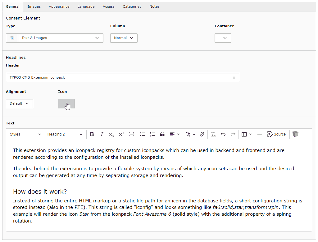
This extension provides an iconpack registry for custom iconpacks which can be
used in backend and frontend and are rendered according to the configuration of
the installed iconpacks.
The idea behind the extension is to provide a flexible system by means of which
any icon sets can be used and the desired output can be generated at any time by
separating storage and rendering.
Features
The extension iconpack is different from previous implementations and will
probably be the only icon extension you will need in the future.
The biggest differences are among others:
Not limited to a specific iconset! Existing iconpacks can be installed, or
custom iconpacks can be created, depending on your requirements
Offers the use of various icons in the header, page, in the bodytext (CKEditor
4/5) and in your own fields
All required assets (JavaScripts, StyleSheets, etc.) are automatically added
in frontend and backend by default, depending on the configuration of the icon
set used
All settings of an iconpack can be overridden via an individual configuration
(YAML)
Instead of storing the entire HTML markup or a static file path for an icon in
the database fields, a short configuration string is stored instead (also in the
RTE). This string is called "iconfig" and looks something like
fa7:solid,star,transform:spin. This example will render the icon Star from
the iconpack Font Awesome 6 (solid style) with the additional property of a
spinnig rotation.
This string is only converted into HTML code according to the configuration
during rendering in the backend or frontend, which ensures the greatest possible
flexibility. It is possible to choose whether the icons are to be rendered as a
webfont, sprites, inline SVG or as an SVG image without having to change the
content in the database.
To illustrate this behavior better, here is an example.
Only the following code is always (!) stored in the database (RTE):
<spandata-iconfig="fa7:solid,star"></span>
Copied!
How this code is then displayed in the backend and frontend depends on the
configured renderTypes and the icons provided by the respective iconpack.
In the case of Font Awesome 7, for example, all possible types are provided:
Webfont
SVG sprites
SVG images
The following possibilities are therefore available as renderTypes, which
are displayed in BE/FE as follows:
The converters included in this extension ensure that only the most necessary
code is stored in the database, and the output in BE/FE always corresponds to
the configuration and requirements.
Furthermore, this extension adds additional icon fields for pages and text
headers, but it can also be used to extend fields of your own extensions.
Note
This extension does NOT have the same approach as the TYPO3 integrated
IconRegistry with its approach to cache all icons including their HTML
markup for the backend and consider them as absolute, but focuses on
dynamically handling icons for editors and frontend output!
If you are using your own templates for the header, please note that a
ViewHelper is used to display icons. In this case, simply take a look at
the supplied template and migrate these settings.
Configuration
The Extension works out of the box and configures all relevant parameters
automatically.
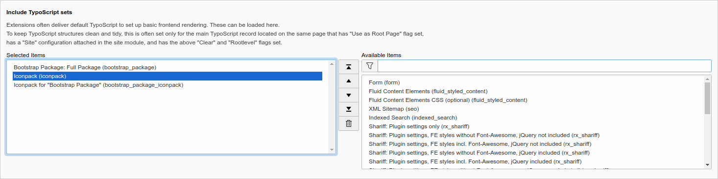
Only the TypoScript needs to be inserted in order to obtain a display in the
frontend. Here you can choose between site sets, add classic TypoScript records,
or write your own TypoScript.
Default CSS file: Use this CSS file as default in the frontend.
renderTypesNative
renderTypesNative
type
string
default
svgInline,svgSprite,webfont,svg
Render types order (Native fields): If an Iconpack provides one of the types defined here (separated by commas), it will be used in the frontend (the order is crucial!).
renderTypesRte
renderTypesRte
type
string
default
svgInline,svgSprite,webfont,svg
Render types order (RTE): If an Iconpack provides one of the types defined here (separated by commas), it will be used in the frontend (the order is crucial!).
Custom TypoScript Configuration
If you do not choose either of the methods above or want to make individual
configurations, you will need to define a few things in TypoScript so that the icons
can be displayed in the frontend:
RTE content needs to be parsed by lib.parseFunc_RTE.nonTypoTagUserFunc
For the RTE, allowed content must be defined to enable the output of SVG elements
Templates must be added so that the icon field contained in the extension can be
rendered for the title of a record. Keep this in mind if you use your own
templates for the header.
A small CSS is required for the frontend output to achieve a consistent display of
different icons.
Tip
Take a closer look at the content of
iconpack/Configuration/TypoScript/setup.typoscript to make individual
adjustments.
Note
If you use EXT:bootstrap_package_iconpack, make sure
you include the templates at the end, otherwise lib.parseFunc_RTE will be
overwritten by EXT:bootstrap_package and the icons cannot
be displayed by the RTE.
Overriding Settings
The basic representation of icons is defined in the respective iconpack via the
"renderTypes" key, and can be subsequently overwritten at any time using
TypoScript for the frontend. The defined values are keywords separated by
commas, which represent a sequence. If an iconpack does not contain the
requested renderType, the next defined renderType is used.
To override the default settings for rendering iconpacks, the key
plugin.tx_iconpack.settings.renderTypes is created in the template or in the
respective page. The settings can apply to all iconpacks with the key
_default, or can refer to a specific iconpack.
The following examples show such a configuration for the frontend.
Override Settings in the Frontend
The settings for the frontend are made in the TypoScript Setup. Rendering in
the frontend is done via dataProcessing, which can be assigned to any custom
fields.
# Typoscript setup
plugin.tx_iconpack {
settings {
# If you change the CSS class, please also note that you have to change it in your CSS files accordingly!# You can also remove this completely if you don't need it.
cssClass = {$plugin.tx_iconpack.cssClass}# Define the order of the renderTypes here.# If an Iconpack provides one of the types defined here (separated by commas), it will be used (the order is crucial!).# This can be specified differently for icons from a field or the RTE with the keys "native" and "rte".# You can also assign one (or more) of the valid values directly to the identifier of a specific iconpack, which will# then affect both "native" and "rte" equally.# Available values: svgInline, svgSprite, webfont, svg
renderTypes {
# Override default values for all iconpacks
_default {
native = svgSprite, webfont
rte = webfont
}
# Override values only for specific iconpacks by using their key
fa7 {
native = svgInline
}
mi = webfont
}
}
}
Copied!
Extension Configuration
You can control whether the required assets should be included automatically and
whether the CKEditor should be configured automatically.
Some iconpacks also offer the option of choosing between different icon set
versions and other options. These settings are made in the extension
configuration of the respective iconpack.
The following settings are currently available:
autoConfigRte
autoConfigRte
type
bool
default
1
If enabled, the CKEditor will be configured automatically (no PageTS needed),
so that the icons inserted in the RTE and their values are preserved when
saving. If this option is disabled, these parameters must be inserted
manually in the custom YAML configuration for the CKEditor.
autoAddAssets
autoAddAssets
type
bool
default
1
If enabled, all CSS files required by the installed iconpacks are
automatically included in the frontend.
rteSvg
rteSvg
type
bool
default
1
If this option is enabled, icons are loaded in the RTE as SVG (inline, sprites) if they
are available in the respective iconpack. Otherwise, only webfonts and IMG tags will
be used instead, which results in a simpler format but may differ from the frontend appearance.
Note: Clear the TYPO3 cache after changing this option!
This setting only affects the presentation of the icons used in the RTE, not the content
stored in the database! When loading the content, an icon is generated as SVG via the
iconfig string and displayed in the RTE. When saving, it is converted back and no real
SVG code ever ends up in the database!
defaultConfig
defaultConfig
type
string
default
EXT:iconpack/Configuration/Iconpack/Default.yaml
Path to the YAML configuration file containing the default options for all
installed iconpacks. Leave this field blank to disable it, or use your own
configuration file. If you specify your own file here, it will overwrite
the default options for all iconpacks, unless they contain their own options.
Please also note that you must specify a corresponding CSS file for rendering
the respective options in the YAML file with the key optionsCss (see example below).
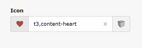
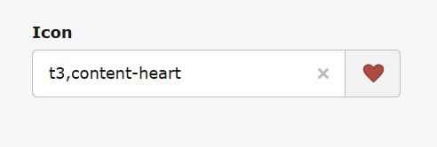
formElementStyle
formElementStyle
type
string (list of keywords)
default
iconButton
Select how the icon field should be rendered in the backend.
iconInputButton
This setting displays the icon next to an input field and a dedicated button:
iconInput
This setting displays the input field next to an icon (as a button):
iconButton
This setting displays the icon next to a dedicated button:
icon
This setting displays only the icon, which also serves as the button:
Important
Changing the extension configuration requires an emptying of the TYPO3 cache
for the changes to take effect!
If you deactivate autoConfigRte or autoAddAssets, however, you will have to make the required
configuration yourself and integrate it into your own setup. Use the following two examples...
Example of manual CKEditor 4 configuration (TYPO3 v10/11)
editor:externalPlugins:iconpack:{resource:'EXT:iconpack/Resources/Public/JavaScript/v11/CKEditor/plugin.js'}config:# Note: CSS files required by specific iconpacks is loaded automatically!contentsCss:-'EXT:iconpack/Resources/Public/Css/Backend/CKEditor.min.css'# This configuration is necessary so that certain contents can be inserted in CKEditor4 in the first place.# All values defined here finally end up in the RTE and can be edited there.## Note, however, that these values are additionally filtered again with PHP when saving, and ultimately only the attributes# defined here are actually stored in the database. In addition, for the output in the frontend on the one hand the# RteHtmlParser is used and on the other hand the Sanitizer, which finally decides which output ends up in the FE.## More information about the RTE content filter can be found here:# https://ckeditor.com/docs/ckeditor4/latest/examples/acfcustom.html# https://ckeditor.com/docs/ckeditor4/latest/guide/dev_advanced_content_filter.html#extraAllowedContent:# Allow <span> tags (webfont)-span(*)[!data-iconfig,id,name,class,style,alt,title]{color,background*,margin,padding,align,vertical-align}# Allow SVG images (svg)-img[!data-iconfig,id,name,class,style,alt,title]{margin,padding,align,vertical-align}extraPlugins:-iconpack
Copied!
If you have also enabled the rteSvg option via the extension configuration, you will
need to allow various SVG elements in CKEditor4 as well (in CKEditor5, this is done automatically
via the model schema of the CKEditor plugin):
Example of manual CKEditor 5 configuration (TYPO3 v12+)
editor:config:# Note: CSS files required by specific iconpacks is loaded automatically!contentsCss:-'EXT:iconpack/Resources/Public/Css/Backend/CKEditor.min.css'# Load modules for plugins when CKEditor is initialized# See CKEditor plugin API for detailsimportModules:-{module:'@quellenform/iconpack-ckeditor.js',exports:['Iconpack']}toolbar:items:-'|'-Iconpack
Copied!
(Please take at look at the examples, located in Configuration/RTE/)
Example of a YAML file for custom options
The defaultConfig option defines a YAML file that controls the default options for all
installed iconpacks. You can edit this file as you wish so that you can use your own
transformations and animations. Please note, however, that the values used here will also
be stored in the database, so you should use these settings with caution.
You can also use Iconpack in your own extensions and add the wizard to your own
database fields as well as the RTE.
Native Fields
The wizard for adding icons can be used arbitrarily in own database fields. To
do this, simply assign the value IconpackWizard to the renderType of the
corresponding field.
Here is an example with /Configuration/TCA/Overrides/tt_content.php:
If you want to use Iconpack in your own RTE fields, the configuration is done
automatically in the TypoScript setup, where lib.parseFunc_RTE.nonTypoTagUserFunc
performs the transformation of the icons.
Using DataProcessor
If this is not desired or possible, the content can optionally be preprocessed in
the field via a DataProcessor.
Use the following TypoScript to add the DataProcessor to your own RTE field:
# Set templates and dataProcessing
lib.contentElement {
dataProcessing {
# This is required to render icons in RTE fields!# The output is controlled exclusively by the DataProcessor and then cleaned up by the Sanitizer.[number] = Quellenform\Iconpack\DataProcessing\IconpackProcessor[number] {
fieldName = myCustomRteField
fieldType = rte
}
}
}
Copied!
Note, however, that for this to work, all content must also be accepted by the HTMLparser, which
is why — depending on the requirements or desired output — additional TypoScript may be necessary.
For example, if you need to output inline SVG, you may need the following TypoScript code:
# Here all tags are defined, which are NOT removed by the parser in principle.# Without this instruction the content from the database will not be displayed in the frontend when using DataProcessor!# If you use your own configuration, make sure that this statement is included at the end, or is not overwritten by other statements.# Note: Even if you allow certain tags here, the sanitizer still decides whether these tags actually end up in the frontend or not!
lib.parseFunc_RTE.allowTags := addToList(icon, svg, use, g, line, path, polyline, polygon, rect, circle, ellipse, image, desc, defs, linearGradient, radialGradient, stop)
Copied!
If you don't use inline SVG, but only SVG sprites, you can also reduce this to the following statement:
Icons can be inserted directly from a fluid template using the provided
ViewHelper. All that needs to be done is to add the namespace
http://typo3.org/ns/Quellenform/Iconpack/ViewHelpers and a corresponding
iconfig string. Optionally additionalAttributes, preferredRenderTypes and
style can be used.
Any custom iconsets can be registered and provided via custom extensions.
Iconsets that meet at least one of the following criteria can be used:
Available as webfont
Available as SVG sprite
Available as single SVG icons
An individual Iconpack extension consists of the necessary assets (SVG files,
StyleSheets, etc.) and a configuration file, which is described below.
Tip
Have a look at the existing extensions!
Note
If you are so kind and want to make your iconpack extension available to the
community, it would be great if you use the name iconpack_* as extension
key, e.g. iconpack_supericons.
Iconpack Kickstarter
If you want to take the easy route and create a ready-to-use iconpack from SVG files,
you can use the Iconpack Kickstarter,
which allows you to create a complete iconpack and includes all the necessary
renderTypes (svgInline, svgSprites, svg, webfont).
Simply clone the repository and follow the instructions in the README.md file.
The Structure of an Iconpack Extension
The structure for your own iconpack extension, which consists of SVG icons and
a webfont, for example, looks something like this:
The iconpack itself is configured via the YAML file. In this file, the basic
information about the iconpack is recorded and the definitions for the available
renderTypes are specified:
Caution
The key of an iconpack should be chosen wisely and should not be changed, as
it is used to identify the iconpack and this value is also saved in the database!
iconpack:title:"My Custom Icons"# The key of the iconpack (!)key:"mci"version:1.0.0# Set this value to "true" if you want to hide your iconpack in dropdown menus in the BE.# This is useful if you only want to use it in FE/ViewHelpers# Default value: falsehidden:falserenderTypes:webfont:# CSS file that is used for web fonts:css:"EXT:iconpack_customicons/Resources/Public/Css/webfont.css"# CSS prefix for the icons:prefix:"mci-"# Attributes to be used by default:attributes:aria-hidden:"true"role:"img"svg:# Source folder of the SVG files, which are rendered as <img> tag:source:"EXT:iconpack_customicons/Resources/Public/Icons/"attributes:class:"mci"svgInline:# Source folder of the SVG files that are rendered as <svg> tag (inline SVG):source:"EXT:iconpack_customicons/Resources/Public/Icons/"attributes:class:"mci"fill:"currentColor"# Optional categories for the backend modal.# All icons not listed here can be displayed using ViewHelper,# but cannot be selected in the backend modal wizard!!!categories:cat1:icons:-icon1-icon2-icon3-...label:"Category 1"cat2:icons:-icon4-icon5-icon6-...label:"Category 2"# Define here which icons are provided by this iconpack# In this case, the values here correspond to the file names (without file name extension)icons:-icon1-icon2-icon3-...-...-iconZ# Aliases for obsolete icons.# Here you can list those icons that have been replaced by this particular version of the icon pack.aliases:icon1:-old-icon1-old-icon2
Copied!
The keys "categories", "icons" and "aliases" can be used directly in the main
configuration with arrays, but it is also possible to refer to a YAML or JSON
file instead. External configuration of these values is particularly recommended
if the number of icons is very high or if better maintainability is required.
# Icon categories for listing in the modal window (BE only)categories:"EXT:iconpack_customicons/Resources/Public/Metadata/categories.yml"# The icons in this iconpackicons:"EXT:iconpack_customicons/Resources/Public/Metadata/icons.yml"# Alternative: Use a JSON-file#icons: "EXT:iconpack_customicons/Resources/Public/Metadata/icons.json"# Aliases for specific iconsaliases:"EXT:iconpack_customicons/Resources/Public/Metadata/aliases.yaml"
Copied!
Aliases
It may happen that some icons are removed from newer versions of certain iconpacks.
Aliases are used to register these icons and provide replacements for them.
Essentially, this simply involves replacing icon identifiers, with an alias
specifying which icon should be replaced by which other icon.
Aliases can be used in external configuration files in two ways:
- Either directly in the "icons" key/array
- Or in a separate file in the "aliases" key/array
If you use the "aliases" key or your own file for storing aliases, any aliases
stored directly in the "icons" key will be ignored!
If the configuration is done in icons.yml, use the following structure:
Depending on which renderTypes your iconpack provides (in this simple example
we have webfonts and SVG icons), these are selected by default in the following
order (with a fallback from top to bottom):
svgInline
svgSprite
webfont
svg
If you want to overwrite or customize these settings later, you can do this
via TypoScript:
plugin.tx_iconpack.settings.renderTypes.mci = svg
Copied!
Rendering in the Backend
In the backend, the order of the renderTypes for native fields and the RTE is
predefined in the source code.
Unless you explicitly change this order in your YAML file or disable the rteSvg
option in the extension settings, it will also be:
svgInline
svgSprite
webfont
svg
Customizing the Rendering Sequence
If you want to change the order of rendering fallbacks or specify only a specific
renderType (which in both cases would only make sense in exceptional cases), you
can add the following setting to the YAML configuration:
iconpack:# The title which is used in the backend [mandatory]title:"Fontawesome Icons 5 (mod)"# The main key for this iconpack [mandatory]key:"fa7"# This iconpack replaces all icons from previous versions with the identifiers "fa5" and "fa6"replaces:"fa5,fa6"version:"7.1.0"url:"https://fontawesome.com/"# Override predefined preferred renderTypes (The first available type is selected) [optional]preferredRenderTypes:backend:native:"svgSprite,svgInline,webfont,svg"rte:"webfont,svg"frontend:native:"svgInline,svgSprite,webfont,svg"rte:"svgInline,svgSprite,webfont,svg"# Use only the following styles, even if others would be available in principlestylesEnabled:"regular,solid,brands"renderTypes:# Default values (Always included in all renderTypes!)_default:# Default values (Always included in all styles!)_default:prefix:"fa-"#attributes:# Note: Individual classes can be added here.#class: "XXX XXX2 XXX3"# Note: Individual styles can be added here.#style: "color:white;background-color:red"css:# Included in all styles but only in CKEditorckeditor:"EXT:iconpack_fontawesome/Resources/Public/Css/CustomStylesForCKEditor.css"regular:# Note: Language specific labels possible:#label: "LLL:EXT:iconpack_xxx/Resources/Private/Language/locallang_be.xlf:label"label:"FontAwesome (Regular)"attributes:class:"far"#style: "background-color:green"solid:label:"FontAwesome (Solid)"attributes:class:"fas"brands:label:"FontAwesome (Brands)"attributes:class:"fab"webfont:_default:css:# Include in all webfonts-styles in all scopes (backend, CKEeditor, frontend)shared:"EXT:iconpack_fontawesome/Resources/Public/Css/StylesForAllWebfonts.css"regular:css:"EXT:iconpack_fontawesome/Resources/Public/Css/regular.css"solid:css:"EXT:iconpack_fontawesome/Resources/Public/Css/solid.css"brands:css:"EXT:iconpack_fontawesome/Resources/Public/Css/brands.css"svgSprite:_default:css:backend:"EXT:iconpack_fontawesome/Resources/Public/Css/SvgBackend.css"ckeditor:"EXT:iconpack_fontawesome/Resources/Public/Css/SvgBackend.css"frontend:"EXT:iconpack_fontawesome/Resources/Public/Css/SvgFrontend.css"attributes:fill:"currentColor"regular:source:"EXT:iconpack_fontawesome/Resources/Public/Sprites/regular.svg"solid:source:"EXT:iconpack_fontawesome/Resources/Public/Sprites/solid.svg"brands:source:"EXT:iconpack_fontawesome/Resources/Public/Sprites/brands.svg"svgInline:_default:css:backend:"EXT:iconpack_fontawesome/Resources/Public/Css/SvgBackend.css"ckeditor:"EXT:iconpack_fontawesome/Resources/Public/Css/SvgBackend.css"frontend:"EXT:iconpack_fontawesome/Resources/Public/Css/SvgFrontend.css"attributes:fill:"currentColor"regular:source:"EXT:iconpack_fontawesome/Resources/Public/Svg/regular/"solid:source:"EXT:iconpack_fontawesome/Resources/Public/Svg/solid/"brands:source:"EXT:iconpack_fontawesome/Resources/Public/Svg/brands/"# If you specify your own options here, they will be used instead of the default options.# Please note that you must also use the corresponding CSS in the renderTypes above.options:customCheckbox:type:"checkbox"label:"My Special Effect"attributes:class:"fa-special"customStyles:type:"select"label:"Custom CSS-Style"values:red:label:"Red"attributes:style:"color: red"green:label:"Green"attributes:style:"color: green"categories:"EXT:iconpack_fontawesome/Resources/Public/metadata/categories.yml"# The icons in this iconpack (mandatory)icons:"EXT:iconpack_fontawesome/Resources/Public/metadata/icons.yml"# Alternative 1: Use a JSON-file#icons: "EXT:iconpack_fontawesome/Resources/Public/metadata/icons.json"# Alternative 2: Define the icons as array#icons:# - icon1# - icon2# - icon3# Aliases for specific iconsaliases:"EXT:iconpack_fontawesome/Resources/Public/metadata/aliases.yaml"
Copied!
Example 4 (Path substitution)
The following example shows the setting in which parts of a path are replaced
with parts of an icon identifier.
For example, the identifier is actions-archive, which in the case of an SVG
sprite leads to the path
EXT:iconpack_typo3/Resources/Public/Vendor/TYPO3.Icons/sprites/actions.svg#actions-archive,
or in the case of an SVG to
EXT:iconpack_typo3/Resources/Public/Vendor/TYPO3.Icons/svgs/actions-archive.svg.
50c1da1 Moved PageTSConfig to file page.tsconfig for v12+
1.1.8
36ac5b0 [BUGFIX] Error on installation with TYPO3 13.3 (#24)
36ac5b0 [BUGFIX] Missing argument when calling YamlFileLoader in version 13.3+ (#23)
2a2bebc Added event listener for v13.3 (XCLASS is no longer necessary due to new events in RteHtmlParser)
1.1.7
b628dc5 Switched from DataProcessor to lib.parseFunc_RTE for automatic conversion of icons in all RTE fields
1.1.6
e98e5d8 Switched from PageRenderer to AssetCollector (this changes the way CSS files are included in BE/FE)
77aec61 Suppress false positive messages in Install Tool
1.1.5
214c9b7 Wrap content of ext_localconf.php with call_user_func() (thanks to @froemken)
69aa787 Remove autoloader from ext_emconf.php (thanks to @froemken)
1.1.4
50bc2db [BUGFIX] iconpack Configuration is null (#17)
1.1.3
d13ac36 [BUGFIX] HiRes Icon for RTE is missing (thanks to @christianhaendel)
1.1.2
Feature
37556e3 [FEATURE] Added compatibility to TYPO3 v13
1.1.1
Feature
f494765 [FEATURE] add icons to sys_category and sys_file_collection (thanks to @t3brightside)
1.1.0
Feature
4750398 Added substitution of path segments with icon names in YAML-configuration files
1.0.1
Updated documentation
1.0.0
First stable version...
Feature
64a41d5 [FEATURE ] Compatibility with CKEditor 5 and TYPO3 version 12
Icons can now be selected and edited directly in the RTE by double-clicking
Added title and description to SVG elements (title will be converted to
<title> and alt to <desc>)
The JavaScript has been almost completely rewritten in TypeScript
Many other changes and optimizations under the hood...
Removed
Removed "enablePlugin" from the extension configuration
Breaking
Changed the icon tag from <icon> to <span> for better compatibility! Due
to a lack of funding for the project, there is unfortunately no upgrade wizard
for this, but there is at least downward compatibility in the frontend. To
update your content and switch to the new tag, simply open the data record for
editing and save it again.
0.3.3
d37a6d7 [BUGFIX] Opening modalbox in IRRE content elements (#10)
17b1d17 [FEATURE] Make the CKEditor plugin optional in the extension
configuration
0.3.2
9632c4a [FEATURE] Option to remove default CSS (#11)
0.3.1
f6e7419 [BUGFIX] Undefined global variable $LANG
106a562 Restructured queryIconpackIcons()
2ca27b9 Updated cache configuration
0.3.0
e21fa7b Removed the templates for "bootstrap_package". Please use
"EXT:bootstrap_package_iconpack" instead!
0.2.1
99f9ccf Remove title attribute from svg elements as it is forbidden in HTML
0.2.0
daf35b7 Added support for custom CSS class
7d2f743 SVG Sanitizer Improvement
c9154b2 Improved CSS for backend/frontend
d7d8f34 Added translatable labels
73d9d7c Code cleanup, PSR12 compatibility
Additional Information
Why I made this extension?
...because this feature is simply missing in TYPO3!
Various existing extensions have so far only ever handled a single iconpack, and
even that was not optimally integrated into TYPO3. Most of them can either only
be used in the RTE, and others only in a single additional field. All extensions
so far also lack the possibility to influence the icon rendering afterwards.
Furthermore, other extensions don't really offer the possibility to use an icon
set flexibly in their own database fields and to achieve a consistent rendering
across the whole website.
It took me several months to find out how an optimal flexible iconpack system
should work. There is still room for improvement in the programming, but I tried
to create a mechanism that offers the greatest possible flexibility and
consistency for current and future requirements by analyzing various icon sets
and extensive testing.
The main focus for me was that every possible icon set should be able to be used
with it, and at the same time it should be possible to use it in all TYPO3
fields (native fields, RTE, fields in own extensions, ...).
Another focus was on the extensibility and modification of existing iconpack
extensions. These should be integrated into the system as easy as possible (YAML
file).
Why I published this extension?
I wrote this extension at the end of 2020, and unfortunately didn't make it
public right then.
The reason why the whole thing is now published by me after all is that I am
convinced that such a system can really help to improve and simplify the
handling with icons in TYPO3.
If you think that this is also a step in the right direction for you and you
have wishes, thanks or improvements, please share your contribution!
Reference to the headline
Copy and freely share the link
This link target has no permanent anchor assigned.The link below can be used, but is prone to change if the page gets moved.


