Administrator Manual
Installation
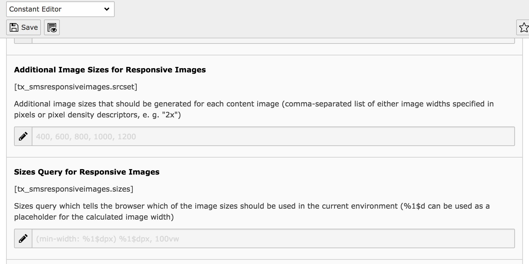
New fields in constants editor
Once you’ve installed the extension, the static TypoScript “Responsive Images” should be included. After that, the TypoScript constants editor contains two new fields concerning content images:
- Additional Image Sizes for Responsive Images: Additional image sizes that should be generated for each content image (comma-separated list of either image widths specified in pixels or pixel density descriptors, e. g. “2x”)
- Sizes Query for Responsive Images: Sizes query which tells the browser which of the image sizes should be used in the current environment (
%1$dcan be used as a placeholder for the calculated image width)
Depending on the preferred image setup, these values can be adjusted to fit the layout of your website.
The image sizes can be altered or modified without major consequences. You should however make sure that your configuration covers the area between 400 and 1000 pixels as this is the most common area of screen sizes. Also note that widths and pixel density descriptors must not be mixed!
If you modify the sizes query, you should note that this applies to all content images by default, so this could have broad consequences to the download size of your website. The default value makes sure that the image can’t get larger than the value configured in the backend. Long story short: You should know what you’re doing.
Demo PlugIn
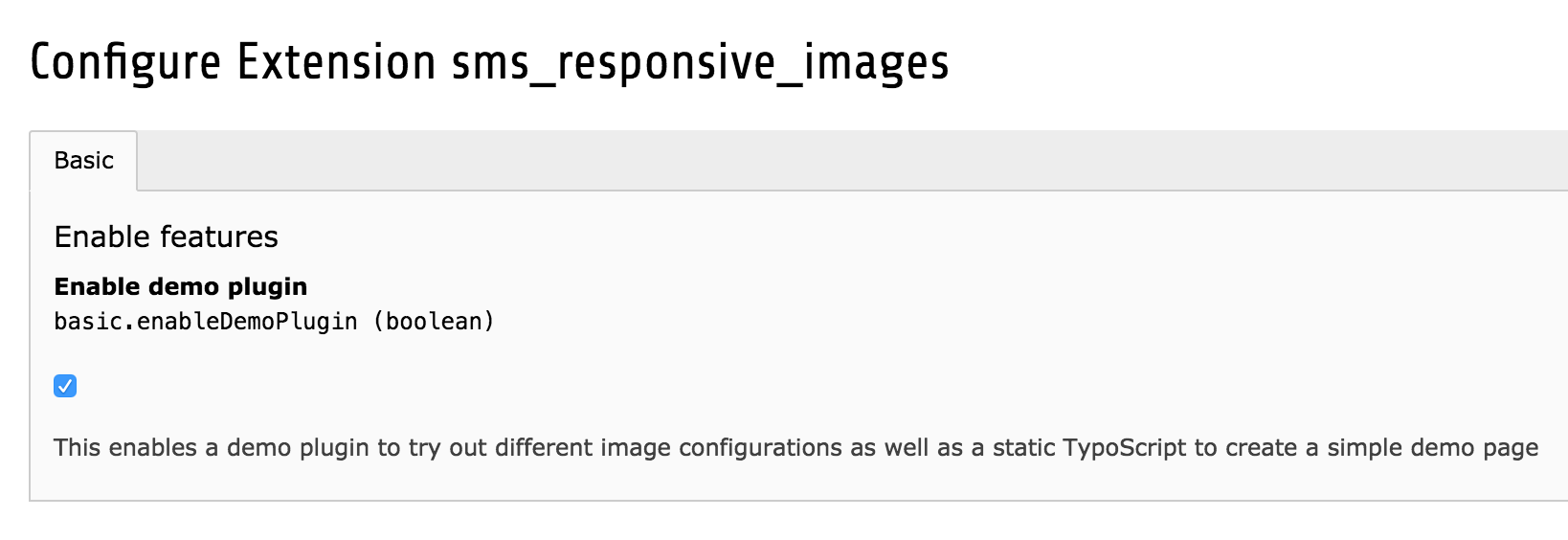
Extension configuration in extension manager
The extension contains a demo mode in which you can test various image setups in a boilerplate website. The mode needs to be enabled in the extension’s configuration found in the extension manager. Once you’ve enabled it, both a plugin and a new static TypoScript will be available, and the media field in the page properties allows three cropping variants (mobile, tablet, desktop).
Next, follow these steps to create the demo page:
- Create a new page
- Create a TypoScript extension template on the page
- Include the static TypoScript “Responsive Images (Demo)”.
- Make sure that the page inherits or includes the static TypoScripts “Responsive Images”, “Fluid Content Elements” and “Fluid Content Elements CSS (optional)”
- Add an image to the media field in the page properties, adjust cropping for each variant
- Add image elements to the main content column
This should give you a simple demo environment in which you can test different image configurations.