Kickstarter, based on fluid and extbase, which automatically generates
basic extensions, extensions for the SAV Library Plus and SAV Library MVC. Multiple views of
the data including forms with frontend editing facilities
can be generated.
The SAV Library Kickstarter is a code generator, developed with
extbase and fluid, to produce Frontend plugins.
Basic Code Generation
This feature can be used to kickstart extensions
based on fluid and extbase.
Code Generation for the SAV Library Plus
The SAV Library Plus Extension is stable since many years.
It makes it possible to develop extensions without any
PHP coding, thanks to simple configuration parameters.
The SAV Library Plus extension relies on a conventional approach for the
queries but uses fluid for the rendering of views.
The concept used in the SAV Library Plus relies on forms. A form is a
way of presenting data. It includes List view, Single view or Edit
views of the data. An extension may contain several forms. The
generator handles also special views like print views or update views.
Data presentation may differ from one view to another. A query is
associated with each form. Therefore, when several forms are used in
an extension, data may be different.
The SAV Library Kickstarter generates extensions which include:
Creation of multiple views of the data,
Frontend input of the data,
Views with folders,
Simple interface in the Kickstarter with Context Sensitive Helps,
Generation of emails,
Generation of RTF files using database tags,
Data export in the CSV format or more complex format by means of XSLT
processing,
Management of different versions of the same extension,
Generation of the documentation,
Generation of the Entity Relationship Diagram,
Many other features.
Code Generation for the SAV Library Mvc
The SAV Library Mvc Extension is the new
development of the SAV Library that fully relies on the MVC approach
with extbase and fluid. The configuration parameters to develop extension without any
PHP coding are the same as in SAV Library Plus.
This library does not implement yet all the features available with SAV Library Plus.
However available features are enough for most extensions.
The extension SAV Basic Example0
was designed to test the SAV Library Kickstarter generation for a basic extension with Fluid and Extbase.
The extension SAV Library Example0
was designed to test the SAV Library Kickstarter generation for the SAV Library
Plus extension.
The extension SAV Library Mvc Example0
was designed to test the SAV Library Kickstarter generation for the SAV Library
Mvc extension. It implements the same features as SAV Library Example0.
Other Extensions in Relation with the SAV Library Kickstarter Project
Extensions Generated for SAV Library Plus
SAV Library Example1
SAV Library Example2
SAV Library Example3
SAV Library Example4
SAV Library Example6
SAV Library Example7
SAV Library Example8
SAV Library Example9 - this extension depends on sav_charts.
SAV Library Example10 - this extension depends on map2.
Filters for SAV Library Plus or SAV Library Mvc
SAV Filters
Extensions Generated as Basic Extensions
The following extensions have been kickstarted with the basic type.
SAV Charts
Screenshots
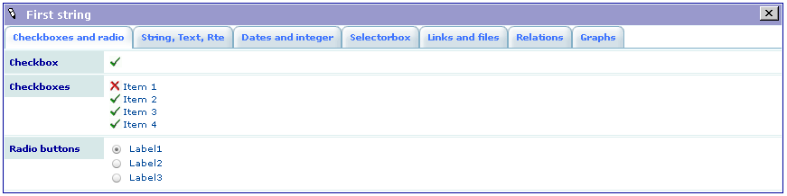
SAV Library Example0: Generated List View
SAV Library Example0: Generated Single View
SAV Library Example0: Generated Edit View
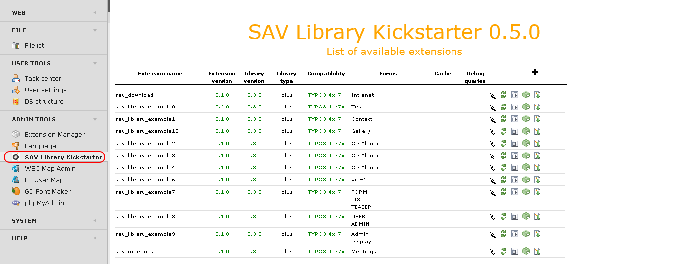
Kickstarter: Extension List
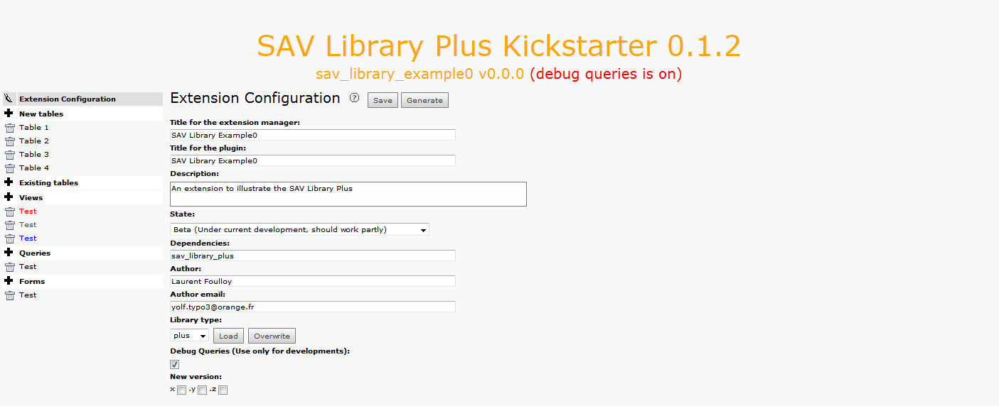
Kickstarter: Extension Configuration Section
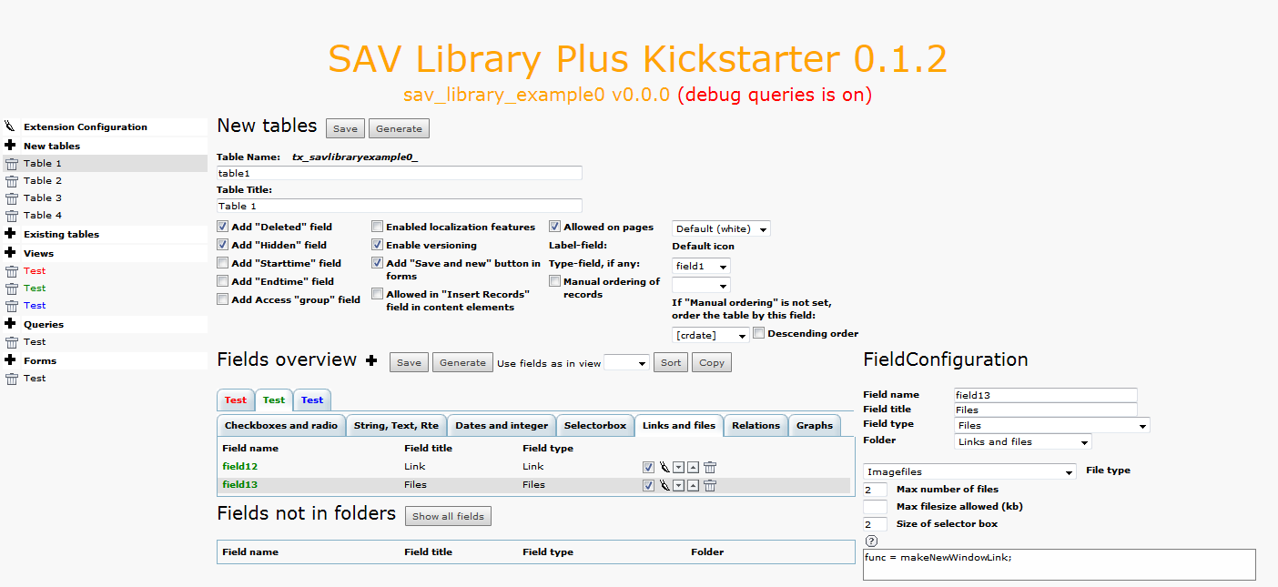
Kickstarter: New Tables Section
Kickstarter: Views Section
Kickstarter: Queries Section
Kickstarter: Forms Section
Configuration
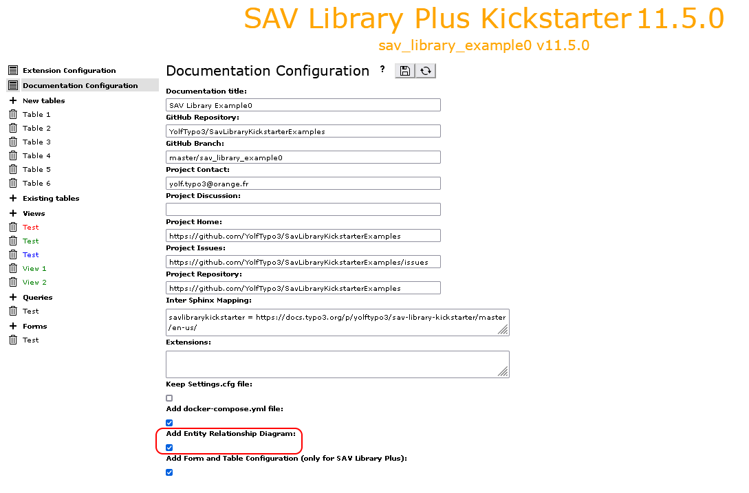
Generation of the Entity Relationship Diagram
The Sav Library Kickstarter can generate Entity Relationship Diagrams
in Graphviz DOT language.
In Documentation section of the SAV Library Kickstarter, check
Add Entity Relationship Diagram:.
The Entity Relationship Diagram will be added to the documentation when the
extension is regenerated.
Generation of Documentation
The Sav Library Kickstarter can generate documentation for
your extensions by means of docker (see also Documentation Configuration
for details about the configuration of the documentation generation).
Note
For Basic type extension, the generated documentation contains only basic sections:
Introduction,
Entity Relationship Diagram, if enabled,
Changelog.
Since the Table of Contents is always regenerated, if you add your own sections
to the documentation, add the file Documentation/TableOfContents.txt to your extension in the conventional
format for the table of contents.
For example, the extension SAV Charts
was generated by SAV Library Kickstarter as a Basic type extension. It has its
specific sections for the documentation. In order to have the table of contents correctly regenerated,
the following content was added in the file Documentation/TableOfContents.txt.
This section describes the role of menu items which are on the left hand side
of the kickstarter when an extension is opened. The following caption shows
the menu when the extension sav_library_example0 is opened.
This item opens the form for the configuration of the extension.
Tip
Click on the icons at the right hand side of Extension Configuration:
to access to this section of the documentation.
to save your configuration.
to generate the extension.
Title for the extension manager: title which will be displayed in
extension manager.
Vendor name: vendor name (mandatory).
Title for the plugin: title which will be displayed in the
plugin selector.
Description: use this field to describe the aim of the
extension.
State: selector which specifies the state of the extension.
Dependencies: specify here the dependencies of the extension.
Dependencies must be comma-separated. If only extension names
are entered, dependencies will be added in ext_emconf.php
file without constraints.
The SAV Library Kickstarter generates automatically the dependency
to SAV Library Plus or SAV Library Mvc for composer.json and
ext_emconf.php files.
Constraints can be added for ext_emconf.php or composer.json.
The following example is taken from the extension sav_library_example10 which
depends on extension maps2.
The extension maps2 has a composer support jweiland/maps2. In
such case, you must enter directly the dependency, i.e. jweiland/maps2,
instead of the extension name. The dependency
is added to composer.json with the constraint ^13.0.
Author: use this field to set the extension's author.
Author email: use this field to set the author's email.
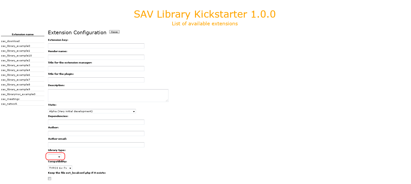
Library type: selector which specifies the type of extension
which will be generated. The Basic type can be used to kickstart
extension using Fluid and Exbase. Icons at the right hand side of
the selector are still experimental. They should make it possible
to migrate a Plus type extension to a Mvc type extension
and vice-versa.
Compatibility: selector which defines the compatibility of the
extension. This selector evolves with the version of TYPO3. If an extension
becomes incompatible, it has to be upgraded.
Add TypoScript configuration: if selected, TypoScript configuration files are
added (only for Plus type. For Basic and Mvc TypoScript configuration files are
always added).
Keep the file ext_localconf.php if it exists: set this option
if you manually modify the ext_localconf.php file.
It will prevent the SAV Library Kickstarter to rebuild it.
Debug Queries (Use only for developments): selector which defines
the level of debuging. The options are:
Off: no debugging is provided.
Queries with errors: debugging is provided for queries with errors.
All queries: debugging is provided for all queries.
Warning
For security reasons, set this selector to Off in the
final version of your extension.
By default, debug information is provided by the TYPO3 Core debug() function.
However, it is often easier to use the TYPO3 Logging system by adding the
following configuration to typo3conf/AdditionalConfiguration.php:
New version: use these checkboxes to automatically ugrade the version of your extension.
Tip
If you set z, one unit will be added to the z part.
It you set y, one unit will be added to the y part, while the z part is reset to 0.
If you set x, one unit, will be added to the x part, while the y and z parts will be reset.
Documentation Configuration
This item opens the form used to generate the documentation of the extension.
Tip
Click on the icons at the right hand side of Documentation Configuration:
to access to this section of the documentation.
to save the configuration
to generate the extension.
Documentation title: title which will be shown in the documenation.
GitHub Repository: GitHub repository if any.
GitHub Branch: GitHub branch if any.
Project Contact: contact for this project.
Project Discussion: URL of the project discussion, if any.
Project Home: URL of the project home, if any.
Project Issues: URL of the project issues, if any.
Project Repository: URL of the project repository, if any.
Add Entity Relationship Diagram: set this option if you want to generate
the Entity Relationship Diagram. The Entity Relationship Diagram is generated by in Graphviz DOT language.
Add Form and Table Configuration (only for SAV Library Plus and SAV Library Mvc):: set this option if you
want to generate a full documentation of the configuration of the forms and tables used in your
extension for SAV Library Plus and SAV Library Mvc.
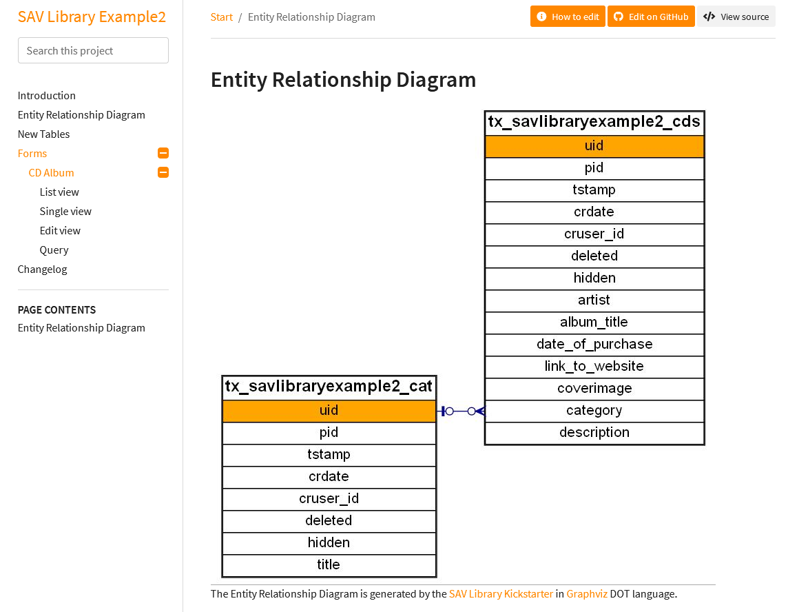
The following figure shows the Entity Relationship Diagram for the extension
sav_library_example2.
As it can be seen on the left hand side menu, the documentation includes the form and the tables
used in the extension.
New Tables
This item opens the form used to generate the new tables
of the extension.
Tip
Click on the icons at the right hand side of New Tables:
to access to this section of the documentation.
to save the configuration
to generate the extension.
The New Tables form has three different sections:
the table configuration.
the fields overview.
the field configuration.
Table Configuration
This section contains several fields which have an impact on the behavior of the
extension.
Table Name: enter in this field a short name for the table.
Important
The SAV Library Kickstarter always prepends to the field tx_yourextensioname
for Plus type and tx_yourextensioname_domain_model for Basic and Mvc
types.
If your enter, for example, shortname, the real name in the database will be
tx_yourextensioname_shortname for Plus type and
tx_yourextensioname_domain_model_shortname for Basic and Mvc
types.
For Plus type, if you leave this field empty, the real name in the database
for the table will be tx_yourextensioname.
Table Title: enter the table title which will appear in the backend.
Add "Deleted" field: select the checkbox to add the field deleted to the table
in the database.
Add "Hidden" field: select the checkbox to add the field hidden to the table
in the database.
Add "Starttime" field: select the checkbox to add the field starttime to the table
in the database.
Add "Endtime" field: select the checkbox to add the field endtime tor the table
in the database.
Add Access "group" field: select the checkbox to add the field fe_group to the table
in the database.
Enabled localization features: select the checkbox to add the fields for the localization
of the record.
Enable versioning: select the checkbox to add the fields for versionning of the record.
Add "Save and new" button in forms: select the checkbox to add a Save and New button
in Edit views.
Allowed in "Insert Records" field in content elements: select this checkbox if you want
to add the table to the list of tables allowed to be included by content element type
"Insert records".
Allowed on pages: select this checkbox if you want to add the table to the
default list of allowed tables on pages. Use the default icon selector to choose
the color of the record icon in the backend.
Label-field: use the selector to choose the field that will appear in the backend.
By defaul the label will be the uid.
Label User Function: when a special labeling is needed in the backend, you may use a
label_userFunc.
Type-field, if any: field name, which defines the "record type"(see type).
Manual ordering of records: select this checkbox if you want to order manually the records.
If "Manual ordering" is not set, order the table by this field: use this selector to order
the record by ascending order of the Label-field in the backend.
Descending order: select this checkbox for a descending order.
Fields Overview
===============
The first part of the Field overview section controls several actions.
Icons at the right hand side of Field Configuration can be respectively used to:
add a new field.
save the configuration.
generate the extension.
sort the current view in the same order as the view in the selector View.
copy the field configuration of the selected field from the view in the selector
View to the current view.
copy the fields configuration from the view in the selector
View to the current view.
The second part of the Field overview section deals with the control of fields
which will be rendered in each view and each folder, if any for the view. You can
select a view or a folder in a view, edit, move or delete fields.
The third part of the Field overview section provides extra fields control action.
The first icon toogles the display of all fields, possibly in a folder if any.
The selector can be used to move a field below another one.
Field Configuration
This section is opened by clicking on a field name or an edit icon in the
Fields Overview section.
Field name: sets the name of the field in the database.
Specific configuration options are added depending on the field type.
Enter configuration attributes for the field in the textarea. See the
Reference section of this manual for allowed attributes
for each type.
Existing Tables
This item opens the form used to generate the existing tables
of the extension.
Tip
Click on the icons at the right hand side of New Tables:
to access to this section of the documentation.
to save the configuration
to generate the extension.
The Existing Tables form has three different sections:
the table configuration.
the fields overview.
the field configuration.
Table Configuration
The table configuration consists simply in selecting an existing
table with the selector and then importing all its fields using
the import icon. Fields are imported with the Show Only type.
See the extension sav_library_example8 for an example.
Fields Overview and Field Configuration
You can execute exactly the same action as with a new table, including adding
new fields to an existing table.
Views
This item opens the form used to generate the views of the extension.
Tip
Click on the icons at the right hand side of Views:
to access to this section of the documentation.
to save the configuration
to generate the extension.
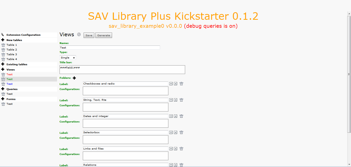
Name: sets the name of the view.
Type: use the selector to set the type of the view.
It is either List, Single, Edit or Update.
Titlebar: the content of this field be displayed as the title bar of the view.
If markers ###fieldName### are used, they will be replaced by the label associated
with the fieldname for a List view. For Single or Edit views, they will
be replaced by the value in the main table by default.
Use ###tableName.fieldName### if you want to access to a field which is in another table.
By default the raw content of the table is displayed. Use ###render[fieldName]### or
###render[tableName.fieldName]### when rendering is required like dates or selector boxes.
Localization by means of the file locallang.xlf can be used with $$$tag$$$ which will be
replaced by its value according to the configuration language. The marker $$$label[fieldName]$$$
will be replaced by the fieldName title according to the localization.
By default, the main table is assumed. Use $$$label[tableName.fieldName]$$$ if necessary.
Item template: this field is for the template for the List, Update or Print views.
The fields to include are defined using markers ###fieldName###. Markers ###tablename.fieldname###
can also be used. In this case, no rendering processing is performed, the marker is replaced by the value
in the selected row.
In the case of a view Update or Print, markers ###field[fieldName, label]### generate
the display of the label (localization can be used with $$$tag$$$ or $$$label[fieldName]$$$),
the current value of field fieldName and an input element for update.
Markers ###newfield[fieldName, label]### generate the display of the label and an input element
for the field fieldName.
In both cases, label and field will be wrapped with default CSS classes
updateCol1 to updateCol4 for an Update view, respectively for the label, the previous value,
the input value, the checkbox.
printCol1 and printCol2 for a Print view respectively for the label, the field.
If you do not want this wrapping, just use $$$label[fieldName]$$$ for the label and
###field[fieldName]### for the field.
Folders: this item is shown in the Single and Edit views.Click on the icon to
add a folder and fill its label.
If the label is defined in the file locallang.xlf, it will be translated to the selected language.
Folder can be deleted or ordered using the icons. See the extension sav_library_example0 for
an example.
Folder configuration parameters can be added. Each parameter should be under the same format as
the format for the field configuration.
parameter = value;
Copied!
Conventional configuration parameters are:
editAdminPlus = 1;: for an Edit view, the folder can be edited if
the frontend user has the Admin+ right. To be an Admin frontend user, the user TSConfig
must contain a line as follows:
extKey_Admin = value
Copied!
extKey is the extension key and value is one of the possible value of the `Input Admin
Field` defined in the flexform associated with the extension.
The frontend user becomes an Admin+ user, if the user TSConfig contains a line as follows:
Add a print icon: if set, a print icon is added to the view.
Queries
This item opens the form used to generate the queries of the extension.
Tip
Click on the icons at the right hand side of Queries:
to access to this section of the documentation.
to save the configuration
to generate the extension.
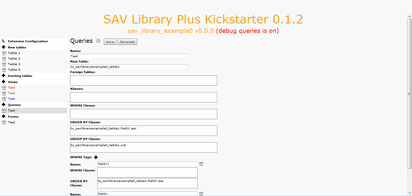
Name: sets the name of your query.
Main Table: sets the main table that your extension will use.
By default, it is the first table in your New tables section.
Foreign Tables: this field can be used to add foreign tables,
e.g. tables from other extension, that are needed for the extension.
It is possible to use LEFT JOIN ou INNER JOIN syntax.
Aliases: use this field to define here the aliases associated
with the query (MySQL syntax).
WHERE Clause: this field is used to define the WHERE clause
for query. It can be a conventional MySQL clause.
The marker ###user### will be replaced by the frontend user uid.
The marker ###uid### or ###uidMainTable### will be
replaced by the current uid record.
The marker ###CURRENT_PID### will be replaced by the current
page uid.
The marker ###group_list = list_of_comma_separed_fe_groups###
is true if the frontend user belongs to the group list.
The marker ###group_list != list_of_comma_separed_fe_groups###
is true if the user does not belong to the group list.
The marker ###func:WHERE_Clause#### returns the WHERE_Clause
if the evaluation of the function func is true. The function must
be a valid method among those defined in the class
\YolfTypo3\SavLibraryPlus\Utility\Conditions. For example:
isInputMode returns true the form is in the input mode.
isNotInputMode returns true the form is not in the input mode.
isGroupMember(groupName) returns true if the frontend user
is a member of groupName.
isNotGroupMember(groupName) returns true if the user
is not a member of groupName.
ORDER BY Clause: ORDER BY clause for the query (MySQL syntax).
GROUP BY BY Clause: GROUP BY clause for the query (MySQL syntax).
Use this field, for example, when MM tables are used .
WHERE Tags: special feature that makes it possible to use hyperlinks with
a parameter &where=tagname.
To add a new WHERE Tag, click on the icon and fill the fields.
The first field is name of the parameter you want to use,
e.g. tagname, and the two others are respectively
a WHERE clause and an ORDER BY clause. See the extension sav_library_example0 for
an example.
Forms
This item opens the form used to generate the forms of the extension.
Tip
Click on the icons at the right hand side of Forms:
to access to this section of the documentation.
to save the configuration
to generate the extension.
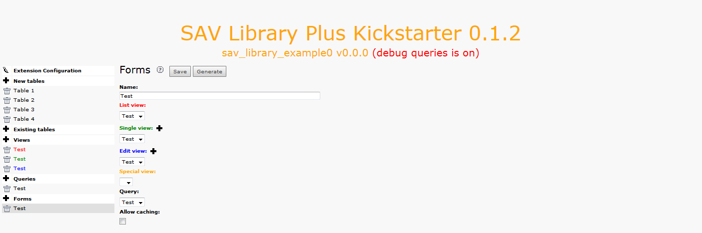
Name: sets the name of the form.
List view: Use the selector to set the List view that should be used
with the form (if any).
Non-cachable List view action (for Mvc type): when using SAV Library Mvc, select
the checkbox if the List view must be non-cachable.
Single view: use the selector to set the Single view that should be used
with the form (if any).
Non-cachable Single view action (for Mvc type): when using SAV Library Mvc, select
the checkbox if the Single view must be non-cachable.
Single view with a condition field: these fields are created by clicking
on the plus icon at the right hand side of Single view. Provide a name
and a condition for the view. See the extension sav_library_example0 for
an example.
Edit view: use the selector to set the Edit view that should be
used with the form (if any).
Edit view with a condition field: these fields are created by clicking
on the plus icon at the right hand side of Edit view. Provide a name
and a condition for the view.
Special view: use the selector to set the Special view that
should be used with the form (if any).
Query: use the selector to set the Query that should be
used with the form.
Allow caching (for Plus type): select this checkbox if the
plugin should behave as USER for this form, that is caching is enabled
for List and Single views when the SAV Library Plus (Plus type)
is used. By default, the plugin will behave as USER_INT (no caching) for
all the forms.
Upgrading Previously Generated Extensions
The SAV Library Kickstarter comes with an upgrade feature which will
upgrade your extensions to the most recent version. When the SAV
Library version used for the extension generation is not the same as
the installed SAV Library version, the following display will be
obtained. The global upgrade icon can be used
to upgrade extensions 10 by 10.
Click on the upgrade icon on the same line as the extension name to
upgrade it to the latest version of the code generator or click on the
icon at the right of the plus icon to upgrade all extensions that
need to be upgraded. Once upgraded, the upgrade icons will disappear
and the library version will be displayed in green as shown below.
For each extension in this list, several information are displayed:
The name of the extension, that is the extension key. By clicking on
the name, you will be able to edit the extension.
The current version of the extension.
The version of the SAV Library which has been used to generate the
extension. If the version of the SAV Library is older than the
installed version, the version will be displayed in red and the
upgrade button will be displayed. In that case, please upgrade the
extension by clicking on the upgrade icon.
The library type which indicates the required library type for the
extension. Plus is the default.
The list of the forms used in the extension since one extension may
contain several forms. For each form you can select if the plugin will
behave as a USER for this form, that is caching will be possible. By
default, the plugin will behave as a USER_INT for all forms, that is
no caching is available. If you want to make a form behaving as a
USER, edit the form section associated with your extension and check
the Allow caching flag.
The debug queries flag which indicates whether you have set this flag
in the extension configuration view. This flag should only be used
during development.
A set of icons is also displayed. From left to right their respective
actions are : edit the extension, generate the extension, copy the
extension and instal/uninstall the extension.
Managing Extension Versions
Management of extension versions was introduced in version 0.5.0 of
the SAV Library Kickstarter. In the extension list, clicking on the extension
version leads to a selector box with the available extension versions as shown below.
Select the version you want to work with and it will be loaded.
Important
The extension used by the SAV Library is always the last generated one.
When the extension in use is not the latest version, the
extension version is displayed in red in the extension list as shown below.
Tutorial
The aim of this tutorial is to show how to use the SAV Library
Kickstarter.
Creating the Extension
If you have neither created any extension with the SAV Library
Kickstarter nor having SAV Library extensions uploaded, you will
obtain the following display.
If you have already created extensions with the SAV Library
Kickstarter or uploaded SAV Library extensions, they will be displayed.
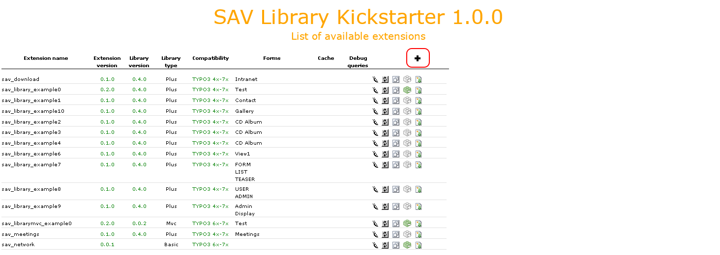
To create a new extension, click on the Create a new extension icon
as shown below.
A new form will be displayed. If your have already created extensions, there
name are displayed on the left hand side.
Three library types are available:
Plus - The SAV Library Kickstarter generates an extension which requires
the SAV Library Plus to be loaded.
The SAV Library Plus Extension is stable since many years.
It makes it possible to develop extensions without any
PHP coding, thanks to simple configuration parameters.
The SAV Library Plus extension relies on a conventional approach for the
queries but uses Fluid for the rendering of views.
Mvc - The SAV Library Kickstarter generates an extension which requires
the SAV Library Mvc to be loaded.
The SAV Library Mvc Extension
is the new development of the SAV Library which fully relies on the MVC approach
with Extbase and Fluid. The configuration parameters to develop extension without any
PHP coding are the same as in SAV Library Plus. This library is in beta state because
it does not implement yet all
the features available with SAV Library Plus. However available features are enough
for most extensions.
Basic - This new feature was introduced in version 1.0.0 to kickstart extensions
based on Extbase and Fluid.
This basic generation includes the database, models, repositories and TCA generation
for all the types available
when using the SAV Library Plus or SAV Library Mvc. The controller displays
a very basic template.
The version 0.0.0 of the extension sav_library_example0 is now
created and a redirection to the Extension Configuration form.
A menu is available on the left hand side.
Two types of menu item are displayed : menu items with edit icon
(paintbrush icon) and menu items with new icon (cross icon). The
former opens directly the requested item either by clicking on the
icon or the title (e.g. Extension Configuration). The latter creates
a sub-item by clicking on the icon. By default, the sub-item title is
New.
Click on the cross icon of the New tables section, enter a name and a title for
the table, change the flags if necessary and save.
Add the table fields by clicking on the cross icon at the right of the
fields overview. By default, the field name and title are set to
New.
If you have several field, in order to fasten the process, you may
click several times on cross icon to add the fields. Each field can be
selected ,edited, moved up or down and deleted using the icons.
Click on the Show all fields button to set the field names, titles and
types, then save.
To create the views, click on the new icon of the Views menu item.
Provide a name and select the type of the view (List, Single,
Edit, Special) and save .
After saving, displayed information will depend on the selected type.
In general, three views are required for one form. A List view, a
single view and an edit view. For the List view, an item template is
required. It contains the HTML code which will be used to display each
item of the list. Markers will be replaced by their values.
Do the same for the single and edit view. You can use the same name
for your view since colors are used to differentiate between them.
Single and edit views may contain folders to present the data as
explained later. In this example, two folders are introduced in the
single view. Click on the new folder icon to add a folder. Each folder
can be moved up, moved down or deleted using the icons at the right
hand side of the label definition.
Now, create a new query. Replace the default name and save. Once
again, you may use the same name as for the views. By default, the
main table will be set to the first table you have defined.
Create a new form, select the list, single, edit views and the query
and save.
The last step is to define with fields should be displayed in the
views. Edit the table by clicking on Table 1 in the left hand side
menu. In the fields overview section, each view is associated with a
folder tab. Select the fields that must be displayed using the
checkbox and save. For the list view, the items associated with
the markers used in the item template must be selected. Save the
selection. The selected items are displayed in the color of the view,
that is in red for the List view.
Click on the green folder tab to select the single view. Select the
fields you want to display and their associated folder if any then
save.
By clicking on a folder, you will see the fields in it which can be
edited, moved up and down or deleted.
Let us note that if you click on the field name, it gives access to
the field configuration as shown below. In this example, field2 will
be displayed.
Add labels for the each checkbox in field3 by clicking on the cross
icon as shown below. It is easier to first add the label fields by
clicking three times on the cross icon and then to fill them before
saving.
Now click on the blue folder tab to select the edit view. Select the
field you want to display. Let us recall that there is no folder
associated with this view.
The final step is to generate the extension by clicking on the
Generate button.
Installing the Extension
Install the extension, create a page and insert a plugin content element and select `SAV
Library Example0` in the plugin selector.
The configuration of the plugin is performed by means of a flexform
which comes with default values. Just select your form name, that is
Test in the Select form selector, save your content element and
clear the cache.
Go to your page in the frontend and you should see the following caption.
Now, log yourself as a frontend user and reload your page. You should
now see the toggle icon to enter in edit mode. Click on it.
A new icon appears at the left hand side of the form. Click on it to
add a new item.
Input the data and save using the icons in the title bar.
For example, if you click on the Save and close icon, you will be
redirected to the List view, where the two fields (field1 and field4)
are displayed according to the template item. You can add a new
record, edit or delete the previous one or leave the edit mode by
clicking on the different icons.
Generally, you will want to display the single view associated with a
given item by clicking on a link. Let us assume that, in our example,
this link should be First record in the previous caption. This will
be done with a simple configuration associated with field1 in the
List view.
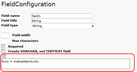
Edit the extension with the SAV Library Kickstarter, click on the
Table 1 item, select the List view and click on field1. In the
configuration text area, type func = makeItemLink;, then click on
Generate.
Go in the frontend and reload your page. Now, a link is associated
with First record. The enter in edit mode icon will be displayed
as long as you are logged as a frontend user.
Click on the link to open the single view. As you can see, the items
are organized with our three folder tabs. The edit icon on the left
hand side will be displayed as long as you are logged as a frontend
user. By clicking on it, you will enter in the edit view.
Click on a folder tab to change the view.
More Information
Please read the reference section for the field configuration
(remember that a context sensitive help is also available for each
field in the SAV Library Kickstarter).
The tutorials section in the SAV Library Plus documentation provides
also several examples.
Click on the cross icon of the Forms section, enter a name and save.
The form name will be the extbase controller name.
Click on the cross icon of the Views section, enter a name and save.
The view name will be the default action name.
Click on the cross icon of the New tables section, enter a short name and a title for
the table, change the flags if necessary and save.
Warning
Provide only a short name for the table. It will be added to the default
part (here tx_savbasicexample0_domain_model) to build the full name.
Add the table fields by clicking on the cross icon at the right of the
fields overview. By default, the field name and title are set to
New.
Tip
if you have several field, in order to fasten the process, you may
click several times on cross icon to add the fields.
Each field can be edited, moved up or down and deleted using the icons. Provide
a field name (name in the database), a label and a type. The kickstarter will
generate the TCA for conventional useful types. Do not forget to save.
The final step is to generate the extension by clicking on the Generate button.
Installing the Extension
Install you extension either with the extension manager or with SAV Library Kickstarter
Create a page and insert a plugin content element and select `SAV
Basic Example0` in the plugin selector.
Go to your page in the frontend and you should see the following caption.
Reference
The TCA configuration generated by the SAV Library Kickstarter is available and
can be changed for each view by means of the field configuration
interface. The SAV Library makes it possible to enter data in the
frontend. However, in most cases data can also be input in the Back
End using the regular interface. In this case, the SAV Library
specific configuration are not taken into account. Configuration are
input in the text area as shown below. The size of the text area will
grow with the number of configuration lines.
The following configurations have been added for the SAV Library. They
are organized in the alphabetic order of the field type. Of course, no
type is provided for the general configuration which can be applied to
any field and to the function options.
Tip
The configuration can also be
obtained directly in the kickstarter by clicking on the
help icon (the question mark icon just above the textarea).
The string is used as a file name which is searched in the default
icon directory and, if not found, in the extension icon directory. It
replaces the default image for a selected checkbox.
checkboxNotSelectedImage
Property
checkboxNotSelectedImage
Data type
String
Description
The string is used as a file name which is searched in the default
icon directory and, if not found, in the extension icon directory. It
replaces the default image for an unselected checkbox.
cols
Property
cols
Data type
Integer
Description
Number of columns to display.
Default
1
displayAsImage
Property
displayAsImage
Data type
Boolean
Description
If set, the check boxes are displayed as images instead of labels.
Default
1
doNotDisplayIfNotChecked
Property
doNotDisplayIfNotChecked
Data type
Boolean
Description
If set, do not display the check box value if it is not checked
(obviously it does not apply when in edit mode).
Adds an icon in front of the hyperlink associated with the file.
Default
0
addToUploadFolder
Property
addToUploadFolder
Data type
String
Description
Adds a subpath to the UploadFolder path.
alt
Property
alt
Data type
String
Description
Provides the HTML alt attribute for an image.
default
Property
default
Data type
String
Description
Defines the default image if the content of the field is null
otherwise the default image is unknown.gif taken in the directory
sav_library_Plus/Resources/Public/Images.
fieldAlt
Property
fieldAlt
Data type
Field name
Description
Sets the alt attribute with the content of the field whose name is
given by field_name.
fieldMessage
Property
fieldMessage
Data type
Field name
Description
Sets the attribute message with the content of the field whose name
is given by field_name.
height
Property
height
Data type
Integer
Description
Sets the height of an image or of the iframe.
iframe
Property
iframe
Data type
Boolean
Description
Opens the image in an iframe.
Default
0
message
Property
message
Data type
String
Description
If the file is not an image, a hyperlink is created with the string.
onlyFileName
Property
onlyFileName
Data type
String
Description
Displays only the file name.
renderAsLink
Property
renderAsLink
Data type
Boolean
Description
If set, the image is rendered as a link.
size
Property
size
Data type
Integer
Description
Sets the size attribute. It overwrites the same attribute in the TCA.
tsProperties
Property
tsProperties
Data type
String
Description
It makes it possible to use the graphic possibilities of TYPO3. If
set, an IMAGE cObject is generated with the given TypoScript properties.
Important
Do not forget that the configuration field is ended by a semi-column,
therefore if you need a semi-column in your TypoScript, write it \\;.
uploadFolder
Property
uploadFolder
Data type
String
Description
Sets the folder path where the file is stored. It overwrites the same
attribute in the TCA.
width
Property
width
Data type
Integer
Description
Sets the width of an image or of the iframe.
Functions
Functions are applied to the value of the field. They can be also
applied to left and right contents. In this case, Lef or Right
should be added to the function name and the optional attributes (Not yet implemented in SAV Library Mvc).
This function generates a format for a unix timestamp date.
Optional attributes can be added:
format = string; The string should be a format that makes sense for
the php-function strftime(). By defaut, %d/%m/%Y and %d/%m/%Y %H:%M are
respectively used for date and datetime.
func = makeEmailLink;
Property
func = makeEmailLink;
Data type
None
Description
This function generates an email link associated with the field.
Optional attributes can be added:
message = string; Message associated with the link.
fieldMessage = fieldName; Sets the attribute message with the
content of the field whose name is given by fieldName.
func = makeExtLink;
Property
func = makeExtLink;
Data type
None
Description
This function generates a hyperlink associated with the value of the
field. It will open the Single view associated with the selected
item in another extension. The following attributes must be provided:
ext = string; String is the extension name followed by the form name.
Example myext_intranet.
pageId = integer; Integer is the page id where the extension is the
content element.
contentId = integer; Integer is the content id of the extension.
Optional attributes can be added:
folderTab = string; If the extension
uses serveral folders, string is the folder tab name.
forceAbsoluteUrl = 1; Forces links to internal pages to be absolute.
forceAbsoluteUrl.scheme = https; Defines the URL scheme https to be used.
http is the default value.
page = string; Alias to folderTab.
linkAccessRestrictedPages = 1; The link is built even if the page is protected.
setUid = integer; The integer defines the item uid associated with the
link.
valueIsUid = 1; The field value is used as the uid of the item
associated with the link.
subformUidForeignInLink = integer; Makes it possible to access to
a subform item, integer is the uid of the subform item.
restrictLinkTo = ###usergroup=group_name###; The link will be
displayed if the user belongs to the group_name.
restrictLinkTo = ###usergroup!=group_name###; The link will be
displayed if the user does not belong to the group_name.
func = makeImage;
Property
func = makeImage;
Data type
None
Description
This function builds an IMG tag where the field value is the name of
the image file.
Additional parameter can be used.
folder = string; String is the folder where the file should be.
width = integer; Width of the image in pixels.
height = integer; Height of the image in pixels.
alt = string; String is the alt attribute of the image.
fieldAlt = field_name; The alt attribute is the value of the
fieldname for the current record.
func = makeItemLink;
Property
func = makeItemLink;
Data type
None
Description
This function generates a hyperlink associated with the value of the
field. It will open the Single view associated with the selected
item.
Optional attributes can be added:
folderTab = string; If the extension
uses serveral folders, string is the folder tab name.
page = string; Alias to folderTab.
updateForm = 1; Makes it possible to open an update view instead of
the Single view (Not yet implemented in SAV Library Mvc).
inputForm = 1; Makes it possible to open an Edit view instead
of the Single view.
setUid = integer; The integer defines the item uid associated with the
link.
valueIsUid = 1; The field value is used as the uid of the item
associated with the link (Not yet implemented in SAV Library Mvc).
subformUidForeignInLink = integer; Makes it possible to access to
a subform item, integer is the uid of the subform item.
func = makeLink;
Property
func = makeLink;
Data type
None
Description
This function generates an internal link (typolink).
Optional attributes can be added:
folder = string; The string will be the
folder where the file should be.
target = string; The string defines the
target parameter.
class = string; Name of the class associated
with the link.
message = string; Message associated with
the link.
fieldMessage = fieldName; Sets the attribute
message with the content of the field whose
name is given by fieldName.
setUid = integer; The integer defines the
item uid associated with the link.
valueIsUid = 1; The field value is used as
the uid of the item associated with the link.
func = makeNewWindowLink;
Property
func = makeNewWindowLink;
Data type
None
Description
This function generates a hyperlink associated with the value of the
field which opens a new window. Paramaters are :
windowUrl = string; String is the url. The marker
###special[fieldname]### from selectors can be used. This parameter is
not necessary if the field is an image.
Optional attributes can be added:
windowText = string; String is added above the image. The marker
###special[fieldname]### from selectors can be used.
windowBodyStyle = string; String is added as the style attribute
to the body html tag. Do not forget to use \\; for style attributes,
since the semi-colon is use to split field attributes, and do not
forget to end your definition by a semi-colon. Example:
message = string; Message associated with the link.
fieldMessage = fieldName; Sets the attribute message with the
content of the field whose name is given by fieldName.
func = makeUrlLink;
Property
func = makeUrlLink;
Data type
None
Description
This function generates a link for an external url.
Optional attributes can be added:
link = string; The string is used for the link instead of the
field value.
fieldLink = fieldName; Sets the attribute link with the content of
the field whose name is given by fieldName.
message = string; Message associated with the link.
fieldMessage = fieldName; Sets the attribute message with the
content of the field whose name is given by fieldName.
func = makeXmlLabel;
Property
func = makeXmlLabel;
Data type
None
Description
This function generates the label from a xml language file. It works
with the following parameters:
xmlLabel = string; The string is the label definition. For example,
assume that the value comes from a selectorbox whose label definition
is in the file locallang_db.xlf in the extension my_ext. Assume
also that the field is my_field. Then, to obtain the label one has
to write
When the field is used in an Update form view, it will add an input
element for update that can be used with the marker
###field_name_Edit### where field_name is the name of the field.
See also the help for Form views (showAllItemTemplate) to see how to
use markers ###field[field_name, label]###.
Default
0
addEditIfAdmin
Property
addEditIfAdmin
Data type
Boolean
Description
Same as addEdit but the element will be added only if the user has the
input right for the plugin.
Default
0
addEditIfNull
Property
addEditIfNull
Data type
Boolean
Description
Same as addEdit but the element will be added only if the field is
null.
Default
0
addLeftIfNotNull
Property
addLeftIfNotNull
Data type
String
Description
String will be added to the left if the field value is not null.
Default
addLeftIfNull
Property
addLeftIfNull
Data type
String
Description
String will be added to the left if the field value is null.
addNewIcon
Property
addNewIcon
Data type
Integer
Description
A new icon, will be displayed in front of the field during the number
of days given by the int number.
addRighIfNotNull
Property
addRighIfNotNull
Data type
String
Description
String will be added to the right if the field value is not null.
addRighIfNull
Property
addRighIfNull
Data type
String
Description
String will be added to the right if the field value is null.
alias
Property
alias
Data type
Field name
Description
The displayed value will be provided by the fieldname value for the
current record.
classField
Property
classField
Data type
String
Description
The string will be added to the class associated with the field.
classLabel
Property
classLabel
Data type
String
Description
The string will be added to the class associated with the label.
classValue
Property
classValue
Data type
String
Description
The string will be added to the class associated with the value.
cut
Property
cut
Data type
Boolean
Description
Cuts the field. It can be used in special cases
when the configuration must be fetched, i.e. for the title bar,
but the field should not be displayed in the view.
If the condition is true, the property cut, show, mail, required, query,
reqValue, edit or value is activated. The string can be:
fieldName operator value. Operator can be =, !=, >, <, >= or <=.
The condition is true if current value of the field is
equal to the given value. The markers ###user### or ###cruser### (same
as user but should be used if a new record is created) will be
replaced by the user id.
fieldName operateur specialValue. Operator can be is or isnot.
The special value can be EMPTY or NEW. The condition is true is the field
is (or is not) empty (or a new record).
###filter = filterName_contentId### The field is cut if the filter with attribut name filterName
and content id contentId is used, e.g. ###filter = searchValue_3490###.
###filter != filterName_contentId### The field is cut if the filter with attribut name filterName
and content id contentId is used, e.g. ###filter != searchValue_3490###.
###usergroup =g roup_name### The field is cut or shown if the group
group_name is a valid group for the current user.
###usergroup != group_name### The field is cut or shown if the group
group_name is not a valid group for the current user.
###group = group_name### The field is cut or shown if the group
group_name is a valid group for the current record. It checks the
usergroup field in the local table if any.
###group != group_name### The field is cut or shown if the group
group_name is not a valid group for the current record. It checks
the usergroup field in the local table if any.
requiredFieldIsEmpty = 0 The condition is true is all required fields are
not empty. This condition is generally used when required fields include
also the attribute saveIfRequired = 1;
Logical connectors &, |, and, or can be used between expressions.
cutIfNull
Property
cutIfNull
Data type
Boolean
Description
Cuts the field if it is empty.
Default
0
cutIfSameAsPrevious
Property
cutIfSameAsPrevious
Data type
Boolean
Description
In ListView, this attribute cut the field if its value is the same as
in the previous record.
Default
0
cutLabel
Property
cutLabel
Data type
Boolean
Description
Cuts the label associated with the field.
Default
0
edit
Property
edit
Data type
Boolean
Description
Makes the field not editable in an input form.
Default
1 in Edit views
editAdminPlus
Property
editAdminPlus
Data type
Boolean
Description
Makes the field editable in an input form, if the user has the
Admin+ right. To be an Admin user, his/her TSConfig must contain a
line as follows:
extKey_Admin=value where extKey is the extension key and value is
one of the possible value of the Input Admin Field defined in the
flexform associated with the extension.
The user becomes an Admin+ user, if his/her TSConfig contains a line
as follows:
String will be added to the left if the result of the applied
function, defined by func=function_name; property, is not null.
funcAddLeftIfNull
Property
funcAddLeftIfNull
Data type
String
Description
String will be added to the left if the result of the applied
function, defined by func=function_name; property, is null.
funcAddRightIfNotNull
Property
funcAddRightIfNotNull
Data type
String
Description
String will be added to the right if the result of the applied
function, defined by func=function_name; property, is not null.
funcAddRightIfNull
Property
funcAddRightIfNull
Data type
String
Description
String will be added to the right if the result of the applied
function, defined by func=function_name; property, is null.
fusion
Property
fusion
Data type
{begin, end}
Description
fusion = begin;
Starts the fusion of the fields, that is the following fields will be
displayed on the same line.
fusion = end;
Ends the fusion of the fields, that is the following field will be
displayed on the next line.
label
Property
label
Data type
String
Description
The displayed label will be provided by the string.
mail
Property
mail
Data type
Boolean
Description
A mail will be associated with the field.
If the field is a checkbox, it is used as a flag to verify is the mail
has to be sent. Mail information are the following and can be used as
properties:
fieldForCheckMail=field_name; The mail will be sent if the value of
the fieldname for the current row is not null.
mailIfFieldSetTo=string; The mail will be sent if the value of the
fieldname for the current row was previously null or zero and is set
to the given string value. If the string is a comma- separated list of
values, the mail is sent is the value of the fieldname for the current
row belongs to this list (only in SAV Library Plus).
mailSender=string; mail of the sender. The marker ###user_email### will
be replaced by the user email.
mailReceiver=string; mail of the person who will receive the mail and
process the information.
mailReceiverFromField=field_name; The field_name contains the mail
of the person who will receive the mail and process the information.
mailReceiverFromQuery=MySQL_Query; The receiver is obtained from a
select query with an alias value that will used to retrieve the
receiver. Example:
SELECT email AS value FROM fe_users WHERE ...
Copied!
mailSubject=string; subject of the mail. Markers ###fieldname### are
allowed and will be replaced by their current value.
mailMessage=string, mail message. Markers ###fieldname### are allowed
and will be replaced by their current value.
mailcc=string; if set the string is used as Cc: for the mail.
mailccFromField=field_name; The field_name contains the mail
of the person who will receive the mail in carbon copy.
mailReceiverFromQuery=MySQL_Query; The receiver is obtained from a
select query with an alias value that will used to retrieve the
carbon copy information.
mailMessageLanguage=string; This parameter will force the language for
the message to the value of the string.
mailMessageLanguageFromField=fieldname; This parameter will force the
language for the message to the value of the field (for example a
selector box).
Localization by means of the file locallang.xlf can be used with
$$$tag$$$ which will be replaced by its value according to the
configuration language.
Default
0
mailAlways
Property
mailAlways
Data type
Boolean
Description
The mail property must be set (mail = 1;) when using this
property.
The mail is always sent when saving. Mail information are the
following:
mailSender=string; mail of the sender. The marker ###user_email### will
be replaced by the user email.
mailReceiver=string; mail of the person who will receive the mail and
process the information.
mailReceiverFromField=field_name; The field_name contains the mail
of the person who will receive the mail and process the information.
mailReceiverFromQuery=MySQL_Query; The receiver is obtained from a
select query with an alias value that will used to retreive the
receiver. Example:
SELECT email AS value FROM fe_users WHERE ...
Copied!
mailSubject=string; subject of the mail. Markers ###fieldname### are
allowed and will be replaced by their current value.
mailMessage=string, mail message. Markers ###fieldname### are allowed
and will be replaced by their current value.
mailcc=string; if set the string is used as Cc: for the mail.
mailccFromField=field_name; The field_name contains the mail
of the person who will receive the mail in carbon copy.
mailReceiverFromQuery=MySQL_Query; The receiver is obtained from a
select query with an alias value that will used to retrieve the
carbon copy information.
Localization by means of the file locallang.xlf can be used with
$$$tag$$$ which will be replaced by its value according to the
configuration language.
mailMessageLanguage=string; This parameter will force the language for
the message to the value of the string.
mailMessageLanguageFromField=fieldname; This parameter will force the
language for the message to the value of the field (for example a
selector box).
Default
0
mailAuto
Property
mailAuto
Data type
Boolean
Description
The mail property must be set (mail = 1;) when using this
property.
The mail is sent when saving, if the field is not empty and if one
field in the form is changed. Mail information are the following:
mailSender=string; mail of the sender. The marker ###user_email###
will be replaced by the user email.
mailReceiver=string; mail of the person who will receive the mail and
process the information.
mailReceiverFromField=field_name; The field_name contains the mail
of the person who will receive the mail and process the information.
mailReceiverFromQuery=MySQL_Query; The receiver is obtained from a
select query with an alias value that will used to retreive the
receiver. Example:
SELECT email AS value FROM fe_users WHERE ...
Copied!
mailSubject=string; subject of the mail. Markers ###fieldname### are
allowed and will be replaced by their current value.
mailMessage=string, mail message. Markers ###fieldname### are allowed
and will be replaced by their current value.
mailcc=string; if set the string is used as Cc: for the mail.
mailccFromField=field_name; The field_name contains the mail
of the person who will receive the mail in carbon copy.
mailReceiverFromQuery=MySQL_Query; The receiver is obtained from a
select query with an alias value that will used to retrieve the
carbon copy information.
Localization by means of the file locallang.xlf can be used with
$$$tag$$$ which will be replaced by its value according to the
onfiguration language.
mailMessageLanguage=string; This parameter will force the language for
the message to the value of the string.
mailMessageLanguageFromField=fieldname; This parameter will force the
language for the message to the value of the field (for example a
selector box).
Default
0
onLabel
Property
onLabel
Data type
Boolean
Description
The value will be displayed in place of the label. Not so useful since
the label can be cut.
Default
0
orderLinkInTitle
Property
orderLinkInTitle
Data type
Boolean
Description
If this property is set, it makes it possible to generate a hyperlink
in the title bar of the List view. The hyperlink is associated with
the field if the marker ###fieldname### is used in the Title bar
section. Order clauses have to be defined in the Where Tags section
of the Query Form.
Use the two followings Where Tags:
Name: fieldname+
WHERE Clause:
ORDER BY Clause: tablename.fieldname
Name: fieldname-
WHERE Clause:
ORDER BY Clause: tablename.fieldname DESC
Copied!
Note: orderLink can be also directly added in the title bar without
any reference to a field. The syntax is:
If the optional part Default is used, by default the whereTagName1
is assumed when the extension is launched.
The optional whereTagName2 can be used to set a toggle link with two
different behaviours.
Default
0
orderLinkInTitleSetup
Property
orderLinkInTitleSetup
Data type
String
Description
This property controls the display of the link when orderLinkInTitle
is set. The format is param1:param2:param3 where param1 to
param3 can take the following values:
value: the field value is displayed,
link: the field value is displayed with a link which toggles the sort,
asc: an icon is displayed with a link to make an ascending sort,
desc: an icon is displayed with a link to make a descending sort,
ascdesc: two icons are displayed with separate links to make an
ascending or descending sort.
label: the field label is displayed.
if there is no value, nothing is displayed.
Default
link
query
Property
query
Data type
SQL statements
Description
The query will be executed once the input form data have been saved.
Therefore, it can only be used with Edit or Update views.
Important
Because any query may be executed, for security reason, this
property can only be used if an admin user has checked the field
Allow the use of the “query” property in the advanced folder of the
flexform.
It may be useful, for example, to update a specific table when the
current data are saved. Several queries can be used in the SQL
statements. Each query must be separated using \\;.
Special markers can be used in the statement:
###uid### or ###uidMainTable### will be replaced by the current record uid.
###CURRENT_PID### will be replaced by the current page uid.
###user### will be replaced by the user id.
###value### will be replaced by the current value for the field.
queryOnValue
Property
queryOnValue
Data type
String
Description
The query, as defined above, will be executed if the current field
value is equal to the right hand side string.
queryForEach
Property
queryForEach
Data type
Field name
Description
If the field is a true MM relation, the query, as defined above, will
be executed for all the record in the relation.
The special marker ###field_name###, where field_name is the field
where the relation is defined, can be used to identify the record. It
will be replaced by the uid of the associated record.
renderReqValue
Property
renderReqValue
Data type
Boolean
Description
Rendering is applied to the value provided by the reqValue attribute
according to the type of the field.
Default
0
reqValue
Property
reqValue
Data type
SQL SELECT statement
Description
SQL SELECT statement must have an alias value which will be used as
the value to display.
Special markers can be used in the statement :
###uid### will be replaced by the current record uid.
###uidMainTable### will be replaced by the uid of the reccord in the
main table.
###user### will be replaced by the user id.
###row[field_name]### where field_name is the name of a field in the
current record, will be replaced by its current value.
The following example returns the name of the user who has created the
current record, assuming that tx_mytable is the local table:
reqValue= SELECT name AS value
FROM fe_users
WHERE uid=(SELECT cruser_id FROM tx_mytable WHERE uid=###uid###);
Copied!
saveIfRequired
Property
saveIfRequired
Data type
Boolean
Description
If set and if required flag is also set, the field will be saved. This
feature makes it possible to save required fields when an Edit view is partially
filled. For example, it can be used with the condition:
editIf = requiredFieldIsEmpty = 0;.
Copied!
setExtendLink
Property
setExtendLink
Data type
Table name
Description
The table name will be left-joined to existing tables.
It defines a conventional TypoScript stdWrap property. You can add
here full TypoScript syntax.
Important
Do not forget that the configuration field is ended by a semi-column,
therefore if you need a semi-column in your TypoScript write it \\;.
stdWrapValue
Property
stdWrapValue
Data type
stdWrap
Description
It defines a conventional TypoScript stdWrap property. You can add
here full TypoScript syntax.
Important
Do not forget that the configuration field is ended by a semi-column,
therefore if you need a semi-column in your TypoScript write it \\;.
styleLabel
Property
styleLabel
Data type
String
Description
The string will be added as a style attribute associated with the
label of the displayed value.
styleValue
Property
styleValue
Data type
String
Description
The string will be added as a style attribute associated with the
displayed value.
tsObject
Property
tsObject
Data type
cObject
Description
It defines a TypoScript content object (e.g. TEXT)
tsProperties
Property
tsProperties
Data type
String
Description
It defines the properties of the TypoScript cObject.
Important
Do not forget that the configuration field is ended by a semi-column,
therefore if you need a semi-column in your TypoScript write it \\;.
value
Property
value
Data type
String
Description
It defines directly the value for the field.
verifier
Property
verifier
Data type
String
Description
Verifiers can be used to check if a field satisfy a constraint. Each
field can have one verifier. Each verifier is associated with a
parameter.
The verifier name can be:
isValidPattern
isValidLength
isValidInterval
isValidQuery
verifierMessage
Property
verifierMessage
Data type
String
Description
It replaces the default message.
Localization by means of the file locallang.xlf can be used with
$$$tag$$$ which will be replaced by its value according to the
configuration language.
The marker $$$label[fieldName]$$$ will be replaced by the fieldName
title according to the localization.
verifierParam
Property
verifierParam
Data type
String
Description
The string can be:
a regular expression for the verifier isValidPattern. For example
/=[A-Za-z0-9_]*$/ will allow any input which contains letters,
numbers or underline characters.
an integer value for the verifier isValidLength.
an interval [a, b] where a and b are integers for the verifier
isValidInterval.
a SELECT query for isValidQuery. The marker ###value### in the query
will be replaced by the value of the field. The marker ###uid### will
be replaced by the uid of the current record.
verifierSetWarning
Property
verifierSetWarning
Data type
Boolean
Description
If set an error detected by the verifier becomes a warning. In that
case, the field content is written in the database (which is not the
case for errors) and a message is displayed.
Default
0
wrapInnerItem
Property
wrapItem
Data type
Wrap
Description
The string will be used to wrap the inner item. The syntax in the same as in
TypoScript.
Localization by means of the file locallang.xlf can be used with
$$$tag$$$ which will be replaced by its value according to the
configuration language.
The marker $$$label[fieldName]$$$ will be replaced by the fieldName
title according to the localization.
wrapItem
Property
wrapItem
Data type
Wrap
Description
The string will be used to wrap the item. The syntax in the same as in
TypoScript.
Localization by means of the file locallang.xlf can be used with
$$$tag$$$ which will be replaced by its value according to the
configuration language.
The marker $$$label[fieldName]$$$ will be replaced by the fieldName
title according to the localization.
wrapItemIfNotCut
Property
wrapItem
Data type
Wrap
Description
The string will be used to wrap the inner item if it is not cut.
The syntax in the same as in TypoScript.
Localization by means of the file locallang.xlf can be used with
$$$tag$$$ which will be replaced by its value according to the
configuration language.
The marker $$$label[fieldName]$$$ will be replaced by the fieldName
title according to the localization.
wrapInnerItem
Property
wrapItem
Data type
Wrap
Description
The string will be used to wrap the value. The syntax in the same as in
TypoScript.
Localization by means of the file locallang.xlf can be used with
$$$tag$$$ which will be replaced by its value according to the
configuration language.
The marker $$$label[fieldName]$$$ will be replaced by the fieldName
title according to the localization.
Comma-separated list of definitions. Example: `marker#begin =
###beginPeriod###`` means that the ``marker`` whose id is ``begin` in the
template will be replaced by the SAV Library marker ###beginPeriod###.
The string will be used for the link instead of the field value.
message
Property
message
Data type
String
Description
Message associated with the link.
saveFileRTF
Property
saveFileRTF
Data type
String
Description
Name under which the generated file will be saved. Field markers
###tableName.fieldName### or ###fieldName### (for aliases) can be
used.
tableName.fieldName
Property
tableName.fieldName
Data type
String
Description
String can be string1->string2 or NL-> string2
In a RTF document, if the field marker ###tableName.fieldName###
exists string1 will be replaced by string2 where string1
can be NL (for the ASCII character LF).
It may be useful when one wants to input data in a textarea and
display them in one line with a given separator in the file.
templateRTF
Property
templateRTF
Data type
String
Description
Defines the template to be used by the RTF generator. Field markers
###tableName.fieldName### or ###fieldName### (for aliases) can be
used.
It adds the string in the FROM part of the select query. It can be used when tables
need to be joined using JOIN statements.
additionalTableSelect
Property
additionalTableSelect
Data type
String
Description
The string is a comma-separated table names.
It adds the table names in the select query. It can be used when tables
need to be joined without JOIN statements.
aliasSelect
Property
aliasSelect
Data type
Field name
Description
Defines an alias used in the SELECT query. Markers ###fieldname### can
be used, fieldname must be in the relation table.
applyFuncToRecords
Property
applyFuncToRecords
Data type
Boolean
Description
If true the function defined by the func attribute is applied to
each record of a double selector in the single view.
Default
0
content
Property
content
Data type
SQL SELECT statement
Description
SQL SELECT statement must have an alias uid and an alias label
which will be used as the value to display. Special markers can be
used in the statement :
###uid### will be replaced by the current record uid.
###uidSelected### will be replaced by the selected item.
###user### will be replaced by the user id.
###cruser### will be replaced by the user id.
The following example returns a selectorbox with the usernames that
are linked with the user by a MM relation:
content =
SELECT fe_users.uid as uid, fe_users.name as label
FROM tx_mytable_rel_myfield_mm,fe_users
WHERE tx_mytable_rel_myfields_mm.uid_local=###user###AND tx_mytable_rel_myfields_mm.uid_foreign=fe_users.uid
ORDER by label;
Copied!
groupBySelect
Property
groupBySelect
Data type
String
Description
Defines the GROUP BY clause for the selector.
labelSelect
Property
labelSelect
Data type
Field name
Description
Defines the label from the field name for the selector.
..important:
This property is mandatory for repositories
not designed for SAV Library Mvc, e.g. Extbase
FrontendUserRepository or FrontendUserGroupRepository.
orderSelect
Property
orderSelect
Data type
String
Description
Define the order clause for the selector. In general: fieldname
[desc].
overrideEnableFields
Property
overrideEnableFields
Data type
Boolean
Description
If set, the method enableFields of the class tslib_cObj which filters
out records with start/end times or hidden/fe_groups fields is not
applied to the query associated with the selectorbox.
It may be used in specific cases when you needed to retreive all the
records.
Default
0
overrideStartingPoint
Property
overrideStartingPoint
Data type
Boolean
Description
By default, when starting points are provided, information associated
with the selector is searched in these page. This property overrides
the default behavior.
Default
0
separator
Property
separator
Data type
String
Description
It should be used when the max number of relations is greater than 1
(not true MM-relation) to replace the default <br /> separator between
items in showAll or showSingle views.
singleWindow
Property
singleWindow
Data type
Boolean
Description
In case of a MM relation, a double window is used to select items.
When this option is used, a single selectorbox in multiple mode is
used.
Default
0
specialFields
Property
specialFields
Data type
comma-separated list of fields
Description
The value of the fields will be propagated in the
###special[fieldname]### marker when available.
whereSelect
Property
whereSelect
Data type
String
Description
Defines the WHERE clause for the selector. It can be:
a conventional MySQL clause. The marker ###user###
will be replaced by the user uid.The marker ###uid### or
###uidMainTable### will be replaced by the main current record.
The marker ###CURRENT_PID### will be replaced by the current
page uid.
###group_list = list_of_comma_separed_fe_groups###. To be used
with a selector on fe_users. It checks if the user belongs to the
group list.
###group_list != list_of_comma_separed_fe_groups###. To be used
with a selector on fe_users. It checks if the user does not belong to
the group list.
In some cases the rendering type defined by the selector for ShowOnly field must be overridden.
This property sets the rendering to the provided type, e.g. String.
updateShowOnlyField
Property
updateShowOnlyField
Data type
Boolean
Description
ShowOnly field are not created nor can be updated. In some cases this default behavior must be
overridden, for example when the field comes from an existing table. Settin this property to 1
makes it possible to update a show only field (See Example 8 or
Example 10 in the tutorial section of SAV Library Plus).
Defines the number of cols of the textarea. This attribute overwrites
the same attribute in the TCA.
Default
30
rows
Property
rows
Data type
Integer
Description
Defines the number of rows of the textarea. This attribute overwrites
the same attribute in the TCA.
Default
5
Sponsors and Credits
Sponsors
None for the moment.
Credits
Thanks to:
Paula Auwehla for having detected several bugs.
Erwin Winkel and Ronald Wopereis for having reported the generation of several warnings.
Changelog
Version
Changes
14.3.0
Compatibility changed to TYPO3 13.4.x and 14.3.x.
13.4.0
Compatibility changed to TYPO3 12.4.x and 13.4.x.
11.5.0
Compatibility changed to TYPO3 11.5.x.
Generation of Entity Relationship Diagram added in the documentation.
Generation of the documentation improved.
10.4.0
Compatibility changed to TYPO3 10.4.x.
10.3.0
Compatibility changed to TYPO3 10.3.x.
Compatibility with TYPO3 8.7 removed.
9.5.0
Compatibility with TYPO3 7.6 removed.
Compatibility changed to TYPO3 9.5.x.
Code generation improved.
Basic documentation generation for Docker added.
Context Sensitive Help replaced by links to the documentation.
1.2.0
Compatibility with TYPO3 6.2 removed.
Compatibility changed to TYPO3 9.0.
1.1.0
Code generation improved.
Compatibility changed to TYPO3 8.9.
composer.json added.
Vendor name changed.
1.0.1
Code generation for sav_library_mvc improved.
1.0.0
Code generation for basic use with fluid/extbase added.
Code generation for sav_library_mvc added.
Several bugs corrected (see the forge).
Compatibility with TYPO3 8.1.0 added.
File organization of generated extensions modified.
Code generation for TYPO3 4.x and for the deprecated sav_library removed.
0.5.0
Warnings corrected.
Documentation converted to the reStructuredText format.
Bug when calling context sensitive help corrected.
Extension versions are kept and can be managed easily.
Generation of the types field in tca.php for extensions using starttime,
endtime or access group fields corrected.
Compatibility with TYPO3 7.x.x added
0.4.1
Code slighly modified in accordance to the TYPO3 coding guidelines.
Compatibility with TYPO3 6.2 improved.
New type Currency added (Feature #52986).
Bug #53253 corrected.
0.4.0
Compatibility with TYPO3 6.1 and 6.2 added.
Subforms can be included into subforms.
0.3.0
Small improvements in the code generation for sav_library_plus and
in fluid templates.
documentation and csh files updated.
Compatibility with TYPO3 6.0 added.
Download button added in the extension list.
Flag added in the extension configuration to keep the
ext_localconf.php file.
0.2.2
Small bug corrected and calls to deprecated functions removed.
Documentation updated to the new documentation template.
Generation of the language files in the XML Localization Interchange
File Format (.xlf)
Generation of dependencies improved.
Bugs #39403, #39832 corrected.
Suggestion #39556 corrected.
Feature #40074 added. Table sorting configuration from the SAV Library
Kickstarter is now working correctly.
Context Sensitive Help localization files have been totally
reorganized to facilitate the translation process.
0.2.1
New icon to upgrade all extensions which need to be upgraded.
Better processing of the extension version.
0.2.0
Changed to stable.
f:form.textbox replaced by f:form.textfield in templates.
0.1.3
Code generation for the SAV Library Plus added. This new library
replaces the SAV Library one.
New feature added to deal with edit or single views that may change
depending on a cutif condition.
Compatibility with the fluid version for TYPO3 4.6 added.
0.1.2
Compatibility with the fluid versions for TYPO3 4.4 and TYPO3 4.5
added (compatibility with TYPO3 4.3 is no more supported).
0.1.1
Small bugs corrected and several features improved in the code
generation.
0.1.0
Several features were improved.
Generation of MVC type extension working with extbase and fluid was
added. The generated extensions require SAV Library MVC
(sav_library_mvc) to be loaded.
0.0.2
Parser modified to work with fluid 1.2.0 (TYPO3 4.4.0) and fluid 1.0.2
(TYPO3 4.3.3).
Templates modified to display a message when an extension is not
loaded.
Small bug corrected in the code generation.
0.0.1
1st public release.
Reference to the headline
Copy and freely share the link
This link target has no permanent anchor assigned.The link below can be used, but is prone to change if the page gets moved.