Attention
TYPO3 v7 has reached its end-of-life November 30th, 2018 and is not maintained by the community anymore. Looking for a stable version? Use the version switch on the top left.
There is no further ELTS support. It is recommended that you upgrade your project and use a supported version of TYPO3.
->OPTIONS
Various options for the user affecting the core at various points.
Property
dontMountAdminMounts
Data type
boolean
Description
This options prevents the root to be mounted for an admin user.
Note
Only for admin-users. For other users it has no effect.
Property
defaultUploadFolder
Data type
string
Description
When a user uploads files they are stored in the default upload folder
of the first file storage that user may access. The folder is used for
RTE and its magic images, as well as uploads in the TCEforms fields.
In general, this will be fileadmin/user_upload.
With this property it is possible to set a specific upload folder.
The syntax is "storage_uid:file_path". Example:
options.defaultUploadFolder = 2:user_folders/my_folder/
Property
RTEkeyList
Data type
(list of keywords)
Description
This is a list of the Rich Text Editor buttons the user may see displayed. The user will not see any buttons not listed here.
Either enter a comma-separated list of button keywords (see "TYPO3 Core API / RTE section") or set a wildcard "*" to show all.
Default
*
Property
clearCache.pages
Data type
boolean
Description
This will allow a non-admin user to clear frontend and page-related caches.
Default
0
Property
clearCache.system
Data type
boolean
Description
This will allow a non-admin user to clear frontend and page-related caches, plus some backend-related caches (that is everything including templates). This property is equivalent to clearCache.all.
Default
0
Property
clearCache.all
Data type
boolean
Description
This will allow a non-admin user to clear frontend and page-related caches, plus some backend-related caches (that is everything including templates).
Default
0
Property
lockToIP
Data type
string
Description
List of IP-numbers with wildcards.
Note
This option is enabled only if the
$TYPO3_CONF_VARS['BE']['enabledBeUserIPLock']
configuration is true.
Examples:
192.168.*.*
- will allow all from 192.168-network
192.168.*.*, 212.22.33.44
- will allow all from 192.168-network plus all from REMOTE_ADDR 212.22.33.44
192.168, 212.22.33.44
- the same as the previous. Leaving out parts of the IP address is the same as wild cards...
Property
saveClipboard
Data type
boolean
Description
If set, the clipboard content will be preserved for the next login. Normally the clipboard content lasts only during the session.
Property
clipboardNumberPads
Data type
integer (0-20)
Description
This allows you to enter how many pads you want on the clipboard.
Default
3
Property
enableBookmarks
Data type
boolean
Description
Enables the usage of bookmarks in the backend.
Default
1
Property
bookmarkGroups
Data type
Array of integers/ strings
Description
Set groups of bookmarks that can be accessed by the user.
By default, 5 default groups will be defined globally (shared, can only be set by admins) and also for each user (personal bookmarks):
Pages
Records
Files
Tools
Miscellaneous
Set 0 to disable one of these group IDs, 1 to enable it (this is the default) or "string" to change the label accordingly.
Example:
bookmarkGroups {
        1=1
        2=My Group
        3=0
        4=
}
Bookmark group 1 is loaded with the default label (Pages), group 2 is loaded and labeled as "My Group" and groups 3 and 4 are disabled. Group 5 has not been set, so it will be displayed by default, just like group 1.
Property
mayNotCreateEditBookmarks
Data type
boolean
Description
If set, the user cannot create or edit bookmarks.
Property
createFoldersInEB
Data type
boolean
Description
If set, a createFolders option appears in the element browser (for admin-users this is always enabled).
Property
noThumbsInEB
Data type
boolean
Description
If set, then image thumbnails are not shown in the element browser.
Property
popupWindowSize
Data type
string
Description
Defines the size of the element browser.
Property
noThumbsInRTEimageSelect
Data type
boolean
Description
As noThumbsInEB but for the Rich Text Editor image selector.
Property
uploadFieldsInTopOfEB
Data type
boolean
Description
If set, the upload-fields in the element browser are put in the top of the window.
Property
saveDocNew
saveDocNew.[table]
Data type
boolean / "top"
Description
If set, a button "Save and create new" will appear in TCEFORMs.
Any value set for a single table will override the default value set to the object "saveDocNew".
Example:
In this example the button is disabled for all tables, except tt_content where it will appear, and in addition create the records in the top of the page (default is after instead of top).
options.saveDocNew = 0
options.saveDocNew.tt_content = top
Property
saveDocView
saveDocView.[table]
Data type
boolean
Description
If set, a button "Save and view" will appear in TCEFORMs.
Any value set for a single table will override the default value set to the object "saveDocView".
Default
1
Property
disableDelete
disableDelete.[table]
Data type
boolean
Description
Disables the "Delete" button in TCEFORMs.
Overriding for single tables works like "saveDocNew" above.
Property
showHistory
showHistory.[table]
Data type
boolean
Description
Shows link to the history for the record in TCEFORMs.
Overriding for single tables works like "saveDocNew" above.
Property
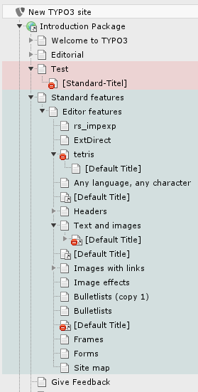
pageTree.backgroundColor
Data type
string
Description
Set background colors for tree branches.
Color can be any valid CSS color value. The best results can be achieved by using rgba values.
The syntax is: options.pageTree.backgroundColor.<pageId> = <color>
Examples:
options.pageTree.backgroundColor.2 = red
options.pageTree.backgroundColor.3 = #00FFFF
options.pageTree.backgroundColor.4 = rgba(0, 255, 0, 0.1)
Property
pageTree.disableIconLinkToContextmenu
folderTree.disableIconLinkToContextmenu
Data type
boolean / "titlelink"
Description
If set, the page/folder-icons in the page/folder tree will not activate the clickmenu.
If the value is set "titlelink" then the icon will instead be wrapped with the same link as the title.
Property
pageTree.disableTitleHighlight
Data type
boolean
Description
If set, the page titles in the page tree will not be highlighted when clicked.
Property
pageTree.showPageIdWithTitle
Data type
boolean
Description
If set, the titles in the page navigation tree will have their ID numbers printed before the clickable title.
Property
pageTree.showDomainNameWithTitle
Data type
boolean
Description
If set, the domain name will be appended to the page title for pages that have "Is root of web site?" checked in the page properties. Useful if there are several domains in one page tree.
Property
pageTree.showNavTitle
Data type
boolean
Description
If set, the navigation title is displayed in the page navigation tree instead of the normal page title. The page title is showed in a tooltip if the mouse hovers the navigation title.
Property
pageTree.showPathAboveMounts
Data type
boolean
Description
If set, the user db mount path above the mount itself is shown.
This is useful if you work a lot with user db mounts.
Property
pageTree.doktypesToShowInNewPageDragArea
Data type
string
Description
If set, the node top panel feature can be configured by a comma-separated list. Each number stands for a doctype id that should be added to the node top panel.
Default
1,6,4,7,3,254,255,199
Property
pageTree.hideFilter
Data type
boolean
Description
If set, the filter-box in the top of the page tree will be hidden.
Property
pageTree.separateNotinmenuPages
Data type
boolean
Description
If set, not in menu and special pages are separated in the page tree from standard pages.
Property
pageTree.alphasortNotinmenuPages
Data type
boolean
Description
If set and pageTree.seperateNotinmenuPages = 1, separated pages are sorted alphabetically.
Property
pageTree.altElementBrowserMountPoints
Data type
(list of integers)
Description
Sets alternative webmounts for use in the Element Browser. You separate page ids by a comma. Non-existing page ids are ignored. If you insert a non-integer it will evaluate to "0" (zero) and the root of the page tree is mounted. Effective in workspaces too.
These alternative webmounts replace configured DB mount points
unless you use the altElementBrowserMountPoints.append option
described below.
Example
options.pageTree.altElementBrowserMountPoints = 34,123
Property
pageTree.altElementBrowserMountPoints.append
Data type
boolean
Description
This option allows administrators to add additional mount points in the RTE and the Wizard element browser instead of replacing the configured database mount points of the user when using the existing UserTSconfig option.
Example
options.pageTree.altElementBrowserMountPoints = 34,123
options.pageTree.altElementBrowserMountPoints.append = 1
Property
pageTree.excludeDoktypes
Data type
(list of integers)
Description
Excludes nodes (pages) with one of the defined doktypes from the pagetree. Can be used for example for hiding custom doktypes.
Example
options.pageTree.excludeDoktypes = 254,1
Property
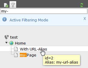
pageTree.searchInAlias
Data type
boolean
Description
If set, the search in the pagetree (filter tree) also filters on the alias field. Contrary to filtered page titles the search result of alias fields will not be highlighted.
Example
Searching for my- now additionally returns also pages with these string in the alias field.
Property
folderTree.altElementBrowserMountPoints
Data type
(list of "storageUid:folderName" items)
Description
Sets alternative filemounts for use in the File List and in Element Browser. Each item consists of storage Uid followed by a colon and the folder name inside that storage. You separate multiple items by a comma.
For backwards compatibility, defining only a folder name but without a storage Uid and colon prepended is still supported as well. Folders without a storage Uid prepended are assumed to be located in the default storage, which by default is the fileadmin/ folder. If a folder you specify does not exist it will not get mounted. Effective in workspaces too.
The alternative filemounts are added to the existing filemounts.
Example
options.folderTree.altElementBrowserMountPoints = _temp_/, 2:/templates, 1:/files/images
Property
folderTree.uploadFieldsInLinkBrowser
Data type
integer
Description
This value defines the number of upload fields in the element browser. Default value is 3, if set to 0, no upload form will be shown.
Default
3
Property
folderTree.hideCreateFolder
Data type
boolean
Description
If set, the user can't create new folders.
Default
false
Property
contextMenu.[key].disableItems
Data type
(list of items)
Description
List of context menu ("clickmenu") items to disable.
"key" points to which kind of icon that brings up the menu, and possible options are "pageTree", "pageList", "folderTree", "folderList". "page" and "folder" obviously point to either the Web or File main module. "Tree" and "List" points to whether the menu is activated from the page/folder tree or the listing of records/files.
Items to disable are (for "page" type - that is database records):
view,edit,hide,new,info,copy,cut,paste,delete,move_wizard,
history,perms,new_wizard,hide,edit_access,edit_pageheader,db_list, versioning,moreoptions
Items to disable are (for "folder" type - that is files/folders):
edit,upload,rename,new,info,copy,cut,paste,delete
Property
contextMenu.options.leftIcons
Data type
boolean
Description
If set, the icons in the clickmenu appear at the left side of the text instead of at the right side.
Default
1
Property
contextMenu.options.clickMenuTimeOut
Data type
integer (1-100)
Description
Number of seconds the click menu is visible in the top frame before it disappears by itself.
Default
5
Property
contextMenu.options.alwaysShowClickMenuInTopFrame
Data type
boolean
Description
If set, then the clickmenu in the top frame is always shown. Default is that it is shown only if the pop-up menus are disabled by user or by browser.
Property
overridePageModule
Data type
string
Description
By this value you can substitute the default "Web > Page" module key ("web_layout") with another backend module key.
Example:
options.overridePageModule = web_txtemplavoilaM1
This will enable TemplaVoila page module as default page module.
Property
hideModules.[module group]
Data type
(list of module groups or modules)
Description
Configure which module groups or modules should be hidden from the main menu.
It is not an access restriction but makes defined modules invisible. That means in principle those modules can still be accessed if the rights allow.
Note
A list of all available module groups and modules can be found in in the backend module SYSTEM -> Configuration -> $GLOBALS['TBE_MODULES'] (BE Modules)
Example:
# Hide module groups "file" + "help"
options.hideModules = file, help

# Hide module "func" and "info" from the "web" group
options.hideModules.web := addToList(func,info)

# Hide module BELogLog from "system" group
options.hideModules.system = BelogLog
Property
alertPopups
Data type
bitmask
Description
Configure which Javascript popup alerts have to be displayed and which not:
1 – onTypeChange
2 – copy / move / paste
4 - delete
8 – FE editing
128 - other (not used yet)
Default
255 (show all warnings)
Property
defaultFileUploads
Data type
integer
Description
Default number of file upload forms shown in the File->List module
Property
hideRecords.pages
Data type
(list of page ids)
Description
This hides records in the backend user interface. It is not an access restriction but makes defined records invisible. That means in principle those records can still be edited if the user rights allow. This makes sense if only a specialized module should be used to edit those otherwise hidden records.
This option is currently implemented for the pages table only and has an effect in the following places:
- Page tree navigation frame
- Web > List module
- New record wizard
Example:
options.hideRecords.pages = 12,45
Property
additionalPreviewLanguages
Data type
(list of sys_language ids)
Description
The user will see these additional languages when localizing stuff in TCEforms. The list are uid numbers of sys_language records.
Property
checkPageLanguageOverlay
Data type
boolean
Description
If set, localized fields in flexforms are shown only for languages which the current page is translated to.
Property
view.languageOrder
Data type
(list of sys_language ids)
Description
When a backend user clicks a view-page link in the backend (magnifying glass) the first language uid in this list which the user has access to edit will be added as the parameter "&L=[UID]" to the view-link.
This is a useful setting for translators which primarily wish to see their translation when they click the view-links.
Example:
options.view.languageOrder = 2,1
Property
file_list.enableDisplayBigControlPanel
Data type
(list of keywords)
Description
Determines whether the checkbox "Extended view" in the filelist module is shown or hidden. If it is hidden, you can predefine it to be always activated or always deactivated.
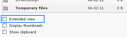
The following values are possible:
- activated: The option is activated and the checkbox is hidden.
- deactivated: The option is deactivated and the checkbox is hidden.
- selectable: The checkbox is shown so that the option can be selected by the user.
Default
selectable
Property
file_list.enableDisplayThumbnails
Data type
(list of keywords)
Description
Determines whether the checkbox "Display thumbnails" in the filelist module is shown or hidden. If it is hidden, you can predefine it to be always activated or always deactivated.
The following values are possible:
- activated: The option is activated and the checkbox is hidden.
- deactivated: The option is deactivated and the checkbox is hidden.
- selectable: The checkbox is shown so that the option can be selected by the user.
Default
selectable
Property
file_list.enableClipBoard
Data type
(list of keywords)
Description
Determines whether the checkbox "Show clipboard" in the filelist module is shown or hidden. If it is hidden, you can predefine it to be always activated or always deactivated.
The following values are possible:
- activated: The option is activated and the checkbox is hidden.
- deactivated: The option is deactivated and the checkbox is hidden.
- selectable: The checkbox is shown so that the option can be selected by the user.
Default
selectable
[beuser:options]