DEPRECATION WARNING
This documentation is not using the current rendering mechanism and is probably outdated. The extension maintainer should switch to the new system. Details on how to use the rendering mechanism can be found here.
EXT: [drecomm] Formmaker
| Author: | Kasper Skårhøj |
|---|---|
| Created: | 2002-11-01T00:32:00 |
| Changed by: | Peter Beernink |
| Changed: | 2008-10-02T14:26:39 |
| Author: | Bas Hoonhout |
| Email: | bas.hoonhout@drecomm.nl |
| Info 3: | |
| Info 4: |
EXT: [drecomm] Formmaker
Extension Key: dre_formmaker
Copyright 2005-2006, Bas Hoonhout, <bas.hoonhout@drecomm.nl>
This document is published under the Open Content License
available from http://www.opencontent.org/opl.shtml
The content of this document is related to TYPO3
- a GNU/GPL CMS/Framework available from www.typo3.com
Table of Contents
EXT: [drecomm] Formmaker 1
Introduction 2
What does it do? 2
Screenshots 2
Users manual 3
Form structure 3
Forms 3
Pages 3
Groups 6
Columns 6
Content elements 6
Modules 8
Form tree 8
Formmaker tools 8
Typoscript 8
Wizards 8
Template editor 8
Template settings wizard 8
Fieldtype settings wizard 8
Javascript wizard 8
Expression wizard 9
Instance wizard 9
Output wizard 9
Connections wizard 9
Preload wizard 9
Backend functions wizard 9
Frontend editor (under construction) 9
Groups wizard (under construction) 9
Administration 10
Repositories 10
Fieldtype repository 10
Javascripts 10
PHP repository 10
Group repository 10
Tools 10
Import 10
Export 10
Conversion 10
Settings 10
Extension manager 10
Security 10
Presets 10
Using presets 11
Creating presets 11
Server requirements 12
PEAR 12
HTML2PS 12
PS2PDF 12
CURL 13
Developer information 14
Plugins 14
PI1: form field 14
PI2: form button 14
PI3: form link 14
Modules 14
MOD1: repositories and tools 14
MOD2: form tree 14
Library 14
Constants 14
Regular expressions 14
Common Functions 14
Expressions 14
Settings 14
Import 14
Export 14
Paths 14
Hooks 14
Formmaker columns 14
TemplaVoila 14
Form tree 14
Third-party modules 14
HTML_ToPDF: PDF generator 14
htmlMimeMail: E-mail generator 14
Known problems 15
To-Do list 15
Changelog 15
Introduction
What does it do?
This extension enables users to create forms varying from quite simple ones to advanced data collecting structures with a minimum of technical knowledge. The extension uses a few TYPO3 core concepts to create an intuitive user interface. The TYPO3 page tree structure and columns are used to define the form structure while the content is defined by separate content elements.
It's possible to divide your forms in pages , groups and columns , to use the dynamic default template for fast form creation or custom HTML templates for the advanced tasks. A repository with a diversity of fieldtypes and javascripts is available to fill your form pages with just a few clicks and can be extended to your own needs. Due to the possibility of shortcutting you could create your own library of form parts and reuse them in any form you like.
Submitted data can be processed any time you like and used to adjust your form according to it. Adjustments could be made based on events or submitted data. Form parts could be shown and hidden based on a click or the value of a form field. Due to the concept of instances, form fields can change their appearance and functionality based on available data. You could change the whole layout of your form according to the actions of the end-user.
Results can be used to dynamically create different types of files and send them as attachment of an e-mail or offer them as download. Static files can be used as well and any data can be stored in a database whenever you want.
The great variety of possibilities is made manageable using a collection of advanced wizards that will adapt their complexity to the complexity of the form being created.
Screenshots
- Screenshots are very much welcome for a visual impression.
- This section will have a link in the EM, so therefore it's very important that it conveys this message.
- Target group: Mostly Developers and administrators, but should be a non-technical and visual presentation.
- This section is required and in some cases it basically tells it all.
Users manual
Form structure
Forms built with the '[drecomm] Form Maker]'-extension consist of a collection of hierarchical entities: forms , pages , groups , columns, fields and buttons . Forms, pages, groups and columns are primarily used to define the form structure and layout. Fields and buttons are primarily used to define the workflow of a form, they respond to events act on certain data from different sources and define the options that are shown to the end-user.
Because of their hierarchical dependencies, forms, pages and groups are stored in the TYPO3 pagestable. This way, the TYPO3 page tree is available to present the hierarchical form structure in an intuitive and easy-to-use way.
Another advantage is that the columns, in which groups are divided, can be shown in the default TYPO3 column representation of regular pages.
Fields and buttons are implemented as content elements, since they represent the main content of a form. Fields and buttons can be inserted by inserting a plugin in a certain column of a certain group and choose the corresponding plugin from the list ('Form Maker field' or 'Form Maker button').
Forms
Forms can be created by inserting a page and select the 'Form' option from the '[DRECOMM] FORM MAKER' part of the page type selection box. A form is just a container to built forms in and has the same characteristics as the SysFolder page type.
The only property that can be set on this level is the temporary storage type. The temporary storage handles the storage of data filled in by the end-user during all form actions that need a page reload, like navigation between pages. There are two types of temporary storage available: cookie and database. Using cookies will require cookies to be enabled on the client machine, but will spare your database server. The size of cookies is limited, this might be a problem for large forms. The advantage of the database type is that you are not depending on any client side settings, the database server load, however, might increase significant.
In order to enable users to put a certain form anywhere in a website, there is a content element named 'Form Maker form'. With this content element, which is available from the 'Insert plugin' list, you can select a form from the TYPO3 page tree and place it anywhere on the website.
Pages
Forms consist of pages. A form can contain one or more pages. There are two types of pages: regular form pages and output pages. Each regular form page represent a physical page in the frontend. In the frontend, there is always just one page displayed at a time. You can navigate between different regular form pages using the navigation buttons (explained in the ' Fields ' section below). An output page represent a file. Such a file can be used after a user completed a form to offer a download or to attach that file to an e-mail.
Templates
The layout of a page, no matter which type, is primarily determined by a HTML template. Such a HTML template consists of HTML code with group and column markers as often seen in TYPO3 extensions. Group markers encapsulate pieces of HTML that correspond to a certain form group. Column markers are anchors that determine where the content from a certain column is placed. For a page with three groups and one to three columns per group, a HTML template could look like this:
<table border=”0”>

<!--GROUP1-->

        <tr>
                <td>###COLUMN1###</td>
                <td>###COLUMN2###</td>
                <td>###COLUMN3###</td>
        </tr>

<!--GROUP1-->

<!--GROUP2-->

        <tr>
                <td colspan=”3”>###COLUMN2###</td>
        </tr>

<!--GROUP2-->

<!--GROUP3-->

        <tr>
                <td colspan=”2”>###COLUMN1###</td>
                <td>###COLUMN2###</td>
        </tr>

<!--GROUP3-->

</table>
The first option when creating a form or output page enables users to upload a HTML template. Once an HTML template is uploaded, it can easily be edited using the ' File editor '. After finalizing the HTML template groups and columns need to be attached to the group and column markers in the template. This can be done with the ' Template settings '-wizard. This wizard will first try to match the markers found in the template with the created form tree in the TYPO3 page tree, for most users saving these auto generated settings will be sufficient. For more complex forms you can use this wizard to customize the attachment of groups and columns.
When group and/or column markers are inserted in the HTML template it's impossible to attach the corresponding groups and/or columns at the same time. In order to prevent the frontend to become a total mess during the insertion of a group and/or column markers in the HTML template, group markers that have unattached column markers left after rendering are skipped and will not appear in the frontend.
Since HTML templates have the disadvantage that they have to be modified after every modification of the form structure and most of the forms don't need the ultimate flexibility of a custom HTML template, you can also the default template. The default template is a virtual and dynamic template that is created based on the form structure. Any page that has no custom HTML template available will generate it's own default template using the group and column structure found in the TYPO3 page tree part of that specific page.
The advantage of the usage of the default template is that the HTML template adapts automatically to any modification of the form structure. Since there really is an HTML template with group and column markers created, also with the default template groups with unattached column markers will be skipped. So, groups with three columns, but only two content elements will not appear in the frontend.
Since all the generation and attaching of groups and columns to their corresponding markers in the default HTML template is automated, the ' Template settings '-wizard is not needed anymore in the way it is used with custom templates. With the default template, this wizard is used to style the default template using CSS (see the ' Template settings wizard ' section below).
Regular pages
A regular form page is created by using the page type 'Form page' from the '[DRECOMM] FORM MAKER' part of the page type selection box. Like mentioned in the previous section, the regular form page have the possibility to upload a template or use the default template and set the corresponding settings. Furthermore, there is the possibility to attach javascripts from the ' Javascript repository '. Javascripts on page level can be attached to two events: onLoad and onSubmit which fires at page load and form submission, respectively.
The last option of regular form pages is to define output. This is done by using the ' Output '-wizard. If there is any output defined, the output is generated when the page where the output is defined is submitted. Output appear in two forms: downloads and e-mails. Downloads are offered via a download popup at the client machine and e-mails are, as expected, e-mailed to a certain address with or without attachments. Downloads. e-mail templates and e-mail attachments can be static files, uploaded via the ' Output '-wizard or dynamic files in the form of output pages. For a more detailed description of the possibilities of generating output, see the ' Output wizard ' section below.
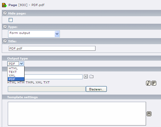
Output pages
A output page is created by using the page type 'Form output' from the '[DRECOMM] FORM MAKER' part of the page type selection box. This page type has the same template options as the regular form pages. However, no javascripts can be attached to output pages since they are static. Also, no output can be defined for obvious reasons.
Since regular form pages are inserted into a webpage, which is expected to contain the necessary CSS definitions, no extra CSS definitions are needed. An output page, however, is a stand alone page. So, everything from the opening HTML tag until the closing HTML tag need to be included in the page itself. Therefore, there is an option implemented to upload a CSS file. This file is literally inserted into the generated HTML page. Once the file is uploaded, it can be edited using the ' Stylesheet editor '.
Since you probably don't want to offer end-users HTML pages only, the generated HTML can be converted to other document types. The current options are html, text, xml and pdf. Text means no conversion takes place and pdf will result in a Adobe Acrobat PDF file. The type of conversion is set by a selectbox named 'Output type'.
Shortcuts
Form pages can be shortcutted by using the default TYPO3 page type 'Shortcut'. The shortcuts acts exactly the same as normal TYPO3 shortcuts. In the background the ID of the shortcut page is used to identify the shortcut. Two shortcuts to the same page will result in two different pages. However, the content on a shortcutted page is identified by it's own ID. This means that in the example of the two shortcuts to the same page, the fields on both pages are actually the same.
Groups
Pages consist of groups. A group is created by using the page type 'Form group' from the '[DRECOMM] FORM MAKER' part of the page type selection box. Groups have multiple purposes. First, it is a container for the actual form fields. Using such a container makes it easy to shortcut and therefore reuse groups of fields. You could create a group 'Personal information' with name and address fields and shortcut to that group from several forms. Second, a group has pretty much the function of a row. Especially when using the default template a group corresponds with a TR tag, but also when using custom HTML templates you will see this is often the case. The last purpose of using groups is to make it possible to adapt the form dynamically depending on certain events or data. The adaption of the form can occur without a page refresh using javascripts attached to one or more fields or with a page refresh using conditions.
Groups consist of columns. Where a group itself can be seen as a row, the columns represent the columns in that row. The number of columns in a group can be defined by the first option when creating a group.
The second option gives the opportunity to attach a condition to a group. The condition is evaluated and the group is only shown when the result of the condition is true (that is true in case of a boolean result, greater than zero in case of a numeric result and with a length greater than zero in case of a string). Conditions are created using the ' Condition '-wizard.
Furthermore, there are two checkboxes to set for each group. The 'Display by default' checkbox determines if a groups has to be displayed on page load. Every valid group is rendered, however when this checkbox is not checked, the group is not displayed due to the CSS setting 'display' is set to 'none'. This way, you can hide a group and let it appear when a checkbox is checked, for example, using javascripts (subform). The second checkbox is only relevant when the page where the group is a part of uses the default template. De default template generates a table, checking this checkbox will close the generated table and immediately start a new one, before rendering this group and the groups after this group. This way, columns can be separated for certain parts of a page.
Groups in groups
Groups can contain other groups. A group that contains other groups has simplified functionalities and is primarily meant to collect other groups. For example, a group cannot contain form fields and groups at the same time (it is physically possible, but the form fields are ignored in such case). So, groups that contain other groups are meant to make reusing form parts more efficient, to simplify dynamic adaptation of forms due to javascripts or conditions.
The group in group principle is primarily meant to use with the default template. However, it is possible to use it with custom templates by nesting group tags in the template. Nevertheless, attaching fields and groups to their corresponding markers will become quite complex using the ' Template settings '-wizard.
Shortcuts
Form groups can be shortcutted by using the default TYPO3 page type 'Shortcut'. The shortcuts acts exactly the same as normal TYPO3 shortcuts. In the background the ID of the shortcut page is used to identify the shortcut. Two shortcuts to the same group will result in two different groups. However, the content in a shortcutted group is identified by it's own ID. This means that in the example of the two shortcuts to the same group, the fields in both groups are actually the same.
Columns
Groups are divided in columns. Only when using the default template columns actually have to correspond to columns in the frontend. Th default template is created based on this information, which is defined at group level. When using custom templates a column corresponds to a column marker, which doesn't necessarily have to correspond to a real column.
In order to prevent the frontend being messed up when modifying a template (default or custom), each column defined has to contain content. The content can be empty, but there has to be some content. If there is an empty column found, the whole group is skipped. This way, you could create a custom template with, say, twenty groups and only use ten of them. The ten groups that are not used are skipped, when you need to add a group in the form tree you will not need to modify the template immediately.
Content elements
Fields
Fields are the actual form content. Fields are placed in columns, this means that fields have actually to be put in one of the Form Maker columns defined by the group they are in. A field is created by creating a content element and select 'Form Maker field' from the list after selecting 'Insert plugin' as content type.
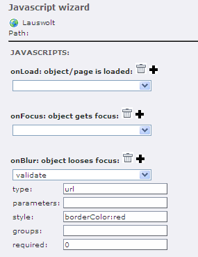
First you have to define a fieldtype via a selectbox. This selectbox is filled with all field types from the ' Fieldtype repository '. After selecting the fieldtype, you need to save the content element. Now, there are four wizards available to modify the appearance and functionality of the field: ' Fieldtype settings '-wizard, ' Input '-wizard, ' Condition '-wizard and ' Javascript '-wizard.
The fieldtypes defined in the ' Fieldtype repository ' can contain variables, also known as user parameters, to be set per field using a specific fieldtype. Via the ' Fieldtype settings '-wizard you can set these variables.
Normally, the content of a field is set by the end-user. However, you might want to set the content yourself and even want to set the content based on other content. Therefore, the ' Input '-wizard exists. This wizard is actually a slightly modified ' Condition '-wizard. It also generates a PHP expression, but doesn't evaluate in true or false but in some value which is used as content for the field.
The ' Condition '-wizard works in the same way as it does for group s: the field is not rendered if the condition evaluates as false. This means the field will not exist and any references to it will break!
The ' Javascript '-wizard makes it possible to attach javascripts from the ' Javascript repository ' to a field. The wizard has an interface to attach different javascripts to different events with different parameters. This wizard can be extended using presets , so event the most complex javascripts can be made user friendly.
Fields can exist in multiple instances.This is a very useful concept, but might be difficult to understand. An instance of a field is a different appearance of that same field. So, it's not another field and therefore it is impossible to get multiple instances of the same field appear in the frontend at the same time. When you create an instance of a field, you will get two content elements in the backend that is actually one field!
Confused? Compare it with yourself in your lazy afternoon clothes and in some expensive gala outfit. No matter which clothes you wear, you will not become someone else and you cannot wear both type of clothes at the same time (actually you could, but something would be wrong), so we now have two instances of you! Both instances look different and they even might act differently, but they both are you.
To create an instance, you copy a field and attach the original field to the property 'Instance of' of the copy. So, a field is an instance as soon it has the property 'Instance of' set or if the field appear in the property 'Instance of' of another content element. The whole procedure of copying and linking is automated via the ' Instance '-wizard which is accessible via the button next to the 'Instance of' field. This wizard has no interface, activating the wizard will copy the object, link the new object to the original and open the property window of the new object.
When you have multiple instances of a field, the conditions of these instances decide which of the instances is used. In the order they appear in the backend, the conditions of the instances are evaluated and the first instance evaluating as true will be used.
Once an instance is created you can modify it's properties independent from the original object. You probably have to change the conditions, but you could also change the fieldtype, for example. This way, you can show a field as open textbox or selectbox depending on the posted data.
Buttons
When you create a form with multiple pages , you need to enable end-users to navigate between the pages. This is done using buttons. Like fields, buttons are content elements that can be placed in a column . Creating a button is like creating a field, but instead of choosing 'Form Maker field' you choose 'Form Maker button'.
There are two types of buttons, 'button' and 'image', that correspond to the HTML input types 'submit' and 'image'. Furthermore, a button needs to have a value which is only relevant for buttons of the type 'button' but also required for buttons of the type 'image'. If choosing the type 'image', an image can be uploaded using the property 'image' and the dimensions can be set using the 'width' and 'height' properties.
A button needs an action. An action is selected by the selectbox 'Action'. The available actions are explained in the following table:
Action
first
Description
Pressing a button of this type will send the user to the first page of the form.
Action
previous
Description
Pressing a button of this type will send the user to the previous page of the form.
Action
next
Description
Pressing a button of this type will send the user to the next page of the form.
Action
last
Description
Pressing a button of this type will send the user to the last page of the form.
Action
reload
Description
Pressing a button of this type will reload the current page.
Action
goto page
Description
Pressing a button of this type will send the user to the page linked to the 'Goto page' property of that button.
Action
goto url
Description
Pressing a button of this type will send the user to the URL defined by the 'Goto URL' property of that button.
Action
Resume session for this form
Description
Action
Goto form
Description
Action
Resume session (use Goto page)
Description
Action
Clear form cache
Description
Pressing a button of this type will clear the cache for the selected id's.
Text and HTML content
It is possible to add default TYPO3 content elements into your form, for example labels, titles and help texts. However, adding default TYPO3 content elements is restricted to the content types 'Text' and 'HTML'. This content also needs to be placed in one of the Form Maker columns of the group it is placed in.
Shortcuts
Also form content (fields, buttons and default TYPO3 content) can be shortcutted by using the default TYPO3 content element 'Insert records'. The shortcuts acts exactly the same as normal TYPO3 shortcuts. In the background the ID of the shortcut element is used to identify the shortcut. Two shortcuts to the same element will result in two different elements.
Typoscript
Wizards
The '[drecomm] Form Maker' extension has a lot of complex object properties. In order to make these properties manageable the extension contains a lot of wizards. Wizards appear in the backend next to a certain property as a yellow square icon. Clicking such an icon will start the wizard. Each wizard will contain save and close buttons which will trigger the extension to translate the supplied information in the wizard to a valid property value.
In this section you can find a user manual per wizard. In the ' Form structure ' section you can find where to expect a certain wizard.
Template editor
The 'File editor' is a simple editor to edit uploaded files. It often happens that templates and stylesheets that are uploaded need a slight modification. In order to prevent you need to upload the files over and over again while experimenting or debugging with a template or stylesheet, the upload options of plain text files have the 'File editor'-wizard attached.
Once you opened the editor, the content of the uploaded file is shown in a text area and can be edited. Clicking the save button will save the file and return to the edited object. Clicking the close button will discard the changes made.
Template settings wizard
 Fieldtype settings wizard
Expression wizard
Instance wizard
The 'Instance'-wizard is a wizard without interface for form fields. It copies the edited field and links the original field to the copied field by the 'Instance of' property of the copied field. This way, an instance is created. The new instance is opened for editing. See the ' instances ' section for an explanation about why and how to use instances.
Preload wizard
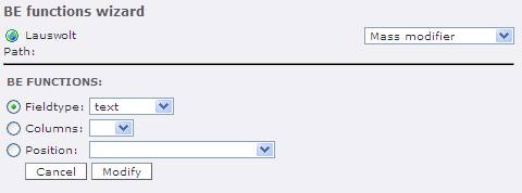
Backend functions wizard
Mass modifier
The 'Mass modifier'-wizard enables users to change a specific property for all objects on a page. For example, you can set the fieldtype of all fields on a page at once. This way, when you want to create a confirmation page you could copy the form groups of the actual form pages to another page and set all fieldtypes on that page to a static type, thereby changing all input boxes to static text boxes. You could also set all columns of all groups to a certain amount using this wizard.
Summary generator
Frontend editor (under construction)
Groups wizard (under construction)
Administration
Repositories
The Form Maker is useless without it's repositories. All field types and javascripts users will be able to create are defined there. It might be needed to extend the default content of the repositories with custom field types and javascripts. The repositories are, in fact, collections of small HTML templates. Items from the repository can be locked. This means, such an item can't be edited unless the value of the locked field in the database table is set to zero.
Fieldtype repository
Fieldtype repository items consist of a name, description and a HTML template. The template can contain the default TYPO3 markers for groups (<!-- ... -->) and fields (### ... ###). Enclosing a part of the template in group markers will enable users to multiply that template part several times. For example, you can define a radio button and enclose it in group markers so users can create a list of radio buttons using just one field. There are two kind of field markers: system markers and user markers. There are three system markers that are obligatorily: ###SYS:Name###, ###SYS:Id### and ###SYS:Value###. The system markers are used to identify a field. All other markers needed will be user markers that look like this: ###USR: ... ###. User markers will return as option in the ' Fieldtype settings '-wizard.
Javascripts
Javascript repository items consist of a name, description, parameter list and a javascript function. The parameter list is a comma separated list of parameter names. These names appear in the ' Javascript '-wizard and can be filled in by the user. The parameters can be accessed in the javascript function by the array 'cParams'. This way, the parameters corresponding to a parameter list 'id,name' can be accessed by the variables 'cParams[“id”]' respectively 'cParams[“name”]'.
Furthermore, all javascripts from the repository have access to two more variables: cObj and cType. cObj contains the calling HTML object and cType contains the type (next, previous, last, first, etc.) of submit button that is pressed. Therefore, cType is only not empty when a javascript is attached to the onSubmit event.
The javascript function itself is that part of the function that you would normally find between the accolades corresponding to the function statement:
function someJavascriptFunction(someParameter) {
        <!-- THIS IS THE PART TO SAVE IN THE REPOSITORY -->
}
PHP repository
Group repository
Settings
Presets
Javascripts can become quite complex, especially when you are trying to create a javascript which is usable in a great variety of situations (which is a good thing). Since all references to form objects is done via ID's things can get fuzzy quite fast. In order to prevent a user to drown in ID's and complex attachments of javascripts to multiple events etc. it is possible to create an user friendly interface on top a javascript, such an interface is called a preset.
Using presets
A detailed description how to use presets is given in the ' Javascript wizard ' section in the ' Users manual ' section above. The idea behind presets is another layer on top of the advanced options of the ' Javascript '-wizard. Preset are accessed via the 'Presets' page in this wizard, while the advanced options can be accessed via the 'Advanced' page. A preset contains three options which can be set by default or can be set by the user using the interface. These options are translated to one or more javascript attachments. Thus, the results of an preset will also be visible through the advanced options and visa versa the advanced options are matched against the three preset parameters. If a match is found, advanced options will also appear on the preset page.
The three options are being stored in xml format. Once the parameters are set, the preset will generate one or more javascript attachments. After using the user friendly interface of a preset, the parameter values could look like this:
<DFMSettings type="javascript">
<setting>
        <event><![CDATA[onsubmit]]></event>
        <javascripts>
                <javascript>
                        <id><![CDATA[1]]></id>
                        <parameters>
                                <parameter>
                                        <name><![CDATA[tekst]]></name>
                                        <value><![CDATA[testing]]></value>
                                </parameter>
                        </parameters>
                </javascript>
        </javascripts>
</setting>
</DFMSettings>
Presets can be complex to understand, play with it and it will become clear soon.
Creating presets
When you created an advanced javascript (or a simple one, but one where the user has to supply fuzzy information like ID's) you might want to create a new preset. This section is a kickstart to your first preset. Presets are saved in PHP files in the extension directory, more precise: in the wizard_javascript/presets directory. Each preset has it's own file. The file contains a PHP class that extends the class 'preset'.
Conf.php file
Once you created a preset, you will have to modify the 'conf.php' file in the wizard_javascript/preset directory in order to let it appear on the 'Presets' page of the ' Javascript '-wizard. This file contains an array that contains all definitions of all available presets. You will need to create a new item in this array, also an array. This array gets the following items:
Key
name
Value
Screen name of the preset.
Example
'Subform'
Key
description
Value
Screen description of the preset.
Example
'Make this object hide/unhide one or more subforms'
Key
file
Value
Filename of file that contains the PHP class for this specific preset.
Example
'preset_subform.php'
Key
class
Value
Name of the PHP class for this specific preset.
Example
'tx_dreformmaker_javascriptpreset_subform'
Key
tables
Value
Comma separated list with tables to which this preset might apply. Javascripts can be attached to fields or pages. Some presets will only function well for fields and not for pages or visa versa. This can be managed to modify this list of tables for which the preset do work.
Example
'pages,tt_content'
Preset class
All presets extend the 'preset' class which can be found in the 'class.preset.php' file. This class contains all variables and functions necessary to create a valid preset. A preset can be created by overwriting one or more of these functions in the extending class. The variables in the 'preset' class are:
Variable
javascriptEvent
Data type
string
Description
Comma separated list with events to which the preset applies. Possible events are:
onload, onfocus, onblur, onchange, onclick, ondblclick and onsubmit
Variable
javascriptID
Data type
integer
Description
ID of the javascript from the repository to which the preset applies.
Variable
javascriptParameters
Data type
array
Description
Array of all parameters defined for the javascript defined with javascriptID and the values that has to be used when saving a preset.
Variable
javascriptOriginal
Data type
array
Description
Same as javascriptParameters, but in this variable the original values of the preset are stored. This means, this variable is only used when editting a preset. When a preset is modified, but the user decides not to save it, these parameters are used to undo the changes.
The functions in the 'preset' class are:
Function
init
Parameters
array original, optional
string event, optional
integer id, optional
array parameters, optional
Return
void
Description
Initializes the preset. Based on the given parameters the preset variables are set. This function can be overwritten in order to set a few of the parameters by default, thereby restricting the scope of the preset.
Function
loadWizard
Parameters
Return
string
Description
Returns the HTML content of the wizard itself. Normally this is a form, the submit buttons do not have to be included. This function has to be overwritten, otherwise an error message 'Preset doesn't contain a wizard' will be shown and the preset exits.
Function
getSummary
Parameters
array javascripts
array parameters
Return
array
Description
Looks for matches in the existing javascript attachments with the preset. Returns an array which is used by the ' Javascript '-wizard to show a nice list with defined presets and options to delete and edit them. The array has the following structure (two matches found):
Array (
  [0] => Array (
           [id] => list with javascript ID's
           [event] => list with events
           [function] => function ID
           [parameters] => Array (
                             [parameter1] => value1
                             [parameter2] => value2
                           )

         )
  [1] => Array (
           [id] => list with javascript ID's
           [event] => list with events
           [function] => function ID
           [parameters] => Array (
                             [parameter1] => value1
                             [parameter2] => value2
                           )
         )
)
You probably don't want to overwrite this function, but want to modify the results before sending them to the ' Javascript '-wizard. For this purpose, the 'modifyDefaultSummary' function is defined.
Function
modifyDeafultSummary
Parameters
array summary
Return
array
Description
Before the summary array created by the 'getSummary' function is returned to the ' Javascript '-wizard it's send to this function. By default, this function returns the array untouched, but you might want to overwrite this function to modify the summary array. This could be useful to replace ID's for names, for example, to make also the summary user friendly.
Function
updateJavascriptSettings
Parameters
array javascripts
array parameters
Return
array
Description
Modifies the javascript settings array based on the preset parameters. These settings are used throughout the extension and will appear on the 'Advanced' page of the ' Javascript '-wizard as well as in the 'Javascript' field of the properties page of the object being edited.
Function
updatePresetParameters
Parameters
Return
void
Description
Handles the submission of the wizard. The 'loadWizard' function creates a form. Once the form is submitted, this function modifies the preset parameters based on the parameters from the wizard. This function is empty, by default, so has to be overwritten will a preset need to make any sense.
Server requirements
PEAR
The PDF generation class requires PEAR (PHP Extension and Application Repository) to be installed. PEAR can be downloaded from http://pear.php.net/ or on UNIX machines installed using the php4-pear package.
HTML2PS
The PDF generation class requires HTML2PS to be installed and being executable. HTML2PS can be downloaded from http://user.it.uu.se/~jan/html2ps.html or on UNIX machines installed using the html2ps package.
PS2PDF
The PDF generation class requires PS2PDF to be installed and being executable. PS2PDF is part of the GhostScript distribution that can be downloaded from http://www.cs.wisc.edu/~ghost/ or on UNIX machines installed using the gs package.
CURL
Known problems
The HTML and CSS options for output pages that are converted to PDF is limited:
- The CSS font-family attribute cannot contain font family lists
- Background images are not converted
To-Do list
- Support for [database:...] and [function:...] markers in expressions, next to the [formfield:...] markers in order to enable users to use data directly from the TYPO3 database and from custom PHP functions
- Implementation of a greater diversity of output file formats (CSV, XML, XLS, etc)
- Extending possibilities to save data to database in order to enable users to generate statistics from supplied form data
- Page in page support in order to enable users to use custom templates for just a part of a page
- Implementation of a tree structure with folders in repositories for a better overview
- Making the form rendering plugin (PI3) TS configurable (paths, default template options, debug options)
- Import / export function for fields, groups, pages and forms
- Adding a reset button type
- Creating a preview option for output pages
- Prevent presets to be overwritten when updating the [drecomm] Form Maker
 EXT: [drecomm] Formmaker - 15