DEPRECATION WARNING
This documentation is not using the current rendering mechanism and is probably outdated. The extension maintainer should switch to the new system. Details on how to use the rendering mechanism can be found here.
EXT: Image_Graph
| Author: | Kasper Skårhøj |
|---|---|
| Created: | 2002-11-01T00:32:00 |
| Changed: | 2007-01-30T11:59:09 |
| Author: | Patrick Broens |
| Email: | patrick@patrickbroens.nl |
| Info 3: | |
| Info 4: |
EXT: Image_Graph
Extension Key: pbimagegraph
Copyright 2000-2006, Patrick Broens, <patrick@patrickbroens.nl>
This document is published under the Open Content License
available from http://www.opencontent.org/opl.shtml
The content of this document is related to TYPO3
- a GNU/GPL CMS/Framework available from www.typo3.com
Table of Contents
EXT: Image_Graph 1
Introduction 1
What does it do? 1
Features 2
Screenshots 2
Users manual 2
Requirements 2
Installation 2
The building blocks 2
FAQ 4
Configuration 4
Reference 4
Canvas initialisation 5
Element settings 5
Plot settings 10
Marker settings 10
DataPreProcessor 11
Dataset settings 12
VERTICAL / HORIZONTAL 13
MATRIX 14
TITLE 15
PLOTAREA 15
AREA 19
SMOOTH_AREA 19
BAND 19
BAR 19
BOXWHISKER 20
CANDLESTICK 20
DOT 20
IMPULSE 21
LINE 21
SMOOTH_LINE 21
FIT_LINE 22
ODO 22
PIE 23
RADAR 24
SMOOTH_RADAR 24
SCATTER 24
STEP 24
GRID 25
LEGEND 25
AXIS_MARKER 26
Examples 26
Known problems 51
To-Do list 51
Changelog 51
Credits 51
Introduction
What does it do?
At some point, developers have a need to create graphs. There are some that get frustrated and end up exporting the data to a spreadsheet, rather than relying upon the graphing capabilities of Open Office or Excel. That can be the way to go in certain cases, but not because there's no alternative. PHP has some great graphing libraries; JpGraph is probably the most well-known, but it can require a commercial licence. Ingmar Schlecht already wrote an extension for JPGraph. This extension is using PEAR's Image_Graph package, which is released under the Lesser GPL or as some of you programmers know as the Library GPL.
Formerly a SourceForge package known as GraPHPite, it merged with and took the name of an older PEAR Image_Graph package. The graphs, charts and plots produced by Image_Graph are highly customizable, and can be any of area, band, bar, box and whisker, candlestick, impulse, map, line, pie, radar, scatter, smoothed line and step. The development of Image_Graph is still going on, and at the time of writing this manual the last version is 0.7.2, released on march 2 nd 2006. The current release is still in alpha, but nevertheless pretty stable. Have a look at the website of Jesper Veggerby, the developer/maintainer of Image_graph for more information. http://pear.veggerby.dk/
Image_Graph is a library that can be used with other BE or FE extensions. It doesn't provide a content element where you can add graphs to a web page. It's main goal is to provide a library which can be configured using the well known Typoscript. Nevertheless there is a small FE plugin which only can be used by entering Typoscript in your templates to generate graphs.
Features
- 17 types of plots: Line, Area, Bar, Box Whisker, Candlestick, Smooth line, Smooth area, Odo, Pie, Radar, Step, Impulse, Dot, Scatter, Band, Smooth radar, Fit line
- Images can be saved as JPEG, PNG and SVG with configurable size. SVG is not supported by every browser. PDF can be generated, but is still in a very early alpha stage. Most pdf's will have a distorted output.
- Image caching; if the Typoscript for an image has not been changed, the image will not be generated again, but taken from the cache.
- Creation of complex layouts by a sophisticated layout system
- No need to install additional PEAR packages
- Highly configurable appearance of every element in the image
Screenshots
Have a look at the examples section of this manual. A lot of screenshots are displayed there together with the Typoscript that generated these images.
Users manual
Requirements
To install pbimagegraph, you need:
- PHP 4.3.0 or later (it works with PHP 5)
- GD (GD 2 is recommended, but you need GD with TYPO3 as well)
- PEAR support (Almost every installation of PHP comes with it)
You don't have to install any additional PEAR package to get the extension working on your system. All required PEAR packages are installed together with this extension.
Installation
Image_Graph is developed for systems running TYPO3 version 3.8.1 and up. Install the extension using the Extension Manager.
The building blocks
Image_Graph works by using layers. That is every element you specify in Image_Graph is a layer on another layer. The main elements are:
a
b
Building a graph always starts with the canvas, where everything else is build on. You can define the width and height which are the dimensions of the actual image, the type of image (JPEG, PNG) and the type of antialiasing.
a
b
The layout is done by dividing parts of the image in horizontal and/or vertical parts, or by a matrix. This can be done without any limits, so you can create very complex layouts.
a
b
Most graphs will have some kind of title to explain what the graph is all about.
a
b
The plotarea is the area where one or multiple plots are drawn. This means each plotarea has its own x- and y-axis.
a
b
The main part of a graph. Image_Graph can draw the following plots:
Line, Area, Bar, Box Whisker, Candlestick, Smooth line, Smooth area, Odo, Pie, Radar, Step, Impulse, Dot, Scatter, Band, Smooth radar, Fit line
a
b
The legend is the part where every plot will be explained using a small icon in the colors and type of the plot, together with a short identifier.
a
b
Grids are part of the plotarea and depend on the x- and y-axis of this plotarea. Grids are visual helpers to clearify the axis.
a
b
Axis Markers are used to mark some part of the plotarea. This could be an area or just a line, to emphasis some part of the plotarea
All these elements, except for the canvas and the layout, can be placed anywhere in the image, because of a sophisticated layout system. The appearance of each element, except the layout, is configurable. Each element has its own configuration and attributes, but they all share the same attributes like background (solid, gradient or an image), a shadow, border style and color, line style and color, the fill style and color, the font and the padding.
FAQ
- Possible subsections: FAQ
Configuration
Reference
Whenever you see a reference to anything named an "object" in this section it's a reference to a "Image_Graph Object" and not the standard "cObjects" from TYPO3.
Colors
Whenever there is a possibility to enter colors, there are two ways to define them. By their hexadecimal value or by name. PEAR has an extensive list of colornames which is provided below. Also the transparency of the color can be set by adding a 'Commercial At' (@) behind the color followed by a number between 0 and 1 where 0 = transparent and 1 = opaque.
Example:
lineColor = blue
lineColor = blue@0.2
lineColor = #FAE000
lineColor = #FAE000@0.5
List of supported named colors
aliceblue
antiquewhite
aqua
aquamarine
azure
beige
bisque
black
blanchedalmond
blue
blueviolet
brown
burlywood
cadetblue
chartreuse
chocolate
coral
cornflowerblue
cornsilk
crimson
cyan
darkblue
darkcyan
darkgoldenrod
darkgray
darkgreen
darkkhaki
darkmagenta
darkolivegreen
darkorange
darkorchid
darkred
darksalmon
darkseagreen
darkslateblue
b
darkslategray
darkturquoise
darkviolet
deeppink
deepskyblue
dimgray
dodgerblue
firebrick
floralwhite
forestgreen
fuchsia
gainsboro
ghostwhite
gold
goldenrod
gray
green
greenyellow
honeydew
hotpink
indianred
indigo
ivory
khaki
lavender
lavenderblush
lawngreen
lemonchiffon
lightblue
lightcoral
lightcyan
lightgoldenrodyellow
lightgreen
lightgrey
lightpink
c
lightsalmon
lightseagreen
lightskyblue
lightslategray
lightsteelblue
lightyellow
lime
limegreen
linen
magenta
maroon
mediumaquamarine
mediumblue
mediumorchid
mediumpurple
mediumseagreen
mediumslateblue
mediumspringgreen
mediumturquoise
mediumvioletred
midnightblue
mintcream
mistyrose
moccasin
navajowhite
navy
oldlace
olive
olivedrab
orange
orangered
orchid
palegoldenrod
palegreen
paleturquoise
d
palevioletred
papayawhip
peachpuff
peru
pink
plum
powderblue
purple
red
rosybrown
royalblue
saddlebrown
salmon
sandybrown
seagreen
seashell
sienna
silver
skyblue
slateblue
slategray
snow
springgreen
steelblue
tan
teal
thistle
tomato
turquoise
violet
wheat
white
whitesmoke
yellow
yellowgreen
Canvas initialisation
Building a graph always starts with the canvas, where everything else is build on. You can define the width and height which are the dimensions of the actual image, the type of image (JPEG, PNG) and the type of antialiasing.
factory
Property
factory
Data type
png, jpg, svg, pdf
Description
Type of canvas.
Png and jpg will be outputted as an <img> tag referring to the image source in the typo3temp folder
Svg will be outputted as an<object> tag referring to the svg file in the typo3temp folder. SVG is not supported by every browser.
Pdf will open a new window containing the pdf. Pdf is still in a very early alpha stage and mostly the output will be distorted.
Default
png
width
Property
width
Data type
int+
Description
The width of the image
Default
400
height
Property
height
Data type
int+
Description
The height of the image
Default
300
left
Property
left
Data type
int
Description
The left offset of the graph on the canvas
Default
top
Property
top
Data type
int
Description
The top offset of the graph on the canvas
Default
noalpha
Property
noalpha
Data type
boolean
Description
If alpha blending has to be disabled
Default
antialias
Property
antialias
Data type
off, driver, native
Description
Antialiasing of the image
'antialias' = 'native' enables native GD antialiasing – this method has no severe impact on performance (approx +5%). Requires PHP 4.3.2 (with bundled GD2)
'antialias = driver' tx_pbimagegraph implemented method. This method has a severe impact on performance, drawing an antialiased line this way is about XX times slower, with an overall performance impact of about +40%. The justification for this method is that if native support is not available this can be used, it is also a future feature that this method for antialiasing will support line styles.
Use antialiased for best results with a line/area chart having just a few datapoints. Native antialiasing does not provide a good appearance with short lines, as for example with smoothed charts. Antialiasing does not (currently) work with linestyles, neither native nor driver method!
Default
off
[tsref:tx_pbimagegraph_ts]
Element settings
The appearance for almost every element in a graph can be changed. A lot of elements have their own configuration for changing their appearance, but on top of that there are some basic settings that can be used with almost every element on the canvas, depending on their functionality. For instance, you can't configure a fill style for a line, because a line doesn't have any fill.
background
Property
background
Data type
array,
gradient,
image
-> fillStyle
Description
The background of an element
See fillStyle.[options] for more information
Default
backgroundColor
Property
backgroundColor
Data type
string
Description
Sets the background color of the element
Example:
This will insert a canvas with the color of the background in green, 20% transparent. The dimension of the image is 400 by 300 and the type is a png. The image will be totally empty, because this will only generate the canvas.
lib.pbimagegraph < plugin.tx_pbimagegraph_pi1
lib.pbimagegraph {
  factory = png
  width = 400
  height = 300
  backgroundColor = green@0.2
}
Default
shadow
Property
shadow
Data type
boolean
->shadow
Description
Shows shadow of the element
Default
borderStyle
Property
borderStyle
Data type
dashed,
dotted,
solid,
array
-> lineStyle
Description
Sets the border style of an element
See lineStyle.[options] for more information
Default
borderColor
Property
borderColor
Data type
string
Description
The color of the border of an element.
Example:
This will insert a canvas with the color of the border in black, 50% opaque. The dimension of the image is 400 by 300 and the type is a png. The image will be totally empty, because this will only generate the canvas.
lib.pbimagegraph < plugin.tx_pbimagegraph_pi1
lib.pbimagegraph {
  factory = png
  width = 400
  height = 300
  borderColor = black@0.5
}
Default
lineStyle
Property
lineStyle
Data type
dashed,
dotted,
solid,
array
-> lineStyle
Description
Sets the line style of an element
There are four options:
- dashed: Draws a dashed line
- dotted : Draws a dotted line
- solid : Draws a solid line which can be configured with a thickness
- array : Draws a solid line which contains multiple parts that can have a separate solid style and color for each part.
Default
lineColor
Property
lineColor
Data type
string
Description
Sets the color of the line(s) to be drawn
Default
fillStyle
Property
fillStyle
Data type
fill_array,
gradient,
image
-> fillStyle
Description
Sets the fill style of an element
Default
fillColor
Property
fillColor
Data type
string
Description
Sets the color of the filling of drawn elements
Default
font
Property
font
Data type
-> fontOptions
Description
Sets the font options
Default
padding
Property
padding
Data type
int+
Description
Sets the padding of the element
Default
-> shadow.[options]
Property
-> shadow.[options]
This is the configuration array for the shadow of an element.
size
Property
size
Data type
int+
Description
Sets the size of the shadow
Default
5
-> lineStyle.[options]
Property
-> lineStyle.[options]
This is the configuration array for the line style of an element
color
Property
color
Data type
string
Description
Set the color of the line
This option can only be used for 'lineStyle = solid' and 'lineStyle = array'
Default
red
color1
Property
color1
Data type
string
Description
Set the color of the dash or dot
This option can only be used for 'lineStyle = dashed' and 'lineStyle = dotted'
Example:
The following part of Typoscript code will configure a dashed line where the dash will be red and the gap will be white
lineStyle = dashed
lineStyle {
  color1 = red
  color2 = transparent
}
Default
red
color2
Property
color2
Data type
string
Description
Set the color of the gaps between the dashes or dots
This option can only be used for 'lineStyle = dashed' and 'lineStyle = dotted'
Example:
The following part of Typoscript code will configure a dotted line where the dot will be red and the gap will be white
lineStyle = dotted
lineStyle {
  color1 = red
  color2 = transparent
}
Default
white
thickness
Property
thickness
Data type
int+
Description
Set the thickness of the line style.
Can only be used with 'lineStyle = solid'
Example:
The following part of Typoscript code will configure a solid red line with a thickness of 5 pixels
lineStyle = solid
lineStyle {
  color = red
  thickness = 5
}
Default
addColor
Property
addColor
Data type
array
->addColor
Description
A line style of the type array draws a solid line which contains multiple parts that can have a separate solid style and color for each part.
Example :
The following code is a part of a stacked impulse line with three parts above each other. The lower part will be blue, the middle orange and the upper one green. If there are more parts than colors in the array, the array will repeat itself, starting with blue. So the fourth part will be blue, the fifth orange etc.
lineStyle = array
lineStyle {
  1 = addColor
  1 {
    color = blue
    id = Extensions
  }
  2 = addColor
  2 {
    color = orange
    id = plugins
  }
  3 = addColor
  3 {
    color = green
    id = modules
  }
}
Default
-> addColor.[options]
Property
-> addColor.[options]
This is the configuration array for the addColor option in lineStyle and fillStyle
color
Property
color
Data type
string
Description
Set the color of this part of the line
Default
red
id
Property
id
Data type
string
Description
Identifier for the legend. This can also be done by id's in the dataset
Default
-> fillStyle.[options]
Property
-> fillStyle.[options]
This is the configuration array for the fill style of an element
direction
Property
direction
Data type
string
Description
Set the direction of the gradient. This is only usefull when the fill style is a gradient
Possible values:
- horizontal: Defines a horizontal gradient fill
- vertical : Defines a vertical gradient fill
- horizontal_mirrored: Defines a horizontally mirrored gradient fill
- vertical_mirrored: Defines a vertically mirrored gradient fill
- diagonally_tl_br : Defines a diagonal gradient fill from top- left to bottom-right
- diagonally_bl_tr: Defines a diagonal gradient fill from bottom- left to top-right
- radial: Defines a radial gradient fill
Default
startColor
Property
startColor
Data type
string
Description
Starting color of the gradient. This is only usefull when the fill style is a gradient
Default
endColor
Property
endColor
Data type
string
Description
Ending color of the gradient. This is only usefull when the fill style is a gradient
Default
image
Property
image
Data type
string
Description
Path to the image that is going to be used as the fill image.
Default
-> font.[options]
Property
-> font.[options]
This is the configuration array for the font of an element
default
Property
default
Data type
string/array
Description
The path to a font file on the server. The path is relative to the root of the site, for instance fileadmin/fonts/verdana.ttf
This adds a new font to the canvas which will be used as the default from the place where it is inserted. Normally one font will be used for the whole canvas, so this one will be configured at the canvas layer in most cases.
If there is a default font available and you like to change its size or color for a certain element, there is no need to call the default font again. Just use the configuration below.
SVG : When generating a SVG file the name of the font will refer to the font-family, like you are used to with HTML.
Windows only :For a few standard fonts Windows users only have to define the name of the font. Image_Graph will look in the file EXT:Image/Canvas/Fonts/fontmap.txt for the name of the fontfile and load the fontfile if it is found in thedirectory C:/Windows/Fonts. These fonts are:
- Arial
- Arial Bold
- Arial Bold Italic
- Arial Italic
- Courier New
- Courier New Bold
- Courier New Bold Italic
- Courier New Italic
- Garamond
- Garamond Bold
- Garamond Italic
- Gothic
- Gothic Bold
- Gothic Bold Italic
- Gothic Italic
- Sans Serif
- Reference Sans Serif
- Times New Roman
- Times New Roman Bold
- Times New Roman Bold Italic
- Times New Roman Italic
- Verdana
- Verdana Bold
- Verdana Bold Italic
- Verdana Italic
Example :
This is a part of a code which defines the default font on canvas level
lib.pbimagegraph < plugin.tx_pbimagegraph_pi1
lib.pbimagegraph {
  factory = png
  width = 400
  height = 200
  font.default = fileadmin/fonts/verdana.ttf
  font.default {
    size = 8
  }
...
Default
color
Property
color
Data type
string
Description
The color of the font
Default
size
Property
size
Data type
int+
Description
The size of the font
Example :
This is a part of a code where the font size of the title is defined. Here the default font is not called, because that's already done at canvas level.
...
10 = TITLE
10 {
  text = Gradient Filled Step Chart
  font {
    size = 11
  }
}
...
Default
angle
Property
angle
Data type
int
Description
The angle of the font
Default
[tsref:tx_pbimagegraph_ts]
Plot settings
This part describes the default settings for plot types. Plot settings are a default set of settings on top of the element settings. Each plot type can have specific settings, which are described in the plot type itself.
title
Property
title
Data type
string
Description
Sets the title of the plot, used for legend
Default
dataSelector
Property
dataSelector
Data type
-> Plot settings.[dataSelector]
Description
Sets the dataselector to specify which data should be displayed on the plot as markers and which are not.
Default
-> Plot settings.[dataSelector]
Property
-> Plot settings.[dataSelector]
Set the data selector
noZeros
Property
noZeros
Data type
boolean
Description
Filter out all zero's.
Display all Y-values as markers, except those with Y = 0
Default
[tsref:tx_pbimagegraph_ts]
Marker settings
Data point marker. The data point marker is used for marking the datapoints on a graph with some visual label, for example a cross, a text box with the value or an icon.
marker
Property
marker
Data type
string
Description
Type of marker
Possible values are:
- array : A sequential array of markers. This is used for displaying different markers for datapoints on a chart. This is done by adding multiple markers to a MarkerArrray structure. The marker array will then when requested return the 'next' marker in sequential order. It is possible to specify ID tags to each marker, which is used to make sure some data uses a specific marker.
- asterisk : Data marker as an asterisk (*)
- average : A marker displaying the 'distance' to the datasets average value.
- box : Data marker as a box
- bubble : Display a circle with y-value percentage as radius (require GD2).
- circle : Data marker as circle (require GD2)
- cross : Data marker as a cross.
- diamond : Data marker as a diamond.
- icon : Data marker using an image as icon.
- pinpoint : Data marker using a pinpoint as marker.
- plus : Data marker as a plus
- reversepinpoint : Data marker using a (reverse) pinpoint as marker:
- star : Data marker as a star
- triangle : Data marker as a triangle
- value : A marker showing the data value
Default
-> Marker settings.[options]
Property
-> Marker settings.[options]
Options for the marker
size
Property
size
Data type
int
Description
Set the 'size' of the marker
The meaning depends on the specific Marker implementation
Default
6
maxRadius
Property
maxRadius
Data type
int
Description
Sets the maximum radius the marker can occupy
This option is for 'bubble' only
Default
40
pointX
Property
pointX
Data type
int
Description
Set the X 'center' point of the marker
This option is for 'icon' only
Default
pointY
Property
pointY
Data type
int
Description
Set the Y 'center' point of the marker
This option is for 'icon' only
Default
useValue
Property
useValue
Data type
string
Description
Defines which value to use from the dataset, i.e. the X or Y value
This option is for 'value' only
Possible values:
- value_x : Defines a X value should be used
- value_y: Defines a Y value should be used
- pct_x_min : Defines a min X% value should be used
- pct_x_max : Defines a max X% value should be used
- pct_y_min: Defines a min Y% value should be used
- pct_y_max : Defines a max Y% value should be used
- pct_y_total: Defines a total Y% value should be used
- point_id : Defines a ID value should be used
Default
value_x
image
Property
image
Data type
string
Description
Path, relative to site root, where image is located
This option is for 'icon' only
Default
pointing
Property
pointing
Data type
string
-> Marker settings.[pointing].[options]
Description
Data marker as a 'pointing marker'.Points to the data using another marker (as start and/or end)
Possible values:
- angular : Marker that points 'away' from the graph. Use this as a marker for displaying another marker pointing to the original point on the graph - where the 'pointer' is calculated as line orthogonal to a line drawn between the points neighbours to both sides (an approximate tangent). This should make an the pointer appear to point 'straight' out from the graph. The 'head' of the pointer is then another marker of any choice.
- radial : A pointing marker in a random angle from the data
...
marker = value
marker {
  fontSize = 20
  useValue = pct_y_max
  pointing = angular
  pointing {
    radius = 20
    dataPreProcessor = formatted
    dataPreProcessor {
      format = %0.1f%%
    }
  }
}
...
Default
dataPreProcessor
Property
dataPreProcessor
Data type
Description
Default
-> Marker settings.[pointing].[options]
Property
-> Marker settings.[pointing].[options]
Data marker as a 'pointing marker'.Points to the data using another marker (as start and/or end)
radius
Property
radius
Data type
int
Description
The length of the angular marker
Default
[tsref:tx_pbimagegraph_ts]
DataPreProcessor
A data preprocessor is used in cases where a value from a dataset or label must be displayed in another format or way than entered. This could for example be the need to display X-values as a date instead of 1, 2, 3, .. or even worse unix-timestamps. It could also be when a value marker needs to display values as percentages with 1 decimal digit instead of the default formatting (fx. 12.01271 -> 12.0%).
dataPreProcessor
Property
dataPreProcessor
Data type
string
Description
Data preprocessor used for preformatting a data.
- array : Format data as looked up in an array. ArrayData is useful when a numercal value is to be translated to something thats cannot directly be calculated from this value, this could for example be a dataset meant to plot population of various countries. Since x-values are numerical and they should really be country names, but there is no linear correlation between the number and the name, we use an array to 'map' the numbers to the name, i.e. $array[0] = 'Denmark'; $array[1] = 'Sweden'; ..., where the indexes are the numerical values from the dataset. This is NOTusefull when the x-values are a large domain, i.e. to map unix timestamps to date-strings for an x-axis. This is because the x-axis will selecte arbitrary values for labels, which would in principle require the ArrayData to hold values for every unix timestamp. However ArrayData can still be used to solve such a situation, since one can use another value for X-data in the dataset and then map this (smaller domain) value to a date. That is we for example instead of using the unix-timestamp we use value 0 to represent the 1st date, 1 to represent the next date, etc.
- currency : Format data as a currency.
- date : Formats Unix timestamp as a date using specified PHP format.
- formatted : Format data using a (s)printf pattern. This method is useful when data must displayed using a simple (s) printf pattern as described in the {@link http://www.php. net/manual/en/function.sprintf.php PHP manual}
Default
-> dataPreProcessor.[dataPreProcessor].[options]
Property
-> dataPreProcessor.[dataPreProcessor].[options]
Settings for the dataPreProcessor.
(array)
Property
(array)
Data type
0/1/2/...
Description
Format data as looked up in an array
...
dataPreProcessor = array
dataPreProcessor {
  0 = A Point
  1 = Another
  5 = Yet another
}
...
Default
format
Property
format
Data type
string
Description
The format depends on the type of dataPreProcessor.
currency : The symbol representing the currency
...
dataPreProcessor = currency
dataPreProcessor {
  format = US$
}
...
date : PHP date format. See PHP function Date()
...
dataPreProcessor = date
dataPreProcessor {
  format = m.d.y
}
...
formatted : (s)printf pattern
...
dataPreProcessor = formatted         dataPreProcessor {
  format = %0.1f%%
}
...
Default
[tsref:tx_pbimagegraph_ts]
Dataset settings
A Data set is used to represent a data collection to plot in a chart
dataset
Property
dataset
Data type
-> dataset.[options]
Description
This will contain the datasets, which can hold more than one
Default
-> dataset.[options]
Property
-> dataset.[options]
The configuration of a dataset
1/2/3/...
Property
1/2/3/...
Data type
string
->dataset.[number].[options]
Description
Type of dataset. This can be:
- trivial : Trivial data set, simply add points (x, y) 1 by 1
- random : Random data set, points are generated by random.This dataset is mostly (if not solely) used for demo-purposes.
Default
->dataset.[number].[options]
Property
->dataset.[number].[options]
The configuration of one single dataset. Setting depend on the type of dataset
count
Property
count
Data type
int+
Description
The number of points to create
This option is only for a dataset of the type 'random'!
Default
minimum
Property
minimum
Data type
int
Description
The minimum value the random set can be
This option is only for a dataset of the type 'random'!
Default
maximum
Property
maximum
Data type
int
Description
The maximum value the random set can be
This option is only for a dataset of the type 'random'!
Default
includeZero
Property
includeZero
Data type
boolean
Description
Whether 0 should be included or not as an X
This option is only for a dataset of the type 'random'!
Default
name
Property
name
Data type
string
Description
Sets the name of the data set, used for legending
Default
1/2/3/...
Property
1/2/3/...
Data type
string
->dataset.[number].[number]
Description
Contains each value in the case of a trivial dataset. The value will always be point.
Default
->dataset.[number].[number].[options]
Property
->dataset.[number].[number].[options]
The values of a single record in a trivial dataset
x
Property
x
Data type
int
Description
The X value to add
Default
y
Property
y
Data type
int
Description
The Y value to add, can be omited
Default
false
id
Property
id
Data type
string
Description
The ID of the point
Default
false
[tsref:tx_pbimagegraph_ts]
VERTICAL / HORIZONTAL
The layout of the canvas can be done with these two objects and the object MATRIX, which will be described after this.With these elements you can divide the canvas in vertical and horizontal parts, each time in two parts. The width (HORIZONTAL) or height (VERTICAL) is set in percentage of the first part, and depends on the width and height of the parent object, not the canvas (or the canvas is the parent object).
((generated))
Example:
lib.pbimagegraph < plugin.tx_pbimagegraph_pi1
lib.pbimagegraph {
10 = VERTICAL
10 {
  percentage = 5
  10 = TITLE
  10 {
    text = Bar Chart Sample
  }
  20 = PLOTAREA
  20 {
    ...
  }
}
In this example the canvas is divided in two vertical parts. The upper part is 5% in height of the canvas, so the second lower part is 95% in height of the canvas.
Example:
lib.pbimagegraph < plugin.tx_pbimagegraph_pi1
lib.pbimagegraph {
10 = VERTICAL
10 {
  percentage = 5
  10 = TITLE
  10 {
    text = Bar Chart Sample
  }
  20 = HORIZONTAL
  20 {
    percentage = 50
    10 = PLOTAREA
    10 {
      ...
    }
    20 = PLOTAREA
    20 {
      ...
    }
}
Here we first divide the canvas in two vertical parts, where the upper part is 5% in height of the canvas. In this part we show the title of the graph. The second vertical part is divided in two horizontal parts, each 50% in wide and both contain a plotarea.
Plots will automatically adjust themselves in width and height according to the layout object they are put in.
Property
percentage
Data type
int+
Description
The width (HORIZONTAL) or height (VERTICAL) of the first part of the object
Default
50
[tsref:tx_pbimagegraph_ts.VERTICAL][tsref:tx_pbimagegraph_ts.HORIZ ONTAL]
MATRIX
The matrix can be used to divide the canvas in multiple rows and columns with even heights and widths. It saves some time and code when having a lot of rows and columns.
((generated))
Example:
lib.pbimagegraph < plugin.tx_pbimagegraph_pi1
lib.pbimagegraph {
  10 = MATRIX
  10 {
    1 {
      1 = PLOTAREA
      1 {
        1 = LINE
        1 {
          ...
        }
      }
      2 = PLOTAREA
      2 {
        1 = BAR
        1 {
          ...
        }
      }
    2 {
      1 = PLOTAREA
      1 {
        1 = AREA
        1 {
          ...
        }
      }
      2 = PLOTAREA
      2 {
        1 = PIE
        1 {
          ...
        }
      }
    }
  }
}
The canvas is divided in for parts. The first row contains a LINE plot in the first column and a BAR plot in de second one. The second row contains a AREA plot in the first column and a PIE plot in the second one.
Property
autoCreate
Data type
boolean
Description
Specifies whether the matrix should automatically be filled with newly created PLOTAREA objects, or they will be added manually
Default
true
Property
0/1/2 ...
Data type
array
-> MATRIX.[rows]
Description
Creates the rows of the matrix
Default
Property
-> MATRIX.[rows]
Sets the rows of the matrix
Property
0/1/2 ...
Data type
array
-> MATRIX.[rows].[columns]
Description
Creates the columns of the matrix
Default
Property
-> MATRIX.[rows].[columns]
Sets the columns of the matrix
Property
0/1/2 ...
Data type
array
Description
Array containing the objects for a apecific cell of the matrix
Default
[tsref:tx_pbimagegraph_ts.MATRIX]
TITLE
The title mainly will be used to explain the purpose of the graph with a short sentence.
((generated))
Example:
lib.pbimagegraph < plugin.tx_pbimagegraph_pi1
lib.pbimagegraph {
10 = VERTICAL
10 {
  percentage = 90
  10 = TITLE
  10 {
    text = Multiple Plots
    alignment = left
    font {
      size = 11
    }
  }
  20 = TITLE
  20 {
    text = This is a demonstration of title alignment
    alignment = left
    font {
      size = 7
    }
  }
}
Property
size
Data type
int+
Description
The size of the font of the title. If no size is given, the title size will inherit the size of the default font.
Default
Property
angle
Data type
int
Description
The angle of the font
Default
Property
color
Data type
string
-> Colors
Description
Set the color of the title
Default
Property
alignment
Data type
string
Description
The alignment of the title in the space available
Possible values:
- left : Align text left
- right : Align text right
- center_x: Align text center x (horizontal)
- top : Align text top
- bottom : Align text bottom
- center_y: Align text center y (vertical)
- center : Align text center (both x and y)
- top_left: Align text top left
- top_right: Align text top right
- bottom_left: Align text bottom left
- bottom_right : Align text bottom right
- vertical : Align vertical
- horizontal : Align horizontal
Default
center
Property
text
Data type
string
Description
The text of the title
Default
Title
Property
(element settings)
Data type
-> Element settings
Description
Element settings can be used with the title
Default
[tsref:tx_pbimagegraph_ts.TITLE]
PLOTAREA
The plotarea is an area where one or multiple plots are drawn. This means each plotarea has its own x- and y-axis.
Currently there are two types of plotareas. A normal plotarea and an area for radar plots. Before drawing a plot on the canvas, you always have to define a plotarea.
((generated))
Example
lib.pbimagegraph < plugin.tx_pbimagegraph_pi1
lib.pbimagegraph {
  factory = png
  width = 400
  height = 300
  10 = PLOTAREA
  10 {
    10 = BAR
    10 {
      ...
    }
  }
}
Here we have a graph of 400 pixels wide and 300 high as file type png, where the plotarea contains a plot of the type Bar.
Property
id
Data type
string
Description
The id of the plotarea to identify itself in the legend.
Default
Property
type
Data type
string
Description
Currently there are only two types of plotareas. The 'type' will only be used when the plotarea has to be a radar plotarea.
10 = PLOTAREA
10 {
  type = radar
  10 = RADAR
  10 {
    ...
  }
}
Default
Property
direction
Data type
horizontal / vertical
Description
The direction of the plotarea - 'horizontal' or 'vertical'. For instance BAR plots will normally be drawn from top to bottom. When the direction is horizontal, they will be drawn from left to right.
Default
vertical
Property
axis
Data type
array
-> PLOTAREA.[axis]
Description
Set configuration for the axis of the plotarea
Default
Property
hideAxis
Data type
boolean
Description
Hides the axis on the plotarea
Default
false
Property
clearAxis
Data type
boolean
Description
If set, this property will clear / rem ove the axis
Default
Property
axisPadding
Data type
int
Description
Set the axis padding for a specified position.
The axis padding is padding "inside" the plotarea (i.e. to put some space between the axis line and the actual plot).
Default
0
Property
(element settings)
Data type
-> Element settings
Description
Element settings can be used with the plotarea
Default
Property
-> PLOTAREA.[axis]
Sets the axis in the plotarea to configure
Property
x / y / y_secondary
Data type
-> PLOTAREA.[axis].[x/y/y_secondary]
Description
A plotarea contains three axis:
- x : The horizontal axis, normally at the bottom of the plotarea
- y : The vertical axis, normally at the left of the plotarea
- y_secondary: A second y-axis, normally displayed at the right of the plotarea
These three axis are configurable each. See for the configuration below.
Default
Property
-> PLOTAREA.[axis].[x/y/y_secondary]
Sets the configuration of the axis in the plotarea
Property
type
Data type
string
Description
Normally a manual creation should not be necessary, axis are created automatically by the constructor unless explicitly defined otherwise like the following:
- category : A normal axis thats displays labels with a 'interval' of 1. This is basically a normal axis where the range is the number of labels defined, that is the range is explicitly defined when constructing the axis.
- logarithmic : Diplays a logarithmic axis.
- radar : Displays an 'X'-axis in a radar plot chart.
Default
Property
level
Data type
int+
Description
Some properties of the axis can be divided in levels. These are ' tickOptions ',' labelOptions ' and ' labelInterval '. Look at these properties for more information.
...
20 = PLOTAREA
20 {
  axis {
    y {
      level {
        2 {
          labelInterval = auto
          tickOptions {
            start = -1
            end = 1
          }
          labelOptions {
            showtext = 1
            font {
              size = 3
              color = red
            }
          }
        }
      }
    }
  }
}
...
Default
Property
label
Data type
string
Description
Shows a label for the the specified value. By default none of these are shows on the axis.
Possible values are:
- minimum
- zero
- maximum
Default
Property
dataPreProcessor
Data type
-> dataPreProcessor
Description
Data preprocessor used for preformatting a data.
A data preprocessor is used in cases where a value from a dataset or label must be displayed in another format or way than entered. This could for example be the need to display X-values as a date instead of 1, 2, 3, .. or even worse unix-timestamps. It could also be when a needs to display values as percentages with 1 decimal digit instead of the default formatting (fx. 12.01271 -> 12.0%).
Default
Property
forceMinimum
Data type
int
Description
Forces the minimum value of the axis
Default
Property
forceMaximum
Data type
int
Description
Forces the maximum value of the axis
Default
Property
showArrow
Data type
1
Description
Show an arrow head at the 'end' of the axis
Default
Property
hideArrow
Data type
1
Description
Do not show an arrow head at the 'end' of the axis (default)
Default
Property
labelInterval
Data type
auto / int+
Description
Sets an interval for where labels are shown on the axis.
The label interval is rounded to nearest integer value
Default
auto
Property
labelOptions
Data type
array
Description
Set options for the label at a specific level
- showtext : true or false
- showoffset : true or false
- font : The font options as an associated array
- position : 'inside' or 'outside'
- format : To format the label text according to a sprintf statement
- dateformat : To format the label as a date, fx. j. M Y = 29. Jun 2005
...
20 = PLOTAREA
20 {
  axis {
    x {
      labelOptions {
        showoffset = 1
      }
    }
  }
...
Default
Property
title
Data type
string
->element settings -> font.[options]
Description
Sets the title of this axis.
This is used as an alternative (maybe better) method, than using layout's for axis-title generation.
To use the current propagated font, but just set it vertically, simply pass ' vertical ' as second parameter for vertical alignment down- to-up or ' vertical2 ' for up-to-down alignment.
...
10 = PLOTAREA
10 {
axis {
  x {
    title = TYPO3 downloads
    title {
      angle = 0
      size = 10
    }
  }
...
Default
Property
fixedSize
Data type
int
Description
Sets a fixed "size" for the axis.
If the axis is any type of y-axis the size relates to the width of the axis, if an x-axis is concerned the size is the height.
Default
Property
addMark
Data type
-> PLOTAREA.[axis].[x/y/y_secondary].[addMark]
Description
Adds a mark to the axis at the specified value
...
20 = PLOTAREA
20 {
  axis {
    y {
      addMark {
        1.value = 5
        2.value = 7
        3 {
          value = 10.8
          value2 = 17.5
        }
      }
    }
  }
...
Default
Property
tickOptions
Data type
-> PLOTAREA.[axis].[x/y/y_secondary].[tickOptions]
Description
Set the major tick appearance.
The positions are specified in pixels relative to the axis, meaning that a value of -1 for start will draw the major tick 'line' starting at 1 pixel outside (negative) value the axis (i.e. below an x-axis and to the left of a normal y-axis).
...
20 = PLOTAREA
20 {
  axis {
    y {
      tickOptions {
        start = -3
        end = -2
      }
    }
  }
...
Default
Property
inverted
Data type
boolean
Description
Invert the axis direction
If the minimum values are normally displayed fx. at the bottom setting axis inversion to true, will cause the minimum values to be displayed at the top and maximum at the bottom.
Default
Property
axisIntersection
Data type
string / int
Description
Set axis intersection.
Sets the value at which the axis intersects other axis, fx. at which Y-value the x-axis intersects the y-axis (normally at 0).
Possible values are:
- default :
- min :
- max :
- a number : between axis min and max (the value will automatically be limited to this range)
Default
Property
-> PLOTAREA.[axis].[x/y/y_secondary].[addMark]
Sets the configuration of the axis mark
Property
value
Data type
double
Description
The value of the mark on the axis
Default
Property
value2
Data type
double
Description
Use when having a ranged string between 'value' and 'value2'
Default
false
Property
-> PLOTAREA.[axis].[x/y/y_secondary].[tickOptions]
Sets the configuration of the axis tick appearance
Property
start
Data type
int
Description
The start position relative to the axis
Default
Property
end
Data type
int
Description
The end position relative to the axis
Default
[tsref:tx_pbimagegraph_ts.PLOTAREA]
AREA
Draws an Area Chart plot. An area chart plots all data points similar to a line, but the area beneath the line is filled and the whole area 'the-line', 'the right edge', 'the x-axis' and 'the left edge' are bounded.
axis
Property
axis
Data type
y/y_secondary
Description
The Y axis to associate the plot with.
Default
plottype
Property
plottype
Data type
string
Description
The type of the plot if multiple datasets are used
Valid values for multiType are:
- normal : Plot is normal, multiple datasets are displayes next to one another
- stacked : Datasets are stacked on top of each other
- stacked100pct : Datasets are stacked and displayed as percentages of the total sum
Default
dataset
Property
dataset
Data type
-> Dataset settings
Description
Data set used to represent a data collection to plot in a chart
Default
(Plot settings)
Property
(Plot settings)
Data type
-> Plot settings
Description
Some settings specific for plot objects
Default
(Element settings)
Property
(Element settings)
Data type
-> Element settings
Description
Element settings can be used with this object
Default
(Marker)
Property
(Marker)
Data type
-> Marker
Description
You can put markers in this object
Default
[tsref:tx_pbimagegraph_ts.AREA]
SMOOTH_AREA
Draws a smoothed Area Chart plot simlar to the AREA object. Smoothed charts are only supported with non-stacked types
axis
Property
axis
Data type
y/y_secondary
Description
The Y axis to associate the plot with
Default
dataset
Property
dataset
Data type
-> Dataset settings
Description
Data set used to represent a data collection to plot in a chart
Default
(Plot settings)
Property
(Plot settings)
Data type
-> Plot settings
Description
Some settings specific for plot objects
Default
(Element settings)
Property
(Element settings)
Data type
-> Element settings
Description
Element settings can be used with this object
Default
(Marker)
Property
(Marker)
Data type
-> Marker
Description
You can put markers in this object
Default
[tsref:tx_pbimagegraph_ts.SMOOTH_AREA]
BAND
A Band plot is an area chart with Minimum and Maximum values.
axis
Property
axis
Data type
y/y_secondary
Description
The Y axis to associate the plot with
Default
dataset
Property
dataset
Data type
-> Dataset settings
Description
Data set used to represent a data collection to plot in a chart
Default
(Plot settings)
Property
(Plot settings)
Data type
-> Plot settings
Description
Some settings specific for plot objects
Default
(Element settings)
Property
(Element settings)
Data type
-> Element settings
Description
Element settings can be used with this object
Default
(Marker)
Property
(Marker)
Data type
-> Marker
Description
You can put markers in this object
Default
[tsref:tx_pbimagegraph_ts.BAND]
BAR
Filled bars, different in height to represent a value
axis
Property
axis
Data type
y/y_secondary
Description
The Y axis to associate the plot with.
Default
plottype
Property
plottype
Data type
string
Description
The type of the plot if multiple datasets are used
Valid values for multiType are:
- normal : Plot is normal, multiple datasets are displayes next to one another
- stacked : Datasets are stacked on top of each other
- stacked100pct : Datasets are stacked and displayed as percentages of the total sum
Default
spacing
Property
spacing
Data type
int+
Description
Set the spacing between 2 neighbouring bars
The number of pixels between 2 bars, should be a multipla of 2 (ie an even number)
Default
barWidth
Property
barWidth
Data type
->BAR.[barWidth]
Description
Set the width of the bars
Default
dataset
Property
dataset
Data type
-> Dataset settings
Description
Data set used to represent a data collection to plot in a chart
Default
(Plot settings)
Property
(Plot settings)
Data type
-> Plot settings
Description
Some settings specific for plot objects
Default
(Element settings)
Property
(Element settings)
Data type
-> Element settings
Description
Element settings can be used with this object
Default
(Marker)
Property
(Marker)
Data type
-> Marker
Description
You can put markers in this object
Default
-> BAR.[barWidth]
Property
-> BAR.[barWidth]
Set the width of the bars
value
Property
value
Data type
int+
Description
Set the width of a bars.
Specify 'auto' to auto calculate the width based on the positions on the x-axis.
Default
unit
Property
unit
Data type
string
Description
Supported units are:
- %: The width is specified in percentage of the total plot width
- px : The width specified in pixels
Default
[tsref:tx_pbimagegraph_ts.BAR]
BOXWHISKER
Box & Whisker chart
axis
Property
axis
Data type
y/y_secondary
Description
The Y axis to associate the plot with
Default
whiskerSize
Property
whiskerSize
Data type
int+
Description
Sets the radius of the whisker circle/dot
Default
false
dataset
Property
dataset
Data type
-> Dataset settings
Description
Data set used to represent a data collection to plot in a chart
Default
(Plot settings)
Property
(Plot settings)
Data type
-> Plot settings
Description
Some settings specific for plot objects
Default
(Element settings)
Property
(Element settings)
Data type
-> Element settings
Description
Element settings can be used with this object
Default
(Marker)
Property
(Marker)
Data type
-> Marker
Description
You can put markers in this object
Default
[tsref:tx_pbimagegraph_ts.BOXWHISKER]
CANDLESTICK
Candle stick chart
axis
Property
axis
Data type
y/y_secondary
Description
The Y axis to associate the plot with
Default
dataset
Property
dataset
Data type
-> Dataset settings
Description
Data set used to represent a data collection to plot in a chart
Default
(Plot settings)
Property
(Plot settings)
Data type
-> Plot settings
Description
Some settings specific for plot objects
Default
(Element settings)
Property
(Element settings)
Data type
-> Element settings
Description
Element settings can be used with this object
Default
(Marker)
Property
(Marker)
Data type
-> Marker
Description
You can put markers in this object
Default
[tsref:tx_pbimagegraph_ts.CANDLESTICK]
DOT
Dot / scatter chart (only marker). This plot type only displays a marker for the datapoints.The marker must explicitly be defined.
axis
Property
axis
Data type
y/y_secondary
Description
The Y axis to associate the plot with
Default
dataset
Property
dataset
Data type
-> Dataset settings
Description
Data set used to represent a data collection to plot in a chart
Default
(Plot settings)
Property
(Plot settings)
Data type
-> Plot settings
Description
Some settings specific for plot objects
Default
(Element settings)
Property
(Element settings)
Data type
-> Element settings
Description
Element settings can be used with this object
Default
(Marker)
Property
(Marker)
Data type
-> Marker
Description
You can put markers in this object
Default
[tsref:tx_pbimagegraph_ts.DOT]
IMPULSE
Draws an Impulse chart
axis
Property
axis
Data type
y/y_secondary
Description
The Y axis to associate the plot with.
Default
plottype
Property
plottype
Data type
string
Description
The type of the plot if multiple datasets are used
Valid values for multiType are:
- normal : Plot is normal, multiple datasets are displayes next to one another
- stacked : Datasets are stacked on top of each other
- stacked100pct : Datasets are stacked and displayed as percentages of the total sum
Default
dataset
Property
dataset
Data type
-> Dataset settings
Description
Data set used to represent a data collection to plot in a chart
Default
(Plot settings)
Property
(Plot settings)
Data type
-> Plot settings
Description
Some settings specific for plot objects
Default
(Element settings)
Property
(Element settings)
Data type
-> Element settings
Description
Element settings can be used with this object
Default
(Marker)
Property
(Marker)
Data type
-> Marker
Description
You can put markers in this object
Default
[tsref:tx_pbimagegraph_ts.IMPULSE]
LINE
Draws a line chart
axis
Property
axis
Data type
y/y_secondary
Description
The Y axis to associate the plot with.
Default
plottype
Property
plottype
Data type
string
Description
The type of the plot if multiple datasets are used
Valid values for multiType are:
- normal : Plot is normal, multiple datasets are displayes next to one another
- stacked : Datasets are stacked on top of each other
- stacked100pct : Datasets are stacked and displayed as percentages of the total sum
Default
dataset
Property
dataset
Data type
-> Dataset settings
Description
Data set used to represent a data collection to plot in a chart
Default
(Plot settings)
Property
(Plot settings)
Data type
-> Plot settings
Description
Some settings specific for plot objects
Default
(Element settings)
Property
(Element settings)
Data type
-> Element settings
Description
Element settings can be used with this object
Default
(Marker)
Property
(Marker)
Data type
-> Marker
Description
You can put markers in this object
Default
[tsref:tx_pbimagegraph_ts.LINE]
SMOOTH_LINE
Draws a smoothed Line Chart plot simlar to the LINE object. Smoothed charts are only supported with non-stacked types
axis
Property
axis
Data type
y/y_secondary
Description
The Y axis to associate the plot with.
Default
dataset
Property
dataset
Data type
-> Dataset settings
Description
Data set used to represent a data collection to plot in a chart
Default
(Plot settings)
Property
(Plot settings)
Data type
-> Plot settings
Description
Some settings specific for plot objects
Default
(Element settings)
Property
(Element settings)
Data type
-> Element settings
Description
Element settings can be used with this object
Default
(Marker)
Property
(Marker)
Data type
-> Marker
Description
You can put markers in this object
Default
[tsref:tx_pbimagegraph_ts.SMOOTH_LINE]
FIT_LINE
Fit the graph (to a line using linear regression).
axis
Property
axis
Data type
y/y_secondary
Description
The Y axis to associate the plot with.
Default
dataset
Property
dataset
Data type
-> Dataset settings
Description
Data set used to represent a data collection to plot in a chart
Default
(Plot settings)
Property
(Plot settings)
Data type
-> Plot settings
Description
Some settings specific for plot objects
Default
(Element settings)
Property
(Element settings)
Data type
-> Element settings
Description
Element settings can be used with this object
Default
(Marker)
Property
(Marker)
Data type
-> Marker
Description
You can put markers in this object
Default
[tsref:tx_pbimagegraph_ts.FIT_LINE]
ODO
2D Odometer
axis
Property
axis
Data type
y/y_secondary
Description
The Y axis to associate the plot with.
Default
center
Property
center
Data type
-> ODO.[center]
Description
Set the center of the odometer
Default
range
Property
range
Data type
-> ODO.[range]
Description
Set minimum and maximum value of the range
Default
angles
Property
angles
Data type
-> ODO[angles]
Description
Set start's angle and amplitude of the chart
Default
radiusWidth
Property
radiusWidth
Data type
int [0-100]
Description
Set the width of the chart in percentage
Default
50
arrowSize
Property
arrowSize
Data type
-> ODO.[arrowSize]
Description
Set the width and length of the arrow (in percent of the total plot "radius")
Default
arrowMarker
Property
arrowMarker
Data type
-> ODO.[arrowMarker]
Description
Set the arrow marker. The arrow marker is the same as a normal marker, but specifically for arrows. Look for settings of this element in -> Marker
Default
tickLenght
Property
tickLenght
Data type
int [0-100]
Description
Set the length of the big ticks in percentage.
The small ones will be half ot it, the values 160% of it 180 min a half circle
Default
14
axisTicks
Property
axisTicks
Data type
Description
The amount of small ticks between one big tick.
Normally the small ticks appear every 6° so with the default value of 5, every 30° there is a value and a big tick when the ODO is 180° or a half circle
Default
arrowLineStyle
Property
arrowLineStyle
Data type
1/2/3/...
-> Element settings.[lineStyle]
Description
Set the line style of the arrows
Default
arrowFillStyle
Property
arrowFillStyle
Data type
1/2/3/...
-> Element settings.[fillStyle]
Description
Set the fillstyle of the arrows
Default
rangeMarker
Property
rangeMarker
Data type
1/2/3/...
-> ODO.[rangeMarker]
Description
Set a range on the display
Default
rangeMarkerFillStyle
Property
rangeMarkerFillStyle
Data type
1/2/3/...
-> Element settings.[fillStyle]
Description
Set the fill style of the ranges
Default
dataset
Property
dataset
Data type
-> Dataset settings
Description
Data set used to represent a data collection to plot in a chart
Default
(Plot settings)
Property
(Plot settings)
Data type
-> Plot settings
Description
Some settings specific for plot objects
Default
(Element settings)
Property
(Element settings)
Data type
-> Element settings
Description
Element settings can be used with this object
Default
(Marker)
Property
(Marker)
Data type
-> Marker
Description
You can put markers in this object
Default
-> ODO.[center]
Property
-> ODO.[center]
Set the center of the odometer
x
Property
x
Data type
int+
Description
The center x point
Default
y
Property
y
Data type
int+
Description
The center y point
Default
-> ODO.[range]
Property
-> ODO.[range]
Set minimum and maximum value of the range
min
Property
min
Data type
int
Description
The minimum value of the chart or the start value
Default
max
Property
max
Data type
int
Description
The maximum value of the chart or the end value
Default
-> ODO.[angles]
Property
-> ODO.[angles]
Set start's angle and amplitude of the chart
offset
Property
offset
Data type
int
Description
The start angle
Default
width
Property
width
Data type
int
Description
The angle of the chart (the length)
Default
-> ODO.[arrowSize]
Property
-> ODO.[arrowSize]
Set the width and length of the arrow (in percent of the total plot "radius")
length
Property
length
Data type
int [0-100]
Description
The length in percent
Default
width
Property
width
Data type
int[0-100]
Description
The width in percent
Default
-> ODO.[arrowMarker]
Property
-> ODO.[arrowMarker]
Set the arrow marker
useValue
Property
useValue
Data type
x / y
Description
Which value to use from the data set, ie the X or Y value
Default
(Element settings)
Property
(Element settings)
Data type
-> Element settings
Description
Element settings can be used with this object
Default
(Marker settings)
Property
(Marker settings)
Data type
-> Marker settings
Description
Marker settings can be used with this object
Default
-> ODO.[rangeMarker]
Property
-> ODO.[rangeMarker]
Set a range on the display
min
Property
min
Data type
int
Description
Minimum or starting point of the range
Default
max
Property
max
Data type
int
Description
Maximum or ending point of the range
Default
id
Property
id
Data type
string
Description
Identifier for the range
Default
false
[tsref:tx_pbimagegraph_ts.ODO]
PIE
Draws a pie chart. In real life this is nice to combine with candlesticks. Yummie ;-))
axis
Property
axis
Data type
y/y_secondary
Description
The Y axis to associate the plot with. This is not advisable with this kind of graph.
Default
dataset
Property
dataset
Data type
-> Dataset settings
Description
Data set used to represent a data collection to plot in a chart
Default
explode
Property
explode
Data type
-> PIE.[explode]
Description
Explodes a piece of this pie chart
Default
startingAngle
Property
startingAngle
Data type
-> PIE.[startingAngle]
Description
Set the starting angle and direction of the plot
Default
diameter
Property
diameter
Data type
int / max
Description
Set the diameter of the pie plot (i.e. the number of pixels the pie plot should be across)
Use 'max' for the maximum possible diameter
Use negative values for the maximum possible - minus this value (fx -2 to leave 1 pixel at each side)
Default
(Plot settings)
Property
(Plot settings)
Data type
-> Plot settings
Description
Some settings specific for plot objects
Default
(Element settings)
Property
(Element settings)
Data type
-> Element settings
Description
Element settings can be used with this object
Default
(Marker)
Property
(Marker)
Data type
-> Marker
Description
You can put markers in this object
Default
-> PIE.[explode]
Property
-> PIE.[explode]
Explodes a piece of the pie chart
radius
Property
radius
Data type
int
Description
Radius to explode a piece of the pie with
Default
id
Property
id
Data type
string
Description
The x value to explode. If not set, all pieces will explode
Default
false
-> PIE.[startingAngle]
Property
-> PIE.[startingAngle]
Set the starting angle and direction of the plot
angle
Property
angle
Data type
int
Description
The starting angle of the plot
- East is 0 degrees
- South is 90 degrees
- West is 180 degrees
- North is 270 degrees
Default
0
direction
Property
direction
Data type
string
Description
It is also possible to specify the direction of the plot angles:
- cw : clockwise
- ccw : counterclockwise
Default
ccw
[tsref:tx_pbimagegraph_ts.PIE]
RADAR
Draws a radar chart
axis
Property
axis
Data type
y/y_secondary
Description
The Y axis to associate the plot with.
Default
dataset
Property
dataset
Data type
-> Dataset settings
Description
Data set used to represent a data collection to plot in a chart
Default
(Plot settings)
Property
(Plot settings)
Data type
-> Plot settings
Description
Some settings specific for plot objects
Default
(Element settings)
Property
(Element settings)
Data type
-> Element settings
Description
Element settings can be used with this object
Default
(Marker)
Property
(Marker)
Data type
-> Marker
Description
You can put markers in this object
Default
[tsref:tx_pbimagegraph_ts.RADAR]
SMOOTH_RADAR
Draws a Smooth Radar chart
axis
Property
axis
Data type
y/y_secondary
Description
The Y axis to associate the plot with.
Default
dataset
Property
dataset
Data type
-> Dataset settings
Description
Data set used to represent a data collection to plot in a chart
Default
(Plot settings)
Property
(Plot settings)
Data type
-> Plot settings
Description
Some settings specific for plot objects
Default
(Element settings)
Property
(Element settings)
Data type
-> Element settings
Description
Element settings can be used with this object
Default
(Marker)
Property
(Marker)
Data type
-> Marker
Description
You can put markers in this object
Default
[tsref:tx_pbimagegraph_ts.SMOOTH_RADAR]
SCATTER
Dot / scatter chart (only marker). This plot type only displays a marker for the datapoints.The marker must explicitly be defined.
axis
Property
axis
Data type
y/y_secondary
Description
The Y axis to associate the plot with
Default
dataset
Property
dataset
Data type
-> Dataset settings
Description
Data set used to represent a data collection to plot in a chart
Default
(Plot settings)
Property
(Plot settings)
Data type
-> Plot settings
Description
Some settings specific for plot objects
Default
(Element settings)
Property
(Element settings)
Data type
-> Element settings
Description
Element settings can be used with this object
Default
(Marker)
Property
(Marker)
Data type
-> Marker
Description
You can put markers in this object
Default
[tsref:tx_pbimagegraph_ts.SCATTER]
STEP
Step chart
axis
Property
axis
Data type
y/y_secondary
Description
The Y axis to associate the plot with.
Default
plottype
Property
plottype
Data type
string
Description
The type of the plot if multiple datasets are used
Valid values for multiType are:
- normal : Plot is normal, multiple datasets are displayes next to one another
- stacked : Datasets are stacked on top of each other
- stacked100pct : Datasets are stacked and displayed as percentages of the total sum
Default
dataset
Property
dataset
Data type
-> Dataset settings
Description
Data set used to represent a data collection to plot in a chart
Default
(Plot settings)
Property
(Plot settings)
Data type
-> Plot settings
Description
Some settings specific for plot objects
Default
(Element settings)
Property
(Element settings)
Data type
-> Element settings
Description
Element settings can be used with this object
Default
(Marker)
Property
(Marker)
Data type
-> Marker
Description
You can put markers in this object
Default
[tsref:tx_pbimagegraph_ts.STEP]
GRID
A grid displayed on the plotarea.
A grid is associated with a primary and a secondary axis. The grid is displayed in context of the primary axis' label interval - meaning that a grid for an Y-axis displays a grid for every label on the y-axis (line gird), which displays horizontal lines for every label on the y-axis from the x-axis minimum to the x-axis maximum). You should always add the grid as one of the first elements to the plotarea. This is due to the fact that elements are 'outputted' in the order they are added, i.e. if an grid is added *after a chart, the grid will be displayed on top of the chart which is (probably) not desired.
type
Property
type
Data type
string
Description
The type of grid that has to be displayed
Possible values are:
bars : Display alternating bars on the plotarea.
lines : Display a line grid on the plotarea.
polar :Display a polar grid on the plotarea.
Default
axis
Property
axis
Data type
string
Description
Defines the axis of the grid
Possible values:
- x : Defines an X (horizontal) axis
- y : Defines an Y (vertical) axis
- y_secondary : Defines an Y (vertical) axis
- horizontal : Defines an horizontal (X) axis
- vertical : Defines an vertical (Y) axis
Default
y
(Element settings)
Property
(Element settings)
Data type
-> Element settings
Description
Element settings can be used with this object
Default
[tsref:tx_pbimagegraph_ts.GRID]
LEGEND
Displays a legend for a plotarea. A legend can be displayed in two ways:
- As an overlayed box within the plotarea
- Layout'ed on the canvas somewhere next to the plotarea. This is the most common way
alignment
Property
alignment
Data type
string
Description
The alignment of the legend in the space available
Possible values:
- left : Align text left
- right : Align text right
- center_x: Align text center x (horizontal)
- top : Align text top
- bottom : Align text bottom
- center_y: Align text center y (vertical)
- center : Align text center (both x and y)
- top_left: Align text top left
- top_right: Align text top right
- bottom_left: Align text bottom left
- bottom_right : Align text bottom right
- vertical : Align vertical
- horizontal : Align horizontal
Default
plotarea
Property
plotarea
Data type
string
Description
Set the plotarea according to the ID
Default
showMarker
Property
showMarker
Data type
boolean
Description
Set if this legends should show markers. True if markers are to be shown, false is not
Default
(Element settings)
Property
(Element settings)
Data type
-> Element settings
Description
Element settings can be used with this object
Default
[tsref:tx_pbimagegraph_ts.LEGEND]
AXIS_MARKER
An axis marker is used for explicitly highlighting an area or point (line) on the graph, based on a value or interval specified on an axis.
type
Property
type
Data type
string
Description
The type of the axis marker
Possible values:
- area : Used for explicitly highlighting a point (line) on the graph, based on a value specified on an axis.
- line : Used for explicitly highlighting a area on the graph, based on an interval specified on an axis.
Default
axis
Property
axis
Data type
string
Description
The axis the marker is based on
Default
lowerBound
Property
lowerBound
Data type
double
Description
Sets the lower bound of the area (value on the axis).
Only applicable when type = area
Default
upperBound
Property
upperBound
Data type
double
Description
Sets the upper bound of the area (value on the axis)
Only applicable when type = area
Default
value
Property
value
Data type
double
Description
Sets the value of the line marker (value on the axis)
Only applicable when type = line
Default
(Element settings)
Property
(Element settings)
Data type
-> Element settings
Description
Element settings can be used with this object
Default
[tsref:tx_pbimagegraph_ts.AXIS_MARKER]
Examples
All the examples below are displaying a graph in the frontend of TYPO3 using the FE-plugin tx_pbimagegraph_pi1
The examples are also available in the directory 'examples' from the extension. The name of the file the code is taken from is at the bottom of each code part.
Most of the examples work with random values. This is to keep the code small and works perfectly for demonstration purposes.
((generated))
((generated))
Example – My first graph
Let's start with a simple bar plot.
1: lib.pbimagegraph < plugin.tx_pbimagegraph_pi1
2: lib.pbimagegraph {
3:   factory = png
4:   width = 400
5:   height = 300
6:   10 = PLOTAREA
7:   10 {
8:     10 = BAR
9:     10 {
10:      dataset {
11:        10 = trivial
12:        10 {
13:          10 = point
14:          10 {
15:            x = Denmark
16:            y = 10
17:          }
18:          20 = point
19:          20 {
20:            x = Norway
21:            y = 3
22:          }
23:          30 = point
24:          30 {
25:            x = Sweden
26:            y = 8
27:          }
28:          40 = point
29:          40 {
30:            x = Finland
31:            y = 5
32:          }
33:        }
34:      }
35:    }
36:  }
37:}
[simple.txt]
This will generate a graph like this:
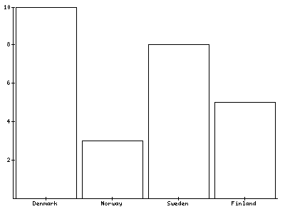
At line 1 the plugin is loaded in lib.pbimagegraph, a defined part of your page where you want to display the graph.At line 3-5 we set the image to 'png' with a width of 400 pixels and a height of 300 pixels.At line 6 the PLOTAREA is put on the canvas.The PLOTAREA contains a BAR plot, which is defined at line 8.From line 10-33 we define the dataset of the BAR plot. It is a trivial dataset which holds 4 x-axis values, Denmark, Norway, Sweden and Finland with their corresponing values on the y-axis.Because no other font is set, the default font will be used with its default settings like color and size. The bars do not have any color, because they are not set.
Example – The layout
In this example a font will be added and the canvas will be divided into several parts to layout the graph. It will contain a title and a legend
1: lib.pbimagegraph < plugin.tx_pbimagegraph_pi1
2: lib.pbimagegraph {
3:   factory = png
4:   width = 400
5:   height = 300
6:   antialias = native
7:   font.default = verdana
8:   font.default {
9:     size = 10
10:  }
11:  10 = VERTICAL
12:  10 {
13:    percentage = 5
14:    10 = TITLE
15:    10 {
16:      text = Simple Line Chart Sample
17:      font {
18:        size = 12
19:      }
20:    }
21:    20 = VERTICAL
22:    20 {
23:      percentage = 88
24:      10 = PLOTAREA
25:      10 {
26:        id = plotarea1
27:        20 = LINE
28:        20 {
29:          lineColor = red
30:          dataset {
31:            10 = random
32:            10 {
33:              count = 10
34:              minimum = 2
35:              maximum = 15
36:              includeZero = true
37:            }
38:          }
39:        }
40:      }
41:      20 = LEGEND
42:      20 {
43:        plotarea.1 = plotarea1
44:      }
45:    }
46:  }
47:}
[plot_line.txt]
This is the graph generated by the previous code
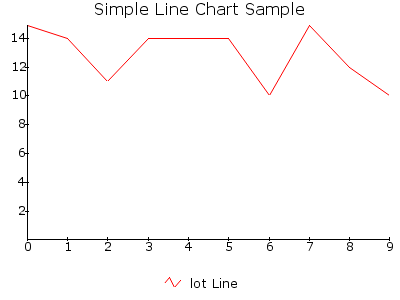 At line 1 the plugin is loaded in lib.pbimagegraph, a defined
part of your page where you want to display the graph.At line 3-6 we
set the image to 'png' with a width of 400 pixels, a height of 300
pixels and altialiased according to the native method.We are using a
default font for the canvas, verdana. The above Typoscript is written
for Windows XP, where Image_Graph tries to find the font itself in
C:/Windows/Fonts. On Linux and other machines, fill in the path
relative to the site and the name of the fontfile, like
fileadmin/templates/main/fonts/verdana.ttf
At line 1 the plugin is loaded in lib.pbimagegraph, a defined
part of your page where you want to display the graph.At line 3-6 we
set the image to 'png' with a width of 400 pixels, a height of 300
pixels and altialiased according to the native method.We are using a
default font for the canvas, verdana. The above Typoscript is written
for Windows XP, where Image_Graph tries to find the font itself in
C:/Windows/Fonts. On Linux and other machines, fill in the path
relative to the site and the name of the fontfile, like
fileadmin/templates/main/fonts/verdana.ttf
On line 11 the canvas will be divided into 2 VERTICAL areas. The upper area will be 5% in height of the available space. In this upper area there is a TITLE. The lower part is again divided into 2 VERTICAL parts (line 21). The upper part of this area is 88% in height of the available area and contains a PLOTAREA, which contains a LINE plot. The lower part of this inner VERTICAL layout is filled with the legend of the plot. Look at line 26 and 43 to see how the LEGEND and the LINE plot are connected to each other. The dataset has not been given a name, so Image_Graph takes the type of the plot. Because of some strange conversion between the TS and Image_Graph, the first P is not written in the legend name. Actually there should be 'Plot Line' instead of 'lot Line'.
Example – A smooth line plot
This example draws a SMOOTH_LINE plot. Almost everything is the same as the previous example, so no real explanation is necessary. Just have a look at it.
1: lib.pbimagegraph < plugin.tx_pbimagegraph_pi1
2: lib.pbimagegraph {
3:   factory = png
4:   width = 400
5:   height = 300
6:   antialias = native
7:   font.default = verdana
8:   font.default {
9:     size = 8
10:  }
11:  10 = VERTICAL
12:  10 {
13:    percentage = 5
14:    10 = TITLE
15:    10 {
16:      text = Smoothed Line Chart Sample
17:      font {
18:        size = 12
19:      }
20:    }
21:    20 = VERTICAL
22:    20 {
23:      percentage = 90
24:      10 = PLOTAREA
25:      10 {
26:        id = plotarea1
27:        20 = SMOOTH_LINE
28:        20 {
29:          lineColor = red
30:          dataset {
31:            10 = random
32:            10 {
33:              count = 10
34:              minimum = 2
35:              maximum = 15
36:              includeZero = true
37:            }
38:          }
39:        }
40:      }
41:      20 = LEGEND
42:      20 {
43:        plotarea.1 = plotarea1
44:      }
45:    }
46:  }
47:}
[plot_line_smooth.txt]
And this is the graph
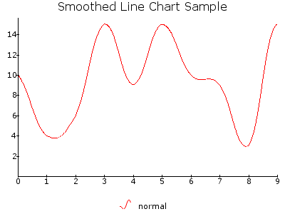 Similar to a LINE plot, but the interconnecting lines between
two datapoints are smoothed using a Bezier curve, which enables the
chart to appear as a nice curved plot instead of the sharp edges of a
conventional LINE. Smoothed charts are only supported with non-stacked
types.
Similar to a LINE plot, but the interconnecting lines between
two datapoints are smoothed using a Bezier curve, which enables the
chart to appear as a nice curved plot instead of the sharp edges of a
conventional LINE. Smoothed charts are only supported with non-stacked
types.
Example – An area plot
You can make all kinds of simple charts, just by changing some lines of Typoscript. In this example I'm using almost the same Typoscript as the previous plot and the one before, but now I've changed the plot type from SMOOTH_LINE to AREA. An area can be filled with some color, so I made it blue. Let's have a look at the script:
1: lib.pbimagegraph < plugin.tx_pbimagegraph_pi1
2: lib.pbimagegraph {
3:   factory = png
4:   width = 400
5:   height = 300
6:   antialias = native
7:   font.default = verdana
8:   font.default {
9:     size = 8
10:  }
11:  10 = VERTICAL
12:  10 {
13:    percentage = 5
14:    10 = TITLE
15:    10 {
16:      text = Simple Area Chart Sample
17:      font {
18:        size = 12
19:      }
20:    }
21:    20 = VERTICAL
22:    20 {
23:      percentage = 90
24:      10 = PLOTAREA
25:      10 {
26:        id = plotarea1
27:        20 = AREA
28:        20 {
29:          title = Area
30:          lineColor = gray
31:          fillColor = blue@0.2
32:          dataset {
33:            10 = random
34:            10 {
35:              count = 10
36:              minimum = 2
37:              maximum = 15
38:              includeZero = true
39:            }
40:          }
41:        }
42:      }
43:      20 = LEGEND
44:      20 {
45:        plotarea.1 = plotarea1
46:      }
47:    }
48:  }
49:}
[plot_area.txt]
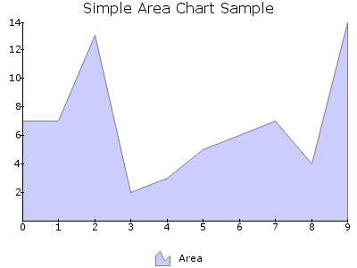 On line 27 we've changed the plot type from SMOOTH_LINE to
AREA.Look at the title on line 29. This is the title given to plot and
is used by the LEGEND to identify this plot.On line 31 we fill the
AREA with the color blue@0.2 . This means the
PEAR color blue is used, 20% opaque.
On line 27 we've changed the plot type from SMOOTH_LINE to
AREA.Look at the title on line 29. This is the title given to plot and
is used by the LEGEND to identify this plot.On line 31 we fill the
AREA with the color blue@0.2 . This means the
PEAR color blue is used, 20% opaque.
Example – I want a smooth area
AREA plots can also be smoothed, the plot type SMOOTH_AREA. Again, this is almost the same code as the examples before, so try to find the differences yourself.
1: lib.pbimagegraph < plugin.tx_pbimagegraph_pi1
2: lib.pbimagegraph {
3:   factory = png
4:   width = 400
5:   height = 300
6:   antialias = native
7:   font.default = verdana
8:   font.default {
9:     size = 8
10:  }
11:  10 = VERTICAL
12:  10 {
13:    percentage = 5
14:    10 = TITLE
15:    10 {
16:      text = Smoothed Area Chart Sample
17:      font {
18:        size = 12
19:      }
20:    }
21:    20 = VERTICAL
22:    20 {
23:      percentage = 90
24:      10 = PLOTAREA
25:      10 {
26:        id = plotarea1
27:        20 = SMOOTH_AREA
28:        20 {
29:          title = Smoothed Area
30:          lineColor = gray
31:          fillColor = blue@0.2
32:          dataset {
33:            10 = random
34:            10 {
35:              count = 10
36:              minimum = 2
37:              maximum = 15
38:              includeZero = true
39:            }
40:          }
41:        }
42:      }
43:      20 = LEGEND
44:      20 {
45:        plotarea.1 = plotarea1
46:      }
47:    }
48:  }
49:}
[plot_area_smooth.txt]
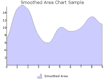 Example – Band plot
The next graph has a plot of the type BAND. Band plots have a low and a high value on one axis, most of the time the y-axis. The Typoscript is similar to the Typoscript used in the examples above, with minimal adjustments.
1: lib.pbimagegraph < plugin.tx_pbimagegraph_pi1
2: lib.pbimagegraph {
3:   factory = png
4:   width = 400
5:   height = 300
6:   antialias = native
7:   font.default = verdana
8:   font.default {
9:     size = 8
10:  }
11:  10 = VERTICAL
12:  10 {
13:    percentage = 5
14:    10 = TITLE
15:    10 {
16:      text = Band Chart Sample
17:      font {
18:        size = 12
19:      }
20:    }
21:    20 = VERTICAL
22:    20 {
23:      percentage = 90
24:      10 = PLOTAREA
25:      10 {
26:        id = plotarea1
27:        axis {
28:          x {
29:            labelInterval = 2
30:          }
31:        }
32:        10 = BAND
33:        10 {
34:          title = Band
35:          lineColor = gray
36:          fillColor = blue@0.2
37:          dataset {
38:            10 = trivial
39:            10 {
40:              1 = point
41:              1 {
42:                x = 0
43:                y {
44:                  low = 6
45:                  high = 22
46:                }
47:              }
48:              2 = point
49:              2 {
50:                x = 1
51:                y {
52:                  low = 12
53:                  high = 32
54:                }
55:              }
56:              3 = point
57:              3 {
58:                x = 2
59:                y {
60:                  low = 15
61:                  high = 26
62:                }
63:              }
64:              4 = point
65:              4 {
66:                x = 3
67:                y {
68:                  low = 14
69:                  high = 28
70:                }
71:              }
72:            }
73:          }
74:        }
75:      }
76:      20 = LEGEND
77:      20 {
78:        plotarea.1 = plotarea1
79:      }
80:    }
81:  }
82:}
[plot_band.txt]
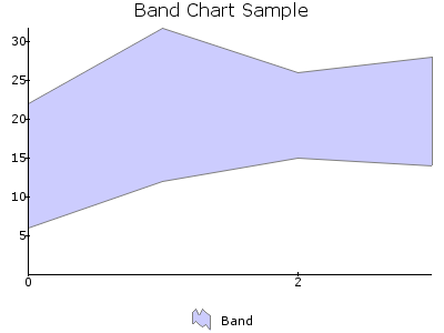 Look at line 29 where the labelInterval for the x-axis is set
to 2. Because of this interval the numbers 1 and 3 are not plotted
below the x-axis.
Look at line 29 where the labelInterval for the x-axis is set
to 2. Because of this interval the numbers 1 and 3 are not plotted
below the x-axis.
Example – Bar plot
I started with a simple BAR graph. This one is a more in line with the previous layouts and the bars will be filled.
1: lib.pbimagegraph < plugin.tx_pbimagegraph_pi1
2: lib.pbimagegraph {
3:   factory = png
4:   width = 400
5:   height = 300
6:   antialias = native
7:   font.default = verdana
8:   font.default {
9:     size = 8
10:  }
11:  10 = VERTICAL
12:  10 {
13:    percentage = 5
14:    10 = TITLE
15:    10 {
16:      text = Bar Chart Sample
17:      font {
18:        size = 12
19:      }
20:    }
21:    20 = VERTICAL
22:    20 {
23:      percentage = 90
24:      10 = PLOTAREA
25:      10 {
26:        id = plotarea1
27:        20 = BAR
28:        20 {
29:          title = Bar
30:          lineColor = gray
31:          fillColor = blue@0.2
32:          dataset {
33:            10 = random
34:            10 {
35:              count = 10
36:              minimum = 2
37:              maximum = 15
38:              includeZero = false
39:            }
40:          }
41:        }
42:      }
43:      20 = LEGEND
44:      20 {
45:        plotarea.1 = plotarea1
46:      }
47:    }
48:  }
49:}
[plot_bar.txt]
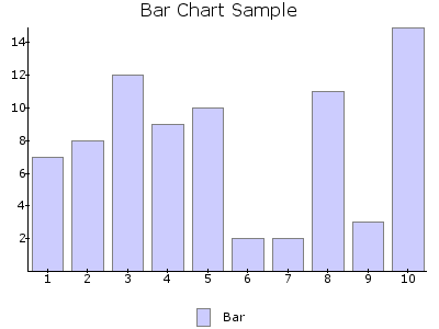
Have a look at line 38. The value includeZero is set to false. This means that zero can't be a number generated by the random object.
Example – Impulse plot
The next example will generate an IMPULSE plot.
1: lib.pbimagegraph < plugin.tx_pbimagegraph_pi1
2: lib.pbimagegraph {
3:   factory = png
4:   width = 400
5:   height = 300
6:   antialias = native
7:   font.default = verdana
8:   font.default {
9:     size = 8
10:  }
11:  10 = VERTICAL
12:  10 {
13:    percentage = 5
14:    10 = TITLE
15:    10 {
16:      text = Impulse Chart Sample
17:      font {
18:        size = 12
19:      }
20:    }
21:    20 = VERTICAL
22:    20 {
23:      percentage = 90
24:      10 = PLOTAREA
25:      10 {
26:        id = plotarea1
27:        20 = IMPULSE
28:        20 {
29:          lineColor = red
30:          dataset {
31:            10 = random
32:            10 {
33:              count = 10
34:              minimum = 2
35:              maximum = 15
36:              includeZero = false
37:            }
38:          }
39:        }
40:      }
41:      20 = LEGEND
42:      20 {
43:        plotarea.1 = plotarea1
44:      }
45:    }
46:  }
47:}
[plot_impulse.txt]
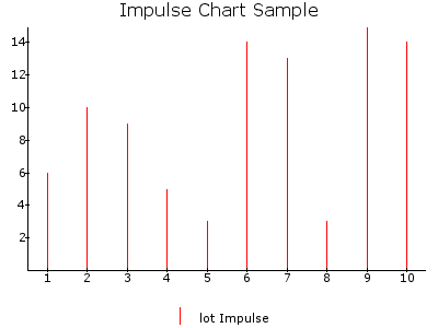 Example – Stacked plots
Ok, let's try something else. As you probably have read, Image_Graph is also capable of generating stacked plots. In this example I will show you a stacked AREA chart. We need some difference in colors as well to show the different datasets used in this plot.
1: lib.pbimagegraph < plugin.tx_pbimagegraph_pi1
2: lib.pbimagegraph {
3:   factory = png
4:   width = 400
5:   height = 300
6:   antialias = native
7:   font.default = verdana
8:   font.default {
9:     size = 8
10:  }
11:  10 = VERTICAL
12:  10 {
13:    percentage = 5
14:    10 = TITLE
15:    10 {
16:      text = Stacked Area Chart Sample
17:      font {
18:        size = 12
19:      }
20:    }
21:    20 = VERTICAL
22:    20 {
23:      percentage = 90
24:      10 = PLOTAREA
25:      10 {
26:        id = plotarea1
27:        20 = AREA
28:        20 {
29:          plottype = stacked
30:          lineColor = gray
31:          dataset {
32:            10 = random
33:            10 {
34:              count = 10
35:              minimum = 2
36:              maximum = 15
37:              includeZero = true
38:              name = Area
39:            }
40:            20 = random
41:            20 {
42:              count = 10
43:              minimum = 2
44:              maximum = 15
45:              includeZero = true
46:              name = Area
47:            }
48:            30 = random
49:            30 {
50:              count = 10
51:              minimum = 2
52:              maximum = 15
53:              includeZero = true
54:              name = Area
55:            }
56:          }
57:          fillStyle = fill_array
58:          fillStyle {
59:            1 = addColor
60:            1 {
61:              color = blue@0.2
62:            }
63:            2 = addColor
64:            2 {
65:              color = yellow@0.2
66:            }
67:            3 = addColor
68:            3 {
69:              color = green@0.2
70:            }
71:          }
72:        }
73:      }
74:      20 = LEGEND
75:      20 {
76:        plotarea.1 = plotarea1
77:      }
78:    }
79:  }
80:}
[plot_area_stack.txt]
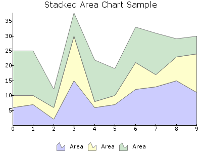 At line 27 we define a normal AREA plot, while on line 29 it
is told to behave like a stacked area. To have 3 stacks we use 3
datasets, defined in line 31 to 56. Finally we give each dataset
another color. To see how this is done, have a look at line 57 to 71.
At line 27 we define a normal AREA plot, while on line 29 it
is told to behave like a stacked area. To have 3 stacks we use 3
datasets, defined in line 31 to 56. Finally we give each dataset
another color. To see how this is done, have a look at line 57 to 71.
Example – Multiple plots in one plotarea
This example is to show how multiple plots can be shown within one plotarea. It also shows how the axis behaves when having negative values. And what if there are there are no equal amount of values in these plots.
1: lib.pbimagegraph < plugin.tx_pbimagegraph_pi1
2: lib.pbimagegraph {
3:   factory = png
4:   width = 400
5:   height = 300
6:   font.default = verdana
7:   font.default {
8:     size = 8
9:   }
10:  10 = VERTICAL
11:  10 {
12:    percentage = 90
13:    10 = PLOTAREA
14:    10 {
15:      id = plotarea1
16:      10 = AREA
17:      10 {
18:        title = Area
19:        fillColor = red@0.2
20:        dataset {
21:          10 = trivial
22:          10 {
23:            10 = point
24:            10 {
25:              x = Jan
26:             y = 1
27:            }
28:            20 = point
29:            20 {
30:              x = Feb
31:              y = 2
32:            }
33:            30 = point
34:            30 {
35:              x = Mar
36:              y = -2
37:            }
38:            40 = point
39:            40 {
40:              x = Apr
41:              y = 4
42:            }
43:            50 = point
44:            50 {
45:              x = May
46:              y = 3
47:            }
48:            60 = point
49:            60 {
50:              x = Jun
51:              y = 6
52:            }
53:            70 = point
54:            70 {
55:              x = Jul
56:              y = -1
57:            }
58:            80 = point
59:            80 {
60:              x = Aug
61:              y = -3
62:            }
63:            90 = point
64:            90 {
65:              x = Sep
66:              y = 2
67:            }
68:            100 = point
69:            100 {
70:              x = Oct
71:              y = 3
72:            }
73:            110 = point
74:            110 {
75:              x = Nov
76:              y = 1
77:            }
78:            120 = point
79:            120 {
80:              x = Dec
81:              y = 4
82:            }
83:          }
84:        }
85:        # dataset end
86:      }
87:      # AREA end
88:      40 = BAR
89:      40 {
90:        title = Bar
91:        fillColor = blue@0.2
92:        dataset {
93:          10 = trivial
94:          10 {
95:            10 = point
96:            10 {
97:              x = Jan
98:              y = 3
99:            }
100:            20 = point
101:            20 {
102:              x = Feb
103:              y = 4
104:            }
105:            30 = point
106:            30 {
107:              x = Mar
108:              y = 1
109:            }
110:            40 = point
111:            40 {
112:              x = Apr
113:              y = -2
114:            }
115:            50 = point
116:            50 {
117:              x = May
118:              y = 3
119:            }
120:            60 = point
121:            60 {
122:              x = Jul
123:              y = 1
124:            }
125:          }
126:        }
127:        # dataset end
128:      }
129:      # BAR end
130:    }
131:    # PLOTAREA end
132:    20 = LEGEND
133:    20 {
134:      plotarea.1 = plotarea1
135:    }
136:  }
137:  # VERTICAL end
138:}
[negative_values.txt]
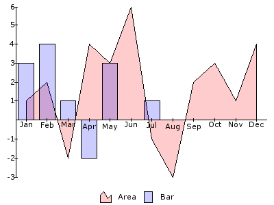 On line 13 we put a PLOTAREA in the space reserved for this
purpose, which is filled with an AREA on line 16-86 and a BAR on line
88-128. Both the BAR and the AREA plots have negative values. The axis
will automatically adjust to these negative values.
On line 13 we put a PLOTAREA in the space reserved for this
purpose, which is filled with an AREA on line 16-86 and a BAR on line
88-128. Both the BAR and the AREA plots have negative values. The axis
will automatically adjust to these negative values.
The AREA plot has 12 values while the BAR plot only has 6. This is visible in the graph.
Example – Negative values
Negative values can be done in all kinds of plot types, like a stacked BAR chart.
1: lib.pbimagegraph < plugin.tx_pbimagegraph_pi1
2: lib.pbimagegraph {
3:   factory = png
4:   width = 400
5:   height = 300
6:   antialias = native
7:   font.default = verdana
8:   font.default {
9:     size = 8
10:  }
11:  10 = VERTICAL
12:  10 {
13:    percentage = 5
14:    10 = TITLE
15:    10 {
16:      text = Negative Stacked Bar Chart
17:      font {
18:        size = 10
19:      }
20:    }
21:    20 = PLOTAREA
22:    20 {
23:      10 = BAR
24:      10 {
25:        plottype = stacked
26:        dataset {
27:          10 = trivial
28:          10 {
29:            1 = point
30:            1 {
31:              x = A
32:              y = 1
33:            }
34:            2 = point
35:            2 {
36:              x = B
37:              y = 4
38:            }
39:            3 = point
40:            3 {
41:              x = C
42:              y = -1
43:            }
44:            4 = point
45:            4 {
46:              x = D
47:              y = 2
48:            }
49:            5 = point
50:            5 {
51:              x = E
52:              y = 1
53:            }
54:            6 = point
55:            6 {
56:              x = F
57:              y = 2
58:            }
59:            7 = point
60:            7 {
61:              x = G
62:              y = 3
63:            }
64:          }
65:          20 = trivial
66:          20 {
67:            1 = point
68:            1 {
69:              x = A
70:              y = 2
71:            }
72:            2 = point
73:            2 {
74:              x = B
75:              y = -3
76:            }
77:            3 = point
78:            3 {
79:              x = C
80:              y = -2
81:            }
82:            4 = point
83:            4 {
84:              x = D
85:              y = 3
86:            }
87:            5 = point
88:            5 {
89:              x = E
90:              y = 3
91:            }
92:            6 = point
93:            6 {
94:              x = F
95:              y = 2
96:            }
97:            7 = point
98:            7 {
99:              x = G
100:              y = -1
101:            }
102:          }
103:          30 = trivial
104:          30 {
105:            1 = point
106:            1 {
107:              x = A
108:              y = -1
109:            }
110:            2 = point
111:            2 {
112:              x = B
113:              y = 2
114:            }
115:            3 = point
116:            3 {
117:              x = C
118:              y = 1
119:            }
120:            4 = point
121:            4 {
122:              x = D
123:              y = 3
124:            }
125:            5 = point
126:            5 {
127:              x = E
128:              y = -1
129:            }
130:           6 = point
131:            6 {
132:              x = F
133:              y = 2
134:            }
135:            7 = point
136:            7 {
137:              x = G
138:              y = 3
139:            }
140:          }
141:        }
142:        fillStyle = fill_array
143:        fillStyle {
144:          1 = addColor
145:          1 {
146:            color = blue@0.2
147:          }
148:          2 = addColor
149:          2 {
150:            color = yellow@0.2
151:          }
152:          3 = addColor
153:          3 {
154:            color = green@0.2
155:          }
156:        }
157:      }
158:    }
159:  }
160:}
[plot_bar_stacked_negative.txt]
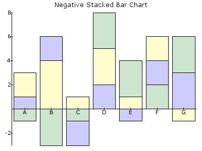 Example – Adding a grid for better reading
A grid makes it easier to read the values of an axis thoughout the whole plot.
1: lib.pbimagegraph < plugin.tx_pbimagegraph_pi1
2: lib.pbimagegraph {
3:   factory = png
4:   width = 400
5:   height = 300
6:   font.default = verdana
7:   font.default {
8:     size = 8
9:   }
10:  10 = VERTICAL
11:  10 {
12:    percentage = 5
13:    10 = TITLE
14:    10 {
15:      text = Simple Graph Example
16:    }
17:    20 = PLOTAREA
18:    20 {
19:      10 = GRID
20:      10 {
21:        axis = y
22:        type = line
23:        lineColor = gray@0.2
24:      }
25:      20 = SMOOTH_AREA
26:      20 {
27:        fillColor = blue@0.2
28:        dataset {
29:          10 = trivial
30:          10 {
31:            10 = point
32:            10 {
33:              x = Dogs
34:              y = 3
35:            }
36:            20 = point
37:            20 {
38:              x = Cats
39:              y = 1
40:            }
41:            30 = point
42:            30 {
43:              x = Parrots
44:              y = 4
45:            }
46:            40 = point
47:            40 {
48:              x = Mice
49:              y = 5
50:            }
51:          }
52:        }
53:      }
54:    }
55:  }
56:}
[simple_graph.txt]
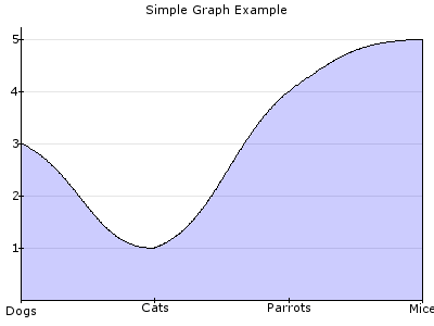 Look at line 19-24. Here the GRID is set. This is done before
any plot is put in the plotarea. This is not mandatory, but I advise
you to do so. Otherwise the grid will be in a layer over the plot and
disturbing the plot. Because the color of the plot is not completely
opaque, you can see the grid through the plot.
Look at line 19-24. Here the GRID is set. This is done before
any plot is put in the plotarea. This is not mandatory, but I advise
you to do so. Otherwise the grid will be in a layer over the plot and
disturbing the plot. Because the color of the plot is not completely
opaque, you can see the grid through the plot.
Example – More grid, secondary axis and axis titles
In this example the grid gets a gradient fill style, shows how to add a secondary axis and how the axis titles are processed.
1: lib.pbimagegraph < plugin.tx_pbimagegraph_pi1
2: lib.pbimagegraph {
3:   factory = png
4:   width = 400
5:   height = 300
6 :  antialias = native
7:   font.default = verdana
8:   font.default {
9:     size = 8
10:  }
11:  10 = VERTICAL
12:  10 {
13:    percentage = 5
14:    10 = TITLE
15:    10 {
16:      text = Primary & Secondary Axis
17:      font {
18:        size = 11
19:      }
20:    }
21:    20 = VERTICAL
22:    20 {
23:      percentage = 90
24:      10 = PLOTAREA
25:      10 {
26:        id = plotarea1
27:        axis {
28:          y {
29:            title = Apples
30:            title {
31:              angle = 90
32:            }
33:          }
34:          y_secondary {
35:            title = Pears
36:            title {
37:              angle = 270
38:            }
39:          }
40:          x {
41:            title = Oranges
42:          }
43:        }
44:        10 = GRID
45:        10 {
46:          type = bar
47:          axis = y_secondary
48:          fillStyle = gradient
49:          fillStyle {
50:            direction = vertical
51:            startColor = white
52:            endColor = lightgrey
53:          }
54:        }
55:        20 = LINE
56:        20 {
57:          title = Primary Axis
58:          lineColor = red
59:          dataset {
60:            10 = random
61:            10 {
62:              count = 8
63:              minimum = 10
64:              maximum = 100
65:              includeZero = true
66:            }
67:          }
68:        }
69:        30 = AREA
70:        30 {
71:          title = Secondary Axis
72:          axis = y_secondary
73:          lineColor = gray
74:          fillColor = blue@0.2
75:          dataset {
76:            10 = random
77:            10 {
78:              count = 8
79:              minimum = 1
80:              maximum = 10
81:              includeZero = true
82:            }
83:          }
84:        }
85:      }
86:      20 = LEGEND
87:      20 {
88:        plotarea.1 = plotarea1
89:      }
90:    }
91:  }
92:}
[secondary_axis.txt]
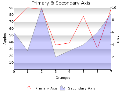 From line 27-43 the names of the axis are set. Look at the
angle for the titles of the y-axis (Apples) and the y_secondary
(Pears) how to rotate the title.
From line 27-43 the names of the axis are set. Look at the
angle for the titles of the y-axis (Apples) and the y_secondary
(Pears) how to rotate the title.
The GRID is this time of the type bar (line 46) instead of the type line. A line does not have a fill color and we want to fill an area. From line 48-53 we set this fillstyle to a vertical gradient with the colors white and lightgrey.
The secondary y_axis is dedicated to the AREA plot, as set in line 72.
Example – Markers and Datapreprocessor
The data point marker is used for marking the datapoints on a graph with some visual label, for example a cross, a text box with the value or an icon. In this example I will show you two types. One showing only a circle around the value and the other one showing the value as text in a box.
1: lib.pbimagegraph < plugin.tx_pbimagegraph_pi1
2: lib.pbimagegraph {
3:   factory = png
4:   width = 600
5:   height = 400
6:   font.default = verdana
7:   font.default {
8:     size = 8
9:   }
10:  10 = VERTICAL
11:  10 {
12:    percentage = 8
13:    10 = VERTICAL
14:    10 {
15:      percentage = 90
16:      10 = TITLE
17:      10 {
18:        text = Multiple Plots
19:        alignment = left
20:        font {
21:          size = 11
22:        }
23:      }
24:      # TITLE end
25:      20 = TITLE
26:      20 {
27:        text = This is a demonstration of title alignment
28:        alignment = left
29:        font {
30:          size = 7
31:        }
32:      }
33:      # TITLE end
34:    }
35:    # VERTICAL end
36:    20 = PLOTAREA
37:    20 {
38:      axis {
39:        x {
40:          dataPreProcessor = array
41:          dataPreProcessor {
42:            0 = Jan-Feb 2004
43:            1 = Mar-Apr 2004
44:            2 = May-Jun 2004
45:            3 = Jul-Aug 2004
46:            4 = Sep-Oct 2004
47:            5 = Nov-Dev 2004
48:            6 = Jan-Feb 2005
49:            7 = Mar-Apr 2005
50:            8 = May-Jun 2005
51:            9 = Jul-Aug 2005
52:          }
53:          font {
54:            angle = 90
55:          }
56:        }
57:      }
58:      10 = GRID
59:      10 {
60:        type = bar
61:        axis = y
62:        fillStyle = gradient
63:        fillStyle {
64:          direction = vertical
65:          startColor = white
66:          endColor = lightgrey
67:        }
68:      }
69:      # GRID end
70:      20 = SMOOTH_AREA
71:      20 {
72:        fillColor = red@0.2
73:        dataset {
74:          10 = random
75:          10 {
76:            count = 10
77:            minimum = 20
78:            maximum = 100
79:            includeZero = true
80:          }
81:        }
82:      }
83:      # SMOOTH_AREA end
84:      30 = LINE
85:      30 {
86:        lineColor = blue@0.2
87:        dataset {
88:          10 = random
89:          10 {
90:            count = 10
91:            minimum = 20
92:            maximum = 100
93:            includeZero = true
94:          }
95:        }
96:        marker = circle
97:        marker {
98:          fillColor = white@0.4
99:        }
100:      }
101:      # LINE end
102:      40 = BAR
103:      40 {
104:        fillColor = green@0.2
105:        dataset {
106:          10 = random
107:          10 {
108:            count = 10
109:            minimum = 2
110:            maximum = 40
111:            includeZero = true
112:          }
113:        }
114:        marker = value
115:        marker {
116:          useValue = value_y
117:          fillColor = white
118:          borderColor = black
119:        }
120:      }
121:      # BAR end
122:    }
123:    # PLOTAREA end
124:  }
125:  # VERTICAL end
126:}
[multiple_plots.txt]
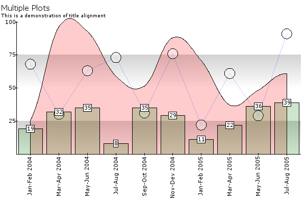 First of all, have a look at line 16 – 33. Here are two title
object, each with their own settings. As you can see in the image, one
title has a bigger font than the other.
First of all, have a look at line 16 – 33. Here are two title
object, each with their own settings. As you can see in the image, one
title has a bigger font than the other.
On line 38 – 52 there is an example how to use the datapreprocessor. All plots are generated by random values, but we need a date at the x-axis. This is done by telling Image_Graph to use dates instead of these generated values. Each value gets a date assigned.
On line 58-68 we put a grid on the plotarea like in the previous example.
The first plot in the plotarea is the red SMOOTH_AREA. (line 70-82)
The next plot is a LINE plot. This line plot is in line 84-100 and has a special item called a marker. Every point of the line is marked with a circle with a default radius and filled with the color white, 40% opaque.
The last plot is a bar with also a marker, but this time a value is shown in a box (line 102-120). The value that is shown in this box is the value of the bar taken from the y-axis.
More examples
I can go on and on and on showing examples and their code. I've added a lot of examples with this extension in the directory examples. I'm now only going to show you images, the name of the file used to generate this graph and a short explanation of the graph..
Enjoy and see what Image_Graph together with TYPO3 can do for you.
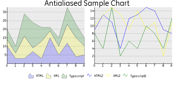 Illustration 1: antialias.txt
a
Illustration 1: antialias.txt
Example to show antialiasing and 2 plotareas in one graph.
b
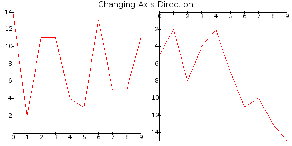 Illustration 2: axis_direction.txt
Change the direction of the y-asix.
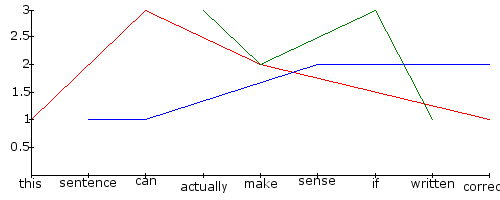 Illustration 3: category_axis_explanation.txt
a
Illustration 3: category_axis_explanation.txt
Explanation of asix type category.
b
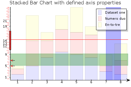 Illustration 4: customize.txt
Customization of the y-axis with axis markers as line and area. Also marks on the axis, interval regulation and a legend as overlayed box in a plotarea
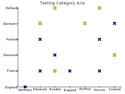 Illustration 5: double_category_axis.txt
a
Illustration 5: double_category_axis.txt
Demonstrating x and y-axis as category type and a SCATTER plot.
b
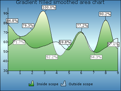 Illustration 6: gradient_fill_area.txt
Fancy a graph with gradient colors
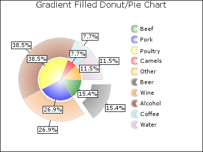 Illustration 7: gradient_pie.txt
a
Illustration 7: gradient_pie.txt
PIE plot with two datasets (Donut), value markers and an exploded part from the pie.
b
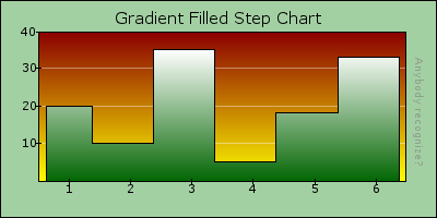 Illustration 8: gradient_step.txt
STEP plot. Demonstrating the use of colors in different elements.
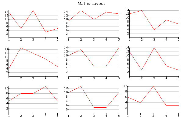 Illustration 9: layout_matrix.txt
a
Illustration 9: layout_matrix.txt
Simple LINE plots in a MATRIX layout
b
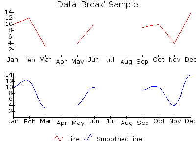 Illustration 10: line_break.txt
Line breaks in a plot
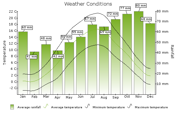 Illustration 11: logo_graph.txt
a
Illustration 11: logo_graph.txt
b
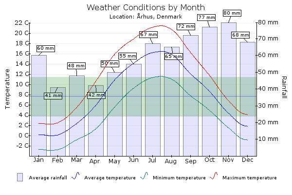 Illustration 12: misc05.txt
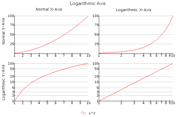 Illustration 13: log_axis.txt
a
Illustration 13: log_axis.txt
Logarithmic y-axis and x-asis
b
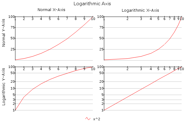 Illustration 14: log_axis_intersect.txt
Set the value at which the axis intersects other axis at maximum
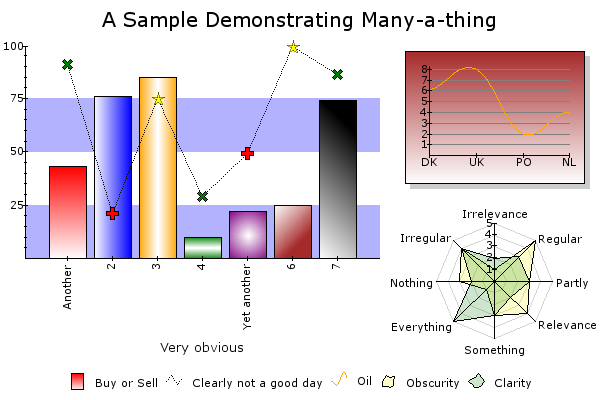 Illustration 15: misc01.txt
a
Illustration 15: misc01.txt
Like the title of this graph says: demonstrating a lot. Complex layout, Use of colors, markers, combined plots, radar plot.
b
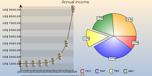 Illustration 16: misc02.txt
Images as value markers
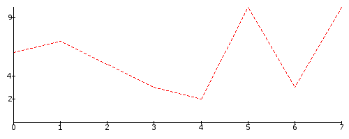 Illustration 17: manual_labels.txt
a
Illustration 17: manual_labels.txt
Dashed line and label interval on y-axis
b
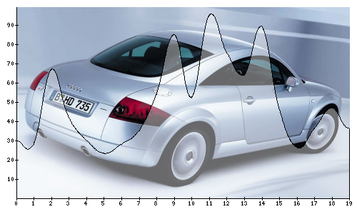 Illustration 18: misc04.txt
Using an image as background of the plotarea
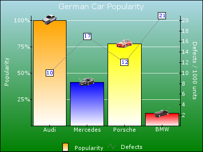 Illustration 19: misc06.txt
a
Illustration 19: misc06.txt
Datapreprocessor on the y-axis. Images as markers on top of each bar.
b
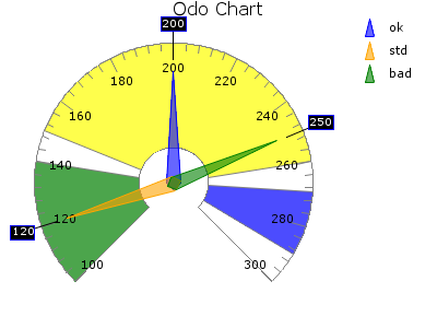 Illustration 20: plot_odo.txt
Demonstrating how to plot an odo with a certain range, range markers, arrows and value markers.
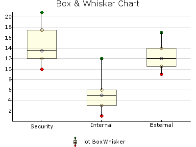 Illustration 21: plot_boxwhisker.txt
a
Illustration 21: plot_boxwhisker.txt
Demonstrating the drawing of a box & whisker chart
b
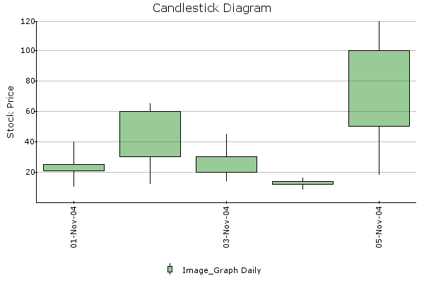 Illustration 22: plot_candlestick.txt
Demonstrating a candlestick diagram
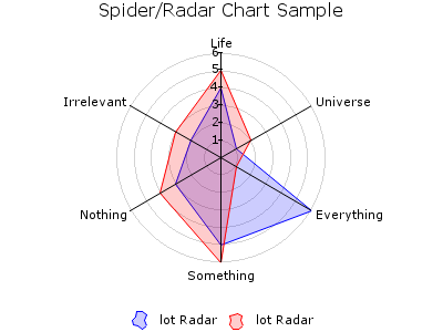 Illustration 23: plot_radar.txt
a
Illustration 23: plot_radar.txt
A RADAR plot with a polar grid
b
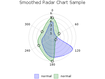 Illustration 24: plot_radar_smooth
A SMOOTH_RADAR plot witch markers as circles
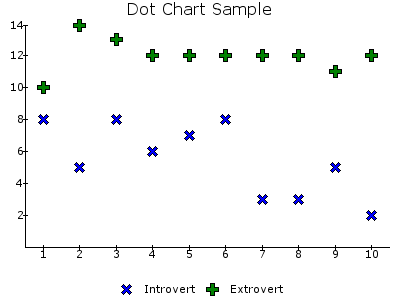 Illustration 25: plot_scatter.txt
a
Illustration 25: plot_scatter.txt
Plotarea with two SCATTER plots, each with their own marker
b
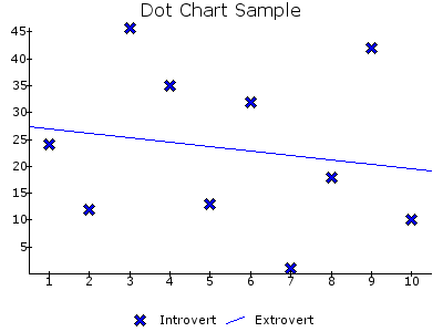 Illustration 26: plot_scatter_linfit.txt
SCATTER plot and a FIT_LINE using linear regression
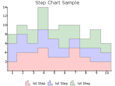 Illustration 27: plot_step.txt
a
Illustration 27: plot_step.txt
Stacked STEP chart
b
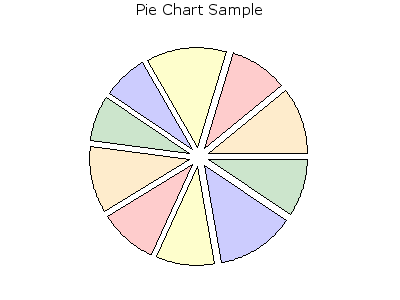 Illustration 28: plot_pie.txt
Simple PIE chart where every piece is a bit exploded
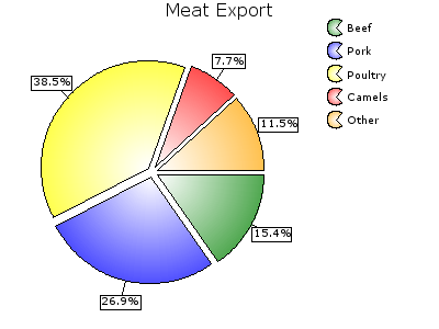 Illustration 29: misc03.txt
a
Illustration 29: misc03.txt
PIE plot with preprocessed markers in percentage
b
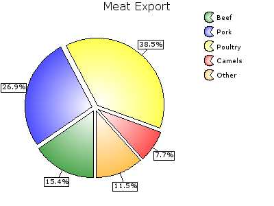 Illustration 30: plot_pie_rotate.txt
The same as the plot at the left, only the startingpoint is rotated
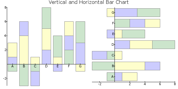 Illustration 31: plot_bar_horizontal.txt
a
Illustration 31: plot_bar_horizontal.txt
Vertical and horizontal stacked BAR plots with negative values
b
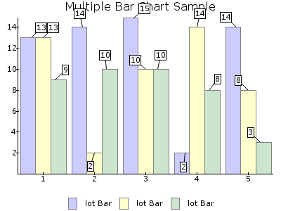 Illustration 32: plot_bar_multiple.txt
Plotarea with BAR plot with multiple datasets and angular markers
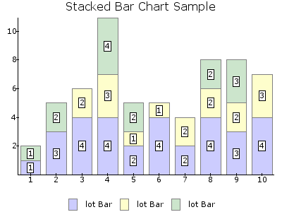 Illustration 33: plot_bar_stacked.txt
a
Illustration 33: plot_bar_stacked.txt
Stacked BAR plot with value markers
b
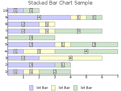 Illustration 34: plot_bar_stacked_horizontal.txt
Horizontal stacked BAR plot with value markers
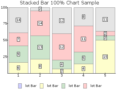 Illustration 35: plot_bar_stacked100pct.txt
a
Illustration 35: plot_bar_stacked100pct.txt
100% Stacked BAR with value markers
b
Known problems
When generating a lot of graphs on the same page, this can be time consuming, especially when antialias is used. However, once the images are generated, and no changes are made in the Typoscript, the extension will use the previously generated image, like Gifbuilder does.
I hardly touched the code of the original Image_Graph PEAR package, only changed the file names to avoid naming annoyances in TYPO3 and added some TYPO3 specific code. This is done because it is more easy to update the extension when a new version of the PEAR package is released. Because of this, there is no good error control. The PEAR package does some error control by itself, but it is not complete. Therefor, when entering the wrong Typoscript, PHP will show errors, because the errors are not catched by TYPO3.
To-Do list
Not all the capabliities of Image_Graph are used. I know it is possible to plot bubbles on country maps of your choice. This is something I'm going to try quite soon, because my upcoming (at the time of writing I'm somehow in between jobs) employee asked for it.
Changelog
0
Main
0
Sub
0
Development
1
Changes
First upload to the TER
1
Main
1
Sub
0
Development
0
Changes
Lot of bugfixes concerning non compatibility PHP4 and directory names
1
Main
1
Sub
0
Development
1
Changes
Added a check if function 'imageantialias' exists in PHP because it was not available in PHP<4.3.2
1
Main
1
Sub
0
Development
2
Changes
Bugfix for backend use. This wasn't possible at all.
1
Main
1
Sub
0
Development
3
Changes
Bugfix in directory naming. Thanks to Jacob Hammeken
1
Main
1
Sub
0
Development
4
Changes
Bugfix setName in datasetTrivial. Thanks to Stefan Koch
1
Main
1
Sub
1
Development
0
Changes
Added SVG support. Also added PDF support, but this is still in a very early alpha stage
1
Main
1
Sub
1
Development
1
Changes
Small bugfix
Credits
First of all, of course, thanks to Jesper Veggerby, the developer of the PEAR package Image_Graph. Have a look at his website http://pear.veggerby.dk/ for more information about Image_Graph.
Secondly thanks to Kasper Skårhøj, the founder of TYPO3, our little king and the most friendly ghost of the world. Without him this extension would not exist at all.Thanks for the Cohiba at T3BOARD06 as well. I took it with the best whisky I've got in stock (approximately 150)
Thanks to my girlfriend Diane, for telling me to believe in myself and my capabilities.
Thanks to the Nederlandse Spoorwegen (Dutch Railways), for all the delays. This extension in completely written while traveling from and to my work. And that's about 3 hours a day, without the delay.
Thanks to Ingmar Schlecht, who initiated the Graph project with JPGraph.
Thanks to everybody in the community for your support, positive responses and ideas.
And finally thanks to everybody at the core team. Where should we extension developers be without you.
See you all at the next T3CON, T3BOARD, T3DD or maybe the T3DIVE
 EXT: Image_Graph - 52