DEPRECATION WARNING
This documentation is not using the current rendering mechanism and is probably outdated. The extension maintainer should switch to the new system. Details on how to use the rendering mechanism can be found here.
Design
The arrangement and appearance from content elements can be defined on different areas. The coarse structure is defined with the page layout where structure elements like grid elements might further organize the content in columns, registers, and the like. Fine tuning can be done on a content element basis by altering the frame, attributes and background.
Page layout
With a page layout the coarse page structure is defined. They can be selected in the page properties dialog under the appearance tab. See as well demo site.
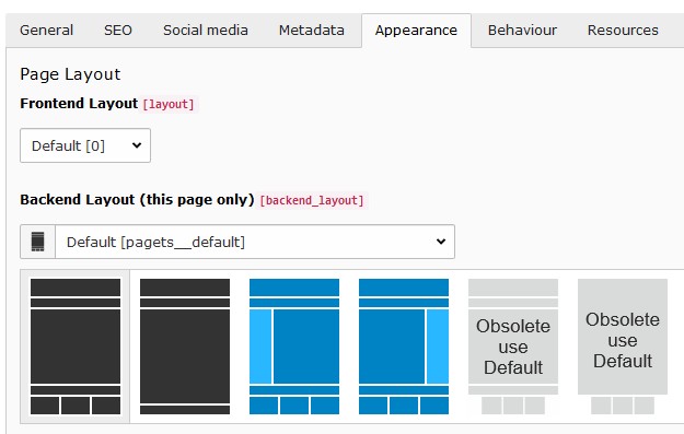
Available page layouts
Note
The page layouts with a navigation menu on the side allow to add content too.
Structure elements
With structure elements the content area might be further organized. Typical elements are containers, columns, accordions and tabs. See as well demo site.
Currently the content elements provided by the extension gridelements are used as structure elements. The available grid elements can be found in the new content element wizard under the “Grid Elements” tab:
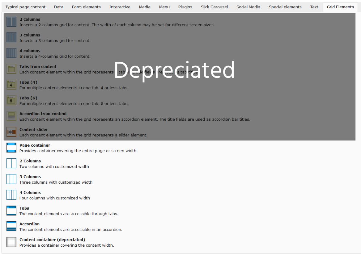
“Grid Elements”-tab in new content element wizard
Content element
The appearance aspects from a content elements can be defined in the content element properties dialog under the appearance tab.
Custom frames
Additional frames can be selected for content elements (see example):
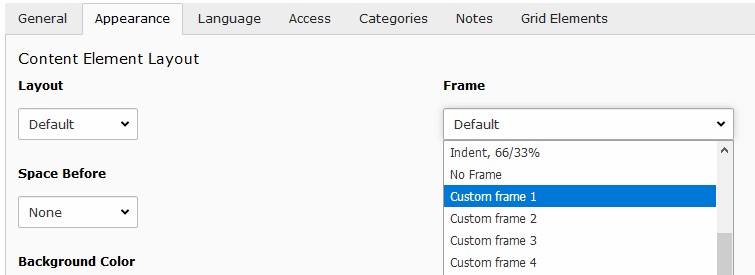
Custom frames for content elements
Note
The custom frame 4 doesn’t have any style definition. You might use it according your needs.
Background
The bootstrap package as well as this distribution provide a way to assign a background to a content element.
The bootstrap package approach uses additional style definitions inside the content element container allowing to define different images for different screen sizes. Additionally it provides easy image manipulations. In case no frame should be used as well no background image can be assigned.
The distribution is embedding a background image by adding an inline style definition. In case no frame is selected the content is wrapped allowing always to have a background image.
Attributes
Sometimes it would be handy to directly alter attributes from a content element. For example to assign additional classes, some inline style or new attributes.
This functionality has been added by introducing additional fields to the content element table and adapting the rendering accordingly. The new fields are available under the appearance tab in the “Attributes” section.
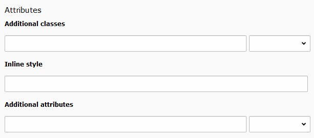
Customizing attributes for a content element
Some predefined classes and attributes can be assigned by help of the adjacent selector box. The selector box for the “Additional attributes” field shows data attributes related to the scroll animation.
Note
For security reasons all attributes are filtered. Currently just data attributes are allowed in the “Additional attributes” field.