DEPRECATION WARNING
This documentation is not using the current rendering mechanism and is probably outdated. The extension maintainer should switch to the new system. Details on how to use the rendering mechanism can be found here.
EXT: PMK Shadowbox
| Created: | 2010-02-18T17:33:18 |
|---|---|
| Changed by: | Peter Klein |
| Changed: | 2011-02-15T16:53:42.020000000 |
| Classification: | pmkshadowbox |
| Keywords: | shadowbox, lightbox |
| Author: | Peter Klein |
| Author 2: | Stefan Galinski |
| Email: | peter@clioonline.dk |
| Email 2: | stefan.galinski@gmail.com |
| Info 4: | Clio Online, domainFACTORY |
| Language: | en |

 EXT: PMK Shadowbox - pmkshadowbox
EXT: PMK Shadowbox
Extension Key: pmkshadowbox
Language: en
Keywords: shadowbox, lightbox
Copyright 2009-2011, Peter Klein <peter@clioonline.dk>, Stefan Galinski <stefan.galinski@gmail.com>
Shadowbox v3 © 2007-2011 Michael J. I. Jackson, < http://www .shadowbox-js.com/ >
This document is published under the Open Content License
available from http://www.opencontent.org/opl.shtml
The content of this document is related to TYPO3
- a GNU/GPL CMS/Framework available from www.typo3.org
Shadowbox is licensed under version 3.0 of the Creative Commons Attribution-Noncommercial-Share Alike license. This means that it is absolutely free for personal, noncommercial use provided that you 1) make attribution to the author and 2) release any derivative work under the same or a similar license.
If you would like to use Shadowbox for commercial purposes, you can purchase a license ($20) that allows you to use Shadowbox in your projects. See Shadowbox homepage for more details.
Table of Contents
`Introduction 3 <#__RefHeading__3180_963918353>`_
`Users manual 5 <#__RefHeading__3186_963918353>`_
`Administration 6 <#__RefHeading__3190_963918353>`_
`Configuration 8 <#__RefHeading__3194_963918353>`_
Additional Reference (tt_content; Click-Enlarge) 11
Additional Reference (tt_news) 11
Additional Reference (tt_products) 12
`Tutorial 13 <#__RefHeading__3200_963918353>`_
How to open another page inside the ShadowBox? 13
How to use SB on links created in HTMLArea RTE? 13
How to use SB on links created in TinyMCE RTE? 13
How to get Shadowbox to work in tt_content (Click-Enlarge)? 13
How to get Shadowbox to work in tt_news? 13
How to get Shadowbox to work in tt_products? 13
How to enhance the Shadowbox functionality 14
`Known problems 15 <#__RefHeading__3202_963918353>`_
`To-Do list 16 <#__RefHeading__3204_963918353>`_
`ChangeLog 17 <#__RefHeading__3206_963918353>`_
Introduction
What Does It Do?
The extensions integrates the shadowbox from Michael J. I. Jackson into TYPO3. As a result you can open specially marked links and images with an enabled click-enlarge option into a shadowbox. We don't use any dirty Xclassing for reaching this goal. It's completely configurable by typoscript and it's developed to be very performant in each setup.
Shadowbox Overview
Shadowbox is an online media viewer application (Lightbox clone) that supports all of the web's most popular media publishing formats. Shadowbox is written entirely in JavaScript and CSS and is highly customizable. Using Shadowbox, website authors can showcase a wide assortment of media in all major browsers without navigating users away from the linking page.
Shadowbox Features
What sets Shadowbox apart from every other "box" out there?
Standards
Shadowbox uses HTML markup that validates. It doesn't depend on phony HTML attributes in your anchor tags to make it work. The web has enough problems with standards compliance as it is and Shadowbox does its best to not perpetuate them.
Free from Frameworks
Although Shadowbox has the unique ability to adapt to whatever JavaScript framework you choose, it's just as easy to run it as a standalone application, giving the developer a great deal of flexibility.
Flexible
Shadowbox supports all of the web's most popular media publishing formats including images, QuickTime, Windows Media Player, Flash, FLV, HTML, and even external web pages. This makes it easy to display your content, no matter what it is.
Smart
Shadowbox uses a smart plugin detection mechanism behind the scenes that can spare your users from confusing torn image or puzzle piece icons when they don't have the plugins they need to view your content. Also, it will never overflow the viewport, forcing those obnoxious scrollbars.
Customizable
Shadowbox supports a host of options that make it highly configurable. If you don't like the way something works, chances are very good that you can change it without digging through the code.
Universal
Shadowbox ships with support for many of the world's most-spoken languages, and it's not difficult to configure Shadowbox to communicate with your visitors in their native tongue.
Neat and Compact
The Shadowbox code is neat and modular. And it's smart enough to only include the code you need to run your application so it's as light weight as possible.
Plays Well with Others
Shadowbox tries to be as unobtrusive as possible. If your client doesn't have JavaScript enabled, it will stay completely out of the way and allow the page to function normally.


Shadowbox Licence
The shadowbox is free for non-commercial projects, but anyone else must pay for the usage. The code shouldn't be distributed on your own. We got a special permission from Michael J. I. Jackson, the author of the Shadowbox script, to redistribute the shadowbox code with the PMK Shadowbox TYPO3 extension.
Further details on the licencing issues can be found in the ` LICENCE (http://www.shadowbox-js.com/LICENSE) <http://www .shadowbox-js.com/LICENSE>`_ file.
Screenshots
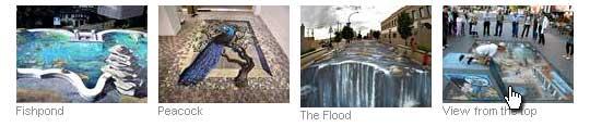 The above picture shows 4 pictures inserted with the standard
TYPO3 “Image” element.
The above picture shows 4 pictures inserted with the standard
TYPO3 “Image” element.
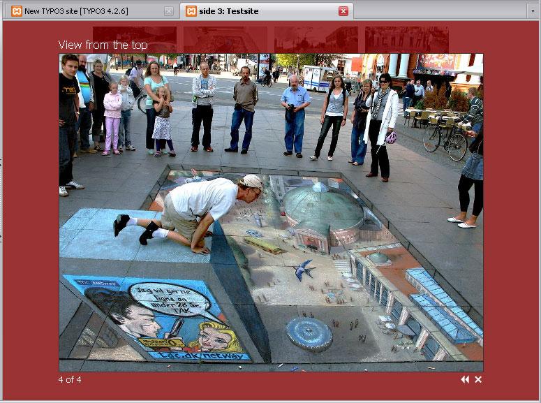 The above picture is a screenshot of how the ShadowBox looks
when you click on one of the images.
The above picture is a screenshot of how the ShadowBox looks
when you click on one of the images.
Users manual
Nothing new is available to the user, as the extension just changes the way the click-enlarge function works.
Administration
Once the extension is installed, you need to include the static TypoScript of the extension, in order for the ShadowBox script to be activated. Also you should include the click-enlarge script that activates the shadowbox to show enlarged images inside such a nice box.
Note: Add the “ShadowBox (pmkShadowbox)” script AFTER “CSS Styled Content (css_styled_content)”
There are two additional PMK Shadowbox static templates. One for tt_news integration, and one for tt_products integration. These must be added AFTER the main PMK Shadowbox static template, otherwise it won't work correctly.
 How does it work?
This extension is done using only TypoScript. The TypoScript code for integration Shadowbox in TYPO3 is located in page.headerData.1229 to page.headerData.1233. So make sure your own code and other extensions doesn't overwrite this location.
The page header informations are splitted in many small pieces to simplify the possible replacement of the css or javascript files. At least a replacement of the final build javascript file shouldn't be that important, because we are generating the build javascript file for shadowbox on-the-fly. Each time you change a configuration option that changes the final javascript, like players or the adapter, we regenerate a new build file. If you need to manually delete the files, you can use the new clear cache menu entry in the tobbar of the TYPO3 backend.
For more information on how the shadowbox javascript is working, I suggest you visit the official homepage: http://www.shadowbox-js.com/
Markup
After you have installed and configured the PMK shadowbox extension, images will automatically open in the shadowbox if the click-enlarge option is enabled. If you want to use shadowbox on links you generate yourself, you need to tell shadowbox which links you want it to open.The simplest way to do this is through your HTML markup. If you're going to take this route, at the very least you must add a rel="shadowbox" attribute to each link. For example, say you have this link to an image on your page:
< a href = "myimage.jpg" >
My Image </ a >
In order to set up this link for use with Shadowbox, simply change it to this:
< a href = "myimage.jpg" rel
= "shadowbox" > My Image </
a >
That's it! Clicking on this link should now open up the image in Shadowbox.
NOTE: The word lightbox will also work here. This feature was added for compatibility with the original Lightbox script. Also note that HTML area tags do not support the rel attribute, you cannot use this method to set them up for the usage with Shadowbox. Instead, use Shadowbox.setup as described below.
If you would like to display a title for your image, simply add a title attribute to the link.
< a href = "myimage.jpg" rel
= "shadowbox" title = "My
Image" > My Image </ a >
You must explicitly tell Shadowbox the dimensions to use to display content other than images. This is done by adding a few parameters to the end of the rel attribute, separated by semi-colons. To specify a movie's height and width (in pixels), use the height and width parameters.
< a href = "mymovie.swf" rel
= "shadowbox;height=140;width=120" > My
Movie </ a >
Additionally, you may set Shadowbox options on a per-link basis. To do this, you must include a JSON-formatted parameter called options.
< a href = "myimage.jpg" rel
= "shadowbox;options={animate:false}" >
My Image </ a >
In addition to displaying single images and movies, Shadowbox is also capable of displaying galleries of content. In order to designate a link as part of a gallery, you must add the gallery name to the rel attribute between square brackets immediately following the word shadowbox. The following markup creates a gallery called "Vacation" with two pictures.
< a href = "beach.jpg" rel
= "shadowbox[Vacation]" > The Beach
</ a >
< a href = "pier.jpg" rel
= "shadowbox[Vacation]" > The Pier
</ a >
Galleries may be composed of content of many different types. The following markup demonstrates how various media can be combined into a single gallery.
< a rel = "shadowbox[Mixed];"
href = "vanquish.jpg" > jpg
</ a >
< a rel =
"shadowbox[Mixed];width=520;height=390" href =
"caveman.swf" > swf </ a
>
< a rel =
"shadowbox[Mixed];width=292;height=218" href =
"kayak.mp4" > movie </ a
>
< a rel = "shadowbox[Mixed]"
href = "index.html" > iframe
</ a >
Advanced
If you don't want to add to your markup, you don't have to. Shadowbox may be manipulated with pure JavaScript. This use is slightly more complex, but it has several benefits including the fact that your HTML markup will be cleaner and you can more easily integrate Shadowbox into an existing project.
If you were paying attention in the section about markup, you'll notice that there are several parameters that commonly accompany Shadowbox content. These parameters are listed in the table below.
Parameter:
a
Parameter:
b
Description
content
a
content
b
The actual content to display (e.g. URL, HTML code, etc.)
player
a
player
b
The player that should be used for the content (optional, can be automatically determined in most cases)
title
a
title
b
The title to use for the content (optional)
height
a
height
b
The content's height (in pixels, optional for images)
width
a
width
b
The content's width (in pixels, optional for images)
gallery
a
gallery
b
The gallery name to use for the content (optional)
When using the markup method, each of these options may be present in one form or another. A link's gallery name, height, and width may all be configured within the link's rel attribute. Similarly, its title is contained in the title attribute and the content value defaults to the link's href. The content type is then derived from the extension on the linked file.
Configuration
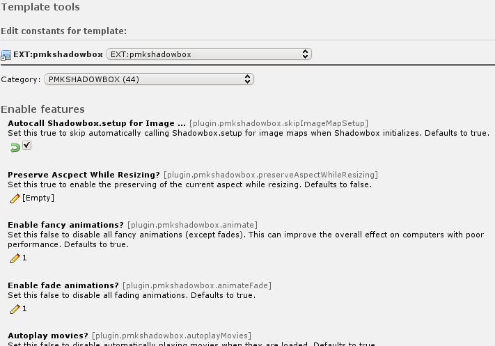 All configuration of the extension is done using TypoScript
constants. Use the “Constants Editor” of TYPO3 to change these
options. You can change things like the transitions, sizes, colors and
many more.
All configuration of the extension is done using TypoScript
constants. Use the “Constants Editor” of TYPO3 to change these
options. You can change things like the transitions, sizes, colors and
many more.
Reference
animate
Property
animate
Data type
boolean
Description
Enable fancy animations?: Set this false to disable all fancy animations (except fades). This can improve the overall effect on computers with poor performance.
Default
1
animateFade
Property
animateFade
Data type
boolean
Description
Enable fade animations?: Set this false to disable all fading animations.
Default
1
modal
Property
modal
Data type
boolean
Description
Enable modal?: Set this true to prevent mouse clicks on the overlay from closing Shadowbox.
Default
0
autoplayMovies
Property
autoplayMovies
Data type
boolean
Description
Autoplay movies?: Set this false to disable automatically playing movies when they are loaded.
Default
1
showMovieControls
Property
showMovieControls
Data type
boolean
Description
Show QuickTime/Windows Media Player controls?: Set this false to disable displaying QuickTime and Windows Media player movie control bars.
Default
1
continuous
Property
continuous
Data type
boolean
Description
Enable "continuous" galleries?: Set this true to enable "continuous" galleries. By default, the galleries will not let a user go before the first image or after the last. Enabling this feature will let the user go directly to the first image in a gallery from the last one by selecting "Next".
Default
0
displayCounter
Property
displayCounter
Data type
boolean
Description
Display gallery counter?: Set this false to hide the gallery counter. Counters are never displayed on elements that are not part of a gallery.
Default
1
skipSetup
Property
skipSetup
Data type
boolean
Description
Autocall Shadowbox.setup?: Set this true to skip automatically calling Shadowbox.setup when Shadowbox initializes.
Default
0
enableKeys
Property
enableKeys
Data type
boolean
Description
Enable keyboard navigation?: Set this false to disable keyboard navigation of galleries.
Default
1
showOverlay
Property
showOverlay
Data type
boolean
Description
Show overlay?: Determines whether the overlay will be shown at all.
Default
1
skipImageMapSetup
Property
skipImageMapSetup
Data type
boolean
Description
Autocall Shadowbox.setup for Image Maps?: Set this true to skip automatically calling Shadowbox.setup for image maps when Shadowbox initializes.
Default
1
preserveAspectWhileResizing
Property
preserveAspectWhileResizing
Data type
boolean
Description
Preserve Ascpect While Resizing?: Set this true to enable the preserving of the current aspect while resizing.
Default
0
useSizzle
Property
useSizzle
Data type
boolean
Description
Use Sizzle?: Set this false to disable loading the Sizzle.js CSS selector library. Note that if you choose not to use Sizzle you may not use CSS selectors to set up your links.
Default
1
initialWidth
Property
initialWidth
Data type
int+
Description
Starting Width: The width of Shadowbox (in pixels) when it first appears on the screen.
Default
320
initialHeight
Property
initialHeight
Data type
int+
Description
Starting Height: The height of Shadowbox (in pixels) when it first appears on the screen.
Default
160
counterLimit
Property
counterLimit
Data type
int+
Description
Counter limit: Limits the number of counter links that will be displayed in a "skip" style counter. If the actual number of gallery elements is greater than this value, the counter will be restrained to the elements immediately preceding and following the current element.
Default
10
viewportPadding
Property
viewportPadding
Data type
int+
Description
Viewport padding: The amount of padding (in pixels) to maintain around the edge of the browser window.
Default
20
resizeDuration
Property
resizeDuration
Data type
float
Description
Resizing Duration: The duration (in seconds) of the resizing animations.
Default
0.55
fadeDuration
Property
fadeDuration
Data type
float
Description
Fade Duration: The duration (in seconds) of the fade animations.
Default
0.35
slideshowDelay
Property
slideshowDelay
Data type
float
Description
Slideshow delay: A delay (in seconds) to use for slideshows. If set to anything other than 0, this value determines an interval at which Shadowbox will automatically proceed to the next piece in the gallery.
Default
0
overlayOpacity
Property
overlayOpacity
Data type
float
Description
Opacity level: The opacity to use for the modal overlay.
Default
0.5
animSequence
Property
animSequence
Data type
string
Description
Animation sequence: The animation sequence to use when resizing Shadowbox. May be either "wh" (width first, then height), "hw" (height first, then width), or "sync" (both simultaneously).
Default
sync
counterType
Property
counterType
Data type
string
Description
Counter Type: The mode to use for the gallery counter. May be either "default" or "skip". The default counter is a simple "1 of 5" message. The skip counter displays a separate link to each piece in the gallery, enabling quick navigation in large galleries.
Default
default
handleOversize
Property
handleOversize
Data type
string
Description
The mode to use for handling content that is too large for the viewport. May be one of "none", "resize", or "drag" (for images). The "none" setting will not alter the image dimensions, though clipping may occur. Setting this to "resize" enables on-the-fly resizing of large content. In this mode, the height and width of large, resizable content will be adjusted so that it may still be viewed in its entirety while maintaining its original aspect ratio. The "drag" mode will display an oversized image at its original resolution, but will allow the user to drag it within the view to see portions that may be clipped. See the demo for a demonstration of all three modes of operation.
Default
resize
handleUnsupported
Property
handleUnsupported
Data type
string
Description
The mode to use for handling unsupported media. May be either "link" or "remove". Media are unsupported when the browser plugin required to display the media properly is not installed. The link option will display a user-friendly error message with a link to a page where the needed plugin can be downloaded. The remove option will simply remove any unsupported gallery elements from the gallery before displaying it. With this option, if the element is not part of a gallery, the link will simply be followed.
Default
link
onOpen
Property
onOpen
Data type
string
Description
onOpen function: A hook function that will be fired when Shadowbox opens. The single argument of this function will be the current gallery element. Returning boolean false from this callback will prevent Shadowbox from opening. (See example later in the manual)
Default
function() {}
onFinish
Property
onFinish
Data type
string
Description
onFinish function: A hook function that will fire when Shadowbox finishes loading the current gallery piece (after all animations are complete). The single argument of this function will be the current gallery element. (See example later in the manual)
Default
function() {}
onChange
Property
onChange
Data type
string
Description
onChange function: A hook function that will be fired when Shadowbox changes from one gallery element to another. The single argument of this function will be the gallery element that is about to be displayed. (See example later in the manual)
Default
function() {}
onClose
Property
onClose
Data type
string
Description
onClose function: A hook function that will be fired when Shadowbox closes. The single argument of this function will be the gallery element that was last displayed. (See example later in the manual)
Default
function() {}
overlayColor
Property
overlayColor
Data type
color
Description
Overlay color: The color to use for the modal overlay (in hex).
Default
#000000
flashParams
Property
flashParams
Data type
string
Description
Flash parameters: A list of parameters (in a JavaScript object) that will be passed to a flash <object>. For a partial list of available parameters, see this page. Only one parameter is specified by default: bgcolor.
Default
{bgcolor:"#000000"}
flashVersion
Property
flashVersion
Data type
string
Description
Minimum Flash Version: The minimum flash version required to play a flash movie (as a string).
Default
9.0.0
troubleElements
Property
troubleElements
Data type
string
Description
Trouble Elements: An array of tag names of elements that should be hidden when a modal overlay is used. This option exists because some browsers are not able to display a semi-transparent overlay on top of these elements. These elements will have their visibility restored when Shadowbox closes.
Default
["select", "object", "embed", "canvas"]
flashVars
Property
flashVars
Data type
string
Description
Flash Movie Variables : A list of variables (in a JavaScript object) that will be passed to a flash movie as FlashVars.
Default
{}
adapter
Property
adapter
Data type
string
Description
JS Adapter: Although Shadowbox can be used in standalone mode, it's just as easy to use Shadowbox with your JavaScript library of choice for a given project. This is accomplished using adapters. An adapter is a small file that tells Shadowbox which methods to call on the underlying framework to achieve some common purpose such as querying the DOM or handling events.
Default
base
players
Property
players
Data type
string
Description
Players: Shadowbox supports a wide range of media formats. However, you may not need to display all of the supported formats on your page. For this purpose, several media "player" classes have been created that are able to display different types of content. Available "players" (See manual for more info.): flv, html, iframe, img, qt, swf, wmp.
Default
flv, html, iframe, img, qt, swf, wmp
fallbackLanguage
Property
fallbackLanguage
Data type
string
Description
Fallback Language: You can define the fallback language of the shadowbox script. The fallback is used if the variable config.language or a language file doesn't exists.
Default
en
imageMapOptions
Property
imageMapOptions
Data type
string
Description
Initial Options for ImageMap Links: The shadowbox must be enabled in a different way for image maps, because the rel attribute is forbidden for area tags. We handle that by adding an initial shadowbox setup call for image maps. If you don't add some options here, then the defaults are used. You can change the options for each area tag by applying the shadowbox function call (Shadowbox.setup(document.getElementsByTagName('area'), {})) with your new options inside the curly braces before each area tag. Example: "player:'iframe',width:805,height:500"
Default
{}
skinModificationDirectory
Property
skinModificationDirectory
Data type
string
Description
Skin Modification: Just select an option if you want a special skin modification. By default we are using the classic shadowbox theme.
Default
flashPlayer
Property
flashPlayer
Data type
string
Description
Flash Player: You can change the default player with this option. You must enter the path relative to your website root. The EXT: syntax is allowed and the configuration defaults to a blank string (default flash player).
Default
flashPlayerYT
Property
flashPlayerYT
Data type
string
Description
Flash Player YouTube companion: You can change the default player with this option. You must enter the path relative to your website root. The EXT: syntax is allowed and the configuration defaults to a blank string (default flash player companion).
Default
flashExpressInstallScript
Property
flashExpressInstallScript
Data type
string
Description
Flash Express Install Script: If you need to change the flash express install script, you can use this option to enter an alternative. The value must be a relative path to the website root and defaults to a blank string (default express install script).
Default
[tsref:(cObject).plugin.pmkshadowbox]
Additional Reference (tt_content; Click-Enlarge)
If the static template for implementing Shadowbox in tt_content (Click-Enlarge) is installed, the following extra constants are available:
imgtext.captionField
Property
imgtext.captionField
Data type
string
Description
tt_content Caption Field: tt_content field to use as caption inside the Shadowbox.
Default
titleText
[tsref:(cObject).plugin.pmkshadowbox]
Additional Reference (tt_news)
If the static template for implementing Shadowbox in tt_news is installed, the following extra constants are available:
tt_news.enableSplit
Property
tt_news.enableSplit
Data type
boolean
Description
Enable Splitting in tt_news: If true, then a small userfunction is included for tt_news. This enables splitting of the caption value by setting the register value "IMAGE_NUM_CURRENT" to the current item number. NOTE. If you are using "dam_ttnews" this option should be turned off!
Default
1
tt_news.displaySingle.shadowboxEnable
Property
tt_news.displaySingle.shadowboxEnable
Data type
boolean
Description
Enable Shadowbox in displaySingle : If set, LightBox effect will be available in tt_news SingleView when you click on an image.
Default
1
tt_news.displayLatest.shadowboxEnable
Property
tt_news.displayLatest.shadowboxEnable
Data type
boolean
Description
Enable Shadowbox in displayLatest : If set, LightBox effect will be available in tt_news LatestView when you click on an image.
Default
0
tt_news.displayList.shadowboxEnable
Property
tt_news.displayList.shadowboxEnable
Data type
boolean
Description
Enable Shadowbox in displayList : If set, LightBox effect will be available in tt_news ListView when you click on an image.
Default
0
tt_news.displayList.shadowboxSingleView
Property
tt_news.displayList.shadowboxSingleView
Data type
boolean
Description
Enable singleView in Shadowbox : If set, tt_news SingleView will be shown inside a LightBox.
Default
0
tt_news.displayList.shadowboxWidth
Property
tt_news.displayList.shadowboxWidth
Data type
int
Description
Shadowbox tt_news Iframe width : Used to set the width of the LightBox if displaying tt_news SingleView in Shadowbox is enabled.
Default
600
tt_news.displayList.shadowboxHeight
Property
tt_news.displayList.shadowboxHeight
Data type
int
Description
Shadowbox tt_news Iframe height : Used to set the height of the LightBox if displaying tt_news SingleView in Shadowbox is enabled.
Default
500
tt_news.captionField
Property
tt_news.captionField
Data type
string
Description
tt_news Caption Field: tt_news field to use as caption inside the Shadowbox.
Default
imagetitletext
[tsref:(cObject).plugin.pmkshadowbox]
Additional Reference (tt_products)
If the static template for implementing Shadowbox in tt_products is installed, the following extra constants are available:
tt_products.image.shadowboxEnable
Property
tt_products.image.shadowboxEnable
Data type
boolean
Description
Enable Shadowbox on image : If set, LightBox effect will be available in tt_products image when you click on an image.
Default
1
tt_products.listImage.shadowboxEnable
Property
tt_products.listImage.shadowboxEnable
Data type
boolean
Description
Enable Shadowbox on listImage : If set, LightBox effect will be available in tt_products listImage when you click on an image.
Default
0
tt_products.basketImage.shadowboxEnable
Property
tt_products.basketImage.shadowboxEnable
Data type
boolean
Description
Enable Shadowbox on basketImage : If set, LightBox effect will be available in tt_products basketImage when you click on an image.
Default
0
tt_products.captionField
Property
tt_products.captionField
Data type
string
Description
tt_products Caption Field: tt_products field to use as caption inside the Shadowbox.
Default
imagetitletext
[tsref:(cObject).plugin.pmkshadowbox]
Tutorial
How to change the images?
The layout of the shadowbox window is template based, so you can create your own HTML/CSS template, and get the window to look exactly like you want. See the official Shadowbox homepage for more information on how to create your own skins or look into the skin modifications in the resources directory of this extension.
How to open another page inside the ShadowBox?
This is quite simple, all you have to do is add a REL attribute to the A tag. This can be done like this in typoscript:
lib.myLink = TEXT
lib.myLink {
value = This link opens in a Shadowbox
typolink {
parameter = 1
ATagParams = rel="shadowbox;plugin=iframe;width=600;height=400"}}
How to use SB on links created in HTMLArea RTE?
It is possible to “fool” the HTMLArea RTE into opening links inside the Shadowbox, by adding the rel=”shadowbox” attribute to the title parameter in the link popup window.
To do this you must add the the title like this:
title" rel="shadowbox;plugin=iframe;width=600;height=400
Note: When you edit the link again, the title field will be “cleaned” of the extra parameter, and only show the title.
How to use SB on links created in TinyMCE RTE?
If you use the TinyMCE RTE, then there's a patch in TinyMCE RTE you can apply. After the patch is applied, you can set the rel=”shadowbox” directly from the TinyMCE linkhandler.
How to get Shadowbox to work in tt_content (Click-Enlarge)?
Just install the additional static template “tt_content (Click- Enlarge).
How to get Shadowbox to work in tt_news?
Just install the additional static template “PMK Shadowbox (tt_news).
Then an extra set of constants will be available in the “Constants Editor”, where you can choose in which tt_news views the images should be display inside the Shadowbox.
You can also choose if you want the tt_news singleView displayed inside the Shadowbox, using the “Constants Editor”.
How to get Shadowbox to work in tt_products?
Just install the additional static template “PMK Shadowbox (tt_products).
Then an extra set of constants will be available in the “Constants Editor”, where you can choose in which tt_products views the images should be display inside the Shadowbox.
How to enhance the Shadowbox functionality
You can enhance the Shadowbox functionality using the functions “onOpen”, "onFinish", "onChange" & "onClose" functions.
Due to the way TYPO3 handles () {} brackets, it is not possible to insert the JavaScript functions directly into the typoscript setup. Instead you should create your JavaScript function in a separate file, and then enter the function name in the typoscript constants/setup.
Example javascript function which will perform a check on the browserheight before opening an HTML page inside the Shadowbox.
If the Browser height is less than 400px, then the page will open in a new browserwindow instead of opening inside the Shadowbox.
function checkBrowserHeight () {if (
Shadowbox . getCurrent ().
player == "iframe" && $(
window ). height ()< 400
) { window . open (
Shadowbox . getCurrent ().
content , "shadowbox" );return
false ;}}
Then in the Shadowbox constants/setup you set the “onOpen”
function to point to the JavaScript function above, like this:
plugin.pmkshadowbox.onOpen **=**
checkBrowserHeight
Note: The above example requires jQuery installed.
Known problems
The Javascript and CSS gets loaded into the typoscript object/properties “page.headerData.1229” to “page.headerData.1233”, so if you are using that for something else, you have to include the javascript and CSS manually. The same applies if you don't use the “page” object.
PMK Shadowbox conflicts with the following TYPO3 extensions and possibly many more. Please send us a small note if you think that this list is incomplete. Thanks!
kj_imagelightbox2
Extension
kj_imagelightbox2
Description
The first TYPO3 lightbox extension. Uses XCLASS to achieve lightbox effect.
pmkslimbox
Extension
pmkslimbox
Description
PMK Shadowbox is based on code from PMK Slimbox.
perfectlightbox
Extension
perfectlightbox
Description
Based on code from PMK Slimbox.
wsclicklightbox
Extension
wsclicklightbox
Description
Based on code from PMK Slimbox.
ju_multibox
Extension
ju_multibox
Description
Based on code from PMK Slimbox.
To-Do list
Please contact us if you have any suggestion about this extension or report the suggestion at our bugtracker .
ChangeLog
1.0.0
Version
1.0.0
Changes
First public release.
1.1.0
Version
1.1.0
Changes
Added merging and caching mechanism of the JavaScript files. Also the documentation has got some love and some minor bugs were squashed.
1.1.2
Version
1.1.2
Changes
Fixed TYPO3 v4.3.0 compatibility problems.
3.0.0
Version
3.0.0
Changes
Moved to shadowbox 3.0.3 with a completely rewritten merging and caching concept and a more flexible typoscript configuration
3.1.0
Version
3.1.0
Changes
Bugfix-Release, Better YouTube-Support, Option to move the javascript to the footer
3.2.0
Version
3.2.0
Changes
TYPO3 v4.5.0 compatibility update, Fullscreen video enabled, Fix of inline Flashvars options
17