DEPRECATION WARNING
This documentation is not using the current rendering mechanism and is probably outdated. The extension maintainer should switch to the new system. Details on how to use the rendering mechanism can be found here.
EXT: Date Selector Library
| Author: | Kasper Skårhøj |
|---|---|
| Created: | 2002-11-01T00:32:00 |
| Changed: | 2005-02-17T18:03:08 |
| Author: | Robert Lemke |
| Email: | robert@typo3.org |
| Info 3: | |
| Info 4: |
EXT: Date Selector Library
Extension Key: rlmp_dateselectlib
Copyright 2003-2005, Robert Lemke, <robert@typo3.org>
This document is published under the Open Content License
available from http://www.opencontent.org/opl.shtml
The content of this document is related to TYPO3
- a GNU/GPL CMS/Framework available from www.typo3.com
Table of Contents
EXT: Date Selector Library 1
Introduction 1
What does it do? 1
Screenshots 1
Credits and License 2
Users manual 2
Configuration 2
Reference 3
Known problems 3
To-Do list 4
Changelog 4
Introduction
What does it do?
This is a TYPO3 library providing a DHTML date selector / calendar. It may be attached to an input field and will be shown after clicking a button. Everything is nicely configurable and the design may be changed by simply modifiying the stylesheet.
Being a libray means that you can only use it by writing a PHP based extension yourself. You won't be able to use it from TYPO3 directly. However I might provide an integration to the FORM cObject in the future in a separate extension.
The date selector library supports TYPO3's translation mechanism and supports any date format.
Credits and License
This TYPO3 extension is based on jscalendar-0.9.3 created by Mihai Bazon < mishoo@infoiasi.ro >, available at Sourceforge: http://sourceforge.net/projects/jscalendar . jscalendar was published under the GNU Lesser General Public License and may therefore be used in your commercial projects as well.
Users manual
Remember that this is a library for your own extensions. That's why there is nothing interesting for users in this manual.
Configuration
Well, how do you integrate that date selector into your own scripts? As you could have guessed, that's fairly easy. Just follow the next few steps and you'll have a working date selector within a minute.
((generated))
Installing and including the library
Download and install the rlmp_dateselectlib extension from the TER like any other extension.
In of your own extension be sure to include the library. Just include the following line before you're defining your class:
require_once(t3lib_extMgm::extPath('rlmp_dateselectlib').'class.tx_rlmpdateselectlib.php');
The next required step is to include the JavaScript libraries and perform some initial tasks. You accomplish that by calling the following function before you use the library the first time:
tx_rlmpdateselectlib::includeLib();
Notice that you don't create an instance of the extension's class, you just call it.
Now you're ready to use the date selector. But before you create that tiny DHTML calendar on your page let me give you some information about configuring this extension:
There are several ways to set certain values and therefore take influence on the behaviour of this script. The most common way is defining (i.e. overriding) the properties in your TypoScript template. You can use the template object browser for that purpose:
See the reference below for the properties you may use.
Another option to pass on configuration to the dateselectlib is when you create the button which opens the calendar. That's our next step:
$output = '
    <input type="text" name="'.$this->prefixId.'[swordfrom]" id="'.$this->prefixId.'[swordfrom]"
    value="'.$this->piVars['swordfrom'].'" size="10" />'.
    tx_rlmpdateselectlib::getInputButton ($this->prefixId.'[swordfrom]',$dateSelectorConf);
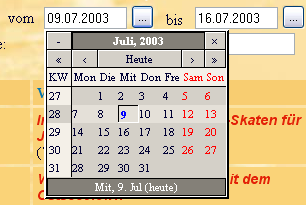
This code generates an input field like it was used in the first screenshot you saw in this manual.
Basically I generate an input field which will contain or already contains a date (lines 2 and 3). It is very importantthat you define an id for your input field, since that id will be used by the calendar's JavaScript to access the date of your form.
Finally in line 4 the input button is generated which allows the visitor to show the calendar. First parameter is the id of your input field (containing the date), second parameter is an array containing configuration overriding your template's or the default configuration.
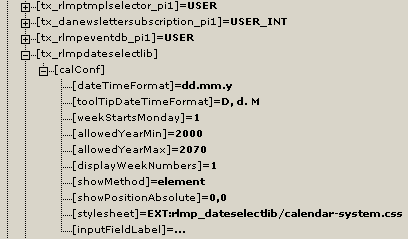
The variable $dateSelectorConf in our example could contain the following data overriding the default configuration:
$dateSelectorConf = array (
    'calConf.' => array (
        'dateTimeFormat' => 'dd.mm.y',
        'stylesheet' => 'fileadmin/mystyle.css'
     )
);
That's fairly known from many other functions in TYPO3. Hmm, that's possibly enough to get you started, right?
Reference
Note that the following properties are all children of plugin.tx_rlmpdateselectlib.calConf !
dateTimeFormat
Property
dateTimeFormat
Data type
string
Description
Defines the date time format. Will be used for parsing your input field as well as writing the selected date. You may use the following placeholders which will be filled with the actual content:
%a abbreviated weekday name
%A full weekday name
%b abbreviated month name
%B full month name
%C century number
%d the day of the month (00 ... 31)
%e the day of the month (0 ... 31)
%H hour (00 ... 24)
%I hour (01 ... 12)
%j day of the year (000 ... 366)
%k hour (0 ... 23)
%l hour (1 ... 12)
%m month (01 ... 12)
%M mInute (00 ... 59)
%n a newline character
%p “PM” or “AM”
%P “pm” or “am”
%S second (00 ... 59)
%s number of seconds since Unix Epoch
%t a tab character
%U, %W, %V the week number
%u the day of the week (1 ... 7, 1 = MON)
%w the day of the week (0 ... 6, 0 = SUN)
%y year without the century (00 ... 99)
%Y year including the century (eg. 1976)
%% a literal % character
Default
depending on frontend language
toolTipDateTimeFormat
Property
toolTipDateTimeFormat
Data type
string
Description
Defines the date time format as used by the tool tip feature.
For possible values see dateTimeFormat
Default
depending on frontend language
inputFieldDateTimeFormat
Property
inputFieldDateTimeFormat
Data type
string
Description
Defines the date time format which will be written into the input field after selecting a date. For possible values see dateTimeFormat.
Default
%y-%m-%d
weekend
Property
weekend
Data type
comma-list of integers
Description
A comma-list of integers which defines which days form a weekend. Possible values range from 0 to 6, where 0 means Sunday, 1 means Monday etc.
The default is Saturday and Sunday (6,0)
Default
6,0
weekStartsMonday
Property
weekStartsMonday
Data type
boolean
Description
If set, the calendar's week will start with monday. Otherwise sunday will be the day to start with.
Default
0
allowedYearMin
Property
allowedYearMin
allowedYearMax
Data type
integer
Description
If specified, the calendar only accepts dates in the range of these years.
Default
1900
2070
displayWeekNumbers
Property
displayWeekNumbers
Data type
boolean
Description
If set, the calendar will display the week numbers.
Default
1
showMethod
Property
showMethod
Data type
string
Description
There are two ways to display the popup calendar: Being attached to the input field containing the date or freely positionable.
If you set showMethod to element the calendar will appear right below your input field.
By setting showMethod to absolute the calendar will be displayed at the position you specify with showPositionAbsolute (see
below)
Default
element
showPositionAbsolute
Property
showPositionAbsolute
Data type
offset
Description
Example:
showPositionAbsolute = 100,150
Default
0,0
styleSheet
Property
styleSheet
Data type
string
Description
Defines a valid stylesheet relatively to your websites root URL. You may use a path using the EXT:yourextension/path/stylesheet.css format.
Examples:
styleSheet = fileadmin/yourstylesheet.css
styleSheet = EXT:yourextension/res1/mystyle.css
Default
EXT:rlmp_dateselectlib/calendar-system.css
inputFieldLabel
Property
inputFieldLabel
Data type
string
Description
You may set a different label for the input field which launches the calendar.
Default
...
[plugin.tx_rlmpdateselectlib.calConf]
Known problems
None.
Changelog
0.1.2 stable (17.02.2005):
Merged translations
0.1.1 stable (17.02.2005):
Fixed a JavaScript bug in the new version of the JS library (click on month selection closes window)
0.1.0 stable (17.02.2005) :
- Corrected a typo in the manual,
- upgraded to version 0.9.6 of the calendar JS and added some features / removed some bugs.
- note that the dateTimeFormat changed!
0.1.0 stable (17.02.2005) :
- Corrected a typo in the manual,
- upgraded to version 0.9.6 of the calendar JS and added some features / removed some bugs.
- note that the dateTimeFormat changed!
0.0.2 beta (09.07.2003) : Initial public release
 EXT: Date Selector Library - 4