Bootstrap Package delivers a fully configured frontend theme for TYPO3, based on
the Bootstrap CSS Framework.
The goal of this package is also to give an advanced example of how modern
templating in TYPO3 CMS can be handled nicely without depending on third party
extensions. Bootstrap Package comes with a fully configurable Frontend via
TypoScript. This includes the TypoScript Constant Editor.
You do not need to have either Fluid Styled Content or CSS Styled Content
installed, we have currently marked both extensions as conflicting to avoid
misconfiguration.
If you really know what you are doing, it is safe to use Core content rendering
along with Bootstrap Package. But please note that we are adding more content
elements that are not supported by these system extensions.
Make sure you have a root page
Create a new page or edit an existing one and set this as root page. You can
find this option in the Edit Page mode filed
under Behavior > Miscellaneous.
Create a new template on the root page
General
Template Title: You can name this as you like, for example "Bootstrap Package".
Website Title: This will be your website title visible in the frontend.
Options
Clear constants and setup by checking the boxes.
Clear the predefined TypoScript setup from the text box if any.
Use this template as root-level template by checking the box.
Includes
Include static (from extensions)
Bootstrap Package (required)
Static Template Files from TYPO3 Extensions
Include before all static templates if root flag is set
Use the Extension Manager to adjust the
Bootstrap Package to your needs.
PageTsConfig
The Bootstrap Package has a lot of PageTsConfig defaults.
In some cases it can be useful to deactivate some of them if you do not need
them.
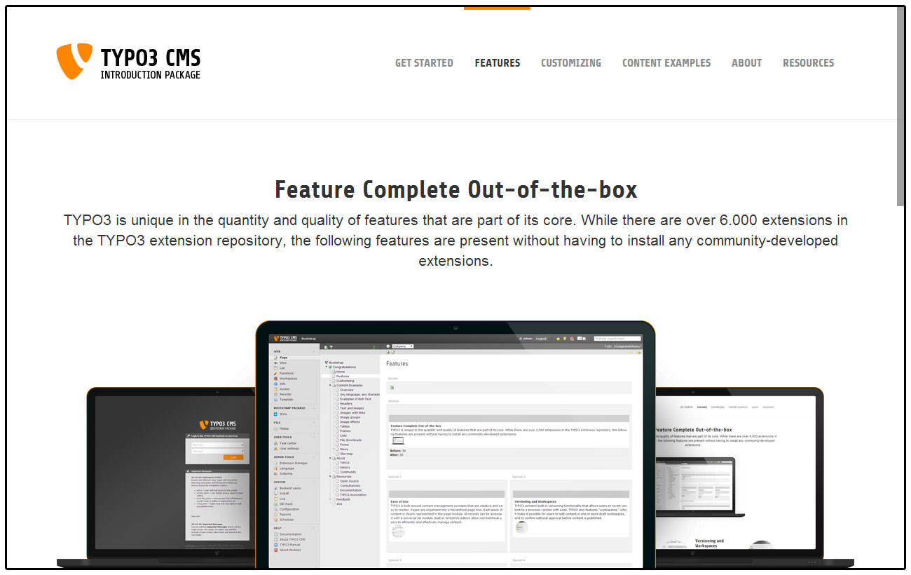
Image Rendering
Bootstrap Package comes with a very flexible responsive image rendering and
supports multiple variants for various device sizes. Each variant defines the
break point, width and the optional sizes for high resolution image
support.
Image variants are used to represent the breakpoints of the design. These
variants have to be defined according the definitions in the style sheet.
Bootstrap Package defines these variants by default:
The breakpoint defines the minimal device width where the width gets
applied. Having a device with a width of 1200 pixels or more uses an image width
of 1100 pixels, devices of 992 up to 1199 pixels width use an image width of
920 pixels and so on.
For each of these variants the multiplier of size 1x is set to 1, see next
section for more about the high-resolution image support:
default
breakpoint
width
sizes
1x
multiplier: 1
Example of changing the default configuration for the default variant.
There is a key called sizes in every variant that should be rendered. This
dataset consists of several entries, each with a default key for a normal
rendering (1x). This key will be added automatically, and it is always available.
It is not possible to store sizes smaller than 1. Each size contains a
multiplier, which is multiplied by the base size.
Example calculations:
Base width: 1000px
Minimum Device Pixel Ratio = 1
Multiplier = 1
Result: 1000px
Minimum Device Pixel Ratio = 1.5
Multiplier = 1.25
Result: 1250px
Minimum Device Pixel Ratio = 2
Multiplier = 1.5
Result: 1500px
Example configuration to enable high-resolution support for the default variant
for devices with a minimum device pixel ratio from 1.5 and 2.
The data for image rendering is now extended with a sub-set for high-resolution
variants. If you did not overwrite the default templates, it will just work as
soon as you add the configuration. If you have overwritten the default
templates, it will still work as before, but you need to add the new support for
high-resolution images yourself.
Please check the new updated templates and adjust your code if you want this
support.
Configuration by Variant
For each variant the following configuration options are possible:
breakpoint
width
aspectRatio
sizes
Configuration by Backend Layout
For each backend layout the following configuration options are possible
for each defined column and variant:
multiplier
gutters
corrections
Example configuration for backend layouts.
lib.contentElement.settings.responsiveimages.backendlayout {
    my_layout {                # this is the BE layout
        0 {                    # this is the column to be modified
            multiplier {
                default = 0.75
                large = 0.75
            }
            gutters {
                default = 40
                large = 40
            }
            corrections {
                default = 25
                large = 25
            }
        }
    }
}
Copied!
Configuration by Content Element
For each content element the following configuration options are possible
for each defined variant or specific property:
multiplier
gutters
corrections
Example configuration for content elements.
lib.contentElement.settings.responsiveimages.contentelements {
    my_content_element {       # this is the content element
        my_custom_property {   # this is a content element specific property, depends on the implementation and is optional
            multiplier {
                default = 0.5
                large = 0.5
                medium = 0.5
            }
            gutters {
                default = 24
                large = 24
                medium = 24
            }
            corrections {
                default = 25
                large = 25
                medium = 25
                small = 50
                extrasmall = 50
            }
        }
    }
}
Copied!
Configuration options explained
Options for variants:
Property
Data Type
Description
breakpoint
integer
Defines the minimal width in pixels of the
device
width
integer
Defines the effective width in pixels for
images for this variant
aspectRatio
float
Optional, defines the default aspect ratio
which will override all previously defined
ratios on image level
sizes
array
Optional, defines the available high resolution
image multiplier for a minimal device pixel
ratio per variant
Options for backend layouts and content elements:
Property
Data Type
Description
multiplier
integer
The width is multiplied with this value
gutters
integer
This value is added to the width before
applying the multiplier and substracted
afterwards
corrections
integer
This value is added as last step to the width
after all other calculations
The options gutters and corrections are needed if you want to be pixel
perfect. Means if you have a 1 pixel outline for example and want this to be
subtracted from the width you can do this kind of corrections late in the
calculation process.
Example Accordion:
Here a correction is added to remove the inner padding of the container.
Example Card Group:
The border is substracted here.
Crop Variants
The Bootstrap Package predefines some cropping variants which can easily be changed
or extended by your sitepackage.
The following crop variants are defined by default:
16:9, for a fixed ratio
4:3, for a fixed ratio
1:1, for a fixed ratio
NaN, for a free ration
TypoScript
Bootstrap Package was built to be as adjustable as possible, so nothing is fixed
and everything can be overridden with TypoScript constants. The constants are
grouped in basic and advanced settings. Use the Constant Editor
in the backend to modify the values.
Backend Layout configurations via PageTS have native support in TYPO3
Versions >= 7.4. To make it more easy to upgrade new installations the prefix
has been changed in the Bootstrap Package to match the new default that´s
available in TYPO3 7.4 and newer versions.
The Prefix for Backend Layouts has been changed from "bootstrap_package" to
"pagets". If you have been referring to these values before you need to adapt
the new prefix for your own layouts in your TypoScript Configuration.
Please adapt to the new prefix and use the UpdateScript inside the
Bootstrap Package extension from the extension manager. This will update all
pages in the database and change the prefix from "bootstrap_package" to "pagets".
Note:
The update script checks if an update is needed.
If there is nothing to do the icon for the Update script will not be shown.
The new Provider in the TYPO3 Core is a port from the Bootstrap Package.
That means that there is no need to do any further changes. The configuration
stays exactly the same.
Before
Markup
page = PAGE
page {
10 = FLUIDTEMPLATE10 {
templateName = TEXT
templateName.stdWrap.cObject = CASE
templateName.stdWrap.cObject {
...
bootstrap_package__default_clean = TEXT
bootstrap_package__default_clean.value = DefaultClean
...
}
}
}
Copied!
After
Markup
page = PAGE
page {
10 = FLUIDTEMPLATE10 {
templateName = TEXT
templateName.stdWrap.cObject = CASE
templateName.stdWrap.cObject {
...
pagets__default_clean = TEXT
pagets__default_clean.value = DefaultClean
...
}
}
}
Copied!
Upgrade from 6.2.10 to 6.2.11
This document will only cover breaking changes, that could happen while
overriding the Bootstrap Package.
Frontend output of the submenu has changed and the 3rd level is now displayed
by default. You will need to adapt this change if you are not using the theme
that comes with the Bootstrap Package.
Previously we appended the version number to the jQuery filename, this has lead
to missing jQuery versions if files were moved outside the bootstrap_package.
We are not removing the version number to prevent jQuery is missing, this makes
it also more easy to maintain in the build process. Check your TypoScript setup
for possible overrides.
Use default Bootstrap markup for navigation toggle
In previous builds Glyphicon icons were used to represent the toggle state of
the main menu for smaller screen sizes. Also the toggle js was always loaded in
within the main.js javascript file from the Bootstrap Package. This has lead to
problems when the icon font was changed or the main javascript file was
externally overriden.
Instead of adapting the custom markup to your theme the default bootstrap markup
is now in use, so its working now also out of the box also if the custom theme
from the Bootstrap Package is not included. The toggle state is now solved via
a CSS class toggle and a bit of custom css in the Bootstrap Package theme. The
JavaScript toggle functionality has been move into a single file so it can be
easily turned of if you do not need it.
page.includeJSFooterlibs {
    #### Toggle collapsed CSS class on the navbar toggle button
    bootstrap_navbartoggle = {$page.includePath.javascript}Libs/bootstrap.navbartoggle.min.js
}
Copied!
Custom Lightbox JavaScript has been moved
In order to make the package more modular we removed the main.js file in favor
of single files for each functionality so it can be added or removed more easily.
The resources folder in TYPO3 extensions is protected by default that made it
impossible to make real usage of CSS SourceMaps. The files have been moved to
Resources/Public, please ensure that your update your references to these files.
Before
EXT:bootstrap_package/Resources/Private/Less/
Copied!
After
EXT:bootstrap_package/Resources/Public/Less/
Copied!
Corrected calculation of relative paths in build in LESS parser
Calculation of relative paths in less should now be resolved correctly.
The wired relative paths you have to set before will no longer be working and
you need to set the constants now relative from the LESS file that is parsed.
We enabled fallbacks for page templates, so you can extend the package without
the need to copy all the templates if you want to change parts of the templates.
We check the source code according to the our Coding Guidelines. To reformat
the code automatically, you can use PHP CS Fixer as follows:
composer cgl
Copied!
Local environment
The extension comes with a ready to use DDEV Local configuration. Type
ddev start in the extension root folder to start the Docker container.
ddev launch will open the browser and head to the testing website. You can
use ddev launch typo3 to get directly to the backend.
Build the frontend files
When you change any of the SCSS files, the combined and minified versions
of the CSS have to be rebuild.
You can run them like this:
cd Build
npm ci
npm run build
Copied!
Then commit any changes to files in folder Resources/Public/Css. If you
ommit any of these steps the pipeline of the automatic checks fails for
"build-frontend".
License
This project is released under the terms of the MIT license.
Slack
You can connect directly with us on Slack, the preferred instant
communication platform of TYPO3 CMS developers. If you already have access to
the TYPO3 Slack platform join the #bootstrap-package channel. If you don't have
access yet, you can register at my.typo3.org.
X
=
If you have any questions about this project or just want to talk:
Send a tweet @benjaminkott.
Sitemap
Index
Reference to the headline
Copy and freely share the link
This link target has no permanent anchor assigned.The link below can be used, but is prone to change if the page gets moved.