Bootstrap Package 

Extension key

bootstrap_package

Package name

bk2k/bootstrap-package

Version

main

Language

en

Author

Benjamin Kott & Contributors

License

This document is published under the Open Publication License.

Rendered

Tue, 02 Dec 2025 12:31:19 +0000


Bootstrap Package delivers a fully configured frontend theme for TYPO3, based on the Bootstrap CSS Framework.

The goal of this package is also to give an advanced example of how modern templating in TYPO3 CMS can be handled nicely without depending on third party extensions. Bootstrap Package comes with a fully configurable frontend via Site Settings.


Table of Contents:

Introduction 

Bootstrap Package is a theme for TYPO3 CMS based on the Bootstrap CSS Framework.

Features 

  • Full configured TypoScript Setup provided via Site Sets
  • Completely adjustable via Settings
  • Responsive image rendering with multiple variants
  • Built-in SCSS Parser

    • All SCSS variables are configurable via Settings
    • SCSS support in page.includeCSS property
  • Bootstrap specific Content Elements

    • Accordion
    • Card Group
    • Carousel (including Fullscreen and Small variants)
    • External Media
    • Icon Group
    • List Group
    • Panel
    • Social Links
    • Tab
    • Text and Icon
    • Text Columns
    • Text Teaser
    • Timeline
    • Quote
  • Various Menu Content Elements

    • Card Menu
    • Thumbnail Menu
    • Section Menu
    • and more
  • Multiple Backend Layouts

    • Default, Simple
    • 2 Columns (various variants)
    • 3 Columns
    • Subnavigation Left/Right
    • Special Feature
    • Special Start

Screenshots 

Desktop

Desktop View

Tablet

Tablet View

Mobile

Mobile View

Installation 

Requirements 

  • TYPO3 13.4 LTS or TYPO3 14
  • PHP 8.2 or higher

For general TYPO3 system requirements, please refer to the official TYPO3 Installation Guide.

Composer Installation 

Install the Bootstrap Package via Composer by running:

composer require bk2k/bootstrap-package
Copied!

Classic Installation 

Alternatively, you can install the extension via the TYPO3 Extension Repository (TER).

Conflicting Extensions 

Bootstrap Package provides its own content rendering and conflicts with the core extension fluid_styled_content. This extension is marked as conflicting to avoid misconfiguration.

Next Steps 

After installation, follow the Quick Start guide to configure your site.

Quick Start 

Follow these steps to get your Bootstrap package up and running quickly.

Table of Contents:

Disable default content rendering extension 

You do not need to have Fluid Styled Content installed, we have marked this extension as conflicting to avoid misconfiguration.

If you really know what you are doing, it is safe to use Core content rendering along with Bootstrap Package. But please note that we are adding more content elements that are not supported by this system extension.

Make sure you have a root page 

Create a new page or edit an existing one and set this as root page. This is done by turning on the option Use as Root Page in the Edit Page under Behavior > Miscellaneous.

Add the Bootstrap Package site set 

When you create a root page, TYPO3 automatically creates a site configuration for it. Edit the site and add the "Bootstrap Package: Full Package" set to include all features needed for a quick start.

Extension Configuration 

The Bootstrap Package provides extension configuration options that can be adjusted in the TYPO3 backend under Admin Tools > Settings > Extension Configuration.
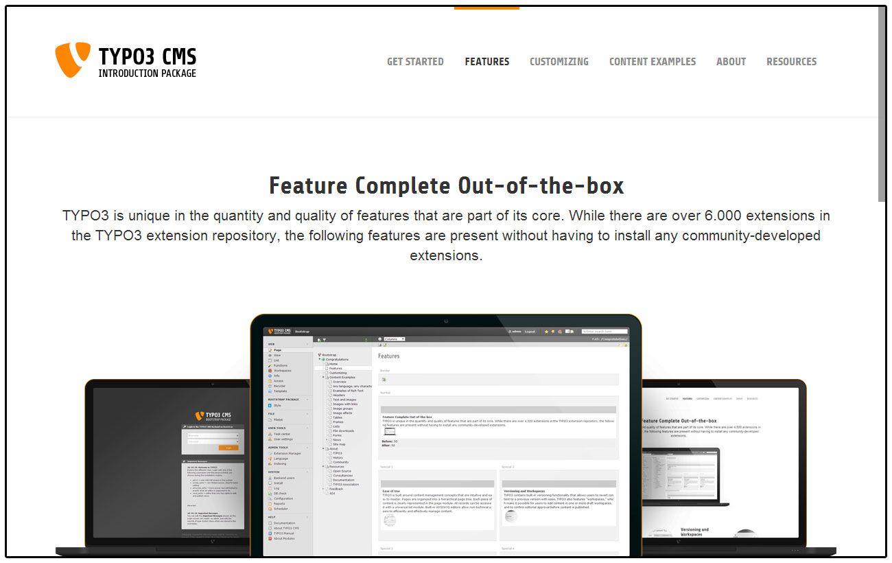
Features 

disableCssProcessing

disableCssProcessing
Type
boolean
Default
false

Disable processing of CSS files.

disableGoogleFontCaching

disableGoogleFontCaching
Type
boolean
Default
false

Disable local Google Font cache. If enabled, Google Fonts will not be cached on the server.

Image Rendering 

Bootstrap Package comes with a very flexible responsive image rendering and supports multiple variants for various device sizes. Each variant defines the break point, width and the optional sizes for high resolution image support.

Table of Contents:

Image Variants 

Image variants are used to represent the breakpoints of the design. These variants have to be defined according the definitions in the style sheet. Bootstrap Package defines these variants by default:

lib.contentElement.settings.responsiveimages.variants {
    default {
        breakpoint = 1200
        width = 1100
    }
    large {
        breakpoint = 992
        width = 920
    }
    medium {
        breakpoint = 768
        width = 680
    }
    small {
        breakpoint = 576
        width = 500
    }
    extrasmall {
        breakpoint = unset
        width = 374
    }
}
Copied!

The breakpoint defines the minimal device width where the width gets applied. Having a device with a width of 1200 pixels or more uses an image width of 1100 pixels, devices of 992 up to 1199 pixels width use an image width of 920 pixels and so on.

For each of these variants the multiplier of size 1x is set to 1, see next section for more about the high-resolution image support:

  • default

    • breakpoint
    • width
    • sizes

      • 1x

        • multiplier: 1

Example of changing the default configuration for the default variant.

lib.contentElement.settings.responsiveimages.variants {
    default {
        breakpoint = 1200
        width = 1100
    }
Copied!

High Resolution Images 

There is a key called sizes in every variant that should be rendered. This dataset consists of several entries, each with a default key for a normal rendering (1x). This key will be added automatically, and it is always available. It is not possible to store sizes smaller than 1. Each size contains a multiplier, which is multiplied by the base size.

Example calculations:

Base width: 1000px

  • Minimum Device Pixel Ratio = 1

    • Multiplier = 1
    • Result: 1000px
  • Minimum Device Pixel Ratio = 1.5

    • Multiplier = 1.25
    • Result: 1250px
  • Minimum Device Pixel Ratio = 2

    • Multiplier = 1.5
    • Result: 1500px

Example configuration to enable high-resolution support for the default variant for devices with a minimum device pixel ratio from 1.5 and 2.

lib.contentElement.settings.responsiveimages.variants {
    default {
        sizes {
            1\.5x {
                multiplier = 1.5
            }
            2x {
                multiplier = 2
            }
        }
    }
}
Copied!

The data for image rendering is now extended with a sub-set for high-resolution variants. If you did not overwrite the default templates, it will just work as soon as you add the configuration. If you have overwritten the default templates, it will still work as before, but you need to add the new support for high-resolution images yourself.

Please check the new updated templates and adjust your code if you want this support.

Configuration by Variant 

For each variant the following configuration options are possible:

  • breakpoint
  • width
  • aspectRatio
  • sizes

Configuration by Backend Layout 

For each backend layout the following configuration options are possible for each defined column and variant:

  • multiplier
  • gutters
  • corrections

Example configuration for backend layouts.

lib.contentElement.settings.responsiveimages.backendlayout {
    my_layout {                # this is the BE layout
        0 {                    # this is the column to be modified
            multiplier {
                default = 0.75
                large = 0.75
            }
            gutters {
                default = 40
                large = 40
            }
            corrections {
                default = 25
                large = 25
            }
        }
    }
}
Copied!

Configuration by Content Element 

For each content element the following configuration options are possible for each defined variant or specific property:

  • multiplier
  • gutters
  • corrections

Example configuration for content elements.

lib.contentElement.settings.responsiveimages.contentelements {
    my_content_element {       # this is the content element
        my_custom_property {   # this is a content element specific property, depends on the implementation and is optional
            multiplier {
                default = 0.5
                large = 0.5
                medium = 0.5
            }
            gutters {
                default = 24
                large = 24
                medium = 24
            }
            corrections {
                default = 25
                large = 25
                medium = 25
                small = 50
                extrasmall = 50
            }
        }
    }
}
Copied!

Configuration options explained 

Options for variants:

Property Data Type Description
breakpoint integer Defines the minimal width in pixels of the device
width integer Defines the effective width in pixels for images for this variant
aspectRatio float Optional, defines the default aspect ratio which will override all previously defined ratios on image level
sizes array Optional, defines the available high resolution image multiplier for a minimal device pixel ratio per variant

Options for backend layouts and content elements:

Property Data Type Description
multiplier integer The width is multiplied with this value
gutters integer This value is added to the width before applying the multiplier and substracted afterwards
corrections integer This value is added as last step to the width after all other calculations

The options gutters and corrections are needed if you want to be pixel perfect. Means if you have a 1 pixel outline for example and want this to be subtracted from the width you can do this kind of corrections late in the calculation process.

  • Example Accordion: Here a correction is added to remove the inner padding of the container.
  • Example Card Group: The border is substracted here.

Crop Variants 

The Bootstrap Package predefines some cropping variants which can easily be changed or extended by your sitepackage.

The following crop variants are defined by default:

  • 16:9, for a fixed ratio
  • 4:3, for a fixed ratio
  • 1:1, for a fixed ratio
  • NaN, for a free ration

Settings 

Bootstrap Package was built to be as adjustable as possible, so nothing is fixed and everything can be configured through settings. The settings are grouped into logical categories and can be modified in the site configuration.

Bootstrap Package provides multiple Site Sets that can be used individually or combined. The "Full Package" set includes all features for a quick start.

Available Site Sets 

Bootstrap Package provides the following Site Sets:

  • Bootstrap Package: Full Package - Includes all sets for a complete setup
  • Bootstrap Package: Backend Layouts - Backend layout configurations
  • Bootstrap Package: Bootstrap 5 - Bootstrap 5 framework with SCSS variables
  • Bootstrap Package: Content Elements - Content element templates and settings
  • Bootstrap Package: Cookie Consent - Cookie consent banner integration
  • Bootstrap Package: Google Font - Google Fonts integration
  • Bootstrap Package: Google Tag Manager - Google Tag Manager integration
  • Bootstrap Package: RTE - Rich Text Editor configuration
  • Bootstrap Package: Skiplink - Accessibility skip links

Sets with Settings 

The following sets provide configurable settings:

Full Package 

The Full Package set (bootstrap-package/full) provides the main configuration options for your site. It includes settings for logo, navigation, contact information, social media, and more.

Name

BootstrapPackage

BootstrapPackage
Label
Bootstrap Package

BootstrapPackage.favicon

BootstrapPackage.favicon
Label
Favicon

page.favicon.file

page.favicon.file
Type
string
Default
"EXT:bootstrap_package/Resources/Public/Icons/favicon.ico"
Label
Favicon
Category
Bootstrap Package > Favicon

BootstrapPackage.templates

BootstrapPackage.templates
Label
Templates

BootstrapPackage.templates.page

BootstrapPackage.templates.page
Label
Pages

page.fluidtemplate.layoutRootPath

page.fluidtemplate.layoutRootPath
Type
string
Default
"EXT:bootstrap_package/Resources/Private/Layouts/Page/"
Label
Layout Root Path
Category
Bootstrap Package > Templates > Pages

page.fluidtemplate.partialRootPath

page.fluidtemplate.partialRootPath
Type
string
Default
"EXT:bootstrap_package/Resources/Private/Partials/Page/"
Label
Partial Root Path
Category
Bootstrap Package > Templates > Pages

page.fluidtemplate.templateRootPath

page.fluidtemplate.templateRootPath
Type
string
Default
"EXT:bootstrap_package/Resources/Private/Templates/Page/"
Label
Template Root Path
Category
Bootstrap Package > Templates > Pages

BootstrapPackage.templates.block

BootstrapPackage.templates.block
Label
Block

plugin.bootstrap_package_blocks.view.layoutRootPath

plugin.bootstrap_package_blocks.view.layoutRootPath
Type
string
Default
"EXT:bootstrap_package/Resources/Private/Layouts/Blocks/"
Label
Layout Root Path
Category
Bootstrap Package > Templates > Block

plugin.bootstrap_package_blocks.view.partialRootPath

plugin.bootstrap_package_blocks.view.partialRootPath
Type
string
Default
"EXT:bootstrap_package/Resources/Private/Partials/Blocks/"
Label
Partial Root Path
Category
Bootstrap Package > Templates > Block

plugin.bootstrap_package_blocks.view.templateRootPath

plugin.bootstrap_package_blocks.view.templateRootPath
Type
string
Default
"EXT:bootstrap_package/Resources/Private/Templates/Blocks/"
Label
Template Root Path
Category
Bootstrap Package > Templates > Block

BootstrapPackage.templates.plugin

BootstrapPackage.templates.plugin
Label
Plugin

plugin.bootstrap_package.view.layoutRootPath

plugin.bootstrap_package.view.layoutRootPath
Type
string
Default
"EXT:bootstrap_package/Resources/Private/Layouts/"
Label
Layout Root Path
Category
Bootstrap Package > Templates > Plugin

plugin.bootstrap_package.view.partialRootPath

plugin.bootstrap_package.view.partialRootPath
Type
string
Default
"EXT:bootstrap_package/Resources/Private/Partials/"
Label
Partial Root Path
Category
Bootstrap Package > Templates > Plugin

plugin.bootstrap_package.view.templateRootPath

plugin.bootstrap_package.view.templateRootPath
Type
string
Default
"EXT:bootstrap_package/Resources/Private/Templates/"
Label
Template Root Path
Category
Bootstrap Package > Templates > Plugin

BootstrapPackage.navigation

BootstrapPackage.navigation
Label
Navigation

BootstrapPackage.navigation.main

BootstrapPackage.navigation.main
Label
Main

page.theme.navigation.style

page.theme.navigation.style
Type
string
Default
"default"
Label
Navigation Style
Enum
{ "default": "Default", "default-transition": "Default Transition", "inverse": "Inverse", "inverse-transition": "Inverse Transition" }
Category
Bootstrap Package > Navigation > Main

page.theme.navigation.type

page.theme.navigation.type
Type
string
Label
Navigation Style
Enum
{ "": "Default", "top": "Fixed" }
Category
Bootstrap Package > Navigation > Main

page.theme.navigation.icon.enable

page.theme.navigation.icon.enable
Type
bool
Default
true
Label
Navigation Icon Enable
Category
Bootstrap Package > Navigation > Main

page.theme.navigation.icon.width

page.theme.navigation.icon.width
Type
int
Default
20
Label
Navigation Icon Width
Category
Bootstrap Package > Navigation > Main

page.theme.navigation.icon.height

page.theme.navigation.icon.height
Type
int
Default
20
Label
Navigation Icon Height
Category
Bootstrap Package > Navigation > Main

BootstrapPackage.navigation.dropdown

BootstrapPackage.navigation.dropdown
Label
Dropdown

page.theme.navigation.dropdown.icon.enable

page.theme.navigation.dropdown.icon.enable
Type
bool
Default
true
Label
Dropdown Icon Enable
Category
Bootstrap Package > Navigation > Dropdown

page.theme.navigation.dropdown.icon.width

page.theme.navigation.dropdown.icon.width
Type
int
Default
16
Label
Dropdown Icon Height
Category
Bootstrap Package > Navigation > Dropdown

page.theme.navigation.dropdown.icon.height

page.theme.navigation.dropdown.icon.height
Type
int
Default
16
Label
Dropdown Icon Height
Category
Bootstrap Package > Navigation > Dropdown

BootstrapPackage.navigation.sub

BootstrapPackage.navigation.sub
Label
Subnavigation

page.theme.subnavigation.icon.enable

page.theme.subnavigation.icon.enable
Type
bool
Default
true
Label
SubNavigation Icon Enable
Category
Bootstrap Package > Navigation > Subnavigation

page.theme.subnavigation.icon.width

page.theme.subnavigation.icon.width
Type
int
Default
16
Label
SubNavigation Icon Height
Category
Bootstrap Package > Navigation > Subnavigation

page.theme.subnavigation.icon.height

page.theme.subnavigation.icon.height
Type
int
Default
16
Label
SubNavigation Icon Height
Category
Bootstrap Package > Navigation > Subnavigation

BootstrapPackage.navigation.breadcrumb

BootstrapPackage.navigation.breadcrumb
Label
Breadcrumb

page.theme.breadcrumb.enable

page.theme.breadcrumb.enable
Type
bool
Default
true
Label
Enable
Category
Bootstrap Package > Navigation > Breadcrumb

page.theme.breadcrumb.enableLevel

page.theme.breadcrumb.enableLevel
Type
int
Default
2
Label
Show menu level if greater or equal to this value
Category
Bootstrap Package > Navigation > Breadcrumb

page.theme.breadcrumb.icon.enable

page.theme.breadcrumb.icon.enable
Type
bool
Default
true
Label
Breadcrumb Icon Enable
Category
Bootstrap Package > Navigation > Breadcrumb

page.theme.breadcrumb.icon.width

page.theme.breadcrumb.icon.width
Type
int
Default
16
Label
Breadcrumb Icon Height
Category
Bootstrap Package > Navigation > Breadcrumb

page.theme.breadcrumb.icon.height

page.theme.breadcrumb.icon.height
Type
int
Default
16
Label
Breadcrumb Icon Height
Category
Bootstrap Package > Navigation > Breadcrumb

BootstrapPackage.navigation.meta

BootstrapPackage.navigation.meta
Label
Meta

page.theme.meta.enable

page.theme.meta.enable
Type
bool
Default
true
Label
Enable
Category
Bootstrap Package > Navigation > Meta

page.theme.meta.navigationValue

page.theme.meta.navigationValue
Type
string
Label
Values
Category
Bootstrap Package > Navigation > Meta

Comma separated list of page uids

page.theme.meta.navigationType

page.theme.meta.navigationType
Type
string
Default
"list"
Label
Type
Enum
{ "list": "List", "directory": "Directory" }
Category
Bootstrap Package > Navigation > Meta

page.theme.meta.includeNotInMenu

page.theme.meta.includeNotInMenu
Type
bool
Default
true
Label
Include items not in menu
Category
Bootstrap Package > Navigation > Meta

BootstrapPackage.navigation.language

BootstrapPackage.navigation.language
Label
Language

page.theme.language.enable

page.theme.language.enable
Type
bool
Default
true
Label
Enable
Category
Bootstrap Package > Navigation > Language

page.theme.language.languageValue

page.theme.language.languageValue
Type
string
Default
"auto"
Label
Language Navigation
Category
Bootstrap Package > Navigation > Language

Comma separated list of language uids or set to "auto" to load all enabled system languages

BootstrapPackage.contact

BootstrapPackage.contact
Label
Contact

BootstrapPackage.contact.data

BootstrapPackage.contact.data
Label
Data

page.theme.contact.data.title

page.theme.contact.data.title
Type
string
Label
Title
Category
Bootstrap Package > Contact > Data

page.theme.contact.data.addressLine1

page.theme.contact.data.addressLine1
Type
string
Label
Address Line 1
Category
Bootstrap Package > Contact > Data

page.theme.contact.data.addressLine2

page.theme.contact.data.addressLine2
Type
string
Label
Address Line 2
Category
Bootstrap Package > Contact > Data

page.theme.contact.data.addressLine3

page.theme.contact.data.addressLine3
Type
string
Label
Address Line 3
Category
Bootstrap Package > Contact > Data

page.theme.contact.data.country

page.theme.contact.data.country
Type
string
Label
Country
Category
Bootstrap Package > Contact > Data

page.theme.contact.data.phone

page.theme.contact.data.phone
Type
string
Label
Phone
Category
Bootstrap Package > Contact > Data

page.theme.contact.data.fax

page.theme.contact.data.fax
Type
string
Label
Fax
Category
Bootstrap Package > Contact > Data

page.theme.contact.data.email

page.theme.contact.data.email
Type
string
Label
Email
Category
Bootstrap Package > Contact > Data

page.theme.contact.data.www

page.theme.contact.data.www
Type
string
Label
WWW
Category
Bootstrap Package > Contact > Data

BootstrapPackage.contact.button

BootstrapPackage.contact.button
Label
Button

page.theme.contact.button.pageUid

page.theme.contact.button.pageUid
Type
int
Default
0
Label
Page Uid
Category
Bootstrap Package > Contact > Button

page.theme.contact.button.label

page.theme.contact.button.label
Type
string
Default
"LLL:EXT:bootstrap_package/Resources/Private/Language/locallang.xlf:contact.button.label"
Label
Page Uid
Category
Bootstrap Package > Contact > Button

page.theme.contact.button.colorClass

page.theme.contact.button.colorClass
Type
string
Default
"primary"
Label
Class
Enum
{ "primary": "primary", "secondary": "secondary" }
Category
Bootstrap Package > Contact > Button

page.theme.contact.enable

page.theme.contact.enable
Type
bool
Default
false
Label
Enable
Category
Bootstrap Package > Contact

page.theme.contact.label

page.theme.contact.label
Type
string
Default
"LLL:EXT:bootstrap_package/Resources/Private/Language/locallang.xlf:contact.label"
Label
Label
Category
Bootstrap Package > Contact

BootstrapPackage.socialmedia

BootstrapPackage.socialmedia
Label
Social Media

page.theme.socialmedia.enable

page.theme.socialmedia.enable
Type
bool
Default
true
Label
Enable
Category
Bootstrap Package > Social Media

page.theme.socialmedia.channels.facebook.label

page.theme.socialmedia.channels.facebook.label
Type
string
Default
"Facebook"
Label
Facebook Label
Category
Bootstrap Package > Social Media

page.theme.socialmedia.channels.facebook.url

page.theme.socialmedia.channels.facebook.url
Type
string
Label
Facebook Url
Category
Bootstrap Package > Social Media

Insert the full account url

page.theme.socialmedia.channels.x.label

page.theme.socialmedia.channels.x.label
Type
string
Default
"X"
Label
X Label
Category
Bootstrap Package > Social Media

page.theme.socialmedia.channels.x.url

page.theme.socialmedia.channels.x.url
Type
string
Label
X Url
Category
Bootstrap Package > Social Media

Insert the full account url

page.theme.socialmedia.channels.bluesky.label

page.theme.socialmedia.channels.bluesky.label
Type
string
Default
"Bluesky"
Label
Bluesky Label
Category
Bootstrap Package > Social Media

page.theme.socialmedia.channels.bluesky.url

page.theme.socialmedia.channels.bluesky.url
Type
string
Label
Bluesky Url
Category
Bootstrap Package > Social Media

Insert the full account url

page.theme.socialmedia.channels.mastodon.label

page.theme.socialmedia.channels.mastodon.label
Type
string
Default
"Mastodon"
Label
Mastodon Label
Category
Bootstrap Package > Social Media

page.theme.socialmedia.channels.mastodon.url

page.theme.socialmedia.channels.mastodon.url
Type
string
Label
Mastodon Url
Category
Bootstrap Package > Social Media

Insert the full account url

page.theme.socialmedia.channels.threads.label

page.theme.socialmedia.channels.threads.label
Type
string
Default
"Threads"
Label
Threads Label
Category
Bootstrap Package > Social Media

page.theme.socialmedia.channels.threads.url

page.theme.socialmedia.channels.threads.url
Type
string
Label
Threads Url
Category
Bootstrap Package > Social Media

Insert the full account url

page.theme.socialmedia.channels.telegram.label

page.theme.socialmedia.channels.telegram.label
Type
string
Default
"Telegram"
Label
Telegram Label
Category
Bootstrap Package > Social Media

page.theme.socialmedia.channels.telegram.url

page.theme.socialmedia.channels.telegram.url
Type
string
Label
Telegram Url
Category
Bootstrap Package > Social Media

Insert the full account url

page.theme.socialmedia.channels.whatsapp.label

page.theme.socialmedia.channels.whatsapp.label
Type
string
Default
"Whatsapp"
Label
Whatsapp Label
Category
Bootstrap Package > Social Media

page.theme.socialmedia.channels.whatsapp.url

page.theme.socialmedia.channels.whatsapp.url
Type
string
Label
Whatsapp Url
Category
Bootstrap Package > Social Media

Insert the full account url

page.theme.socialmedia.channels.instagram.label

page.theme.socialmedia.channels.instagram.label
Type
string
Default
"Instagram"
Label
Instagram Label
Category
Bootstrap Package > Social Media

page.theme.socialmedia.channels.instagram.url

page.theme.socialmedia.channels.instagram.url
Type
string
Label
Instagram Url
Category
Bootstrap Package > Social Media

Insert the full account url

page.theme.socialmedia.channels.github.label

page.theme.socialmedia.channels.github.label
Type
string
Default
"GitHub"
Label
GitHub Label
Category
Bootstrap Package > Social Media

page.theme.socialmedia.channels.github.url

page.theme.socialmedia.channels.github.url
Type
string
Label
GitHub Url
Category
Bootstrap Package > Social Media

Insert the full account url

page.theme.socialmedia.channels.researchgate.label

page.theme.socialmedia.channels.researchgate.label
Type
string
Default
"Research Gate"
Label
Research Gate Label
Category
Bootstrap Package > Social Media

page.theme.socialmedia.channels.researchgate.url

page.theme.socialmedia.channels.researchgate.url
Type
string
Label
Research Gate Url
Category
Bootstrap Package > Social Media

Insert the full account url

page.theme.socialmedia.channels.linkedin.label

page.theme.socialmedia.channels.linkedin.label
Type
string
Default
"LinkedIn"
Label
LinkedIn Label
Category
Bootstrap Package > Social Media

page.theme.socialmedia.channels.linkedin.url

page.theme.socialmedia.channels.linkedin.url
Type
string
Label
LinkedIn Url
Category
Bootstrap Package > Social Media

Insert the full account url

page.theme.socialmedia.channels.xing.label

page.theme.socialmedia.channels.xing.label
Type
string
Default
"Xing"
Label
Xing Label
Category
Bootstrap Package > Social Media

page.theme.socialmedia.channels.xing.url

page.theme.socialmedia.channels.xing.url
Type
string
Label
Xing Url
Category
Bootstrap Package > Social Media

Insert the full account url

page.theme.socialmedia.channels.youtube.label

page.theme.socialmedia.channels.youtube.label
Type
string
Default
"YouTube"
Label
YouTube Label
Category
Bootstrap Package > Social Media

page.theme.socialmedia.channels.youtube.url

page.theme.socialmedia.channels.youtube.url
Type
string
Label
YouTube Url
Category
Bootstrap Package > Social Media

Insert the full account url

page.theme.socialmedia.channels.vk.label

page.theme.socialmedia.channels.vk.label
Type
string
Default
"VK"
Label
VK Label
Category
Bootstrap Package > Social Media

page.theme.socialmedia.channels.vk.url

page.theme.socialmedia.channels.vk.url
Type
string
Label
VK Url
Category
Bootstrap Package > Social Media

Insert the full account url

page.theme.socialmedia.channels.vimeo.label

page.theme.socialmedia.channels.vimeo.label
Type
string
Default
"Vimeo"
Label
Vimeo Label
Category
Bootstrap Package > Social Media

page.theme.socialmedia.channels.vimeo.url

page.theme.socialmedia.channels.vimeo.url
Type
string
Label
Vimeo Url
Category
Bootstrap Package > Social Media

Insert the full account url

page.theme.socialmedia.channels.rss.label

page.theme.socialmedia.channels.rss.label
Type
string
Default
"RSS"
Label
RSS Label
Category
Bootstrap Package > Social Media

page.theme.socialmedia.channels.rss.url

page.theme.socialmedia.channels.rss.url
Type
string
Label
RSS Url
Category
Bootstrap Package > Social Media

Insert the full account url

page.theme.socialmedia.channels.discord.label

page.theme.socialmedia.channels.discord.label
Type
string
Default
"Discord"
Label
Discord Label
Category
Bootstrap Package > Social Media

page.theme.socialmedia.channels.discord.url

page.theme.socialmedia.channels.discord.url
Type
string
Label
Discord Url
Category
Bootstrap Package > Social Media

Insert the full server url

BootstrapPackage.meta

BootstrapPackage.meta
Label
Meta

page.meta.viewport

page.meta.viewport
Type
string
Default
"width=device-width, initial-scale=1, minimum-scale=1"
Label
viewport
Category
Bootstrap Package > Meta

page.meta.robots

page.meta.robots
Type
string
Default
"index,follow"
Label
robots
Category
Bootstrap Package > Meta

page.meta.mobile-web-app-capable

page.meta.mobile-web-app-capable
Type
string
Default
"no"
Label
mobile-web-app-capable
Category
Bootstrap Package > Meta

page.meta.google

page.meta.google
Type
string
Default
"notranslate"
Label
google
Category
Bootstrap Package > Meta

page.meta.google-site-verification

page.meta.google-site-verification
Type
string
Label
google-site-verification
Category
Bootstrap Package > Meta

BootstrapPackage.config

BootstrapPackage.config
Label
Config

config.no_cache

config.no_cache
Type
bool
Default
false
Label
No Cache
Category
Bootstrap Package > Config

config.removeDefaultJS

config.removeDefaultJS
Type
string
Default
"0"
Label
Remove default JavaScript
Enum
{ "0": "Do not remove", "1": "Remove", "external": "Move to external file" }
Category
Bootstrap Package > Config

config.compressJs

config.compressJs
Type
bool
Default
true
Label
Compress JavaScript
Category
Bootstrap Package > Config

config.compressCss

config.compressCss
Type
bool
Default
true
Label
Compress CSS
Category
Bootstrap Package > Config

config.concatenateJs

config.concatenateJs
Type
bool
Default
true
Label
Concatenate JavaScript
Category
Bootstrap Package > Config

config.concatenateCss

config.concatenateCss
Type
bool
Default
true
Label
Concatenate CSS
Category
Bootstrap Package > Config

config.admPanel

config.admPanel
Type
bool
Default
true
Label
Admin Panel
Category
Bootstrap Package > Config

config.headerComment

config.headerComment
Type
string
Default
"Based on the TYPO3 Bootstrap Package by Benjamin Kott - https://www.bootstrap-package.com/"
Label
Header Comment
Category
Bootstrap Package > Config

config.sendCacheHeaders

config.sendCacheHeaders
Type
bool
Default
true
Label
Send cache headers
Category
Bootstrap Package > Config

Allow appropriate caching by transparent proxies and browser clients

BootstrapPackage.settings

BootstrapPackage.settings
Label
Settings

plugin.bootstrap_package.settings.cssSourceMapping

plugin.bootstrap_package.settings.cssSourceMapping
Type
bool
Default
false
Label
CSS source mapping
Category
Bootstrap Package > Settings

Create a CSS source map useful to debug CSS in browser developer tools. Note: CSS compression will be disabled.

plugin.bootstrap_package.settings.overrideParserVariables

plugin.bootstrap_package.settings.overrideParserVariables
Type
bool
Default
true
Label
Override Parser Variables
Category
Bootstrap Package > Settings

If enabled the variables defined in your SCSS files will be overridden with the ones defined as Site Settings

Backend Layouts 

The Backend Layouts set (bootstrap-package/backend-layouts) provides backend layout configurations. Each backend layout can be individually enabled or disabled via settings.

BootstrapPackage

BootstrapPackage
Label
Bootstrap Package

BootstrapPackage.backendLayouts

BootstrapPackage.backendLayouts
Label
Backend Layouts

backendlayout.default

backendlayout.default
Type
bool
Default
true
Label
Enable Default Layout
Category
Bootstrap Package > Backend Layouts

Enable the default backend layout with border, content before/after, main content and footer columns.

backendlayout.simple

backendlayout.simple
Type
bool
Default
true
Label
Enable Simple Layout
Category
Bootstrap Package > Backend Layouts

Enable the simple backend layout with border, content before/after and main content columns.

backendlayout.2_columns

backendlayout.2_columns
Type
bool
Default
true
Label
Enable 2 Columns Layout
Category
Bootstrap Package > Backend Layouts

Enable the 2 columns (75/25) backend layout.

backendlayout.2_columns_25_75

backendlayout.2_columns_25_75
Type
bool
Default
true
Label
Enable 2 Columns 25/75 Layout
Category
Bootstrap Package > Backend Layouts

Enable the 2 columns (25/75) backend layout.

backendlayout.2_columns_50_50

backendlayout.2_columns_50_50
Type
bool
Default
true
Label
Enable 2 Columns 50/50 Layout
Category
Bootstrap Package > Backend Layouts

Enable the 2 columns (50/50) backend layout.

backendlayout.2_columns_offset_right

backendlayout.2_columns_offset_right
Type
bool
Default
true
Label
Enable 2 Columns Offset Right Layout
Category
Bootstrap Package > Backend Layouts

Enable the 2 columns offset right backend layout.

backendlayout.3_columns

backendlayout.3_columns
Type
bool
Default
true
Label
Enable 3 Columns Layout
Category
Bootstrap Package > Backend Layouts

Enable the 3 columns backend layout.

backendlayout.special_feature

backendlayout.special_feature
Type
bool
Default
true
Label
Enable Special Feature Layout
Category
Bootstrap Package > Backend Layouts

Enable the special feature backend layout.

backendlayout.special_start

backendlayout.special_start
Type
bool
Default
true
Label
Enable Special Start Layout
Category
Bootstrap Package > Backend Layouts

Enable the special start backend layout.

backendlayout.subnavigation_left

backendlayout.subnavigation_left
Type
bool
Default
true
Label
Enable Subnavigation Left Layout
Category
Bootstrap Package > Backend Layouts

Enable the subnavigation left backend layout.

backendlayout.subnavigation_left_2_columns

backendlayout.subnavigation_left_2_columns
Type
bool
Default
true
Label
Enable Subnavigation Left 2 Columns Layout
Category
Bootstrap Package > Backend Layouts

Enable the subnavigation left with 2 columns backend layout.

backendlayout.subnavigation_right

backendlayout.subnavigation_right
Type
bool
Default
true
Label
Enable Subnavigation Right Layout
Category
Bootstrap Package > Backend Layouts

Enable the subnavigation right backend layout.

backendlayout.subnavigation_right_2_columns

backendlayout.subnavigation_right_2_columns
Type
bool
Default
true
Label
Enable Subnavigation Right 2 Columns Layout
Category
Bootstrap Package > Backend Layouts

Enable the subnavigation right with 2 columns backend layout.

Bootstrap 5 

The Bootstrap 5 set (bootstrap-package/bootstrap-5) provides SCSS variables that allow you to customize the Bootstrap framework. These settings override the default Bootstrap variables when compiling SCSS.

BootstrapPackage

BootstrapPackage
Label
Bootstrap Package

BootstrapPackage.scss

BootstrapPackage.scss
Label
SCSS

BootstrapPackage.scss.colors

BootstrapPackage.scss.colors
Label
Colors

plugin.bootstrap_package.settings.scss.primary

plugin.bootstrap_package.settings.scss.primary
Type
string
Default
"#577760"
Label
$primary
Category
Bootstrap Package > SCSS > Colors

plugin.bootstrap_package.settings.scss.secondary

plugin.bootstrap_package.settings.scss.secondary
Type
string
Default
"#514553"
Label
$secondary
Category
Bootstrap Package > SCSS > Colors

plugin.bootstrap_package.settings.scss.tertiary

plugin.bootstrap_package.settings.scss.tertiary
Type
string
Default
"#758c7f"
Label
$tertiary
Category
Bootstrap Package > SCSS > Colors

plugin.bootstrap_package.settings.scss.quaternary

plugin.bootstrap_package.settings.scss.quaternary
Type
string
Default
"#2d1e2f"
Label
$quaternary
Category
Bootstrap Package > SCSS > Colors

plugin.bootstrap_package.settings.scss.default

plugin.bootstrap_package.settings.scss.default
Type
string
Default
"#eaebec"
Label
$default
Category
Bootstrap Package > SCSS > Colors

plugin.bootstrap_package.settings.scss.success

plugin.bootstrap_package.settings.scss.success
Type
string
Default
"#3A833A"
Label
$success
Category
Bootstrap Package > SCSS > Colors

plugin.bootstrap_package.settings.scss.info

plugin.bootstrap_package.settings.scss.info
Type
string
Default
"#287F9A"
Label
$info
Category
Bootstrap Package > SCSS > Colors

plugin.bootstrap_package.settings.scss.warning

plugin.bootstrap_package.settings.scss.warning
Type
string
Default
"#a4660e"
Label
$warning
Category
Bootstrap Package > SCSS > Colors

plugin.bootstrap_package.settings.scss.danger

plugin.bootstrap_package.settings.scss.danger
Type
string
Default
"#d4403a"
Label
$danger
Category
Bootstrap Package > SCSS > Colors

plugin.bootstrap_package.settings.scss.lighter

plugin.bootstrap_package.settings.scss.lighter
Type
string
Default
"$gray-100"
Label
$lighter
Category
Bootstrap Package > SCSS > Colors

plugin.bootstrap_package.settings.scss.light

plugin.bootstrap_package.settings.scss.light
Type
string
Default
"$gray-200"
Label
$light
Category
Bootstrap Package > SCSS > Colors

plugin.bootstrap_package.settings.scss.dark

plugin.bootstrap_package.settings.scss.dark
Type
string
Default
"$gray-800"
Label
$dark
Category
Bootstrap Package > SCSS > Colors

plugin.bootstrap_package.settings.scss.darker

plugin.bootstrap_package.settings.scss.darker
Type
string
Default
"$gray-900"
Label
$darker
Category
Bootstrap Package > SCSS > Colors

BootstrapPackage.scss.contrast

BootstrapPackage.scss.contrast
Label
Contrast

plugin.bootstrap_package.settings.scss.min-contrast-ratio

plugin.bootstrap_package.settings.scss.min-contrast-ratio
Type
number
Default
4.50
Label
$min-contrast-ratio
Category
Bootstrap Package > SCSS > Contrast

BootstrapPackage.scss.body

BootstrapPackage.scss.body
Label
Body

plugin.bootstrap_package.settings.scss.body-bg

plugin.bootstrap_package.settings.scss.body-bg
Type
string
Default
"$white"
Label
$body-bg
Category
Bootstrap Package > SCSS > Body

plugin.bootstrap_package.settings.scss.body-color

plugin.bootstrap_package.settings.scss.body-color
Type
string
Default
"$gray-900"
Label
$body-color
Category
Bootstrap Package > SCSS > Body

BootstrapPackage.scss.fonts

BootstrapPackage.scss.fonts
Label
Fonts

plugin.bootstrap_package.settings.scss.font-family-sans-serif

plugin.bootstrap_package.settings.scss.font-family-sans-serif
Type
string
Default
""#{$google-webfont}", sans-serif"
Label
$font-family-sans-serif
Category
Bootstrap Package > SCSS > Fonts

plugin.bootstrap_package.settings.scss.font-family-monospace

plugin.bootstrap_package.settings.scss.font-family-monospace
Type
string
Default
"SFMono-Regular, Menlo, Monaco, Consolas, "Liberation Mono", "Courier New", monospace"
Label
$font-family-monospace
Category
Bootstrap Package > SCSS > Fonts

BootstrapPackage.scss.options

BootstrapPackage.scss.options
Label
Options

plugin.bootstrap_package.settings.scss.enable-rounded

plugin.bootstrap_package.settings.scss.enable-rounded
Type
bool
Default
true
Label
$enable-rounded
Category
Bootstrap Package > SCSS > Options

plugin.bootstrap_package.settings.scss.enable-shadows

plugin.bootstrap_package.settings.scss.enable-shadows
Type
bool
Default
true
Label
$enable-shadows
Category
Bootstrap Package > SCSS > Options

plugin.bootstrap_package.settings.scss.enable-gradients

plugin.bootstrap_package.settings.scss.enable-gradients
Type
bool
Default
false
Label
$enable-gradients
Category
Bootstrap Package > SCSS > Options

plugin.bootstrap_package.settings.scss.enable-transitions

plugin.bootstrap_package.settings.scss.enable-transitions
Type
bool
Default
true
Label
$enable-transitions
Category
Bootstrap Package > SCSS > Options

Content Elements 

The Content Elements set (bootstrap-package/content-elements) provides settings for content element rendering, including templates, headers, lightbox, media, and more.

Name

BootstrapPackage

BootstrapPackage
Label
Bootstrap Package

BootstrapPackage.content-elements

BootstrapPackage.content-elements
Label
Content Elements

BootstrapPackage.content-elements.templates

BootstrapPackage.content-elements.templates
Label
Templates

plugin.bootstrap_package_contentelements.view.layoutRootPath

plugin.bootstrap_package_contentelements.view.layoutRootPath
Type
string
Default
"EXT:bootstrap_package/Resources/Private/Layouts/ContentElement/"
Label
Layout Root Path
Category
Bootstrap Package > Content Elements > Templates

Path to layouts

plugin.bootstrap_package_contentelements.view.partialRootPath

plugin.bootstrap_package_contentelements.view.partialRootPath
Type
string
Default
"EXT:bootstrap_package/Resources/Private/Partials/ContentElement/"
Label
Partial Root Path
Category
Bootstrap Package > Content Elements > Templates

Path to partials

plugin.bootstrap_package_contentelements.view.templateRootPath

plugin.bootstrap_package_contentelements.view.templateRootPath
Type
string
Default
"EXT:bootstrap_package/Resources/Private/Templates/ContentElement/"
Label
Template Root Path
Category
Bootstrap Package > Content Elements > Templates

Path to templates

BootstrapPackage.content-elements.header

BootstrapPackage.content-elements.header
Label
Header

plugin.bootstrap_package_contentelements.header.defaultHeaderType

plugin.bootstrap_package_contentelements.header.defaultHeaderType
Type
number
Default
2
Label
Default Header type
Category
Bootstrap Package > Content Elements > Header

Enter the number of the header layout to be used by default [1-5]

plugin.bootstrap_package_contentelements.header.class

plugin.bootstrap_package_contentelements.header.class
Type
string
Default
"element-header"
Label
Default Header class
Category
Bootstrap Package > Content Elements > Header

plugin.bootstrap_package_contentelements.header.date.format

plugin.bootstrap_package_contentelements.header.date.format
Type
string
Default
"%B %e, %Y"
Label
Header date format
Category
Bootstrap Package > Content Elements > Header

BootstrapPackage.content-elements.subheader

BootstrapPackage.content-elements.subheader
Label
Subheader

plugin.bootstrap_package_contentelements.subheader.class

plugin.bootstrap_package_contentelements.subheader.class
Type
string
Default
"element-subheader"
Label
Default Subheader class
Category
Bootstrap Package > Content Elements > Subheader

BootstrapPackage.content-elements.lightbox

BootstrapPackage.content-elements.lightbox
Label
Lightbox

plugin.bootstrap_package_contentelements.lightbox.cssClass

plugin.bootstrap_package_contentelements.lightbox.cssClass
Type
string
Default
"lightbox"
Label
CSS Class
Category
Bootstrap Package > Content Elements > Lightbox

plugin.bootstrap_package_contentelements.lightbox.prefix

plugin.bootstrap_package_contentelements.lightbox.prefix
Type
string
Default
"lightbox-group"
Label
Group Prefix
Category
Bootstrap Package > Content Elements > Lightbox

plugin.bootstrap_package_contentelements.lightbox.image.maxHeight

plugin.bootstrap_package_contentelements.lightbox.image.maxHeight
Type
int
Default
1200
Label
Max Image Hight
Category
Bootstrap Package > Content Elements > Lightbox

plugin.bootstrap_package_contentelements.lightbox.image.maxWidth

plugin.bootstrap_package_contentelements.lightbox.image.maxWidth
Type
int
Default
1200
Label
Max Image Width
Category
Bootstrap Package > Content Elements > Lightbox

BootstrapPackage.content-elements.media

BootstrapPackage.content-elements.media
Label
Media

plugin.bootstrap_package_contentelements.media.additionalConfig.autoplay

plugin.bootstrap_package_contentelements.media.additionalConfig.autoplay
Type
bool
Default
false
Label
Autoplay
Category
Bootstrap Package > Content Elements > Media

plugin.bootstrap_package_contentelements.media.additionalConfig.controls

plugin.bootstrap_package_contentelements.media.additionalConfig.controls
Type
bool
Default
true
Label
Controls
Category
Bootstrap Package > Content Elements > Media

plugin.bootstrap_package_contentelements.media.additionalConfig.loop

plugin.bootstrap_package_contentelements.media.additionalConfig.loop
Type
bool
Default
false
Label
Loop
Category
Bootstrap Package > Content Elements > Media

plugin.bootstrap_package_contentelements.media.additionalConfig.enablejsapi

plugin.bootstrap_package_contentelements.media.additionalConfig.enablejsapi
Type
bool
Default
true
Label
Enable JavaScript API
Category
Bootstrap Package > Content Elements > Media

plugin.bootstrap_package_contentelements.media.additionalConfig.showinfo

plugin.bootstrap_package_contentelements.media.additionalConfig.showinfo
Type
bool
Default
false
Label
Show Info
Category
Bootstrap Package > Content Elements > Media

plugin.bootstrap_package_contentelements.media.additionalConfig.relatedVideos

plugin.bootstrap_package_contentelements.media.additionalConfig.relatedVideos
Type
bool
Default
false
Label
Related Videos
Category
Bootstrap Package > Content Elements > Media

plugin.bootstrap_package_contentelements.media.additionalConfig.modestbranding

plugin.bootstrap_package_contentelements.media.additionalConfig.modestbranding
Type
bool
Default
false
Label
Modest Branding
Category
Bootstrap Package > Content Elements > Media

plugin.bootstrap_package_contentelements.media.additionalConfig.nocookie

plugin.bootstrap_package_contentelements.media.additionalConfig.nocookie
Type
bool
Default
true
Label
No Cookie
Category
Bootstrap Package > Content Elements > Media

BootstrapPackage.content-elements.menu-thumbnail

BootstrapPackage.content-elements.menu-thumbnail
Label
Menu Thumbnail

plugin.bootstrap_package_contentelements.menu_thumbnail.title.crop

plugin.bootstrap_package_contentelements.menu_thumbnail.title.crop
Type
int
Default
100
Label
Crop Title
Category
Bootstrap Package > Content Elements > Menu Thumbnail

plugin.bootstrap_package_contentelements.menu_thumbnail.subtitle.crop

plugin.bootstrap_package_contentelements.menu_thumbnail.subtitle.crop
Type
int
Default
100
Label
Crop Subtitle
Category
Bootstrap Package > Content Elements > Menu Thumbnail

BootstrapPackage.content-elements.menu-card

BootstrapPackage.content-elements.menu-card
Label
Menu Card

plugin.bootstrap_package_contentelements.menu_card.title.crop

plugin.bootstrap_package_contentelements.menu_card.title.crop
Type
int
Default
100
Label
Crop Title
Category
Bootstrap Package > Content Elements > Menu Card

plugin.bootstrap_package_contentelements.menu_card.subtitle.crop

plugin.bootstrap_package_contentelements.menu_card.subtitle.crop
Type
int
Default
100
Label
Crop Subtitle
Category
Bootstrap Package > Content Elements > Menu Card

plugin.bootstrap_package_contentelements.menu_card.abstract.crop

plugin.bootstrap_package_contentelements.menu_card.abstract.crop
Type
int
Default
250
Label
Crop Abstract
Category
Bootstrap Package > Content Elements > Menu Card

plugin.bootstrap_package_contentelements.menu_card.icon.enable

plugin.bootstrap_package_contentelements.menu_card.icon.enable
Type
bool
Default
false
Label
Enable Icon
Category
Bootstrap Package > Content Elements > Menu Card

plugin.bootstrap_package_contentelements.menu_card.icon.height

plugin.bootstrap_package_contentelements.menu_card.icon.height
Type
string
Default
"32"
Label
Icon Height
Category
Bootstrap Package > Content Elements > Menu Card

plugin.bootstrap_package_contentelements.menu_card.icon.width

plugin.bootstrap_package_contentelements.menu_card.icon.width
Type
string
Default
"32c"
Label
Icon Width
Category
Bootstrap Package > Content Elements > Menu Card

BootstrapPackage.content-elements.text-and-icon

BootstrapPackage.content-elements.text-and-icon
Label
Text and Icon

plugin.bootstrap_package_contentelements.texticon.icon.default.height

plugin.bootstrap_package_contentelements.texticon.icon.default.height
Type
string
Default
"32"
Label
Default Icon Height
Category
Bootstrap Package > Content Elements > Text and Icon

plugin.bootstrap_package_contentelements.texticon.icon.default.width

plugin.bootstrap_package_contentelements.texticon.icon.default.width
Type
string
Default
"32"
Label
Default Icon Width
Category
Bootstrap Package > Content Elements > Text and Icon

plugin.bootstrap_package_contentelements.texticon.icon.medium.height

plugin.bootstrap_package_contentelements.texticon.icon.medium.height
Type
string
Default
"48"
Label
Medium Icon Height
Category
Bootstrap Package > Content Elements > Text and Icon

plugin.bootstrap_package_contentelements.texticon.icon.medium.width

plugin.bootstrap_package_contentelements.texticon.icon.medium.width
Type
string
Default
"48"
Label
Medium Icon Width
Category
Bootstrap Package > Content Elements > Text and Icon

plugin.bootstrap_package_contentelements.texticon.icon.large.height

plugin.bootstrap_package_contentelements.texticon.icon.large.height
Type
string
Default
"64"
Label
Large Icon Height
Category
Bootstrap Package > Content Elements > Text and Icon

plugin.bootstrap_package_contentelements.texticon.icon.large.width

plugin.bootstrap_package_contentelements.texticon.icon.large.width
Type
string
Default
"64"
Label
Large Icon Width
Category
Bootstrap Package > Content Elements > Text and Icon

plugin.bootstrap_package_contentelements.texticon.icon.awesome.height

plugin.bootstrap_package_contentelements.texticon.icon.awesome.height
Type
string
Default
"80"
Label
Awesome Icon Height
Category
Bootstrap Package > Content Elements > Text and Icon

plugin.bootstrap_package_contentelements.texticon.icon.awesome.width

plugin.bootstrap_package_contentelements.texticon.icon.awesome.width
Type
string
Default
"80"
Label
Awesome Icon Width
Category
Bootstrap Package > Content Elements > Text and Icon

BootstrapPackage.content-elements.timeline

BootstrapPackage.content-elements.timeline
Label
Timeline

plugin.bootstrap_package_contentelements.timeline.date.format

plugin.bootstrap_package_contentelements.timeline.date.format
Type
string
Default
"%B %e, %Y - %H:%M"
Label
Date Format
Category
Bootstrap Package > Content Elements > Timeline

BootstrapPackage.content-elements.uploads

BootstrapPackage.content-elements.uploads
Label
Uploads

plugin.bootstrap_package_contentelements.uploads.preview.height

plugin.bootstrap_package_contentelements.uploads.preview.height
Type
string
Default
"100c"
Label
Preview Height
Category
Bootstrap Package > Content Elements > Uploads

plugin.bootstrap_package_contentelements.uploads.preview.width

plugin.bootstrap_package_contentelements.uploads.preview.width
Type
string
Default
"100c"
Label
Preview Width
Category
Bootstrap Package > Content Elements > Uploads

Google Font 

The Google Font set (bootstrap-package/google-font) enables Google Fonts integration.

BootstrapPackage

BootstrapPackage
Label
Bootstrap Package

BootstrapPackage.google-font

BootstrapPackage.google-font
Label
Google Font

page.theme.googleFont.enable

page.theme.googleFont.enable
Type
bool
Default
true
Label
Enable
Category
Bootstrap Package > Google Font

page.theme.googleFont.font

page.theme.googleFont.font
Type
string
Default
"Source Sans Pro"
Label
Font
Category
Bootstrap Package > Google Font

page.theme.googleFont.weight

page.theme.googleFont.weight
Type
string
Default
"300,400,700"
Label
Font Weights
Category
Bootstrap Package > Google Font

Comma separated list of font weights

Google Tag Manager 

The Google Tag Manager set (bootstrap-package/google-tag-manager) enables Google Tag Manager integration.

BootstrapPackage

BootstrapPackage
Label
Bootstrap Package

BootstrapPackage.google-tag-manager

BootstrapPackage.google-tag-manager
Label
Google Tag Manager

page.tracking.google.tagManagerContainerId

page.tracking.google.tagManagerContainerId
Type
string
Label
Container-ID
Category
Bootstrap Package > Google Tag Manager

Google Tag Manager Container ID

Contribution 

Feel free to create an issue or fork this project and create a pull request when you're happy with your changes.

Table of Contents:

Bug reporting 

Please open an issue at GitHub and describe your problem.

Clean code 

We check the source code according to the our Coding Guidelines. To reformat the code automatically, you can use PHP CS Fixer as follows:

composer cgl
Copied!

Local environment 

The extension comes with a ready to use DDEV Local configuration. Type ddev start in the extension root folder to start the Docker container.

ddev launch will open the browser and head to the testing website. You can use ddev launch typo3 to get directly to the backend.

Build the frontend files 

When you change any of the SCSS files, the combined and minified versions of the CSS have to be rebuilt.

You can run them like this:

cd Build
npm ci
npm run build
Copied!

Then commit any changes to files in folder Resources/Public/Css. If you omit any of these steps the pipeline of the automatic checks fails for "build-frontend".

License 

This project is released under the terms of the MIT license.

Slack 

You can connect directly with us on Slack, the preferred instant communication platform of TYPO3 CMS developers. If you already have access to the TYPO3 Slack platform join the #bootstrap-package channel. If you don't have access yet, you can register at my.typo3.org.

X =

If you have any questions about this project or just want to talk: Send a tweet @benjaminkott.

Sitemap