Design
The arrangement and appearance from content elements can be defined on different areas. The coarse structure is defined with the page layout where structure elements like grid elements might further organize the content in columns, registers, and the like. Fine tuning can be done on a content element basis by altering the frame, attributes and background.
Page layout
With a page layout the coarse page structure is defined. They can be selected in the page properties dialog under the appearance tab. See as well demo site.
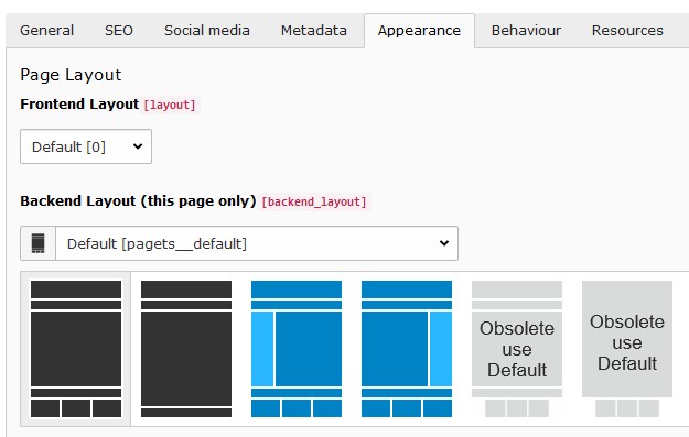
Available page layouts
Note
The page layouts with a navigation menu on the side allow to add content too.
Structure elements
With structure elements the content area might be further organized. Typical elements are containers, columns, accordions and tabs. See as well demo site.
This extension supports the following extensions providing similar structure elements:
- Extension pp_gridelements powered by the extension gridelements
- Extension flux_elements powered by the extension flux
- Extension container_elements powered by the extension container
Tip
To minimize maintenance expenses it is recommended to just use one extension providing structure elements.
The available structure elements can be found in the new content element wizard under the Grid Elements, Flux content
or Container tab:
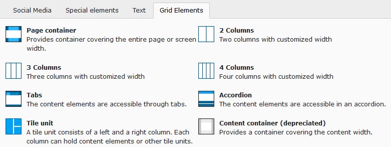
“Grid Elements”-tab in new content element wizard
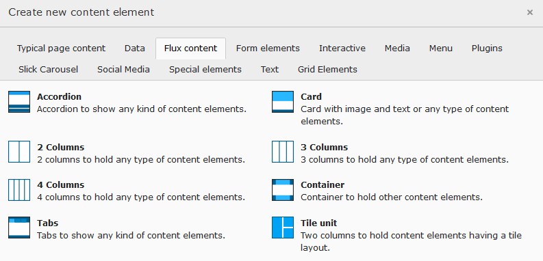
“Flux content”-tab in new content element wizard
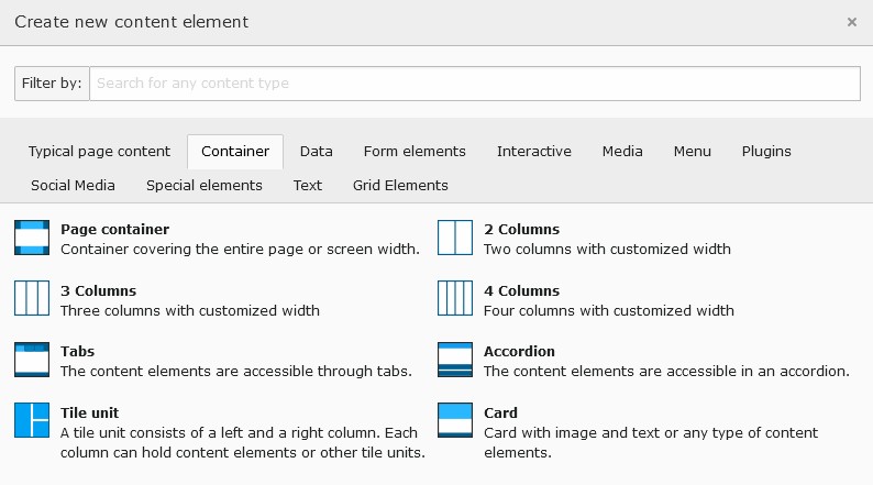
“Container”-tab in new content element wizard
Content element
Images tab
Image cropping
To faster crop images to be used in tiles the side ratios 2:1 and 1:2 were added.
Note
When defining an image crop area with the same side ratio (e.g. 2:1) as used for the content element layout the image might not fill the entire tile area. This is due to the fact that the tile area is having the exact side ratio where the images side ratio deviates from that due to the tile border. After approximating the image area with the exact tile ratio select the free side ratio to fine adjust the area.
Image variants
Usually the images are used in a content element using the content width. To optimize page loading time and reducing the data bandwidth the image sizes are adapted to the content width. This works fine for most cases.
In case one likes to use images in a content element spanning a different width (e.g. the full page width) the resolution might result to be too small resulting in not sharp images. For this situation the image variant selector has been introduced allowing to adapt the image rendering to different sizes (e.g. “Full page width”).
Image scaling
The image sizes for the different screen sizes are defined by the selected image variants as well as the image column count.
Some times an editor adds additional elements for structuring the content area resulting in a smaller available space for images. To deliver the optimal image size under such conditions a scaling can be defined.
As an example consider adding a two column structure element with the first column being 33% and the second column 67% from the content width. Let’s assume the two columns to be next to each other for screen sizes bigger than md. Now when adding an image to the first column (33% width) the rendered image would be two times bigger than needed (due to the system not knowing how much space is available in the column). To deliver optimal sized images the following scaling definition could be used:
xl: 0.33,
lg: 0.33,
md: 0.33,
sm: 1.0,
xs: 1.0
Important
Before adjusting the image scaling manually make sure the images aren’t yet created with the correct sizes.
The extension pizpalue supports image scaling for structure elements by providing view helpers (see view helpers
Render/Bootstrap/Column, Structure/Wrap/Column and Structure/Multiplier/GetForColumn) and adjusting the
content element template. Extensions like pp_gridelements might already make use of them and deliver correct image
sizes. See as well Integration-Templating.
Appearance tab
Tile layouts
Three tile layouts and a Layout screen breakpoint selector were added.
By selecting a Layout screen breakpoint a css class is added to the content element allowing to adjust the layout
depending on the screen width. This is currently used in conjunction with tile layouts but might be used in other
contexts as well.
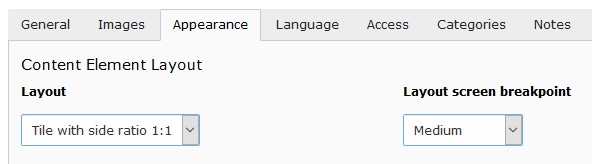
Content element layouts and layout breakpoints
Note
Tile views
Tile views can be created by arranging tiles in columns. For this the classes pp-tile-row and no-gutters
are assigned to the row and pp-tile-col to the column tag. The extension
pp_gridelements provides the structure element tile unit
that assigns the mentioned classes directly.
The tile border width can be adjusted in the constant editor (PIZPALUE: CLIENT STYLE - Tile gutter).
In case a tile content needs to be vertically scrolled the class pp-tile-scroll-y might be assigned to the tile.
Emphasize media layout
For the content element Text & media a teaser- and read more-field as well as the layout Emphasize media has
been added to stronger draw the users attention to the media.
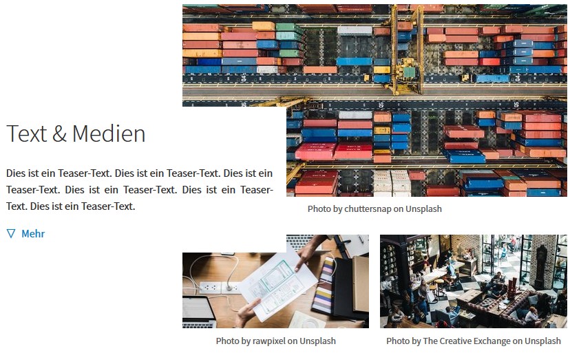
Note
The layout Emphasize media increases the image width by 40%. To adapt the images to the new width the TS
configuration emphasizeMediaMultiplier has been introduced (.left. applies to the image orientation left. See
as well right, centered_left and centered_right for other orientations):
lib.contentElement.settings.responsiveimages.contentelements.textmedia {
   left.emphasizeMediaMultiplier {
      default = 0.7
      large = 0.7
      medium = 0.7
   }
}
In case an other with for images is desired the respective configurations should be adapted.
Custom frames
Additional frames can be selected for content elements (see example):
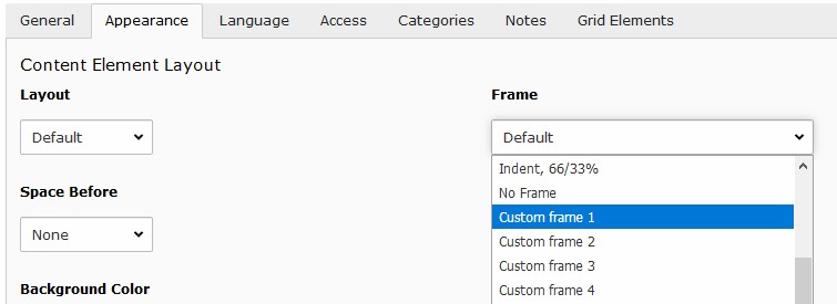
Custom frames for content elements
Note
The custom frame 4 doesn’t have any style definition. You might use it according your needs.
Background variants
As for the images a variants selector has been introduced for the background images allowing to adapt the background
image size to the container width. In case a content element isn’t embedded into a structure element it is likely
that it should be displayed on the entire display width hence Full page width should be selected.
Background
The bootstrap package offers a possibility to add a background image to the content element.
Its configuration has been adapted to enable the background image as well when no frame is used for the content element. In this case just a wrapping div is added.
Warning
This extension provides an alternative way to assign a background to a content element by using the field
Background image (inline). To reduce redundancy it has been marked as deprecated and shouldn’t be used any more.
Attributes
Sometimes it would be handy to directly alter attributes from a content element. For example to assign additional classes, some inline style or new attributes.
This functionality has been added by introducing additional fields to the content element table and adapting the rendering accordingly. The new fields are available under the appearance tab in the “Attributes” section.
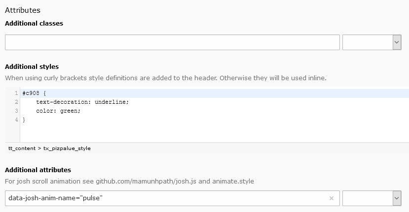
Customizing attributes for a content element
Some predefined classes and attributes can be assigned by help of the adjacent selector box. The selector box for the “Additional attributes” field shows data attributes related to the scroll animation.
Note
For security reasons all attributes are filtered. Currently just data attributes are allowed in the “Additional attributes” field.
Note
Style definitions will be included to the header when curly brackets are used. Otherwise they will be added inline.