Various
Popover
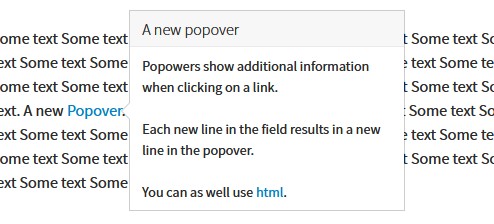
A popover in the front end
Popovers show additional information in a small window. Mainly they are associated with a link (see popovers component from bootstrap framework).
Create a popover
This extension provides an easy way to use popovers by defining them in the RTE editor:
- Select the text that should be associated with a popover
- Click the create link button
- In the link browser dialog select the register
Popover - Select the class
Popoverand define the title and content
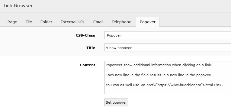
Register popover in link browser
Adjust a popover
To adjust a popovers behaviour related attributes might be added to the link tag. The following link results in a popover showing up when hovering over the link text where clicking on it loads the TYPO3 home page.
<a class="pp-popover" data-trigger="hover" href="t3://pppopover?href=https://typo3.org&content=A+text" title="A title">item</a>
Note
The popover content is parsed the same way as the RTE text by using the configuration from lib.parseFunc_RTE
hence TYPO3 specific links can be used (e.g. t3://page?uid=6).
Data from type getText
The getText data type can be enabled for the RTE editor. It allows to get various data from a web site. As an example a translated text might be retrieved depending on the currently selected page language. For this users might reference data by using curly brackets within the editor (see example):

Use of localized text within the editor
Tip
You might reference other content as defined by the “getText” data type.
The feature can be enabled through the constant editor selecting the category PIZPALUE: CUSTOMER EXTENDED
(constant: pizpalue.features.content.insertData).
Warning
Enabling this feature allows editors to output sensitive data. Enable it only if security isn’t compromised.
Pizpalue classes
General
These classes act on the element they are assigned to.
| Class | Usage |
|---|---|
| pp-bg-primary | Applies the primary color to the background |
| pp-bg-secondary | Applies the secondary color to the background |
| pp-bg-complementary | Applies the complementary color to the background |
| pp-bg-light | Applies the light color to the background |
| pp-bg-dark | Applies the dark color to the background |
| pp-bg-centercover | Centers the background and sizes it to cover the area. |
| pp-bg-fixed | Fixes the background. The result is a parallax effect. Due to mobile devices not supporting this feature fully it is generally disabled on mobile devices. |
Card backgrounds
| Class | Usage |
|---|---|
| pp-card-primary | Applies the primary color to the card background |
| pp-card-secondary | Applies the secondary color to the card background |
| pp-card-complementary | Applies the complementary color to the card background |
| pp-card-light | Applies the light color to the card background |
| pp-card-dark | Applies the dark color to the card background |
Content element
These classes act on content element wrappers.
| Class | Usage |
|---|---|
| pp-frame-collapsible | Applies a negative top margin to compensate the top padding |
| pp-inner-margin | Applies a margin to the inner container |
| pp-inner-padding | Applies a padding to the inner container |
| pp-inner-bgwhite70 | Applies a white background with 70% opacity to the inner container |
| pp-inner-bggrey70 | Applies a grey background with 70% opacity to the inner container |
| pp-inner-bgblack70 | Applies a black background with 70% opacity to the inner container |
Gallery / Image
These classes are used in conjunction with galleries (images, text & images)
| Class | Usage |
|---|---|
| pp-gallery-item-left | Aligns the gallery items (e.g. images) to the left |
| pp-gallery-item-right | Aligns the gallery items to the right |
| pp-gallery-item-join | Joins the gallery items by removing any margin and padding |
| pp-gallery-item-shadow | Adds a shadow to the gallery items |
| pp-image-overlay | Overlays the heading to the image. Used with image content element |
Content element transformation
These classes transform a content element. They influence various elements and might be used in JS.
| Class | Usage |
|---|---|
| pp-ce-overlaycard | Render an overlay card when being assigned to a text & image content element. |
| (DEPRECATED since 30.6.2021) | An overlay card is characterized by an animation taking place when the user hovers over the image. The animation fades in the text from the content element. DEPRECATED: Use Picture with overlay content element |
Utility
These classes are used in templating or together with JS.
| Class | Usage |
|---|---|
| pp-label-dataprotection | Used in content element to define a replacement text for a data protection notice check box (see contact page). |
| pp-below-header | Used to shift a content element below the page header by applying a negative top margin. |
| pp-extend-link | Assign this class to a link to make the closest ancestor container with class
frame-container linked to the same url. Alternatively the ancestor container
can be defined by the class ppc-el-[ancestorclass name]. |
| ppc-el-[ancestor class name] | Used in conjunction with the class pp-extend-link. Overwrites the default
link ancestor. Replace [ancestor class name] with the class used in the
ancestor container. As an example when assigning the classes
pp-extend-link ppc-el-up-my-container to an a-tag the closest ancestor from
the link having the class up-my-container assigned to will be linked to
the same url as defined in the a-tag. |
RTE
The following classes are used in the context of the real text editor.
| Class | Usage |
|---|---|
| pp-popover | Used to control the behaviour from popovers. Popovers that were triggered from elements having this class close when the user clicks outside the popover. |