Developer's Guide
This chapter covers the technical aspects of integrating the Focal Point Editor in your TYPO3 templates and custom extensions.
Namespace
The extension uses the namespace:
Nng\NnfocalpointViewHelpers
The extension provides six ViewHelpers for easy frontend integration.
CSS Styles
The extension includes a frontend CSS file with basic styles. Include it via TypoScript:
page.includeCSS.nnfocalpoint = EXT:nnfocalpoint/Resources/Public/Css/Frontend.cssOr include the static TypoScript "Focal Point Editor" in your template.
Available CSS classes:
.nnfp-image- Automatically added to images fromnnfp:image(width/height 100%, display block).nnfp-container- Container with overflow hidden for focal point images.nnfp-container--16-9,--4-3,--1-1,--3-2,--21-9- Aspect ratio helpers.nnfp-bg- Background image helper (background-size: cover, no-repeat)
Registering the Namespace
The extension registers a global namespace nnfp automatically. You can use the
ViewHelpers without any namespace declaration:
<!-- Global namespace - no declaration needed -->
<nnfp:image image="{image}" width="400" />
<div style="{nnfp:backgroundStyle(image: image)}">Alternatively, you can use the full namespace declaration:
{namespace nnfocalpoint=Nng\Nnfocalpoint\ViewHelpers}Or use the XML namespace syntax:
<html xmlns:nnfocalpoint="http://typo3.org/ns/Nng/Nnfocalpoint/ViewHelpers"
data-namespace-typo3-fluid="true">ImageViewHelper (Drop-in f:image replacement)
A drop-in replacement for f:image that automatically adds focal point styling.
All standard f:image arguments are supported.
Class: Nng\Nnfocalpoint\ViewHelpers\ImageViewHelper
Additional Arguments:
| Argument | Type | Required | Description |
|---|---|---|---|
| objectFit | string | No | CSS object-fit value (default: cover) |
| disableFocalPoint | bool | No | Set to true to disable focal point styling |
Usage:
<!-- Simple usage - replaces f:image -->
<nnfp:image image="{image}" width="400" height="300" />

<!-- With crop variant -->
<nnfp:image image="{image}" width="800c" height="600c" cropVariant="mobile" />

<!-- With custom object-fit -->
<nnfp:image image="{image}" width="400" objectFit="contain" />

<!-- Disable focal point (use as regular f:image) -->
<nnfp:image image="{image}" width="400" disableFocalPoint="true" />Output:
<img src="/fileadmin/_processed_/image.jpg"
     width="400" height="300"
     class="nnfp-image"
style="object-fit: cover; object-position: 50% 30%;" />Note
The nnfp-image CSS class is automatically added to all images rendered
with this ViewHelper. This class provides basic styling (width/height 100%,
display block) that works well with container-based layouts.
FocalCropViewHelper (Server-side focal crop)
Crops images to exact dimensions while keeping the focal point centered.
Unlike nnfp:image which uses CSS positioning, this ViewHelper performs
actual server-side cropping - the generated image file has the exact target dimensions.
Class: Nng\Nnfocalpoint\ViewHelpers\FocalCropViewHelper
Arguments:
| Argument | Type | Required | Description |
|---|---|---|---|
| image | object | Yes | The file reference object |
| width | string | No | Width specification (append "c" for crop) |
| height | string | No | Height specification (append "c" for crop) |
| cropVariant | string | No | Crop variant for focal point lookup (default: default) |
| absolute | bool | No | Force absolute URL (default: false) |
Usage:
<!-- Crop to 400x200, focal point centered horizontally -->
<nnfp:focalCrop image="{image}" width="400c" height="200" />

<!-- Square crop -->
<nnfp:focalCrop image="{image}" width="200c" height="200c" />

<!-- With specific crop variant -->
<nnfp:focalCrop image="{image}" width="800c" height="600" cropVariant="mobile" />How it works:
The "c" suffix indicates that dimension should be cropped. The ViewHelper:
- Calculates the target aspect ratio (e.g., 400:200 = 2:1)
- Crops the original image to match that aspect ratio, centered on the focal point
- Scales the cropped result to the final dimensions
Example: For a 1200x800 image with focal point at (0.7, 0.3):
width="400c" height="200"creates a 2:1 crop (800x400 from original)- The crop window is positioned to keep the focal point (at x=840, y=240) as centered as possible
- Result is scaled to 400x200
Output:
<img src="/fileadmin/_processed_/image_cropped.jpg"
width="400" height="200" />Replacing CropVariants with FocalCrop
The nnfp:focalCrop ViewHelper can largely replace the need for multiple crop variants.
Traditional TYPO3 crop variants require editors to manually define crop areas for each
aspect ratio (desktop, tablet, mobile, square, etc.). This is time-consuming and error-prone.
With focal points, you can simplify this workflow:
- Use only the default crop variant in your TCA configuration
- Let editors set a single focal point on the important part of the image
- Use
nnfp:focalCropwith different dimensions - the focal point stays centered automatically
Before (traditional approach):
<!-- Editor must define 4 different crop areas -->
<f:image image="{image}" cropVariant="desktop" width="1920c" height="600c" />
<f:image image="{image}" cropVariant="tablet" width="1024c" height="768c" />
<f:image image="{image}" cropVariant="mobile" width="768c" height="768c" />
<f:image image="{image}" cropVariant="square" width="400c" height="400c" />After (with focal point):
<!-- Editor sets ONE focal point, all crops are calculated automatically -->
<nnfp:focalCrop image="{image}" width="1920c" height="600" />  <!-- wide banner -->
<nnfp:focalCrop image="{image}" width="1024c" height="768" />  <!-- 4:3 -->
<nnfp:focalCrop image="{image}" width="768c" height="768" />   <!-- square -->
<nnfp:focalCrop image="{image}" width="400c" height="600" /> <!-- portrait -->Benefits:
- Less editor work: One focal point instead of multiple crop definitions
- Consistent results: The important subject stays visible in all aspect ratios
- Flexible frontend: Developers can use any aspect ratio without backend changes
- Simpler TCA: No need to configure multiple crop variants
Tip
This approach works best for images where there's a clear subject (person, product, logo) that should remain visible. For images requiring precise artistic framing per aspect ratio, traditional crop variants may still be preferred.
Uri\FocalCropViewHelper (URI only)
Returns only the URI of a focal-point-cropped image. Use this when you need the image URL for custom markup, srcset, or JavaScript.
Class: Nng\Nnfocalpoint\ViewHelpers\Uri\FocalCropViewHelper
Arguments: Same as FocalCropViewHelper
Usage:
<!-- In custom img tag -->
<img src="{nnfp:uri.focalCrop(image: image, width: '400c', height: '200')}"
     alt="{image.alternative}" />

<!-- In srcset -->
<img src="{nnfp:uri.focalCrop(image: image, width: '400c', height: '200')}"
     srcset="{nnfp:uri.focalCrop(image: image, width: '400c', height: '200')} 1x,
             {nnfp:uri.focalCrop(image: image, width: '800c', height: '400')} 2x" />

<!-- As CSS background -->
<div style="background-image: url('{nnfp:uri.focalCrop(image: image, width: '1920c', height: '600')}')">
</div>

<!-- With absolute URL -->
{nnfp:uri.focalCrop(image: image, width: '400c', height: '200', absolute: 1)}Output:
/fileadmin/_processed_/csm_image_abc123.jpgBackgroundStyleViewHelper
Returns a complete style attribute value for background images with focal point. Use this for divs or other elements with background images.
Class: Nng\Nnfocalpoint\ViewHelpers\BackgroundStyleViewHelper
Arguments:
| Argument | Type | Required | Description |
|---|---|---|---|
| image | mixed | Yes | The file reference object or array |
| cropVariant | string | No | The crop variant (default: default) |
| width | string | No | Width for image processing (e.g., "1920" or "1920c") |
| height | string | No | Height for image processing |
| backgroundSize | string | No | CSS background-size value (default: cover) |
| includeRepeat | bool | No | Include background-repeat: no-repeat (default: true) |
| fallbackPosition | string | No | Fallback position if no focal point (default: 50% 50%) |
Usage:
<!-- Simple usage -->
<div style="{nnfp:backgroundStyle(image: image)}">
    Content here
</div>

<!-- With image processing -->
<div class="hero" style="{nnfp:backgroundStyle(image: image, width: '1920')}">
    <h1>Hero Title</h1>
</div>

<!-- With crop variant -->
<div style="{nnfp:backgroundStyle(image: image, cropVariant: 'hero', width: '1920')}">
    Content
</div>

<!-- Custom background-size -->
<div style="{nnfp:backgroundStyle(image: image, backgroundSize: 'contain')}">
    Content
</div>Output:
<div style="background-image: url('/fileadmin/image.jpg'); background-size: cover; background-position: 50% 30%; background-repeat: no-repeat">
    Content here
</div>ObjectPositionViewHelper
Returns a CSS object-position value based on the focal point coordinates.
Class: Nng\Nnfocalpoint\ViewHelpers\ObjectPositionViewHelper
Arguments:
| Argument | Type | Required | Description |
|---|---|---|---|
| image | mixed | Yes | The file reference object or array |
| cropVariant | string | No | The crop variant to get the focal point for (default: default) |
| fallback | string | No | Fallback value if no focal point is set (default: 50% 50%) |
Usage:
<img src="{image.publicUrl}"
style="object-fit: cover; object-position: {nnfp:objectPosition(image: image, cropVariant: 'default')}" />Output:
<img src="/fileadmin/image.jpg"
style="object-fit: cover; object-position: 50% 30%" />With fallback:
<img src="{image.publicUrl}"
style="object-fit: cover; object-position: {nnfp:objectPosition(image: image, fallback: 'center top')}" />FocalPointViewHelper
Returns the raw focal point data for a specific crop variant.
Class: Nng\Nnfocalpoint\ViewHelpers\FocalPointViewHelper
Arguments:
| Argument | Type | Required | Description |
|---|---|---|---|
| image | mixed | Yes | The file reference object or array |
| cropVariant | string | No | The crop variant to get the focal point for (default: default) |
| as | string | No | Variable name to assign the focal point to |
Usage (inline):
<f:debug>{nnfp:focalPoint(image: image, cropVariant: 'default')}</f:debug>Usage (with variable):
<nnfp:focalPoint image="{image}" cropVariant="default" as="fp">
    <f:if condition="{fp}">
        <p>Focal point: {fp.x} / {fp.y}</p>
        <div style="position: absolute; left: {fp.x * 100}%; top: {fp.y * 100}%;"></div>
    </f:if>
</nnfp:focalPoint>Return value:
Returns an array with x and y keys (values 0-1), or null if no focal
point is set:
['x' => 0.5, 'y' => 0.3]Data Format
Focal points are stored in the sys_file_reference.tx_nnfocalpoint_points field
as a JSON string:
{
  "default": {"x": 0.5, "y": 0.3},
  "landscape": {"x": 0.9, "y": 0.712},
  "portrait": {"x": 0.2, "y": 0.5}
}Coordinate System:
x: 0= left edgex: 1= right edgey: 0= top edgey: 1= bottom edgex: 0.5, y: 0.5= center of the image
Accessing Focal Points in PHP
From FileReference Object
use TYPO3\CMS\Core\Resource\FileReference;

/** @var FileReference $image */
$focalPointsJson = $image->getProperty('tx_nnfocalpoint_points');
$focalPoints = json_decode($focalPointsJson, true) ?: [];

// Get focal point for a specific variant
$defaultFocalPoint = $focalPoints['default'] ?? null;
if ($defaultFocalPoint) {
    $x = $defaultFocalPoint['x'];
    $y = $defaultFocalPoint['y'];
}From Extbase FileReference
use TYPO3\CMS\Extbase\Domain\Model\FileReference;

/** @var FileReference $image */
$originalResource = $image->getOriginalResource();
$focalPointsJson = $originalResource->getProperty('tx_nnfocalpoint_points');
$focalPoints = json_decode($focalPointsJson, true) ?: [];Custom Integration Examples
The following examples show how to use the focal point data in your templates. The result ensures that the important part of the image remains visible when the container is scaled or cropped.
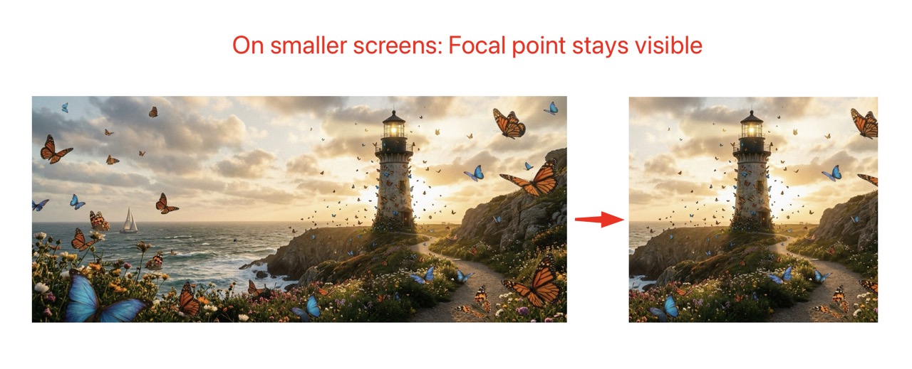
Using object-position with the focal point coordinates keeps the subject
visible regardless of container dimensions.
Required CSS
For focal points to work correctly, you need CSS that allows the image to be positioned within its container. Here are the essential styles:
/* Basic focal point container */
.focal-container {
    position: relative;
    overflow: hidden;
}

/* Image with focal point - fills container and respects focal point */
.focal-container img {
    width: 100%;
    height: 100%;
    object-fit: cover;
    /* object-position is set inline via ViewHelper */
}

/* Fixed aspect ratio containers */
.focal-container--16-9 {
    aspect-ratio: 16 / 9;
}

.focal-container--4-3 {
    aspect-ratio: 4 / 3;
}

.focal-container--1-1 {
    aspect-ratio: 1 / 1;
}

/* Background image with focal point */
.focal-bg {
    background-size: cover;
    background-repeat: no-repeat;
    /* background-position is set inline via ViewHelper */
}Example 1: Simple IMG Tag
The most basic usage with a standard <img> tag:
<!-- Basic usage -->
<div class="focal-container" style="width: 300px; height: 200px;">
    <img src="{image.publicUrl}"
         alt="{image.alternative}"
         style="object-fit: cover; object-position: {nnfp:objectPosition(image: image)}" />
</div>

<!-- With aspect ratio class -->
<div class="focal-container focal-container--16-9" style="width: 100%; max-width: 800px;">
    <img src="{image.publicUrl}"
         alt="{image.alternative}"
         style="object-fit: cover; object-position: {nnfp:objectPosition(image: image, cropVariant: 'default')}" />
</div>Example 2: Using f:image ViewHelper
Combine TYPO3's f:image ViewHelper with focal point positioning:
<!-- f:image with focal point -->
<div class="focal-container" style="width: 400px; height: 300px;">
    <f:image image="{image}"
             alt="{image.alternative}"
             width="800"
             style="object-fit: cover; object-position: {nnfp:objectPosition(image: image)}" />
</div>

<!-- f:image with crop variant -->
<div class="focal-container focal-container--4-3">
    <f:image image="{image}"
             cropVariant="mobile"
             width="600c"
             height="450c"
             style="object-fit: cover; object-position: {nnfp:objectPosition(image: image, cropVariant: 'mobile')}" />
</div>Note
When using f:image with cropping (width="600c"), the focal point provides
additional fine-tuning for how the already-cropped image is positioned in its container.
Example 3: Background Images
Use focal points with CSS background images:
<!-- Simple background image -->
<div class="hero focal-bg"
     style="height: 400px;
            background-image: url('{image.publicUrl}');
            background-position: {nnfp:objectPosition(image: image)};">
    <h1>Hero Title</h1>
</div>

<!-- With f:uri.image for processed images -->
<div class="hero focal-bg"
     style="height: 500px;
            background-image: url('{f:uri.image(image: image, width: 1920)}');
            background-position: {nnfp:objectPosition(image: image, cropVariant: 'hero')};">
    <div class="hero__content">
        <h1>{headline}</h1>
        <p>{subheadline}</p>
    </div>
</div>CSS for the hero section:
.hero {
    position: relative;
    display: flex;
    align-items: center;
    justify-content: center;
    color: white;
    text-align: center;
}

.hero::before {
    content: '';
    position: absolute;
    inset: 0;
    background: rgba(0, 0, 0, 0.4);
}

.hero__content {
    position: relative;
    z-index: 1;
    padding: 2rem;
}Example 4: Custom Logic with FocalPoint ViewHelper
For advanced use cases, access the raw focal point data:
<nnfp:focalPoint image="{image}" cropVariant="default" as="fp">
    <f:if condition="{fp}">
        <f:then>
            <!-- Display focal point coordinates -->
            <p class="debug">Focal point: X={fp.x}, Y={fp.y}</p>

            <!-- Use in calculations -->
            <div class="image-with-hotspot" style="position: relative;">
                <img src="{image.publicUrl}" alt="" />

                <!-- Hotspot marker at focal point -->
                <span class="hotspot"
                      style="left: {fp.x * 100}%; top: {fp.y * 100}%;">
                </span>
            </div>

            <!-- Conditional positioning based on focal point location -->
            <f:if condition="{fp.x} < 0.5">
                <f:then>
                    <div class="text-overlay text-overlay--right">
                        Text on right (focal point is on left)
                    </div>
                </f:then>
                <f:else>
                    <div class="text-overlay text-overlay--left">
                        Text on left (focal point is on right)
                    </div>
                </f:else>
            </f:if>
        </f:then>
        <f:else>
            <!-- Fallback when no focal point is set -->
            <img src="{image.publicUrl}" alt="" style="object-position: center center;" />
        </f:else>
    </f:if>
</nnfp:focalPoint>CSS for hotspot marker:
.image-with-hotspot {
    position: relative;
    display: inline-block;
}

.hotspot {
    position: absolute;
    width: 20px;
    height: 20px;
    background: rgba(255, 0, 0, 0.7);
    border: 2px solid white;
    border-radius: 50%;
    transform: translate(-50%, -50%);
    pointer-events: none;
    animation: pulse 2s infinite;
}

@keyframes pulse {
    0%, 100% { transform: translate(-50%, -50%) scale(1); }
    50% { transform: translate(-50%, -50%) scale(1.2); }
}Example 5: Responsive Images with Picture Element
Different focal points for different crop variants:
<picture>
    <!-- Mobile: square crop with mobile focal point -->
    <source media="(max-width: 767px)"
            srcset="{f:uri.image(image: image, cropVariant: 'mobile', width: '767c', height: '767c')}" />

    <!-- Tablet: 4:3 crop -->
    <source media="(max-width: 1023px)"
            srcset="{f:uri.image(image: image, cropVariant: 'tablet', width: '1023c', height: '767c')}" />

    <!-- Desktop: 16:9 crop -->
    <source media="(min-width: 1024px)"
            srcset="{f:uri.image(image: image, cropVariant: 'default', width: '1920c', height: '1080c')}" />

    <!-- Fallback image -->
    <img src="{f:uri.image(image: image, cropVariant: 'default', width: '1920c')}"
         alt="{image.alternative}"
         class="responsive-hero"
         style="object-fit: cover; object-position: {nnfp:objectPosition(image: image, cropVariant: 'default')}" />
</picture>Example 6: Data Attributes for JavaScript
Pass focal point data to JavaScript for dynamic effects:
<nnfp:focalPoint image="{image}" cropVariant="default" as="fp">
    <img src="{image.publicUrl}"
         alt="{image.alternative}"
         class="js-parallax-image"
         data-focal-x="{fp.x}"
         data-focal-y="{fp.y}"
         data-has-focal-point="{f:if(condition: fp, then: 'true', else: 'false')}" />
</nnfp:focalPoint>Example JavaScript for parallax effect respecting focal point:
document.querySelectorAll('.js-parallax-image').forEach(img => {
    const focalX = parseFloat(img.dataset.focalX) || 0.5;
    const focalY = parseFloat(img.dataset.focalY) || 0.5;

    window.addEventListener('scroll', () => {
        const rect = img.getBoundingClientRect();
        const scrollProgress = 1 - (rect.bottom / (window.innerHeight + rect.height));

        // Parallax offset based on focal point
        const offsetY = (scrollProgress - 0.5) * 50 * (1 - focalY);
        img.style.objectPosition = `${focalX * 100}% calc(${focalY * 100}% + ${offsetY}px)`;
    });
});Extending the Extension
Custom Form Element
The focal point form element is registered in ext_localconf.php:
$GLOBALS['TYPO3_CONF_VARS']['SYS']['formEngine']['nodeRegistry'][1702100000] = [
    'nodeName' => 'focalPointElement',
    'priority' => 40,
    'class' => \Nng\Nnfocalpoint\Form\Element\FocalPointElement::class,
];You can create a custom form element by extending FocalPointElement and
registering it with a higher priority.
Custom ViewHelper
Create custom ViewHelpers by extending the existing ones:
namespace YourVendor\YourExtension\ViewHelpers;

use Nng\Nnfocalpoint\ViewHelpers\ObjectPositionViewHelper;

class CustomObjectPositionViewHelper extends ObjectPositionViewHelper
{
    public function render(): string
    {
        $position = parent::render();
        // Add custom logic
        return $position;
    }
}API Reference
FocalPointController
Class: Nng\Nnfocalpoint\Controller\FocalPointController
Handles AJAX requests for the backend modal.
Methods:
wizardAction(ServerRequestInterface $request): ResponseInterface- Returns JSON data for the focal point wizard modal, including image URL, dimensions, crop variants, and existing focal points.
imageAction(ServerRequestInterface $request): ResponseInterface- Returns image data for a specific crop variant.
FocalPointElement
Class: Nng\Nnfocalpoint\Form\Element\FocalPointElement
Custom FormEngine element that renders the focal point button and hidden input.
Extends: TYPO3\CMS\Backend\Form\Element\AbstractFormElement
ObjectPositionViewHelper
Class: Nng\Nnfocalpoint\ViewHelpers\ObjectPositionViewHelper
Extends: TYPO3Fluid\Fluid\Core\ViewHelper\AbstractViewHelper
Methods:
render(): string- Returns CSS object-position value (e.g., "50% 30%")
FocalPointViewHelper
Class: Nng\Nnfocalpoint\ViewHelpers\FocalPointViewHelper
Extends: TYPO3Fluid\Fluid\Core\ViewHelper\AbstractViewHelper
Methods:
render(): mixed- Returns focal point array or renders children with focal point variable
FocalCropViewHelper
Class: Nng\Nnfocalpoint\ViewHelpers\FocalCropViewHelper
Extends: TYPO3Fluid\Fluid\Core\ViewHelper\AbstractTagBasedViewHelper
Methods:
render(): string- Returns
<img>tag with server-side cropped image centered on focal point
Uri\FocalCropViewHelper
Class: Nng\Nnfocalpoint\ViewHelpers\Uri\FocalCropViewHelper
Extends: TYPO3Fluid\Fluid\Core\ViewHelper\AbstractViewHelper
Methods:
render(): string- Returns URI of focal-point-cropped processed image