Validators
Introduction
Validators can be maintained with all form elements to check input for "validity" - presence, meaningfulness and correctness. For example, you can determine whether a field has been filled in or the information provided is an email address. Additionally, you can define your own error messages for the fields. These messages can be maintained in the form editor. In the following, the individual validators are explained and their function is discussed.
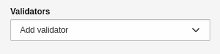
In the Inspector - setting for maintaining validators.
Overview of validators
Alphanumeric
The validator checks whether the field contains an alphanumeric string only. "Alphanumeric" defines a combination of alphabetic and numeric characters. No special characters may be entered in this field, only characters from [A-Z] and [0-9]. The settings for the validator are as follows:
Custom error message: custom error message that will be issued if validation fails.
Form element where the validator is available:
Text
Textarea
Password
Advanced password
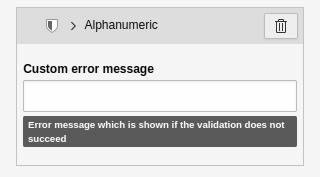
In the Inspector - Settings element for the 'Alphanumeric' validator.
String length
The validator uses the minimum and maximum values to check how many characters may be entered in the field. The settings for the validator are as follows:
Minimum: How many characters the field must contain as a minimum.
Maximum: How many characters the field may contain as a maximum.
Custom error message: Custom error message that will be displayed if the validation fails.
Form element where the validator is available:
Text
Textarea
Password
Advanced password
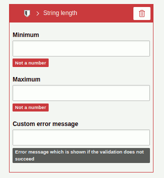
In the Inspector - settings to the validator 'String length'.
Email
The validator checks whether the specified value is a valid email address. The default allows international characters and multiple occurrences of the @ sign. The settings for the validator are as follows:
Custom error message: custom error message issued when validation fails.
Form element where the validator is available:
Text
Email address (validator is automatically active)
Password
Advanced password
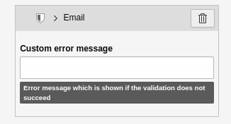
In the Inspector - Settings element for the 'E-mail' validator.
Integer number
The validator checks whether the specified value is a valid integer. No numbers with commas can be entered. The settings for the validator are as follows:
Custom error message: custom error message issued when validation fails.
Form element where the validator is available:
Text
Textarea
Password
Advanced password
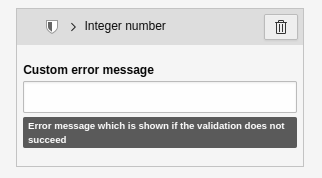
In the Inspector - settings to the validator 'Integer number'.
Floating-point number
The validator checks whether the specified value is a valid floating-point number. Only numbers with a comma can be entered. The settings for the validator are as follows:
Custom error message: custom error message issued when validation fails.
Form element where the validator is available:
Text
Textarea
Password
Advanced password

In the Inspector - Settings element for the 'Floating-point number' validator.
Number
The validator checks whether the specified value is a valid number. Only numbers without a comma can be entered. The settings for the validator are as follows:
Custom error message: custom error message issued when validation fails.
Form element where the validator is available:
Number (validator is automatically active).

In the Inspector - Settings element for the 'Number' validator.
Number range
The validator checks if the specified value is a number within the specified number range. The settings for the validator are as follows:
Minimum: The minimum value to accept.
Maximum: The maximum value to be accepted.
Custom error message: Custom error message that will be issued if the validation fails.
Form element where the validator is available:
Text
Textarea
Password
Number
Advanced password
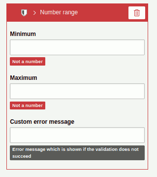
In the Inspector - Settings element for the 'Number range' validator.
Regular expression
The validator checks whether the specified value matches the specified regular expression. The settings for the validator:
Regular expression: the regular expression to use for validation.
Custom error message: set your own error message if the validation fails.
Imagine the following example. You want the user to specify a domain name. The value entered should contain only the domain, for example, "docs.typo3.org" instead of "https://docs.typo3.org" The regular expression for this use case would be /^[a-z]+.[a-z]+.[a-z]$/.
Content elements where to maintain the validator:
Text
Textarea
Password
Telephone number
URL
Advanced password
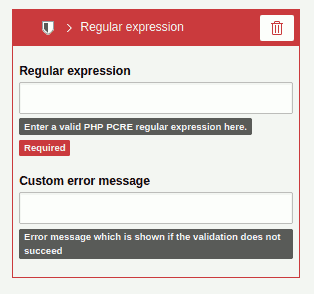
In the Inspector - Settings for the 'Regular Expression' validator.
Date range
The validator checks whether the specified value is within the specified date range. The range can be defined by specifying a start and/or end date. The settings for the validator are as follows:
Custom Error Message: custom error message that will be issued if validation fails.
Start date: Here you select the beginning of the date range (input: YYYY-MM-DD ).
End date: Here you select the end of the date range (input: YYYY-MM-DD ).
Form element where the validator is available:
Date

In the Inspector - Settings element for the 'Date range' validator.
Number of submitted values
The validator checks whether the specified value, which is defined in a minimum and a maximum, contains the specified number of elements. The settings for the validator are as follows:
Minimum: the minimum number of values submitted.
Maximum: The maximum number of submitted values.
Custom error message: custom error message that will be issued if the validation fails.
Form element where the validator is available:
Multi checkbox
Multi select
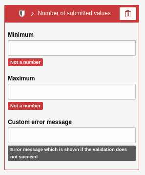
In the Inspector - Settings element for the validator'Number of submitted values'.
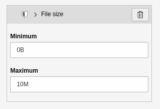
File size
The validator checks a file resource for its file size. The settings for the validator are as follows:
Minimum: The minimum file size that is accepted (default: 0B).
Maximum: The maximum file size that will be accepted (default: 10M).
Use the format B | K | M | G (byte | kilobyte | megabyte | gigabyte) when entering file sizes. For example: 10M means 10 megabytes. Please note that the maximum file size also depends on the settings of your server environment.
Form element where the validator is available:
File upload
Image upload
In the Inspector - Settings element for the 'File size' validator.
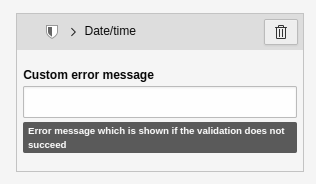
Date/Time
The validator checks if the specified value is a valid date and/ or time. The settings for the validator are as follows:
Custom error message: custom error message that will be issued if the validation fails.
Form element where the validator is available:
Date picker (jQuery)
In the Inspector - Settings element for the 'Date/Time' validator.