Attention
TYPO3 v9 has reached its end-of-life September 30th, 2021 and is not maintained by the community anymore. Looking for a stable version? Use the version switch on the top left.
You can order Extended Long Term Support (ELTS) here: TYPO3 ELTS.
mod
Configuration for backend modules. This is the part of Page TSconfig with the most options, most sections affect the main TYPO3 editing modules like Web > Page and Web > List.
SHARED
colPos_list
- Datatype
list of integers
- Description
This option lets you specify which columns of tt_content elements should be editable in the 'Columns' view of the Web > Page module.
Used on top of backend layouts, this setting controls which columns are editable. Columns configured in the Backend Layout which are not listed here, will be displayed with placeholder area.
Each column has a number which ultimately comes from the configuration of the table tt_content, field 'colPos'. These are the values of the four default columns used in the default backend layout:
Left:
1, Normal:0, Right:2, Border:3- Default
1,0,2,3
- Example
The example creates a basic backend layout and sets the "Left" column to be not editable:
Create a record of type "Backend Layout", for instance in the root page of your website
Add a title, e.g. "My Layout"
Use the wizard to create a two column backend layout, the result may look like this:
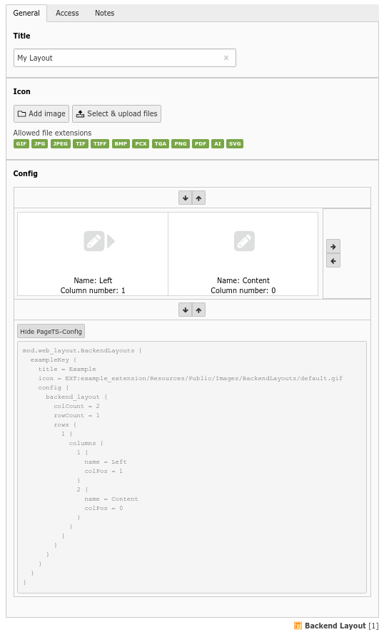
A simple backend layout
Create a page and select this new backend layout in the "Appearance" tab. The page modul then looks like this, displaying the two defined columns:

Backend layout used in page module
Now set the "Left" column to be not editable using Page TSconfig in the "Resources" tab of the page, by restricting
colPos_listto0(the "Content" colums as defined above):mod.SHARED.colPos_list = 0
The result in the page module then looks like this:
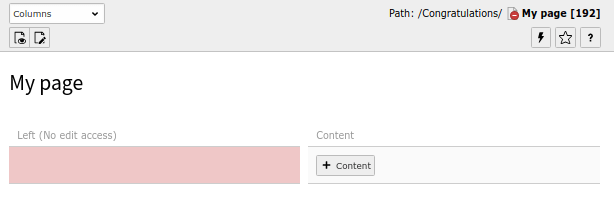
One column not editable in a backend layout
defaultLanguageFlag
- Datatype
string
- Description
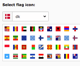
Country flag shown for the "Default" language in the backend, used in Web > List and Web > Page module. Values as listed in the "Select flag icon" of a language record in the backend are allowed, including the value "multiple".
The flag selector of a language record in the backend
Example
This will show the German flag, and the text "deutsch" on hover.
mod.SHARED {
    defaultLanguageFlag = de
    defaultLanguageLabel = deutsch
}
defaultLanguageLabel
- Datatype
string
- Description
Alternative label for "Default" when language labels are shown in the interface.
Used in Web > List and Web > Page module.
disableLanguages
- Datatype
string
- Description
Comma-separated list of language UID which will be disabled in the given page tree.
web_info
Configuration options of the "Web > Info" module.
menu.function
- Datatype
array
- Description
Disable elements of the "Function selector" in the document header of the module. The keys for single items can be found by browsing System > Configuration > $GLOBALS['TBE_MODULES_EXT'].
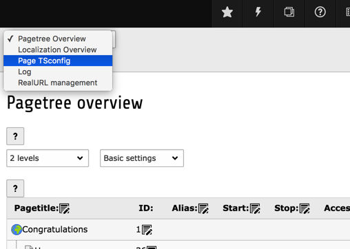
The function menu of the Info module
Warning
Blinding Function Menu items is not hardcore access control! All it does is hide the possibility of accessing that module functionality from the interface. It might be possible for users to hack their way around it and access the functionality anyways. You should use the option of blinding elements mostly to remove otherwise distracting options.
Example
mod.web_info.menu.function {
    # Disable item "Page Tsconfig"
    TYPO3\CMS\Info\Controller\InfoPageTyposcriptConfigController = 0
    # Disable item "Log"
    TYPO3\CMS\Belog\Module\BackendLogModuleBootstrap = 0
    # Disable item "Pagetree Overview"
    TYPO3\CMS\Info\Controller\PageInformationController = 0
    # Disable item "Localization Overview"
    TYPO3\CMS\Info\Controller\TranslationStatusController = 0
    # Disable item "Linkvalidator"
    TYPO3\CMS\Linkvalidator\Report\LinkValidatorReport = 0
}
web_layout
Configuration options of the "Web > Page" module.
allowInconsistentLanguageHandling
- Datatype
boolean
- Description
By default, TYPO3 will not allow you to mix translated content and independent content in the page module. Content elements violating this behavior will be marked in the Page Module and there is no UI control (yet) allowing you to create independent content elements in a given language.
If you want to go back to the old, inconsistent behavior, you can toggle it back on via this switch.
Example
Allows to set TYPO3s page module back to inconsistent language mode
mod.web_layout.allowInconsistentLanguageHandling = 1
BackendLayouts
- Datatype
array
- Description
Allows to define backend layouts via Page TSconfig directly without using database records.
Example
mod.web_layout.BackendLayouts {
    exampleKey {
        title = Example
        icon = EXT:example_extension/Resources/Public/Images/BackendLayouts/default.gif
        config {
            backend_layout {
                colCount = 1
                rowCount = 2
                rows {
                    1 {
                        columns {
                            1 {
                                name = LLL:EXT:frontend/Resources/Private/Language/locallang_ttc.xlf:colPos.I.3
                                colPos = 3
                                colspan = 1
                            }
                        }
                    }
                    2 {
                        columns {
                            1 {
                                name = Main
                                colPos = 0
                                colspan = 1
                            }
                        }
                    }
                }
            }
        }
    }
}
defaultLanguageLabel
- Datatype
string
- Description
Alternative label for "Default" when language labels are shown in the interface.
Overrides the same property from mod.SHARED if set.
defLangBinding
- Datatype
boolean
- Description
If set, translations of content elements are bound to the default record in the display. This means that within each column with content elements any translation found for exactly the shown default content element will be shown in the language column next to.
This display mode should be used depending on how the frontend is configured to display localization. The frontend must display localized pages by selecting the default content elements and for each one overlay with a possible translation if found.
- Default
0
disableAdvanced
- Datatype
boolean
- Description
Disables the clear cache advanced function in the bottom of the page in the module, including the "Create new record" link. As well removes the "Clear cache for this page" icon in the right top of the page module.
- Default
0
disableIconToolbar
- Datatype
boolean
- Description
Disables the topmost icon toolbar with the "view"-Icon and the icon toolbar below.
disableNewContentElementWizard
- Datatype
boolean
- Description
Disables the fact that the new-content-element icons links to the content element wizard and not directly to a blank "NEW" form.
disableSearchBox
- Datatype
boolean
- Description
Disables the search box in Columns view.
- Default
0
editFieldsAtATime
- Datatype
positive integer
- Description
Specifies the number of subsequent content elements to load in the edit form when clicking the edit icon of a content element in the 'Columns' view of the module.
- Default
1
Example
mod.web_layout {
    editFieldsAtATime = 2
}
hideRestrictedCols
- Datatype
boolean
- Description
If activated, only columns will be shown in the backend that the editor is allowed to access. All columns with access restriction are hidden in that case.
By default columns with restricted access are rendered with a message telling that the user doesn't have access. This may be useless and distracting or look repelling. Instead, all columns an editor doesn't have access to can be hidden:
mod.web_layout.hideRestrictedCols = 1
Attention
This setting will break your layout if you are using backend layouts.
- Default
false
localization.enableCopy
- Datatype
boolean
- Description
Enables the creation of copies of content elements into languages in the translation wizard ("free mode").
- Default
1
- Example
mod.web_layout {
    localization.enableCopy = 0
}
localization.enableTranslate
- Datatype
boolean
- Description
Enables simple translations of content elements in the translation wizard ("connected mode").
- Default
1
- Example
mod.web_layout {
    localization.enableTranslate = 0
}
menu.functions
- Datatype
array
- Description
Disable elements of the "Function selector" in the document header of the module.
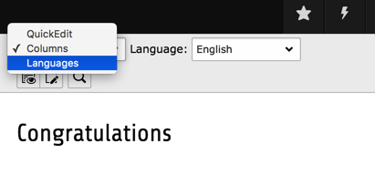
The function keys are numerical:
- Columns
1
- Languages
2
Warning
Blinding Function Menu items is not hardcore access control! All it does is hide the possibility of accessing that module functionality from the interface. It might be possible for users to hack their way around it and access the functionality anyways. You should use the option of blinding elements mostly to remove otherwise distracting options.
- Example
# Disables "Languages" from function menu
mod.web_layout.menu.functions {
    2 = 0
}
noCreateRecordsLink
- Datatype
boolean
- Description
If set, the link in the bottom of the page, "Create new record", is hidden.
- Default
0
preview
- Datatype
string
- Description
It is possible to render previews of your own content elements in the page module. By referencing a Fluid template you can create a visual representation of your content element, making it easier for an editor to understand what is going on on the page.
The syntax is as follows:
mod.web_layout.tt_content.preview.[CTYPE].[list_type value] = EXT:site_mysite/Resources/Private/Templates/Preview/ExamplePlugin.html
This way you can even switch between previews for your plugins by supplying
listas CType.Note
This only works, if there is no hook registered for this content type, you may want to check this section in the "System > Configuration" module:
$GLOBALS['TYPO3_CONF_VARS']['SC_OPTIONS']['cms/layout/class.tx_cms_layout.php']
    ['tt_content_drawItem']['content_element_xy'];
Example
mod.web_layout.tt_content.preview.custom_ce = EXT:site_mysite/Resources/Private/Templates/Preview/CustomCe.html
mod.web_layout.tt_content.preview.table = EXT:site_mysite/Resources/Private/Templates/Preview/Table.html
mod.web_layout.tt_content.preview.list.tx_news = EXT:site_mysite/Resources/Private/Templates/Preview/TxNews.html
web_list
Configuration options of the "Web > List" module.
allowedNewTables
- Datatype
list of table names
- Description
If this list is set, then only tables listed here will have a link to "create new" in the page and sub pages. This also affects the "Create new record" content element wizard.
This is the opposite of deniedNewTables property.
Note
Technically records can be created (e.g. by copying/moving), so this is not a security feature. The point is to reduce the number of options for new records visually.
Example
mod.web_list {
    # Only pages and sys_category table elements will be linked to in the new record wizard
    allowedNewTables = pages, sys_category
}
The New record screen after modifying the allowed elements
clickTitleMode
- Datatype
string
- Description
Keyword which defines what happens when a user clicks a record title in the list.
The following values are possible:
- edit
Edits record
- info
Shows information
- show
Shows page in the frontend
- Default
edit
csvDelimiter
- Datatype
string
- Description
Defines the delimiter for CSV exports (Microsoft Excel expects
;to be set).- Default
,
Example
mod.web_list {
    csvDelimiter = ;
}
csvQuote
- Datatype
string
- Description
Defines the quoting character for CSV exports.
- Default
"
- Example
mod.web_list {
    csvQuote = '
}
deniedNewTables
- Datatype
list of table names
- Description
If this list is set, then the tables listed here won't have a link to "create new record" in the page and sub pages. This also affects the "Create new record" content element wizard.
This is the opposite of allowedNewTables property.
If
allowedNewTablesanddeniedNewTablescontain a common subset,deniedNewTablestakes precedence.
Example
mod.web_list {
    deniedNewTables = sys_category, tt_content
}
disableSearchBox
- Datatype
boolean
- Description
Disables the search and search icon in the doc header.
- Default
0
disableSingleTableView
- Datatype
boolean
- Description
If set, then the links on the table titles which shows a single table listing will not be available - including sorting links on columns titles, because these links jumps to the table-only view.
enableClipBoard
- Datatype
list of keywords
- Description
Determines whether the checkbox "Show clipboard" in the list module is shown or hidden. If it is hidden, you can predefine it to be always activated or always deactivated.
The following values are possible:
- activated
The option is activated and the checkbox is hidden.
- deactivated
The option is deactivated and the checkbox is hidden.
- selectable
The checkbox is shown so that the option can be selected by the user.
- Default
selectable
enableDisplayBigControlPanel
- Datatype
list of keywords
- Description
Determines whether the checkbox "Extended view" in the list module is shown or hidden. If it is hidden, you can predefine it to be always activated or always deactivated.
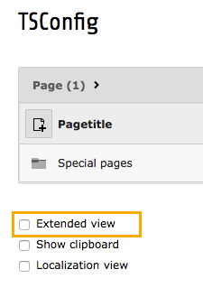
Extended view is shown in the list module
The following values are possible:
- activated
The option is activated and the checkbox is hidden.
- deactivated
The option is deactivated and the checkbox is hidden.
- selectable
The checkbox is shown so that the option can be selected by the user.
- Default
selectable
hideTables
- Datatype
list of table names, or *
- Description
Hide these tables in record listings (comma-separated)
If
*is used, all tables will be hidden
hideTranslations
- Datatype
list of table names, or *
- Description
For tables in this list all their translated records in additional website languages will be hidden in the List module.
Use
*to hide all records of additional website languages in all tables or set single table names as comma-separated list.
Example
mod.web_list.hideTranslations = *mod.web_list.hideTranslations = tt_content, tt_news
itemsLimitPerTable
- Datatype
positive integer
- Description
Set the default maximum number of items to show per table.
- Default
20
itemsLimitSingleTable
- Datatype
positive integer
- Description
Set the default maximum number of items to show in single table view.
- Default
100
listOnlyInSingleTableView
- Datatype
boolean
- Description
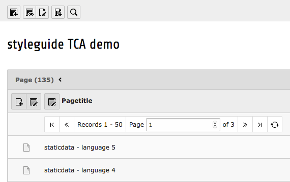
If set, the default view will not show the single records inside a table anymore, but only the available tables and the number of records in these tables. The individual records will only be listed in the single table view, that means when a table has been clicked. This is very practical for pages containing many records from many tables!
Example
mod.web_list {
    listOnlyInSingleTableView = 1
}
The result will be that records from tables are only listed in the single-table mode:

The list module after activating the single-table mode
- Default
0
newContentElementWizard.override
- Datatype
string
- Description
If set to an extension key, then the specified module or route for creating new content elements.
Example
mod.newContentElementWizard.override = my_custom_module
mod.newContentElementWizard.override = my_module_route
newPageWizard.override
- Datatype
string
- Description
If set to an extension key, then the specified module or route will be used for creating new elements on the page.
noCreateRecordsLink
- Datatype
boolean
- Description
If set, the link "Create new record" is hidden.
- Default
0
Example
mod.web_list {
   noCreateRecordsLink = 1
}
noExportRecordsLinks
- Datatype
boolean
- Description
If set, the "Export" and "Download CSV file" buttons are hidden in single table view inside the list module. This option is for example important to disable batch download of sensitive data via csv or t3d exports.
The buttons "Export" and "Download CSV file" are hidden in single table view inside the list module:
The list module with export buttons after activating the single-table mode
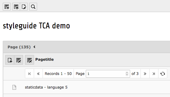
The list module without export buttons after activating the single-table mode
- Default
0
Example
mod.web_list {
    noExportRecordsLinks = 1
}
noViewWithDokTypes
- Datatype
string
- Description
Hide view icon for the defined doktypes (comma-separated)
- Default
254,255
table.[tableName].hideTable
- Datatype
boolean
- Description
If set to non-zero, the table is hidden. If it is zero, table is shown even if table name is listed in "hideTables" list.
Example
mod.web_list.table.tt_content.hideTable = 1
tableDisplayOrder
- Datatype
array
- Description
Flexible configuration of the order in which tables are displayed.
The keywords
beforeandaftercan be used to specify an order relative to other table names.
Example
mod.web_list.tableDisplayOrder.<tableName> {
    before = <tableA>, <tableB>, ...
    after = <tableA>, <tableB>, ...
}
searchLevel.items
- Datatype
array
- Description
Sets labels for each level label in the search level select box
mod.web_list.searchLevel.items {
    -1 = EXT:lang/locallang_core.xlf:labels.searchLevel.infinite
    0 = EXT:lang/locallang_core.xlf:labels.searchLevel.0
    1 = EXT:lang/locallang_core.xlf:labels.searchLevel.1
    2 = EXT:lang/locallang_core.xlf:labels.searchLevel.2
    3 = EXT:lang/locallang_core.xlf:labels.searchLevel.3
    4 = EXT:lang/locallang_core.xlf:labels.searchLevel.4
}
showClipControlPanelsDespiteOfCMlayers
- Datatype
boolean
- Description
If set, then the control- and clipboard panels of the module is shown even if the context-popups (ClickMenu) are available. Normally the control- and clipboard panels are disabled unless extended mode is set.
web_ts
Configuration options of the "Web > Template" module.
menu.function
- Datatype
array
- Description
Disable elements of the "Function selector" in the document header of the module. The keys for single items can be found by browsing System > Configuration > $GLOBALS['TBE_MODULES_EXT'].
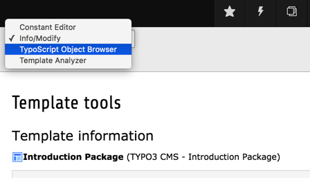
The function menu of the Template module
Warning
Blinding Function Menu items is not hardcore access control! All it does is hide the possibility of accessing that module functionality from the interface. It might be possible for users to hack their way around it and access the functionality anyways. You should use the option of blinding elements mostly to remove otherwise distracting options.
Example
# Disable the item "Template Analyzer"
mod.web_ts.menu.function {
    TYPO3\CMS\Tstemplate\Controller\TemplateAnalyzerModuleFunctionController = 0
}
web_view
Configuration options of the "Web > View" module.
previewFrameWidths
- Datatype
array
- Description
Configure available presets in view module.
- <key>.label
Label for the preset
- <key>.type
Category of the preset, must be one of 'desktop', 'tablet' or 'mobile'
- <key>.width
Width of the preset
- <key>.height
Height of the preset
Example
With this configuration a new preset '1014' with size 1027x768 will be configured with a label loaded from an xlf file and the category 'desktop'.
mod.web_view.previewFrameWidths {
    1024.label = LLL:EXT:viewpage/Resources/Private/Language/locallang.xlf:computer
    1024.type = desktop
    1024.width = 1024
    1024.height = 768
}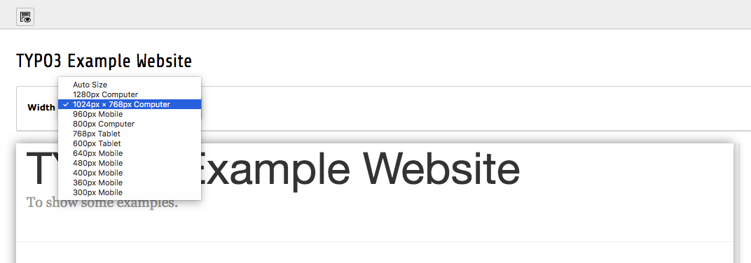
Dropdown menu Width with added frame size called myPreview
type
- Datatype
positive integer
- Description
Enter the value of the &type parameter passed to the webpage.
Example
mod.web_view {
    # Frontend link will be something like index.php?id=123&type=1
    type = 1
}
wizards
The wizards section allows to customize the New record wizard and the
New content element wizard.
newContentElement.wizardItems
- Datatype
array
- Description
In the new content element wizard, content element types are grouped together by type. Each such group can be configured independently. The four default groups are: "common", "special", "forms" and "plugins".
The configuration options below apply to any group.
- mod.wizards.newContentElement.wizardItems.[group].before
(string) Sorts [group] in front of the group given.
- mod.wizards.newContentElement.wizardItems.[group].after
(string) Sorts [group] after the group given.
- mod.wizards.newContentElement.wizardItems.[group].header
(localized string) Name of the group.
- mod.wizards.newContentElement.wizardItems.[group].show
(string) Comma-separated list of items to show in the group. Use
*to show all, example:# Hide bulletList mod.wizards.newContentElement.wizardItems.common.show := removeFromList(bullets) # Only show text and textpic in common mod.wizards.newContentElement.wizardItems.common.show = text,textpic
- mod.wizards.newContentElement.wizardItems.[group].elements
(array) List of items in the group.
- mod.wizards.newContentElement.wizardItems.[group].elements.[name]
(array) Configuration for a single item.
- mod.wizards.newContentElement.wizardItems.[group].elements.[name].iconIdentifier
(string) The icon identifier of the icon you want to display.
- mod.wizards.newContentElement.wizardItems.[group].elements.[name].title
(localized string) Name of the item.
- mod.wizards.newContentElement.wizardItems.[group].elements.[name].description
(localized string) Description text for the item.
- mod.wizards.newContentElement.wizardItems.[group].elements.[name].tt_content_defValues
(array) Default values for tt_content fields.
- Example
# Add a new element (header) to the "common" group
mod.wizards.newContentElement.wizardItems.common.elements.header {
    iconIdentifier = content-header
    title = Header
    description = Adds a header element only
    tt_content_defValues {
        CType = header
    }
}
mod.wizards.newContentElement.wizardItems.common.show := addToList(header)
# Create a new group and add a (pre-filled) element to it
mod.wizards.newContentElement.wizardItems.myGroup {
    header = LLL:EXT:cms/layout/locallang.xlf:advancedFunctions
    elements.customText {
        iconIdentifier = content-text
        title = Introductory text for national startpage
        description = Use this element for all national startpages
        tt_content_defValues {
            CType = text
            bodytext (
                <h2>Section Header</h2>
                <p class="bodytext">Lorem ipsum dolor sit amet, consectetur, sadipisci velit ...</p>
            )
            header = Section Header
            header_layout = 100
        }
    }
}
mod.wizards.newContentElement.wizardItems.myGroup.show = customText
With the second example, the bottom of the new content element wizard shows:
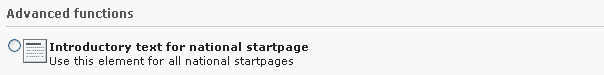
Added entry in the new content element wizard
newRecord.order
- Datatype
list of values
- Description
Define an alternate order for the groups of records in the new records wizard. Pages and content elements will always be on top, but the order of other record groups can be changed.
Records are grouped by extension keys, plus the special key "system" for records provided by the TYPO3 Core.
- Example
Place the tt_news group at the top (after pages and content elements), other groups follow unchanged:
mod.wizards.newRecord.order = tt_news
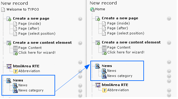
The position of News changed after modifying the New record screen
newRecord.pages
- Datatype
boolean
- Description
Use the following sub-properties to show or hide the specified links. Setting any of these properties to 0 will hide the corresponding link, but setting to 1 will leave it visible.
- show.pageAfter
Show or hide the link to create new pages after the selected page.
- show.pageInside
Show or hide the link to create new pages inside the selected page.
- show.pageSelectPosition
Show or hide the link to create new pages at a selected position.
Example
mod.wizards.newRecord.pages.show {
    # Hide the "Page (inside)" link.
    pageInside = 0
}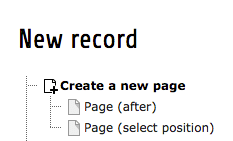
The modified New record screen without Page (inside)