
Quick Start
This walkthrough builds one small, real Grid Element: a two-area structure named Main and Sidebar. It follows the same sequence any Grid Element goes through: define a structure, instantiate it, place content in its areas, and render it. That sequence is Structure-first Authoring, the authoring model behind Grid Elements; this page demonstrates it rather than explains it, see Core Concepts for the concept itself.
Note
This assumes Grid Elements is installed, active, and its recommended static template is included, see Installation.
Define the grid layout
A grid's structure is TSconfig, not TypoScript, see TSconfig.
Add the following to the page TSconfig of the page tree this project
works in, either the site's page.tsconfig file or, for quick
experimentation, the Resources tab of a page's properties:
tx_gridelements.setup.GridElement {
  title = Two-column layout
  config {
    colCount = 2
    rowCount = 1
    rows {
      1 {
        columns {
          1 {
            name = Main
            colPos = 0
          }
          2 {
            name = Sidebar
            colPos = 1
          }
        }
      }
    }
  }
}title is what identifies this layout to editors in the backend, it
must be set or the layout will not appear as a choice at all.
colPos here is a cell identifier local to this layout, not TYPO3
Core's own colPos field, see Grid TS Syntax for the full
notation and Data Model for what actually relates a child to its
container. GridElement, the identifier this layout is defined
under, is explained below, in See it render.
This is the same structure the Grid Wizard would produce visually on a CE backend layout database record; either route defines the same thing, see Grid Definitions for both.
Create the Grid Element
Reload the backend so the new layout is picked up, then open the Page Module on a page within reach of that TSconfig. Use the Drag-In Wizard, the toggle button next to the Page Module's own Create new content element button, find Two-column layout among the Grid Elements offered there, and drag it into a column. TYPO3's standard New Content Element Wizard offers the same layout and works just as well; either one creates a Grid Element with this structure, already placed on the page.
Fill the structural areas
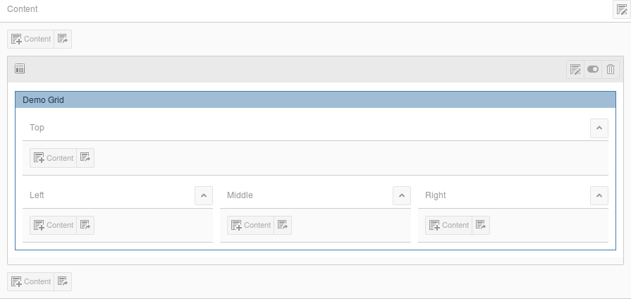
The new Grid Element now shows Main and Sidebar as two areas on the page, each with its own Content control, exactly like an ordinary page column:
Add a content element, a simple Text element is enough, to Main, and another to Sidebar, the same way content is created anywhere else in the Page Module.
See it render
Preview the page in the frontend. Both areas already appear, each showing the content just placed in it, with no template written for this walkthrough.
That works because of how the recommended static template resolves a
template file: it looks up a Fluid template named after the grid
layout's own identifier, tx_gridelements.setup.<id>. Grid Elements
ships one ready-made, generic template under exactly that lookup
mechanism, GridElement.html, built to render any row and column
structure without per-layout customization. Naming this walkthrough's
layout identifier GridElement is what makes it resolve straight to
that shipped template, so there is nothing left to configure for a
first render. A real project typically gives each layout its own
identifier and, where its rendering should differ, its own template,
see Rendering Architecture and How To for how
that resolution works and how to build on it.
Where to continue
| Grid Definitions | The full Grid TS Syntax notation, the Grid Wizard, FlexForm and every TSconfig option used to build a layout like this one. |
| Restrictions, Validation & Permissions | Limit which content types, and how many, a cell accepts. |
| Editor Guide | Day-to-day authoring: the Page Module, drag and drop, both wizards, references and localization. |
| Rendering | The rendering architecture, GridChildrenProcessor in depth,
and its full option reference. |
| Data Model | The parent-child relation, nesting and the data actually stored behind what was just built. |