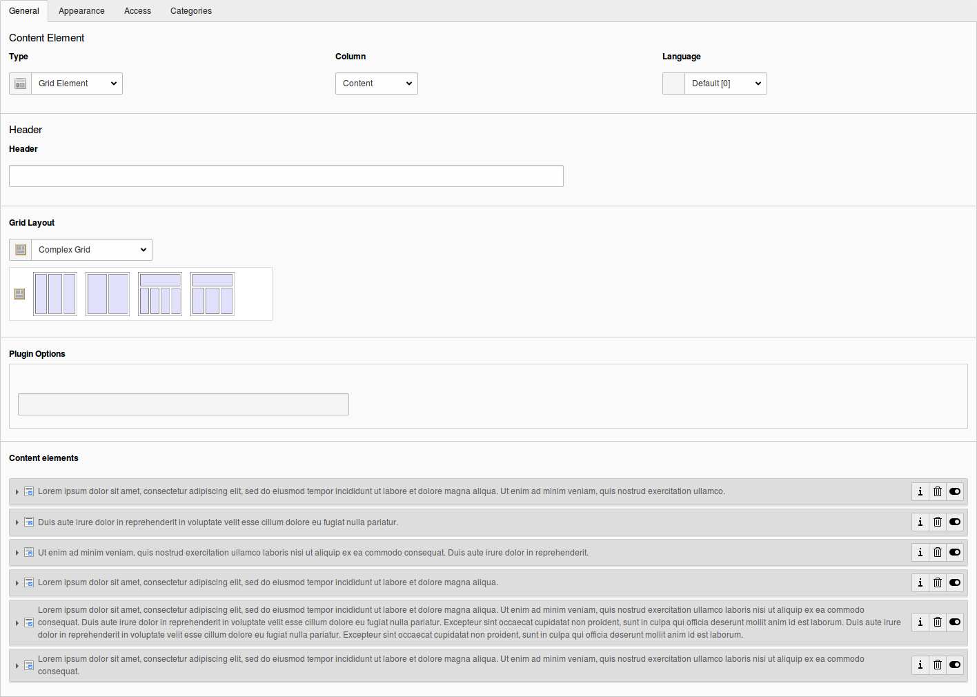
Grid TS Syntax
Grid TS Syntax is the notation used to describe a grid's rows, columns and cell configuration. It is backend structural configuration, part of TSconfig, not frontend TypoScript. A page's Backend Layout and a Grid Element's own layout both use the same syntax, parsed by the same internal TypoScript parser Core uses elsewhere, which is why the notation itself looks like TypoScript even though its purpose here is purely structural.
You can write this syntax by hand, or build it visually with the Grid Wizard, which reads and writes the exact same structure. Once a project has several similar layouts, editing the syntax directly is often faster than repeating the same wizard clicks.
Step by step
Start with the number of columns and rows
Use the keys colCount and rowCount to define the grid a layout's cells are placed on. Both values should be at least the lowest common multiple of the column sizes you intend to create, since they describe the grid the cell structure is measured against, and the calculation should account for any cells that will span multiple columns or rows.
config {
  colCount = 4
  rowCount = 3
}Note
Grid layouts stored as TSconfig, and Grid Elements' own CE layout records, historically wrapped this configuration in a backend_layout block, the same wrapper page-level Backend Layouts use:
config {
  backend_layout {
    colCount = 4
    rowCount = 3
  }
}Grid Elements still recognizes and unwraps this block for
compatibility with configuration written that way. It is not the
current way to write a new grid definition; write the keys directly
under config as shown above.
Fill in the rows
rows is a plain array with one numeric key per row, even a row that will stay empty:
config {
  colCount = 4
  rowCount = 3
  rows {
    1 {
      ...
    }
    2 {
      ...
    }
    3 {
      ...
    }
  }
}Create the cells
Each cell in a row's columns array accepts up to seven keys: name, colPos, colspan, rowspan, allowed, disallowed and maxitems. name is required. Without a value for colPos, the cell has no target column and stays inactive, a placeholder in the page module that cannot hold content.
colspan, rowspan, allowed, disallowed and maxitems are all optional.
colPos here is a cell identifier local to this layout, not TYPO3
Core's own colPos field on a content element. It becomes the value
stored in a child's tx_gridelements_columns once it is placed in
that cell. It does not create the parent-child relation between a
container and its children; that relation, and why a child's own
colPos instead carries a sentinel value, is documented in
Data Model.
allowed, disallowed and maxitems define, per cell, which
content is permitted and how many elements a cell accepts. allowed
and disallowed take an array with CType, list_type and
tx_gridelements_backend_layout as keys, restricting content
element types, plugin types and nested grid element types
respectively; disallowed wins where the two overlap. This syntax
matches the one used by the third-party content defender extension,
so a project already using it does not need to change its
configuration. maxitems caps how many elements the cell accepts; a
cell at or over its limit still shows existing elements and stays
editable, it only stops offering more. This is definition-time
configuration; how it is enforced and filtered at authoring time is
covered fully in Restrictions, Validation & Permissions.
The following example defines a larger top row, an outer/inner left column pair, a right column with an item limit, and an outer right placeholder-free column:
config {
  colCount = 4
  rowCount = 3
  rows {
    1 {
      columns {
        1 {
          name = Top
          colspan = 4
          colPos = 0
          allowed {
            CType = text,textpic
          }
        }
      }
    }
    2 {
      columns {
        1 {
          name = Outer Left
          rowspan = 2
          colPos = 1
          allowed {
            CType = text,textpic
            tx_gridelements_backend_layout = 2ColumnContainer,3ColumnContainer
          }
        }
        2 {
          name = Left
          colPos = 2
          allowed = *
          disallowed {
            CType = text,textpic
            tx_gridelements_backend_layout = 2ColumnContainer,3ColumnContainer
          }
        }
        3 {
          name = Right
          colPos = 3
          maxitems = 4
        }
        4 {
          name = Outer Right
          colPos = 4
        }
      }
    }
    3 {
      columns {
        1 {
          name = Bottom
          colspan = 4
          colPos = 5
        }
      }
    }
  }
}This is the visible result of the example code:
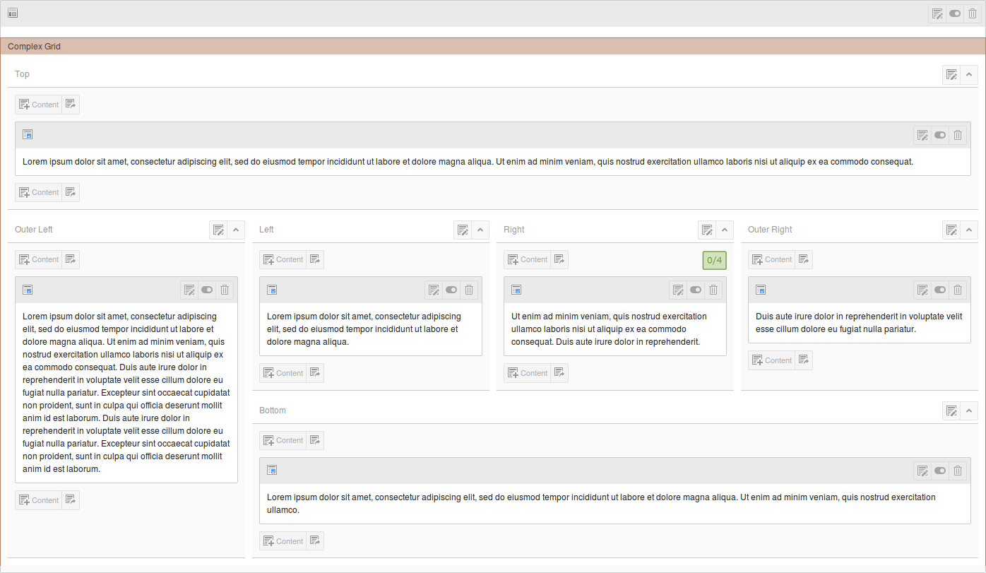
Once a Grid Element using this layout has children, editing it shows them connected to their parent through Core's Inline Relational Record Editing (IRRE), see Parent-Child Relations and IRRE for how that relation is maintained. Nested grids and their own children can be edited the same way, without leaving the form, though sorting by drag and drop or the sorting arrows is disabled inside it; dragging and dropping elements directly in the page module still works.