Registration field
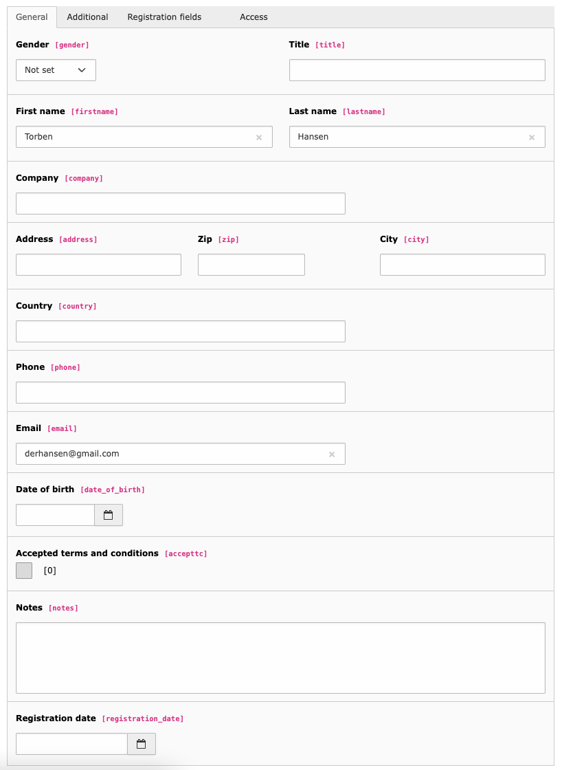
If the registration option is enabled for an event, you can use registration fields to add additional fields to the default registration form.
|
Field: |
Description: |
|---|---|
|
Title |
Title of the field. Will be rendered as field label in the frontend |
|
Type |
Type of the registration field Possible values:
|
|
Options |
Options for the type "Radiobutton" and "Checkbox". Example:
|
|
Required |
If checked, field must be filled out in frontend |
|
Placeholder |
Placeholder for the field |
|
Default value |
The default value of the field |
|
Date input mode |
Only visible when the selected field type is "Date/Time". Selects the date input mode: either 'date' (default), 'datetime' or 'time' Please note: The default template just uses HTML5 input types. You might want to extend that to use a JavaScript datetimepicker instead. |
|
Prefill with frontend user data |
Field will be prefilled with value of selected frontend user data. |