Attention
TYPO3 v6 has reached its end-of-life April 18th, 2017 and is not maintained by the community anymore. Looking for a stable version? Use the version switch on the top left.
There is no further ELTS support. It is strongly recommended updating your project.
GMENU_FOLDOUT
Note: Until TYPO3 6.0 the menu objects GMENU_LAYERS, TMENU_LAYERS and GMENU_FOLDOUT were part of the TYPO3 Core. Since TYPO3 6.1 they have been moved to the extension statictemplates, which with TYPO3 6.1 has itself been removed from the TYPO3 Core. In order to use these menu objects now, you need to install statictemplates from TER.
GMENU_FOLDOUT works as an extension to GMENU, which means that the properties underneath are additional properties to the ones above.
The purpose of GMENU_FOLDOUT is to create 2-level menus, which are folded out dynamically.
The menu on the first level is a GMENU, because GMENU_FOLDOUT is responsible for this, but the submenu on the next level (referred to as 2nd level) can be both TMENU or another GMENU.
Note: You must include the library "media/scripts/gmenu_foldout.php" (in older versions "typo3/sysext/statictemplates/media/scripts/gmenu_foldout.php").
The script implemented is taken from http://www9.ewebcity.com/skripts/foldoutmenu_move.htm
Property
dontLinkIfSubmenu
Data type
boolean
Description
If set, items that has a submenu is not linked. Items without a submenu are always linked in the regular ways.
Property
foldTimer
Data type
integer
Description
The timeout in the animation, these are milliseconds.
Default
40
Property
foldSpeed
Data type
integer, range 1-100
Description
How many steps in an animation? Choose 1 for no animation.
Default
1
Property
stayFolded
Data type
boolean
Description
Stay open when you click a new toplink? (Level 1)
Property
bottomHeight
Data type
integer, pixels
Description
Sets the height of the bottom layer. Is important if the bottom layer contains either content or a background color: Else the layer will be clipped.
Default
100
Property
menuWidth
Data type
integer, pixels
Description
Width of the whole menu main layer. Important to set, especially for the bottom layer as it is clipped by this value. Always try to set this to the width in pixels of the menu.
Default
170
Property
menuHeight
Data type
integer
Description
Height of the whole menu layer. Seems not to be not that important.
Default
400
Property
subMenuOffset
Data type
x,y
Description
Offset of the submenu for each menu item. This is important because if you don't set this value the items will appear on top of their "parent".
Property
menuOffset
Data type
x,y
Description
Offset of the menu main layer on the page. From upper left corner
Property
menuBackColor
Data type
HTML-color
Description
Background color behind menu. If not set, transparent (which will not work very well in case .foldSpeed is set to something else than 1. But see for yourself)
Property
dontWrapInTable
Data type
boolean
Description
By default every menu item on the first level is wrapped in a table:
<TABLE cellSpacing=0 cellPadding=0 width="100%" border=0><TR><TD>
[menu item HTML here..]
</TD></TR></TABLE>
Doing this ensures that the layers renders equally in the supported browsers. However you might need to disable that which is what you can do by setting this flag.
Note: Using <TBODY> in this tables seems to break Netscape 4+
Default
0
Property
bottomContent
Data type
cObject
Description
Content for the bottom layer that covers the end of the menu.
Property
adjustItemsH
Data type
integer
Description
Adjusts the height calculation of the menulayers of the first level (called Top)
Example:
-10
This value will substract 10 pixels from the height of the layer in calculations.
Property
adjustSubItemsH
Data type
integer
Description
Adjusts the height calculation of the menu layers of the second level (subitems, called Sub)
See above
Property
arrowNO
arrowACT
Data type
imgResource
Description
If both arrowNO and arrowACT is defined and valid imgResources then these images are use as "traditional arrows" that indicates whether an item is expanded (active) or not.
NO is normal, ACT is expanded
The image is inserted just before the menu item. If you want to change the position, put the marker ###ARROW_IMAGE### into the wrap of the item and the image will be put there instead.
Property
arrowImgParams
Data type
<img> params
Description
Parameters to the arrow-image.
Example:
hspace=5 vspace=7
Property
displayActiveOnLoad
Data type
boolean
Description
If set, the active menu items will fold out "onLoad".
[tsref:(cObject).HMENU.(mObj).GMENU_FOLDOUT]
Example:
## GMENU_FOLDOUT
includeLibs.gmenu_foldout = media/scripts/gmenu_foldout.php

temp.foldoutMenu = HMENU
temp.foldoutMenu.1 = GMENU_FOLDOUT
temp.foldoutMenu.1.expAll = 1
temp.foldoutMenu.1.NO {
  wrap = | <br>
  XY = 150,20
  backColor = silver

  10 = TEXT
  10.text.field = title
  10.fontSize = 12
  10.fontColor = Blue
  10.offset = 2,10
}
temp.foldoutMenu.1.RO < temp.foldoutMenu.1.NO
temp.foldoutMenu.1.RO = 1
temp.foldoutMenu.1.RO {
  10.fontColor = red
}
temp.foldoutMenu.2 = TMENU
temp.foldoutMenu.2.NO {
  linkWrap = <nobr><font face=verdana size=1 color=black><b>|</b></font></nobr><br>
  stdWrap.case = upper
}
temp.foldoutMenu.1 {
  dontLinkIfSubmenu = 1
  stayFolded=1
  foldSpeed = 6
  subMenuOffset = 10,18
  menuOffset = 100,20
  menuBackColor = silver
  bottomBackColor = silver
  menuWidth = 170

  arrowNO = media/bullets/arrow_no.gif
  arrowACT = media/bullets/arrow_act.gif
  arrowImgParams = hspace=4 align=top

  bottomContent = TEXT
  bottomContent.value = Hello World! Here is some content!
}
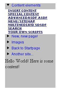
This creates a menu like this (above). One important point is the line
temp.foldoutMenu.1.expAll = 1
If you don't set this (just like the GMENU_LAYERS) then the second level is not generated!