Attention
TYPO3 v10 has reached end-of-life as of April 30th 2023 and is no longer being maintained. Use the version switcher on the top left of this page to select documentation for a supported version of TYPO3.
Need more time before upgrading? You can purchase Extended Long Term Support (ELTS) for TYPO3 v10 here: TYPO3 ELTS.
check (checkboxToggle)
This page describes the check type with the renderType='checkboxToggle'.
Toggle switches are rendered instead of checkboxes.
No additional configuration is necessary. Its state can be inverted via
invertStateDisplay.
Table of contents:
Examples
Example: Single checkbox With toggle
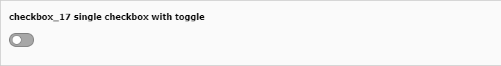
Single checkbox with toggle (checkbox_17)
'checkbox_17' => [
   'exclude' => 1,
   'label' => 'checkbox_17 single checkbox with toggle',
   'config' => [
      'type' => 'check',
      'renderType' => 'checkboxToggle',
      'items' => [
         [
            0 => '',
            1 => '',
         ]
      ],
   ]
],
checkboxToggle: Instead of checkboxes, a toggle item is displayed.
Example: Single checkbox with toggle inverted state display
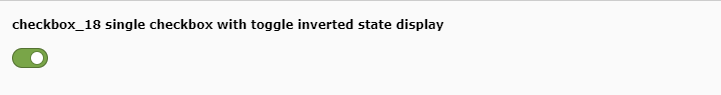
Single checkbox with toggle inverted state display (checkbox_18)
'checkbox_18' => [
   'exclude' => 1,
   'label' => 'checkbox_18 single checkbox with toggle inverted state display',
   'config' => [
      'type' => 'check',
      'renderType' => 'checkboxToggle',
      'items' => [
         [
            0 => '',
            1 => '',
            'invertStateDisplay' => true
         ]
      ],
   ]
],
invertedStateDisplay: A checkbox is marked checked if the database bit is not set and vice versa.
Properties
behaviour
- Datatype
array
- Scope
Proc.
- Description
The behaviour array contains various sub properties to specify processing options like localization overlay behaviour and children behaviour for relation types. Available properties vary by type and renderType combination.
behaviour => allowLanguageSynchronization
- Datatype
boolean
- Scope
Proc.
- Description
Allows an editor to select in a localized record whether the value is copied over from default or source language record, or if the field has an own value in the localization. If set to true and if the table supports localization and if a localized record is edited, this setting enables FieldWizard LocalizationStateSelector: Two or three radio buttons shown below the field input. The state of this is stored in a json encoded array in the database table called
l10n_state. It tells the DataHandler which fields of the localization records should be kept in sync if the underlying default or source record changes.Example:
'aField' => [
   'config' => [
      'type' = 'sometype',
      'behaviour' => [
         'allowLanguageSynchronization' => true
      ]
   ]
]
- Default
false
cols
- Datatype
integer/string
- Scope
Display
- Description
In how many columns the checkboxes will be shown. Makes sense only if the 'items' property is defining multiple checkboxes.
Allowed values are 1, 2, 3, ..., 31 or
inline, 1 being default. If set toinlinethe checkboxes are "floating" and there will be as many in one row as fits to browser width.Note checkboxes will still wrap if browser width is not sufficient.
default
- Datatype
integer
- Scope
Display / Proc.
- Description
Setting the default value of the checkbox(es). As example, value
5enabled first and third checkbox.Each bit corresponds to a check box. This is true even if there is only one checkbox which which then maps to bit-0.
eval
- Datatype
string (list of keywords)
- Scope
Proc. / Display
- Description
Configuration of field evaluation.
Keywords:
- maximumRecordsChecked
If this evaluation is defined, the maximum number of records from the same table that can have this box checked will be limited. If someone tries to check the box of a record beyond the allowed maximum, the box will be unchecked automatically upon saving.
The actual limit is defined with the validation property validation.
- maximumRecordsCheckedInPid
Similar to
maximumRecordsCheckedbut with the validation scope limited to records stored in the same page.
fieldInformation
- Datatype
array
- Scope
Display
- Description
Show information between an element label and the main element input area. Configuration works identical to the "fieldWizard" property, no default configuration in the core exists (yet). In contrast to "fieldWizard", HTML returned by fieldInformation is limited, see FormEngine docs for more details.
fieldWizard
- Datatype
array
- Scope
Display
- Description
Specifies wizards rendered below the main input area of an element. Single type / renderType elements can register default wizards which are merged with this property.
As example, type='check' comes with this default wizards configuration:
protected $defaultFieldWizard = [
    'localizationStateSelector' => [
        'renderType' => 'localizationStateSelector',
    ],
    'otherLanguageContent' => [
        'renderType' => 'otherLanguageContent',
        'after' => [
            'localizationStateSelector'
        ],
    ],
    'defaultLanguageDifferences' => [
        'renderType' => 'defaultLanguageDifferences',
        'after' => [
            'otherLanguageContent',
        ],
    ],
];
This is be merged with the configuration from TCA, if there is any. Below example disables the default
localizationStateSelectorwizard.'aField' => [ 'config' => [ 'fieldWizard' => [ 'localizationStateSelector' => [ 'disabled' => true, ], ], ], ],
It is possible to add own wizards by adding them to the TCA of the according field and pointing to a registered renderType, to resort wizards by overriding the
beforeandafterkeys, to hand over additional options in the optionaloptionsarray to specific wizards, and to disable single wizards using thedisabledkey. Developers should have a look at the FormEngine docs for details.
The following fieldWizards are available for this renderType:
fieldWizard => defaultLanguageDifferences
- Datatype
array
- Scope
fieldWizard
- Description
Show a "diff-view" if the content of the default language record has been changed after the translation overlay has been created. The ['ctrl'] section property transOrigDiffSourceField has to be specified to enable this wizard in a translated record.
This wizard is important for editors who maintain translated records: They can see what has been changed in their localization parent between the last save operation of the overlay.
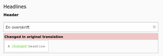
A field has been changed in default language record
fieldWizard => localizationStateSelector
- Datatype
array
- Scope
fieldWizard
- Description
The localization state selector wizard displays two or three radio buttons in localized records saying: "This field has an own value distinct from my default language or source record", "This field has the same value as the default language record" or "This field has the same value as my source record". This wizard is especially useful for the
tt_contenttable. It will only render, if:The record is a localized record (not default language)
The record is in "translated" (connected), but not in "copy" (free) mode
The table is localization aware using the ['ctrl'] properties languageField, transOrigPointerField. If the optional property translationSource is also set, and if the record is a translation from another localized record, the third radio appears.
The property ['config']['behaviour']['allowLanguageSynchronization'] is set to true
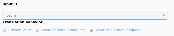
Example localization state selector on an type=input field
fieldWizard => otherLanguageContent
- Datatype
array
- Scope
fieldWizard
- Description
Show values from the default language record and other localized records if the edited row is a localized record. Often used in
tt_contentfields. By default, only the value of the default language record is shown, values from further translations can be shown by setting the userTsConfig property additionalPreviewLanguages.The wizard shows content only for "simple" fields. For instance, it does not work for database relation fields, and if the field is set to
readOnly. Additionally, the table has to be language aware by setting up the according fields in ['ctrl'] section.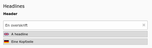
Header field showing values from two other languages
items
- Datatype
array
- Scope
Display
- Description
If set, this array will create an array of checkboxes instead of just a single "on/off" checkbox.
Note
You can have a maximum of 31 checkboxes in such an array and each element is represented by a single bit in the integer value which ultimately goes into the database.
In this array each entry is itself an array where the first entry is the label (string or LLL reference) and the second entry is a blank value. The value sent to the database will be an integer where each bit represents the state of a checkbox in this array.
A basic item looks like this:
'items' => [
    ['Green tomatoes', ''], // Note these should be LLL references
    ['Red peppers', ''],
],
Further properties can be set per item, but not all of them apply to all renderTypes:
- invertStateDisplay (boolean)
All renderTypes. If set to true, checked / unchecked state are swapped in view: A checkbox is marked checked if the database bit is not set and vice versa.
- iconIdentifierChecked (string)
Only if renderType is not set (default): An optional icon shown is selected / on. If not set, a check mark icon is used.
- iconIdentifierUnchecked (string)
Only if renderType is not set (default): An optional icon shown selected / on. If not set, no icon is show (check mark icon not displayed).
- labelChecked (string)
Mandatory property for renderType
checkboxLabeledToggle: Text shown if element is selected / on.- labelUnchecked (string)
Mandatory property for renderType
checkboxLabeledToggle: Text shown if element is not selected.
itemsProcFunc
- Datatype
string (class->method reference)
- Scope
Display / Proc.
- Description
PHP function which is called to fill / manipulate the array with elements.
[classname]->[methodname]
The function/method will have an array of parameters passed to it, the items-array is passed by reference in the key 'items'. By modifying the array of items, you alter the list of items. A method may throw an exception which will be displayed as a proper error message to the user.
Example:
The configuration for the field
category_fieldof the tablett_contentlooks like this:'type' => 'select', 'renderType' => 'selectSingle', 'itemsProcFunc' => 'TYPO3\CMS\Core\Category\CategoryRegistry->getCategoryFieldsForTable', 'itemsProcConfig' => [ 'table' => 'tt_content' ], 'minitems' => 0, 'maxitems' => 1, 'size' => 1
The referenced
itemsProcFuncshould populate the items by filling$configuration['items']`:/** * Returns a list of category fields for a given table for populating selector "category_field" * in tt_content table (called as itemsProcFunc). * * @param array $configuration Current field configuration * @throws \UnexpectedValueException * @internal */ public function getCategoryFieldsForTable(array &$configuration) { $table = $configuration['config']['itemsProcConfig']['table'] ?? ''; // Return early if no table is defined if (empty($table)) { throw new \UnexpectedValueException('No table is given.', 1381823570); } // Loop on all registries and find entries for the correct table foreach ($this->registry as $tableName => $fields) { if ($tableName === $table) { foreach ($fields as $fieldName => $options) { $fieldLabel = $this->getLanguageService()->sL($GLOBALS['TCA'][$tableName]['columns'][$fieldName]['label']); $configuration['items'][] = [$fieldLabel, $fieldName]; } } } }
Further examples on different config type's can be found in the extension
styleguide.
readOnly
- Datatype
boolean
- Scope
Display
- Description
Renders the field in a way that the user can see the values but cannot edit them. The rendering is as similar as possible to the normal rendering but may differ in layout and size.
Warning
This property affects only the display. It is still possible to write to those fields when using the DataHandler.
validation
- Datatype
array
- Scope
Proc.
- Description
Values for the eval rules. The keys of the array must correspond to the keyword of the related evaluation rule. For
maximumRecordsCheckedandmaximumRecordsCheckedInPidthe value is expected to be an integer.In the example below, only five records from the same table will be allowed to have that particular box checked.
'aCheckbox' => [
    'label' => 'aLabel',
    'config' => [
        'type' => 'check',
        'eval' => 'maximumRecordsChecked',
        'validation' => [
            'maximumRecordsChecked' => 5
        ],
    ],
],