Attention
TYPO3 v10 has reached end-of-life as of April 30th 2023 and is no longer being maintained. Use the version switcher on the top left of this page to select documentation for a supported version of TYPO3.
Need more time before upgrading? You can purchase Extended Long Term Support (ELTS) for TYPO3 v10 here: TYPO3 ELTS.
input (colorPicker)
This page describes the input type with renderType='colorPicker'.
An input field with a JavaScript color picker.
Table of contents:
Example
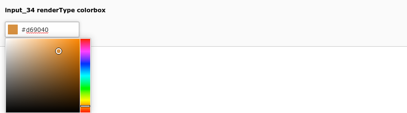
Color picker (input_34)
'input_34' => [
    'label' => 'input_34 renderType colorbox',
    'config' => [
        'type' => 'input',
        'renderType' => 'colorpicker',
        'size' => 10,
    ],
],
Properties
autocomplete
- Datatype
boolean
- Scope
Display
- Description
Controls the
autocompleteattribute of a given input field. If set to true (default false), adds attributeautocomplete="on"to the input field allowing browser auto filling the field:'title' => [ 'label' => 'LLL:EXT:lang/locallang_tca.xlf:sys_file_reference.title', 'config' => [ 'type' => 'input', 'size' => 20, 'eval' => 'null', 'autocomplete' => true ] ],
behaviour
- Datatype
array
- Scope
Proc.
- Description
The behaviour array contains various sub properties to specify processing options like localization overlay behaviour and children behaviour for relation types. Available properties vary by type and renderType combination.
behaviour => allowLanguageSynchronization
- Datatype
boolean
- Scope
Proc.
- Description
Allows an editor to select in a localized record whether the value is copied over from default or source language record, or if the field has an own value in the localization. If set to true and if the table supports localization and if a localized record is edited, this setting enables FieldWizard LocalizationStateSelector: Two or three radio buttons shown below the field input. The state of this is stored in a json encoded array in the database table called
l10n_state. It tells the DataHandler which fields of the localization records should be kept in sync if the underlying default or source record changes.Example:
'aField' => [
   'config' => [
      'type' = 'sometype',
      'behaviour' => [
         'allowLanguageSynchronization' => true
      ]
   ]
]
- Default
false
default
- Datatype
integer / string
- Scope
Display / Proc.
- Description
Default value set if a new record is created.
eval
- Datatype
string (list of keywords)
- Scope
Display / Proc.
- Description
Configuration of field evaluation.
Some of these evaluation keywords will trigger a JavaScript pre- evaluation in the form. Other evaluations will be performed in the backend. The evaluation functions will be executed in the list-order. Keywords:
- alpha
Allows only a-zA-Z characters.
- alphanum
Same as "alpha" but allows also "0-9"
- alphanum_x
Same as "alphanum" but allows also "_" and "-" chars.
- domainname
Allows a domain name such as
example.organd automatically transforms the value to punicode if needed.- double2
Converts the input to a floating point with 2 decimal positions, using the "." (period) as the decimal delimited (accepts also "," for the same).
This type adds a server-side validation of an email address. If the input does not contain a valid email address, a flash message warning will be displayed.
- int
Evaluates the input to an integer.
- is_in
Will filter out any character in the input string which is not found in the string entered in the property is_in.
- lower
Converts the string to lowercase (only A-Z plus a selected set of Western European special chars).
- md5
Will convert the input value to its md5-hash using a JavaScript function.
- nospace
Removes all occurrences of space characters (
chr(32))- null
An empty value (string) will be stored as
NULLin the database, requires a proper sql definition.- num
Allows only 0-9 characters in the field.
- password
Will show "*******" in the field after entering the value and moving to another field. Thus passwords can be protected from display in the field.
Note
The value is visible while it is being entered!
- required
A non-empty value is required in the field (otherwise the form cannot be saved).
- saltedPassword
The value will be hashed using the password hash configuration for BE for all tables except
fe_user, where the password hash configuration for FE is used. Note this eval is typically only used core internally for tablesbe_usersandfe_userson thepasswordfield.- trim
The value in the field will have white spaces around it trimmed away.
- unique
Requires the field to be unique for the whole table. Evaluated on the server only.
Note
When selecting on unique-fields, make sure to select using
AND pid>=0since the field can contain duplicate values in other versions of records (always having PID = -1). This also means that if you are using versioning on a table where the unique-feature is used you cannot set the field to be truly unique in the database either!- uniqueInPid
Requires the field to be unique for the current PID among other records on the same page. Evaluated on the server only.
- upper
Converts to uppercase (only A-Z plus a selected set of Western European special chars).
- year
Evaluates the input to a year between 1970 and 2038. If you need any year, then use "int" evaluation instead.
- Vendor\Extension\*
User defined form evaluations.
- Examples:
Trimming the value for white space before storing in the database:
'aField' => [
    'label' => 'aLabel',
    'config' => [
        'type' => 'input',
        'eval' => 'trim',
    ],
],
By this configuration the field will be stripped for any space characters, converted to lowercase, only accepted if filled in and on the server the value is required to be unique for all records from this table:
'eval' => 'nospace,lower,unique,required'
You can supply own form evaluations in an extension by creating a class with three functions, one which returns the JavaScript code for client side validation called
returnFieldJS()and two for the server side:deevaluateFieldValue()called when opening the record andevaluateFieldValue()called for validation when saving the record:EXT:extension/Classes/Evaluation/ExampleEvaluation.phpnamespace Vendor\Extension\Evaluation; /** * Class for field value validation/evaluation to be used in 'eval' of TCA */ class ExampleEvaluation { /** * JavaScript code for client side validation/evaluation * * @return string JavaScript code for client side validation/evaluation */ public function returnFieldJS() { return 'return value + " [added by JavaScript on field blur]";'; } /** * Server-side validation/evaluation on saving the record * * @param string $value The field value to be evaluated * @param string $is_in The "is_in" value of the field configuration from TCA * @param bool $set Boolean defining if the value is written to the database or not. * @return string Evaluated field value */ public function evaluateFieldValue($value, $is_in, &$set) { return $value . ' [added by PHP on saving the record]'; } /** * Server-side validation/evaluation on opening the record * * @param array $parameters Array with key 'value' containing the field value from the database * @return string Evaluated field value */ public function deevaluateFieldValue(array $parameters) { return $parameters['value'] . ' [added by PHP on opening the record]'; } }
EXT:extension/ext_localconf.php:// Register the class to be available in 'eval' of TCA $GLOBALS['TYPO3_CONF_VARS']['SC_OPTIONS']['tce']['formevals']['Vendor\\Extension\\Evaluation\\ExampleEvaluation'] = '';
EXT:extension/Configuration/TCA/tx_example_record.php:'columns' => [ 'example_field' => [ 'config' => [ 'type' => 'text', 'eval' => 'trim,Vendor\\Extension\\Evaluation\\ExampleEvaluation,required' ], ], ],
Note
A lot of the default eval properties do not make much sense in the colorpicker. Choose with care.
fieldControl
- Datatype
array
- Scope
Display
- Description
Show action buttons next to the element. This is used in various type's to add control buttons right next to the main element. They can open popups, switch the entire view and other things. All must provide a "button" icon to click on, see FormEngine docs for more details. See type=group for examples.
fieldInformation
- Datatype
array
- Scope
Display
- Description
Show information between an element label and the main element input area. Configuration works identical to the "fieldWizard" property, no default configuration in the core exists (yet). In contrast to "fieldWizard", HTML returned by fieldInformation is limited, see FormEngine docs for more details.
fieldWizard
- Datatype
array
- Scope
Display
- Description
Specifies wizards rendered below the main input area of an element. Single type / renderType elements can register default wizards which are merged with this property.
As example, type='check' comes with this default wizards configuration:
protected $defaultFieldWizard = [
    'localizationStateSelector' => [
        'renderType' => 'localizationStateSelector',
    ],
    'otherLanguageContent' => [
        'renderType' => 'otherLanguageContent',
        'after' => [
            'localizationStateSelector'
        ],
    ],
    'defaultLanguageDifferences' => [
        'renderType' => 'defaultLanguageDifferences',
        'after' => [
            'otherLanguageContent',
        ],
    ],
];
This is be merged with the configuration from TCA, if there is any. Below example disables the default
localizationStateSelectorwizard.'aField' => [ 'config' => [ 'fieldWizard' => [ 'localizationStateSelector' => [ 'disabled' => true, ], ], ], ],
It is possible to add own wizards by adding them to the TCA of the according field and pointing to a registered renderType, to resort wizards by overriding the
beforeandafterkeys, to hand over additional options in the optionaloptionsarray to specific wizards, and to disable single wizards using thedisabledkey. Developers should have a look at the FormEngine docs for details.
The following fieldWizards are available for this renderType:
fieldWizard => defaultLanguageDifferences
- Datatype
array
- Scope
fieldWizard
- Description
Show a "diff-view" if the content of the default language record has been changed after the translation overlay has been created. The ['ctrl'] section property transOrigDiffSourceField has to be specified to enable this wizard in a translated record.
This wizard is important for editors who maintain translated records: They can see what has been changed in their localization parent between the last save operation of the overlay.
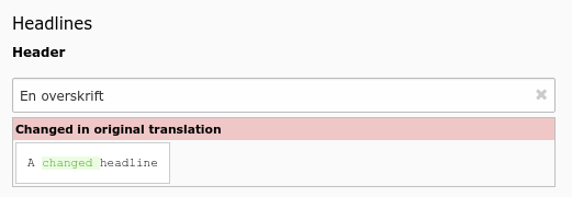
A field has been changed in default language record
fieldWizard => localizationStateSelector
- Datatype
array
- Scope
fieldWizard
- Description
The localization state selector wizard displays two or three radio buttons in localized records saying: "This field has an own value distinct from my default language or source record", "This field has the same value as the default language record" or "This field has the same value as my source record". This wizard is especially useful for the
tt_contenttable. It will only render, if:The record is a localized record (not default language)
The record is in "translated" (connected), but not in "copy" (free) mode
The table is localization aware using the ['ctrl'] properties languageField, transOrigPointerField. If the optional property translationSource is also set, and if the record is a translation from another localized record, the third radio appears.
The property ['config']['behaviour']['allowLanguageSynchronization'] is set to true
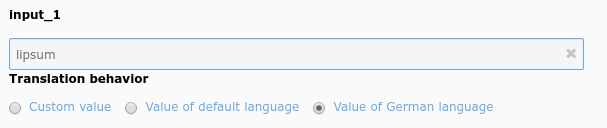
Example localization state selector on an type=input field
fieldWizard => otherLanguageContent
- Datatype
array
- Scope
fieldWizard
- Description
Show values from the default language record and other localized records if the edited row is a localized record. Often used in
tt_contentfields. By default, only the value of the default language record is shown, values from further translations can be shown by setting the userTsConfig property additionalPreviewLanguages.The wizard shows content only for "simple" fields. For instance, it does not work for database relation fields, and if the field is set to
readOnly. Additionally, the table has to be language aware by setting up the according fields in ['ctrl'] section.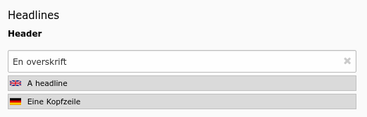
Header field showing values from two other languages
is_in
- Datatype
string
- Scope
Display / Proc.
- Description
If the evaluation type "is_in" (see eval) is used for evaluation, then the characters in the input string should be found in this string as well. This value is also passed as argument to the evaluation function if a user-defined evaluation function is registered.
Note
The "is_in" value is trimmed during processing, leading and trailing whitespaces are removed. If whitespaces should be allowed, it should be in between other characters, example
a b.
max
- Datatype
integer
- Scope
Display
- Description
Value for the "maxlength" attribute of the
<input>field. Javascript prevents adding more than these number of characters.If the form element edits a varchar(40) field in the database you should also set this value to 40.
mode
- Datatype
string (keywords)
- Scope
Display
- Description
Possible keywords:
useOrOverridePlaceholderThis property is related to the placeholder property. When defined a checkbox will appear above the field. If that box is checked, the field can be used to enter whatever the user wants as usual. If the box is not checked, the field becomes read-only and the value saved to the database will be
NULL.What impact this has in the frontend depends on what is done in the code using this field. In the case of FAL relations, for example, if the "title" field has its box checked, the "title" from the related metadata will be provided.
This is how the mode checkbox appears in the TYPO3 CMS backend:
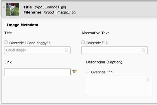
Several fields with their placeholder override checkboxes
Warning
In order for this property to apply properly, the field must be allowed to use "NULL" as a value, the "eval" property must list "null" as a possible evaluation.
placeholder
- Datatype
string
- Scope
Display
- Description
Placeholder text for the field. This can be a simple string or a reference to a value in the current record or another one. With a syntax like
__row|fieldthe placeholder will take the value of the given field from the current record.This can be recursive to follow a longer patch in a table record chain. If the designated field is a relation to another table (is of type select, group or inline), the related record will be loaded and the placeholder searched within it.
Example from the "sys_file_reference" table:
'title' => [
    'label' => 'LLL:EXT:lang/locallang_tca.xlf:sys_file_reference.title',
    'config' => [
        'type' => 'input',
        'size' => 20,
        'eval' => 'null',
        'placeholder' => '__row|uid_local|metadata|title',
        'mode' => 'useOrOverridePlaceholder'
    ]
],
In the above placeholder syntax,
uid_localpoints to the related "sys_file" record andmetadatapoints to the "sys_file_metata" of the related "sys_file" record. From there we take the content of thetitlefield as placeholder value.
readOnly
- Datatype
boolean
- Scope
Display
- Description
Renders the field in a way that the user can see the values but cannot edit them. The rendering is as similar as possible to the normal rendering but may differ in layout and size.
Warning
This property affects only the display. It is still possible to write to those fields when using the DataHandler.
search
- Datatype
array
- Scope
Search
- Description
Defines additional search-related options for a given field.
- pidonly (boolean)
Searches in the column only if search happens on the single page, does not search the field if searching in the whole table.
- case (boolean)
Makes the search case-sensitive. This requires a proper database collation for the field, see your database documentation.
- andWhere (string)
Additional SQL WHERE statement without 'AND'. With this it is possible to place an additional condition on the field when it is searched
Example from "tt_content" bodytext:
'bodytext' => [
    'config' => [
        'search' => [
            'andWhere' => '{#CType}=\'text\' OR {#CType}=\'textpic\'',
        ],
        ...
    ],
    ...
],
This means that the "bodytext" field of the "tt_content" table will be searched in only for elements of type Text and Text & Images. This helps making any search more relevant.
The above example uses the special field quoting syntax
{#...}around identifiers of the QueryHelper to be as DBAL compatible as possible.
size
- Datatype
integer
- Scope
Display
- Description
Abstract value for the width of the
<input>field. To set the input field to the full width of the form area, use the value 50. Minimum is 10. Default is 30.
softref
- Datatype
string
- Scope
Proc.
- Description
Used to attach "soft reference parsers", typically used in
type='text'fields.The syntax for this value is key1,key2[parameter1;parameter2;...],...
See Soft references of core API for more details about softref keys.
valuePicker
- Datatype
array
- Scope
Display
- Description
Renders a select box with static values next to the input field. When a value is selected in the box, the value is transferred to the field. Keys:
- mode (keyword)
- blank (or not set)
The selected value substitutes the value in the input field
- append
The selected value is appended to an existing value of the input field
- prepend
The selected value is prepended to an existing value of the input field
- items (array)
An array with selectable items. Each item is an array with the first value being the label in the select drop-down (LLL reference possible) the second being the value transferred to the input field.
Example:
'input_33' => [
    'label' => 'input_33',
    'config' => [
        'type' => 'input',
        'valuePicker' => [
            'items' => [
                ['spring', 'Spring'],
                ['summer', 'Summer'],
                ['autumn', 'Autumn'],
                ['winter', 'Winter'],
            ],
        ],
    ],
],
Note
The colorpicker ignores mode setting of the valuePicker, new values from the select box always substitute an existing one.