Carousel Content Block example
This content block demonstrates some additional features of friendsoftypo3/content-blocks . We assume that you are already familiar with the concepts described in chapter Custom Content Blocks.
Table of contents
Directory structure of the carousel content element
Additionally to the files that the jumbotron provides (compare Directory structure of a Content Block), the carousel comes with special CSS and JavaScript needed for this element only.
Additionally it supplies a template for its display in the backend.
The carousel: A Content Block containing a collection of elements
The carousel can contain one or several items, each of which has an image, header, and description:
name: my-site-package/carousel
typeName: my_site_package_carousel
group: my_site_package
prefixFields: true
fields:
  - identifier: carousel_items
    type: Collection
    minitems: 1
    appearance:
      collapseAll: true
      levelLinksPosition: both
    fields:
      - identifier: image
        type: File
        allowed: common-image-types
        minitems: 1
        relationship: oneToOne
      - identifier: header
        type: Text
      - identifier: description
        type: Textarea
        enableRichtext: true
Line 8: We use a field of type Collection to contain the items to be displayed in the carousel. This field type expects an array of fields (line 10ff).
Line 15: We use the type File to reference the image for the carousel item. We allow images only (line 16) and require exactly one image (lines 17 and 18).
Line 20: The title should be one line of text. We use the type Text.
Line 22: The description may contain rich text. Therefore, we use the type Textarea and enable the Rich-Text Editor (line 23).
Frontend template: Fluid template for a Content Block with a Collection
<f:asset.css identifier="content-block-css-t3docs-t3docs/carousel" href="{cb:assetPath()}/frontend.css"/>
<f:asset.script identifier="content-block-js-t3docs-t3docs/carousel" src="{cb:assetPath()}/frontend.js"/>

<div id="carousel{data.uid}" class="carousel slide" data-bs-ride="carousel">
    <div class="carousel-indicators">
        <f:for each="{data.carousel_items}" as="item" iteration="iteration">
            <button type="button" data-bs-target="#carousel{data.uid}" data-bs-slide-to="{iteration.index}" class="{f:if(condition: '{iteration.isFirst}', then:' active')}" aria-current="true" aria-label="{item.header}"></button>
        </f:for>
    </div>
    <div class="carousel-inner">
        <f:for each="{data.carousel_items}" as="item" iteration="iteration">
            <div class="carousel-item{f:if(condition: '{iteration.isFirst}', then:' active')}">
                <f:image image="{item.image}" class="d-block w-100"/>
                <div class="carousel-caption d-none d-md-block">
                    <h5>{item.header}</h5>
                    <f:render.text field="description">{item}</f:render.text>
                </div>
            </div>
        </f:for>
    </div>
    <button class="carousel-control-prev" type="button" data-bs-target="#carousel{data.uid}" data-bs-slide="prev">
        <span class="carousel-control-prev-icon" aria-hidden="true"></span>
        <span class="visually-hidden"><f:translate key="{cb:languagePath()}:previous.label"/></span>
    </button>
    <button class="carousel-control-next" type="button" data-bs-target="#carousel{data.uid}" data-bs-slide="next">
        <span class="carousel-control-next-icon" aria-hidden="true"></span>
        <span class="visually-hidden"><f:translate key="{cb:languagePath()}:next.label"/></span>
    </button>
</div>
Line 1: We use Asset.css ViewHelper <f:asset.css>
to load the provided CSS file only if a carousel is displayed on that page. The
Asset collector
takes care that the file is not loaded more then once per page. All Fluid
ViewHelpers prefixed with cb: are provided by
friendsoftypo3/content-blocks
they are therefore not listed in the official View Helper reference. The inline
ViewHelper cb: resolves paths to the asset folder of the current
content block.
Line 2: We use the Asset.script ViewHelper <f:asset.script> to load the JavaScript file the same way.
Line 6: We use the For ViewHelper <f:for> to loop through each item. We then render a button for each carousel item.
Line 11: We loop the items a second time to now display all carousel slides.
Line 13: The field image was defined with option relationship: one in
the config.yaml it can therefore only contain
one image at maximum. As supplying an image is also mandatory minitems: 1
we can be sure there is always exactly one image. And just use the
Image ViewHelper <f:image>
to display the image.
Line 16: As the field {item. is of type Textarea with rich-text
enabled we have to use the Render.text ViewHelper <f:render.text>
to properly display it.
New in version 14.2
The render. ViewHelper handles the processing of both simple and rich
text fields.
Render.text ViewHelper <f:render.text>
It should be used now instead of the old Format.html ViewHelper <f:format.html>
Line 23, 27: The previous and next buttons use localized text for their labels. We use the Translate ViewHelper <f:translate> to translate these labels and a view helper provided by the Content Block extension to determine the path to the language file.
Content Block with backend template
This Content Block contains a template to influence how the content elements should be displayed in the TYPO3 backend in the Page module:
<f:layout name="Preview"/>

<f:section name="Header">
    <f:variable name="itemCount"><f:count subject="{data.carousel_items}" /></f:variable>
    <div>{f:translate(key: '{cb:languagePath()}:backend.itemCount', arguments: {0: '{itemCount}'})}</div>
</f:section>

<f:section name="Content">
    <div class="row">
        <f:for each="{data.carousel_items}" as="item" iteration="iteration">
            <div class="col">
                <f:image image="{item.image}" width="100"/><br/>
                {item.header}
            </div>
        </f:for>
    </div>
</f:section>

<f:section name="Footer">
    <f:variable name="lastUpdated"><f:format.date>{data.rawRecord.crdate}</f:format.date></f:variable>
    <div>{f:translate(key: '{cb:languagePath()}:backend.lastUpdated', arguments: {0: '{lastUpdated}'})}</div>
</f:section>
The same fields like for the frontend template are available and the same ViewHelpers can be used. However we display them in a simplified form.
Line 1: We are using the layout Preview, which already gives some structure to
the display of the backend element:
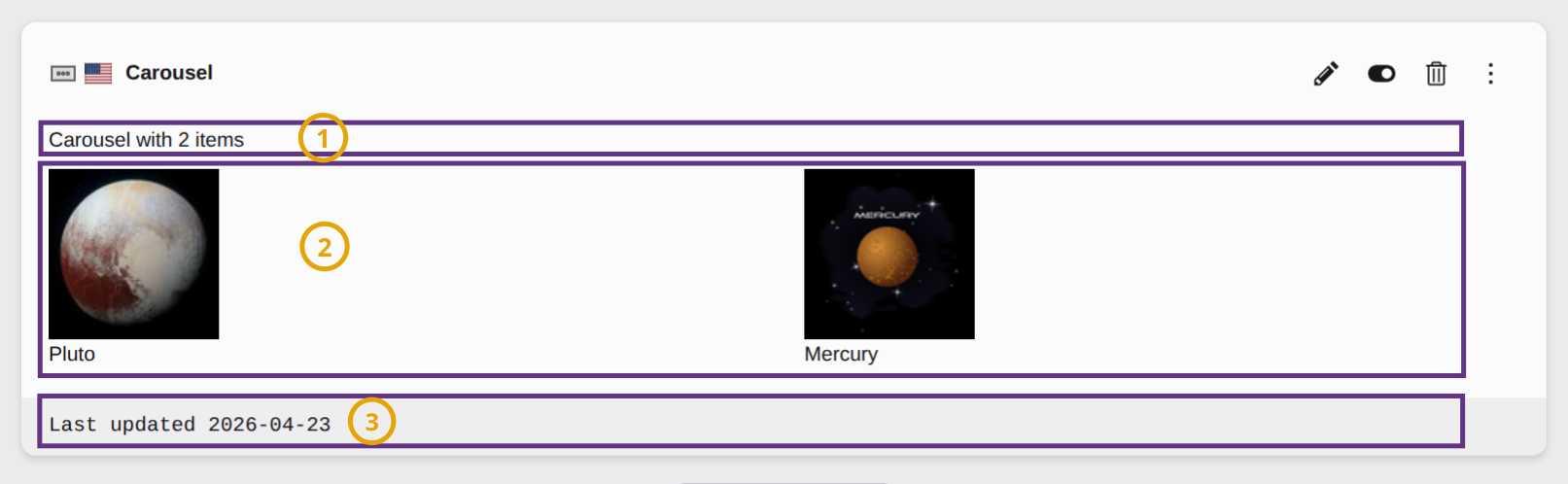
The sections of a content element backend layout: (1) Header, (2) Content, (3) Footer
The line on the very top with the name of the content element, the icon and the
edit buttons is generated by TYPO3 automatically and cannot be influenced by
a backend template. It uses the label title defined in language/
and the icon assets/.
As always we use the Layout ViewHelper <f:layout>
to select the Preview layout.
Each section is declared using the Section ViewHelper <f:section>.
Line 10: We once more use the For ViewHelper <f:for> to loop through all items of the slider and display them one by one.
Line 21: Labels can and should also be localized in the backend. To not lose
context we prefixed all labels to be used in the backend with backend..
Tip
See also chapter Backend Preview in the Content Blocks manual.
Content Block specific assets
The assets in folder assets can be loaded in the
Frontend Template. They will only be loaded when the
Content Block is loaded on the current page.
This also has the advantage that your JavaScript is only loaded if needed.