Views
This item opens the form used to generate the views of the extension.
Tip
Click on the icons at the right hand side of Views:
to access to this section of the documentation.
to save the configuration
to generate the extension.
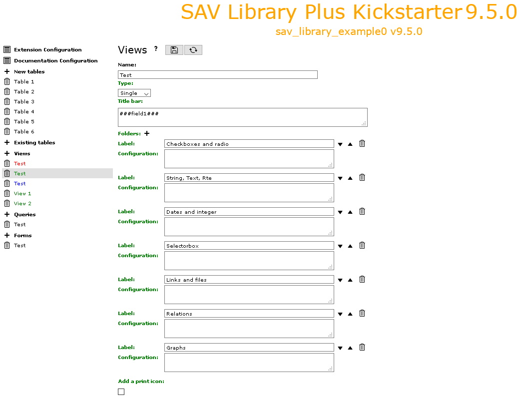
Name: sets the name of the view.
Type: use the selector to set the type of the view. It is either
List,Single,EditorUpdate.Titlebar: the content of this field be displayed as the title bar of the view. If markers
###fieldName###are used, they will be replaced by the label associated with the fieldname for aListview. ForSingleorEditviews, they will be replaced by the value in the main table by default.Use
###tableName.fieldName###if you want to access to a field which is in another table.By default the raw content of the table is displayed. Use
###render[fieldName]###or###render[tableName.fieldName]###when rendering is required like dates or selector boxes.Localization by means of the file locallang.xlf can be used with
$$$tag$$$which will be replaced by its value according to the configuration language. The marker$$$label[fieldName]$$$will be replaced by the fieldName title according to the localization. By default, the main table is assumed. Use$$$label[tableName.fieldName]$$$if necessary.
Item template: this field is for the template for the
List,UpdateorPrintviews. The fields to include are defined using markers###fieldName###. Markers###tablename.fieldname###can also be used. In this case, no rendering processing is performed, the marker is replaced by the value in the selected row.In the case of a view
UpdateorPrint, markers###field[fieldName, label]###generate the display of the label (localization can be used with$$$tag$$$or$$$label[fieldName]$$$), the current value of fieldfieldNameand an input element for update. Markers###newfield[fieldName, label]###generate the display of the label and an input element for the fieldfieldName. In both cases, label and field will be wrapped with default CSS classesupdateCol1 to updateCol4 for an
Updateview, respectively for the label, the previous value, the input value, the checkbox.printCol1 and printCol2 for a
Printview respectively for the label, the field.
If you do not want this wrapping, just use
$$$label[fieldName]$$$for the label and###field[fieldName]###for the field.Folders: this item is shown in the
SingleandEditviews.Click on the icon to add a folder and fill its label. If the label is defined in the file locallang.xlf, it will be translated to the selected language. Folder can be deleted or ordered using the icons. See the extension sav_library_example0 for an example.Folder configuration parameters can be added. Each parameter should be under the same format as the format for the field configuration.
parameter = value;
Conventional configuration parameters are:
editAdminPlus = 1;: for anEditview, the folder can be edited if the frontend user has theAdmin+right. To be anAdminfrontend user, the user TSConfig must contain a line as follows:extKey_Admin = value
extKeyis the extension key andvalueis one of the possible value of theInput Admin Fielddefined in the flexform associated with the extension.The frontend user becomes an
Admin+user, if the user TSConfig contains a line as follows:extKey_Admin = value+
Add a print icon: if set, a print icon is added to the view.