Form elements and their properties
Overview of form elements
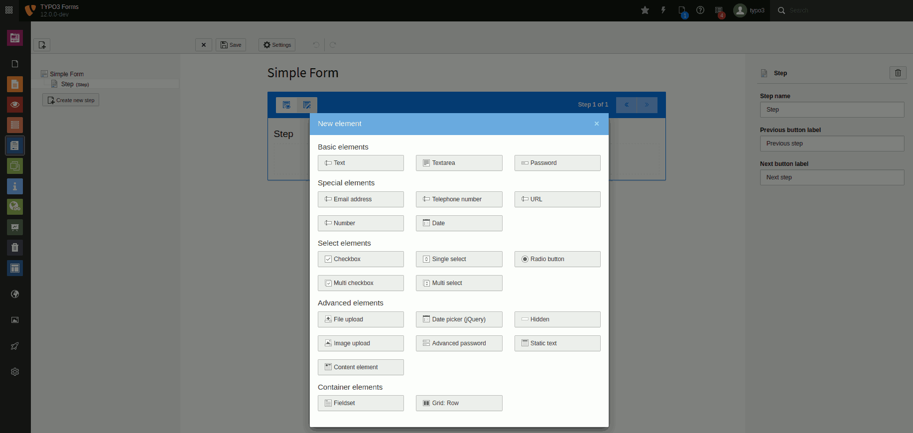
Overview of all form elements included in TYPO3. There may be fewer or different elements in your installation.
Form element settings
Most form elements have these 7 basic settings:
- Label: Label of the element.
- Description: Description of the element. Can be used to provide the user with more information about the expected input.
- Placeholder: Example of the expected content. Disappears with the user's input.
- Default value: Preset value. Pre-entered by the system and does not disappear with the user's input.
- Mandatory field: Specify whether the field is a mandatory field and thus must be filled in by the user.
- Custom error message: Custom message that will be displayed to the user if the field is not filled in. If you don't provide a message, a default message is shown.
- Validators: Validators are used to check the data entered in the field. The system displays error messages if there are errors.
Warning
If a form element is a required field or validators fail, error messages are displayed by the browser. These error texts and formatting cannot be changed by editors or integrators as they are controlled by the browser/operating system.
Basic form elements
Text
A single-line text field, e.g. for entering short information such as name, address, location. This element has the basic settings.

Element 'Text' - preview in the frontend.
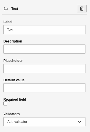
Settings for the 'Text' element.
Textarea
A multi-line text field, e.g. for the free input of continuous text. This allows the user to provide a short text such as a message. This element has the basic settings.
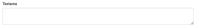
Element 'Textarea' - preview in the frontend.
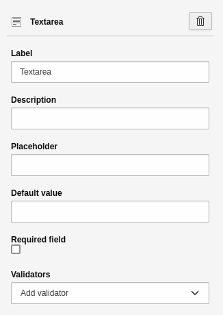
Settings for the 'Textarea' element.
Password
A single-line text field for entering a password. The browser "hides" the text input, i.e. the entered characters are not visible. This element has the basic settings.
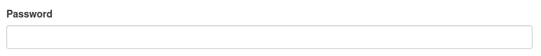
Element 'Password' - preview in the frontend.

Settings for the 'Password' element.
Special elements
Sometimes it is better to use special elements instead of simple text elements. Mobile devices such as smartphones display on-screen keyboards. If you use the "Email address" element the form field on the device will contain a "@" character in a central position and a validator will be triggered that checks for the input format "firstname.lastname@example.org".
Email address
A single-line field for entering an email address. This element has the
basic settings. In addition, the field has an
Email validator (this is the only validator available for this form element).

Element 'E-mail' - preview in the frontend.
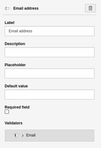
Settings for the 'E-mail' element.
Telephone number
A single-line text field for entering a phone number. This element has the basic settings.
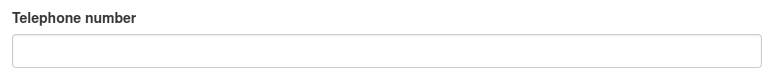
Element 'Telephone' - preview in the frontend.
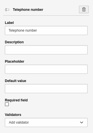
Settings for the 'Telephone' element.
URL
A single-line text field for entering a URL. A URL is typically an internet address, such as that of your website. This element has the basic settings
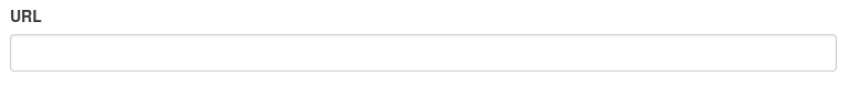
Element 'URL' - preview in the frontend.
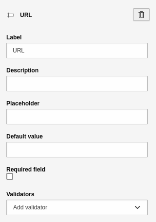
Settings for the 'URL' element.
Number
A single-line text field for entering a number. A user can increase and decrease
the number in preconfigured steps using visual controls in the browser.
This element has the basic settings.
By default, the field has a Number validator. Additional settings:
- Step: Here you can enter a number that defines the step size. The step size is the amount by which a number is increased or decreased in the frontend.

Element 'Number' - preview in the frontend.
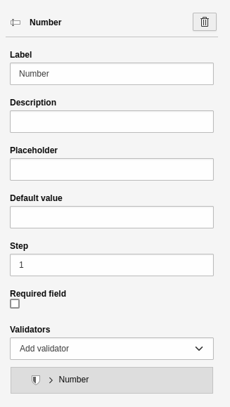
Settings for the 'Number' element.
Date
A single-line text field for entering a date. Most modern browsers will also display a calendar from which the user can select the date. This element has the basic settings. Additional settings:
- Frequency: default value "1" means that the user can select every day.

Element 'Date' - preview in the frontend.
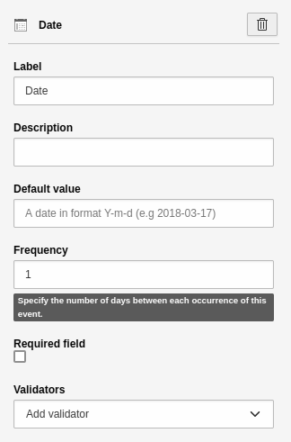
Settings for the 'Date' element.
Select elements
Select elements (including checkboxes, radio buttons and selectboxes) do not allow a user to enter text. Instead, they offer a predefined number of choices, for example, salutation options.
Note
Select elements behave differently to text fields if they are marked as "required".Checkboxes with multiple choices, for example, cannot be be required fields. This is not supported by the HTML standard.
Checkbox
A simple checkbox. This element has the basic settings.

Element 'Checkbox' - preview in the frontend.
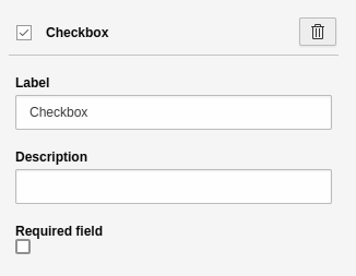
Settings for the 'Checkbox' element.
Single selectbox
An element to create a drop-down list. This element has the basic settings. Additional settings:
- First option: Define the "empty option", i.e. the first element of the selectbox. You can use this to provide additional guidance for the user.
- Choices: A tool to insert and manage options.
-
- Label: Name of the option.
- Value: Value of the option. The system automatically sets the "Value" to the "Label". You can leave it like this if you are unsure of what you are doing.
- Selected: Check this to pre-select an option in the frontend.
- [ + ]: Adds a new line for a new option.

Element 'Single select' - preview in the frontend.
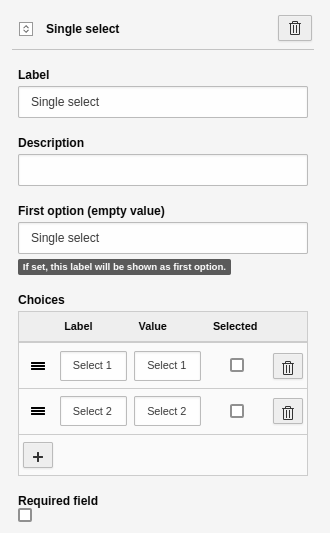
Settings for the 'Single select' element.
Radio buttons
An element to display one or more radio buttons. This element has the basic settings. Additional settings:
- Choices: A tool to insert and manage the options.
-
- Label: Name of the option.
- Value: Value of the option. The system automatically sets the "Value" to the "Label". You can leave it like this if you are unsure of what you are doing.
- Selected: Check this to pre-select an option in the frontend.
- [ + ]: Adds a new line for a new option.
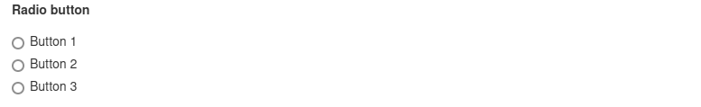
Element 'Radio button' - preview in the frontend.
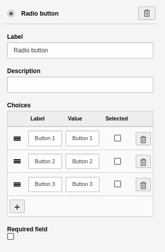
Settings for the 'Radio button' element.
Multi checkbox
An element to create one or more checkboxes. This element has the basic settings. Additional settings:
- Choices: A tool to insert and manage the options.
-
- Label: Name of the option.
- Value: Value of the option. The system automatically sets the "Value" to the "Label". You can leave it like this if you are unsure of what you are doing.
- Selected: Check this to pre-select an option in the frontend.
- [ + ]: Adds a new line for a new option.
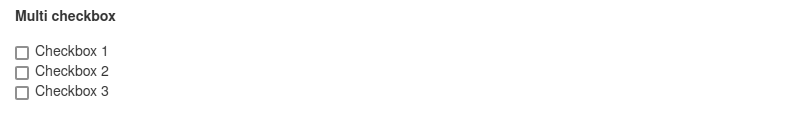
Element 'Multi checkbox' - preview in the frontend.
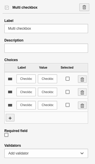
Settings for the 'Multi checkbox' element.
Warning
HTML does not check that "required" fields are filled out. They are only checked after a form has been submitted.
Multi select
An element to create a multiple selection. This element has the basic settings. Additional settings:
- First option: Define the "empty option", i.e. the first element of the select. You can use this to provide additional guidance for the user.
- Choices: A tool to insert and manage the options.
-
- Label: Name of the option.
- Value: Value of the option. The system automatically sets the "Value" to the "Label". You can leave it like this if you are unsure of what you are doing.
- Selected: Check this to pre-select an option in the frontend.
- [ + ]: Adds a new line for a new option.
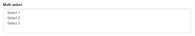
Element 'Multi select' - preview in the frontend.
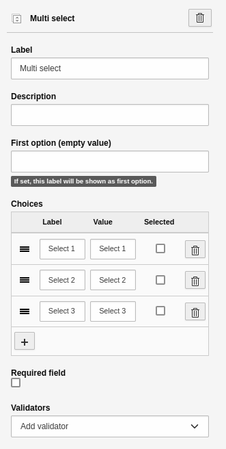
Settings for the 'Multi select' element.
Country select
An element to create a country selectbox. This element has the basic settings Additional settings:
- First option: Define the "empty option", i.e. the first element of the select. You can use this to provide additional guidance for the user.
- Prioritized countries: A multi-selection of country names, which should be listed as the top options in the form element.
- Only countries: Restrict the countries to be rendered in the selection.
- Exclude countries: Define which countries should not appear in the selection.
Advanced elements
File upload
An element to upload a file to the File > Filelist module. This element has the basic settings. Additional settings:
- Allowed Mime Types: Select the allowed file extensions a user is able to upload.
- Storage path for uploads: Select the storage path in your TYPO3 installation. This is where the uploaded file will be saved.

Element 'File upload' - preview in the frontend.
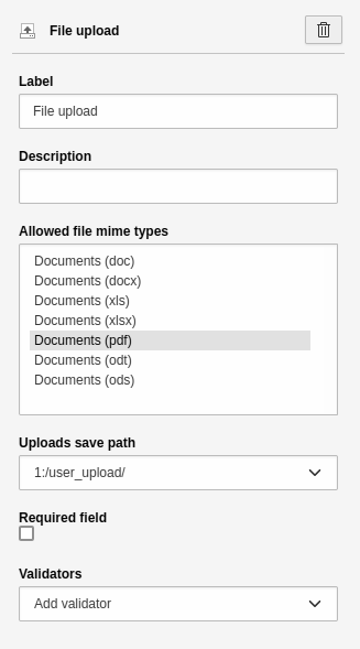
Settings for the 'File upload' element.
Error
Privacy issues: Keep in mind that the storage path you choose may not be protected. The path may be indexed by your search and search engines. If you need to protect sensitive documents, contact your administrator to create a secure storage path.
Image upload
An element to upload an image to File > Filelist. This element has the basic settings. Other settings:
- Allowed Mime Types: Select the file extensions a user is allowed to upload.
- Storage path for uploads: Select the storage path in your TYPO3 installation. This is where the uploaded file will be saved.

Element 'Image upload' - preview in the frontend.
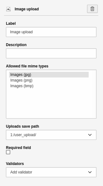
Settings for the 'Image upload' element.
Error
Privacy issues: Keep in mind that the storage path you choose may not be protected. The path may be indexed by your search and search engines. If you need to protect sensitive documents, contact your administrator to create a secure storage path.
Advanced password
The element is analogous to the Password form element. A single-line text
field is displayed for entering a password. The browser "hides" the text input,
i.e. the entered characters are not visible. Another field is displayed below it
so that the user has to repeat the password to prevent typing errors. This field
is useful for registration forms. This element has the
basic settings. Additional settings:
- Confirmation label: Label for the confirmation field.
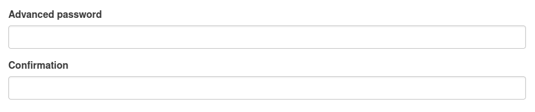
Element 'Advanced password' - preview in the frontend.
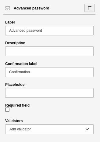
Settings for the 'Advanced password' element.
Static text
A field for static text. This text cannot be formatted, which means you can't insert links or highlight text. Instead, the text is output in the style of your website. The settings for this element are:
- Heading: Heading for the element.
- Text: Content for the element.
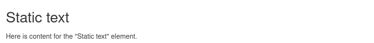
Element 'Static text' - preview in the frontend.
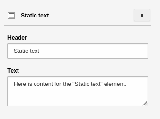
Settings for the 'Static text' element.
Content element
You can display any content elements that are on your website. The settings for this element are:
- Content element uid: ID of the content element you want to display. You can either enter the ID manually or select it via the page tree. To do this, click on the "Page content" button.
- [ Page content ]: Modal which displays the page tree. You can select a page and the content element.

Element 'Content element' - preview in the frontend.
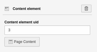
Settings for the 'Content element' element.
Container elements
Fieldset and grid elements are container elements that structure your form in terms of content or visual appearance. Container elements can be combined. For example, a fieldset can contain several grids.
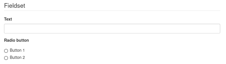
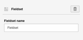
Fieldset
This container groups form elements based on content. This is important for screen readers and helps you to improve the accessibility of your form. For example, in an "Address" fieldset you could have street, house number, postal code and city form elements. The settings for this element are:
- Field group name: Heading for the field group, e.g. "Address".
Element 'Fieldset' - preview in the frontend.
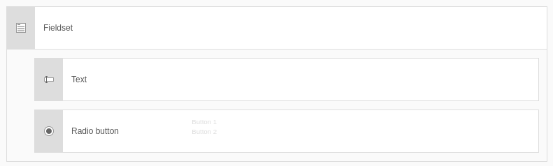
Element 'Fieldset' - preview in the backend.
Settings for the 'Fieldset' element.
Grid
Use this container element to place fields next to each other (create a visual structure).
The additional settings apply to the content elements inside the grid:
- Configuration Grid Area:
-
- Areas: xs (Very small), sm (Small), md (Medium), lg (Large), xl (Extra large), xxl (Extra extra large).
- These are the "breakpoints". These are ranges of resolutions or adaptations to different screen sizes. Smartphones, for example, have a low resolution range (xs or sm) and desktop monitors have a high resolution range (lg, xl or xxl). Use this to abstractly control how many elements are displayed next to each other in which resolution.
- Number of columns for grid area "xx":
-
- Enter a number for the selected area.
- The number determines how much space the field takes up on the different screen sizes and therefore how many elements are displayed next to each other.
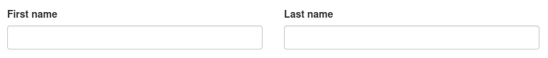
Element 'Grid' - preview in the frontend.
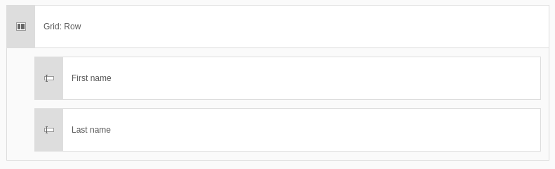
Element 'Grid' - preview in the backend.
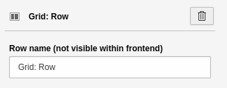
Settings for the 'Grid' element - Part 1.
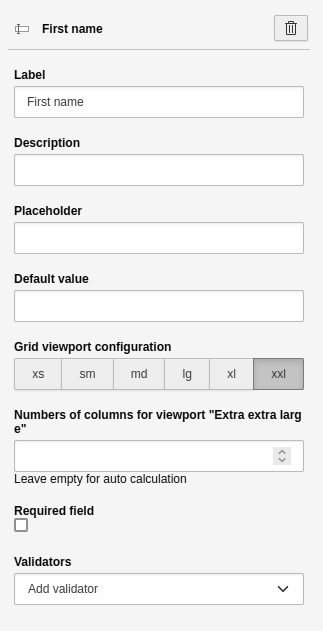
Settings for the 'Grid' element - Part 2.