Attention
TYPO3 v12 has reached end-of-life as of April 30th 2026 and is no longer being maintained. Use the version switcher on the top left of this page to select documentation for a supported version of TYPO3.
Need more time before upgrading? You can purchase Extended Long Term Support (ELTS) for TYPO3 v12 here: TYPO3 ELTS.
wizards
The wizards section allows to customize the New record wizard and the
New content element wizard.
newContentElement.wizardItems
newContentElement.wizardItems
-
- Type
- array
- Path
- mod.wizards.newContentElement.wizardItems
In the new content element wizard, content element types are grouped together by type. Each such group can be configured independently. The four default groups are:
common,special,formsandplugins.The configuration options below apply to any group.
[group].before
-
- Type
- string
- Path
- mod.wizards.newContentElement.wizardItems.[group].before
Sorts [group] in front of the group given.
[group].after
-
- Type
- string
- Path
- mod.wizards.newContentElement.wizardItems.[group].after
Sorts [group] after the group given.
[group].header
-
- Type
- string | localized string
- Path
- mod.wizards.newContentElement.wizardItems.[group].header
Name of the group.
[group].show
-
- Type
- string, comma-separated list of items
- Path
- mod.wizards.newContentElement.wizardItems.[group].show
Name of the group.
Comma-separated list of items to show in the group. Use
*to show all, example:EXT:site_package/Configuration/page.tsconfig# Hide bulletList mod.wizards.newContentElement.wizardItems.common.show := removeFromList(bullets) # Only show text and textpic in common mod.wizards.newContentElement.wizardItems.common.show = text,textpicCopied!
[group].elements
-
- Type
- array
- Path
- mod.wizards.newContentElement.wizardItems.[group].elements
List of items in the group.
[name]
-
- Type
- array
- Path
- mod.wizards.newContentElement.wizardItems.[group].elements.[name]
Configuration for a single item.
iconIdentifier
-
- Type
- string
- Path
- mod.wizards.newContentElement.wizardItems.[group].elements.[name].iconIdentifier
The icon identifier of the icon you want to display.
iconOverlay
-
- Type
- string
- Path
- mod.wizards.newContentElement.wizardItems.[group].elements.[name].iconOverlay
The icon identifier of the overlay icon you want to use.
title
-
- Type
- string | localized string
- Path
- mod.wizards.newContentElement.wizardItems.[group].elements.[name].title
Name of the item.
description
-
- Type
- string | localized string
- Path
- mod.wizards.newContentElement.wizardItems.[group].elements.[name].description
Description text for the item.
tt_content_defValues
-
- Type
- array
- Path
- mod.wizards.newContentElement.wizardItems.[group].elements.[name].tt_content_defValues
Default values for tt_content fields.
saveAndClose
-
- Type
- bool
- Path
- mod.wizards.newContentElement.wizardItems.[group].elements.[name].saveAndClose
- Default
false
If
true, directs the user back to the Page module directly instead of showing the FormEngine.
Example: Add a new element to the "common" group
# Add a new element (header) to the "common" group
mod.wizards.newContentElement.wizardItems.common.elements.header {
    iconIdentifier = content-header
    title = Header
    description = Adds a header element only
    tt_content_defValues {
        CType = header
    }
}
mod.wizards.newContentElement.wizardItems.common.show := addToList(header)
Example: Create a new group and add an element to it
# Create a new group and add a (pre-filled) element to it
mod.wizards.newContentElement.wizardItems.myGroup {
    header = LLL:EXT:cms/layout/locallang.xlf:advancedFunctions
    elements.customText {
        iconIdentifier = content-text
        title = Introductory text for national startpage
        description = Use this element for all national startpages
        tt_content_defValues {
            CType = text
            bodytext (
                    <h2>Section Header</h2>
                    <p class="bodytext">Lorem ipsum dolor sit amet, consectetur, sadipisci velit ...</p>
            )
            header = Section Header
            header_layout = 100
        }
    }
}
mod.wizards.newContentElement.wizardItems.myGroup.show = customTextWith the second example, the bottom of the new content element wizard shows:
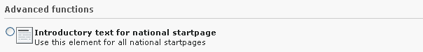
Added entry in the new content element wizard
newRecord.order
newRecord.order
-
- Type
- list of values
Define an alternate order for the groups of records in the new records wizard. Pages and content elements will always be on top, but the order of other record groups can be changed.
Records are grouped by extension keys, plus the special key "system" for records provided by the TYPO3 Core.
Example: Place the tt_news group at the top of the new record dialog
Place the tt_news group at the top (after pages and content elements), other groups follow unchanged:
mod.wizards.newRecord.order = tt_news
The position of News changed after modifying the New record screen
newRecord.pages
newRecord.pages
-
- Type
- boolean
Use the following sub-properties to show or hide the specified links. Setting any of these properties to 0 will hide the corresponding link, but setting to 1 will leave it visible.
- show.pageAfter
- Show or hide the link to create new pages after the selected page.
- show.pageInside
- Show or hide the link to create new pages inside the selected page.
- show.pageSelectPosition
- Show or hide the link to create new pages at a selected position.
Example: Hide the "Page (inside)" link in the "New Record" dialog
mod.wizards.newRecord.pages.show {
    # Hide the "Page (inside)" link.
    pageInside = 0
}
The modified new record screen without page (inside)